

Filters & Date Range
Overview
Global dashboard filters let you filter data across all widgets simultaneously. Filters appear at the top of the dashboard and affect every widget that has the matching column in its data.
Filter Types
- Multi-Select — Choose one or more values from a dropdown
- Toggle — On/off switch for boolean filters
- Custom — Custom-defined filter logic
Multi-Select Features
- Search/Autocomplete — Type to search and filter available values. Suggestions appear as you type with keyboard navigation (arrow keys + Enter).
- "Only" Button — Hover over any item in the dropdown to reveal an "Only" button. Click it to select ONLY that item and deselect everything else. Useful for quick single-value filtering.
- Select All / Clear All — Bulk selection controls.
- ↻ Refresh — Reloads the list of values in place. Filter values are cached together with widget results, so use it when a new campaign, tag, or sprint does not show up yet. See Cached Data and Refresh.
Smart Filter Behavior
Filters are intelligent about which widgets they apply to:
- If a widget's data table doesn't have the filtered column, that filter is automatically skipped for that widget (no errors)
- Tables without a date column automatically skip date filtering
- Different data sources on the same dashboard work without filter conflicts
Widget-Level vs Dashboard-Level Filters
Filters have a priority system:
- Widget-level filters (highest priority) — Set on individual widgets in the properties panel
- Dashboard-level filters — Global filters applied to all widgets
- Cross-widget interaction filters — Temporary filters from clicking other widgets
Widget-level filters override dashboard filters when they target the same column.
Configuring Filters
- Add default filters — Pre-configure which filters appear on the dashboard
- Custom filters — Define filters with custom labels, target columns, and dependencies
- Filter dependencies — A filter can depend on another (e.g., Campaign filter depends on Channel selection)
- Filter groups — Visually group related filters with separators
Hide for View-Only Users
When editing a dashboard-level filter, toggle Hide for view-only users in the filter configuration panel to keep the filter active for data but hide its control from anyone opening the dashboard in shared or view-only mode.
- The filter still applies to the data — selected values continue to constrain every widget on the dashboard.
- The filter control is hidden from the filter bar for view-only viewers, so they cannot change or clear it.
- Editors still see the filter normally and can adjust it.
Use this when a filter should pin a dashboard to a specific scope (e.g. a single account, brand, or region) for shared recipients without exposing the control.
SQL-Defined Filters
Some things you want to filter by are not a column on the widget's table. Creative tags, ad labels, and mapping tables usually live in their own table, keyed by an id the widget never selects. For these, a filter can be defined by SQL instead of by a column.
A SQL-defined filter has two parts, both set in the filter's configuration panel:
-
Options query — the SQL that fills the dropdown. It must return a single column
aliased
value. -
Apply condition — a boolean SQL expression added to every widget's query when
values are selected. Write
{values}where the selection goes; Improvado substitutes the selected values, escaped and quoted for you.
For example, to filter by a tag stored in a separate table:
visual_id IN (SELECT visual_id FROM creative_tag_values WHERE tag_name = 'hook' AND tag_value
    IN ({values}))
Smart filter skip does not apply here. A column filter is silently ignored by widgets whose table
lacks that column, but a SQL-defined filter is applied to every widget —
Improvado cannot tell which columns your expression needs. Make sure the join key in the apply
condition (visual_id above) exists on every widget's table, or scope those widgets to
their own table.
SQL Filter Groups
Sometimes the set of filters is itself data: one filter per tag, per label, per taxonomy component. Listing them by hand means editing the dashboard every time someone adds a tag. A SQL filter group describes the whole set with SQL instead.
Add one from the Filters panel — SQL filter group, next to Custom SQL filter — and fill in three queries:
-
Filters query — returns one row per filter to create. An
idcolumn is required;labelis optional and falls back to a readable version of the id. -
Options query and Apply condition — the same two fields as
above, but written once as templates.
{filter_id}is replaced with each row's id.
Use Run filters query in the panel to preview the filters a group would create before saving it.
The group is expanded every time the dashboard loads, so a new source row — a tag created in your tagging tool, say — shows up as a new filter on the next load, with no dashboard edit and no rebuild.
Filters created by a group behave like any other filter, with a few differences:
- They carry an Auto badge, and rename, remove, and configure are hidden on them — the group's queries are the source of truth, so per-filter edits would be discarded the next time the group is expanded.
- Selections are remembered across reloads and shared links, exactly like other filters.
- Refresh on the group's card re-runs the queries in place, without reloading the page. The dashboard also refreshes a group on its own when you return to the tab and the filters are more than a minute old — so creating a tag in another tab and switching back is enough to see it.
-
A group creates at most 50 filters. If your filters query returns more, the
rest are dropped — usually a sign the query is returning rows at the wrong grain (a missing
GROUP BYorDISTINCT). - If a group's filters query fails, the filters already on screen stay as they are rather than disappearing.
SQL-defined filters and filter groups assume you are comfortable writing ClickHouse SQL. The same placeholders and conventions as the widget query editor apply — see Custom SQL Editor.
Sharing a Filtered View
The dashboard address reflects what you are looking at: the page you are on and the filters you have applied. Set the filters the way you want someone else to see them, copy the address from your browser, and send it — they open the same view, with no instructions attached.
A shared link only changes what that person sees. It never changes the dashboard's saved filters, so sharing a filtered view cannot affect anyone else's default.
Two things are worth telling the recipient:
- Filters apply to the page the link opens. On a multi-page dashboard, switching to another page shows that page's own defaults instead — see Multi-Page Dashboards.
- They need access to the dashboard's workspace. A link does not move someone into a different workspace; if they cannot find the dashboard, check which workspace they are in.
Building a Link Yourself
If you generate links automatically — from a script, a report, or another tool — you can assemble
one instead of copying it. Add page to open a specific page, and one
f. parameter per filter:
?page=90682— opens that page&f.owner=Jane_Doe— applies a filter-
&f.owner=Jane_Doe&f.owner=John_Roe— repeat the parameter to select several values &f.owner=— an empty value clears the filter, showing everything
An empty value is not the same as leaving the parameter out. Leaving it out gives the recipient whatever that filter defaults to, which is not always "All"; an empty value tells the dashboard to clear it.
To find the exact parameter name and value spelling for a filter, apply it once in the dashboard and read them off the address bar. The parameter name comes from how the filter was set up, so it is not always the column name, and values must match the data exactly.
The date range is not carried by the link — the recipient sees the dashboard's own date range setting.
Date Range Selector
Controls the time period for all widgets on the dashboard.
Preset Date Ranges
- Today — Current day only
- Last 7 Days — Rolling 7-day window
- Last 30 Days — Rolling 30-day window
- Last 90 Days — Rolling 90-day window
- Last 12 Months — Rolling 12-month window
- This Month — From 1st of current month to today
- Last Month — Full previous calendar month
- This Year — From January 1st to today
Custom Date Range
Click the date fields to open a dual-month calendar picker. Select start date, then end date. The cursor automatically moves between fields. Date format: Jan 01, 2025.
How Date Range Affects Widgets
- All widgets with a date column automatically filter to the selected range
- KPI widgets use the date range for period-over-period comparison
- Charts show data points within the selected range
- Widgets without date columns are unaffected
Filter by clicking a chart or table
Click-to-filter lets a selection in one widget filter compatible widgets on the same page without creating a permanent dashboard filter.
Enable click-to-filter
- Open the dashboard editor and go to Customize → Show/Hide Sections.
- Enable Click-to-filter and save the dashboard.
- In widget properties, use Click to filter other widgets to control whether a chart, pie, or table sends selections. Use Accept cross-filters to control whether a widget responds.
Select and clear values
- Click a bar, pie slice, or table row to select its dimension values.
- Click the same mark again to clear it, or hold Cmd (macOS) / Ctrl (Windows or Linux) while clicking to select multiple values.
- Remove a selection using its chip, or use Clear all to remove all click selections.
- Selections on different fields combine. Selecting the same field in another widget replaces that field’s previous selection.
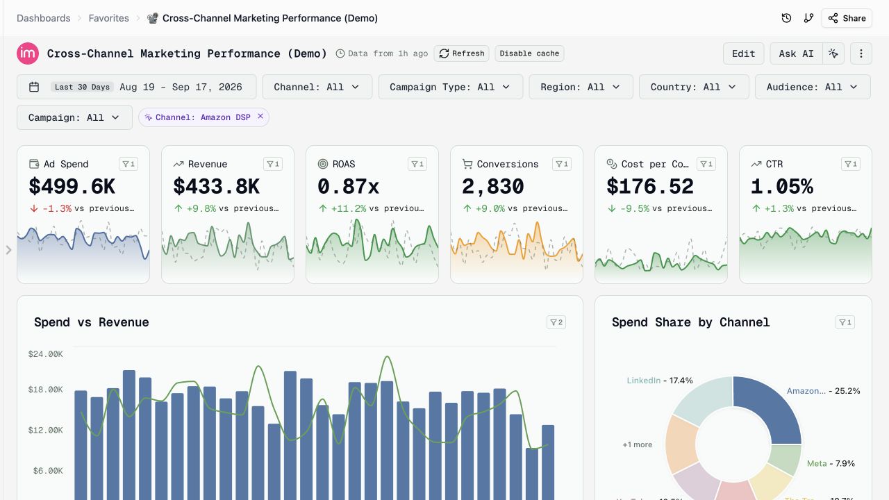
Compatible widgets and fields
Widgets respond when their source supports the selected field and they accept cross-filters. The source widget retains its context and highlights the selected marks. Date-only chart axes, the pie’s Others slice, and funnel stages do not emit selections. Funnel widgets can still receive filters.
Sharing and persistence
Click selections are temporary: they are not saved with the dashboard, are not included in its URL, and clear when switching pages. Use dashboard filter controls when you want filter values included in a shared link.
Was this article helpful?
Thanks for the feedback!
Questions? The Improvado team is always happy to help. Send us an email, contact your Customer Success Manager, or raise a request in the Improvado Service Desk.