Creative Analytics Intelligence — Dashboard & Stats
Insights — What's Working Right Now
💡 Why use this tab: weekly check-ins, prep for client meetings, or quick answers to "what's working right now?" Designed for a 30-second read — six headline KPIs at the top, a quadrant map of your spend, a heatmap of attribute combinations, and ranked breakdowns under that. Best opened first.
Top KPIs and AI Insight
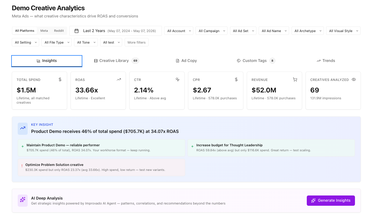
- Six headline KPIs: Total Spend, ROAS, CTR, CPR, Revenue, Creatives Analyzed. Each shows a "Lifetime" benchmark vs your selected date range.
- AI Insight card(below KPIs): an LLM-generated, one-line headline of what's working — paste-ready into a CSM update or QBR.
Creative Strategy Map
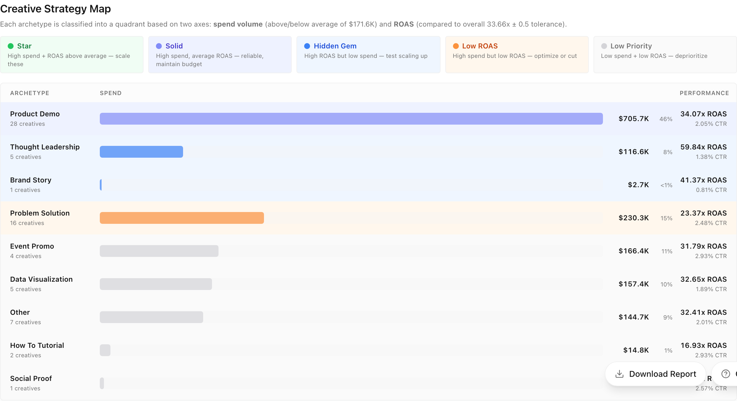
How your spend is distributed across archetypes (Product Demo, Brand Story, Problem-Solution, etc.), with revenue percentage per slice. Each archetype is classified as Star / Solid / Hidden Gem / Low ROAS / Low Priority based on spend × ROAS.
Performance Heatmap
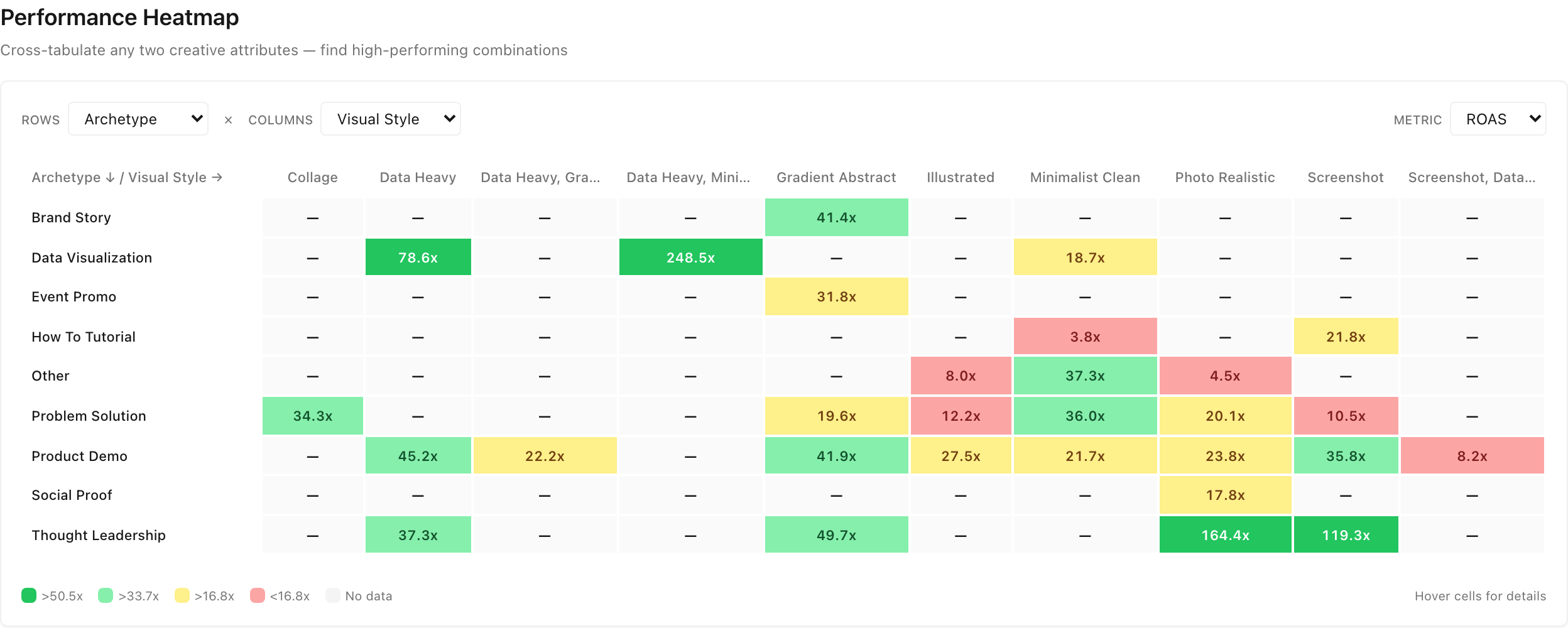
A matrix of any two creative attributes (default: archetype × visual style), color-coded by your chosen metric (ROAS / CTR / Spend). Green cells are winners; red cells are spend you may want to redirect. Use the Rows / Columns dropdowns to cross-tabulate any pair of taxonomy dimensions.
Performance breakdowns
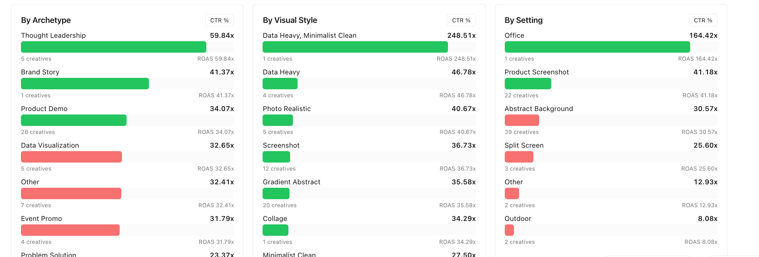
Six side-by-side cards showing ROAS or CTR per attribute value: By Archetype / Visual Style / Setting / Pacing / File Type / Tone. Each card has a metric toggle in the top-right (CTR % / ROAS / Spend / Purchases) — click to re-rank by a different metric. Useful when ROAS hides smaller-budget winners.
💡 Tip: Click the CTR % / ROAS / Spend / Purchases toggle on any breakdown card to re-rank by a different metric. The toggle changes only that one card.
Surprising Creatives
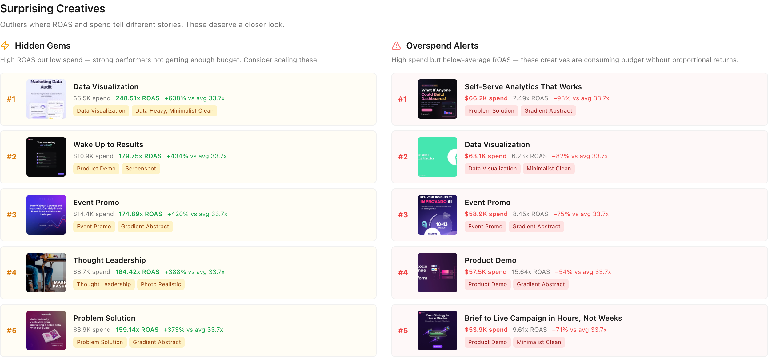
Two ranked lists of creatives where ROAS and spend tell different stories:
- Hidden Gems — high ROAS but low spend; strong performers not getting enough budget. Consider scaling.
- Overspend Alerts — high spend but below-average ROAS; consuming budget without proportional returns.
Creative Library — every ad with full attribution
💡Why use this tab: when you want to find a specific ad, brief a designer with concrete examples, or explore why a particular archetype is winning. The Library is your searchable creative archive — every ad rendered as a card with thumbnail, KPIs, and taxonomy badges.
Filters
| Filter | What it does |
|---|---|
| Date range | Last 7/30/90 days, Last 12/24 months, or custom range |
| Platform | Meta, Reddit, or all |
| Account / Campaign / Ad Set / Ad | Standard hierarchy filters, multi-select |
| Archetype / Visual Style / Hook / Setting / Tone / etc. | Taxonomy filters, also multi-select |
| Custom tags | Any user-defined tag you've created |
Cards
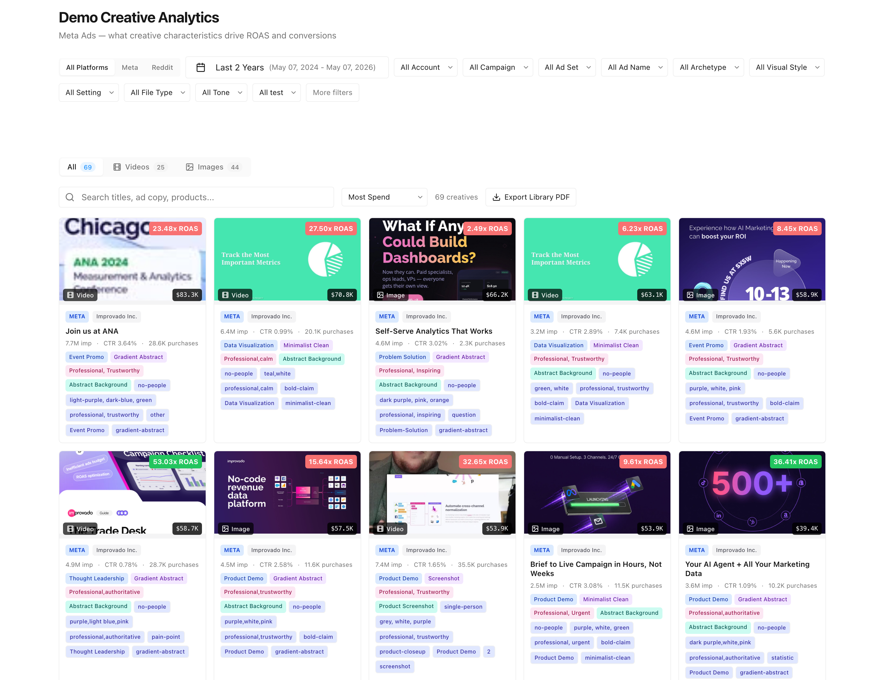
Each card shows:
- Thumbnail (image or video preview)
- ROAS, spend, CTR, purchase count
- Archetype, visual style, hook, tone, characters, setting
- Custom tags (if you've assigned any — see Section 4)
- Account name, ad title, and ad body text on hover
Toggle between All / Videos / Images at the top of the grid. Sort by ROAS, spend, CTR, or recency.
💡 Tip: Combine date range + taxonomy filters to compare versions of the same creative concept across quarters. Example: "Product Demo + Screenshot, Q3 vs Q4."
Ad Copy — what messaging actually works
💡Why use this tab: before writing a new batch of ad copy, when reviewing copy performance with a copywriter or content lead, or when investigating why certain headlines convert. The Ad Copy tab analyzes the text in your headlines and ad bodies — message type, tone, length, and rank by ROAS.
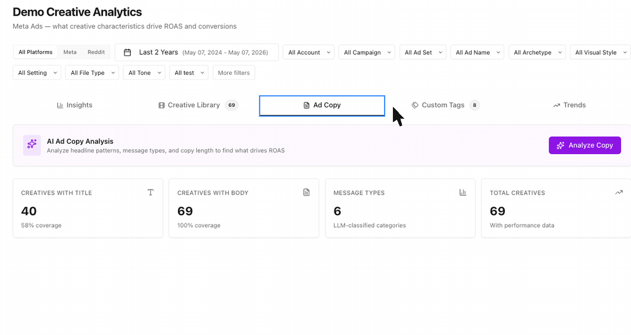
Title classification and length
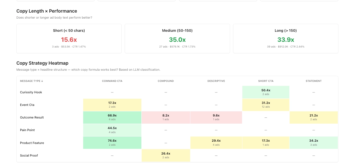
- Coverage cards: how many creatives have a title, body, message-type tag.
- Copy Length × Performance: ROAS for Short (<50 chars), Medium (50–150), Long (>150 chars). Quickly tells you whether your audience prefers terse or detailed copy.
- Every headline is tagged by
message_type(offer, social proof, question, statement, list, urgency),structure,tone, andaction_verb.
Message Type Performance
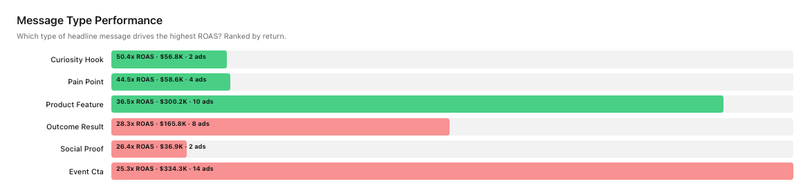
Which message styles drive the highest ROAS / CTR on average. Re-rank by clicking the metric toggle.
Best & Worst Headlines
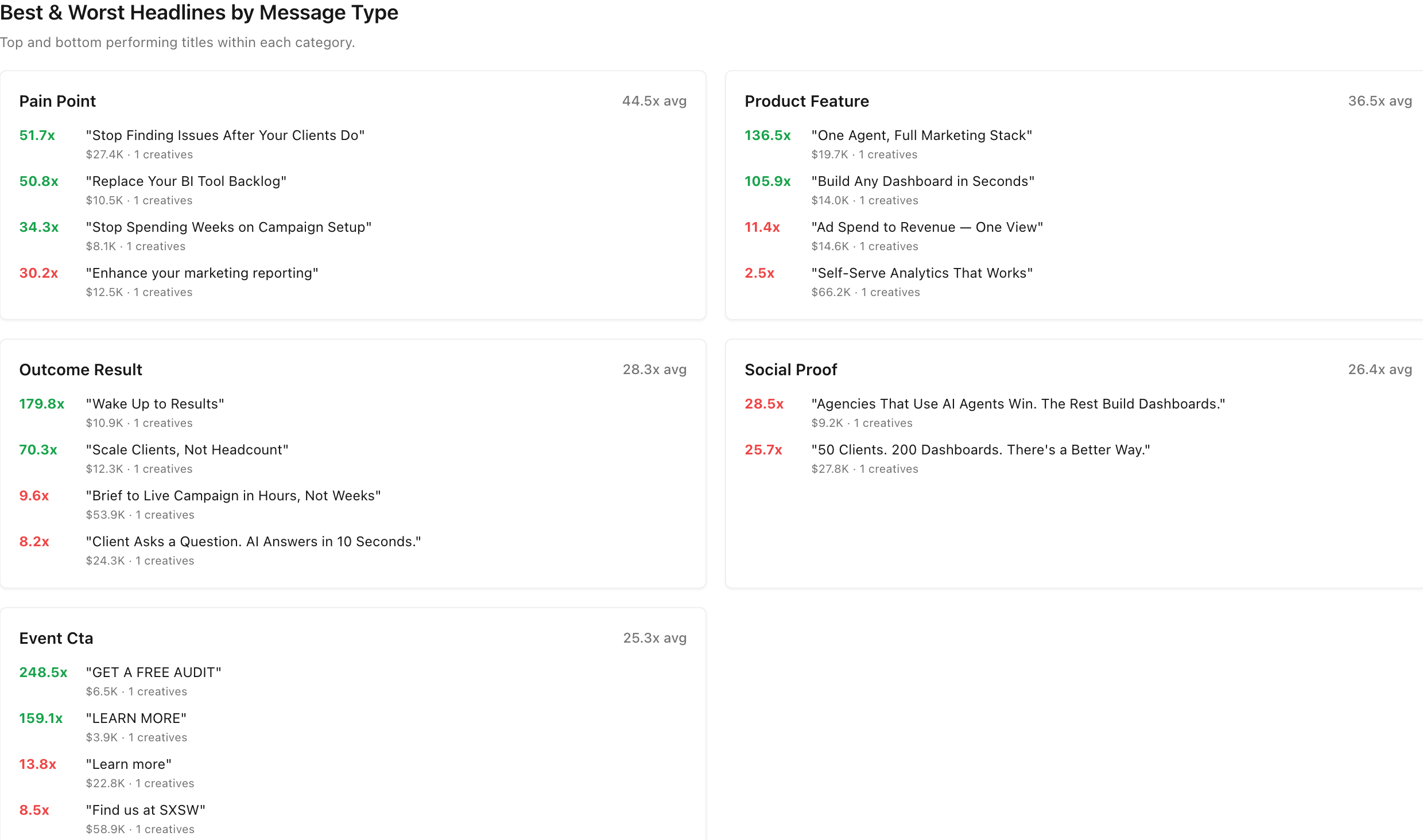
The top and bottom 5 headlines by ROAS, grouped by message type (Pain Point, Product Feature, Outcome Result, Social Proof, Event CTA). Useful for a copywriter brief — show the design lead what's working and what isn't.
Ad Copy Explorer
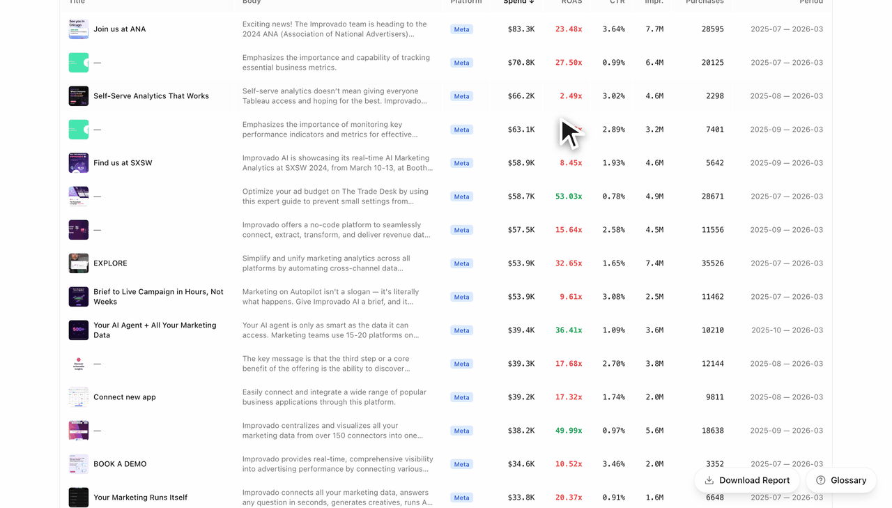
Search and filter every headline + body in your library. Click a row to open the source creative with thumbnail and full performance metrics.
💡When to use this tab: before writing a new batch of ad copy, or when reviewing copy performance with a copywriter or content lead.
Trends — performance over time
💡Why use this tab: when answering "are we trending up or down?", building QBRs, or investigating a sudden spend or ROAS swing. Insights gives you one snapshot. Trends gives you the timeline.
Period-over-period deltas
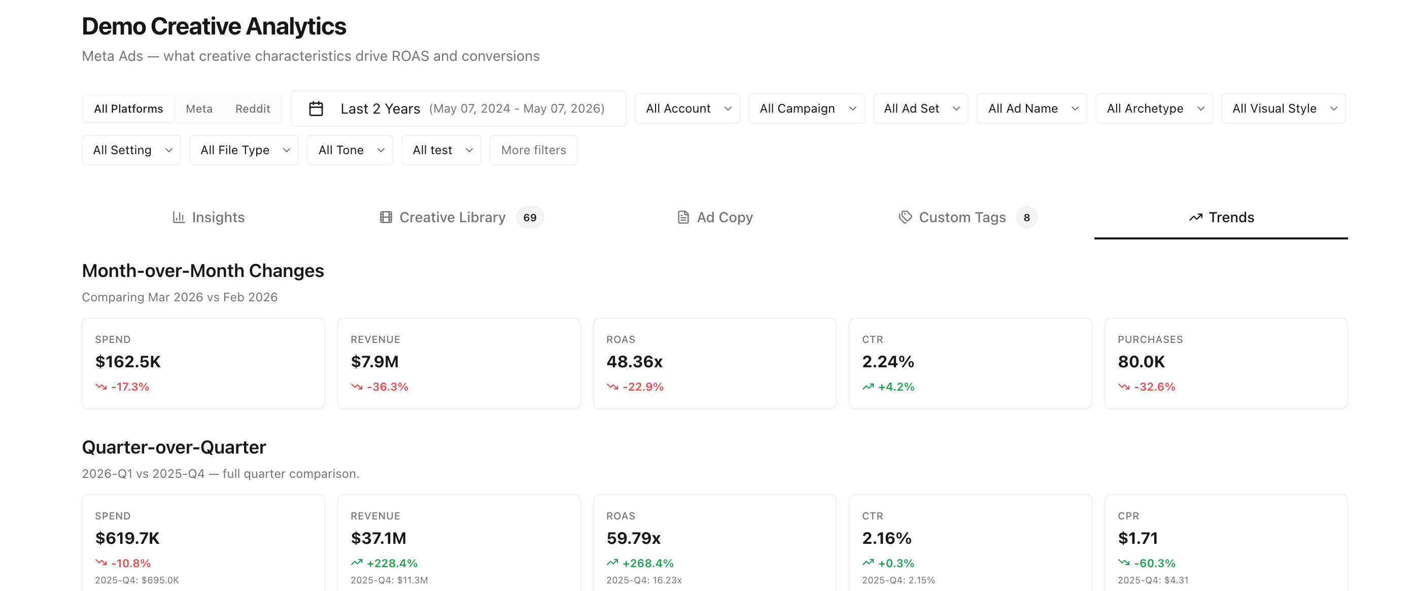
Quarter-over-quarter and month-over-month % changes are shown next to each KPI card. Green = improvement, red = decline. Read these first to know whether the rest of the page is showing a recovery, a plateau, or a slowdown.
Performance over time
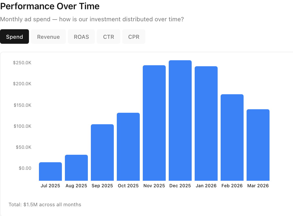
Spend, revenue, ROAS, CTR — toggle between metrics with the selector at the top. Bars are sized to your selected date range; if your data is shorter than 12 months, the bars naturally widen to fill the chart.
Monthly performance summary
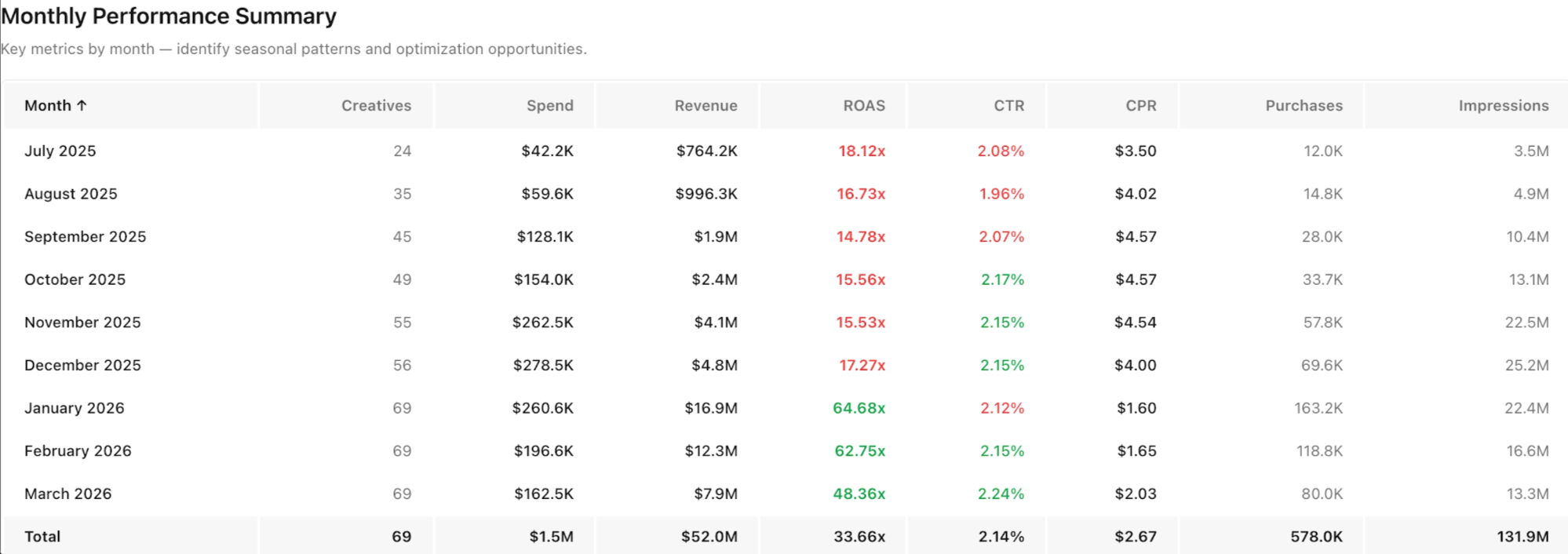
Rows per month, columns for Creatives, Spend, Revenue, ROAS, CTR, CPR, Purchases, Impressions. The bottom Total row matches the Insights KPIs exactly.
💡Tip: The Trends Total row is your sanity check — it should always match Insights. If it doesn't, refresh the page; both tabs read from the same data with the same filters applied.