
Dataflow Dashboard
Overview
The Dataflow Dashboard allows to seamlessly aggregates and showcases log data in both near real-time and historical perspectives, delivering key insights in a visual format across multiple Improvado products.
Let's introduce the following definitions:
- Order is an entity that describes all settings for an extraction, transformation, or load process.
- An extraction order is responsible for retrieving data from various sources such as API providers, flat files, and others. It operates based on specific parameters including report type, account details, and scheduling settings.
- A load order is directly data-driven by its corresponding extraction order. Once data is successfully extracted, the load order is triggered to ingest this extracted data into the designated storage.
- Dataflow is a sequential chain of orders initiated from data extraction. Depending on your requirements, this order sequence may extend through various processes such as ETL (Extract, Transform, Load), ELT (Extract, Load, Transform), EL (Extract, Load).
The primary objective of dataflow is to facilitate seamless data delivery from the starting point (data source) to the ending point, which is tailored to the user’s specific needs. This ending point could either be your connected Destination or the Improvado Storage.
User flow in UI
To start using this feature click the Dataflow Dashboard item in the menu on the left side of the screen.
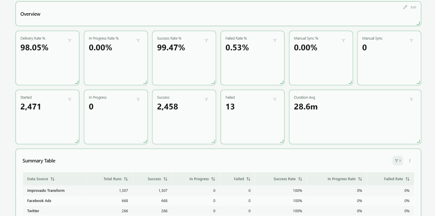
The timezone and delivery ETA displayed in both the Organization Settings page and at the top of the Dataflow Dashboard are estimated references used only for monitoring delays. They do not affect actual data delivery speed or performance. Delivery times may still vary depending on system load and data volume.
You can modify these values from the Organization Settings page.
Upon loading the Dataflow Dashboard page, you'll encounter the main page showcasing two primary sections:
- Charts
- Filters
Let's look at each of them in more detail.
Charts
The time zone and Estimated Time of Arrival (ETA) are established by your Customer Success Manager (CSM). The data displayed in the dashboard is presented in accordance with this designated time zone. The Delivery Rate and Data delivery tracking metrics are calculated based on these specified values.
If you have any concerns or questions regarding this information, please contact your dedicated CSM for further assistance.
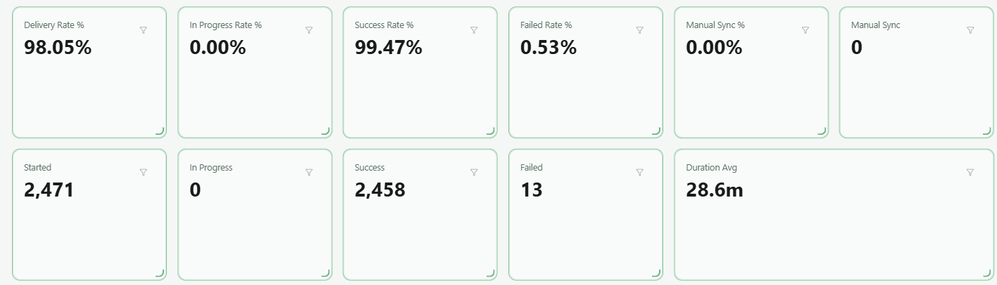
Scorecards:
- Delivery rate %: Shows the percentage of orders that have been delivered to customers in time out of all successful dataflow runs. (Dataflow)
- In progress rate %: Shows the percentage of orders actively being processed out of the total initiated. (Dataflow)
- Success rate %: Shows the percentage of completed orders out of the total initiated. (Dataflow)
- Failed rate %: Shows the percentage of orders that have encountered failure out of the total initiated. (Dataflow)
- Manual sync %: Reveals the percentage of orders manually synchronized by customers out of the total initiated. (Orders)
- Started: Shows the total number of orders that have been initiated or started. (Dataflow)
- In progress: Reflects the total number of orders that are actively being processed. (Dataflow)
- Success: Indicates the exact number of orders that are completed. (Dataflow)
- Failed: Specifies the exact count of orders that have encountered failure. (Dataflow)
- Manual sync: Shows the total number of orders synced manually by the customer. (Orders)
- Duration avg: Represents the average duration of order fulfilment. (Dataflow)
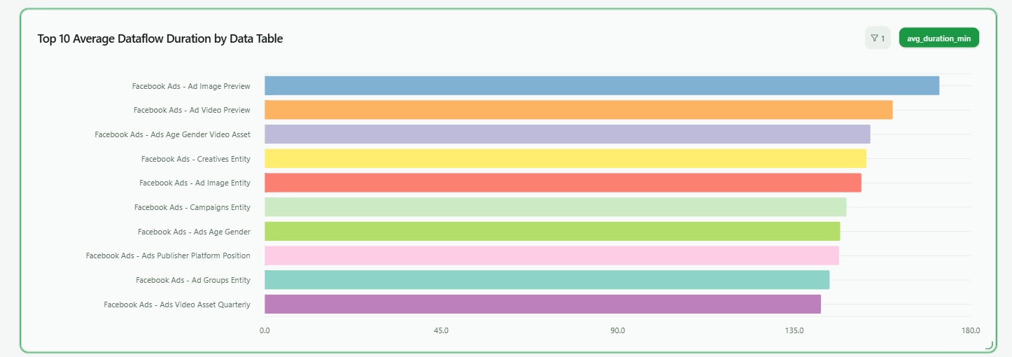
Dataflow charts:
- Top 10 average dataflow duration by data table: Demonstrates 10 dataflows with the highest average duration across various data tables.
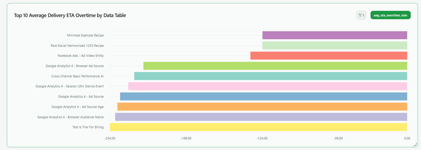
- Top 10 average delivery ETA overtime by data table: Shows the top 10 tables with the highest average of overdue deliveries with estimated arrival times.
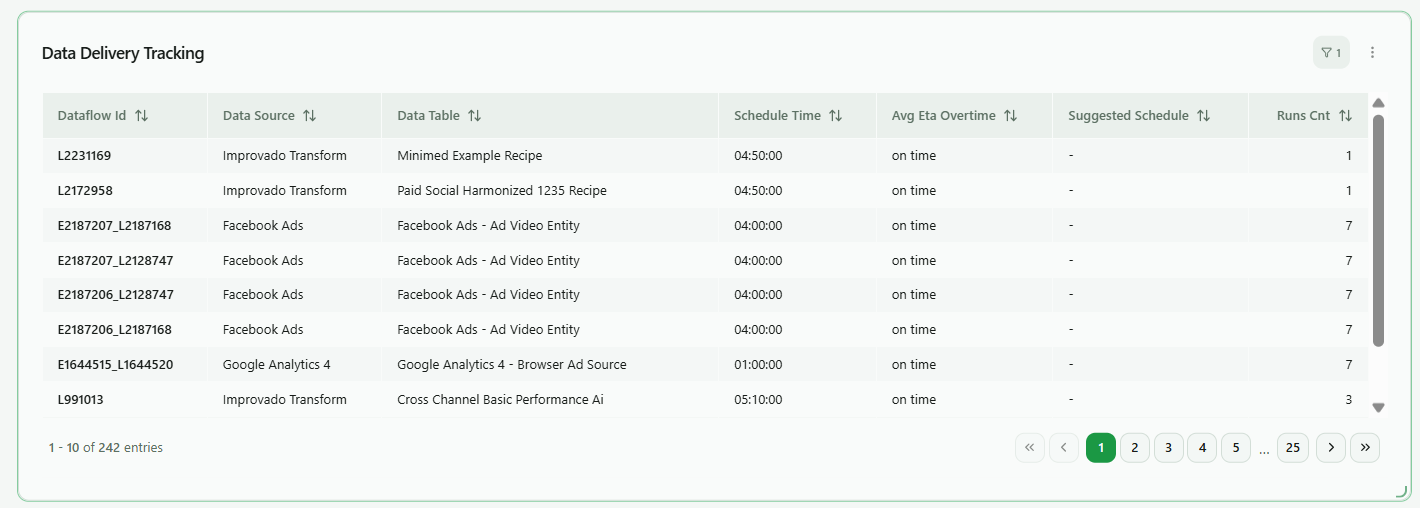
- Data delivery tracking: This table summarises the key data delivery metrics. It enables you to identify the most problematic dataflows and consider the recommended scheduling options.
Orders charts:
- Summary table: This table represents key metrics for order performance across various data sources for the specified period.
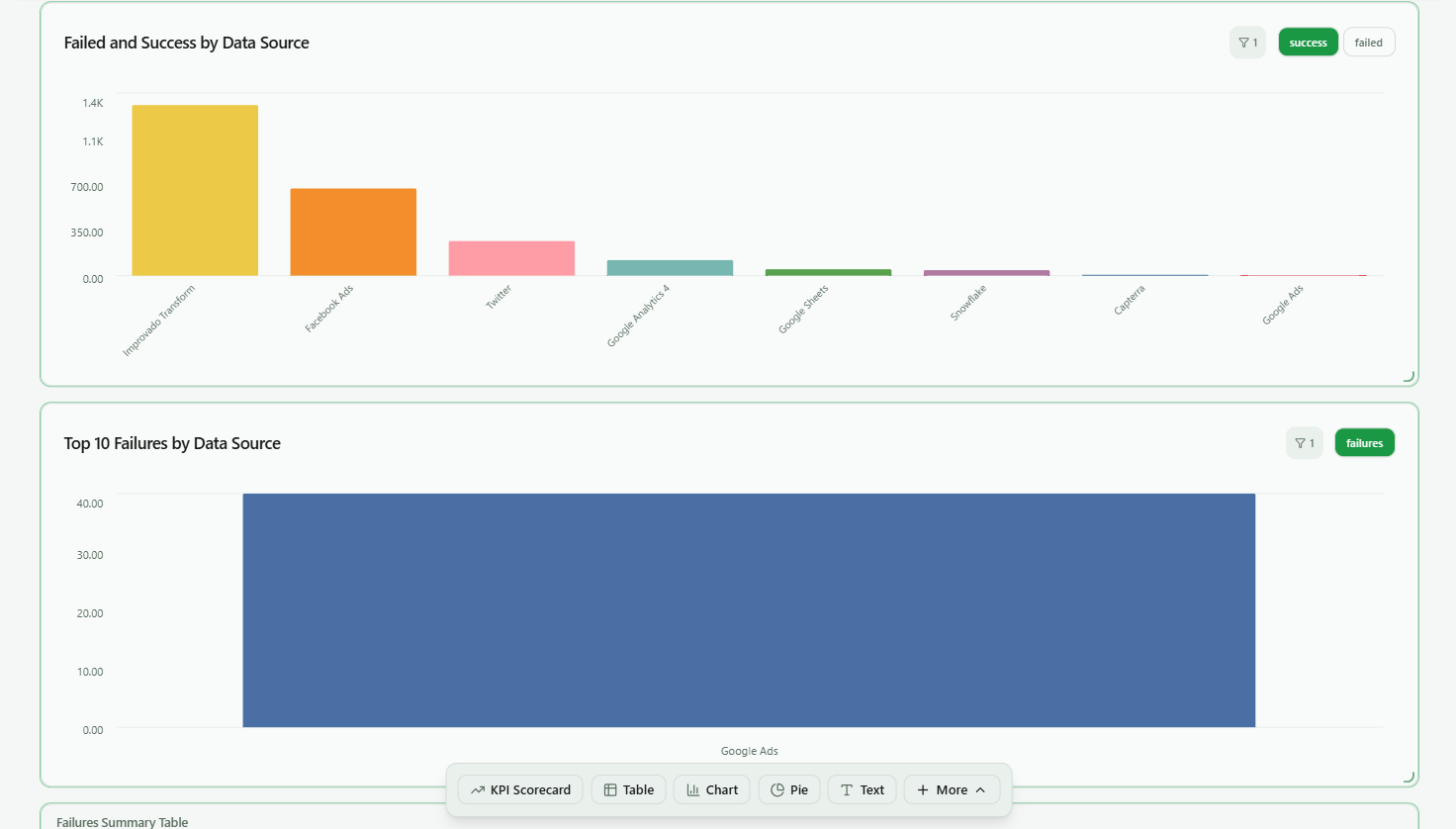
- Failed and success by data source: This bar chart compares the number of successes and failures across data sources.
- Top 5 failures by data source / day: Shows the 5 data sources with the most failures for every day of the specified period.
- Top 10 failures by data source / time range: Illustrates the top 10 data sources with the most failures for the specified period.
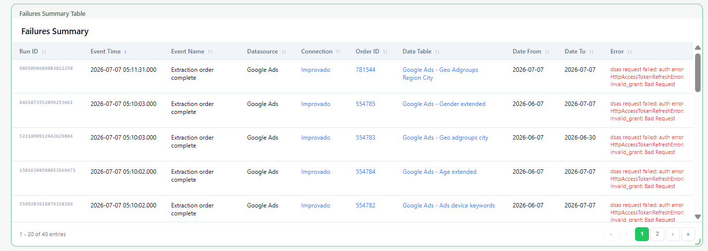
- Failures summary table: Represents key metrics about each data delivery failure, helping identify, analyze, and troubleshoot issues in your data pipelines more effectively.
How to export and share the dashboard
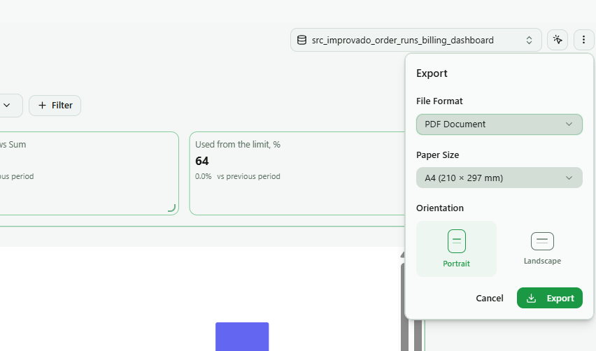
You can export the entire Dataflow Dashboard as a file to share it. Open Export, choose the File Format (for example, PDF), Paper Size, and Orientation, then click Export.
Filters
To refine the data presented in the Dataflow Dashboard, the platform offers a variety of filters that allow you to tailor the information to your specific needs.You can filter your data by:
- Workspace (Select a specific workspace to view its log data.)
- Time range (Choose a pre-set date range to focus your log data analysis, note that the smallest intervals, like a minute to an hour, are not supported.)
- Product (Filter the orders by dataflow process product.)
- Data source (Filter the orders by specific data sources to see usage from particular platforms.)
- Data table (Narrow down the view to specific data tables for targeted analysis.)
- Account name (Focus on orders related to a particular account within your workspace.)
After choosing the necessary parameters in the Filters panel, enable the Instant filtering toggle to apply them automatically and refresh your overview. If you want to undo all the applied filters, click on the Clear all button.
Was this page helpful?
Thanks for the feedback!
Questions? The Improvado team is always happy to help. Send us an email, contact your Customer Success Manager, or raise a request in the Improvado Service Desk.