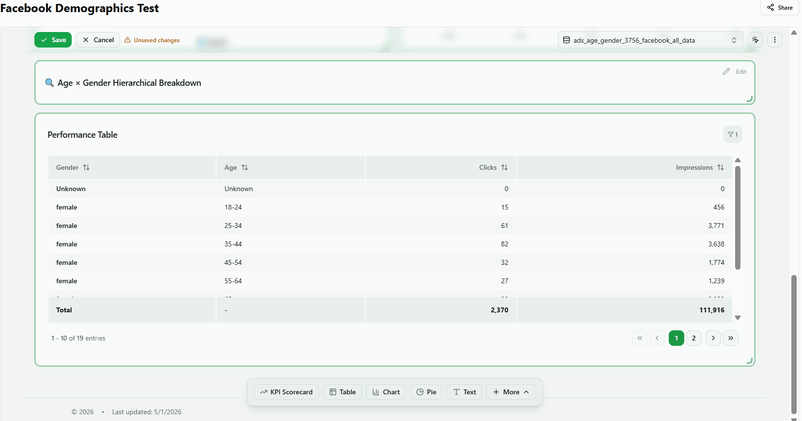
Pie Chart, Funnel, Text Box, and Heatmap Widgets
Pie Chart
Proportional breakdown visualization. Supports multiple metric columns, color customization, labels, legend, and series limit with "Others" aggregation.

1. Add a pie chart widget
- In Edit Mode, click the + Pie button in the widget toolbar.
- Click Select a default data table and choose your data table.
- In the Properties Panel, select a metric (e.g., Spend) and a dimension (e.g., Channel).
- Close the Properties Panel. The pie chart renders with your selected data.
Result: The widget appears with the title "Distribution Chart" and shows data broken down by the selected dimension.
2. Select a dimension for slices
- Open the Data section in the Properties Panel.
- Find the Dimension picker and select a categorical field (e.g., data_source_type or campaign_name).
- Select a metric to define the slice size (e.g., spend).
Result: The pie chart displays colored slices, each representing a unique dimension value. Labels or a legend identify each slice.
3. Switch between pie and donut styles
- With data configured, find the Inner Radius slider in the Layout section of the Properties Panel.
- Set the inner radius to 0 to display a full pie chart.
- Drag the slider to 40 or higher to create a donut shape with a visible center hole.
- Increase further (e.g., 60–70) to make the ring thinner.
Note: The inner radius control may be labeled "Donut Hole" or appear as a preset toggle (Pie / Donut) depending on the version.
4. Configure labels, percentages, and values
- Open the Layout section in the Properties Panel.
- Toggle Show Labels on to display labels on or near each slice; toggle off to hide them.
- Enable Show Percentages to add a percentage to each label (e.g., "45%").
- Enable Show Values to include the raw metric value alongside the label.
- Use the Label Position selector to place labels Inside the slices or Outside with connector lines.
Funnel
Stage-based visualization. Each numeric column represents a funnel stage. Optional dimension breakdown with required 'Total' row via UNION ALL.
1. Add a funnel widget
- In Edit Mode, click the + Funnel button in the widget toolbar.
- Click Select a default data table and choose your data table.
- In the Properties Panel, select the metrics that form your funnel stages (e.g., Spend, Clicks, Impressions).
- Close the Properties Panel.
Result: The widget appears with the title "Conversion Funnel" and displays the selected metrics as funnel stages.
2. Select metrics for funnel stages
- Open the Data section in the Properties Panel.
- Select multiple metrics in order from top-of-funnel to bottom (e.g., impressions → clicks → conversions).
Result: The funnel displays stages in descending order with conversion rates between each stage. The order of selected metrics determines the funnel direction.
3. Configure funnel orientation, style, and size
- With metrics selected, open the Basics section in the Properties Panel.
- Change Orientation: select Vertical to stack stages top-to-bottom, or Horizontal to arrange them left-to-right.
- Change Style: select Compact for a condensed layout, or Detailed to show conversion rates and labels alongside each stage.
- Change Size: select Large for more prominent stage blocks, or Small for a compact view.
Text Box
Static text box for labels, notes, annotations, and dashboard instructions.
1. Add a text box widget
- In Edit Mode, click the Text button in the widget toolbar.
- In the Properties Panel, open the Basics section and set the Widget Title (e.g., "My Notes").
- Close the Properties Panel. The widget heading updates to your title.
- Click the Edit button on the widget to enter edit mode.
- Type your content in the text area and click Save.
Result: The text box displays your content. Re-opening edit mode shows the saved text, confirming it persists.
2. Edit text box content and formatting
- With the widget selected, open the Basics section in the Properties Panel and type your annotation text in the content input.
- Find the background color selector and choose a color (e.g., dark or blue).
- Find the text color selector and choose a contrasting color (e.g., white).
- Find the text alignment control and set it to Center.
Result: The text box reflects the updated background color, text color, and center alignment.
Heatmap
Matrix visualization showing metric intensity across two dimensions with color-coded cells.
1. Add a heatmap widget
- In Edit Mode, click the More button (⋯) in the widget toolbar and select Heatmap.
- Click Select a default data table and choose your data table. Select a data table with at least 2 dimensions and 1 metric
- Select which metric determines cell color intensity. Select a dimension for the rows (e.g., campaign_name) and a metric for the values (e.g., spend).
- Close the Properties Panel.
Result: The heatmap displays a grid of colored cells where intensity represents metric magnitude — higher values appear greener, lower values appear redder, and zero-value cells appear grey.
2. Explore heatmap colors and cell interactions
- With the heatmap rendered, verify the color gradient: high metric values show in the high-end color (green), low values in the low-end color (red).
- Exit Edit Mode by clicking Done.
- Click any colored cell in the heatmap.
Result: An interaction bar appears at the top of the dashboard showing the selected dimension value (e.g., campaign name). Other widgets on the page filter to that selection. Click X on the interaction bar to clear the filter and restore all widgets to their unfiltered state.
Configuration:
- Color Schemes — Red→Green, Blue, Purple, Orange, Pink, Viridis, Plasma, Inferno, Magma
- Marginal Totals — Row and column sums on edges
- Value Limits — Top N for X/Y axis values
- Efficiency Delta — Compare % of spend vs % of another metric
Was this article helpful?
Thanks for the feedback!