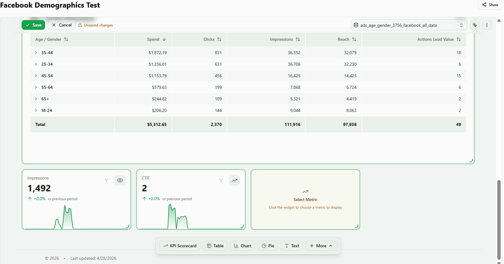
KPI Scorecard
The KPI Scorecard displays a single metric value at a glance — formatted as a number, currency, or percentage — alongside a period-over-period comparison and trend indicator. The use cases below show common ways to configure it.
1. Add a KPI Scorecard to your dashboard
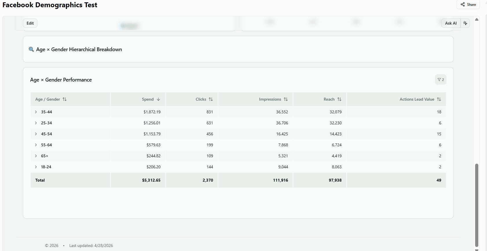
Display a headline metric from any connected data table in a single formatted number.
- Open your dashboard in edit mode.
- Click Select a default data table in the header and choose your data source (e.g. cross_channel_automated_recipe).
- Click + KPI Scorecard in the bottom toolbar. The widget appears on the canvas and the Properties Panel opens on the right.
- Optionally enter a title in the Basics section.
- Open the Data section and click a metric (e.g. Spend). The KPI renders immediately.
- Close the Properties Panel to see the finished widget.
Result: The widget shows a formatted value (e.g. $29,442.62) with a period-over-period percentage change below it.
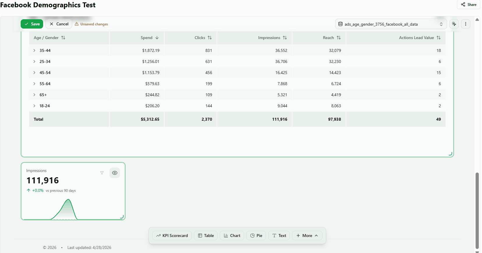
2. Show average daily spend instead of the total
Switch from Sum to Average to see what each day in the selected range is worth on average, rather than the cumulative total.
- Add a KPI widget and select the Spend metric.
- Click the expand arrow next to the Spend row in the Data section to reveal additional options.
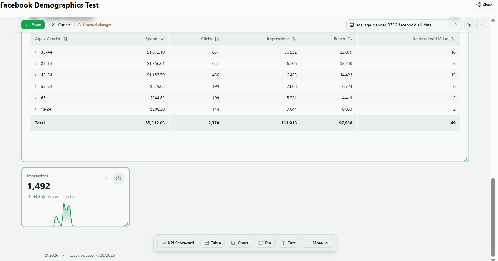
- Open the Total dropdown (showing Sum by default) and select Average.
- The value updates — for a 30-day range, the average daily spend replaces the monthly total.
Aggregation Methods:
- Sum (default) — Adds all values in the selected period
- Average — Calculates the mean value
- Min / Max — Shows the minimum or maximum value
- Count — Counts the number of rows
Note: Average computes the total divided by the number of days in the selected date range, not a row-level average.
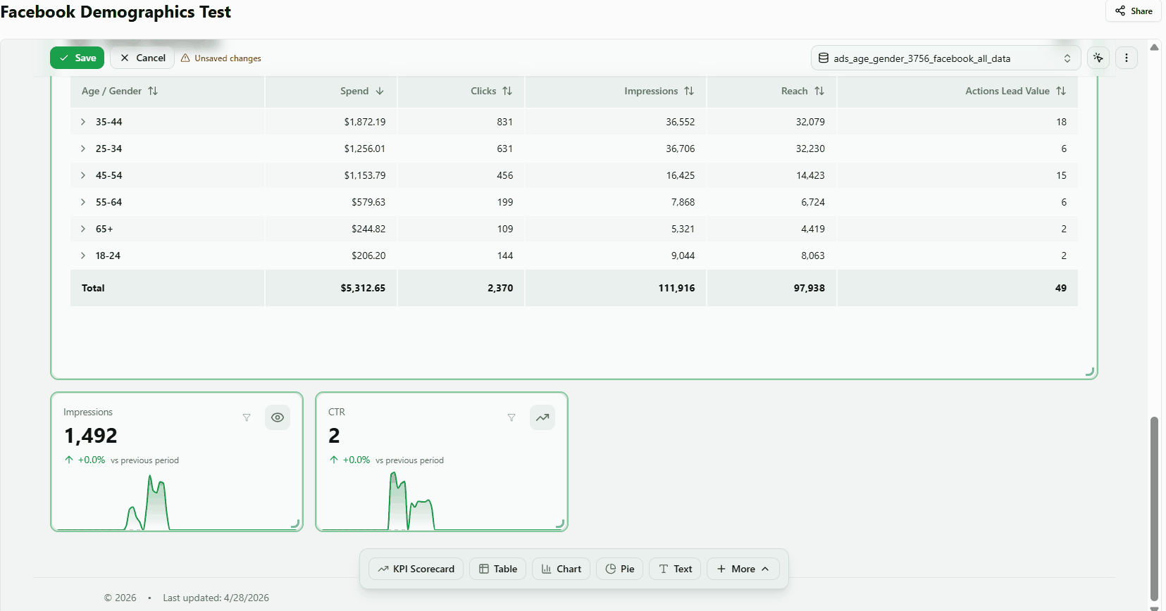
3. Display a calculated metric like ROAS or CTR
Pick a ratio-based metric — such as Return on Ad Spend or Click-through Rate — to show a derived performance indicator rather than a raw total.
- Add a KPI widget and open the Data section.
- Scroll through the metric list to find calculated metrics (e.g. ROAS, CTR, CPC, CPM, CPA, Conversion Rate).
- Click the metric to select it. The value is automatically formatted based on its type (ratio, percentage, or currency).
Result: ROAS typically shows in the 2–5× range; CTR shows as a percentage (e.g. 1–5%).
4. Compare performance vs. the previous period
Understand whether your current results are improving or declining compared to the equivalent previous period — automatically, without any extra configuration.
- After selecting a metric, a comparison appears below the main value (e.g. +57.5% vs previous 30 days).
- A green upward arrow indicates improvement; a red downward arrow indicates a decline.
- Changing the date range (e.g. to Last 7 Days) automatically updates the label to vs previous 7 days.
Switch the comparison range. Need a different baseline? Open the + Filter menu and find the Comparison range card to change what "previous" means for every KPI on the dashboard:
- Previous period (default) — same length, immediately before the selected range.
- Previous year — same calendar dates a year earlier (e.g. April 2026 vs. April 2025). Useful for seasonal businesses where a year-over-year view is more meaningful than the trailing window.
- Custom range — pick any two dates to compare against. Useful for one-off comparisons (e.g. campaign launch month vs. a chosen baseline month).
The label under each KPI updates automatically — vs previous year, vs Apr 1, 2025 – Apr 30, 2025, etc.
Note: Comparison is not available when the date range is set to All Time, as there is no equivalent previous period to compare against. Pick Custom range if you still want to define a baseline manually.
5. Choose a display style
Pick the KPI layout that best fits the space and context in your dashboard. Find the type selector in the Basics section of the Properties Panel.
- Sparkline — metric value with a mini trend chart alongside it
- Simple — metric value only, no chart
- Compact — denser layout that takes less vertical space on the canvas
Sparkilne shows a mini time-series chart below the KPI value. Supports custom sparkline aggregation independent from the main value. Color can be fixed or vary by metric.
Note: Select a metric before switching types to see the full effect of each layout.
6. Build a custom metric with your own formula
For ratio metrics like ROAS, CTR, or CPC, use Formula aggregation mode. Instead of summing individual row-level ratios (which produces incorrect results), Formula mode evaluates the expression from its component parts. Example: ROAS configured as revenue / spend calculates SUM(revenue) / SUM(spend) = correct ROAS.
- Add a KPI widget and open the Data section.
- Scroll to Custom Metrics and click the + button. The Add Custom Metric dialog opens.
- For a formula-based metric, click the Custom SQL tab and enter your expression (e.g. revenue / NULLIF(spend, 0)). For a standard aggregation, stay on the Simple tab and choose a field and aggregation method.
- Enter a name (e.g. ROAS) and click Add. The metric is automatically selected and the KPI shows the result immediately.
- Click Save in the dashboard toolbar. Custom metrics persist after the page is reloaded.
Result: The KPI displays the calculated value (ROAS typically falls in the 0.5–3.0 range).
7. Reuse a custom metric across multiple widgets
Apply the same calculated metric to different widgets — KPIs, charts, tables — without re-creating it each time.
- Create a custom metric in any widget (see Build a custom metric above).
- Add a second widget (e.g. another KPI Scorecard or a Chart).
- Open its Data section, scroll to Custom Metrics, and click Use Existing. The button shows a count of available shared metrics (e.g. Use Existing (1)).
- The popover lists all shared metrics — click your metric (e.g. ROAS) to apply it.
- Close the Properties Panel to see the result.
Result: Both widgets display the same calculated value. Any update to the metric definition applies across all widgets using it.
Was this article helpful?
Thanks for the feedback!