Most marketing dashboards fail within 90 days—not because of bad data, but because stakeholders never open them. A 2026 analysis of 148,000+ user complaints across G2, Capterra, Reddit, and Upwork found manual reporting and analytics is the single biggest business pain point, with a 33.3% validation rate. Teams build dashboards expecting automation and insight, but end up with static views that answer yesterday's questions while today's decisions wait in a backlog.
This guide shows 12 marketing dashboard examples that actually get used, plus 5 that died and why. You'll see annotated screenshots, KPI formulas, failure cases, and a filterable template library organized by role, complexity, and tool. If you've ever built a dashboard only to watch it gather dust, or inherited one that nobody trusts, start here.
What Is a Marketing Dashboard?
A marketing dashboard is a centralized, interactive interface that visualizes key performance indicators from multiple data sources—Google Ads, Meta, LinkedIn, Salesforce, HubSpot, GA4—in a single view. It answers "What's happening now?" rather than "What happened last month?" and allows teams to filter, drill down, and act on real-time data without logging into a dozen platforms.
The core difference between a dashboard and a report: a dashboard is live, interactive, and designed for monitoring; a report is static, comprehensive, and designed for analysis. A dashboard gives you the pulse; a report gives you the diagnosis. Most teams need both, with the dashboard feeding the report.
Dashboard Graveyard: 5 Examples That Failed and Why
Before showing what works, here's what kills dashboards—anonymized examples from real implementations, with the 1-2 changes that would have saved them.
Failure #1: Metric Overload Dashboard
What it showed: 47 KPIs across 6 channels, every number the team could track rather than should track. Impressions, clicks, CTR, CPC, conversions, conversion rate, cost per conversion, ROAS, bounce rate, time on site, pages per session, new vs. returning, device breakdown, geography—all on one screen.
Why it died: Stakeholders couldn't find the decision-critical number within 10 seconds. The VP of Marketing wanted to know "Are we on track to hit Q1 pipeline targets?" but had to mentally calculate it from 8 scattered fields. After two weeks, she stopped opening it and asked for a weekly email instead.
The fix: Cut to 8 core KPIs tied to quarterly goals (MQLs, pipeline created, cost per MQL, pipeline velocity, win rate by source, CAC, payback period, forecast vs. actual). Move channel-level detail to a linked drill-down dashboard. Add a single "health score" aggregate that turns red/yellow/green based on goal progress.
Failure #2: Vanity Metrics Dashboard
What it showed: Social media impressions, follower growth, email open rates, website sessions, blog post views—all trending up and to the right, making the marketing team look busy.
Why it died: Leadership asked "How much revenue did this generate?" and the dashboard had no answer. When budget cuts came, the CMO couldn't defend the team's impact because the dashboard tracked activity, not outcomes. It was replaced by a pipeline dashboard built by RevOps.
The fix: Swap vanity metrics for business metrics: replace "impressions" with "cost per qualified lead," replace "sessions" with "demo requests," replace "email opens" with "email-sourced pipeline." Tie every number to a funnel stage or revenue outcome. If a metric can go up while the business fails, delete it.
Failure #3: No Segmentation Dashboard
What it showed: Aggregate performance across all campaigns, all channels, all geographies. Clean, simple, executive-friendly—and useless for optimization.
Why it died: The paid media manager asked "Which campaign is bleeding budget?" and the dashboard couldn't answer without exporting to Excel. Performance looked fine in aggregate, but three underperforming campaigns were masked by two strong ones. By the time the team noticed, $40K had been wasted.
The fix: Add filters for campaign, channel, geography, audience segment, and product line. Include a "performance outliers" table showing the top 5 and bottom 5 campaigns by efficiency. Make it scannable: green for above-goal, red for below-goal, with drill-down links to granular views.
Failure #4: Stale Data Dashboard
What it showed: Beautiful visualizations, perfect layout, comprehensive KPIs—refreshed manually every Monday morning via CSV exports from 6 platforms, pasted into Google Sheets, then imported to Looker Studio.
Why it died: A campaign overspent by $12K over a weekend because the dashboard showed Thursday's data on Monday. When the team asked for daily updates, the analyst said it would take 2 hours per day. Leadership decided the dashboard wasn't worth the maintenance cost and went back to weekly emails.
The fix: Automate data extraction and loading. Use an ETL tool (Fivetran, Stitch, Supermetrics) for simple workflows, or a marketing-specific data pipeline (Improvado, Funnel) for complex attribution and cross-channel normalization. Set refresh to hourly for ad spend and daily for everything else. Add a "last updated" timestamp so stakeholders know data freshness.
Failure #5: Wrong Audience Dashboard
What it showed: Campaign-level detail with UTM breakdowns, ad group performance, keyword bids, A/B test results, and technical SEO metrics—built by a performance marketer for performance marketers.
Why it died: The CFO and CEO were the intended audience, but they didn't understand half the terms and didn't have time to learn. They wanted 5 numbers: total marketing spend, leads generated, cost per lead, pipeline created, and ROI. After three months of "Can you just send me the summary?" emails, the dashboard was abandoned.
The fix: Build role-specific dashboards. Executives get a 6-metric summary with trends and goal progress. Channel managers get granular views with optimization levers. Analysts get raw data access for ad-hoc exploration. Link them hierarchically: summary → channel detail → campaign detail, so stakeholders can drill down only when needed.
The Anatomy of an Effective Marketing Dashboard
A dashboard that gets used daily has five non-negotiable components. Strip any one out and trust collapses within two weeks.
Data Sources and Integration
To streamline data integration, organizations rely on platforms like Improvado to centralize and standardize all marketing and customer data before it reaches the dashboard. Improvado consolidates data from 1,000+ sources, aligns metrics and taxonomies, and delivers clean, analysis-ready datasets, removing the need for manual aggregation, connector maintenance, or custom data preparation. This ensures dashboards are built on reliable, consistent, and always up-to-date information.
"Improvado allows us to have all information in one place for quick action. We can see at a glance if we're on target with spending or if changes are needed—without having to dig into each platform individually.
On the reporting side, we saw a significant amount of time saved! Some of our data sources required lots of manipulation, and now it's automated and done very quickly. Now we save about 80% of time for the team."

Key Performance Indicators (KPIs)
KPIs define how performance is measured and must directly reflect the strategic purpose of the dashboard. An executive dashboard prioritizes revenue efficiency and high-level trends; a performance dashboard focuses on channel effectiveness and optimization levers; a campaign dashboard emphasizes granular, in-flight metrics.
Effective dashboards highlight actionable KPIs such as Cost Per Acquisition, Revenue per Marketing Dollar, Conversion Rate, or Pipeline Contribution, while deprioritizing vanity indicators like impressions or follower counts. KPIs must be selected with the audience, decision-making workflow, and intended outcomes in mind to ensure the dashboard drives insight rather than noise.
See the complete KPI formula library with calculation specs for every metric mentioned in the examples below.
Visualizations
Data visualizations (charts, graphs, maps) turn raw numbers into understandable insights. The key is to choose the right visualization for the data: use a line chart for trends over time, a bar chart for comparisons, and a pie chart for composition. Each of the 12 examples below includes annotated screenshots showing which visualization type was chosen for each metric and why.
Look for the 🔴 red annotations on each dashboard highlighting key design decisions. For more on handling complex, multi-dimensional datasets with greater precision and clarity, read our guide to data visualization techniques.
Filters and Segmentation
A great dashboard is interactive. Users should be able to filter and segment data to dig deeper. Common filters include date range, marketing channel, campaign, or geographic region. This allows users to answer their own questions without needing a data analyst.
Automation and Alerts
The entire process, from data extraction to visualization, should be automated. Data should refresh on a regular schedule (daily or even hourly) without any manual intervention. This ensures the information is always timely and reliable, making it a cornerstone of any reliable cross-channel reporting strategy.
Beyond scheduled refreshes, effective dashboards include threshold-based alerts and anomaly detection. Set alerts for critical thresholds (e.g., daily ad spend exceeds budget by 20%, conversion rate drops below 2%, cost per lead spikes above $150) and anomaly detection for unusual patterns (traffic drops 40% week-over-week, zero conversions from a normally strong channel). Alerts should route to Slack, email, or SMS with recommended actions, not just notifications.
The trade-off: real-time dashboards require streaming data pipelines and increase infrastructure cost; batch processing (nightly or hourly) is cheaper and sufficient for most use cases. Reserve real-time for high-velocity channels (paid search, programmatic) and use batch for slower-moving metrics (SEO, email, pipeline).
12 Best Marketing Dashboard Examples for 2026
Each example below includes a screenshot, core KPIs, recommended visualizations, target audience, and implementation notes. Examples are organized from executive-level to granular channel dashboards.
1. CMO / Marketing Executive Dashboard
Purpose: High-level view of marketing performance for leadership. Answers "Are we on track?" and "Where should we double down or cut?"
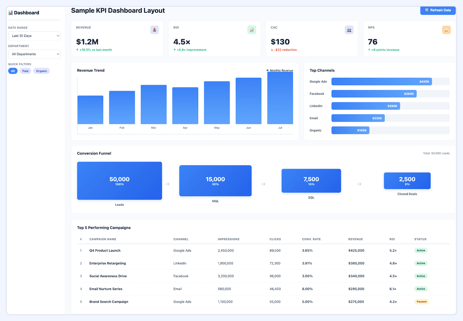
Core KPIs (6–8 metrics):
• Total Marketing Spend (actual vs. budget)
• Marketing Qualified Leads (MQLs) generated
• Cost per MQL
• Pipeline created ($ value)
• Marketing-sourced revenue
• Customer Acquisition Cost (CAC)
• Return on Marketing Investment (ROMI)
• Goal progress indicator (% to quarterly target)
Recommended visualizations: Scorecard tiles for each KPI with month-over-month trend arrows, line chart showing budget burn rate vs. pacing, funnel chart from MQLs → SQLs → Opportunities → Closed-Won, and a stacked bar chart breaking down spend and pipeline by channel.
Target audience: CMO, VP Marketing, CEO, CFO—anyone who approves budgets and doesn't have time to interpret 40 metrics.
Filters: Date range (MTD, QTD, YTD), channel (paid, organic, email, events), geography (if multi-region).
Refresh cadence: Daily for spend and leads, weekly for pipeline and revenue (due to CRM lag).
Implementation notes: Requires integration between ad platforms (Google Ads, Meta, LinkedIn), marketing automation (HubSpot, Marketo), and CRM (Salesforce). Use a marketing data pipeline like Improvado to automate the stitching of ad spend → leads → opportunities → revenue. Without automation, this dashboard requires 5–10 hours/week of manual work.
2. Marketing Performance Dashboard (Channel Rollup)
Purpose: Compare performance across all marketing channels to identify winners and losers. Used for budget reallocation and quarterly planning.
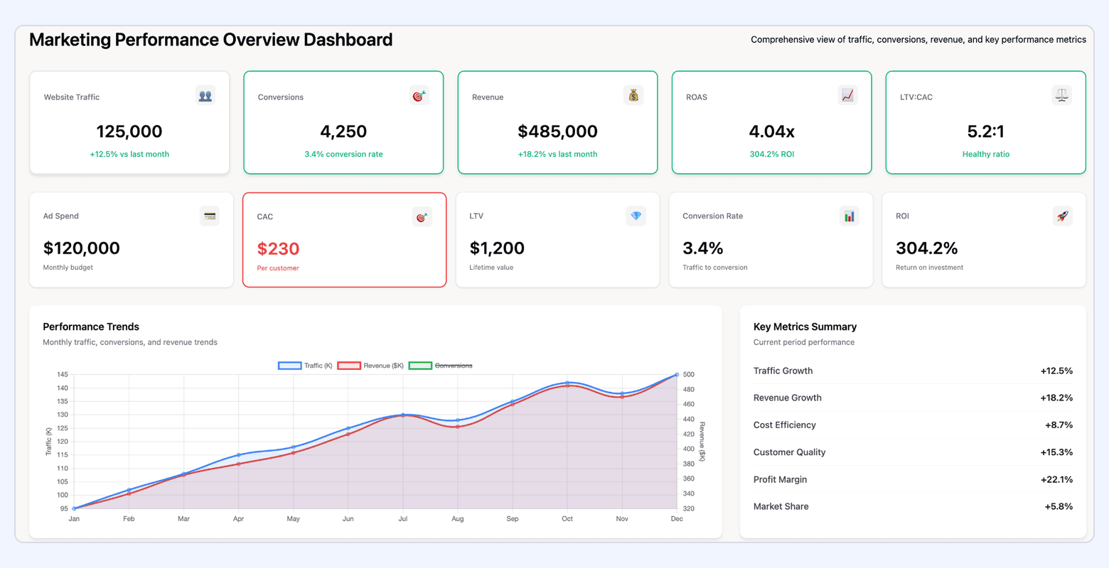
Core KPIs by channel:
• Spend
• Impressions
• Clicks
• Click-through rate (CTR)
• Conversions (leads or purchases)
• Conversion rate
• Cost per conversion
• Return on ad spend (ROAS) or ROMI
Recommended visualizations: Table view with sparklines for each metric, heatmap showing performance by channel × week, and a scatter plot with cost per conversion on X-axis and conversion volume on Y-axis (identifies high-efficiency, high-volume channels).
Target audience: Marketing Director, Growth Manager, Paid Media Manager—anyone responsible for cross-channel optimization.
Filters: Date range, channel, campaign type, audience segment, geography.
Refresh cadence: Daily.
Implementation notes: Data must be normalized across platforms—Google Ads, Meta, LinkedIn, TikTok, and programmatic all define "conversions" differently. Use a data pipeline with built-in transformation rules (Improvado, Funnel) to harmonize metrics. Manual aggregation in spreadsheets breaks when platforms change their API schemas.
3. Paid Media / PPC Dashboard
Purpose: Monitor and optimize paid search and paid social campaigns in real-time. Focused on efficiency and waste reduction.
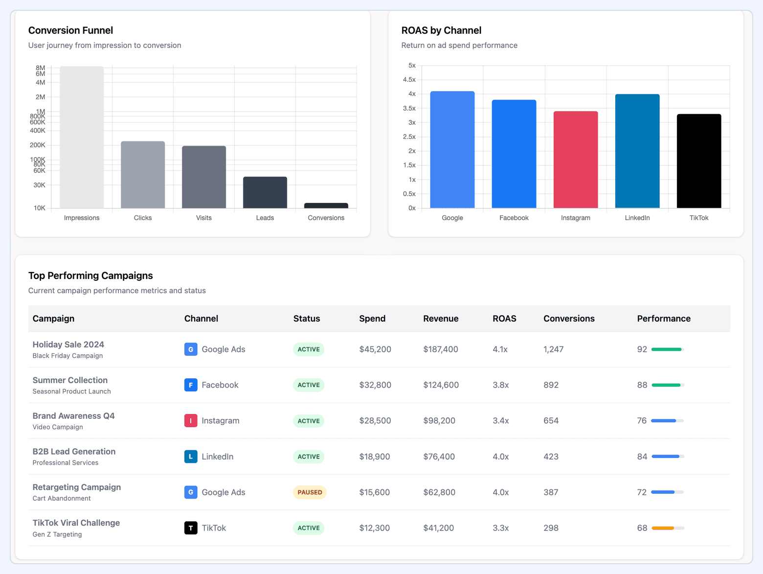
Core KPIs:
• Total ad spend (daily, MTD)
• Impressions and reach
• Clicks and CTR
• Cost per click (CPC)
• Conversions and conversion rate
• Cost per conversion
• Return on ad spend (ROAS)
• Quality Score (Google Ads) or Relevance Score (Meta)
• Top/bottom performing campaigns (by ROAS or CPA)
Recommended visualizations: Line chart for spend vs. pacing, bar chart for CPA by campaign, table with top 10 and bottom 10 campaigns by ROAS, and a trend chart showing quality score over time.
Target audience: Paid Media Manager, PPC Specialist, Performance Marketer.
Filters: Platform (Google, Meta, LinkedIn, TikTok), campaign, ad group, geography, device, audience.
Refresh cadence: Hourly or real-time for high-spend accounts, daily for smaller budgets.
Implementation notes: Connect directly to ad platform APIs (Google Ads API, Meta Marketing API, LinkedIn Ads API). Most BI tools (Looker Studio, Power BI, Tableau) have native connectors, but they often lack support for custom conversions, offline conversions, or cross-platform attribution. For advanced use cases (blended ROAS across Google + Meta + LinkedIn), use Improvado or Funnel to normalize conversion logic before loading into the BI tool.
Tool-specific implementations:
• Powered by Google Ads: Best for search-heavy campaigns. Unique metrics: Quality Score, Search Impression Share, Auction Insights. Native integration with Google Analytics for post-click behavior.
• Powered by Meta Ads Manager: Best for social and display. Unique metrics: Relevance Score, Frequency, Cost per Thousand Impressions (CPM), breakdown by placement (Feed, Stories, Reels).
• Powered by LinkedIn Campaign Manager: Best for B2B. Unique metrics: Lead Form submissions, demographic breakdown by job title/seniority, account-based targeting performance.
4. SEO Performance Dashboard
Purpose: Track organic search visibility, traffic, and conversions. Focused on keyword rankings, backlinks, and technical SEO health.
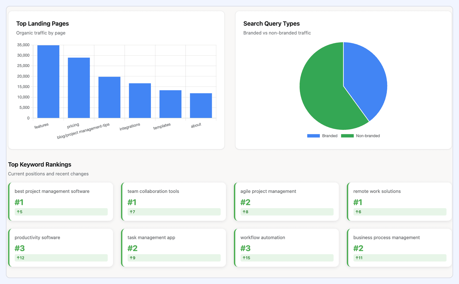
Core KPIs:
• Organic traffic (sessions and users)
• Keyword rankings (average position, top 10 keywords)
• Organic conversions (leads, signups, purchases)
• Backlinks (total, new, lost)
• Domain authority / Domain rating
• Click-through rate (CTR) from search results
• Pages indexed vs. submitted
• Core Web Vitals (LCP, FID, CLS)
• Top landing pages by traffic and conversions
Recommended visualizations: Line chart for organic traffic over time, table showing keyword position changes week-over-week, bar chart for top landing pages, and a scorecard for Core Web Vitals pass/fail.
Target audience: SEO Manager, Content Marketing Manager, Growth Marketer.
Filters: Date range, keyword group, landing page, device (mobile vs. desktop), geography.
Refresh cadence: Daily for traffic and rankings, weekly for backlinks and technical SEO metrics.
Implementation notes: Combine data from Google Search Console (CTR, impressions, rankings), Google Analytics 4 (traffic, conversions), and an SEO tool (Ahrefs, Semrush, Moz) for backlinks and domain authority. Most BI connectors for GSC and GA4 are free; SEO tool integrations require API access (usually paid tiers). Use Improvado or Supermetrics to automate the blend.
Tool-specific implementations:
• Powered by Ahrefs: Best for backlink analysis. Unique metrics: Referring domains, Domain Rating (DR), broken backlinks, internal linking opportunities.
• Powered by Semrush: Best for keyword research and competitive analysis. Unique metrics: Keyword difficulty, search intent classification, SERP features (featured snippets, People Also Ask).
• Powered by Google Search Console: Best for click and impression data directly from Google. Unique metrics: Average position, CTR by query, mobile usability errors, manual actions.
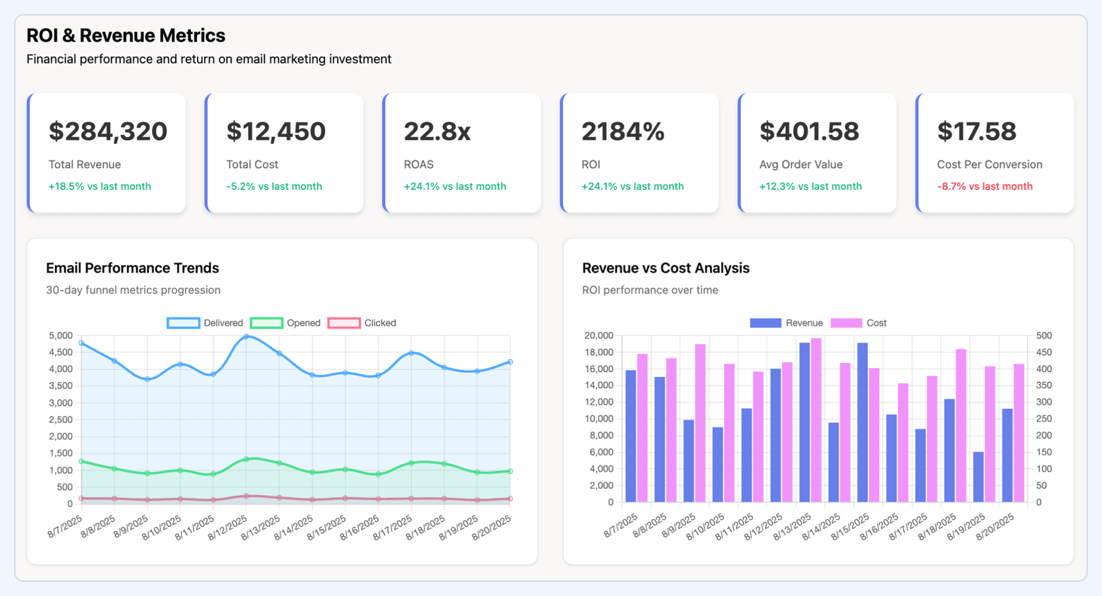
5. Email Marketing Dashboard
Purpose: Monitor email campaign performance and list health. Focused on engagement, deliverability, and revenue attribution.
Core KPIs:
• Emails sent
• Delivery rate (%)
• Open rate (%)
• Click-through rate (%)
• Click-to-open rate (CTOR)
• Unsubscribe rate (%)
• Bounce rate (hard + soft)
• Conversions from email (signups, purchases)
• Revenue attributed to email
• List growth rate
Recommended visualizations: Scorecard tiles for each rate metric, line chart for open/click rates over time, bar chart for top-performing campaigns by CTR, and a funnel showing sent → delivered → opened → clicked → converted.
Target audience: Email Marketing Manager, Marketing Automation Specialist, CRM Manager.
Filters: Campaign, audience segment, email type (promotional, nurture, transactional), date range.
Refresh cadence: Daily.
Implementation notes: Connect to email platform API (Mailchimp, HubSpot, Klaviyo, Marketo). Most platforms provide delivery, open, and click data; revenue attribution requires linking email clicks to CRM opportunities or eCommerce transactions (use UTM parameters and a marketing data warehouse to stitch the funnel).
6. Social Media Marketing Dashboard
Purpose: Track organic and paid social performance across platforms. Focused on engagement, reach, and conversions.
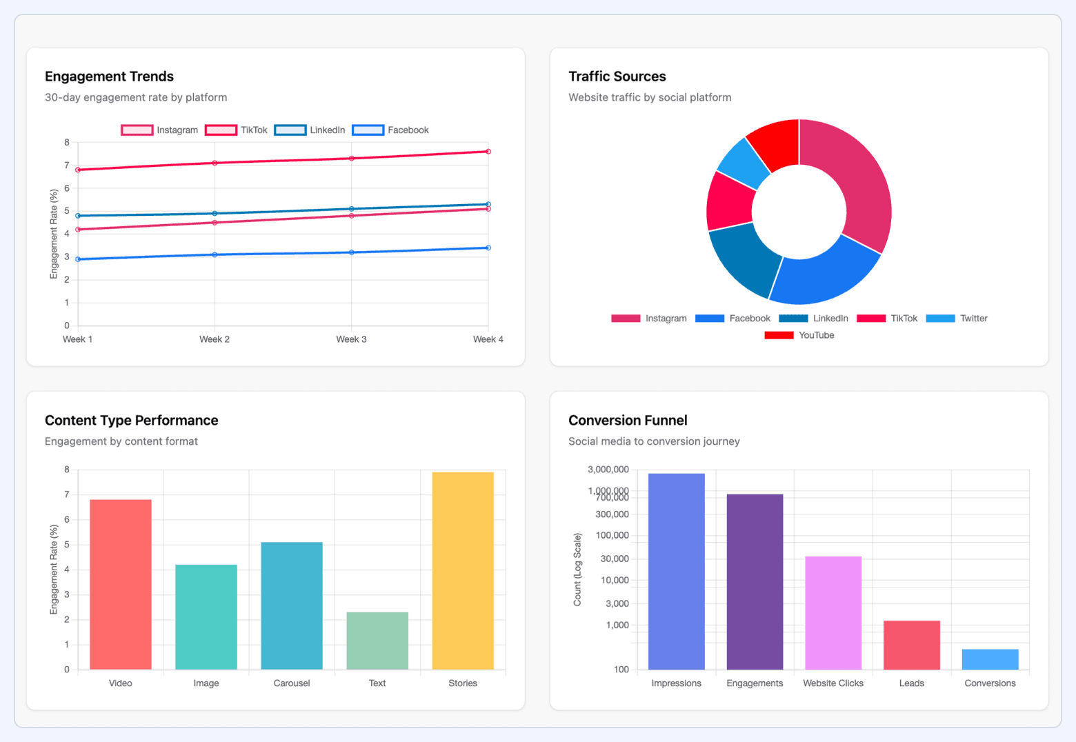
Core KPIs by platform:
• Followers / audience size
• Reach and impressions
• Engagement (likes, comments, shares)
• Engagement rate (%)
• Link clicks
• Video views and view duration
• Conversions (if tracking pixels are installed)
• Cost per engagement (for paid social)
• Top-performing posts
Recommended visualizations: Bar chart for engagement by platform, table showing top posts by engagement rate, line chart for follower growth, and a heatmap showing best posting times.
Target audience: Social Media Manager, Content Marketing Manager, Community Manager.
Filters: Platform (Facebook, Instagram, LinkedIn, Twitter/X, TikTok), post type (image, video, carousel), date range.
Refresh cadence: Daily.
Implementation notes: Each platform has its own API and metric definitions—Facebook/Instagram use "reach," LinkedIn uses "impressions," TikTok reports "views." Use a social media management tool (Hootsuite, Sprout Social) or a marketing data pipeline (Improvado) to normalize metrics across platforms. Without normalization, cross-platform comparison is unreliable.
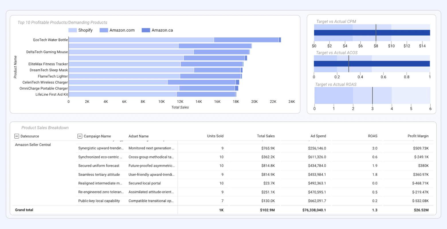
7. Campaign Performance Dashboard
Purpose: Track performance of a specific multi-channel campaign (product launch, event, seasonal promotion). Focused on in-flight optimization and post-campaign analysis.
Core KPIs:
• Total campaign spend (by channel)
• Impressions, reach, clicks
• Conversions (leads, registrations, purchases)
• Cost per conversion
• Revenue or pipeline generated
• ROAS or ROI
• Attribution by touchpoint
• Goal progress (% to target)
Recommended visualizations: Funnel chart from awareness → consideration → conversion, stacked bar chart showing spend by channel, line chart for daily conversion rate, and a sankey diagram showing multi-touch attribution paths.
Target audience: Campaign Manager, Growth Marketer, Marketing Director.
Filters: Channel, geography, audience segment, date range (campaign flight dates).
Refresh cadence: Hourly during active campaign, daily post-campaign.
Implementation notes: Requires UTM tagging discipline and cross-platform tracking. Use a consistent naming convention for all campaign URLs (utm_campaign=[campaign_name], utm_medium=[channel], utm_source=[platform]). For multi-touch attribution, use a marketing data warehouse to stitch touchpoints from ad impressions → website visits → form fills → CRM opportunities. Improvado's Marketing Cloud Data Model handles this automatically.
8. Multi-Touch Attribution Dashboard
Purpose: Show how multiple touchpoints (ads, emails, content, events) contribute to conversions. Answers "What's the real ROI of each channel?" and "Which combinations work best?"
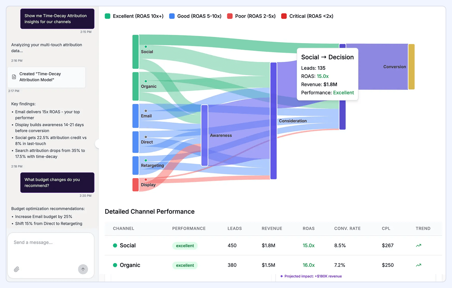
Core KPIs:
• Conversions by attribution model (first-touch, last-touch, linear, time-decay, position-based)
• Average touchpoints to conversion
• Top conversion paths
• Channel contribution by position (first, middle, last)
• Assisted conversions by channel
• Incremental revenue by channel (vs. last-click baseline)
Recommended visualizations: Sankey diagram showing conversion paths, bar chart comparing attribution models side-by-side, and a table showing top 20 conversion paths with frequency.
Target audience: Marketing Analyst, VP Marketing, CMO—anyone making budget allocation decisions.
Filters: Date range, conversion type (lead, demo, purchase), attribution model, product line.
Refresh cadence: Weekly (attribution requires historical data to calculate paths).
Implementation notes: Multi-touch attribution is the hardest dashboard to build correctly. It requires:
• Session-level tracking across all channels (UTM parameters, referrer data, paid ad click IDs)
• User identity resolution (stitching anonymous sessions to known users via email, CRM ID, or cookie matching)
• Touchpoint sequencing (ordering events chronologically and attributing them to a conversion event)
• Attribution model calculation (applying weighting logic—linear, time-decay, position-based—to each touchpoint)
Most teams cannot build this from scratch. Use a marketing analytics platform with built-in attribution (Bizible, HockeyStack, Dreamdata) or a marketing data warehouse (Improvado) that includes pre-built attribution models. Google Analytics 4's default attribution is last-click only; GA4's Data-Driven Attribution requires 400+ conversions/month and often conflicts with CRM data.
9. Marketing ROI / Revenue Dashboard
Purpose: Connect marketing spend to closed revenue. Answers "How much revenue did marketing generate?" and "What's our payback period?"
Core KPIs:
• Total marketing spend
• Marketing-sourced pipeline ($)
• Marketing-influenced pipeline ($)
• Closed-won revenue (marketing-sourced)
• Customer Acquisition Cost (CAC)
• Lifetime Value (LTV)
• LTV:CAC ratio
• Payback period (months)
• Return on Marketing Investment (ROMI)
Recommended visualizations: Line chart showing spend vs. revenue over time, bar chart for CAC by channel, scatter plot with CAC on X-axis and LTV on Y-axis (identifies high-value channels), and a waterfall chart showing pipeline progression from MQL → SQL → Opportunity → Closed-Won.
Target audience: CFO, CMO, VP Marketing, Board of Directors.
Filters: Channel, product line, geography, customer segment, cohort (month/quarter acquired).
Refresh cadence: Weekly or monthly (revenue data lags).
Implementation notes: Requires full integration between ad platforms, marketing automation, CRM, and billing/revenue systems. The hardest part is defining "marketing-sourced" vs. "marketing-influenced":
• Marketing-sourced: First touch was a marketing activity (ad click, organic search, content download). Conservative definition, undercounts marketing impact.
• Marketing-influenced: Any touch was a marketing activity. Generous definition, overcounts marketing impact.
Most teams report both. For B2B companies with long sales cycles (6+ months), use cohort analysis: track the revenue generated by customers acquired in Q1 2025, Q2 2025, etc., and compare against the marketing spend in those quarters. This avoids the lag problem where spend happens in Q1 but revenue doesn't close until Q3.
Use Improvado to automate the stitching of ad spend → leads → opportunities → revenue across Salesforce, HubSpot, Google Ads, and Meta Ads.
10. Pipeline & Demand Generation Dashboard
Purpose: Track the flow of leads through the funnel from MQL → SQL → Opportunity → Closed-Won. Focused on velocity, conversion rates, and bottlenecks.
Core KPIs:
• MQLs generated (by channel)
• MQL → SQL conversion rate
• SQLs generated
• SQL → Opportunity conversion rate
• Opportunities created (count and $ value)
• Opportunity → Closed-Won rate
• Average deal size
• Sales cycle length (days)
• Pipeline velocity ($ per day)
• Forecast vs. actual pipeline
Recommended visualizations: Funnel chart with conversion rates at each stage, line chart for pipeline created over time, bar chart for pipeline by source, and a cohort table showing conversion rates by month acquired.
Target audience: VP Marketing, VP Sales, RevOps, CMO.
Filters: Channel, campaign, geography, sales rep, product line, deal size.
Refresh cadence: Daily.
Implementation notes: Requires CRM integration (Salesforce, HubSpot, Pipedrive) and clear stage definitions. The biggest challenge: MQL and SQL definitions vary by company. Align with Sales before building the dashboard, or you'll spend months arguing over metric definitions instead of optimizing the funnel.
Common pitfall: Marketing counts "MQL" at form submission; Sales counts "SQL" only after a qualification call. The dashboard must match CRM field logic, not marketing's aspirational definitions.
11. Content Marketing Dashboard
Purpose: Track content performance—blog posts, videos, podcasts, webinars. Focused on traffic, engagement, and lead generation.
Core KPIs:
• Pageviews and unique visitors
• Time on page / Avg. session duration
• Bounce rate
• Scroll depth (%)
• Social shares
• Backlinks generated
• Conversions from content (newsletter signups, lead magnets, demos)
• Content-influenced pipeline ($)
• Top-performing content (by traffic, engagement, conversions)
Recommended visualizations: Table showing top 20 blog posts by traffic and conversions, line chart for content traffic over time, bar chart for conversions by content type (blog, video, webinar), and a heatmap showing engagement by topic category.
Target audience: Content Marketing Manager, SEO Manager, VP Marketing.
Filters: Date range, content type, topic category, author, distribution channel (organic, email, social).
Refresh cadence: Weekly (content performance stabilizes over days, not hours).
Implementation notes: Combine Google Analytics 4 (traffic, engagement) with CRM data (conversions, pipeline) and social media analytics (shares). Use UTM parameters to track content promotion (e.g., utm_source=linkedin, utm_medium=social, utm_campaign=blog_promo). For advanced analysis, track scroll depth and time-on-page with Google Tag Manager or a tool like Hotjar.
Common mistake: Ranking content by pageviews alone ignores business impact. A blog post with 10,000 views and zero conversions is less valuable than a post with 500 views and 20 demo requests. Always include a conversion metric.
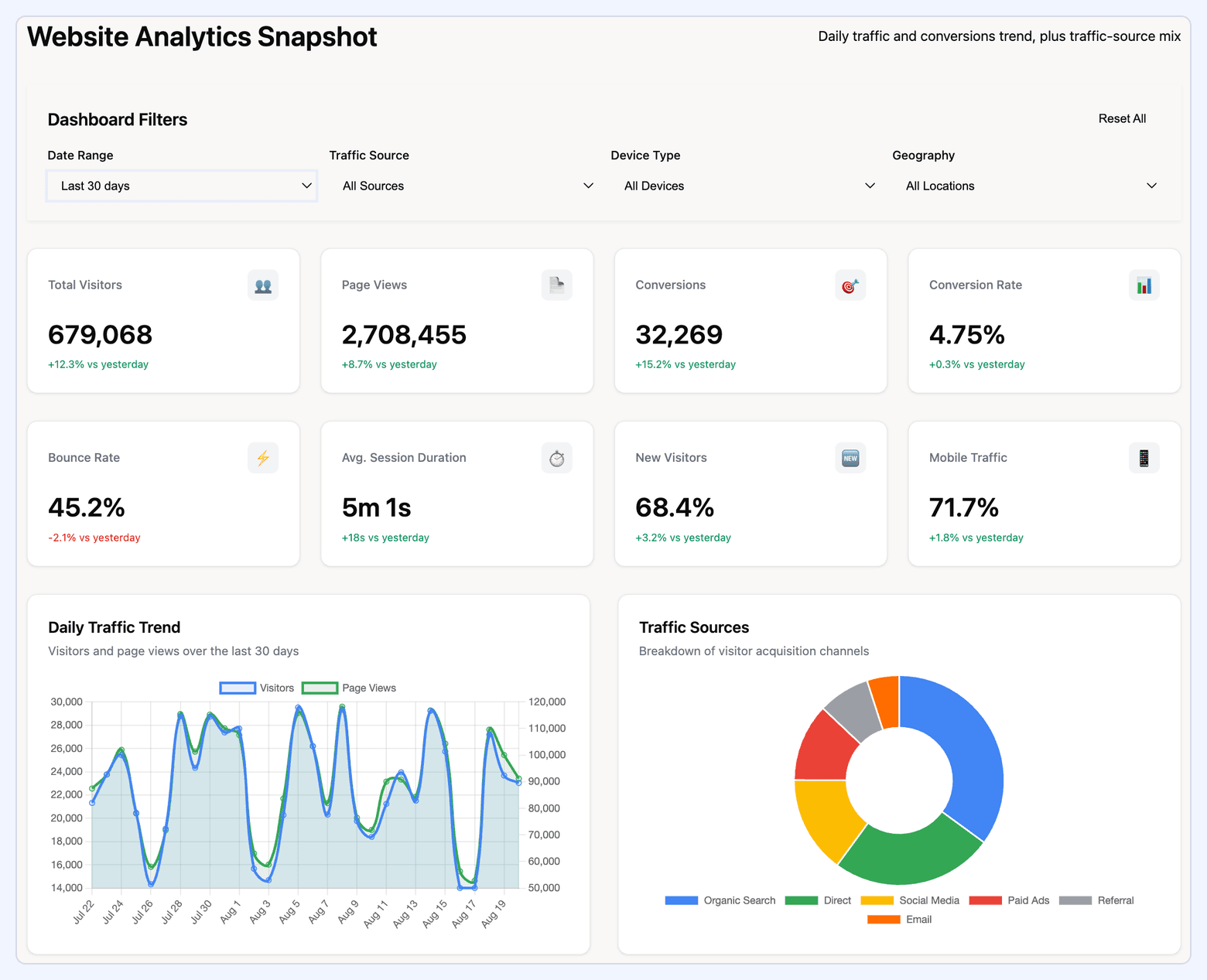
12. Customer Acquisition Dashboard
Purpose: Focus on top-of-funnel performance—how many new prospects are entering the funnel and at what cost. Complements the pipeline dashboard by zooming in on acquisition efficiency.
Core KPIs:
• New leads generated (by channel)
• Cost per lead (CPL)
• Lead quality score (if using predictive scoring)
• Lead → MQL conversion rate
• Time to MQL (days from first touch)
• New accounts created (for B2B PLG or self-serve models)
• Cost per acquisition (CPA)
• Paid vs. organic acquisition mix
Recommended visualizations: Bar chart for leads by channel, line chart for CPL over time, funnel showing lead → MQL → SQL, and a scatter plot with CPL on X-axis and lead volume on Y-axis (identifies high-efficiency, high-volume channels).
Target audience: Demand Gen Manager, Growth Marketer, Marketing Director.
Filters: Channel, campaign, geography, audience segment, lead source.
Refresh cadence: Daily.
Implementation notes: Requires integration between ad platforms, landing page tools (Unbounce, Instapage), marketing automation (HubSpot, Marketo), and CRM. The key challenge: attributing leads to the correct channel when prospects interact with multiple touchpoints before converting. Use UTM parameters and first-touch attribution for simplicity, or multi-touch attribution for accuracy (see Dashboard #8).
Dashboard KPI Formula Library
Every metric mentioned in the examples above, with calculation specs, data sources, refresh cadence, and common mistakes.
Pro tip: When building a new dashboard, start with 5–8 of these core metrics and validate the calculations with Finance and Sales before adding more. Dashboards fail when stakeholders see a number they don't trust and dismiss the entire tool.
When NOT to Build a Dashboard
Dashboards are not always the right solution. Here are five situations where you should walk away or choose a simpler reporting method.
1. Ad-Hoc Analysis Needs
A dashboard answers pre-defined questions efficiently ("What's our cost per lead this week?"). It cannot answer novel questions ("How does cost per lead differ for mobile users in EMEA who visited the pricing page twice before converting?"). For exploratory analysis, use a BI tool with SQL access or raw data exports, not a dashboard.
2. One-Time Reporting
If you need a report once (board deck, investor update, annual review), building a dashboard is over-engineering. Export the data, build the report in slides or a spreadsheet, and move on. Dashboards are for repeated reporting workflows.
3. Unstable KPIs
If your team is still debating what to measure, or if KPI definitions change every month, building a dashboard is premature. Every definition change requires rebuilding queries, visualizations, and filters. Wait until metrics settle, then automate. Until then, use a shared spreadsheet or weekly email.
4. No Action Authority
If the dashboard viewer cannot act on the data (e.g., a junior marketer who can see budget waste but can't pause campaigns without approval), the dashboard creates frustration, not value. In this case, send a weekly email summary to the decision-maker instead. Dashboards are for people who can do something with the insight.
5. Too Few Data Sources
If you're only tracking one or two data sources (e.g., Google Ads only), the platform's native reporting interface is often sufficient. Dashboards provide value when aggregating and normalizing data across multiple sources. Don't build infrastructure for a problem you don't have yet.
How to Choose the Right Dashboard for Your Team
Start with your team size, data complexity, and decision-making cadence. Use this decision matrix to identify the right architecture and avoid over-building or under-building.
Hidden costs to include in TCO:
• Data engineering time: Building and maintaining connectors, transformations, and data quality checks (10–40 hours/month depending on complexity)
• BI license scaling: Per-user fees add up—Tableau and Power BI charge per viewer; Looker charges per developer
• Connector maintenance: APIs change, schemas break, connectors need updates (budget 5–10 hours/month for 10+ sources)
• Training and adoption overhead: Onboarding stakeholders, building documentation, answering "how do I filter this?" questions (15–30 hours upfront, 2–5 hours/month ongoing)
• Re-work from taxonomy changes: Campaign naming changes, CRM field updates, new product launches require dashboard rebuilds (10–20 hours per major change)
Most teams underestimate ongoing costs by 40–60%. A "free" Looker Studio dashboard that requires 10 hours/week of analyst time costs $26,000/year in labor at $50/hour fully loaded.
Dashboard Audit Checklist: Is Yours Actually Working?
Run this 12-point diagnostic against your existing dashboard. Score each item 0 (broken), 5 (partially working), or 10 (fully working). Total score below 80? Time to rebuild or retire it.
Scoring guide:
• 100–120: Best-in-class dashboard—keep it, document it, use it as a template for others
• 80–99: Functional but has gaps—prioritize top 3 failing items and fix within a quarter
• 60–79: Struggling—schedule a rebuild or consider replacing with a simpler tool
• Below 60: Retire it—the dashboard is creating more confusion than clarity
Common Dashboard Mistakes (And How to Fix Them)
Mistake 1: Building for Yourself, Not Your Audience
Analysts build dashboards they would want to use—granular, flexible, full of detail. But executives want 6 numbers and a trend. Channel managers want optimization levers. Solve: Start every dashboard project with a stakeholder interview. Ask: "What decision does this dashboard help you make?" and "What's the one number you'd check first?" Build that dashboard, not the one you think they need.
Mistake 2: Treating All Metrics as Equally Important
When everything is highlighted, nothing is. Dashboards with 30+ metrics of equal visual weight force users to do the prioritization work themselves—and they won't. Solve: Limit top-level dashboards to 6–8 core KPIs. Use size, color, and position to create hierarchy. Everything else goes into linked drill-down views.
Mistake 3: No Benchmark or Goal Context
A metric without context is noise. "Cost per lead is $87" means nothing without knowing if that's good, bad, or average. Solve: Every KPI should show one of: goal progress ("85% to target"), prior period comparison ("+12% vs. last month"), or benchmark ("-23% below industry avg"). Never show a naked number.
Mistake 4: Using the Wrong Visualization
Pie charts for 8+ categories, line charts for non-time-series data, tables when a chart would be clearer—wrong visualizations slow comprehension. Solve: Follow these rules: line charts for trends over time, bar charts for comparisons across categories, scorecards for single numbers, tables only for granular drill-downs (top 20 campaigns), and maps for geographic data. When in doubt, use a bar chart.
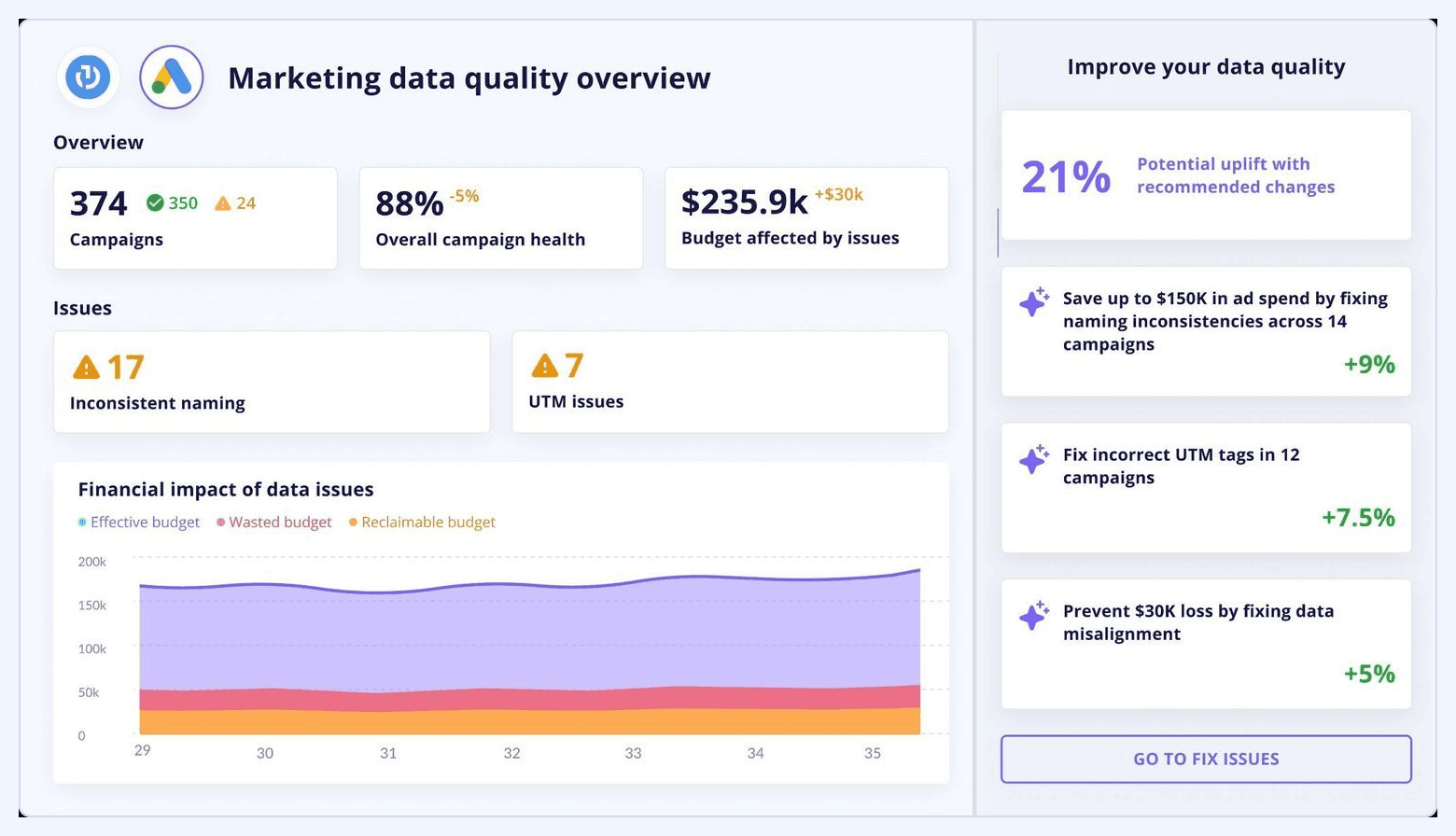
Mistake 5: Ignoring Data Quality Until It's Too Late
Dashboards look great in demos, then fall apart in production when dirty UTM parameters, missing campaign IDs, or duplicated records corrupt the data. Solve: Build data quality checks before building visualizations. Flag missing UTM tags, campaign naming violations, conversion tracking gaps, and duplicate records. Surface data quality scores in the dashboard itself so users know when to trust the numbers.
Comparison: Marketing Dashboard Tools for 2026
Here's how the leading platforms compare for building marketing dashboards, with focus on data connectivity, automation, and use case fit.
Recommendation by use case:
• If you need automated cross-channel data pipelines with revenue stitching: Improvado or Funnel
• If you're a small team on a budget: Looker Studio + Supermetrics or Databox
• If you're enterprise with heavy Microsoft investment: Power BI
• If visualization quality is top priority: Tableau
• If you're an agency managing multiple client dashboards: Klipfolio or Databox
AI and Marketing Dashboards: What's New in 2026
AI is changing how dashboards surface insights. Instead of passively displaying metrics, 2026 dashboards increasingly include conversational analytics, anomaly detection, and predictive forecasting.
Anomaly Detection
Rather than manually scanning for performance drops, modern dashboards flag unusual patterns automatically: conversion rate drops 30% week-over-week, ad spend spikes without corresponding click increases, SEO traffic plummets for a keyword cluster. These alerts include likely causes (API tracking broke, campaign budget cap removed, Google algorithm update) and recommended actions.
Conversational Analytics (AI Agents)
Platforms like Improvado now include AI Agents that let users ask natural-language questions: "Which campaigns are underperforming this month?" or "Show me pipeline by source for EMEA enterprise accounts." The AI generates the query, visualization, and insight narrative in seconds—no SQL, no BI tool training required. This democratizes dashboard access for non-technical stakeholders.
Predictive Forecasting
Dashboards with ML-powered forecasting show not just current performance, but projected end-of-month or end-of-quarter outcomes based on historical trends and current pacing. Example: "At current conversion rate and spend, you will generate 342 MQLs this month (12% below goal). To hit goal, increase spend by $8,200 or improve conversion rate by 0.8 points."
SEO and Content Dashboards
With the rise of Google's Search Generative Experience (SGE) and AI Overviews, 2026 dashboards now track AI visibility metrics alongside traditional SEO KPIs:
• AI Overview appearances: How often your content is cited in Google's AI-generated answers
• ChatGPT referral traffic: Direct visits from ChatGPT, Perplexity, and other AI search engines
• Conversational query rankings: Performance for long-tail, question-based searches that trigger AI summaries
• Traditional vs. AI search traffic split: Breakdown of organic traffic from classic 10-blue-links SERP vs. AI-enhanced results
Tools like Ahrefs, Semrush, and BrightEdge are adding these metrics to their APIs, making them available for custom dashboards. If your SEO dashboard doesn't track AI visibility yet, it's missing a growing share of search traffic.
Conclusion: From Dashboard to Decision
A marketing dashboard is only as valuable as the decisions it enables. The 12 examples above—executive, channel, campaign, attribution, revenue, pipeline, content, and acquisition dashboards—represent the core views most marketing teams need. But examples alone don't create impact.
Start with these principles:
• Build for your audience, not yourself. Executives need 6 numbers, not 60.
• Automate ruthlessly. Manual dashboards die within 90 days.
• Validate data quality first. A beautiful dashboard with bad data is worse than no dashboard.
• Add context to every metric. No naked numbers—always show vs. goal, vs. prior period, or vs. benchmark.
• Measure adoption. If stakeholders aren't opening it weekly, fix it or retire it.
Use the failure cases, audit checklist, and decision matrix above to diagnose what's broken and choose the right architecture for your team. And remember: the best dashboard is the one that gets used.
FAQ
How can I build a marketing dashboard using Google Data Studio or a similar tool?
What components are essential for an effective marketing dashboard?
How can I build a marketing dashboard?
What is a marketing dashboard?
How can I create a marketing ROI dashboard?
What makes a marketing dashboard user-friendly?
How can I create a marketing dashboard to report campaign performance?
What are the benefits of using a marketing analytics dashboard?


.png)