
Data visualization techniques are the chart types and design methods that turn raw marketing data into clear, decision-ready visuals. The right technique depends on your goal: bar and line charts to compare and track performance, scatter and bubble charts to expose relationships, and Sankey diagrams or heat maps to reveal flows and concentration across the customer journey.
Most guides stop at listing chart types. The harder problem for marketing teams is matching a technique to a specific report, then trusting the data underneath it. This guide covers 15 techniques from foundational to advanced, when each one fits a marketing use case, and how to keep the numbers behind every chart accurate.
Advanced data visualization techniques extend this further, handling complex, multi-dimensional datasets with greater precision so the patterns and correlations that drive strategic decisions do not stay hidden in the raw data.
Key Takeaways
- Start with the Goal: The most effective data visualization starts with a clear question. Choose your technique based on whether you want to show comparison, composition, distribution, or relationships in your data.
- Master the Fundamentals: Basic charts like bar graphs, line charts, and pie charts are the workhorses of data analysis. Understanding their strengths and weaknesses is crucial for clear communication.
- Embrace Advanced Techniques: For complex data, advanced methods like Sankey diagrams, heat maps, and network graphs can reveal insights that basic charts would miss, especially for analyzing customer journeys or market segmentation.
- Data Integrity is Non-Negotiable: A beautiful chart is useless if it's based on bad data. A solid foundation of data cleansing, validation, and integration is the prerequisite for any meaningful visualization.
What Is Data Visualization and Why Is it Crucial?
Data visualization (also spelled data visualisation) is the graphical representation of information and data. By using visual elements like charts, graphs, and maps, data visualization tools provide an accessible way to see and understand trends, outliers, and patterns in data.
At its core, data visualization translates complex, high-dimensional, or voluminous data into a visual context that is easier for the human brain to process. Instead of poring over spreadsheets with thousands of rows, you can see the story of your data at a glance.
It is about communication: telling a compelling story backed by evidence.
The Importance of Visualizing Data for Business Intelligence
The primary goal of business intelligence (BI) is to help organizations make more informed decisions. Visualizing data is a cornerstone of this process for several reasons:
- Faster Comprehension: The brain interprets a well-designed chart far faster than a table of numbers, so trends and outliers that stay hidden in a spreadsheet surface at a glance.
- Pattern and Trend Identification: Visuals make it easy to spot trends over time, relationships between variables, and unexpected patterns that might go unnoticed in raw data.
- Improved Decision-Making: By making data more understandable, stakeholders at all levels can engage with it, ask better questions, and arrive at data-driven conclusions with greater confidence.
Foundational Data Visualization Techniques (The Basics)
Before diving into complex visualizations, it's essential to master the fundamentals. These classic chart types are the building blocks of data analysis and reporting, valued for their simplicity and clarity.
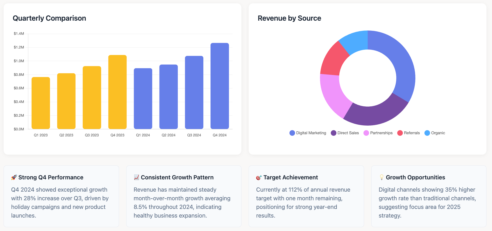
Bar Charts (Vertical & Horizontal)
What they are: Bar charts use rectangular bars to represent categorical data. The length or height of the bar is proportional to the value it represents. They are perfect for comparing different groups or tracking changes over time (when the changes are significant).
When to use them: Use a vertical bar chart (column chart) for chronological data or when category labels are short. Use a horizontal bar chart when category labels are long, preventing them from being squished or angled.
Example: A marketer could use a bar chart to compare revenue from different channels (e.g., Organic Search, Social Media, Paid Ads, Direct) for the last quarter.
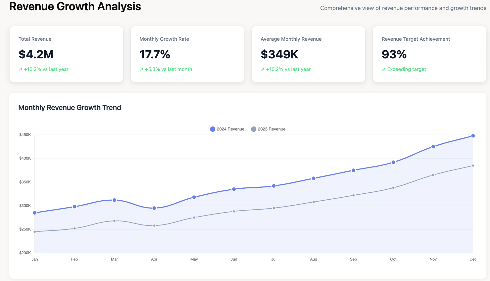
Line Graphs (or Line Charts)
What they are: A line graph displays data points connected by straight lines. It is the go-to chart for showing trends over a continuous interval or time period.
When to use them: Ideal for visualizing time-series data to identify trends, seasonality, and fluctuations. They are excellent for showing acceleration or deceleration.
Example: A line graph could track a company's monthly revenue over the last two years, clearly showing periods of growth, decline, or seasonal peaks.
Pie Charts (and Donut Charts)
What they are: A pie chart is a circular statistical graphic divided into slices to illustrate numerical proportion. Each slice represents a category, and its size is proportional to the quantity it represents.
When to use them: Best used to show parts of a whole or a percentage composition. They are most effective with a small number of categories (ideally under six) that clearly add up to 100%.
Example: Visualizing the market share of different competitors in a specific industry, or the breakdown of a marketing budget by channel.
Histograms
What they are: A histogram looks similar to a bar chart, but it groups numbers into ranges (or "bins") to show the distribution of a continuous dataset. The height of each bar represents the frequency of data points falling within that bin.
When to use them: Use a histogram to understand the distribution of your data. It helps you see where most values are concentrated, identify the shape of the distribution (e.g., normal, skewed), and spot outliers.
Example: An e-commerce business could use a histogram to analyze the distribution of customer order values, identifying the most common purchase amounts.
Tables
What they are: While not a "visual" in the same way as a chart, a well-structured table is a powerful visualization technique for displaying precise values.
When to use them: Use tables when you need to show exact numbers, compare individual values, or present multiple units of measure. They are essential for detailed reporting where precision is key.
Example: A campaign performance report table showing key metrics (Impressions, Clicks, CPC, Conversions, CPA) for a dozen different ad campaigns.
Intermediate Data Visualization Methods for Deeper Analysis
Once you've mastered the basics, these intermediate techniques can help you explore relationships, density, and multi-dimensional data with greater nuance.
Scatter Plots (Correlation & Outliers)
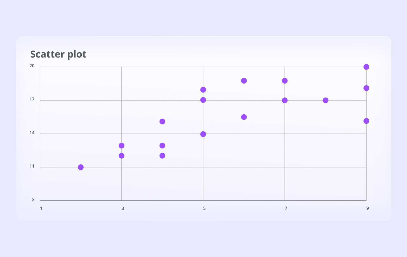
What they are: Scatter plots use dots to represent the values of two different numeric variables. The position of each dot on the horizontal (x-axis) and vertical (y-axis) indicates values for an individual data point.
When to use them: They are the best way to visualize the relationship (or correlation) between two variables. You can easily see if there's a positive, negative, or no correlation and identify outliers that don't fit the overall pattern.
Example: A scatter plot can be used to analyze the relationship between marketing ad spend and sales revenue. Each dot could represent a day, helping you determine if higher spending generally leads to higher sales.
Bubble Charts (Adding a Third Dimension)
What they are: A bubble chart is an extension of a scatter plot. It adds a third dimension of data by varying the size of the dots, turning them into bubbles. The x and y axes represent two variables, while the bubble size represents a third.
When to use them: Use a bubble chart when you want to compare three variables at once in a visually engaging way.
Example: Visualizing campaign performance where the x-axis is conversion rate, the y-axis is click-through rate, and the bubble size is the total budget for each campaign. This quickly highlights high-performing, well-funded campaigns.
Heat Maps (Density & Concentration)
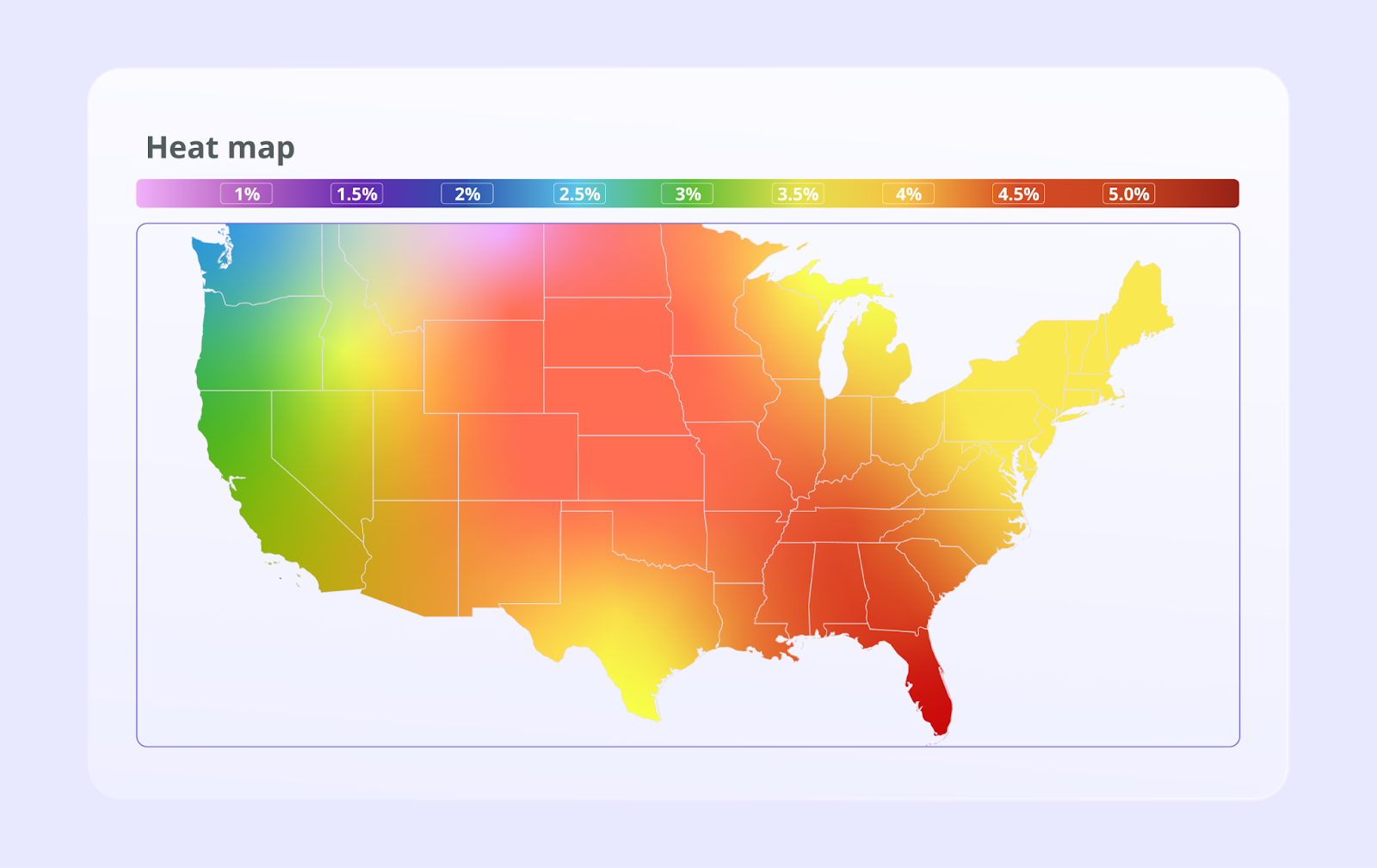
What they are: Heat maps use a system of color-coding to represent different values in a matrix or on a map. Darker or "hotter" colors typically indicate higher values or density, while lighter or "cooler" colors indicate lower values.
When to use them: Excellent for showing the concentration of data over a geographical area or for visualizing patterns in large tables of data. Website heat maps are also used to show where users click and scroll most frequently.
Example: A geo heat map showing sales concentrations by state, allowing a national sales manager to instantly see top-performing and underperforming regions.
Treemaps (Hierarchical Data)
What they are: Treemaps display hierarchical (tree-structured) data as a set of nested rectangles. Each branch of the tree is given a rectangle, which is then tiled with smaller rectangles representing sub-branches. The size of each rectangle is proportional to a specified measure of the data.
When to use them: Perfect for visualizing "part-to-whole" relationships within a large, hierarchical dataset. They make efficient use of space and can display thousands of items simultaneously.
Example: A treemap could visualize a company's product sales, with large rectangles for main categories (e.g., Electronics, Clothing) and smaller, nested rectangles for individual products, sized by revenue.
Box and Whisker Plots (Distribution Analysis)
What they are: A box and whisker plot (or box plot) displays the five-number summary of a set of data: the minimum, first quartile, median, third quartile, and maximum. It's a standardized way of displaying the distribution of data.
When to use them: Use box plots to compare distributions between multiple groups. They are very effective at summarizing data and highlighting differences in median, spread (range), and identifying outliers.
Example: Comparing the performance distribution of sales representatives by showing the range and median of their monthly sales figures in a single chart.
Advanced Data Visualization Techniques for Complex Datasets
For highly complex, multi-dimensional data, you need specialized techniques that go beyond standard charts to uncover intricate patterns and flows.
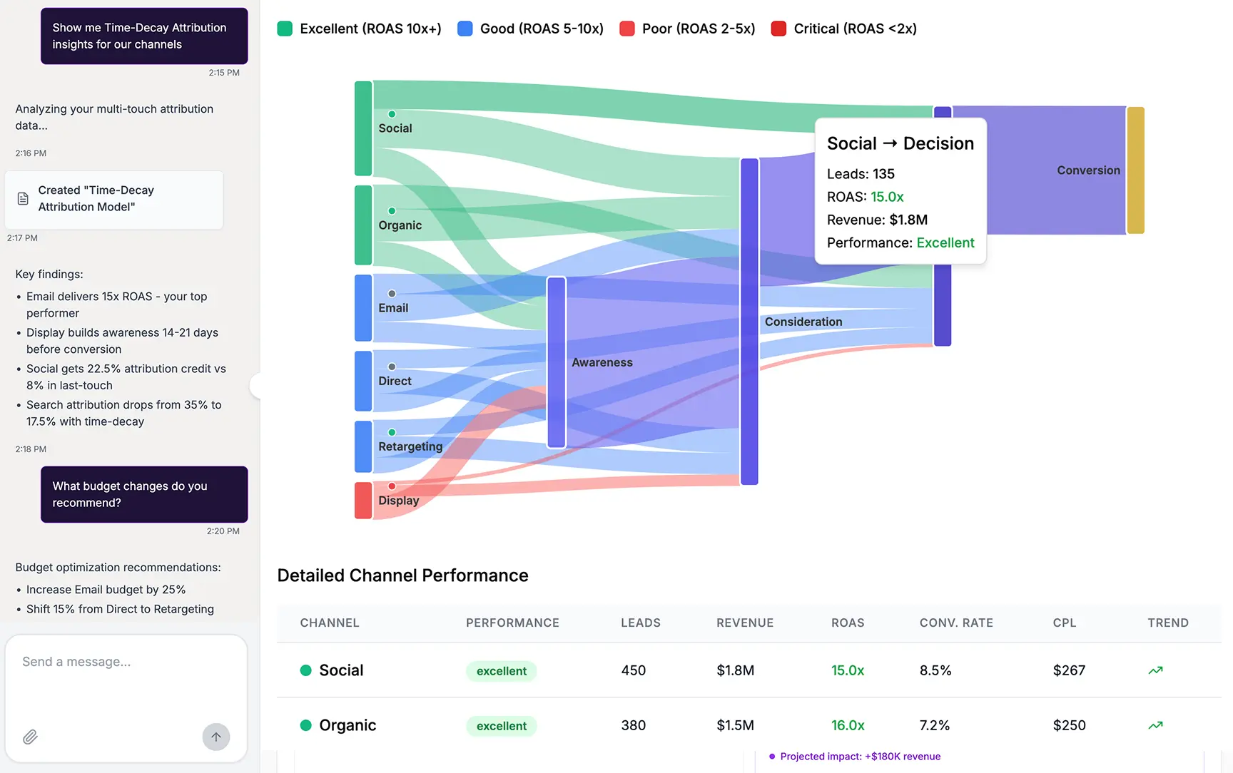
Sankey Diagrams (Flow Analysis)
What they are: Sankey diagrams visualize flow. The width of the arrows or streams is proportional to the flow quantity. They excel at showing how a quantity is distributed or transferred between stages in a process.
When to use them: Ideal for visualizing energy flows, material flows, financial flows, or user journeys on a website. They powerfully illustrate transfers, contributions, and losses within a system.
Example: A marketer can use a Sankey diagram to map the customer journey, showing how users navigate from various landing pages through different site sections to a final conversion or exit page. This clearly highlights the most common paths and drop-off points.
Network Diagrams (Relationships & Connections)
What they are: Network diagrams (or graphs) show connections between different entities (called nodes). Nodes are represented by circles or dots, and the relationships between them are shown as lines (or edges).
When to use them: Use them to visualize complex networks, such as social networks, logistical networks, or interactions between different entities. They are powerful for understanding the structure and density of relationships.
Example: Analyzing a social media campaign by visualizing how a key message spreads. Each node could be a user, and lines could represent shares or mentions, revealing key influencers in the network.
Geospatial Maps (Location-Based Insights)
What they are: More advanced than simple heat maps, geospatial visualizations layer data onto real-world maps. This can range from simple point maps to complex choropleth maps where areas are shaded in proportion to a statistical variable.
When to use them: Essential whenever location is a key component of your data. This is common in logistics, retail, real estate, and regional marketing analysis.
Example: An insurance company might map claim locations overlaid with weather data to analyze risk, or a retail chain could map store locations against demographic data to plan new openings.
Word Clouds (Textual Data Analysis)
What they are: A word cloud is a visual representation of text data. The importance of each word is shown with font size or color. It's a simple way to see the most prominent terms in a body of text.
When to use them: Useful for a quick analysis of unstructured text data, like customer reviews, survey responses, or social media mentions, to identify frequently discussed topics.
Example: Analyzing thousands of customer support tickets by creating a word cloud to quickly identify the most common issues (for example, "login," "password," "shipping").
Gantt Charts (Project Management & Timelines)
What they are: A Gantt chart is a type of bar chart that illustrates a project schedule. It lists tasks on the vertical axis and time intervals on the horizontal axis. The width of the horizontal bars shows the duration of each task.
When to use them: A staple in project management, Gantt charts are perfect for planning projects, showing task dependencies, and tracking progress against deadlines.
Example: A marketing team planning a major product launch can use a Gantt chart to schedule all activities, from market research and content creation to ad campaign deployment and post-launch analysis.
Choosing the Right Data Visualization Technique
Creating an effective visualization is less about artistic flair and more about strategic choice. The right chart can illuminate insights, while the wrong one can confuse or mislead. Success depends on understanding your data, your goal, and your audience.
Understanding Your Data
First, know the type of data you are working with. Data can generally be classified into four types:
- Categorical: Data that can be sorted into groups (e.g., channels like 'Social Media', 'Email').
- Ordinal: Categorical data that has a logical order (e.g., customer satisfaction ratings like 'Poor', 'Good', 'Excellent').
- Interval: Numerical data with a known difference between values, but no true zero (e.g., temperature in Celsius).
- Ratio: Numerical data with a known difference and a true zero (e.g., revenue, ad spend).
Knowing this helps narrow down the appropriate chart types.
Defining Your Goal
What story are you trying to tell with your data? Most visualization goals fall into one of four categories:
- Comparison: Showing how different items or groups stack up against each other. Bar charts, line charts, and box plots are excellent for comparison.
- Relationship: Investigating the connection or correlation between two or more variables. Scatter plots and bubble charts are the go-to choices here.
- Composition: Breaking down a whole into its constituent parts. Pie charts, treemaps, and stacked bar charts are used to show composition.
- Distribution: Understanding how individual data points are spread out or clustered. Histograms and scatter plots are ideal for analyzing distribution.
Knowing Your Audience
Who will be viewing your visualization? An executive leadership team needs a high-level, clear summary, while a team of data analysts might require a more detailed, interactive view. Tailor the complexity and density of information to your audience's level of data literacy. For high-level reporting, clear and simple KPI dashboards that present the most critical metrics are often the most effective approach.
| Goal | Description | Recommended Techniques | Marketing Use Case |
|---|---|---|---|
| Comparison | Compare values across different categories or over time. | Bar Chart, Line Graph, Box Plot, Bubble Chart | Comparing the performance (e.g., conversion rate) of three different ad creatives. |
| Relationship | Show the correlation or connection between two or more variables. | Scatter Plot, Bubble Chart, Network Diagram | Analyzing if there is a relationship between social media engagement and website sales. |
| Composition | Illustrate the parts that make up a whole. | Pie Chart, Treemap, Stacked Bar Chart, Sankey Diagram | Showing the breakdown of the quarterly marketing budget by channel (Paid, Social, Content). |
| Distribution | Understand how data points are spread across a range. | Histogram, Scatter Plot, Box Plot | Analyzing the distribution of customer ages to identify the largest demographic groups. |
The Role of Data Visualization in Marketing Analytics
For marketing teams, data visualization is not just a reporting tool. It transforms performance data into a clear narrative that can guide strategy, optimize campaigns, and prove value.
Which Chart for Which Marketing Report
Generic chart lists rarely tell you which visualization to reach for. This mapping pairs the most common marketing reports with the technique that reads fastest for each job.
| Marketing report | Best technique | Why it works |
|---|---|---|
| Channel performance comparison | Grouped or stacked bar chart | Lines up CTR, CPA, and ROAS side by side across channels for a fast read. |
| Trend and pacing over time | Line chart | Tracks spend, leads, or revenue against target and exposes seasonality. |
| Budget composition | Treemap or stacked bar chart | Shows how spend splits across channels and campaigns as parts of a whole. |
| Spend efficiency | Bubble chart | Plots spend, CPA, and conversion volume together to surface wasted budget. |
| Customer journey and attribution | Sankey diagram | Maps paths from first touch to conversion and makes drop-off points obvious. |
| Geographic performance | Geo heat map | Highlights top and underperforming regions without scanning a table. |
| Funnel or cohort retention | Heat map | Reveals where users convert or churn stage by stage. |
Visualizing Campaign Performance
Instead of static reports, marketers can use interactive dashboards to monitor campaigns in real-time. Visualizing metrics like Click-Through Rate (CTR), Cost Per Acquisition (CPA), and Return on Ad Spend (ROAS) across different channels allows for quick identification of what's working and what's not.
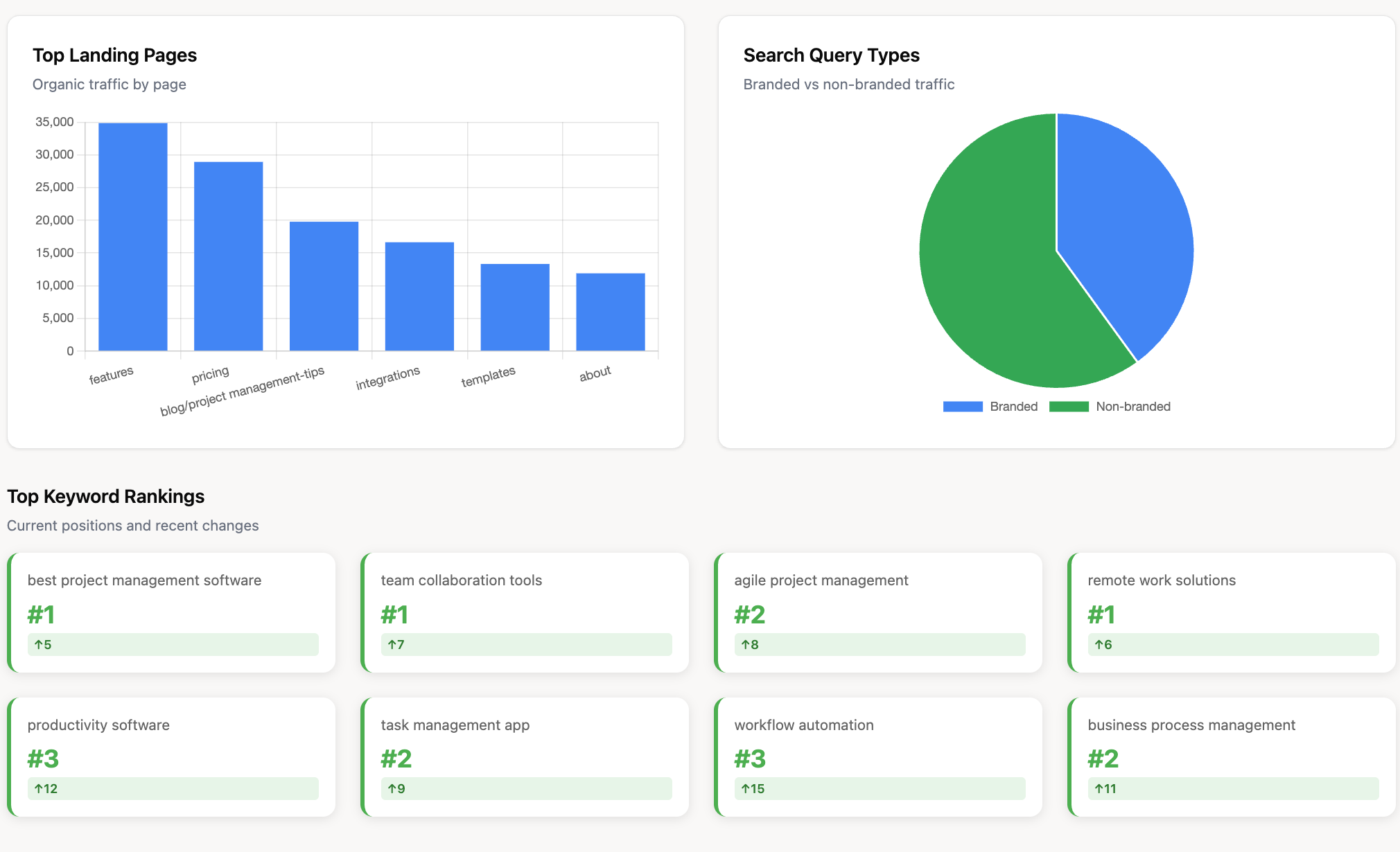
For example, a set of well-designed SEO dashboards can immediately highlight the best-performing pages and content formats.
Mapping the Customer Journey
Understanding how customers interact with your brand across multiple touchpoints is a major challenge. Visualization techniques like Sankey diagrams can map these complex paths, showing how different channels contribute to conversion.
This is fundamental to effective marketing attribution, helping you assign proper credit to each touchpoint in the journey.
Analyzing Marketing ROI and Spend Allocation
One of the most critical questions for any CMO is, "Are we spending our budget effectively?"
Visualizations help answer this by clearly linking spend to outcomes. A bubble chart could plot campaigns by spend (bubble size), CPA (y-axis), and conversion volume (x-axis) to quickly identify the most efficient use of funds. This direct visual link is crucial for analyzing and proving marketing ROI.
Understanding Audience Segmentation
Data visualization can bring audience segments to life. A series of bar charts can compare the behaviors of different demographic groups, while a treemap can show the relative size and value of each customer segment. This helps marketers tailor messaging and target their efforts more effectively.
Best Practices for Effective Data Visualization
Creating a visualization that is both beautiful and effective requires adherence to some key principles. These best practices ensure your message is clear, accurate, and impactful.
- Keep it Simple and Clear: Avoid "chart junk," the unnecessary visual elements like 3D effects, excessive gridlines, or decorative fonts that don't add informational value. The focus should always be on the data.
- Use Color and Contrast Thoughtfully: Use color to highlight important information or distinguish between categories. Be mindful of colorblindness and ensure sufficient contrast. Avoid using too many colors, which can be overwhelming.
- Provide Context and Labels: A chart without labels is just a picture. Always include a clear title, labeled axes, and a legend if necessary. Add annotations to point out key events or insights.
- Ensure Accessibility: Design visualizations that can be understood by as many people as possible. This includes using clear fonts, providing text alternatives for key insights, and choosing color palettes that are accessible to those with color vision deficiencies.
- Tell a Story with Your Data: The best visualizations guide the viewer through a narrative. Structure your charts and dashboards to answer a specific question, starting with a high-level overview and allowing users to drill down for more detail.
The Foundation of Great Visuals: Data Preparation and Integrity
You can master every visualization technique in the world, but if your source data is messy, inconsistent, or inaccurate, your visuals will be misleading. A solid data foundation is the most critical and often overlooked part of the process.
The Importance of Data Cleansing and Validation
Data preparation involves cleaning and structuring your raw data to make it suitable for analysis. This includes:
- Handling missing values: Deciding whether to remove or impute missing data points.
- Correcting inaccuracies: Identifying and fixing typos or structural errors.
- Removing duplicates: Ensuring each record is unique to avoid skewed results.
- Standardizing formats: Making sure dates, names, and categories are consistent across all data sources.
Automating Your Marketing Data Pipeline
Manually preparing data is time-consuming and prone to human error. Utilizing an automated marketing data pipeline is essential for any serious analytics effort. This pipeline automatically collects data from various sources, transforms it into a clean, analysis-ready format, and loads it into a central repository.
Improvado provides the data integrity and automation layer that makes accurate visualization possible.
It connects to 1,000+ marketing, sales, and analytics platforms, automatically extracting, cleaning, and standardizing data before it ever reaches your BI or visualization tools. With built-in validation, deduplication, and governance workflows, Improvado ensures that every chart, dashboard, and report is built on consistent, trustworthy data.
With Improvado, you can:
- Automate data extraction and transformation from 1,000+ marketing and revenue sources.
- Apply data normalization and mapping rules to standardize metrics across platforms.
- Enforce governance and naming conventions to maintain consistency across teams and tools.
- Perform real-time validation and anomaly detection to prevent inaccuracies in dashboards.
- Deliver clean, analysis-ready datasets directly into data warehouses or BI environments.
- Maintain complete data lineage and transparency, ensuring every visualization can be trusted.
- Use pre-built dashboard templates for Tableau, Power BI and Looker Studio to kickstart data visualization.
By automating data preparation and enforcing accuracy at scale, Improvado gives teams the confidence that every visualization reflects the truth.