
Defining key performance indicators (KPIs) is only the starting point. The real challenge lies in interpreting those metrics correctly and tracking progress in a way that reveals what’s driving or hindering performance.
A well-structured KPI dashboard brings all critical metrics into one view. It aligns teams around shared goals, exposes trends early, and enables faster, evidence-based decisions. Without it, organizations risk drowning in disconnected reports and missing the signals that matter most.
This guide explains what KPI dashboards are, explores the benefits of using them, provides KPI dashboard examples across industries, and shares best practices for creating effective dashboards that drive measurable business outcomes.
Key Takeaways:
- KPI Dashboard definition: Visual analytics interface that displays key performance indicators from multiple data sources in real-time, enabling data-driven decision-making and performance monitoring.
- Core benefits: Real-time visibility into business performance, faster decision-making, improved team alignment around strategic goals, proactive issue identification, and enhanced accountability across the organization.
- Dashboard types: Operational dashboards (day-to-day metrics), analytical dashboards (trend analysis), tactical dashboards (departmental KPIs), and strategic dashboards (executive-level goals).
- Essential features: Real-time data updates, customizable visualizations (charts, graphs, gauges), drill-down capabilities, mobile accessibility, data source integration, and role-based access controls.
- Best for: Business professionals tracking performance metrics, executives monitoring strategic goals, data analysts visualizing trends, sales teams measuring targets, marketing teams tracking campaign ROI, and operations managers optimizing processes.
Quick answer
A KPI dashboard is a centralized business intelligence tool that visualizes the most important metrics tracking progress toward organizational objectives. It combines data aggregation, transformation, and visualization to present complex performance data in intuitive, actionable formats that stakeholders can understand at a glance, enabling real-time monitoring and data-driven decision-making.
What Is a KPI Dashboard?
At its core, a KPI dashboard answers critical business questions:
- Are we meeting our performance targets and strategic goals?
- Which metrics are trending positively or negatively?
- Where should we focus resources and attention?
- How do different departments, products, or campaigns compare?
- What issues require immediate intervention?
Additionally, by consolidating data aggregation and visualization capabilities, dashboards eliminate the manual effort of pulling reports from multiple systems, copying data into spreadsheets, and creating static charts that become outdated minutes after creation.
KPI Dashboard vs Reports vs Scorecards
KPI dashboards, reports, and scorecards each serve a distinct analytical purpose. While they all track performance, they differ in timing, audience, and depth of insight.
The table below compares these tools across key dimensions, helping you determine when to monitor in real time, when to analyze historical data, and when to evaluate progress against strategic goals.
| Aspect | KPI Dashboard | Report | Scorecard |
|---|---|---|---|
| Update Frequency | Real-time or near-real-time | Periodic (daily, weekly, monthly) | Periodic (often quarterly) |
| Format | Visual (charts, graphs, gauges) | Tables, text, some visuals | Tables with targets vs actuals |
| Purpose | Monitor current performance | Document historical performance | Track progress toward strategic goals |
| Interactivity | Highly interactive (filters, drill-downs) | Static or limited interactivity | Minimal interactivity |
| Audience | Executives, managers, teams | Analysts, compliance, stakeholders | Executives, board members |
| Time Focus | Current performance (now) | Historical analysis (past) | Goal achievement (future-oriented) |
Types of KPI Dashboards
Different business needs require different dashboard approaches. Understanding dashboard types helps organizations select the right format and metrics for specific use cases.
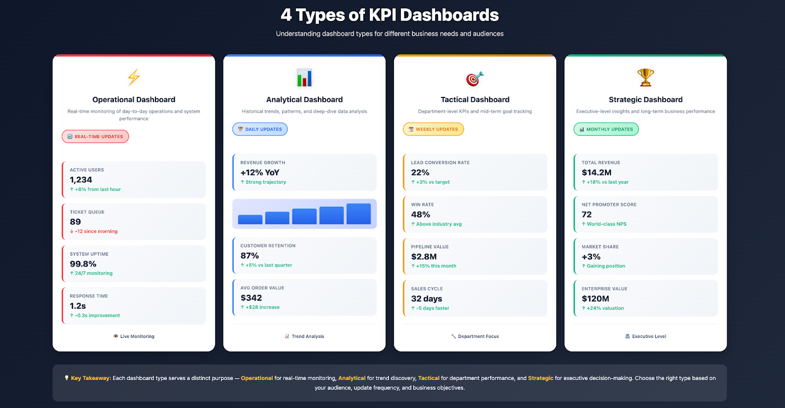
1. Operational Dashboards
Operational dashboards monitor day-to-day business activities and processes, providing real-time visibility into current operations. These dashboards update frequently (often every few minutes) and focus on metrics requiring immediate attention or quick response.
Typical metrics tracked:
- Website traffic and active users (right now)
- Sales pipeline activity and daily revenue
- Customer service ticket volume and response times
- Inventory levels and fulfillment status
- System uptime and performance monitoring
- Manufacturing throughput and quality metrics
Best for: Operations managers, customer service teams, sales teams, IT teams monitoring systems.
2. Analytical Dashboards
Analytical dashboards focus on trend analysis, pattern identification, and deeper insights into historical performance. These dashboards typically update less frequently (daily or weekly) and emphasize comparative analysis, correlation discovery, and root cause investigation.
Typical features:
- Trend lines showing performance over time
- Comparative analysis (period-over-period, segment comparisons)
- Drill-down capabilities for deeper investigation
- Statistical analysis and forecasting
- Correlation identification between metrics
Best for: Data analysts, marketing analysts, financial planners, business intelligence teams.
3. Tactical Dashboards
Tactical dashboards serve department or function-level teams tracking progress toward medium-term objectives (monthly or quarterly goals). These dashboards bridge the gap between operational (day-to-day) and strategic (long-term) monitoring.
Common examples:
- Sales dashboard: Pipeline health, quota attainment, win rates, sales cycle length
- Marketing dashboard: Campaign performance, lead generation, conversion rates, marketing ROI
- Customer success dashboard: Retention rates, customer satisfaction (NPS), churn risk, expansion revenue
- Finance dashboard: Cash flow, accounts receivable aging, budget vs actual, financial health indicators
Best for: Department managers, team leaders, function heads.
4. Strategic Dashboards
Strategic dashboards provide executive-level visibility into organizational performance against long-term strategic goals. These high-level dashboards typically update weekly or monthly and emphasize company-wide KPIs aligned with strategic priorities.
Typical metrics:
- Revenue growth and profitability
- Market share and competitive position
- Customer lifetime value and acquisition cost
- Employee engagement and retention
- Strategic initiative progress
- Overall business health indicators
Best for: C-suite executives, board members, senior leadership teams.
Benefits of Using KPI Dashboards
Organizations implementing effective KPI dashboards realize transformative benefits across decision-making, performance management, and operational efficiency.
Real-Time Visibility into Business Performance
Traditional reporting creates lag between events and awareness, monthly reports arrive weeks after month-end, leaving decision-makers operating on outdated information. Real-time KPI dashboards eliminate this delay, providing up-to-the-second visibility into business performance that enables timely intervention when metrics trend unfavorably or opportunities emerge.
For operations teams, real-time dashboards mean instantly identifying bottlenecks, quality issues, or capacity constraints before they cascade into larger problems. For sales teams, live pipeline visibility enables proactive deal management and accurate forecasting. For executives, current performance data supports strategic adjustments based on market realities rather than historical assumptions.
Faster, Data-Driven Decision-Making
When key metrics are readily accessible through intuitive visualizations, decision-making shifts from intuition-based to data-driven. Dashboard visualizations make patterns, outliers, and trends immediately apparent, trends that might remain hidden in spreadsheet tables or raw data exports.
This accelerates decision velocity. Instead of waiting days for analyst teams to pull reports, clean data, and create presentations, stakeholders access insights instantly through self-service dashboards. Teams spend less time gathering data and more time analyzing it, discussing implications, and taking action.
Proactive Issue Identification and Response
Static monthly reports reveal problems weeks after they began; KPI dashboards with real-time updates surface issues as they emerge. Automated alerts can notify responsible teams when metrics cross critical thresholds – customer service response times exceeding targets, website conversion rates dropping below benchmarks, inventory levels falling toward stockouts.
This proactive monitoring enables preventive action rather than reactive damage control. Teams address small deviations before they become crisis situations, maintaining performance consistency and avoiding costly corrections.
Improved Team Alignment Around Strategic Goals
Dashboards create transparency around organizational priorities and performance. When team members across departments see the same metrics tracking progress toward shared strategic goals, it reinforces focus, accountability, and collaborative problem-solving.
Marketing teams align campaigns with sales pipeline needs visible in shared dashboards. Product teams prioritize features based on customer satisfaction metrics displayed company-wide. Finance teams collaborate with operations when dashboard metrics reveal cost overruns or revenue shortfalls. This organizational alignment compounds effectiveness far beyond individual function optimization.
Enhanced Accountability and Performance Culture
Visible metrics create accountability. When performance is transparent through dashboards accessible to leadership and peers, it motivates teams to meet targets and maintain standards. Healthy performance cultures emerge when success is celebrated based on objective data and improvement opportunities are identified through clear metrics rather than subjective impressions.
Dashboards also enable fair recognition: top performers are identified based on dashboard data, and struggling team members receive targeted coaching grounded in specific performance gaps rather than vague criticism.

Reduced Manual Reporting Effort
Before implementing dashboards, many organizations dedicate significant analyst time to manual reporting: pulling data from multiple systems, cleaning and consolidating it in spreadsheets, creating charts, formatting presentations, and distributing reports. This process repeats weekly or monthly, consuming resources that could focus on analysis and insights.
Automated KPI dashboards eliminate most of this manual effort. Once configured, dashboards refresh automatically as data updates, delivering current insights without ongoing manual intervention. This frees analysts to focus on deeper investigation, hypothesis testing, and strategic recommendations rather than data wrangling.
How to Create a KPI Dashboard
Building effective KPI dashboards requires thoughtful planning, stakeholder input, and iterative refinement. Follow these proven steps to create dashboards that drive business value.
Step 1: Define Clear Objectives and Audience
Before selecting metrics or tools, clarify what the dashboard should accomplish and who will use it. Different audiences need different information:
- Executive dashboard objective: Monitor overall business health and strategic goal progress (audience: C-suite, board)
- Sales dashboard objective: Track pipeline health and quota attainment (audience: sales reps, managers, VP Sales)
- Marketing dashboard objective: Measure campaign performance and lead generation (audience: marketing team, CMO)
- Operations dashboard objective: Monitor production efficiency and quality (audience: operations managers, plant supervisors)
Clear objectives prevent "dashboard bloat" – cramming too many metrics into a single view until insights are obscured by information overload.
Step 2: Identify Relevant Key Performance Indicators (KPIs)
Select key performance indicators that directly measure progress toward dashboard objectives. Effective KPIs share common characteristics:
- Actionable: The metric should inform specific decisions or actions
- Measurable: Can be quantified objectively from available data
- Relevant: Directly connects to business objectives
- Timely: Updates frequently enough to enable timely decisions
- Understandable: Audience comprehends what the metric means and why it matters
Limit dashboards to 5-15 KPIs to maintain focus.
Too many metrics create cognitive overload; too few provide insufficient context. The exact number depends on dashboard type: operational dashboards may track more real-time metrics, while strategic dashboards typically focus on fewer high-level indicators.
What Are Good KPI Examples?
Effective KPIs vary by business function, but common examples include:
Sales KPIs:
- Monthly recurring revenue (MRR) and growth rate
- Sales qualified leads (SQLs) generated
- Average deal size and sales cycle length
- Win rate (deals won / total opportunities)
- Quota attainment percentage by rep and team
- Customer acquisition cost (CAC)
Marketing KPIs:
- Marketing qualified leads (MQLs) generated
- Conversion rate (MQL to SQL)
- Cost per lead by channel
- Marketing ROI and return on ad spend (ROAS)
- Website traffic and engagement metrics
- Email open rates and click-through rates
Customer Success KPIs:
- Customer retention rate and churn rate
- Net Promoter Score (NPS)
- Customer lifetime value (CLV)
- Monthly active users (MAU)
- Support ticket resolution time
- Product adoption and feature usage rates
Finance KPIs:
- Revenue and profit margins
- Operating cash flow
- Burn rate and runway (for startups)
- Accounts receivable days outstanding
- Budget variance (actual vs planned)
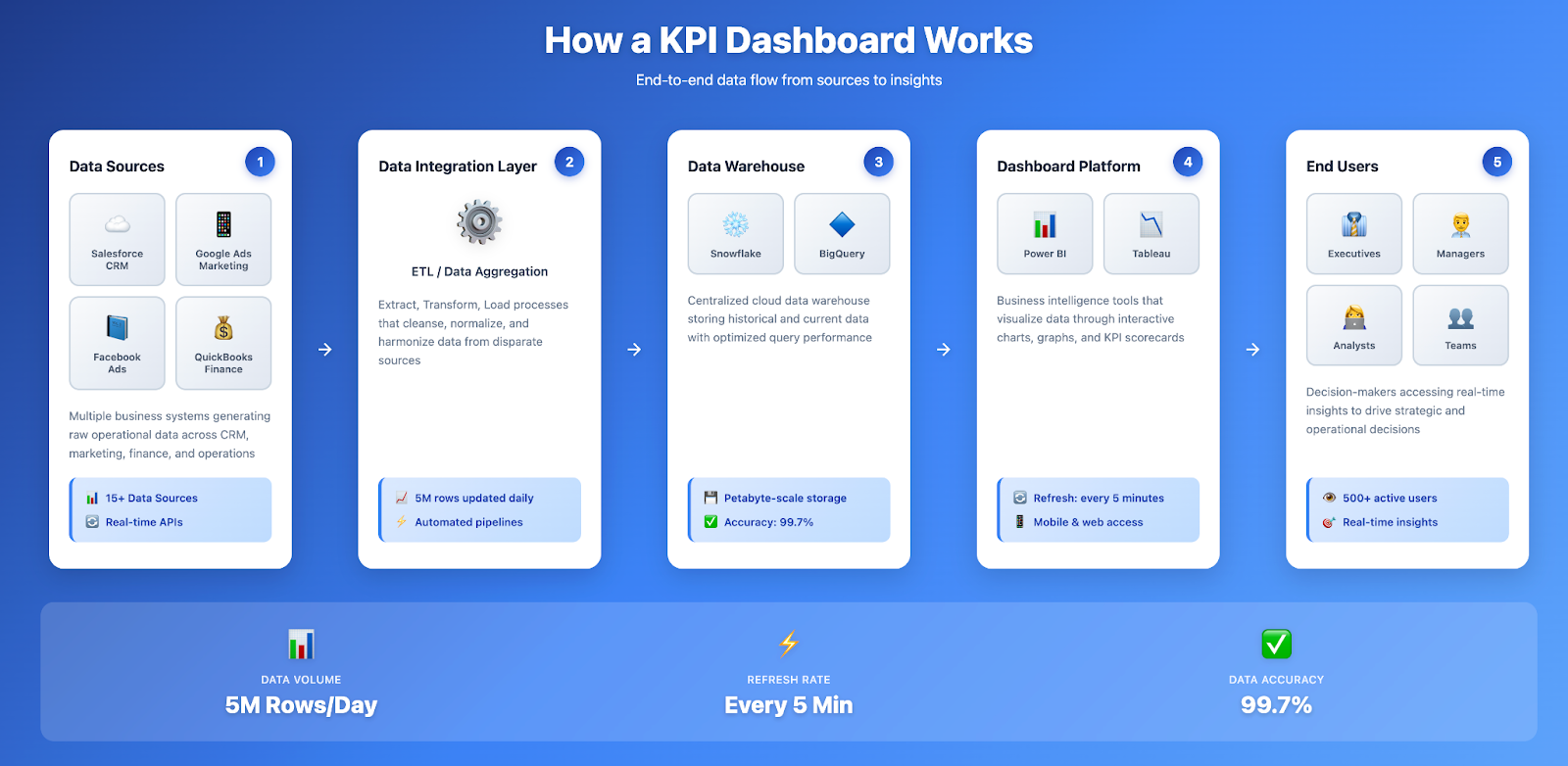
Step 3: Connect Data Sources
Identify where KPI data resides and establish integration to pull it into your dashboard platform. Data sources typically include:
- CRM systems (Salesforce, HubSpot, Microsoft Dynamics)
- Marketing platforms (Google Ads, Facebook Ads, email marketing tools)
- Analytics tools (Google Analytics, Adobe Analytics)
- Financial systems (QuickBooks, NetSuite, ERP platforms)
- Customer support platforms (Zendesk, Intercom, Freshdesk)
- Product analytics (Mixpanel, Amplitude, Heap)
- Data warehouses (Snowflake, BigQuery, Redshift)
Step 4: Design Dashboard Layout and Visualizations
Effective KPI dashboard design follows visual hierarchy principles that guide viewer attention to the most important information:
Layout best practices:
- Top-left positioning: Place the most critical KPI in the top-left corner (where eyes naturally start)
- Visual grouping: Cluster related metrics together (all sales KPIs in one section, marketing KPIs in another)
- Size and color: Make important metrics larger and use color to indicate status (green = on track, yellow = warning, red = alert)
- White space: Avoid cramming too much information; white space improves readability
- Consistent formatting: Use consistent date ranges, units, and visualization types to reduce cognitive load
Choosing the right chart types:
- Gauges and scorecards: Single-value KPIs showing current status against target
- Line graphs: Trends over time (revenue growth, website traffic patterns)
- Bar charts: Comparisons across categories (sales by region, leads by source)
- Pie charts: Part-to-whole relationships (market share, budget allocation) - use sparingly
- Tables: Detailed breakdowns when precision matters more than visual pattern recognition
- Heatmaps: Performance across two dimensions (salesperson performance by product line)
Select visualization types that make patterns and insights immediately obvious. The best data visualizations communicate key information in seconds without requiring viewer interpretation.
Step 5: Implement Role-Based Access and Permissions
Different users need access to different metrics. Implement role-based access controls ensuring:
- Executives see company-wide strategic metrics
- Department heads view their functional area dashboards
- Individual contributors see relevant team and personal performance metrics
- External stakeholders (board members, investors) access appropriate high-level summaries
This prevents information overload, protects sensitive data, and ensures each viewer sees dashboards tailored to their responsibilities.
Step 6: Test, Iterate, and Refine
Launch dashboards in beta mode with a subset of users. Gather feedback on:
- Are the metrics useful for decision-making?
- Is the layout intuitive or confusing?
- Are visualizations clearly understood?
- Are any critical metrics missing?
- Is the data accurate and updating correctly?
Iterate based on feedback. Dashboard development is not a one-time project – effective dashboards evolve as business priorities change, new data sources become available, and users discover which metrics drive the most value.
KPI Dashboard Examples by Industry and Function
Understanding how different teams and industries use KPI dashboards illustrates practical applications and inspires dashboard design.
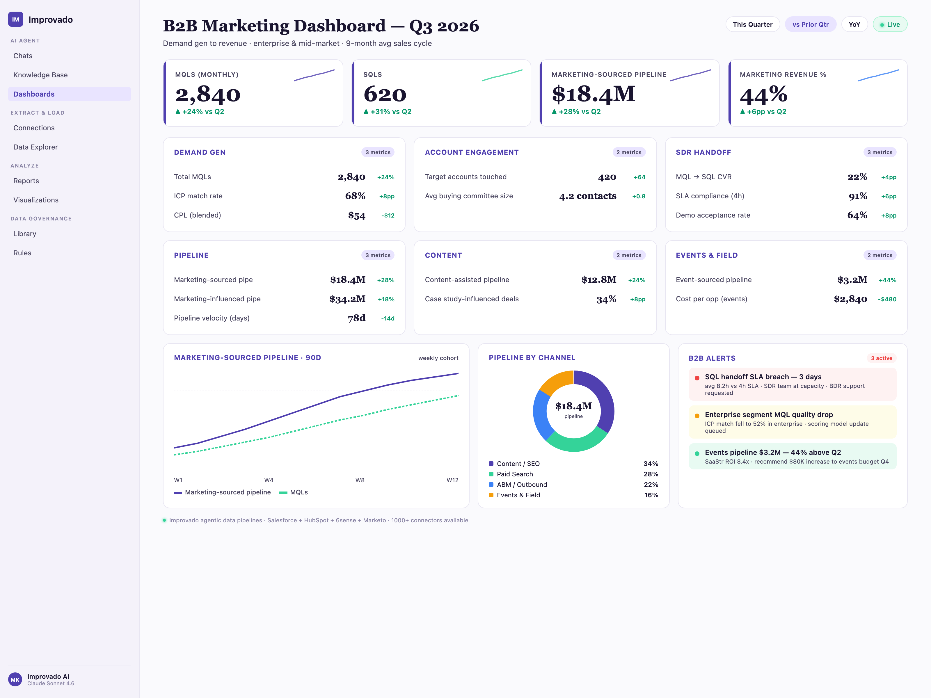
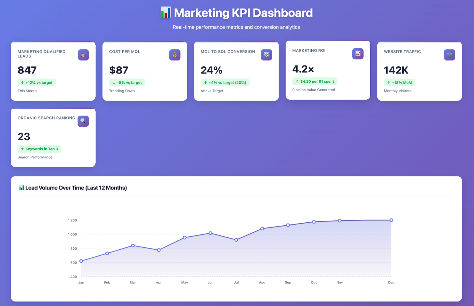
Marketing KPI Dashboard Example
Audience: Marketing team, CMO, sales leadership
Primary KPIs tracked:
- Marketing qualified leads (MQLs): 847 this month (+12% vs target)
- Cost per MQL: $87 (-8% vs target, trending down)
- MQL to SQL conversion rate: 24% (target: 20%)
- Marketing ROI: 4.2x (every $1 spent generates $4.20 in pipeline value)
- Website traffic: 142K visitors (+18% MoM)
- Organic search ranking: 23 keywords in top 3 positions
Visualizations: Trend lines showing lead volume over time, bar chart comparing channel performance (organic, paid, email, social), funnel chart showing conversion from visitor → MQL → SQL → customer.
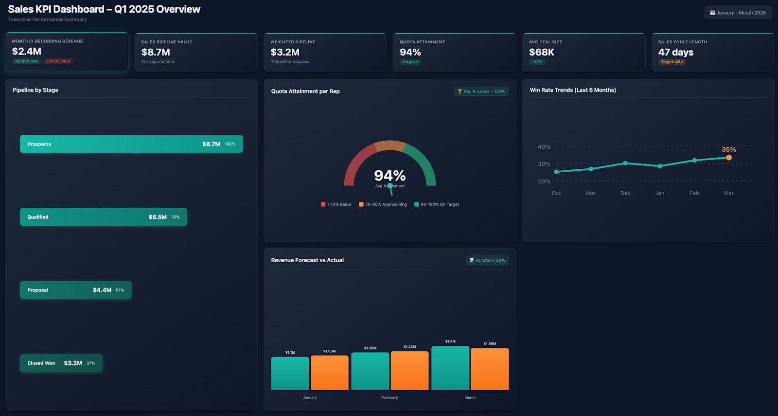
Sales KPI Dashboard Example
Audience: Sales team, sales managers, VP Sales, revenue operations
Primary KPIs tracked:
- Monthly recurring revenue (MRR): $2.4M (+$180K new, -$42K churn)
- Sales pipeline value: $8.7M across 127 active opportunities
- Weighted pipeline (probability-adjusted): $3.2M
- Quota attainment: 94% of team on pace to hit quarterly quota
- Average deal size: $68K (+15% vs last quarter)
- Sales cycle length: 47 days (target: 45 days)
Visualizations: Pipeline funnel by stage, quota attainment gauge per rep, win rate trends, revenue forecast vs actual.
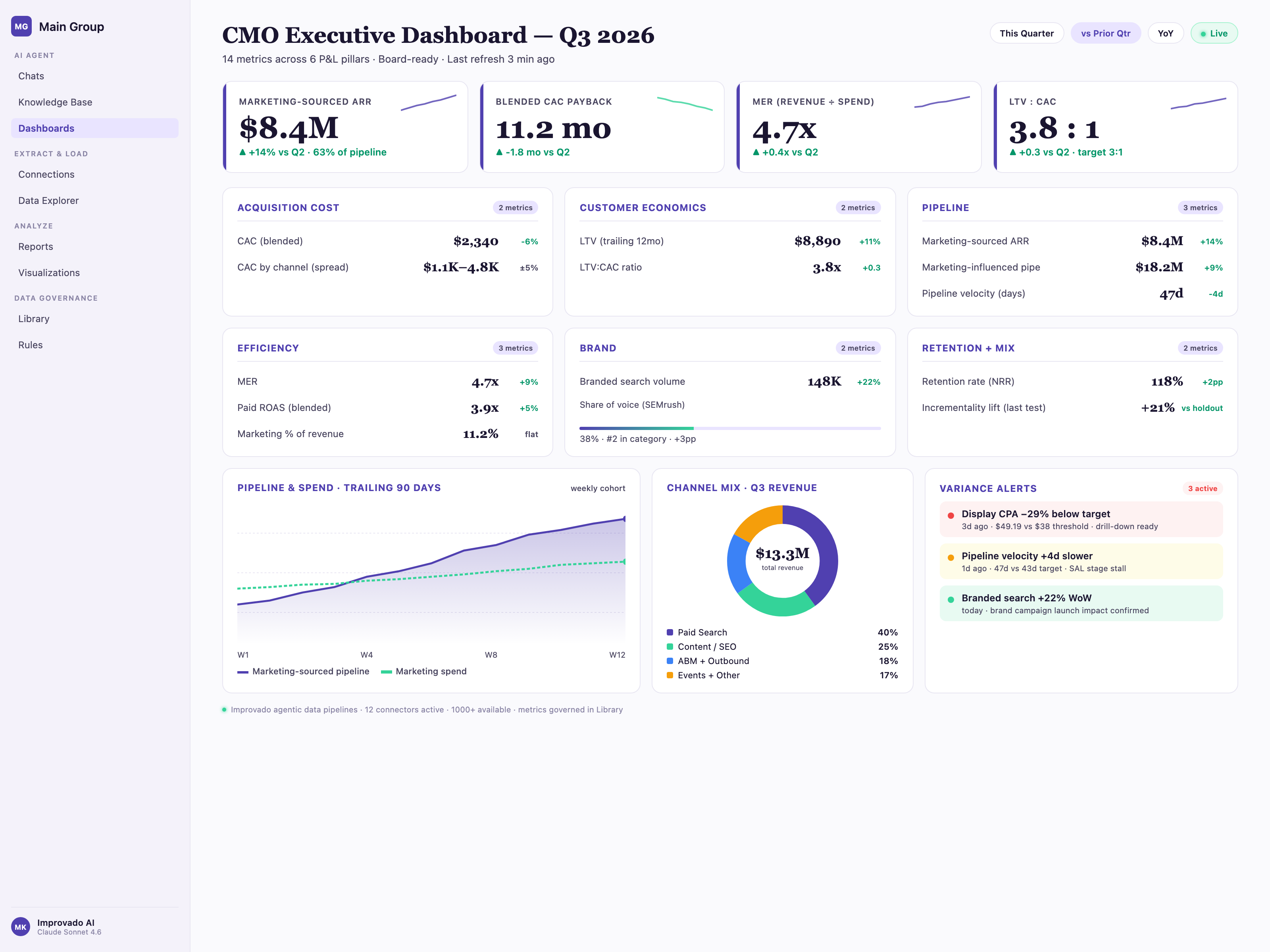
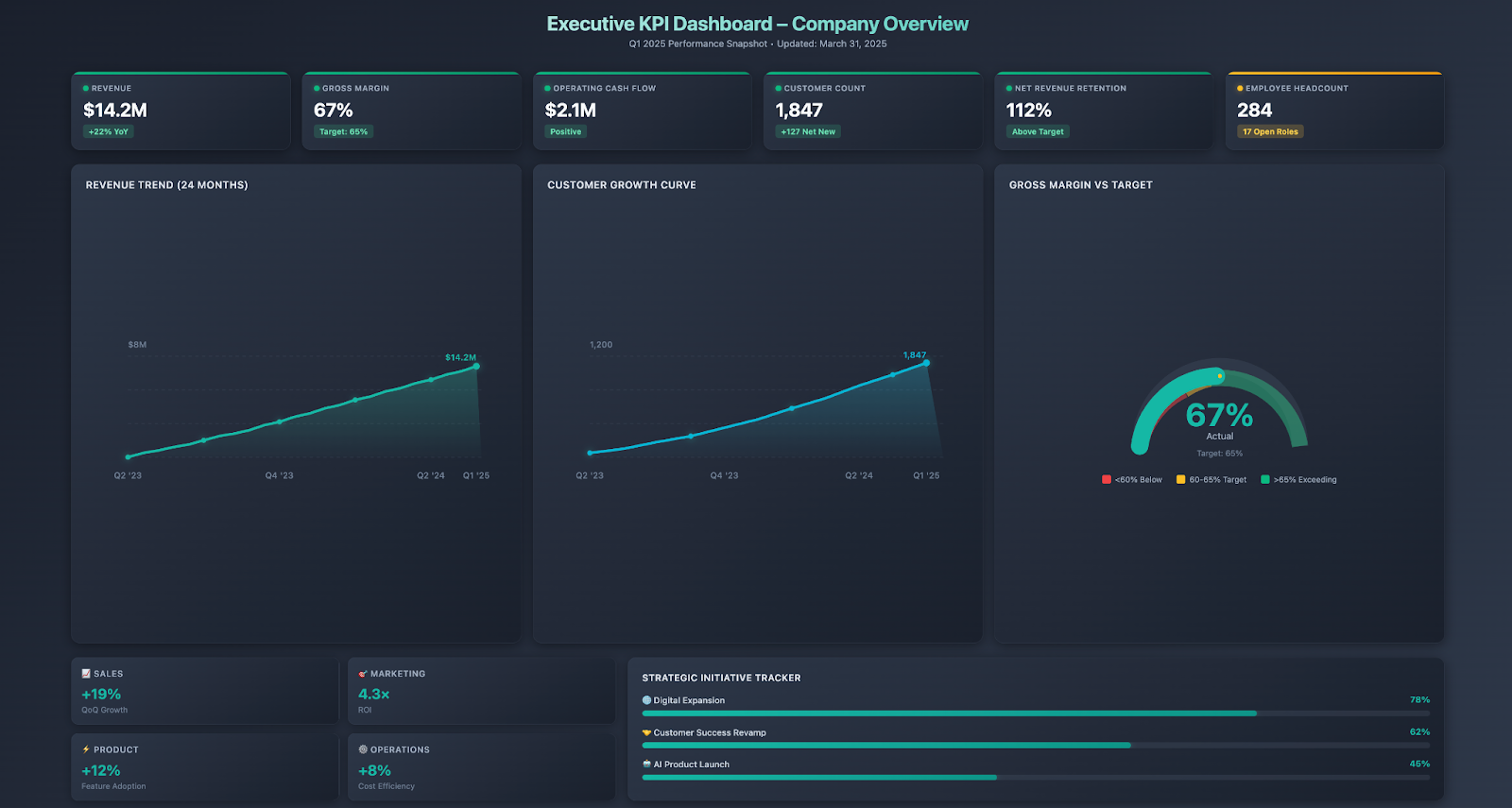
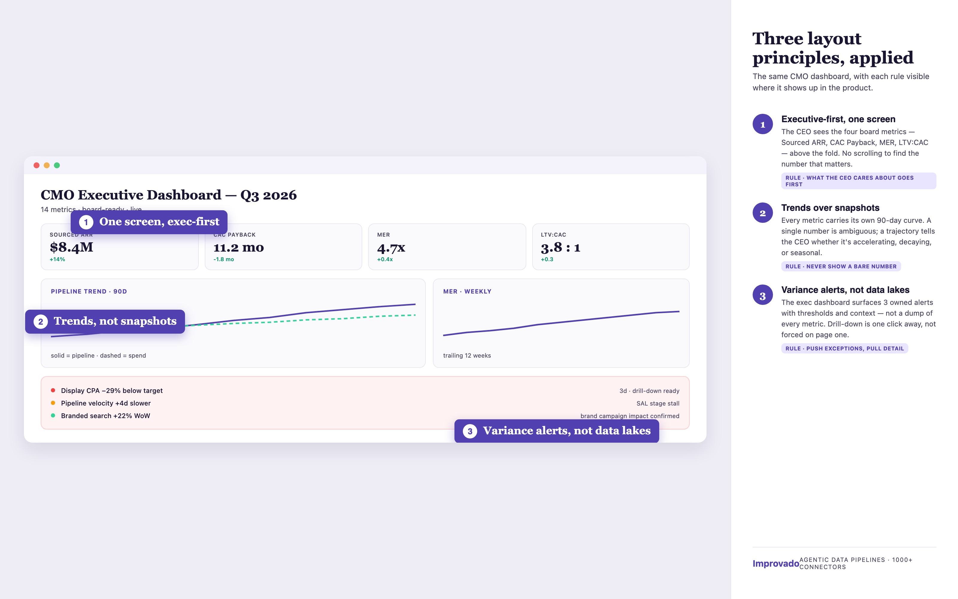
Executive/CEO KPI Dashboard Example
Audience: CEO, CFO, board of directors
Primary KPIs tracked:
- Revenue: $14.2M this quarter (+22% YoY)
- Gross margin: 67% (target: 65%)
- Operating cash flow: $2.1M positive
- Customer count: 1,847 (+127 net new this quarter)
- Net revenue retention: 112% (expansion revenue exceeds churn)
- Employee headcount: 284 (17 open positions)
Visualizations: Revenue trend over 24 months, customer growth curve, department-level performance scorecards, strategic initiative progress indicators.
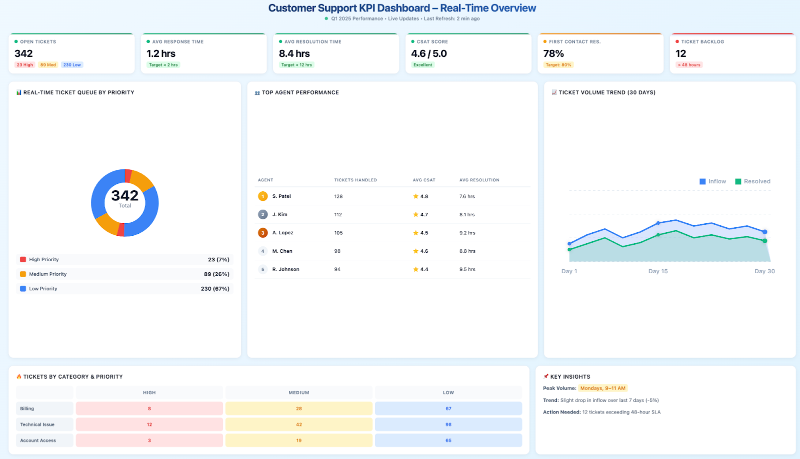
Customer Support KPI Dashboard Example
Audience: Support agents, support managers, customer success leadership
Primary KPIs tracked:
- Open tickets: 342 (23 high priority, 89 medium, 230 low)
- Average response time: 1.2 hours (target: < 2 hours)
- Average resolution time: 8.4 hours (target: < 12 hours)
- Customer satisfaction (CSAT): 4.6/5.0
- First contact resolution rate: 78% (target: 80%)
- Ticket backlog: 12 tickets > 48 hours old
Visualizations: Real-time ticket queue showing priorities, agent performance table (tickets handled, CSAT scores), trend showing ticket volume by category over time.
KPI Dashboard Best Practices
Organizations achieving the greatest value from KPI dashboards consistently apply these proven practices:
Focus on Actionable Metrics, Not Vanity Metrics
Vanity metrics look impressive but don't inform decisions: total website visitors without context about conversion rates, social media follower counts without engagement metrics, total revenue without profitability or customer acquisition cost analysis.
Actionable metrics directly connect to business decisions: conversion rate informs optimization priorities, customer acquisition cost relative to lifetime value determines sustainable growth economics, net promoter score predicts retention and expansion opportunities.
Review each dashboard metric and ask: "If this metric changes, what specific action would we take?" If there's no clear answer, consider replacing it with a more actionable indicator.
Establish Clear Targets and Benchmarks
Metrics without context are difficult to interpret. Is a 3.2% website conversion rate good or bad? It depends on industry benchmarks, historical performance, and strategic targets.
Enhance dashboard KPIs with:
- Targets: Goals the organization aims to achieve (quota, budget targets, strategic objectives)
- Historical comparison: Performance vs same period last year, last quarter, or previous month
- Industry benchmarks: How performance compares to competitors or industry averages
- Visual indicators: Color coding (green/yellow/red) showing whether metrics are on track, at risk, or missing targets
These reference points transform raw numbers into meaningful insights about performance quality.
Keep Dashboards Simple and Focused
The most common dashboard mistake is information overload, cramming dozens of metrics, multiple chart types, and excessive detail into a single view. Complex dashboards overwhelm viewers, obscure insights, and reduce adoption.
Effective dashboards follow the "5-second rule" — viewers should grasp the overall performance status within 5 seconds of seeing the dashboard. Reserve detailed analysis for drill-down views or separate analytical reports.
Design principles for simplicity:
- Limit to 5-15 KPIs per dashboard page
- Use consistent color schemes and chart types
- Eliminate decorative elements that don't convey information
- Group related metrics together visually
- Provide context (targets, trends) without cluttering the interface
Enable Mobile Access for On-the-Go Monitoring
Business leaders need access to critical metrics regardless of location. Mobile-responsive KPI dashboards enable performance monitoring from smartphones and tablets, whether executives are traveling, attending off-site meetings, or reviewing performance outside office hours.
Ensure mobile dashboards:
- Adapt layout for smaller screens (stacked views, simplified charts)
- Maintain fast load times on cellular connections
- Support touch interactions (tap to drill down, swipe to navigate)
- Deliver push notifications for critical alerts or threshold breaches
Automate Data Updates and Alerts
Manual dashboard updates defeat the purpose. If someone must export data, clean it, and upload it to dashboards, real-time visibility is lost and labor costs negate efficiency benefits.
Configure automated data pipelines that refresh dashboards on schedules matching business needs (real-time for operational dashboards, daily for tactical dashboards, weekly for strategic dashboards). Complement automated updates with threshold-based alerts notifying teams when metrics exceed acceptable ranges or reach critical milestones.
Regularly Review and Update Dashboard Metrics
Business priorities evolve, new strategic initiatives launch, market conditions change, organizational structures shift. Dashboard KPIs should reflect current priorities, not outdated objectives from when the dashboard was first created.
Schedule quarterly dashboard reviews asking:
- Are these still the most important metrics for current objectives?
- Are any metrics consistently ignored (suggesting low relevance)?
- Are new data sources available that could provide better insights?
- Have targets or benchmarks changed requiring dashboard updates?
- Are visualizations still effective or could improvements enhance clarity?
Maintain dashboard relevance through continuous refinement aligned with business evolution.
What Are the 4 P's of KPI?
The 4 P's of KPI framework helps organizations develop effective key performance indicators:
- Purpose: Why does this metric matter? What decision does it inform? Every KPI should have a clear purpose aligned with business objectives.
- People: Who is responsible for this metric? Who needs to see it? Assign ownership and define the audience for each KPI.
- Process: How is the metric measured? What data sources feed it? Document calculation methodology and data lineage for transparency.
- Performance: What constitutes good performance? Define targets, thresholds, and benchmarks distinguishing success from failure.
Applying the 4 P's ensures KPIs are well-designed, clearly understood, and effectively managed across the organization.
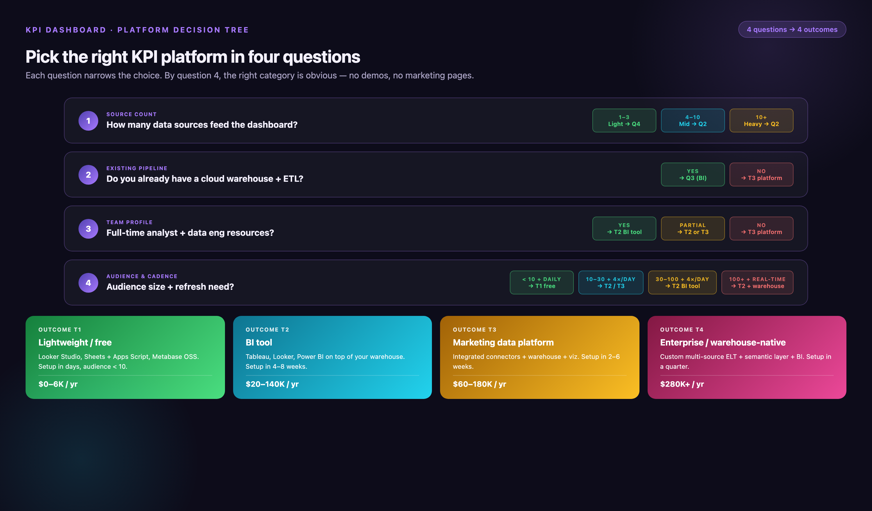
KPI Dashboard Tools and Platforms
Selecting the right platform significantly impacts dashboard effectiveness, adoption, and maintenance requirements. Leading KPI dashboard tools offer different strengths for various use cases.
Business Intelligence (BI) Platforms
Full-featured BI platforms provide comprehensive analytics capabilities including dashboard creation, ad-hoc reporting, and advanced analytics.
- Tableau: Industry-leading visualization capabilities with extensive chart types, strong community support, and enterprise scalability. Best for organizations prioritizing sophisticated visual analytics.
- Microsoft Power BI: Cost-effective option with deep Microsoft ecosystem integration (Office 365, Azure, Dynamics). Strong choice for Microsoft-centric organizations.
- Looker (Google Cloud): Cloud-native BI platform with semantic modeling layer ensuring consistent metrics across the organization. Ideal for companies using Google Cloud infrastructure.
- Qlik Sense: Associative analytics engine enabling flexible exploration beyond predefined dashboards. Suited for organizations emphasizing self-service analytics.
Marketing-Specific Dashboard Platforms
Marketing analytics platforms specialize in consolidating marketing data and creating marketing-specific dashboards.
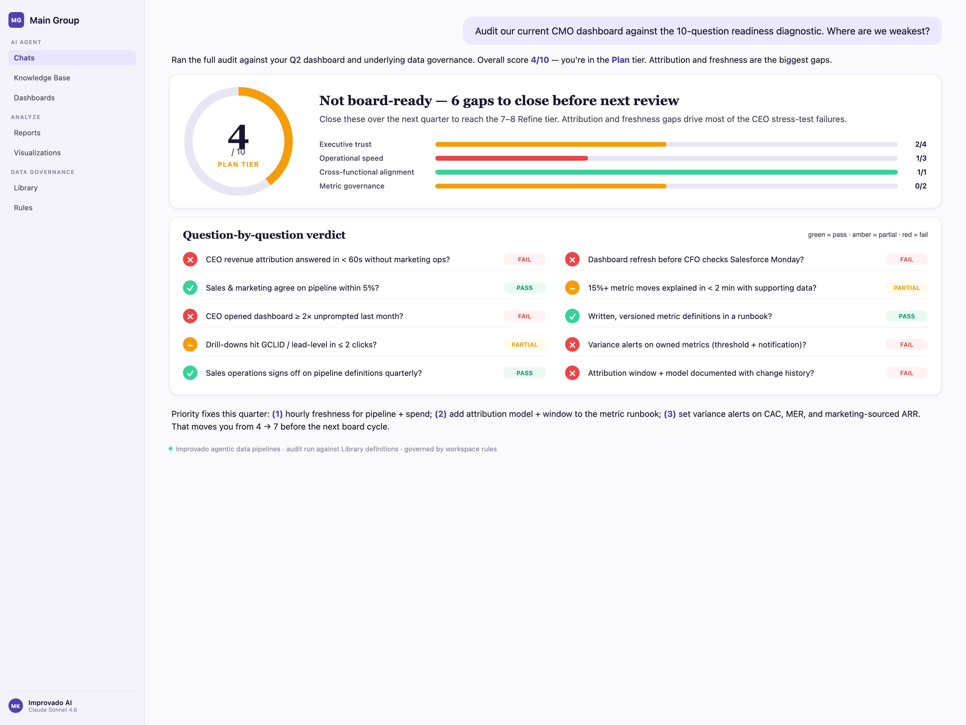
- Improvado: Marketing data aggregation platform with 1,000+ pre-built connectors to advertising, analytics, CRM, and marketing automation platforms. Automates data extraction, transformation, and loading into dashboards and data warehouses. Best for marketing teams needing comprehensive cross-channel analytics without engineering resources.
- Google Data Studio: Free dashboard tool with native Google integration (Analytics, Ads, Search Console). Good starting point for small teams primarily using Google marketing stack.
- Domo: Cloud-based BI platform with strong marketing use cases, pre-built connectors, and mobile-first design. Suited for organizations wanting an all-in-one analytics and dashboard platform.
Spreadsheet-Based Dashboards
For simple use cases or limited budgets, spreadsheet tools offer basic dashboard capabilities:
- Google Sheets: Create simple dashboards using formulas, pivot tables, and built-in charts. Good for small teams with straightforward reporting needs.
- Microsoft Excel: More advanced capabilities than Google Sheets including Power Query for data connections and Power Pivot for data modeling. Suitable for individual users or small teams comfortable with Excel.
Choosing the Right KPI Dashboard Platform
Consider these factors when selecting dashboard tools:
- Data source integration: Does the platform connect to your existing systems (CRM, marketing tools, databases)?
- Ease of use: Can intended users (often non-technical business users) build and modify dashboards without extensive training?
- Scalability: Will the platform handle growing data volumes and increasing user counts?
- Mobile capabilities: Does it provide responsive mobile access or dedicated mobile apps?
- Collaboration features: Can users share dashboards, add comments, and collaborate on insights?
- Pricing model: Per-user licensing, data volume-based, or flat-rate pricing? Which aligns with your budget and usage patterns?
- Customization: Can you tailor dashboards to specific branding, layout, and metric requirements?
Common KPI Dashboard Mistakes to Avoid
Learning from common pitfalls helps organizations implement more effective dashboards from the start.
Tracking Too Many Metrics
More metrics don't mean better insights. Dashboards with dozens of KPIs create cognitive overload, diffuse focus, and obscure the truly critical indicators. Teams spend time monitoring numerous metrics without taking action on any.
Solution: Ruthlessly prioritize. Identify the 5-10 metrics that most directly measure progress toward current objectives. Archive or eliminate the rest. Create separate dashboards for different purposes rather than cramming everything into one view.
Poor Data Quality and Accuracy
Dashboards displaying incorrect data are worse than no dashboards, they inspire confidence in false information, leading to misguided decisions. Common data quality issues include duplicate records, outdated information, incorrect calculations, or incomplete data extraction.
Solution: Implement data validation checks, reconcile dashboard metrics against source system reports regularly, document calculation logic, and establish data governance processes ensuring data accuracy. When users stop trusting dashboard data, dashboard adoption collapses.
Lack of Context or Benchmarks
Displaying metrics without targets, trends, or comparisons forces viewers to guess whether performance is good or bad. A metric showing "847 MQLs this month" provides no actionable information without knowing the target (850 MQLs), trend (up 12% from last month), or benchmark (20% above industry average).
Solution: Always include context: targets, historical trends, period-over-period comparisons, or benchmark ranges. Use visual indicators (color coding, progress bars, trend arrows) making status interpretation immediate.
Creating Dashboards No One Uses
Dashboard projects often fail due to low adoption. Teams build dashboards that look impressive in demonstrations but go unused in daily operations because they don't match user workflows, answer real questions, or justify the effort required to access them.
Solution: Involve end users from the start. Understand what questions they need answered, what decisions the dashboard should support, and how it fits their workflow. Build iteratively, gathering feedback and adjusting based on actual usage patterns. Promote adoption through training, embedding dashboards in regular meetings, and demonstrating value through success stories.
Insufficient Drill-Down Capabilities
High-level dashboards reveal what is happening but not why. When a metric trends unfavorably, users need the ability to drill into underlying details, which products, regions, campaigns, or customer segments drive the overall number.
Solution: Design dashboards with hierarchical drill-down allowing users to click summary metrics and explore contributing factors. For example, clicking overall revenue reveals breakdown by product line; clicking a product line shows regional performance; clicking a region displays individual deals.
The Future of KPI Dashboards
KPI dashboard technology continues evolving with emerging trends shaping next-generation capabilities:
AI-Powered Insights and Anomaly Detection
Artificial intelligence augments traditional dashboards with automated pattern recognition, anomaly detection, and predictive insights. Rather than requiring users to spot trends manually, AI algorithms surface unexpected changes, forecast future performance, and suggest explanatory factors for metric movements.
Natural Language Queries
Natural language processing (NLP) enables conversational dashboard interaction, users ask questions in plain English ("What was last quarter's marketing ROI?") and receive instant visualizations answering the query. This democratizes analytics access for non-technical users uncomfortable building complex reports.
Embedded Analytics and Contextual Dashboards
Instead of switching to separate dashboard applications, analytics embed directly into workflow tools where decisions happen, CRM systems, project management platforms, collaboration tools. Contextual dashboards surface relevant metrics at the point of decision rather than requiring users to seek them out.
Augmented Analytics
Machine learning automates insight discovery, root cause analysis, and recommendation generation. Dashboards evolve from passive reporting tools to active advisors suggesting actions based on metric patterns and historical outcomes.
Conclusion
As business environments grow increasingly complex and competitive advantage depends on decision speed, organizations that master KPI dashboard implementation gain sustainable edges. They identify opportunities faster, respond to threats more proactively, allocate resources more efficiently, and maintain organizational alignment more effectively than competitors operating on delayed, fragmented, or intuition-based information.
The technology enablers, data integration platforms, visualization tools, cloud infrastructure, have matured to the point where dashboard creation no longer requires extensive technical expertise or long implementation timelines. Modern solutions like Improvado's marketing analytics platform automate the complex data engineering work, allowing business teams to focus on insight generation and action rather than data wrangling.