%2520(1).png)
A marketing dashboard translates fragmented data from dozens of platforms—ad networks, CRMs, analytics tools, and data warehouses—into a unified view that drives immediate action. Platforms like Improvado connect to 500+ marketing and sales data sources, centralizing raw data before it reaches the dashboard layer, which means the metrics your team sees are already deduplicated, normalized, and attribution-ready. The difference between a dashboard that gets used daily and one that's abandoned within weeks comes down to design decisions made before a single chart is built.
This guide covers the complete dashboard design process—from stakeholder interviews to launch—with decision frameworks, failure case studies, and validation checklists. Whether you are working with a self-serve BI tool, an embedded analytics layer, or a dedicated marketing intelligence platform, the principles here apply across the full data visualization stack. You'll learn when to add interactivity (and when it hurts), how to choose between 12 dashboard types, which 7 design mistakes cause 80% of implementation failures, and how data governance decisions made upstream directly affect what your dashboard can reliably display.
When NOT to Build a Dashboard
Before investing in dashboard design, validate whether a dashboard is the right solution. Five scenarios indicate you need a different approach:
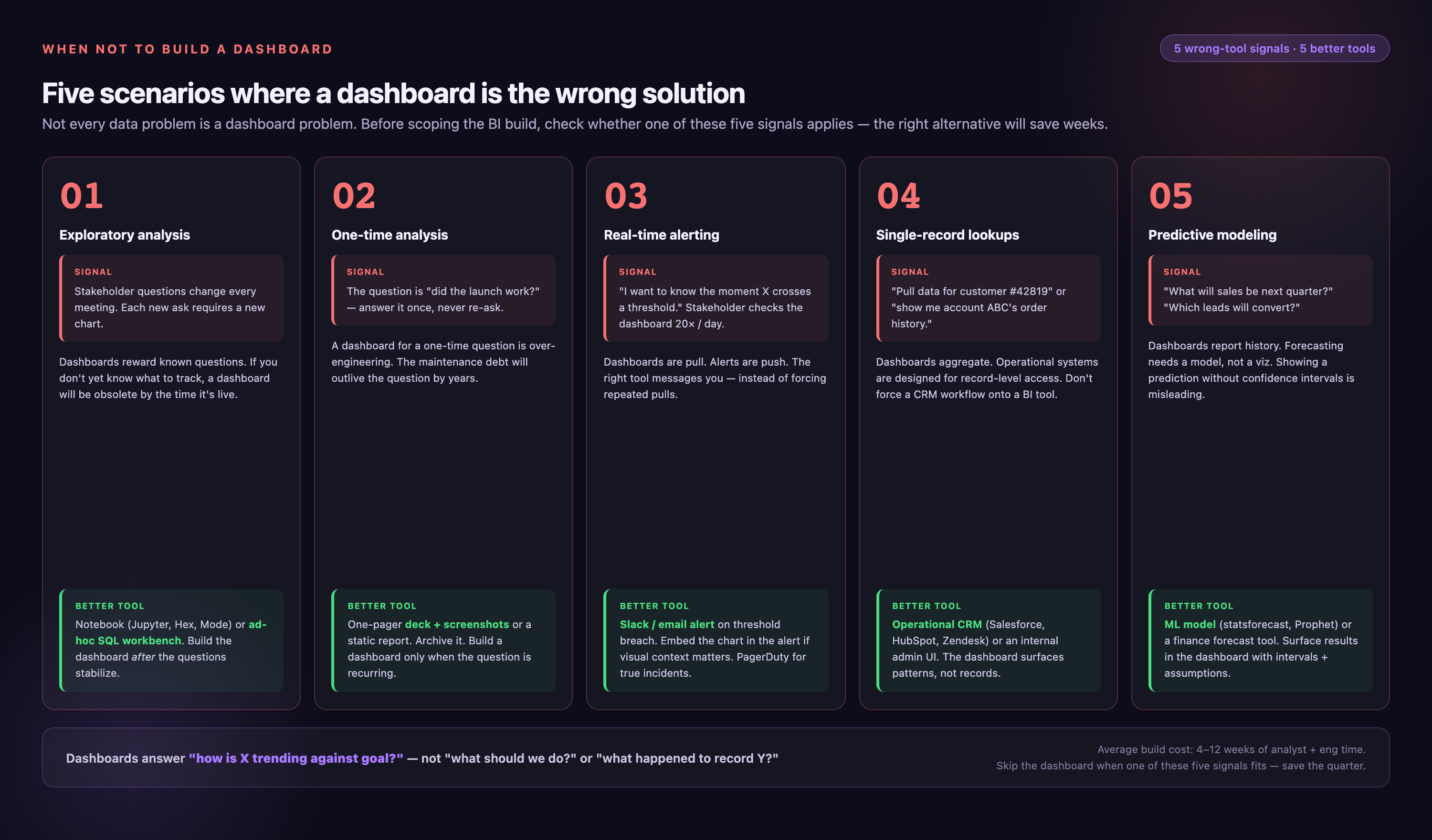
1. Exploratory Analysis Needs
If stakeholders are asking "what patterns exist in this data?" rather than "what is the current value of X metric?", they need ad-hoc analysis tools, not a dashboard. Dashboards answer known questions—they don't surface unknown insights. Alternative: Provide SQL access or Jupyter notebooks for data exploration.
2. Fewer Than 3 Regular Users
Dashboard development costs 40-120 hours for initial build plus 8-15 hours monthly maintenance. If only 1-2 people will view it, the ROI doesn't justify the investment. Alternative: Create a scheduled email report or shared spreadsheet.
3. Unstable or Changing Metrics
If your team is still defining what to measure, or metric definitions change monthly, a dashboard will require constant rebuilding. Dashboards work best when KPIs are stable for at least 6 months. Alternative: Use flexible reporting tools until metrics stabilize.
4. No Decision Authority
If dashboard viewers can't act on the insights (e.g., an analyst monitors campaign performance but can't adjust budgets), the dashboard creates frustration rather than value. Alternative: Route insights directly to decision-makers through alerts or briefings.
5. One-Time Questions
Building a dashboard to answer a single business question ("Why did revenue drop in Q3?") is engineering overkill. Alternative: Conduct a focused analysis and present findings in a slide deck or memo.

Dashboard Design Anti-Patterns: 7 Failures That Kill Adoption
Most dashboard failures follow predictable patterns. Here are the seven most common mistakes, with examples from real implementations:
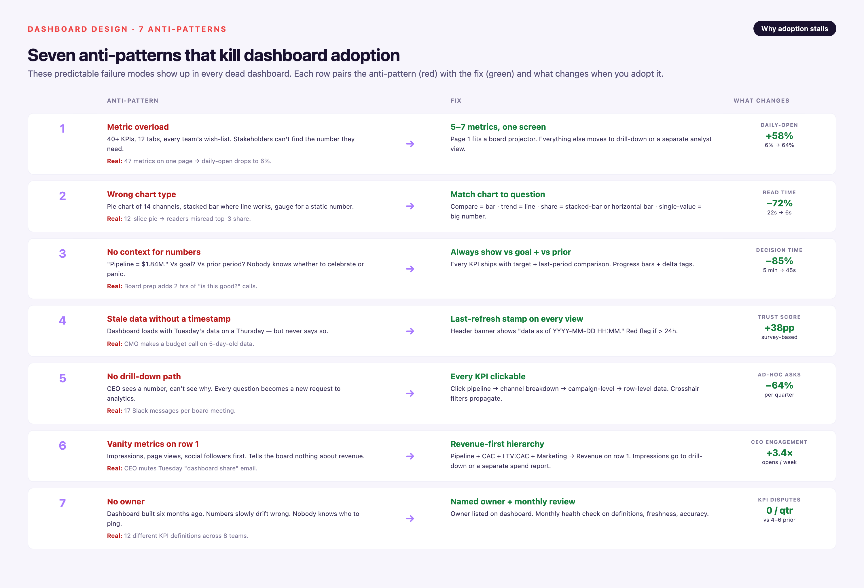
1. Metric Overload and Decision Paralysis
The Problem: A B2B SaaS company built an executive dashboard with 34 metrics covering website traffic, lead generation, pipeline, customer success, and product usage. Executives spent 15 minutes per session just scanning the screen, couldn't identify priority issues, and eventually stopped using it.
The Science: Working memory can process 5-9 elements simultaneously. Dashboards exceeding 12 KPIs show 40% lower engagement rates because users experience cognitive overload.
The Fix: Apply the 2×2 Priority Matrix: plot each metric on [Actionable: Yes/No] × [Frequently Needed: Yes/No]. Only the top-left quadrant (actionable + frequent) belongs on the main dashboard. Move low-priority metrics to drill-down views or separate reports.
2. Vanity Metrics Driving Wrong Decisions
The Problem: A marketing team prominently displayed total social media followers and website page views at the top of their dashboard. These metrics grew steadily, but pipeline revenue declined. The dashboard signaled success when the business was failing.
Why It Happens: Vanity metrics (totals, gross numbers, always-increasing counts) feel good but don't connect to business outcomes. Teams unconsciously optimize for what's measured prominently.
The Fix: Every metric must pass the "Decision Test"—what specific action will change based on this number? If the answer is vague ("we'll improve engagement"), remove it. Replace vanity metrics with actionable equivalents: followers → follower growth rate, page views → conversion rate by traffic source.
3. Missing Context Makes Data Meaningless
The Problem: A dashboard showed "Q3 Revenue: $2.4M" in large text. Stakeholders asked: Is that good? Up or down? On track? The number lacked any reference point.
Why It Fails: Isolated metrics don't inform decisions. A metric needs at least one comparison: to a goal, prior period, benchmark, or forecast.
The Fix: Add three layers of context: (1) Target indicator—show goal and progress percentage, (2) Trend sparkline—7-day or 4-week mini chart showing direction, (3) Variance annotation—"↑23% vs. last quarter" or "15% below plan." Context transforms data into insight.
4. Wrong Visual Hierarchy Buries Insights
The Problem: A sales dashboard placed year-over-year revenue growth (the CEO's #1 metric) in a small table in the bottom-right corner, while giving half the screen to a detailed lead source breakdown (relevant to one analyst).
The Science: Users follow F-pattern scanning (top-left → top-right → down left side). Information in the top-left gets 80% of attention; bottom-right gets <10%.
The Fix: Map metrics to zones: Top-left = primary KPI (biggest, boldest), Top-right = secondary KPIs (medium emphasis), Left column = trends over time, Right column = supporting breakdowns, Bottom = detailed tables. Reserve 40-50% of screen space for the single most important metric.
5. Chart Type Mismatch for Data Structure
The Problem: A marketing analyst used a pie chart to show monthly revenue trend over 12 months. Users couldn't see the growth pattern. Another team used a line chart to compare revenue across 8 unrelated product lines, making it impossible to rank products.
Why It Fails: Each chart type is optimized for specific data structures and user tasks. Mismatches force users to mentally translate the visualization.
The Fix: Use the Chart Selection Decision Tree (see next section). General rules: Time trends → line chart, Category comparison → horizontal bar chart, Part-to-whole → stacked bar or treemap (not pie for >5 slices), Correlation → scatter plot, Distribution → histogram.
6. Interactivity That Slows Down Insights
The Problem: A dashboard required users to select date range, then region, then product category through three dropdown menus before seeing any data. Daily users abandoned it for a static PDF report.
When Interactivity Hurts: Every click adds 3-5 seconds and increases cognitive load. For dashboards viewed daily with consistent questions, interactivity becomes friction.
The Fix: Apply these rules: (1) Add filters only when users need 3+ views of the same data, (2) Add drill-down only when <20% of users need detail—otherwise promote to top level, (3) Avoid interactivity for dashboards viewed <1×/week—users forget navigation between sessions, (4) Default to the most common view (e.g., "Last 30 Days, All Regions").
7. Unclear Objectives = Unfocused Design
The Problem: A "Marketing Performance Dashboard" tried to serve executives (who needed ROI summary), campaign managers (who needed channel optimization data), and analysts (who needed granular attribution). It satisfied no one.
Why Multi-Audience Dashboards Fail: Research shows 61% of users ignore features meant for other roles. Attempting to serve everyone creates cluttered layouts and conflicting information hierarchies.
The Fix: Design for one primary persona. If you have multiple audiences, build separate dashboards with shared data sources. Use a Stakeholder Matrix (see implementation section) to identify the primary user and their core question.
Key Concepts of Dashboard Design
Designing an effective dashboard requires understanding three foundational concepts: information hierarchy, data visualization selection, and strategic interactivity.
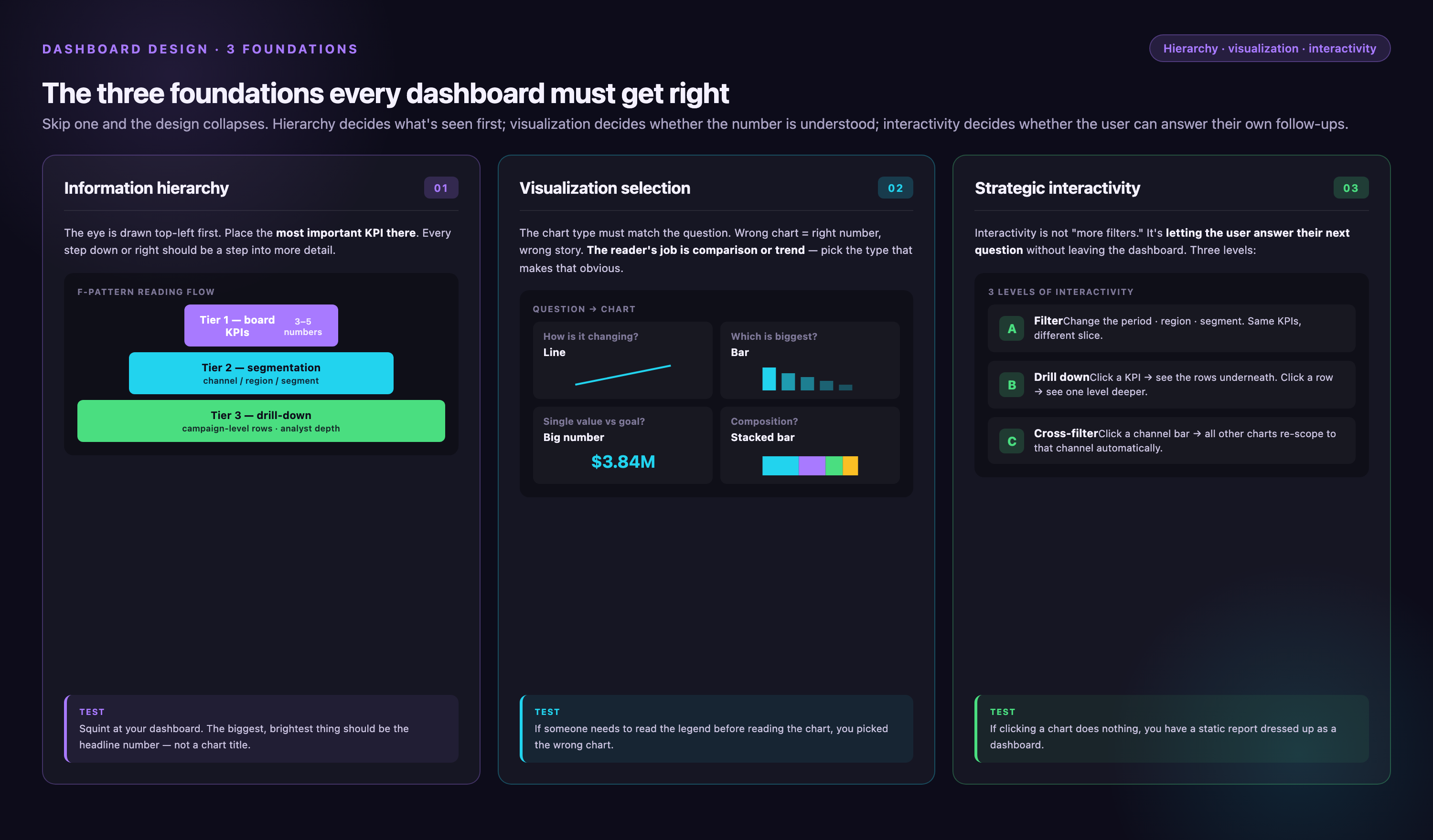
Information Hierarchy
A successful dashboard follows a clear information hierarchy, highlighting critical data prominently while providing supplementary details as needed. This makes it easier for users to absorb key insights and make informed decisions.
Users can process 5-9 elements in working memory—dashboards exceeding 12 KPIs show 40% engagement drop. The hierarchy must guide attention through size, position, color, and whitespace.
Apply the F-Pattern Layout: Research on eye-tracking shows users scan dashboards in an F-pattern (top-left → top-right → down left side). Place your primary KPI in the top-left quadrant using the largest font and highest contrast. Secondary metrics go top-right with medium emphasis. Supporting details and breakdowns belong in the bottom half.
Use the 40-30-20-10 Space Rule: Allocate 40% of screen space to the single most important metric, 30% to 2-3 secondary KPIs, 20% to trend context (sparklines, comparison bars), and 10% to navigation or filters. This prevents the "democratic layout" trap where all metrics get equal space.
Create Visual Weight Contrast: The primary metric should be 2-3× larger than secondary metrics. Use bold, dark text (80-100% opacity) for primary data, medium weight and 60-70% opacity for secondary data, and light text (40-50% opacity) for labels and annotations. Sufficient whitespace helps important elements stand out—aim for 30-40% of the screen to be empty space.
Data Visualization Selection
Choosing the wrong chart type is the #1 cause of dashboard failure. The decision depends on three factors: data structure (categorical vs. continuous), user task (comparison vs. trend vs. composition), and cognitive load budget.
Chart Selection Decision Tree:
| If Your Data Is... | And User Needs To... | Use This Chart | Why |
|---|---|---|---|
| Time series (dates) | See trend over time | Line chart | Human eye detects slope changes instantly |
| 2-7 categories | Compare values | Horizontal bar chart | Length comparison is 2× more accurate than area/angle |
| 8+ categories | Compare & rank | Sorted horizontal bar | Sorting reveals top/bottom performers; horizontal labels stay readable |
| Part-to-whole (3-5 parts) | See composition | Stacked bar or treemap | Pie charts fail beyond 5 slices—eye can't distinguish angles |
| Two continuous variables | Find correlation | Scatter plot | Shows relationship strength and outliers simultaneously |
| Distribution of values | See shape/outliers | Histogram or box plot | Histogram for shape, box plot for quartile summary |
| Geographic data | See spatial patterns | Choropleth map | Only if geography matters—otherwise use bar chart |
| Matrix of values | Spot patterns/hotspots | Heat map | Color encodes magnitude—good for large datasets |
Common Mistakes to Avoid:
• Dual-axis charts: Avoid unless scales are directly comparable. Users misinterpret the relationship between left and right axes 70% of the time.
• 3D charts: Never use 3D effects—they distort area perception and reduce accuracy by up to 50%.
• Too many colors: Limit to 3-4 colors per chart. More creates visual noise and reduces accessibility for colorblind users (8% of males).
• Pie charts for trends: Pie charts can't show change over time. Use line or area charts instead.
Interactive Elements
Interactivity is a vital aspect of dashboard design, enabling users to delve deeper into specific data subsets, apply filters, and explore different scenarios. However, 2026 research shows that overuse of interactivity increases time-to-insight by 35% for frequently viewed dashboards.
When to Add Filters: Add filters when users need 3+ views of the same data. For example, if a marketing manager regularly compares campaign performance by region, channel, and time period, filters are essential. But if 80% of users view the same default setting, make that the permanent view and eliminate the filter.
When to Add Drill-Down: Add drill-down capability when fewer than 20% of users need detail. If most users need the granular data, promote it to the top level instead of hiding it behind clicks. Example: If executives rarely need to see individual campaign performance but analysts do daily, create separate dashboards rather than forcing executives to navigate drill-downs they'll never use.
Avoid Interactivity for Infrequent Dashboards: For dashboards viewed less than once per week, users forget navigation between sessions. Static views with clear labels perform better. Users spend cognitive energy re-learning the interface instead of analyzing data.
2026 Trends in Dashboard Interactivity:
AI Chatbot Interfaces: Natural language query interfaces allow users to ask questions like "What were our top three selling products in Q3?" or "Show me campaigns with ROAS above 3.0." This eliminates the need to learn filter navigation and accommodates ad-hoc questions without pre-built views.
Proactive Alerts (Zero-Interface Design): Advanced dashboards now anticipate user needs and push insights proactively. Instead of requiring users to check dashboards, the system sends alerts when anomalies occur ("Your CAC increased 40% this week") or milestones are reached ("You're 85% toward your Q4 pipeline goal"). This reduces dashboard dependency for routine monitoring.
Natural Language Filters: Instead of dropdown menus, users type or speak filters: "Show last 30 days" or "Exclude brand campaigns." This reduces the learning curve for new users and speeds up analysis for power users.
Context-Aware Defaults: Dashboards now remember user preferences and adjust default views based on behavior. If a user always filters to "North America," the dashboard loads with that filter pre-selected.
Dashboard Type Selection Framework
Choosing the right dashboard type depends on three factors: decision frequency (how often users need the data), user authority (can they act on insights?), and data literacy level. Using the wrong type leads to either over-engineered solutions (real-time dashboards for monthly reviews) or under-engineered ones (static reports for operational monitoring).
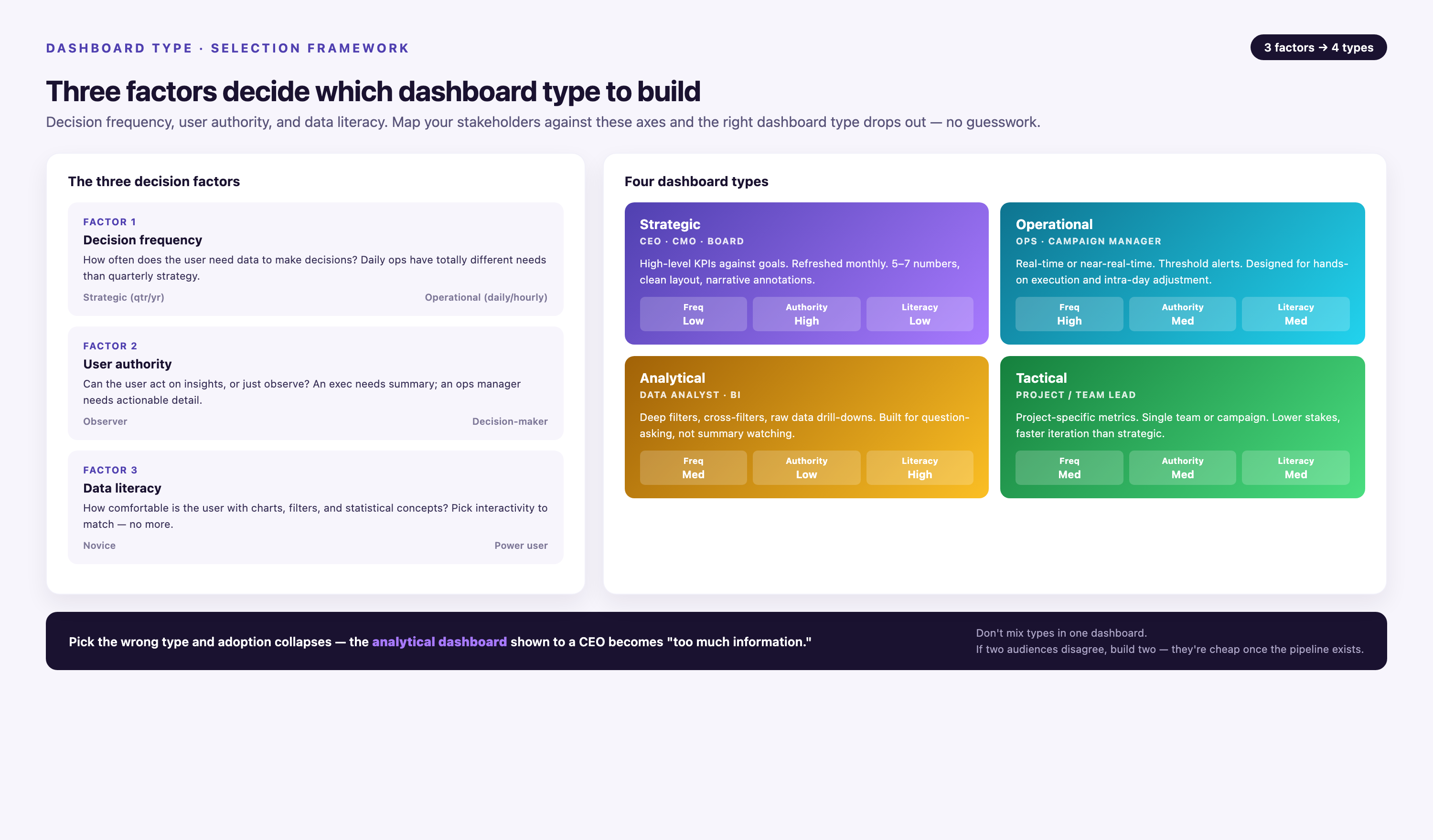
| Dashboard Type | Refresh Rate | User Role | Time Horizon | Primary Action | Common Anti-Pattern |
|---|---|---|---|---|---|
| Operational | Real-time to hourly | Frontline staff, support teams | Immediate intervention | Showing monthly trends—users need current status, not history | |
| Tactical | Daily to weekly | Campaign managers, analysts | 1-30 days | Optimization & adjustment | Real-time refresh—wastes infrastructure cost for decisions made weekly |
| Strategic | Weekly to monthly | Managers, directors | 1-12 months | Goal tracking & planning | Excessive granularity—showing daily data for quarterly goals |
| Executive | Monthly to quarterly | C-suite, board members | 3-36 months | Strategic direction | Too many metrics—execs need 3-5 key outcomes, not 30 KPIs |
| Analytical | On-demand | Data analysts, researchers | Variable | Exploration & hypothesis testing | Over-designing for one persona—analysts need flexibility, not fixed views |
Decision Logic:
Start with Decision Frequency: If users need to act within hours of data arrival, build an operational dashboard with real-time refresh. If decisions happen weekly (e.g., budget reallocation), daily refresh is sufficient. For monthly business reviews, weekly updates are adequate.
Validate User Authority: If viewers can't act on the insights (an analyst monitoring campaign performance but unable to adjust budgets), route data to the actual decision-maker instead. Dashboards without action pathways create frustration.
Assess Data Literacy: For low data literacy audiences (executives, non-technical stakeholders), limit to 3-5 metrics with heavy context (comparisons, annotations, plain-language insights). For analysts, provide drill-down capabilities and flexible filtering.
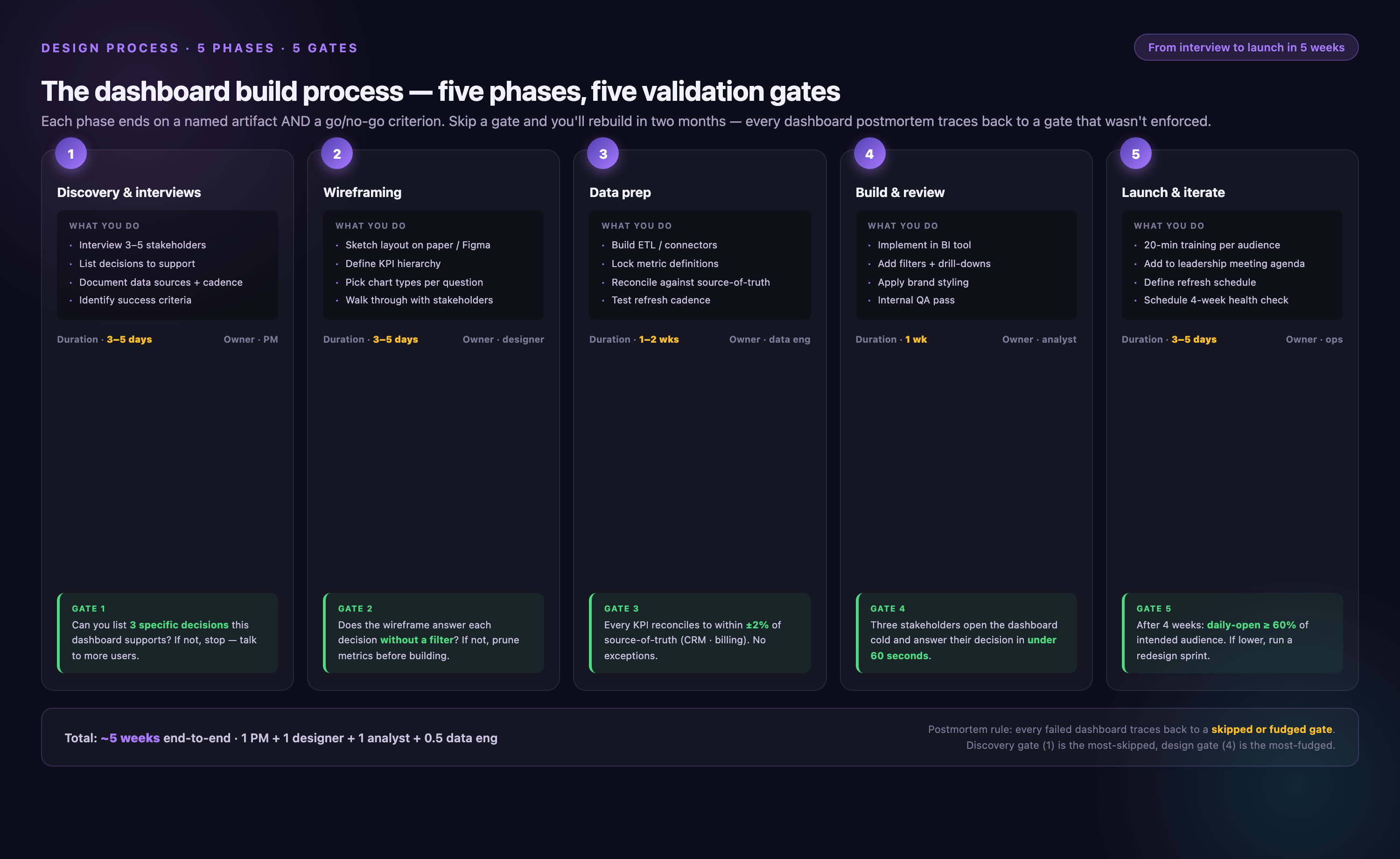
Dashboard Design Process: From Stakeholder Interview to Launch
The design of a dashboard plays a significant role in how effectively it communicates information. This process includes five validation gates—each with clear criteria for proceeding to the next step—plus common failure modes to avoid.
Dashboard Design Red Flags: 7 Signs Your Requirements Are Wrong
Before starting design, validate your requirements. These red flags indicate you need to revisit stakeholder conversations:
• Stakeholder says "I want to see everything": This indicates unclear objectives. Use the 2×2 Priority Matrix to force prioritization.
• No one can articulate a specific decision: If "we'll monitor performance" is the best answer, the dashboard will fail. Dig deeper: "What will you do differently if this metric is 20% higher?"
• Multiple personas with conflicting needs: Executives want summaries, analysts want detail. Build separate dashboards.
• Requested metrics aren't available: If 30% of requested data doesn't exist or requires 40+ hours of ETL work, reset expectations before designing.
• Viewer can't change outcomes: If the dashboard user has no authority to act on insights, you're building for the wrong audience.
• Metrics change monthly: Unstable KPIs require constant dashboard rebuilding. Wait for measurement framework to stabilize.
• "Make it look like [competitor's dashboard]": Copycat designs ignore your unique data structure and user workflows. Focus on requirements, not aesthetics.
Step 1: Define Objectives with Validation Tests
Determine what the dashboard aims to achieve. Vague objectives ("improve visibility") lead to vague designs. Apply these three validation tests:
Decision Test: What specific action will change based on this data? Example of a failed objective: "Monitor brand awareness." Improved version: "Identify campaigns driving qualified leads so we can reallocate budget within 72 hours."
Frequency Test: How often is the decision made? If the decision happens monthly, real-time data is over-engineering. Match refresh rate to decision frequency.
Authority Test: Does the viewer control the action? If a dashboard shows customer churn risk but the viewer can't contact customers or adjust retention programs, route insights to someone who can.
Examples of Fake vs. Real Objectives:
| Fake Objective (Fails Tests) | Real Objective (Passes Tests) |
|---|---|
| Improve visibility into marketing performance | Identify underperforming campaigns weekly to reallocate 15% of budget toward top performers |
| Track customer engagement | Detect accounts with declining usage (30% drop over 2 weeks) to trigger customer success outreach |
| Monitor sales pipeline | Identify deals stalled >30 days in negotiation stage so sales managers can intervene before quarter-end |
| Understand campaign ROI | Calculate ROAS by channel monthly to set next quarter's budget allocation across paid search, social, and display |
Validation Criteria: Proceed to Step 2 only when you have 1-3 clear objectives, each passing all three tests, documented in writing and approved by stakeholders.
Step 2: Understand Your Audience with Stakeholder Matrix
Know who will be using the dashboard. Different roles require different data. Tailoring the dashboard to the needs of the audience enhances its utility and relevance.
Use this Stakeholder Matrix template during requirements gathering:
| Role | Frequency of Use | Primary Question | Decision Authority | Data Literacy (1-5) |
|---|---|---|---|---|
| VP Marketing | Weekly | Are we on track to hit pipeline goals? | Budget reallocation | 3 (Medium) |
| Campaign Manager | Daily | Which campaigns need optimization today? | Pause/adjust campaigns | 4 (High) |
| CEO | Monthly | Is marketing ROI improving? | Hire/fire, strategy pivot | 2 (Low) |
| Marketing Analyst | Daily | What patterns exist in the data? | None (recommends only) | 5 (Expert) |
Design for One Primary Persona: Multi-audience dashboards fail—research shows 61% of users ignore features meant for other roles. Identify the person who uses the dashboard most frequently and has decision authority. That's your primary persona. If you have multiple primary personas, build separate dashboards.
Interview Question Bank for Requirements Gathering:
• "Walk me through the last time you needed this information. What did you do next?"
• "If this metric increased 50% overnight, what would be your first action?"
• "What decisions have you delayed because you lacked this data?"
• "How do you currently get this information? What's frustrating about that process?"
• "When you look at data, do you prefer tables, charts, or written summaries?"
Validation Criteria: Proceed to Step 3 only when you have a completed Stakeholder Matrix with one identified primary persona and documented interview responses.
Step 3: Select Relevant Metrics with Prioritization Framework
Choose the metrics that best align with the dashboard's purpose and the audience's needs. Avoid including every possible metric; focus on those that provide valuable insights and drive informed decision-making.
Metric Selection Rules:
Limit to 5-9 Metrics Per Screen: This aligns with working memory constraints. If you need more than 9 metrics, create multiple dashboard pages or drill-down views.
Use the 2×2 Prioritization Matrix: Plot each candidate metric on two dimensions:
| Actionable: Yes | Actionable: No | |
|---|---|---|
| Frequently Needed: Yes | TOP PRIORITY Main dashboard |
Context metric Supportive role |
| Frequently Needed: No | Drill-down view On-demand access |
VANITY METRIC Delete or move to report |
Only the top-left quadrant (actionable + frequently needed) belongs on the main dashboard. Examples: Campaign ROAS, pipeline velocity, customer churn rate.
Bottom-right quadrant metrics (not actionable, rarely needed) are vanity metrics—like total page views or social media followers. These create decision paralysis and should be deleted or moved to a separate analytical report.
Metric Retirement Process: Set up a quarterly review to remove metrics that no longer drive decisions. Signs a metric should be retired: (1) No one mentions it in meetings, (2) It hasn't influenced a decision in 90 days, (3) Stakeholders can't remember why it was added.
Validation Criteria: Proceed to Step 4 only when you have 5-9 prioritized metrics, each validated through the 2×2 matrix, with clear documentation of why each metric was selected.
Step 4: Choose Appropriate Visualizations
Match data with the right visualization techniques. Use the Chart Selection Decision Tree from the previous section to avoid the most common mistake: choosing charts based on aesthetics rather than data structure.
Visualization Selection Checklist:
• Is the data categorical or continuous?
• Is the user comparing, tracking a trend, or analyzing composition?
• How many data points? (2-7 = bar chart, 8+ = sorted bar, 20+ = consider aggregation)
• Does the chart work in grayscale? (Test for accessibility—8% of males are colorblind)
• Can a user explain the insight in 5 seconds? (If not, the chart is too complex)
Validation Criteria: Proceed to Step 5 only when each metric has a matched visualization, validated against the selection criteria, with a wireframe or mockup showing placement.
Step 5: Organize Information with Layout Grid
Apply principles of information hierarchy to arrange data and visualizations on the dashboard. Prioritize key information, group related data, and use a logical sequence to enhance readability and understanding.
Layout Framework:
• Top-left (40% space): Primary KPI with context (goal, trend, variance)
• Top-right (30% space): 2-3 secondary KPIs
• Middle section (20% space): Trend charts and supporting visualizations
• Bottom section (10% space): Detailed tables or navigation elements
Grid System: Use a 12-column grid for flexible layouts. Primary elements span 6-8 columns, secondary elements span 3-4 columns. Maintain consistent spacing: 16px between elements, 32px between sections, 48px margins.
Validation Criteria: Proceed to Step 6 only when you have a layout wireframe approved by primary stakeholders, following F-pattern principles, with labeled sections.
Step 6: Add Strategic Interactivity
If necessary, add interactive elements such as filters, drill-downs, or parameter controls. Apply the interactivity decision rules from earlier sections:
• Add filters when users need 3+ views of the same data
• Add drill-down when <20% of users need detail
• Avoid interactivity for dashboards viewed <1×/week
• Default to the most common view
Validation Criteria: Proceed to Step 7 only when interactive elements have documented use cases and default states are configured.
Step 7: Optimize for Clarity and Simplicity
Aim for a clean, clutter-free design. Use clear labels, maintain consistency in design elements, and ensure each visualization is simple to understand at a glance.
Clarity Checklist:
• All charts have clear titles that describe the insight (not just the data)
• Axes are labeled with units
• Numbers use thousand separators (1,234 not 1234)
• Colors are consistent across all visualizations
• Text is at least 14px for body, 18px for titles
• Sufficient contrast: minimum 4.5:1 for text, 3:1 for data visualizations
Validation Criteria: Proceed to Step 8 only when the dashboard passes all accessibility checks (WCAG AA contrast, screen reader compatibility, keyboard navigation).
Step 8: Test and Refine with User Acceptance Criteria
Once the initial design is complete, test the dashboard with a group of users. Gather feedback on its functionality, ease of use, and relevance of the data presented.
User Testing Script Template:
• Task 1: "Open the dashboard and tell me the current status of [primary KPI]." (Test: Can user find primary metric within 5 seconds?)
• Task 2: "Which campaign is underperforming and needs attention today?" (Test: Does hierarchy guide user to actionable insight?)
• Task 3: "How has [secondary KPI] trended over the past month?" (Test: Can user interpret trend visualization correctly?)
• Task 4: "Filter the data to show only [specific segment]." (Test: Are interactive elements discoverable and intuitive?)
• Feedback: "What would you change about this dashboard? What's confusing or missing?"
Success Criteria:
• 80% of users complete Task 1 within 5 seconds
• 80% of users complete Task 2 within 15 seconds
• Users provide actionable feedback (not just "looks good")
• No critical bugs or data errors identified
Validation Criteria: Proceed to launch only when success criteria are met and critical feedback is incorporated.
Step 9: Launch with Change Management Plan
Deploy the dashboard with proper training and documentation. Monitor adoption metrics for the first 30 days.
Launch Checklist:
• Send announcement email with dashboard link and 2-minute walkthrough video
• Schedule 15-minute live training session for primary users
• Create one-page quick reference guide
• Set up feedback channel (Slack, email, or survey)
• Define adoption metrics: unique users/week, average session duration, actions taken
Step 10: Maintain and Iterate
Ensure that the dashboard stays relevant by regularly updating it with new data. Review and update the dashboard design periodically to align with changing user needs and business goals.
Maintenance Schedule:
• Weekly: Monitor data quality, check for API failures, review usage analytics
• Monthly: Gather user feedback, identify unused features, validate that metrics still drive decisions
• Quarterly: Retire stale metrics, add new requirements, conduct mini user testing sessions
• Annually: Full dashboard redesign review—does it still serve the original objective?
Common Maintenance Failure Modes:
• Data pipeline breaks but no monitoring alerts—users see stale data and lose trust
• Metrics accumulate over time without retirement—dashboard becomes cluttered
• Original requirements change but dashboard isn't updated—users build parallel reports in Excel
• No feedback mechanism—team doesn't know dashboard is failing until adoption drops to zero
"On the reporting side, we saw a significant amount of time saved! Some of our data sources required lots of manipulation, and now it's automated and done very quickly. Now we save about 80% of time for the team."

Dashboard Design Examples
To inspire your own dashboard designs, consider these real-world examples with specific design decisions explained.
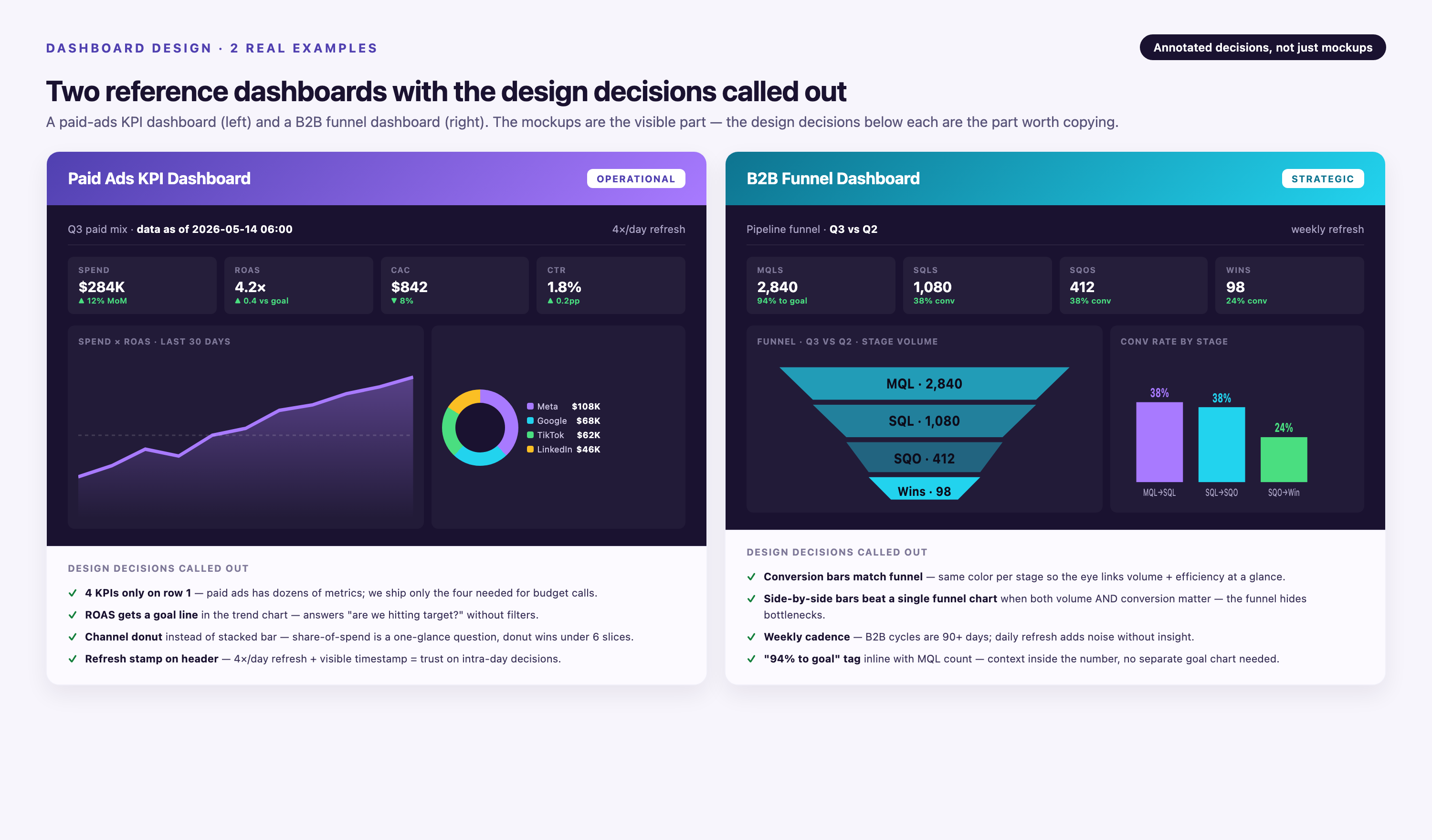
KPI Dashboard for Paid Ads Campaigns
A KPI Dashboard for Paid Ads Campaigns consolidates key metrics like Cost per Click (CPC), Click Through Rate (CTR), Conversion Rate, and Return on Ad Spend (ROAS) from various ad platforms.
Design Decisions:
• Layout: ROAS occupies top-left position (40% of screen) because it's the primary decision metric—campaigns with ROAS <2.0 get paused within 24 hours.
• Trend Analysis: Line charts show 30-day performance trends, allowing managers to distinguish temporary dips from systemic problems.
• Interactivity: Filters by platform, campaign type, and date range enable comparison views ("How does Google Ads ROAS compare to Meta?")—justifying the filter overhead because users need 5+ views of the same data.
• Color Coding: Red/yellow/green indicators for ROAS threshold compliance (>3.0 = green, 2.0-3.0 = yellow, <2.0 = red) provide instant status recognition.
User Outcome: Campaign managers identify underperforming campaigns in under 10 seconds, reducing analysis time by 80% compared to logging into individual platforms.
Web Analytics Dashboard
A Web Analytics Dashboard offers a centralized overview of website performance metrics, providing valuable insights for marketers, SEO specialists, and website managers.
Design Decisions:
• Metric Priority: Conversion rate occupies primary position because it connects directly to revenue. Page views and sessions are secondary metrics—high traffic without conversions indicates a problem.
• Segmentation: Traffic source breakdown (organic, paid, direct, referral) uses horizontal bar chart sorted by conversion rate—not traffic volume—to highlight the most valuable channels.
• Time Comparison: Every metric includes "vs. prior period" percentage to provide context. "23,450 visitors" is meaningless without knowing if that's up or down.
• Bounce Rate Context: Instead of showing raw bounce rate, dashboard shows bounce rate by landing page in a heat map—revealing which pages need UX improvement.
User Outcome: Marketing teams identify low-performing traffic sources weekly and reallocate SEO/content efforts toward high-conversion channels.
Dashboard Health Audit Checklist
Use this 25-point diagnostic to evaluate existing dashboards. Score each item as pass (2 points), partial (1 point), or fail (0 points). Total score interpretation: 0-30 = needs redesign, 31-40 = optimization needed, 41-50 = best-in-class.
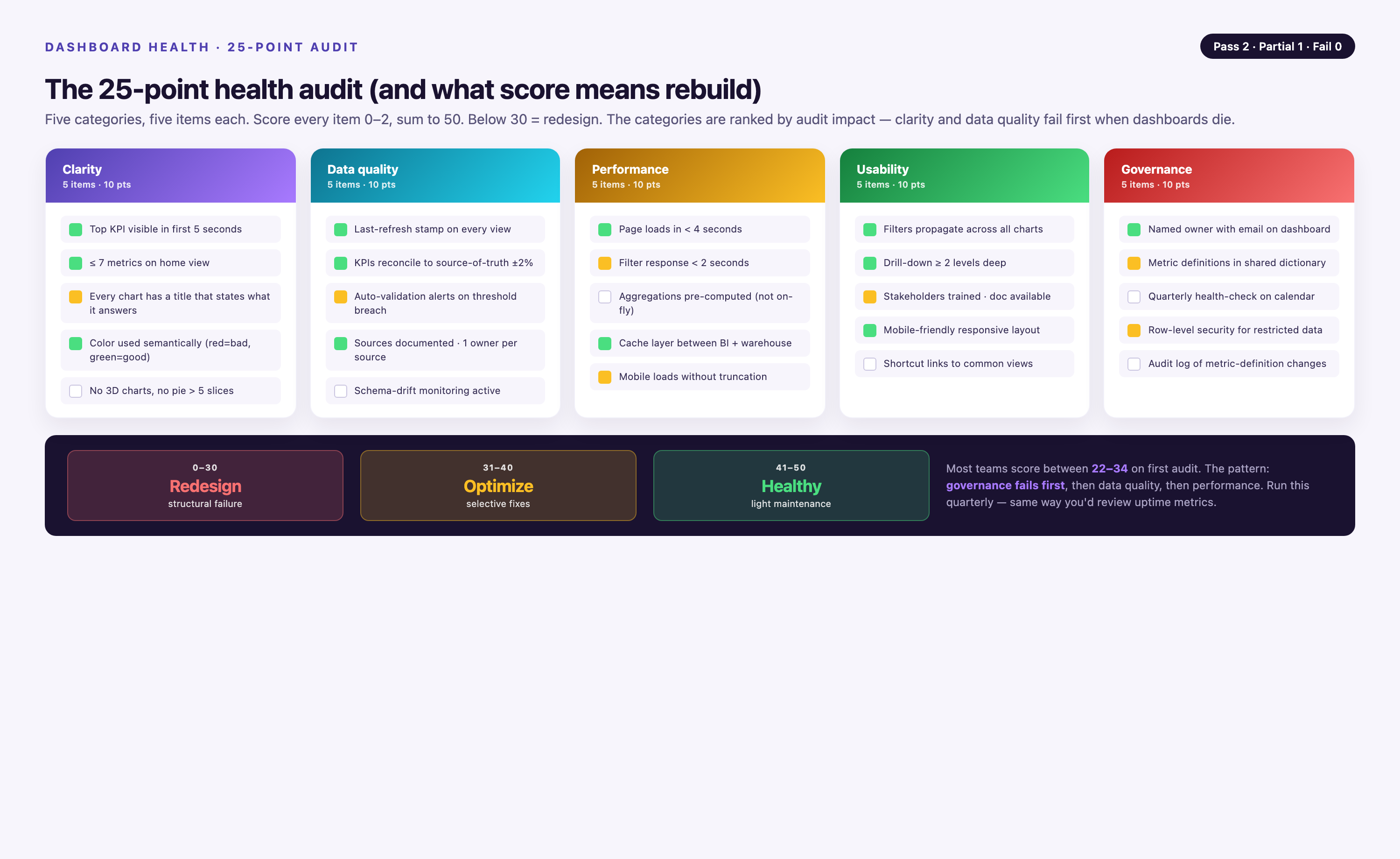
| Category | Audit Question | Pass Criteria |
|---|---|---|
| Objective Clarity | Does the dashboard have a documented, specific objective? | Objective passes Decision, Frequency, and Authority tests |
| Metric Count | Are there 5-9 metrics per screen? | No more than 9 KPIs visible without scrolling |
| Metric Relevance | Do all metrics drive decisions? | Each metric was used in a decision within past 90 days |
| Visual Hierarchy | Is the primary metric 2-3× larger than secondary? | Clear size/color/position differentiation |
| F-Pattern Layout | Is the most important metric in the top-left? | Primary KPI occupies top-left quadrant |
| Context | Do all metrics have comparison points? | Every metric includes goal, prior period, or benchmark |
| Chart Selection | Are chart types matched to data structure? | No pie charts >5 slices, trends use lines, comparisons use bars |
| Color Accessibility | Does the dashboard work in grayscale? | Key distinctions visible without color (use patterns/labels) |
| Contrast Ratio | Is text contrast ≥4.5:1? | Passes WCAG AA standards |
| Font Size | Is body text ≥14px, titles ≥18px? | Readable from 2 feet away |
| Whitespace | Is 30-40% of screen empty space? | No cramped layouts, clear visual separation |
| Title Clarity | Do chart titles describe the insight, not just data? | "ROAS declining in Q3" not "ROAS Over Time" |
| Axis Labels | Are all axes labeled with units? | No ambiguous scales ("% of what?") |
| Number Formatting | Are large numbers formatted with separators? | "1,234,567" not "1234567" |
| Filter Necessity | Are filters used for 3+ views? | Each filter has documented use case |
| Default View | Does dashboard load with most common filter settings? | 80% of users don't change defaults |
| Load Time | Does dashboard load in | No user complaints about speed |
| Mobile Responsiveness | Is dashboard usable on mobile devices? | Key metrics readable on phone without zooming |
| Data Freshness | Is refresh rate matched to decision frequency? | Real-time only if decisions are hourly |
| Data Quality | Are there monitoring alerts for pipeline failures? | Team is notified within 1 hour of stale data |
| Adoption Rate | Do 80%+ of target users access weekly? | Usage analytics show consistent engagement |
| Time-to-Insight | Can users answer primary question in | User testing validates speed |
| Documentation | Is there a quick reference guide? | One-page PDF or video walkthrough available |
| Feedback Loop | Is there a process for gathering user feedback? | Monthly feedback review with stakeholders |
| Maintenance Schedule | Is there a documented review cadence? | Quarterly metric retirement, annual redesign review |
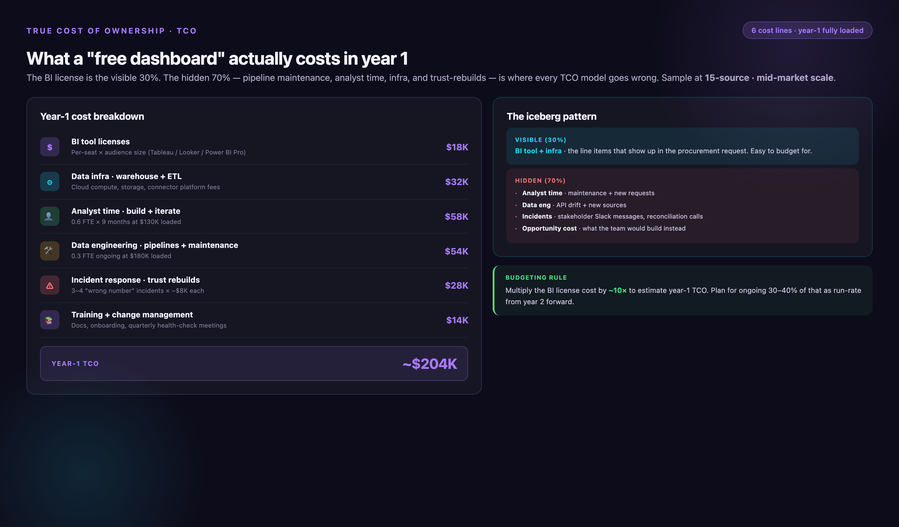
True Cost of Dashboard Ownership
Understanding the total cost of ownership helps set realistic expectations and choose the right implementation approach. Costs vary significantly based on tool selection and customization needs.
| Cost Component | Excel/Sheets | BI Tool (Tableau/Power BI) | Custom Development | Embedded Analytics (Improvado) |
|---|---|---|---|---|
| Initial Design | 8-20 hours | 40-80 hours | 120-240 hours | Days, not months |
| Data Pipeline Setup | Manual exports | 20-60 hours | 80-160 hours | Pre-built 1,000+s |
| Monthly Maintenance | 4-10 hours | 8-15 hours | 15-30 hours | Managed by platform |
| Tool Licenses (annual) | $0-$300 | $1,000-$10,000 | Server costs: $5,000-$20,000 | Custom pricing |
| Training | Minimal | 2-4 hours per user | 4-8 hours per user | Included with CSM |
| Redesign Frequency | Every 6 months | Every 12-18 months | Every 18-24 months | Continuous iteration |
| Hidden Costs | Manual refresh labor, version control, broken formulas | API maintenance, connector updates, server management | Technical debt, security patches, scalability refactors | Handled by vendor |
| 3-Year TCO | $15,000-$35,000 | $40,000-$120,000 | $150,000-$400,000 | Varies by scale |
ROI Calculation Framework: Dashboard ROI = (Time Saved per Week × Hourly Rate × 52 weeks) - Total Cost of Ownership. Example: If a dashboard saves a $100/hour analyst 5 hours per week, annual value is $26,000. If TCO is $15,000/year, ROI is 73%.
Hidden Cost Warning: Real-time dashboards cost 4× more to maintain than daily-refresh dashboards due to infrastructure requirements, but research shows they benefit only 8% of use cases. Most business decisions don't require sub-hour data freshness.
Empower Your Marketing Team with Custom-Tailored Dashboards
Custom dashboard design is critical as it ensures alignment with the specific needs and goals of the user. Rather than adopting a one-size-fits-all approach, custom dashboards are tailored to display the most relevant data, in the most useful formats, for the intended audience. This enhances data interpretation, fosters informed decision-making, and ultimately increases efficiency and productivity.
Improvado is an automated reporting tool and marketing analytics platform. This end-to-end solution assists at every stage of the marketing reporting cycle, from data collection to report customization. The platform comes with over 1,000 data sources and integrates with Power BI, Redash, Tableau, and many other data visualization and business intelligence (BI) tools.
Key Capabilities for Dashboard Development:
• 1,000+ Pre-Built Connectors: Unified data from all marketing platforms into a single, consistent schema. This eliminates the "what does this number mean?" confusion that reduces dashboard trust.
• No-Code + SQL Flexibility: Marketers can build dashboards through drag-and-drop interfaces, while data engineers retain full SQL access for advanced transformations. This bridges the literacy gap identified in the stakeholder matrix.
• AI Agent for Conversational Analytics: Natural language queries ("Which campaigns exceeded $500 CPA last month?") reduce dependency on pre-built views and accommodate ad-hoc questions without dashboard redesigns.
• Marketing Data Governance: 250+ pre-built data quality rules detect anomalies (spend spikes, missing campaigns, duplicate records) before they corrupt dashboards. This addresses the data trust issue that kills 40% of dashboard adoption.
Limitation: Improvado's custom pricing model requires contacting sales, which may not suit teams seeking transparent, self-service pricing. However, this enables flexible configurations for enterprise-scale implementations.
Dashboard Tool Selection Framework: 5 Criteria That Actually Matter
Choosing the wrong dashboard tool is one of the most expensive mistakes a data or marketing team can make. The following criteria cut through vendor marketing and focus on what determines long-term adoption and ROI.
- 1. Data Source Coverage and Connector Depth
Evaluate how many of your active data sources the tool connects to natively, and whether those connectors handle schema changes automatically. A tool that covers 80% of your sources but requires manual ETL for the remaining 20% will create a permanent maintenance burden. Prioritize platforms that offer pre-built, maintained connectors over generic API frameworks that push connector upkeep onto your team. - 2. Data Refresh Frequency vs. Actual Decision Cadence
Match the tool's refresh capabilities to how often your team actually makes decisions, not to the fastest refresh rate available. Real-time streaming infrastructure costs significantly more to operate and maintain than scheduled batch pipelines. Audit your top five use cases: if none require sub-hour data, a tool optimized for real-time is likely over-engineered for your needs. - 3. User Permissions and Row-Level Security
Enterprise deployments require granular access control—different stakeholders should see only the data relevant to their role and region. Confirm whether the tool supports row-level security natively or whether access control must be managed at the data warehouse layer. Gaps here create either security risk or significant engineering overhead. - 4. Embedded Analytics and Distribution Options
Consider how dashboards will be consumed: inside a BI tool, embedded in a product, shared via scheduled email, or exported to slides. Tools that lock insights inside a single interface reduce adoption among stakeholders who live in other workflows. Evaluate export fidelity, embedding SDK quality, and scheduled delivery reliability as first-class features. - 5. Total Cost of Ownership Beyond License Fees
License cost is rarely the largest line item. Factor in data engineering time for connector maintenance, compute costs for query execution, training overhead for non-technical users, and the cost of dashboard sprawl as the tool scales. Request a breakdown of these costs from vendors using your actual data volume and user count before signing.
Frequently Asked Questions
What are the most important dashboard design best practices for 2026?
The highest-impact practices are limiting each dashboard to 5–9 metrics per screen, establishing a clear visual hierarchy that surfaces the most critical KPIs first, and matching chart types to the specific analytical question being answered. Equally important is validating the dashboard with real end-users before launch—most adoption failures trace back to design decisions made without stakeholder input. In 2026, teams are also prioritizing data freshness transparency, displaying the last-updated timestamp prominently so users can trust what they see.
What is the difference between an operational dashboard and a strategic dashboard?
An operational dashboard monitors real-time or near-real-time metrics that require immediate action—think live campaign spend, server uptime, or inbound lead volume by hour. A strategic dashboard aggregates longer-horizon data (weekly, monthly, quarterly) to support planning and resource allocation decisions made by senior stakeholders. The key design implication is that operational dashboards prioritize speed and alerting, while strategic dashboards prioritize context, trend lines, and comparative benchmarks.
How many metrics should a dashboard display?
Cognitive load research consistently points to 5–9 metrics as the effective range for a single dashboard screen—this aligns with working memory capacity and prevents the analysis paralysis that comes from metric overload. If your use case genuinely requires more metrics, use progressive disclosure: show summary KPIs at the top level and allow users to drill into supporting metrics on demand. Forcing more than 12 metrics onto a single view typically signals that the dashboard is serving multiple audiences and should be split into separate views.
When should you use a real-time dashboard versus a scheduled report?
Real-time dashboards are justified when the cost of a delayed decision exceeds the cost of the real-time infrastructure required to support it—live bidding, active incident response, and same-day campaign optimization are legitimate use cases. For the majority of marketing and business reporting, scheduled data refreshes (hourly, daily, or weekly) deliver sufficient timeliness at a fraction of the infrastructure and maintenance cost. Audit your actual decision cadence before committing to real-time architecture; most teams find that 90% of their dashboards can run on daily refreshes without any loss of decision quality.
What causes dashboard abandonment, and how do you prevent it?
The most common causes of dashboard abandonment are metric overload, lack of clear ownership (no one is accountable for acting on the data), and a mismatch between the dashboard's update frequency and the user's workflow. Prevention starts at the design phase: every metric on the dashboard should map to a specific decision that a specific person is empowered to make. Conducting a dashboard health audit 30 and 90 days post-launch—checking active user counts, filter usage, and stakeholder feedback—catches adoption problems early enough to course-correct before the dashboard is quietly ignored.