
Many teams adopt Databox for its simplicity and quick setup, but quickly run into its limitations as their reporting needs grow.
Limited data customization, shallow integrations, lack of advanced analytics, and scalability constraints often drive organizations to seek more robust solutions that can handle complex, multi-source data and provide deeper insights.
This article explores the top 15 Databox alternatives for teams seeking greater flexibility, advanced analytics, and enterprise-ready features. We’ll compare key tools side by side, outline their strengths and use cases, and provide detailed overviews of each platform to help you choose the solution best suited to your data and reporting requirements.
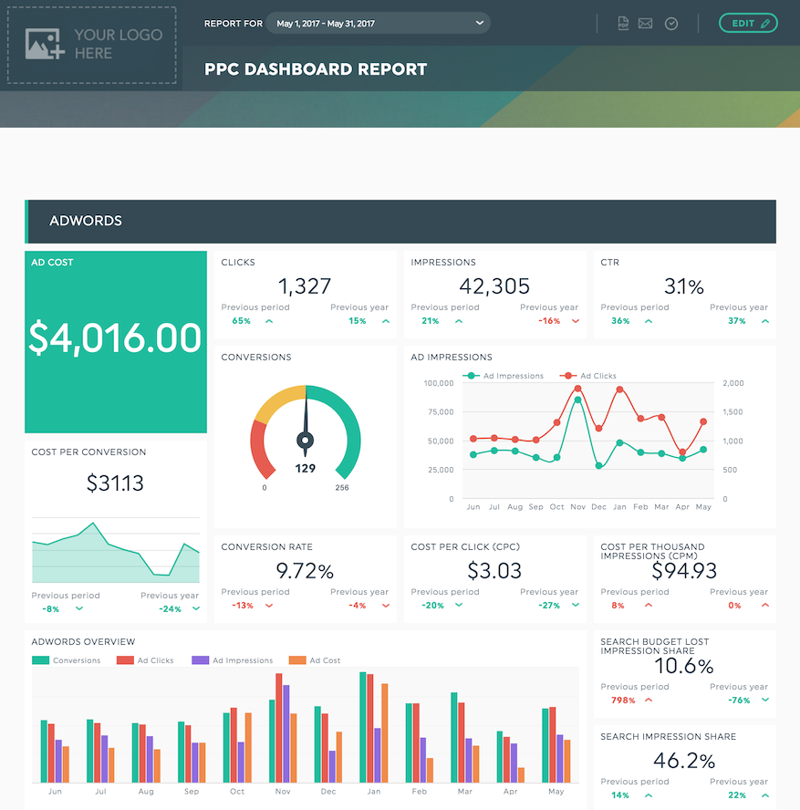
What Is Databox?
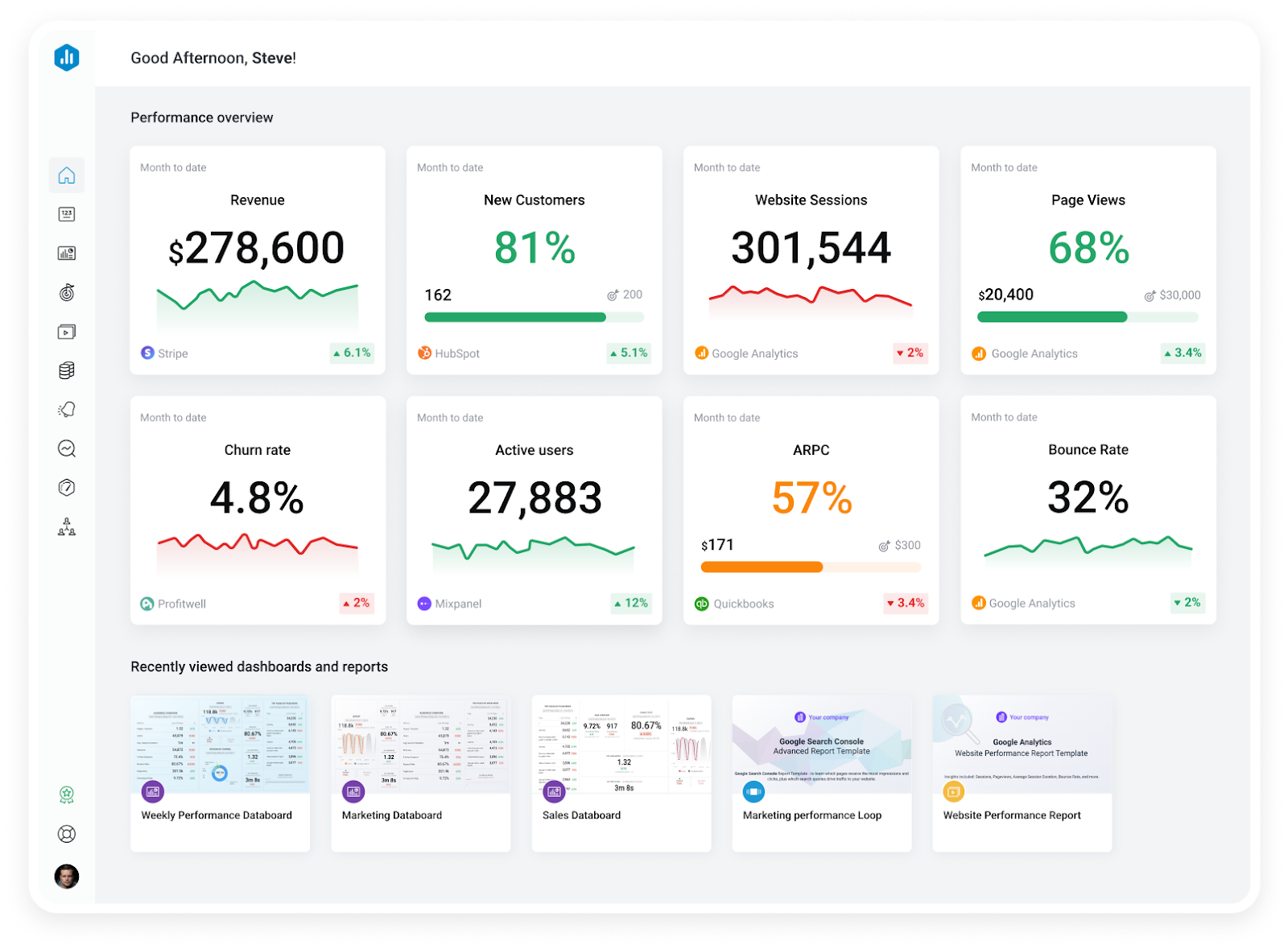
Databox is a business analytics and dashboarding platform that helps teams monitor performance metrics from multiple sources in one place. It focuses on simplifying KPI tracking and visualization for businesses that want quick, lightweight reporting without the need for extensive technical resources.
The platform connects directly to over 100 popular marketing, sales, and analytics tools, pulling data into customizable dashboards that update automatically.
Key Databox features:
- Real-time dashboards: Visualize live data from connected sources, with drag-and-drop widgets.
- Pre-built templates: Databox offers industry-specific templates for marketing, sales, and finance to get dashboards running quickly without designing from scratch.
- Automated performance alerts: Set thresholds for KPIs and receive notifications when metrics deviate significantly, helping teams stay ahead of potential issues.
- Data integrations: Connect to 100+ native integrations including Google Analytics, HubSpot, Salesforce, Facebook Ads, and Shopify. However, support for custom data sources or complex ETL workflows is limited compared to enterprise-grade tools.
- Scorecards and scheduled reporting: Distribute daily, weekly, or monthly scorecards via email or mobile notifications to keep stakeholders updated without manual reporting.
- Goal tracking: Define KPI targets and monitor progress visually within dashboards, making it easier to track short- and long-term performance against objectives.
Why Look for Databox Alternatives?
While Databox works well for lightweight KPI tracking and quick dashboard setup, many teams eventually outgrow its capabilities as their reporting needs become more complex.
Several common challenges drive companies to explore alternatives:
- Limited Data customization and transformation: Databox primarily focuses on visualizing data from connected sources as-is, with minimal options for cleaning, transforming, or combining datasets. Companies needing multi-step calculations, custom metrics, or blended data across platforms often find these limitations restrictive.
- Shallow data integration flexibility: Although Databox integrates with popular tools, it lacks robust support for custom data sources or advanced API connections. For organizations using niche platforms or proprietary systems, this means extra manual work to fill reporting gaps.
- Basic reporting and analytics features: Databox excels at surface-level KPI tracking but offers limited drill-down, segmentation, and historical trend analysis. Teams that require more in-depth analysis, such as attribution modeling, cohort analysis, or campaign performance comparisons, often reach functional ceilings.
- Limited scalability for larger teams: As reporting needs grow across departments or regions, Databox can become difficult to manage. Its user permissions, governance controls, and data management capabilities are not designed for enterprise-scale workflows or complex organizational structures.
These limitations are common pain points for growing companies that start with Databox but later require more advanced analytics, better integration capabilities, stronger governance, or deeper insights.
Below, we review 15 top Databox alternatives, highlighting each tool’s strengths, drawbacks, and ideal use cases, to help you find the right fit for your organization.
Top 15 Databox Alternatives and Competitors in 2026
When evaluating Databox alternatives, it’s critical to match the platform’s strengths with your organization’s data complexity, reporting needs, and scalability requirements.
The table below provides a high-level comparison of Databox and its top alternatives, highlighting what each tool is best for and its ideal use case.
In the next section, we’ll provide a detailed overview of each platform to help you assess which solution aligns best with your analytics goals.
| Tool | Best for | Ideal use case |
|---|---|---|
| Databox | Quick KPI tracking for smaller teams/agencies | Fast setup dashboards for surface-level performance monitoring without advanced customization. |
| Improvado | Enterprise marketing intelligence and AI insights | Centralizing marketing data, applying governance, and layering AI-driven insights at scale. |
| Looker | Governed BI and semantic modeling | Centralized KPI definitions and scalable analytics connected to data warehouses. |
| AgencyAnalytics | Client reporting for digital marketing agencies | Multi-client management, branded dashboards, and automated marketing reports. |
| Klipfolio | Customizable KPI dashboards for SMBs | Teams wanting flexible, real-time dashboards with formula-driven metrics and API integrations. |
| Geckoboard | Lightweight real-time KPI visibility | Visualizing key metrics on TV-ready dashboards for small teams or department-level tracking. |
| DashThis | Simple marketing performance reporting | Agencies needing white-labeled dashboards and automated multi-channel reports. |
| Whatagraph | Visual, presentation-ready marketing reports | Automated reporting with branded visuals and summaries. |
| Tableau | Enterprise BI and advanced visual analytics | In-depth analysis, interactive dashboards, and predictive insights connected to large data sets. |
| Cyfe | All-in-one business dashboards | Unified, multi-department KPI monitoring for SMBs across marketing, finance, and sales. |
| Looker Studio | Free, flexible dashboarding for Google ecosystem | Teams using Google stack needing customizable, shareable dashboards. |
| NinjaCat | Agency-scale reporting & PPC optimization | Agencies managing multiple ad accounts with white-label dashboards and budget pacing tools. |
| Grow | No-code BI for SMBs | Blending multiple sources into custom dashboards without engineering resources. |
| Zoho Analytics | Affordable BI with AI features | SMBs needing self-service analytics, AI-assisted insights, and wide integration support. |
| GoodData | Embedded and governed analytics | SaaS companies or enterprises embedding analytics into products or requiring strict KPI governance. |
| Coupler.io | Automated data pipelines | Automating data flows from apps to BI tools or spreadsheets for custom reporting workflows. |
1. Improvado
Improvado is an enterprise-grade marketing intelligence platform that automates data integration, reporting, insights, and empowers your team with advanced AI Agents.
It centralizes and harmonizes data from hundreds of marketing, sales, and revenue platforms into a single source of truth, applies data governance at scale, and layers AI-driven insights and automation on top.
Key strengths:
- Advanced data integration and ETL: Connects to 500+ marketing, sales, and analytics platforms with automated data extraction, normalization, and transformation. Supports custom APIs and warehouses for complex data environments.
- Marketing Data Governance: Enforces consistent naming conventions, validates data quality, and detects and alerts on errors in campaign tracking and spend, reducing time lost to manual QA.
- AI-powered analytics: Features an AI Agent for natural language querying, automated reporting, and optimization recommendations, reducing reliance on data teams for insights.
- Customizable metrics and calculations: Build and apply custom metrics, business logic, and multi-source data blends to fit unique reporting needs without being constrained to pre-built templates. Improvado data transformations are entirely no-code and powered by AI.
- Scalable architecture: Built for distributed teams with granular access controls, role-based permissions, and multi-entity management across regions or business units.
Before Improvado, preparing reports at Signal Theory was a labor-intensive process, often taking four hours or more per report. Switching to Improvado reduced that time by over 80%, making reporting significantly more efficient and far less stressful.
"Reports that used to take hours now only take about 30 minutes. We're reporting for significantly more clients, even though it is only being handled by a single person. That's been huge for us.”

Potential drawbacks:
- Implementation time: More setup and configuration are required compared to out-of-the-box dashboard tools like Databox.
- Learning curve: While designed for non-technical users, advanced features and governance controls may require onboarding for optimal use.
- Best fit for complex environments: Smaller teams or those with basic reporting needs may find its capabilities exceed their requirements.
Improvado pricing
Improvado offers three custom-tailored pricing tiers—Growth, Advanced, and Enterprise, that differ in the number of data rows, customization credits, and access to advanced features.
All plans include access to 1,000+ connectors and allow unlimited accounts per data source, without restricting sources or users. Each tier also includes customization credits and professional services for a tailored setup.
Implementation support, managed services, and compliance features (SOC 2, HIPAA, GDPR) scale with plan level, while AI-enabled capabilities—like the AI Agent and marketing data governance—are available through configurable add-ons across all packages.
Schedule a demo call with a member of the Improvado sales team to discuss your data needs and business objectives, and receive a personalized quote.
2. Looker

Looker is a modern business intelligence (BI) and analytics platform designed for organizations that require highly customizable reporting and advanced data modeling capabilities.
Unlike lightweight dashboarding tools like Databox, Looker operates as a semantic layer on top of your data warehouse, offering centralized governance and scalability for complex, multi-source analytics environments.
Key strengths:
- Centralized data modeling (LookML): Looker uses LookML, its unique modeling language, to define metrics, relationships, and business rules. It offers flexibility but requires a solid understanding of data modeling and SQL.
- Direct query on data warehouses: Queries data directly from cloud warehouses like BigQuery, Snowflake, and Redshift without replicating or moving data, which eliminates data duplication and speeds up the process.
- Customizable dashboards and visualizations: Offers flexible, interactive dashboards that can be tailored to department-specific needs, with drill-down capabilities for deeper analysis.
- Built-in governance and security: Provides robust user permissions, version control, and audit logs.
- Embedded analytics and API access: Enables embedding dashboards and analytics into internal tools or customer-facing apps, as well as programmatic access to insights via APIs.
- Scalable for enterprise use: Designed to support multi-entity organizations, large datasets, and advanced analytics workflows at scale.
Potential drawbacks:
- Steeper learning curve: Requires familiarity with LookML for advanced customization, which can be challenging for non-technical teams.
- Resource-heavy implementation: Setting up and maintaining Looker typically requires dedicated data engineering or analytics support.
- Cost considerations: Pricing is geared toward enterprise environments and may be high for smaller teams with basic reporting needs. It also varies based on several factors like the number of users, the volume of data processed, and the level of customization and support required. This complexity can make it difficult for potential users to estimate costs upfront.
Looker pricing
Looker pricing consists of two components: platform editions and user licensing.
The Standard plan is priced at $5,000 a month or a custom annual commission. To learn the price of Enterprise and Embed plans, you need to contact the sales team.
An additional cost is licensing. Each user must be licensed according to their level of interaction with the platform.
3. AgencyAnalytics
AgencyAnalytics is a Databox alternative designed specifically for digital marketing agencies and freelancers.
It focuses on simplifying client reporting by centralizing performance metrics from multiple marketing channels into white-labeled dashboards and automated reports.
Compared to Databox, AgencyAnalytics is purpose-built for agency workflows, offering features tailored to multi-client management and streamlined communication.
Key strengths:
- Client-centric dashboards: Create branded, client-facing dashboards with customizable KPIs and visualizations, making it easy to present campaign results clearly and professionally.
- Multi-client management: Manage reporting for multiple clients from a single account, with separate logins, permissions, and dedicated dashboards for each client.
- Automated reports and scheduling: Schedule recurring reports that are automatically generated and delivered to clients, reducing manual effort for account managers.
- Marketing integrations: Connect to 80+ marketing platforms, including Google Ads, Meta Ads, Semrush, Ahrefs, and email platforms to consolidate performance metrics in one place.
- White-labeling options: Fully rebrand dashboards and reports with agency logos, colors, and domains to provide a seamless client experience.
- Task and SEO tools: Includes built-in SEO auditing, keyword tracking, and task assignment tools, combining campaign reporting with basic project management functionality.
Potential drawbacks:
- Limited customization for advanced analytics: Reporting is primarily focused on out-of-the-box integrations, with minimal options for custom metrics, complex calculations, or blended data sources.
- Lacks data governance features: No centralized semantic layer or advanced controls for managing KPIs across clients.
- Not designed for enterprise data needs: Lacks support for data warehouses or large-scale ETL workflows, making it unsuitable for more complex enterprise analytics requirements.
AgencyAnalytics pricing
AgencyAnalytics pricing is tiered based on client count and features, starting with the Freelancer plan at $59/month(billed annually) for up to 5 clients.
AgencyAnalytics offers a 14-day free trial.
4. Klipfolio
Klipfolio serves as a Databox alternative for teams looking for greater control over dashboard design and metric customization, though it is better suited to smaller teams or organizations without complex governance or AI-driven analytics needs.
It is a cloud-based business dashboard and reporting platform that focuses on flexibility, enabling users to build custom dashboards and reports using a wide range of data connectors and visualization options.
Key strengths:
- Customizable dashboards: Build dashboards from scratch or use pre-built templates, with flexible widget configuration and a wide range of visualization types.
- Broad data integrations: Connect to over 100 native integrations, including Google Analytics, Facebook Ads, Salesforce, HubSpot, plus support for custom APIs, spreadsheets, and SQL databases.
- Formula editor for custom metrics: Create custom calculations, blends, and KPIs using its formula editor, giving more control over how metrics are defined and displayed.
- Real-time data updates: Dashboards update continuously, making it suitable for monitoring live performance across marketing, sales, or operational metrics.
- Sharing and publishing options: Share dashboards internally or externally via public links, scheduled email reports, or embedded dashboards for clients or stakeholders.
Potential drawbacks:
- Steeper learning curve for customization: While templates are available, creating highly customized dashboards or metrics often requires familiarity with the formula editor and setup.
- Limited data governance: Lacks enterprise-grade governance, semantic modeling, or centralized metric definitions for large organizations.
- Not AI-driven: Does not include advanced features like anomaly detection, predictive analytics, or automated recommendations found in more modern analytics platforms.
Klipfolio pricing
Klipfolio offers tiered plans starting at $90 per month for the Base plan with unlimited users, 3 dashboards, 130 integrations, and data refresh every 4 hours.
All plans include unlimited users and essential integrations, with advanced features and refresh performance scaling at higher tiers. A 14-day free trial is available.
5. Geckoboard

Geckoboard is a lightweight dashboarding tool geared toward teams that want simple, visually focused dashboards for monitoring performance metrics without advanced analytics or complex data modeling.
Key strengths:
- Simple, real-time dashboards: Provides clean dashboards optimized for displaying key metrics in offices or team environments for instant visibility.
- Quick setup and ease of use: An intuitive drag-and-drop interface enables teams to build dashboards rapidly with minimal technical knowledge and setup time.
- Data source integrations: Similar to Databox, Gekoboard supports around 90-100 integrations with popular platforms, including Google Analytics, Salesforce, HubSpot, Facebook Ads, and Zendesk, with the ability to import data from spreadsheets and basic APIs.
- Mobile-friendly and shareable dashboards: Dashboards can be shared via secure links or viewed on mobile devices, making KPI monitoring accessible from anywhere.
Potential drawbacks:
- Limited depth of analysis: Designed for surface-level KPI display only; lacks drill-down, segmentation, or advanced data exploration features.
- No data governance or custom modeling: Offers no support for centralized metric definitions, data warehousing, or advanced governance controls.
- Not AI-powered: Does not include anomaly detection, forecasting, or intelligent recommendations.
- Restricted customization: Visualization options and custom metrics are more limited compared to tools like Klipfolio or Looker.
Geckoboard pricing
Geckoboard tiered plans are priced based on three parameters: number of dashboards, editors (users who can build or modify dashboards), and viewers (users who can only view).
Plans start with an Essential tier for as little as $60/month billed annually.
Custom pricing is available for Enterprise customers needing larger-scale deployments, SSO, and advanced support.
6. DashThis
DashThis is a marketing reporting and dashboard tool that focuses on ease of use and quick setup, offering pre-built templates and automated report delivery for agencies and small to mid-sized teams.
Compared to Databox, DashThis is more specialized for marketing reporting but remains limited in terms of customization, advanced analytics, and enterprise-scale capabilities.
Key strengths:
- Marketing-focused dashboards: DashThis offers pre-built dashboard templates specifically designed for various marketing reporting use cases.
- Automated report delivery: Generate and schedule recurring reports that are automatically sent to stakeholders or clients, reducing manual reporting tasks.
- Multi-channel integrations: Connect to over 30 native marketing integrations, including Google Analytics, Meta Ads, LinkedIn, HubSpot, and Mailchimp, plus CSV uploads for custom data. That is the lowest number of ready-made data connectors across all Databox alternatives.
- White-label reporting for agencies: Fully customizable branding options enable agencies to deliver client-ready dashboards and reports featuring their logos, custom domains, and brand colors.
- Drag-and-drop interface: Build and edit dashboards quickly without technical expertise, using a simple drag-and-drop editor for widgets and visualizations.
- Multi-client management: Manage separate dashboards for multiple clients from one account, making it efficient for agencies with growing client portfolios.
Potential drawbacks:
- Limited data customization: Custom metric creation and complex data blending are minimal, making it unsuitable for advanced analysis.
- No AI-driven capabilities: Lacks features like anomaly detection, predictive analytics, or smart recommendations.
- Smaller integration library: Fewer native integrations compared to broader BI platforms, limiting flexibility for diverse data sources.
- Basic governance features: Does not provide advanced permissions, compliance tools, or enterprise-grade data controls.
- Data quality issues: User reviews also mention issues with inaccurate data, poor filtering capabilities, and the inability to switch between data sources quickly.
DashThis pricing
DashThis pricing is structured around the number of dashboards you need, an approach tailored for agencies or teams creating reports per client or campaign.
Each plan grants access to all features, including unlimited data sources and users.
Prices scale with dashboards, starting at around $49/month for 3 dashboards, up to $739/month for 100 dashboards.
7. Whatagraph
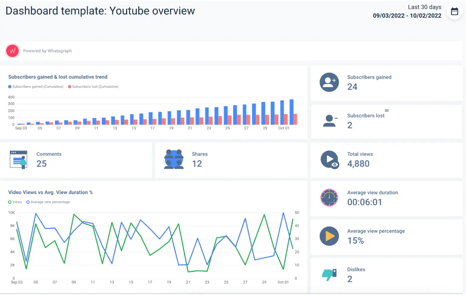
Whatagraph is a marketing reporting platform designed to automate data collection, visualization, and sharing for agencies and in-house marketing teams.
Key strengths:
- Pre-built marketing templates: Offers over 40 dashboard examples and templates for social, search, email, and SEO KPIs that align with commonly tracked marketing metrics.
- Automated summary narratives: Includes auto-generated natural language summaries that accompany visual reports, providing instant context to numbers.
- Scheduled reporting and white labeling: Enables branded dashboards and periodic reports to be delivered directly to clients or stakeholders via email or secure links.
- Multi-source integration: Connects to around 50 platforms, including Google Analytics, Facebook Ads, HubSpot, LinkedIn, and TikTok, automating data aggregation across campaigns.
- Custom metrics builder: Allows for basic metric configuration (such as ROAS and cost-per-lead), although advanced blending and calculations remain limited.
Potential drawbacks:
- Limited data transformations: Whatagraph is not a full-scale ETL solution, meaning users cannot perform complex data transformations, advanced calculations, or multi-source data modeling within the platform.
- Short-term data storage: The platform does not store historical data for extended periods, which can limit long-term trend analysis, benchmarking, or year-over-year performance comparisons.
- Limited customizations: While Whatagraph provides pre-built reports, customization options for charts, widgets, and dashboards are limited.
- Limited scalability for large enterprises: Whatagraph is primarily designed for agencies and small businesses, lacking advanced enterprise-grade features. As marketing data operations scale, companies may outgrow the platform’s capabilities, much like they outgrow Databox.
Whatagraph pricing
Whatagraph operates on a custom pricing model. To learn the starting price of the tool, companies need to request a quote on the website.
9. Tableau

Tableau is a robust business intelligence (BI) and data visualization platform designed for deep, interactive analytics across large and complex datasets.
Compared to Databox, Tableau offers significantly more analytical depth, customization, and governance features, making it a better fit for organizations with mature data infrastructure and advanced reporting needs.
Key strengths:
- Advanced data visualization: Tableau provides highly interactive dashboards with extensive customization options. It offers a drag-and-drop interface and a wide range of visualization types, including bar charts, line graphs, and pie charts, as well as more complex options such as scatter plots, heat maps, and tree maps.
- Broad data connectivity: Connects to a wide range of sources, including cloud warehouses (Snowflake, BigQuery, Redshift), relational databases, spreadsheets, and APIs.
- Calculated fields and custom metrics: Supports complex data transformations and advanced calculations, giving teams flexibility to create highly specific metrics and KPIs.
- Enterprise-grade governance: Includes version control, role-based permissions, and centralized data sources to ensure consistent KPI definitions and secure sharing across teams.
- AI-powered features: Tableau integrates capabilities like Explain Data (automated insight generation), Ask Data (natural language queries), and forecasting powered by machine learning.
Potential drawbacks:
- Steeper learning curve: Tableau requires training to master advanced features like calculated fields, complex dashboards, and data modeling.
- Resource-intensive: More demanding in terms of implementation and ongoing maintenance compared to lighter tools like Databox.
- Higher costs: Pricing is geared toward enterprise-scale organizations, which may not be suitable for smaller teams focused on lightweight reporting.
- No native marketing-specific models: Tableau lacks built-in, marketing-specific analytical models. This means marketing teams might have to build these models from scratch, which can be time-consuming and require a deep understanding of both marketing dynamics and data analysis.
Tableau pricing
Tableau’s pricing is subscription-based and role-specific, with costs determined by user type:
- Creator licenses for full analytics and content creation,
- Explorer for interactive analysis,
- and Viewer for dashboard consumption.
It is available via Tableau Cloud (hosted) or Tableau Server (self-managed), with enterprise deployments incurring additional infrastructure and support costs.
Advanced AI features and embedded analytics are offered in higher-tier plans with custom pricing.
Marketers often face a challenge with Tableau due to its lack of built-in, marketing-specific models. Before looking for insights, users must spend hours creating custom metrics and models.
Improvado consolidates disparate revenue data into a unified dataset, preparing it for analysis before pushing it to Tableau.
To further simplify and speed up the process, the platform provides a no-code data transformation framework and a number of pre-built data models for common use-cases.
“Once the data's flowing and our recipes are good to go—it's just set it and forget it. We never have issues with data timing out or not populating in GBQ. We only go into the platform now to handle a backend refresh if naming conventions change or something. That's it.”

9. Cyfe

Cyfe is an all-in-one dashboard platform designed for monitoring marketing, sales, finance, and support performance through a unified interface.
Key strengths:
- All-in-one monitoring dashboards: Cyfe enables users to create composite dashboards that pull in data from marketing, CRM, analytics, and finance systems, providing high-level visibility across business functions.
- Widget-based custom metrics: Includes customizable widgets and basic formulas for charting metrics side by side in a single view, ideal for overview reporting and cross-functional tracking.
- Centralized alerts and notifications: Supports real-time alerts for key metrics, sent via email, Slack, or mobile, to highlight performance shifts or thresholds without manual monitoring.
- Affordable setup and ease of use: Simple onboarding and intuitive dashboard building make it accessible to small teams or non-technical users.
Potential drawbacks:
- Limited analytical depth: Lacks advanced reporting, segmentation, or drill-down functionality, making it unsuitable for detailed data exploration or insight generation.
- No cross-channel analytics: It does not support advanced calculated metrics beyond what you can do with basic formulas on individual widgets, and you cannot blend data from different sources into one visualization or create new complex metrics. Essentially, each widget in Cyfe is tied to one data source or a simple merge of a few, so complex multi-source analysis is not possible.
- No governance or enterprise features: Does not support centralized metric definitions, user roles, or auditability, risky for organizations with compliance or scale needs.
- No AI or predictive capabilities: Cyfe focuses purely on visualization and monitoring, lacking anomaly detection, recommendation engines, and machine learning-based features.
Cyfe pricing
Cyfe uses tiered pricing driven by dashboard count and number of users.
Plans start at $29/month for a few dashboards and 1 user, scaling up to more comprehensive options like the Premier tier (~$89/month), which includes 20+ dashboards, unlimited users, and extras such as weekly exports and white-label branding.
10. Looker Studio (former Google Data Studio)

Looker Studio (formerly Google Data Studio) is a free data visualization and reporting tool from Google that allows users to create interactive, shareable dashboards.
Key strengths:
- Cost-effective solution: Available for free, making it highly accessible for teams needing customizable dashboards without additional licensing costs.
- Broad data integrations: Since Looker Studio is a part of the Google ecosystem, it connects seamlessly with other Google products (Google Analytics, Google Ads, BigQuery, Sheets) and supports partner connectors for platforms like Facebook Ads, HubSpot, and LinkedIn.
- Customizable visualizations: Provides full control over dashboard layout, widget customization, and branding options to tailor reports to specific needs.
- Calculated fields and blended data: Supports calculated metrics and blending data from multiple sources within a single report for more complex analysis.
- Collaborative sharing and permissions: Dashboards can be shared with specific users or embedded publicly, with permission settings similar to Google Drive.
Potential drawbacks:
- Performance issues with large datasets: Reports can become slow or unresponsive when working with high-volume or complex data queries.
- No centralized governance: Lacks enterprise-grade governance features such as semantic layers, audit trails, and role-based metric control.
- Dependence on connectors: Many non-Google integrations require paid third-party connectors, adding complexity and cost for multi-platform reporting.
- Limited advanced analytics: Primarily focused on visualization and reporting; does not include AI-driven features like anomaly detection or predictive modeling.
Looker Studio pricing
Looker Studio is a free tool.
11. NinjaCat

NinjaCat is a reporting and analytics platform designed primarily for marketing agencies and multi-location brands. It focuses on consolidating advertising, SEO, and call tracking data into client-ready dashboards and automated reports.
Compared to Databox, NinjaCat offers stronger capabilities for agency workflows, including white-labeled reporting and scalable multi-account management, but is less suited for deep or enterprise-grade analytics.
Key strengths:
- Agency-focused reporting: Tailored for agencies managing multiple clients, with built-in tools for scaling reporting across accounts and presenting results in branded, client-friendly formats.
- Automated report delivery: NinjaCat supports scheduled, recurring reports that are automatically generated and sent to stakeholders, reducing manual effort in client communication.
- White-label dashboards: Offers full branding options, including custom domains and logos, allowing agencies to present dashboards as an extension of their brand.
- Multi-channel data integrations: Integrates with 100+ marketing platforms, including Google Ads, Facebook Ads, LinkedIn Ads, SEO tools (Moz, Semrush), and call tracking platforms.
- Budget pacing and performance monitoring: NinjaCat includes budget tracking features that enable teams to monitor spend across campaigns and accounts, ensuring delivery stays on target.
Potential drawbacks:
- Limited data transformation capabilities: NinjaCat focuses on out-of-the-box reporting, offering minimal options for advanced data modeling, blending, or creating complex custom metrics.
- Limited scalability for multi-account environments: NinjaCat performance tends to degrade when handling more than 10-20 accounts per dashboard, which makes it less stable for teams managing 50+ client or brand profiles simultaneously.
- Learning curve for setup: Initial configuration for multi-client environments can be time-intensive, especially for teams managing large volumes of accounts.
NinjaCat pricing
NinjaCat doesn't mention any pricing information on its website.
12. Grow

Grow is a business intelligence (BI) and dashboarding platform designed for small to mid-sized businesses that need accessible, no-code analytics.
Compared to Databox, Grow provides greater flexibility for blending and modeling data but lacks the capabilities and scalability required by larger enterprises.
Key strengths:
- No-code data transformation: Grow includes an ETL layer for cleaning, joining, and manipulating data that doesn't require SQL or programming skills.
- Multiple data integrations: Connects to 150+ data sources, including marketing tools (Google Ads, Facebook Ads), CRMs (HubSpot, Salesforce), e-commerce platforms, and databases.
- Customizable dashboards: Offers flexible dashboards with a drag-and-drop editor and a range of visualization types for presenting KPIs and trends.
- Real-time updates: Provides live data sync from integrated sources, keeping dashboards and reports continuously up to date.
- Collaboration features: Supports dashboard sharing, scheduled email reports, and team-level access to ensure alignment across departments or clients.
Potential drawbacks:
- Limited advanced analytics: Does not include AI-driven insights, predictive modeling, or automated anomaly detection, which are typically found in more advanced platforms.
- Performance constraints: Users may experience slower performance when working with larger or more complex datasets.
- Limited visualization customization: Grow’s dashboards, while user-friendly, may lack advanced customization features. Some users even refer to it as a more out-of-the-box solution.
Grow pricing
Similar to NinjaCat, Grow doesn't disclose any pricing information on the website. Users can request a free trial to test it out.
13. Zoho Analytics

Zoho Analytics is a self-service business intelligence and analytics platform that combines data integration, preparation, and visualization within a single environment.
Key strengths:
- Comprehensive data integration: Supports over 500 data connectors, including marketing platforms like Google Ads, Facebook Ads, CRMs, e-commerce tools, and databases.
- Built-in ETL and data prep tools: Offers built-in data cleaning and transformation tools, allowing users to join, filter, and manipulate datasets before visualization.
- Customizable dashboards and reports: Offers interactive dashboards with drill-down capabilities, advanced filtering, and flexible visual customization options.
- AI-powered insights (Zia): Features Zia, an AI assistant that generates automated insights, anomaly detection, forecasting, and natural language querying for faster analysis.
- Collaboration and sharing: Enables role-based permissions, scheduled report delivery, and sharing options for internal teams or external stakeholders.
Potential drawbacks:
- Complex setup for large data volumes: Handling larger datasets or advanced modeling may require database knowledge and additional setup time.
- Interface learning curve: While accessible, mastering advanced features like formula fields, joins, or AI queries takes time for non-technical users.
- Not purpose-built for marketing: Zoho Analytics tries to cater to various types of analysis, not just marketing, which is why it doesn’t have specialized marketing-report templates out of the box. You might have to create those yourself, whereas other Databox alternatives like Improvado or Whatagraph have built-in marketing report formats.
Zoho Analytics pricing
Zoho Analytics offers a tiered pricing model that scales with data volume and user access.
Plans begin at approximately $30/month, supporting 0.5 million rows and basic reporting functionality. Higher tiers, such as Standard, Premium, and Enterprise, offer expanded capacity of up to 50 million rows, as well as advanced features like audit logs, data snapshots, single sign-on, an AI assistant (Ask Zia), predictive analytics, and branded analytics portals.
14. GoodData

GoodData is a cloud-based analytics and business intelligence platform built for embedding analytics into applications, products, and internal workflows.
Compared to Databox, GoodData offers stronger governance, customization, and integration capabilities, making it more suitable for enterprise or product-embedded analytics scenarios rather than lightweight KPI tracking.
Key strengths:
- Semantic layer for governance: Provides a centralized semantic model that defines metrics and KPIs once and ensures consistent usage across dashboards, teams, and applications.
- Embedded analytics: GoodData allows organizations to integrate dashboards, reports, and visualizations directly into customer-facing products or internal tools through APIs and SDKs.
- Customizable metrics and workflows: Enables custom metric creation and advanced modeling with governance controls to ensure alignment across the organization.
- Scalable, multi-tenant architecture: Designed for complex organizations, SaaS companies, and ISVs needing analytics delivery across multiple clients or departments.
- Enterprise-grade security and compliance: Includes SOC 2 compliance, granular role-based permissions, and audit trails to meet enterprise security and regulatory requirements.
Potential drawbacks:
- Higher setup complexity: GoodData requires data modeling and technical expertise during initial configuration, which may not be suitable for small teams without dedicated analytics resources.
- Not focused on out-of-the-box dashboards: GoodData’s focus is broad BI, not specifically marketing, so it doesn’t come with marketing-specific features out of the box and reporting templates for immediate KPI tracking, unlike tools like Databox.
- Steeper learning curve: The learning curve for GoodData can be steep if you’re coming from simpler tools. You must define data models, possibly write SQL or MAQL (GoodData’s metric language), and thoroughly plan how to organize metrics for end users.
GoodData pricing
GoodData offers two core subscription tiers, with pricing tailored to usage scale and deployment needs:
- Professional: The plan includes support for cloud data warehouses, interactive dashboards, and embedded analytics features. The price includes the platform fee and the price for the selected number of workspaces.
- Enterprise plan: Custom pricing designed for organizations requiring enterprise-grade capabilities, such as multi-region or hybrid deployment, HIPAA/FedRAMP compliance, usage analytics, dedicated infrastructure, 99.5% uptime SLA, and VPC support.
15. Coupler.io

Coupler.io is a data automation and integration platform designed to streamline the movement of data from various apps and platforms into analytics and reporting environments like Google Sheets, Excel, BigQuery, or Looker Studio.
Key strengths:
- Automated data pipelines: Enables scheduled imports of data from multiple platforms into destinations like spreadsheets, data warehouses, or BI tools.
- Broad integration library: Supports 200+ integrations including marketing platforms, CRMs, financial tools, and project management apps.
- Customizable scheduling: Offers flexible automation schedules (hourly, daily, weekly) to keep reports and dashboards consistently up to date.
- Data transformation features: Coupler.io includes filtering, field selection, and data formatting during import to prepare datasets for analysis without the need for additional ETL tools.
- Support for BI and visualization tools: Integrates seamlessly with Looker Studio, Tableau, and Power BI, enabling users to create advanced dashboards.
Potential drawbacks:
- No native dashboarding or visualization: Unlike Databox, Coupler.io does not provide built-in dashboards; visualization depends on third-party tools or spreadsheets.
- Learning curve: There’s a significant learning aspect to understanding data flows, as you need to define what data to pull, how to join it, and so on, which is quite powerful, but requires you to know what you’re doing with the data.
Coupler.io pricing
Coupler.io pricing starts at $24/month (billed annually), with costs determined by the number of users, data connections, and refresh frequency. All plans include access to all connectors, with higher tiers offering more connections and faster refresh intervals.
Finding Your Ideal Databox Alternative
With a wide range of Databox alternatives available, choosing the right platform depends on your data complexity, reporting requirements, and growth plans. From lightweight dashboard tools to enterprise-grade BI and AI-driven analytics solutions, each option serves different needs and levels of maturity.
Improvado is an ideal fit for organizations seeking a scalable, enterprise-ready alternative. It centralizes marketing and sales data, automates data preparation and transformation, enforces governance, and layers AI-driven insights to streamline data-driven decision-making.
To see how Improvado can transform your analytics stack and replace Databox with a more robust solution, book a demo today.