If you run marketing, sales, or BI analytics, your job is to turn messy, multichannel data into clear, defensible decisions. That is the promise of data visualization. The risk is also real. One sloppy axis or chart choice can mislead stakeholders and wreck trust. Recent public chart fiascos from AI vendors are a warning shot for all of us. Clarity and honesty are not optional.
This guide tells you exactly how to visualize data well, with frameworks you can apply today, examples to copy, pitfalls to avoid, and technology choices that fit real marketing teams.
What Is Data Visualization?
Effective visualization combines three elements:
- Right encoding: Mapping quantitative values to the most accurate perceptual channels, such as position and length, rather than less precise cues like area, angle, or color intensity.
- Right context: Clear scales, axes, annotations, and baselines that reduce ambiguity and prevent misinterpretation. Without this context, even well-encoded data can mislead.
- Right interactions: The ability to filter, pivot, and drill into subsets of data so analysts and business users can move from “what happened” to “why it happened” without friction.
In practice, visualization is not only about aesthetic presentation but about engineering a decision-support layer.
For decision-makers, the right visual model reduces cognitive load, accelerates pattern recognition, and directs attention to actionable levers—where resources should be reallocated, which campaigns require optimization, and which signals point to emerging risk or opportunity.
Why Is Data Visualization Important?
Effective data visualization doesn’t just create charts; it accelerates decision-making.
In environments where datasets span millions of rows and dashboards proliferate across silos, visualization compresses complexity into interpretable patterns.
The benefits of data visualization can be summed up in three points:
- Accelerates decision-making: By mapping data into visual encodings, the human eye processes information more efficiently than text or tables; visualization dramatically reduces the time to insight. When velocity and volume of data increase, teams that rely on visual analysis outperform those stuck in spreadsheets.
- Aligns stakeholders: Shared visuals anchor conversations around consistent metrics and a single source of truth. In cross-functional organizations, this is critical—executives, analysts, and operations teams can interpret the same graph without translation, bridging the gap between technical precision and business strategy.
- Prevents costly errors: Visualizations surface anomalies earlier than tabular reviews. A sudden drop in impressions, a misaligned attribution window, or a data feed gap becomes instantly visible. This only works when paired with strong governance upstream, namely, naming conventions, validation rules, and monitoring, which ensures what’s visualized is both accurate and trusted.
Types of Data Visualization
Most analytical questions reduce to a handful of relationships: comparisons, trends, distributions, correlations, flows, and hierarchies.
The key is matching the right chart type to the business question while keeping scales, labels, and encodings precise.
| Visualization type | Best use case |
|---|---|
| Compare categories | Bars (grouped, stacked, or 100%) are the most accurate way to compare categories, since length and aligned position are easy to read. Ideal for analyzing channel spend, ROAS by region, or creative performance across tests. |
| Show change over time | Line charts are best for showing trends, while area charts emphasize totals over time. When multiple series create clutter, small multiples allow comparisons on shared scales. Common examples include tracking monthly CAC, MQL volume by region, or pipeline growth. |
| Show part to whole | Stacked and 100% stacked bars visualize composition within a total, while waterfall charts explain additive/subtractive contributions. Useful for budget allocations, attribution shares, or campaign mix composition. |
| Show distribution | Histograms highlight the shape of data, skew, and outliers. Box plots summarize medians, quartiles, and variability, enabling fast comparison across segments. Examples include CPC spread, session duration ranges, or distribution of order values. |
| Show correlation | Scatterplots illustrate relationships between two measures, such as spend vs. revenue or impressions vs. conversions. Bubble size can encode a third variable, though less precise than position or length. Effective for testing efficiency or scaling relationships. |
| Show flow | Alluvial or Sankey diagrams reveal how entities move through stages or categories, such as multi-touch attribution paths or how budget allocations translate into campaign outcomes. Clarity requires concise labeling to avoid “spaghetti” diagrams. |
| Show hierarchy | Treemaps compactly display nested structures, while sunbursts emphasize levels and paths. Both are effective for visualizing campaign hierarchies, product categories, or account portfolios. |
| Show geography | Choropleth maps show ratios or rates (e.g., conversion rate by region) to avoid population bias, while symbol maps are better for absolute values like store sales or installs. Choosing the right map prevents misleading interpretations. |
Data Visualization Techniques and Best Practices
The goal of data visualization isn’t to make charts look impressive but to encode data in ways that minimize cognitive load, preserve accuracy, and accelerate decisions.
For analytics teams working at scale, adhering to proven practices ensures that dashboards remain both trustworthy and actionable.
1. Choose encodings that match the task
Not all encodings carry the same perceptual weight.
Quantitative values should be mapped to position on a common scale or length, as these yield the highest accuracy in human estimation. Reserve less precise channels—area, angle, and color—for secondary encodings or categorical distinctions.
Validate choices with your actual users; domain expertise, screen resolution, and cultural context can shift interpretability.
2. Optimize for comparisons, not decoration
Remove visual noise, 3D effects, gradients, shadows, or “chartjunk” to reduce signal-to-noise ratio without adding analytical value.
Following Tufte’s principle of data-ink ratio, prioritize clean encodings that highlight relationships.
3. Label clearly and use honest scales
Scales shape interpretation.
Start bar chart axes at zero to avoid exaggerating differences. If truncation is necessary, flag it explicitly and consider indexed line charts for relative comparisons.
Misleading scales can erode trust quickly; errors at this level ripple into flawed business judgments.
4. Prefer simple chart families
Bars, lines, and scatterplots remain the workhorses of dashboards. They optimize cognitive processing.
While advanced visuals, such as sankey diagrams and treemaps, have their place, simplicity ensures scalability and comparability across reports.
5. Match interactivity to analytical questions
Interactivity should extend, not obscure, analysis.
Filtering, highlighting, and drill-throughs should mirror recurring business questions, such as “Which regions underperform this quarter?” or “Which campaigns drive incremental lift?”
Avoid exotic interactions that look impressive but slow comprehension. Visualization exists to accelerate decisions, not showcase novelty.
6. Govern your definitions
Visualization is only as credible as the metric layer beneath it.
Enforce naming conventions, taxonomies, and compliance rules at the data governance stage to prevent downstream inconsistencies.
Tools like Improvado’s Marketing Data Governance provide automated enforcement and anomaly detection, ensuring every chart rests on a trusted foundation.
7. Close the loop with user testing
Even rigorously designed dashboards can mislead if users misinterpret them. Conduct usability studies with real stakeholders to observe navigation patterns, accuracy of interpretation, and decision-making speed.
Iteration based on real-world use closes the feedback loop, ensuring the visualization environment serves as a genuine decision-support system.
Examples of Data Visualization
In marketing analytics, the right visualization technique connects performance data directly to operational and strategic decisions. Below are practical examples that illustrate how specific chart types map to common use cases.
1. Attribution share by campaign
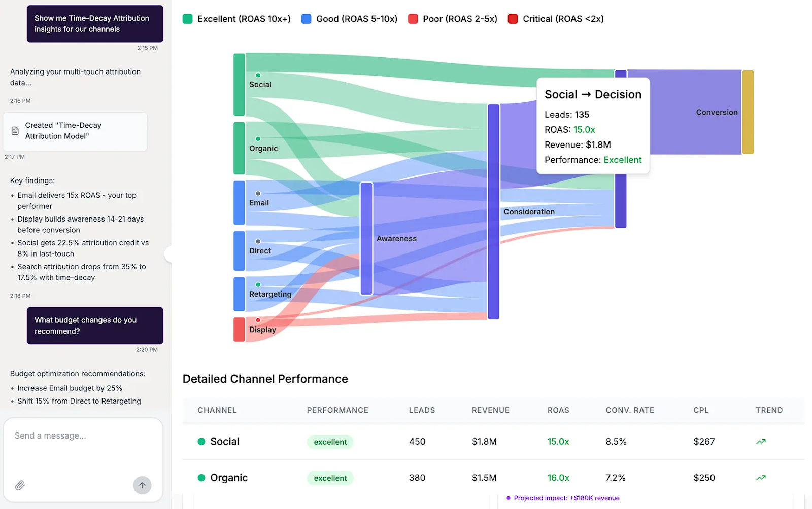
This view combines multi-touch attribution with time-decay modeling to surface how each channel contributes across the funnel. Instead of over-crediting last-touch channels like search, the model redistributes value based on where each interaction occurs in the journey.
The Sankey diagram highlights these flows visually, showing how leads move from awareness through decision, and where channels deliver the highest ROI.
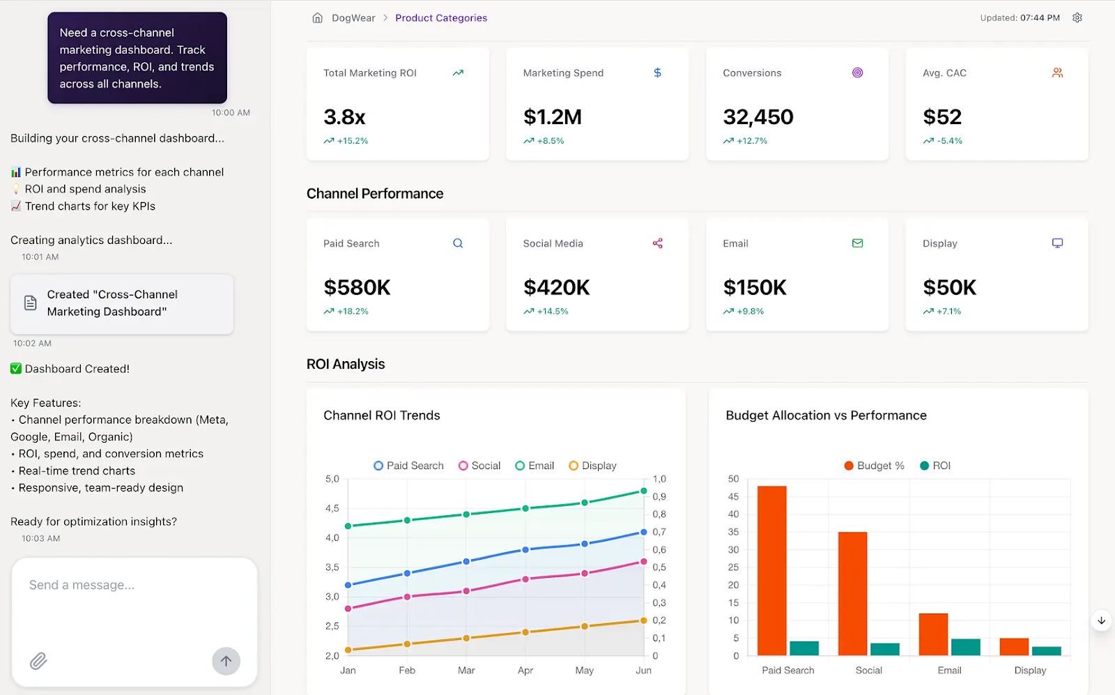
2. Budget allocation vs. performance
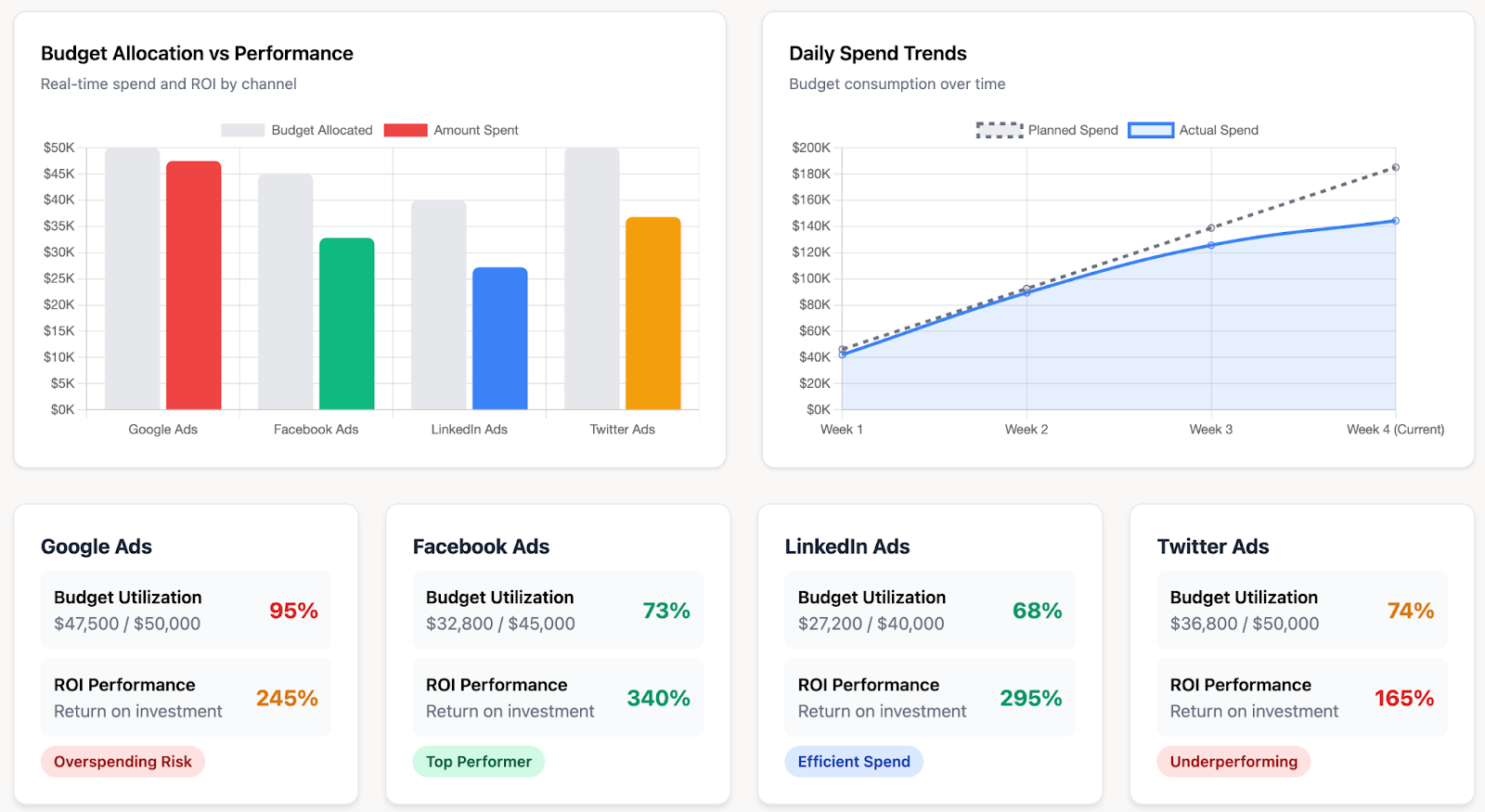
Bar charts compare allocated vs. actual spend across channels, making it easy to spot overspending or underspending at a glance.
In this example, Google Ads is near its allocation limit, while LinkedIn and Facebook are underutilizing the budget.
3. Ecommerce dashboard
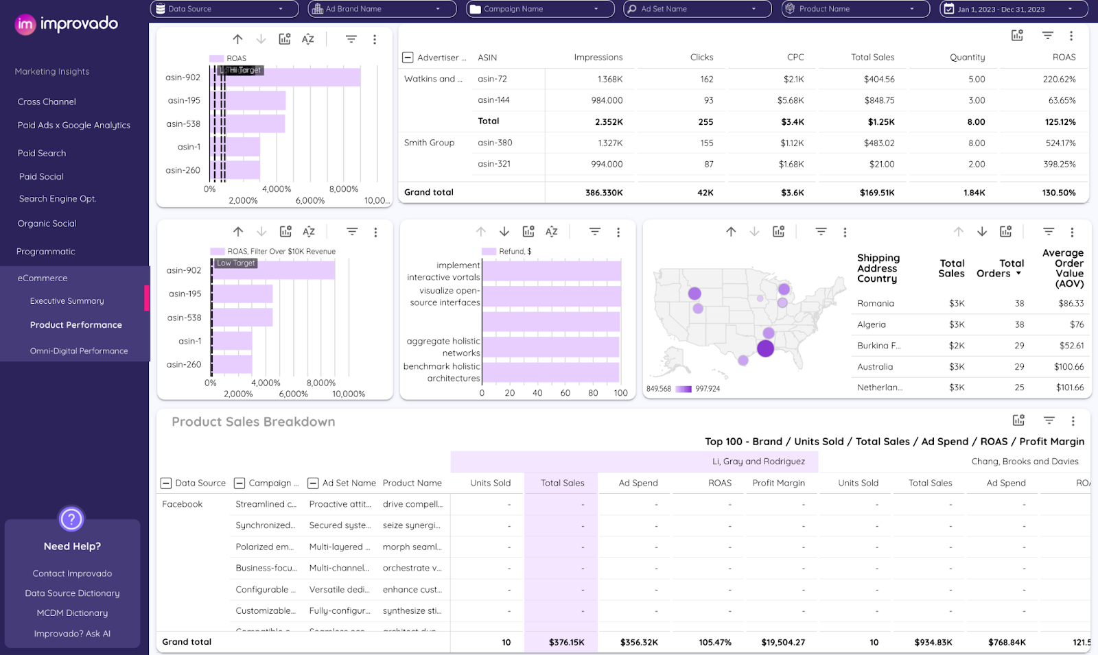
The ecommerce dashboard surfaces the intersection of sales, ad spend, and return metrics across multiple channels, products, and geographies.
- Bar charts for ROAS by product highlight which SKUs exceed or fall short of profitability targets. Useful for quickly spotting top performers vs. underperformers at the product level.
- Tabular views for advertiser and ASIN metrics provide granular detail on impressions, clicks, CPC, and ROAS. This format is best suited for precise performance audits where exact values are crucial.
- Geographic maps with sales overlays visualize contribution by country, showing both sales totals and AOV. Effective for identifying high-value markets versus low-margin regions.
- Refund charts track return volumes alongside sales to ensure margin health is visible. This prevents revenue reporting from masking profitability risks.
- Breakdown tables for campaigns and brands show how spend translates into units sold and ROAS across portfolios. Ideal for aligning budget allocation with brand- or campaign-level results.
AI in Data Visualization
The widespread adoption of AI has also reshaped the field of data visualization.
AI augments visualization by automating translation from business questions to analytic views. Instead of manually selecting chart types or encodings, models parse natural language queries, recommend statistically appropriate encodings, and generate charts aligned with the structure and scale of the data.
This accelerates the shift from exploratory tables to interpretable, decision-ready visuals generated by AI reporting tools.
Where AI adds the most value is in acceleration and scale.
Proactive anomaly detection highlights metric shifts in real time, narrative summaries convert multivariate patterns into concise executive briefs, and auto-charting reduces analyst time spent on repetitive reporting.
These capabilities extend the reach of data teams, enabling faster iteration cycles without compromising depth of analysis.
Key applications include:
- Prompt-to-chart: Allowing stakeholders to request charts in plain language, with analysts refining outputs for accuracy and context.
- Narrative summaries: Automatically turning statistical patterns into structured briefs for leadership audiences.
- Proactive insights: Detecting anomalies and metric shifts, with alerts pushed to Slack, email, or workflow tools for immediate triage.
What Is Data Structure Visualization?
Most visualization in marketing and analytics focuses on magnitudes—tracking performance by time, category, or geography. But some business questions center on relationships, flows, and hierarchies.
That’s where data structure visualization comes in. It shifts attention from “how much” to “how things connect,” exposing dependencies, bottlenecks, and clusters that traditional charts can’t reveal.
Core approaches
- Node-link graphs: Best for tracing paths in relatively sparse networks, such as influencer relationships or site architectures. They emphasize connectivity but degrade into “hairballs” when density rises.
- Sankey and alluvial diagrams: Show both sequence and volume across stages, making them ideal for multi-touch attribution, funnel transitions, and budget flow into outcomes.
- Sunbursts and treemaps: Effective for hierarchies, such as campaign portfolios or product taxonomies. Treemaps highlight proportional comparisons within levels, while sunbursts emphasize depth and nesting.
- Adjacency matrices: Scale better than node-link graphs for dense networks. By reordering rows and columns, analysts can reveal clusters and modularity, thereby surfacing structural patterns that are hidden in traditional charts.
- Geographic or hybrid overlays: When relationships involve physical context (for example, sales by DMA with campaign hierarchies layered on top), structural and geographic visual grammars can be paired to provide multidimensional insight.
Data Visualization Platforms Inside a Marketing Analytics Stack
In a modern marketing analytics architecture, visualization sits at the top of a stack designed to make data reliable, explainable, and actionable. A robust reference model includes:
- Source: Paid media platforms, analytics suites, CRMs, web event trackers, and offline datasets provide the raw inputs. For enterprises, this often spans hundreds of accounts across dozens of systems.
- Pipelines: Automated extraction and loading orchestrate data ingestion into a central warehouse or lake. Connectors must handle API pagination, rate limits, schema changes, and refresh schedules to prevent pipeline fragility.
- Modeling: Transformation logic harmonizes metrics and dimensions across channels. Reusable recipes ensure comparability while supporting custom business logic for attribution, funnel stages, or account hierarchies.
- Governance: Rule-based enforcement of naming conventions, compliance, and data quality ensures that downstream dashboards are protected from broken inputs. Alerts on anomalies or taxonomy drift safeguard trust in the numbers.
- Insights: Pre-built dashboards and visualization templates enable immediate performance tracking, with drill-downs for channel, creative, or cohort views. This accelerates time to insight while maintaining consistency across teams.
- AI: Agentic layers extend visualization beyond static charts. Natural language querying, anomaly detection, and proactive insight delivery bring analysis directly into workflow tools, such as Slack, BI platforms, or CRM systems.
Improvado operationalizes this stack end-to-end for marketing analytics. With 1,000+ connectors, flexible transformation logic, BI enablement, and AI-assisted reporting, it enables teams to move beyond fragmented reporting toward unified, revenue-driven insight delivery.
For organizations tasked with revenue analytics at scale, building this architecture is the prerequisite; chart selection comes after the data foundation is in place.