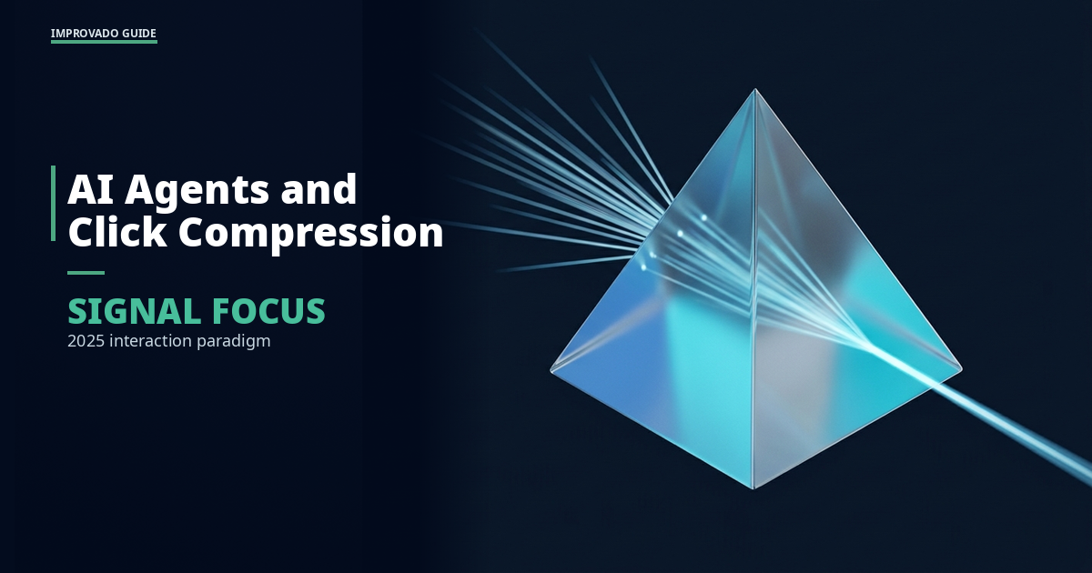
"AI agents will kill button-clicking." That's the headline from Bret Taylor, Sierra co-founder and CEO and former Salesforce co-CEO, speaking at HumanX in San Francisco this April. It got picked up everywhere. It's also a reasonable observation of a real shift — but it's the wrong word.
Agents don't kill the click. They absorb the workflow we used to navigate one click at a time.
The interface doesn't go away. It changes form. Microphone, language, recognition, speech, gesture, expression instead of most of the clicks and taps we do now. Individually tailored UI. Per team. Per person. Generated by agents against your actual business context.
What does go away is the share of buttons that exist purely for navigation — the menus, breadcrumbs, filter dropdowns, and modal stacks we click through to get to the place where a real decision happens. Matt Slotnick of Poggio frames the next state more precisely: the share of agentic labor input grows, the number of buttons shrinks, and the remaining buttons change what they're for.
Key Takeaways
- "Kill button-clicking" is the wrong word. Agents absorb navigation clicks. The consequential clicks stay — and become more important.
- Two classes of clicks behave very differently. Navigation clicks are how you operate the interface. Consequential clicks are how you take responsibility for a decision: approving spend, paying a vendor, signing off on a hire.
- The interface doesn't disappear. It changes form. Voice, language, gesture, and per-person generated UI replace most of the today's chrome.
- Conversational UI doesn't win on its own. It wins where context-loading dominates the workflow. Pure chat is a regression for tasks where the structure is the value.
- The remaining buttons get more design weight, not less. Fewer buttons, each carrying more decision weight, demand stronger affordances and clearer accountability than the buttons they replace.
The Real Shift: Navigation Clicks vs. Consequential Clicks
If you watch how people actually use a B2B SaaS product, most of the click volume is navigation. Open the campaign manager. Filter by date range. Drill into the campaign. Switch to the breakdown view. Re-filter by placement. Export the segment. Copy it into a brief. Open the brief. Paste.
A tiny fraction of those clicks are consequential. Approve the budget. Pay the new vendor. Send the offer to the candidate. Push the campaign live. Each of those is a click that owns a decision and assigns responsibility.
Today's UIs treat both classes the same. A "Submit" button looks roughly like a "Filter" button. The interface doesn't distinguish navigation cost from decision weight.
Agents change that ratio. Most of the navigation can be expressed as a workflow the agent runs end-to-end — assemble the segment, summarize the breakdown, draft the brief — without the human clicking through any of it. What's left on the screen is the decision. That decision now carries the full weight of the workflow behind it, and the click that confirms it is the only click the human actually needs to make.
That's the precise sense in which agents "kill" buttons. They retire the navigation buttons. The consequential ones get heavier.
Conversational UI vs Buttons: A Misleading Framing
The popular framing of this shift is "conversational UI vs buttons", chat boxes replacing menus. That framing is mostly a category error, and most of the early conversational products show why.
Conversational UI is a great fit when context-loading dominates the task. Asking the agent "summarize this quarter's paid media performance against the original plan and flag anything off-trend by more than 10%" is a single sentence that would otherwise be twenty clicks across three tools. The agent does the navigation. The output is the answer. The interface gets out of the way.
Conversational UI is a poor fit when the structure of the task is the value. Comparing five vendor proposals side by side, scrubbing a video timeline, picking a creative from a generated grid, reordering a sprint backlog — these are tasks where the visual structure carries information that chat can't compress without losing it. Trying to do them in pure text is a regression in time, not a step forward.
The honest answer to "conversational UI vs buttons" is: neither, exclusively. The interface that wins is hybrid. Agents absorb the navigation, conversation handles the context-loading, and the remaining UI handles the structured decisions that visuals make easier than words. Done well, you click less and decide more.
Where the Remaining Buttons Live
If most navigation buttons fade, what stays on screen?
A short list, based on what we keep seeing in enterprise marketing stacks:
- Budget approvals. Allocating, reallocating, and pausing spend across channels.
- Vendor and contract decisions. Paying a new vendor, renewing a tool, signing a contract.
- People decisions. Approving an offer, signing off on a promotion, assigning an account.
- Brand and legal sign-offs. Approving creative, copy, or claims before they ship — especially anything that touches regulated language.
- Strategy commits. Locking in this quarter's ICP, voice framework, or campaign hypothesis as the canonical version every agent should read from.
- Override and rollback. Stopping an agent's run, rolling back a deployed campaign, escalating an exception.
What these have in common: each is a moment where a human signs their name on the outcome. The button isn't decoration. It's the audit trail.
What This Means for B2B Software UX
The future of B2B software UX, on this read, isn't "no buttons." It's a deliberate split between the agentic surface and the decision surface. Three implications for product and design teams.
1. The agentic surface does navigation. The decision surface does responsibility. Don't blend them. A chat box that also lets you approve, say, a large media plan with the same affordance you use to ask a question is a design that quietly invites errors. Treat the consequential click as its own UI layer with its own affordances.
2. The remaining buttons need stronger affordances, not weaker. Because each one now carries the weight of a workflow behind it, the cost of an unintended click goes up. Confirmation dialogs, signed states, clear undo windows, and visible context (for example: "this approves $X across N campaigns owned by Y") become non-negotiable.
3. The agent needs the same context the human has. This is the part most teams underestimate. If the agent is going to absorb the navigation, it needs to operate against the same canonical version of strategy the human would consult. Otherwise the decision the human is asked to click is the wrong decision wrapped in good UX. The agent fed stale context produces a perfectly designed approval flow against an out-of-date plan.
That third one is where most of the failure cases we see actually live. The interface looks clean. The agent looks competent. The decision the human is asked to make is rendered against a context that's six weeks old. The click happens. The wrong outcome ships.
Why Conversational UI Alone Loses to Agentic UI
A lot of the "conversational UI vs buttons" discourse implicitly assumes the choice is between a chat box and a menu. That framing skips the layer that actually matters: what's running underneath both of them.
A conversational UI on top of an agent with no shared context is just a slower menu. The user types the same intent they would have clicked, the agent assembles a workflow from a partial picture of the business, and the answer comes back fluent and wrong. Pretty interface, broken substrate.
An agentic UI on top of a shared, canonical layer is a different thing entirely. The buttons that remain — the consequential ones — light up against the same source of truth the agent used to assemble the workflow. The navigation that disappears is replaced by an agent run that drew from the same ICP definition, the same segment meanings, the same campaign hypotheses, the same funnel model the human would have consulted. The decision the human clicks is well-formed because everything underneath it agrees.
That's the design pattern that earns the "kill button-clicking" headline. Not the chat box. The shared context underneath.
At Improvado we've spent the last several years building this for the marketing function specifically — agentic data pipelines that pull from 1000+ connectors per Improvado's own catalog, an internal canonical layer (we call it Miras) that holds the authoritative version of marketing strategy as a graph, and agents that read from it at execution time rather than from a frozen snapshot taken when they were deployed. The reason the agentic UI on top of that stack feels different isn't the chat. It's that every remaining click maps to a decision the underlying data already agrees on. The integration catalog is the unsexy part; the canonical layer is what makes the buttons feel honest. In practice, new customer environments come online in days, not weeks — versus the months our enterprise customers typically describe spending on custom-built equivalents before switching.
The work gets simpler, faster, more native. No killing required.
FAQ
What is a conversational UI?
A conversational UI is an interface where the primary mode of interaction is natural language — typed or spoken — rather than visual controls like buttons, menus, and forms. Chatbots, voice assistants, and AI agents accessed through a chat surface are all conversational UIs. The interface doesn't disappear; it shifts from visual chrome to language plus a small set of structured controls for the moments where a decision needs to be confirmed.
What is an example of a conversational UI?
Asking an AI agent "summarize last quarter's paid media performance against the original plan and flag anything off-trend by more than 10%" and getting a structured answer back, instead of opening four dashboards and clicking through filters, is a conversational UI doing what it's good at. Customer-support chat surfaces, voice-first interfaces in cars, and AI coding assistants are other common examples.
Will AI agents replace traditional buttons in software?
They'll replace most of the navigation buttons — the ones that exist to move you between views, filter data, or trigger pre-canned workflows. They won't replace the buttons that confirm a consequential decision: approving spend, paying a vendor, signing off on a hire, pushing creative live. Those clicks are how humans assign responsibility, and that requirement doesn't go away because the workflow underneath got faster.
What are the different types of buttons in UI?
The functional taxonomy that matters in the agentic-UI era is two-layer: navigation buttons (open, filter, drill, switch, export) and consequential buttons (approve, pay, send, publish, sign). Visual taxonomy — primary, secondary, ghost, icon, FAB — still applies, but the more important split is by whether the click moves you somewhere or commits you to something. Agentic UIs collapse most of the first category and elevate the second.
Is conversational UI better than a button-based interface?
Neither is universally better. Conversational UI wins when context-loading dominates the task — when one sentence can replace twenty navigation clicks. Button-based and visual interfaces win when the structure of the task is the value — comparing options side by side, scrubbing a timeline, picking from a generated grid. The interface that wins in production B2B software is hybrid: agents absorb the navigation, conversation handles context-loading, and structured controls handle the decisions.
How should B2B product teams design for agentic UX?
Split the surface deliberately. The agentic surface (chat, voice, generated UI) handles navigation and context assembly. The decision surface (the remaining buttons) handles responsibility, with stronger affordances, visible context, and clear audit trails. And make sure the agent and the human are reading from the same canonical version of strategy — otherwise the prettiest UX in the world is just rendering the wrong decision faster.
Stop designing for the buttons that are about to fade. Improvado's agentic data layer absorbs the navigation clicks across paid, content, and analytics — and feeds the buttons that survive against one canonical version of marketing strategy. Deployed in days, not weeks. See how it works →