CMOs today report to boards that want clear answers: What's working? What's the return? Where should we invest next? Yet the data needed to answer those questions lives in dozens of disconnected platforms — ad networks, CRMs, analytics tools, attribution systems. Pulling it together manually takes days. By the time the dashboard is ready, the board meeting has passed.
This is the problem a CMO dashboard solves. A well-designed dashboard transforms fragmented performance data into a unified executive view — the metrics that matter, updated in real-time, with enough context to drive decisions. It tells leadership what's driving revenue, where budget is going, and which channels deliver the best return.
This guide walks you through building a CMO dashboard from the ground up: the metrics that belong in it, the structure that makes it readable, the tools that automate the data pipeline, and ready-to-use templates you can adapt today.
Key Takeaways
✓ A CMO dashboard consolidates cross-channel marketing performance into a single executive view, eliminating manual reporting and reducing data latency from days to minutes.
✓ Focus on outcome metrics boards care about — pipeline contribution, CAC, LTV:CAC ratio, and revenue attribution — rather than vanity metrics like impressions or social followers.
✓ The best dashboards segment by channel, campaign, region, and customer segment to surface actionable insights, not just aggregate totals.
✓ Pre-built templates accelerate time-to-value, but customization is essential: every CMO dashboard should reflect the company's unique GTM strategy and board priorities.
✓ Automation is non-negotiable at scale — manual CSV exports break when campaign volume grows, connector schemas change, or team members leave.
✓ Integration complexity is the biggest implementation barrier: connecting Google Ads, Salesforce, HubSpot, and attribution tools requires purpose-built marketing ETL that normalizes schemas and preserves historical data.
What Is a CMO Dashboard?
A CMO dashboard is a centralized reporting interface that aggregates marketing performance data across all channels, campaigns, and customer touchpoints. It surfaces the metrics executive leadership uses to evaluate marketing effectiveness: pipeline contribution, customer acquisition cost, lifetime value ratios, channel ROI, and attribution breakdowns.
Unlike operational dashboards built for day-to-day campaign management, a CMO dashboard prioritizes strategic visibility. It answers board-level questions: Are we hitting our pipeline targets? Which channels generate the highest-quality leads? Is our CAC sustainable relative to LTV? Where should we reallocate budget next quarter?
The dashboard pulls data from advertising platforms (Google Ads, Meta, LinkedIn), CRM systems (Salesforce, HubSpot), web analytics (Google Analytics, Adobe Analytics), and attribution tools. It normalizes that data into a consistent format, applies business logic (lead stages, revenue attribution models, cost allocation), and visualizes trends over time. Without automation, this process requires multiple analysts and delivers stale insights. With the right infrastructure, it updates in real-time.
Why CMO Dashboards Matter in 2026
Marketing teams today manage more channels, more data sources, and more budget than ever before. The average enterprise marketing organization runs campaigns across eight to twelve platforms simultaneously. Each platform reports performance in its own format, with its own metric definitions, on its own timeline. Without a unified dashboard, leadership operates blind — making budget decisions based on incomplete data, outdated reports, or anecdotal evidence from platform reps.
CMO dashboards solve three critical problems:
• Visibility — Leadership sees the full funnel in one place, from first touch to closed revenue, across every channel and campaign.
• Speed — Real-time data eliminates the reporting lag. Decisions happen faster because the data is already current.
• Accountability — Clear attribution and ROI tracking tie marketing spend directly to revenue outcomes, making it easier to defend budget requests and prove performance.
According to industry benchmarks, teams using automated dashboards reduce reporting time by up to 80% and increase campaign optimization speed by 3x. The ROI isn't just operational — it's strategic. Boards trust CMOs who can show clear metrics and explain performance trends in real-time.
Core Metrics Every CMO Dashboard Should Track
Not every metric belongs in a CMO dashboard. The goal is to surface the numbers that drive decisions — the ones leadership actually uses to evaluate marketing performance and allocate resources. Vanity metrics (impressions, social followers, page views) belong in operational dashboards, not executive reporting.
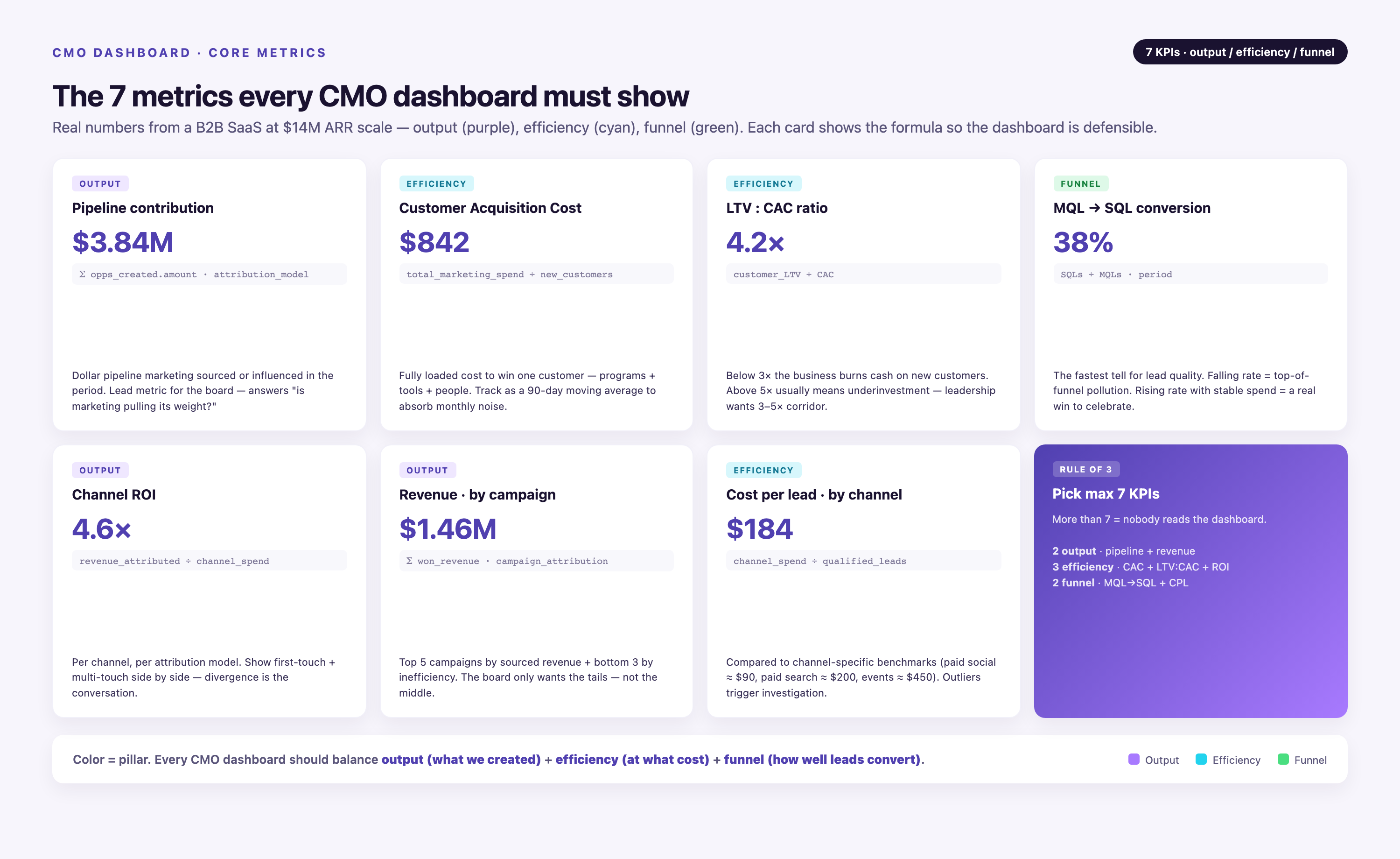
Pipeline Contribution
Pipeline contribution measures how much qualified pipeline marketing generated in a given period. It's the clearest signal of marketing's impact on revenue. Break it down by channel, campaign, and region to identify which efforts drive the most valuable opportunities. Track both new pipeline created and pipeline influenced (multi-touch attribution).
Customer Acquisition Cost (CAC)
CAC is total marketing and sales spend divided by the number of new customers acquired. It tells leadership whether customer acquisition is efficient or expensive. Compare CAC across channels to identify where you're overspending. Track CAC trends over time — rising CAC signals saturation or declining campaign effectiveness.
LTV:CAC Ratio
The LTV:CAC ratio compares customer lifetime value to acquisition cost. A ratio above 3:1 indicates healthy unit economics — you're generating three dollars of value for every dollar spent acquiring the customer. Industry benchmarks suggest ratios below 2:1 signal unsustainable growth, while ratios above 5:1 suggest underinvestment in acquisition.
MQL-to-SQL Conversion Rate
This metric measures how many marketing-qualified leads convert to sales-qualified leads. It's a key indicator of lead quality. Low conversion rates mean marketing is generating volume but not value — leadership needs to see this early. Benchmark targets range from 10% to 25%, depending on industry and product complexity.
Channel ROI
Channel ROI compares revenue generated to spend invested, segmented by channel (paid search, paid social, organic, email, events). It's the metric that drives budget reallocation decisions. Without accurate attribution, channel ROI is guesswork. Multi-touch attribution models (first-touch, last-touch, U-shaped, W-shaped, time-decay) provide different lenses on the same data — CMO dashboards should allow leadership to toggle between models.
Revenue Attribution by Campaign
Revenue attribution ties closed deals back to the campaigns that influenced them. This is where marketing proves ROI. Surface this data by campaign type, audience segment, and channel mix. Show leadership which campaigns drive pipeline and which drive closed revenue — they're not always the same.
Cost Per Lead (CPL) by Channel
CPL measures efficiency at the top of the funnel. It's useful for operational optimization but should be contextualized with downstream metrics. A low CPL means nothing if those leads don't convert. Pair CPL with MQL-to-SQL conversion and close rate to give leadership the full picture.
How to Structure a CMO Dashboard for Maximum Clarity
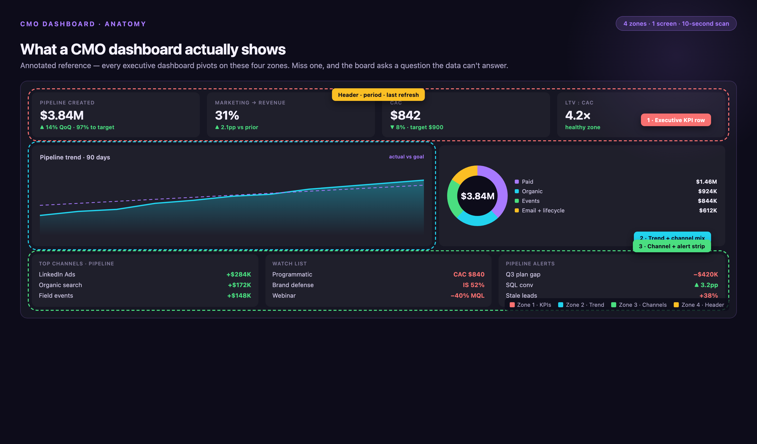
A CMO dashboard should be scannable in under 60 seconds. Leadership doesn't have time to dig through tabs, filters, or footnotes. The best dashboards follow a three-tier structure: summary view, segmentation view, and drill-down view.
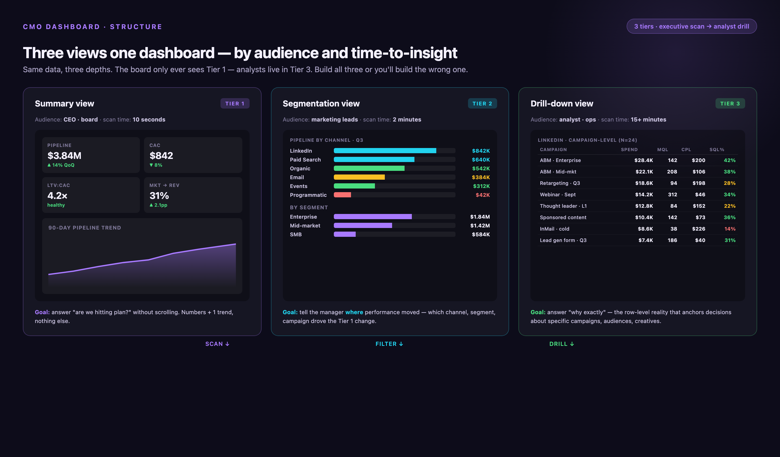
Summary View: The 10-Second Snapshot
The summary view sits at the top. It shows the five to seven metrics leadership checks first: total pipeline created, CAC, LTV:CAC ratio, MQL-to-SQL conversion, and channel ROI. Each metric displays the current value, the trend (up or down), and the comparison to target. Use conditional formatting — green for on-target, red for off-target. Leadership should be able to glance at this section and know immediately whether marketing is performing.
Segmentation View: Where the Insights Live
The segmentation view breaks aggregate metrics into actionable dimensions: by channel, by campaign, by region, by customer segment, by product line. This is where leadership identifies what's working and what's not. For example, overall CAC might look healthy, but segmented by channel, paid social CAC could be 3x higher than paid search. That's the insight that drives reallocation.
Drill-Down View: The Supporting Detail
The drill-down view provides campaign-level, ad-set-level, or keyword-level detail. Leadership rarely needs this depth, but it should be available on demand. Link summary metrics to underlying data so stakeholders can investigate anomalies without leaving the dashboard. For example, if MQL-to-SQL conversion drops, leadership should be able to click through and see which campaigns or lead sources are driving the decline.
Pre-Built CMO Dashboard Templates You Can Use Today
Building a dashboard from scratch takes time — defining metrics, mapping data sources, designing layouts, testing visualizations. Pre-built templates accelerate the process. They provide proven metric frameworks and ready-to-use layouts you can adapt to your business.
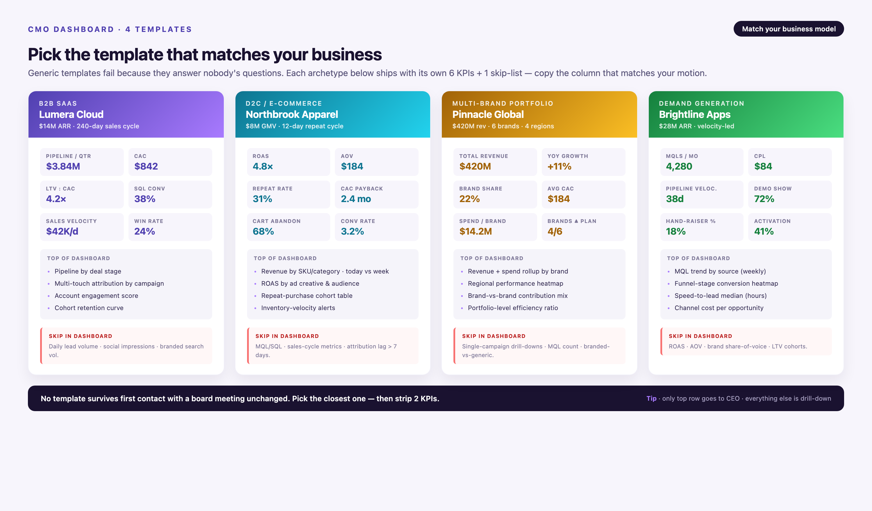
B2B SaaS CMO Dashboard Template
This template focuses on pipeline velocity, MQL-to-SQL conversion, CAC payback period, and net revenue retention. It includes breakdowns by channel (paid search, paid social, content, events) and by customer segment (SMB, mid-market, enterprise). It tracks both new pipeline created and pipeline influenced using multi-touch attribution. Ideal for companies with long sales cycles and account-based marketing strategies.
E-Commerce CMO Dashboard Template
This template prioritizes customer acquisition efficiency, repeat purchase rate, average order value, and channel contribution to revenue. It segments performance by product category, traffic source, and customer cohort. It includes lifetime value projections and CAC trends by cohort. Best suited for direct-to-consumer brands and online retailers optimizing for customer lifetime value.
Multi-Brand Portfolio Dashboard Template
This template aggregates performance across multiple brands or business units. It shows consolidated metrics at the portfolio level, then breaks down by brand. It tracks brand-specific CAC, revenue contribution, and marketing efficiency. Useful for holding companies, private equity portfolios, or enterprises managing multiple product lines under one marketing organization.
Demand Generation Dashboard Template
This template focuses exclusively on top-of-funnel and mid-funnel metrics: lead volume, lead quality scores, content engagement, MQL velocity, and cost per MQL. It segments by campaign type (webinars, white papers, paid ads, organic content) and tracks conversion rates at each funnel stage. Built for demand generation teams that need to prove lead quality to sales leadership.
Porter Metrics offers additional pre-built templates covering HubSpot, CRM integrations, ActiveCampaign, and more, with multiple KPIs for funnels, pipelines, email, and paid ads.
- →Your team spends 15+ hours per week pulling reports from different platforms and reconciling conflicting numbers
- →Board members ask questions you can't answer without digging into raw data for days
- →Campaign performance data is days or weeks old by the time leadership sees it
- →Attribution logic lives in spreadsheets that break every time someone adds a new campaign or changes a naming convention
- →You can't tie marketing spend directly to pipeline or revenue without manual cross-referencing between CRM, ad platforms, and attribution tools
Common Mistakes to Avoid When Building a CMO Dashboard
Most CMO dashboards fail not because of bad data, but because of bad design. They try to show too much, bury the insights, or rely on manual processes that break under scale. Here are the mistakes that sabotage adoption.
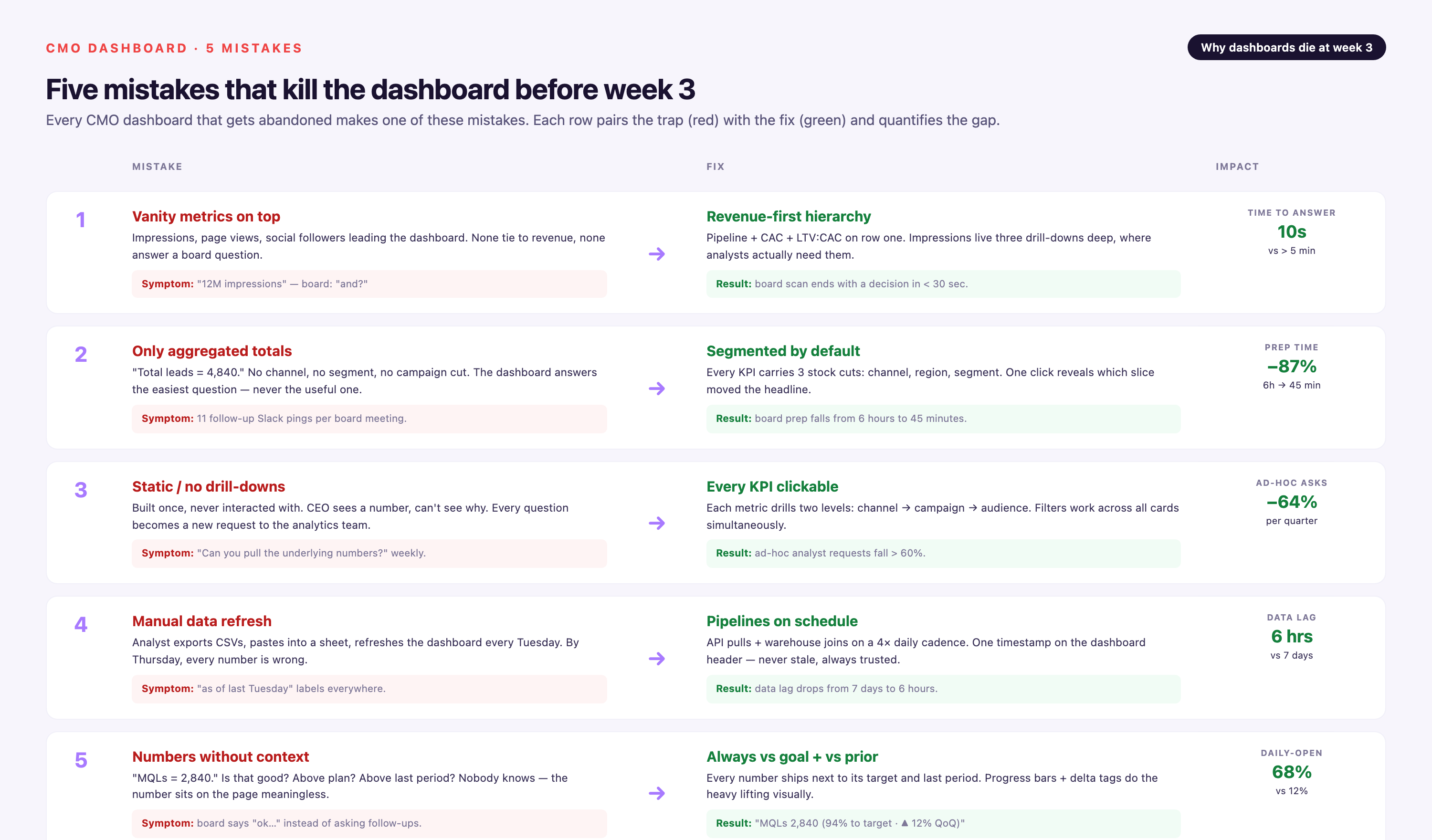
Focusing on Vanity Metrics
Impressions, clicks, and page views don't tell leadership whether marketing is driving revenue. They're operational metrics, not executive metrics. A dashboard full of vanity metrics signals that marketing can't tie its work to outcomes. Focus on pipeline, CAC, LTV, and attribution instead.
Showing Only Aggregated Totals
Aggregate numbers hide the insights. Total pipeline created is useful, but pipeline by channel, by region, by segment is actionable. Leadership can't make decisions without segmentation. Build segmentation into every key metric.
Building a Static Dashboard
Static dashboards go stale the moment they're built. Campaign naming conventions change. New channels launch. Attribution models evolve. A static dashboard can't adapt. Use dynamic data pipelines that update automatically as your marketing stack changes.
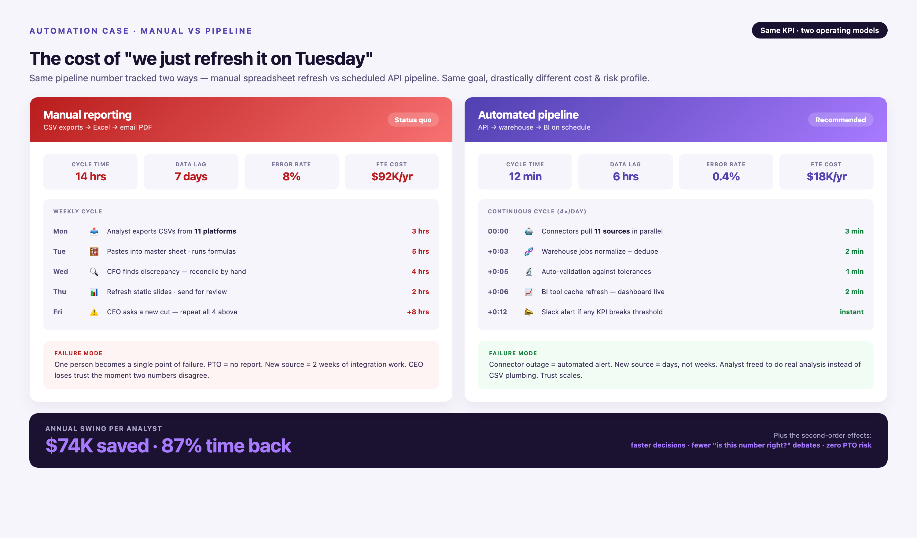
Relying on Manual Data Refresh
Manual CSV exports and spreadsheet uploads don't scale. They break when campaign volume grows, when team members leave, or when platform APIs change. Automated ETL pipelines eliminate the manual work and reduce reporting lag from days to minutes.
Presenting Metrics Without Context
A number without a benchmark is meaningless. Show trends over time. Compare actuals to targets. Add industry benchmarks where relevant. Context turns data into insight.
Tools That Help You Build and Automate CMO Dashboards
The right tools determine whether your dashboard delivers real-time insights or becomes another manual reporting project. The best solutions handle three jobs: data integration, transformation, and visualization.
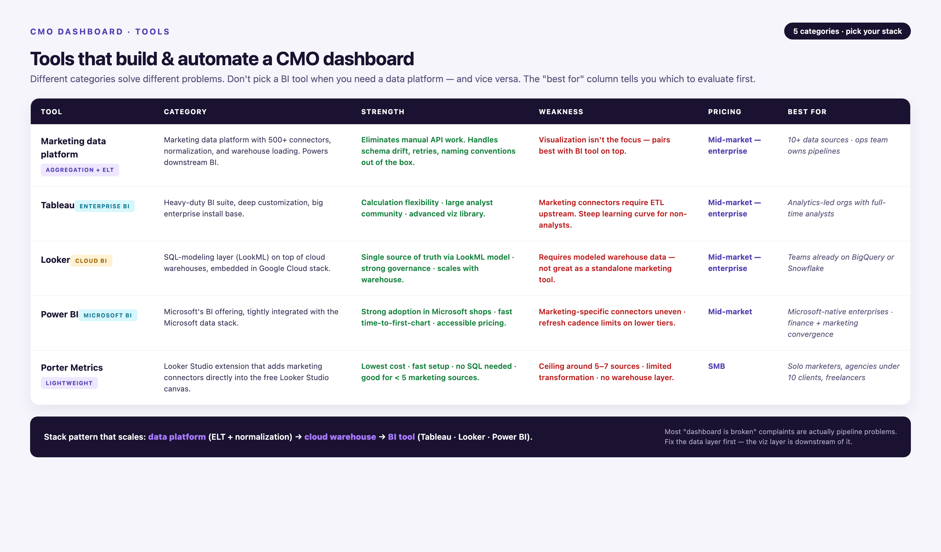
Improvado
Improvado is a marketing data platform built specifically for CMO-level reporting. It connects to 1,000+ data sources — advertising platforms, CRM systems, analytics tools, attribution systems — and normalizes that data into a unified schema. It handles connector maintenance automatically, so when Google Ads changes its API, your dashboard doesn't break.
Improvado's Marketing Cloud Data Model (MCDM) provides pre-built metric definitions, multi-touch attribution logic, and funnel mapping. You don't rebuild the same logic every time you add a data source. The platform includes an AI Agent that lets leadership query data conversationally: "Show me CAC by channel for Q4." It's SOC 2 Type II, HIPAA, GDPR, and CCPA certified, with dedicated CSMs and professional services included.
Improvado is ideal for mid-market and enterprise marketing teams managing complex, multi-channel campaigns. It's not a fit for small teams with simple reporting needs or companies running fewer than five marketing platforms.
Pricing: custom pricing based on data sources and data volume. Contact sales for a quote.
Tableau
Tableau is a business intelligence platform with strong visualization capabilities. It connects to databases, spreadsheets, and cloud apps, and lets you build custom dashboards with drag-and-drop interfaces. Tableau excels at visual exploration — heatmaps, scatter plots, geographic overlays — but requires manual data prep. You need to integrate and clean your data before Tableau can visualize it.
Pricing: starts at $70/user/month for Tableau Creator licenses.
Looker
Looker (now part of Google Cloud) is a data platform built on SQL. It's powerful for teams with strong data engineering resources. Looker defines metrics in code (LookML), which ensures consistency across reports. However, it requires technical expertise to configure and maintain. Non-technical marketers can't build or modify dashboards without engineering support.
Pricing: custom pricing based on usage and user count.
Power BI
Microsoft Power BI integrates tightly with the Microsoft ecosystem (Excel, Azure, Dynamics). It's a strong choice for enterprises already using Microsoft products. Power BI offers solid visualization capabilities and a relatively affordable entry point. However, connecting to non-Microsoft data sources requires manual connector configuration, and maintaining those connections at scale is a common pain point.
Pricing: starts at $10/user/month for Power BI Pro.
Porter Metrics
Porter Metrics provides pre-built dashboard templates for marketing teams. It's designed for speed — you can deploy a working dashboard in hours, not weeks. However, customization is limited compared to platforms like Improvado or Looker. It's best for small teams that need a turnkey solution and don't require deep attribution logic or advanced data governance.
Pricing: starts at $99/month for small teams.
| Tool | Best For | Key Strength | Key Limitation | Pricing |
|---|---|---|---|---|
| Improvado | Enterprise marketing teams | 1,000+ pre-built connectors, automated schema normalization, marketing-specific data models | Not ideal for small teams with <5 data sources | Custom pricing |
| Tableau | Visual exploration | Advanced visualization capabilities | Requires manual data prep | $70/user/month |
| Looker | Data engineering teams | Code-based metric definitions (LookML) | Requires technical expertise | Custom pricing |
| Power BI | Microsoft-centric orgs | Tight Microsoft ecosystem integration | Manual connector configuration at scale | $10/user/month |
| Porter Metrics | Small teams | Pre-built templates, fast deployment | Limited customization | $99/month |
Step-by-Step: Building Your CMO Dashboard
Building a CMO dashboard is a structured process. Skip steps and you'll end up with a dashboard that looks good but delivers no insight. Follow this sequence to build a dashboard that leadership actually uses.
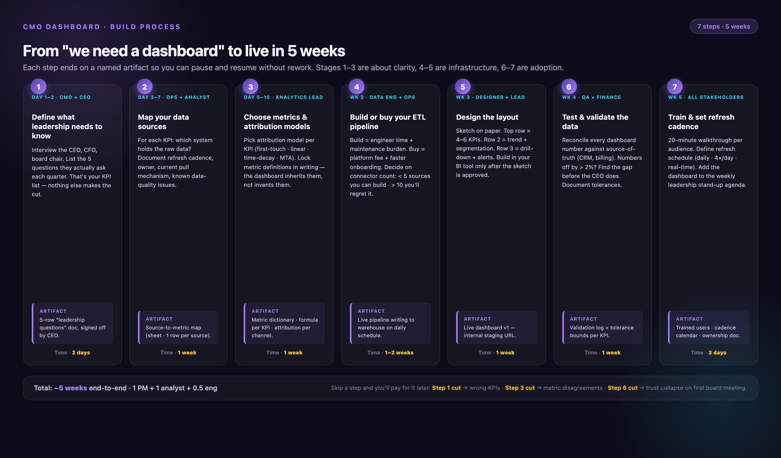
Step 1: Define What Leadership Needs to Know
Start by interviewing stakeholders. What decisions does the CEO make based on marketing performance? What questions does the board ask in quarterly reviews? What metrics does the CFO use to evaluate marketing efficiency? Write down the five to seven questions your dashboard needs to answer. If you can't tie a metric to a decision, don't include it.
Step 2: Map Your Data Sources
List every platform that holds marketing performance data: Google Ads, Meta Ads, LinkedIn Ads, Salesforce, HubSpot, Google Analytics, your attribution tool, your email platform. Document how data flows between systems. Identify where data lives in silos and where integrations are missing. This audit reveals the integration gaps you'll need to solve.
Step 3: Choose Metrics and Attribution Models
Select the metrics that answer your stakeholder questions. Define how each metric is calculated. Choose your attribution model — first-touch, last-touch, multi-touch, or a blend. Document these decisions. If you don't define metrics upfront, different reports will calculate them differently, and leadership will lose trust in the data.
Step 4: Build or Buy Your ETL Pipeline
This is the hardest step. You need to connect all your data sources, extract the data, transform it into a consistent format, normalize schemas, apply business logic (lead stages, cost allocation, attribution), and load it into a data warehouse or BI tool. You can build this pipeline in-house using Python scripts and custom API integrations, but that takes months and requires ongoing maintenance. Or you can use a purpose-built marketing ETL platform like Improvado that handles connectors, schema normalization, and data governance automatically.
Step 5: Design the Dashboard Layout
Use the three-tier structure: summary view, segmentation view, drill-down view. Place the most important metrics at the top. Use consistent colors (green for on-target, red for off-target). Avoid clutter — every chart should answer a specific question. Test the layout with stakeholders before finalizing.
Step 6: Test and Validate the Data
Before you launch, validate every metric. Compare dashboard outputs to platform native reports. Check that attribution logic matches your documented model. Test edge cases — what happens when a campaign spans multiple months, or when a lead touches five channels before converting? Fix discrepancies before leadership sees the dashboard, or you'll spend months explaining why the numbers don't match.
Step 7: Train Stakeholders and Set Refresh Cadence
Walk leadership through the dashboard. Explain what each metric means, how it's calculated, and what actions they should take based on the data. Set expectations for refresh cadence — daily, weekly, real-time. Make sure everyone knows how to access the dashboard and who to contact with questions.
Why Automation Matters: The Case Against Manual Reporting
Manual reporting doesn't scale. It breaks under pressure. When campaign volume doubles, when attribution models change, when leadership asks for a new segmentation, manual processes collapse. Automated dashboards eliminate the fragility.
Here's what automation solves:
• Connector maintenance — Platforms change their APIs constantly. Google Ads updates its schema every quarter. Manual integrations break, and someone has to fix them. Automated ETL platforms monitor connector health and apply updates automatically.
• Schema normalization — Every platform reports metrics differently. Google Ads calls it "conversions," Meta calls it "purchases," LinkedIn calls it "leads." Manual reporting requires someone to map these schemas every time. Automated platforms normalize schemas into a unified data model.
• Historical data preservation — When a platform changes its schema, historical data often breaks. Automated platforms preserve historical data through schema migrations, so your year-over-year comparisons stay accurate.
• Data freshness — Manual reporting delivers data days or weeks late. Automated dashboards refresh in near-real-time, so leadership makes decisions based on current performance, not last week's snapshot.
According to internal benchmarks, teams that automate their CMO dashboards reduce reporting time from 38 hours per week to under 8 hours. That's 30 hours per analyst reallocated from data wrangling to analysis and optimization.
How to Customize a Template for Your Business
Templates provide a starting point, but no two businesses have identical reporting needs. Customization is essential. Here's how to adapt a pre-built template to your organization.
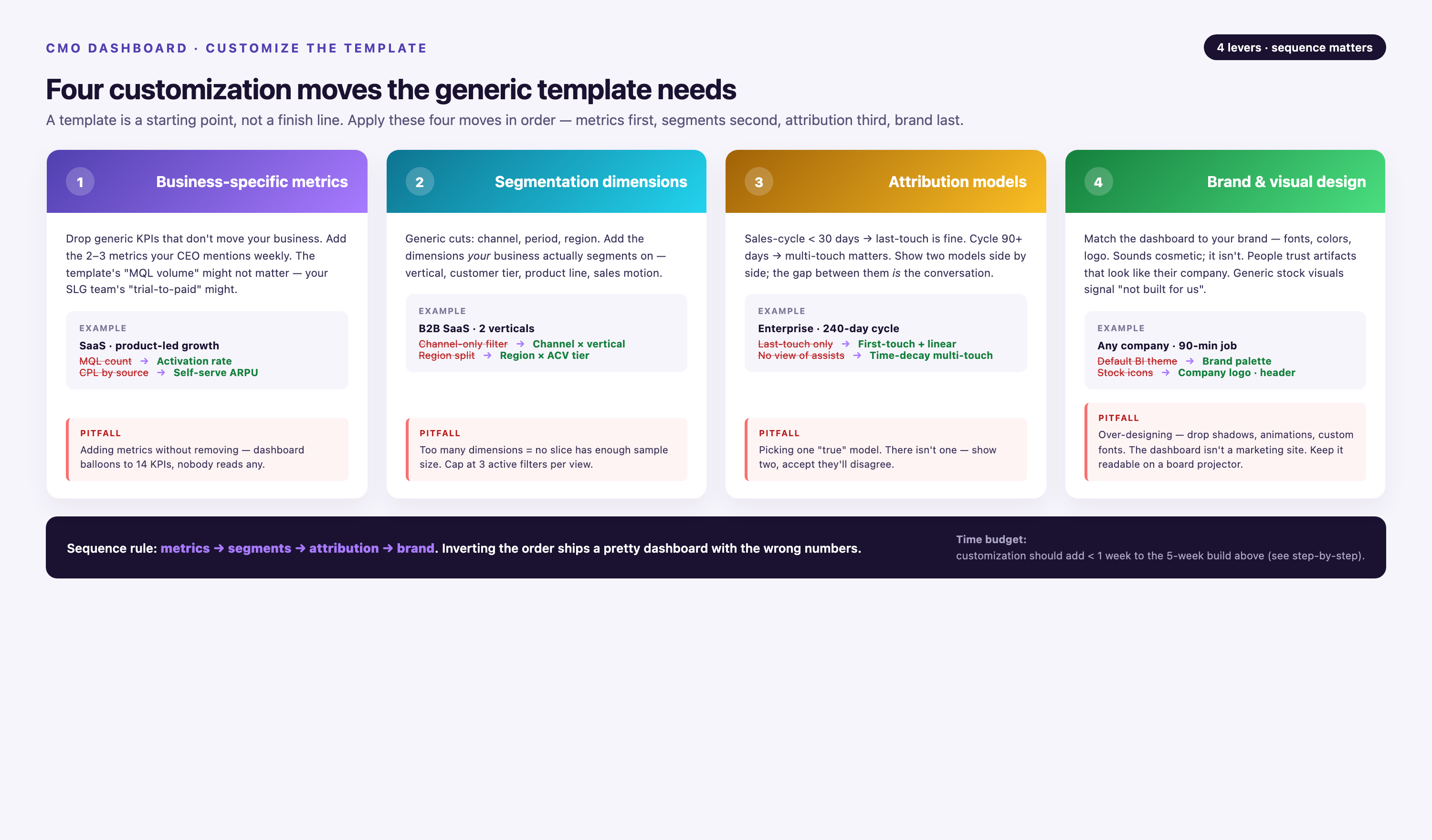
Add Business-Specific Metrics
If your business model depends on metrics not included in the template, add them. For example, a subscription business might need churn rate and net revenue retention. A marketplace might need take rate and seller acquisition cost. A services business might need billable utilization and project margin. Build these into the summary view so they're visible immediately.
Adjust Segmentation Dimensions
Templates provide generic segmentation (by channel, by campaign). Customize it to match your GTM strategy. If you sell by region, add regional breakdowns. If you run account-based marketing, segment by account tier. If you manage multiple product lines, segment by product. The goal is to surface the dimensions leadership uses to make decisions.
Tailor Attribution Models to Your Sales Cycle
Short sales cycles (under 30 days) work well with last-touch attribution. Long sales cycles (over 90 days) benefit from multi-touch models that credit every interaction. Choose the model that reflects how your customers actually buy. If your sales cycle involves multiple touchpoints across months, use a time-decay or U-shaped model that gives credit to both initial engagement and closing interactions.
Align Visual Design with Brand Guidelines
Templates come with default colors and fonts. Customize them to match your brand guidelines. Consistency matters — leadership should immediately recognize the dashboard as part of your organization's reporting suite. Use your brand's color palette for conditional formatting (green, yellow, red) and apply your standard fonts to all text elements.
Data Governance: Ensuring Accuracy and Trust
A dashboard is only as good as the data it contains. If leadership doesn't trust the numbers, the dashboard becomes decoration. Data governance ensures accuracy, consistency, and reliability.
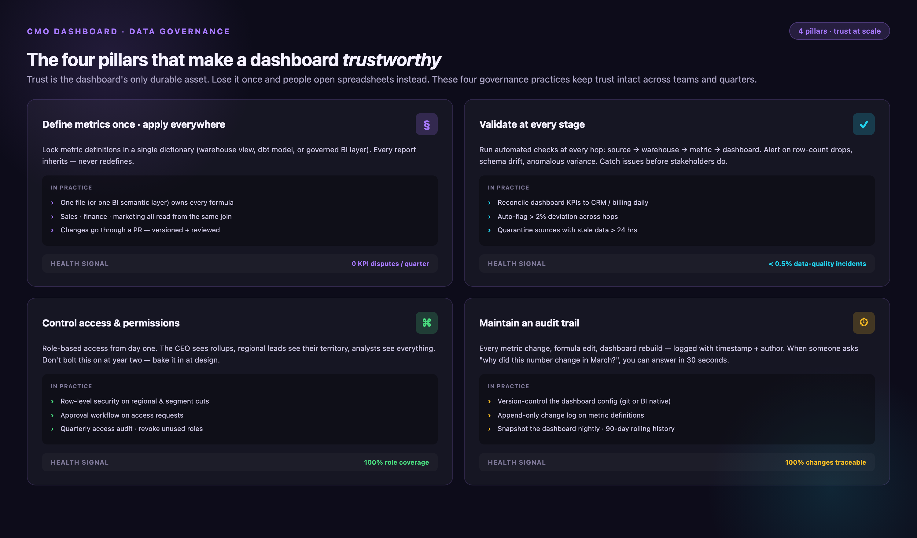
Define Metrics Once, Apply Everywhere
Every metric should have one definition. If CAC is calculated differently in the dashboard than in the CFO's financial model, leadership loses trust. Document how each metric is calculated, who owns the definition, and where the source data comes from. Store these definitions in a shared repository so everyone references the same logic.
Validate Data at Every Stage
Build validation checks into your ETL pipeline. Compare extracted data to source platform totals. Flag anomalies — sudden drops, spikes, missing data. Alert stakeholders when validation fails so issues get fixed before leadership sees them. Automated validation catches errors that manual spot-checks miss.
Control Access and Permissions
Not everyone needs access to every metric. Segment permissions by role. Leadership sees strategic metrics. Campaign managers see tactical metrics. Finance sees cost data. Limiting access reduces the risk of misinterpretation and keeps sensitive data secure.
Maintain an Audit Trail
Track changes to metric definitions, data sources, and attribution models. When a number changes, leadership needs to know why. An audit trail provides the context — did we add a new data source? Did we change the attribution model? Did a platform update its API? Transparency builds trust.
Scaling Your Dashboard as Your Marketing Organization Grows
A dashboard that works for a ten-person marketing team breaks when the team scales to fifty. As your organization grows, your dashboard infrastructure needs to scale with it.
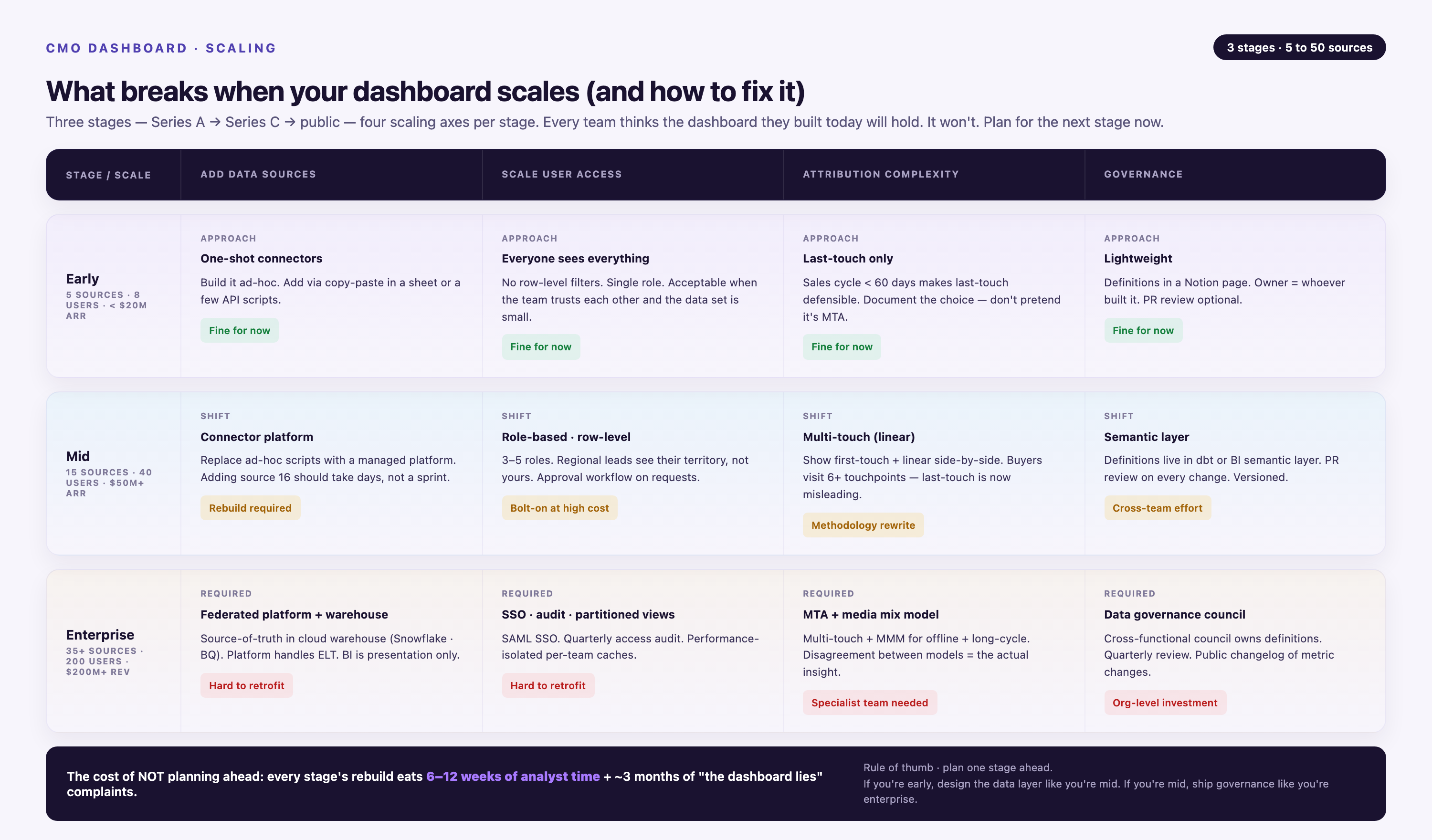
Add Data Sources Without Rewriting Pipelines
When you launch a new channel or adopt a new tool, your dashboard should integrate it automatically. Hard-coded integrations require engineering time every time you add a source. Platforms with 1,000+ pre-built connectors let you add sources with no code — you authenticate the account, map the fields, and the data flows.
Scale User Access Without Degrading Performance
As more stakeholders use the dashboard, query load increases. Slow dashboards don't get used. Use data warehouses that scale horizontally (Snowflake, BigQuery, Redshift) to handle increased query volume. Pre-aggregate common queries to reduce load times.
Handle Increasing Attribution Complexity
As your marketing mix becomes more sophisticated, attribution becomes harder. Multi-channel, multi-touch, multi-product attribution requires advanced data models. Build flexibility into your attribution logic so you can iterate models without rebuilding the entire pipeline.
Maintain Governance as Teams Grow
More team members means more risk of inconsistency. Enforce naming conventions for campaigns, UTM parameters, and lead sources. Use automated validation to catch deviations. Centralize metric definitions so new team members don't reinvent calculations.
Conclusion
A CMO dashboard transforms fragmented marketing data into executive intelligence. It surfaces the metrics leadership uses to evaluate performance, allocate budget, and hold marketing accountable. The best dashboards are automated, segmented, and built on a foundation of clean, governed data. They answer strategic questions in seconds, not days.
Building one requires choosing the right metrics, integrating your data sources, designing a scannable layout, and automating the data pipeline. Pre-built templates accelerate the process, but customization is essential — every dashboard should reflect your unique GTM strategy and board priorities.
The alternative is manual reporting: slow, error-prone, and unsustainable at scale. Leadership makes decisions whether you have good data or not. A well-built CMO dashboard ensures those decisions are informed.
Frequently Asked Questions
How long does it take to build a CMO dashboard from scratch?
Timeline depends on complexity. A basic dashboard connecting three to five data sources with pre-built templates can be operational in a week. A custom dashboard integrating ten or more sources, with multi-touch attribution and custom business logic, typically takes four to eight weeks. The bottleneck is rarely visualization — it's data integration and validation. Using a marketing ETL platform with pre-built connectors reduces implementation time by 60% to 80% compared to building custom integrations in-house.
How often should a CMO dashboard refresh?
Refresh cadence depends on decision velocity. For operational dashboards used daily, near-real-time refresh (hourly or every few hours) is ideal. For executive dashboards reviewed weekly or monthly, daily refresh is sufficient. Avoid over-refreshing — it increases infrastructure cost without adding value. The key is matching refresh frequency to how often leadership actually looks at the data and makes decisions based on it.
What's the most important factor when choosing a dashboard tool?
Integration capability. The best visualization tool is useless if it can't connect to your data sources. Prioritize platforms that offer pre-built connectors to your marketing stack, automated schema normalization, and ongoing connector maintenance. Visualization features matter, but they're secondary. A simple bar chart built on accurate, real-time data is more valuable than a beautiful dashboard built on stale, incomplete data.
Should I use first-touch, last-touch, or multi-touch attribution?
It depends on your sales cycle. First-touch attribution works for businesses where the first interaction drives most buying decisions (e.g., impulse purchases, short sales cycles). Last-touch attribution works when the final touchpoint is decisive (e.g., demo requests, direct sales). Multi-touch attribution is essential for long sales cycles with multiple touchpoints across weeks or months. Most B2B companies benefit from multi-touch models — U-shaped, W-shaped, or time-decay — because they credit awareness, consideration, and decision-stage interactions appropriately.
Can I build a CMO dashboard in Google Sheets or Excel?
You can, but it doesn't scale. Spreadsheets work for small teams with simple reporting needs and low data volume. They break when you add more data sources, when campaign volume grows, or when you need real-time data. Spreadsheets also lack governance — different stakeholders make copies, apply different formulas, and generate conflicting reports. For anything beyond basic reporting, use a purpose-built BI or data platform.
How much does it cost to build and maintain a CMO dashboard?
Cost depends on whether you build in-house or use a platform. Building in-house requires data engineering resources — expect to allocate one to two full-time engineers for initial build and ongoing maintenance. At a fully loaded cost of $150,000 per engineer per year, that's $150,000 to $300,000 annually. Using a marketing ETL platform costs $20,000 to $100,000 per year depending on data volume and source count, plus BI tool licensing ($5,000 to $20,000 per year). The break-even point favors platforms unless you have unique requirements that pre-built solutions can't handle.
How do I ensure data accuracy in a multi-source dashboard?
Validate at every stage. Compare extracted data to source platform totals. Build automated checks that flag anomalies — missing data, sudden spikes, schema mismatches. Reconcile dashboard totals with financial systems and CRM reports monthly. Document metric definitions and attribution logic so everyone calculates the same way. Assign ownership — one person or team is responsible for data quality and resolves discrepancies when they arise.