
Tracking revenue across multiple products, regions, and campaigns can quickly become overwhelming, especially when data is scattered across different platforms. Without a clear way to visualize this information, it’s difficult to identify growth patterns, spot issues early, or communicate performance effectively to stakeholders.
This article will walk you through how to create a revenue chart that provides a clear picture of business growth. We’ll cover which metrics to include, how to structure your visualization for maximum clarity, and which tools can help you build accurate, actionable charts that drive better decision-making.
Quick answer
Revenue growth charts are visual representations of financial performance over time that consolidate income data into accessible formats. They track growth patterns, performance shifts, and key revenue drivers across products, regions, and channels. Common types include line charts for trends, bar charts for comparisons, and stacked bar charts for composition analysis.
Key Takeaways
- A revenue chart visualizes income over time or by categories, helping you see growth, trends, drivers, and compare performance.
- Choose the right chart type based on what aspect of revenue you want to communicate (trend, composition, driver analysis, etc.).
- Best practices include defining your objective, standardizing and automating data, using clear colors/labels, and providing context.
- You need both gross and net revenue metrics, YoY or recurring revenue measures for meaningful insights.
- Tools like Excel, Tableau, Power BI, and platforms like Improvado enable you to build accurate, up-to-date revenue dashboards reducing manual work.
What Is a Revenue Chart?
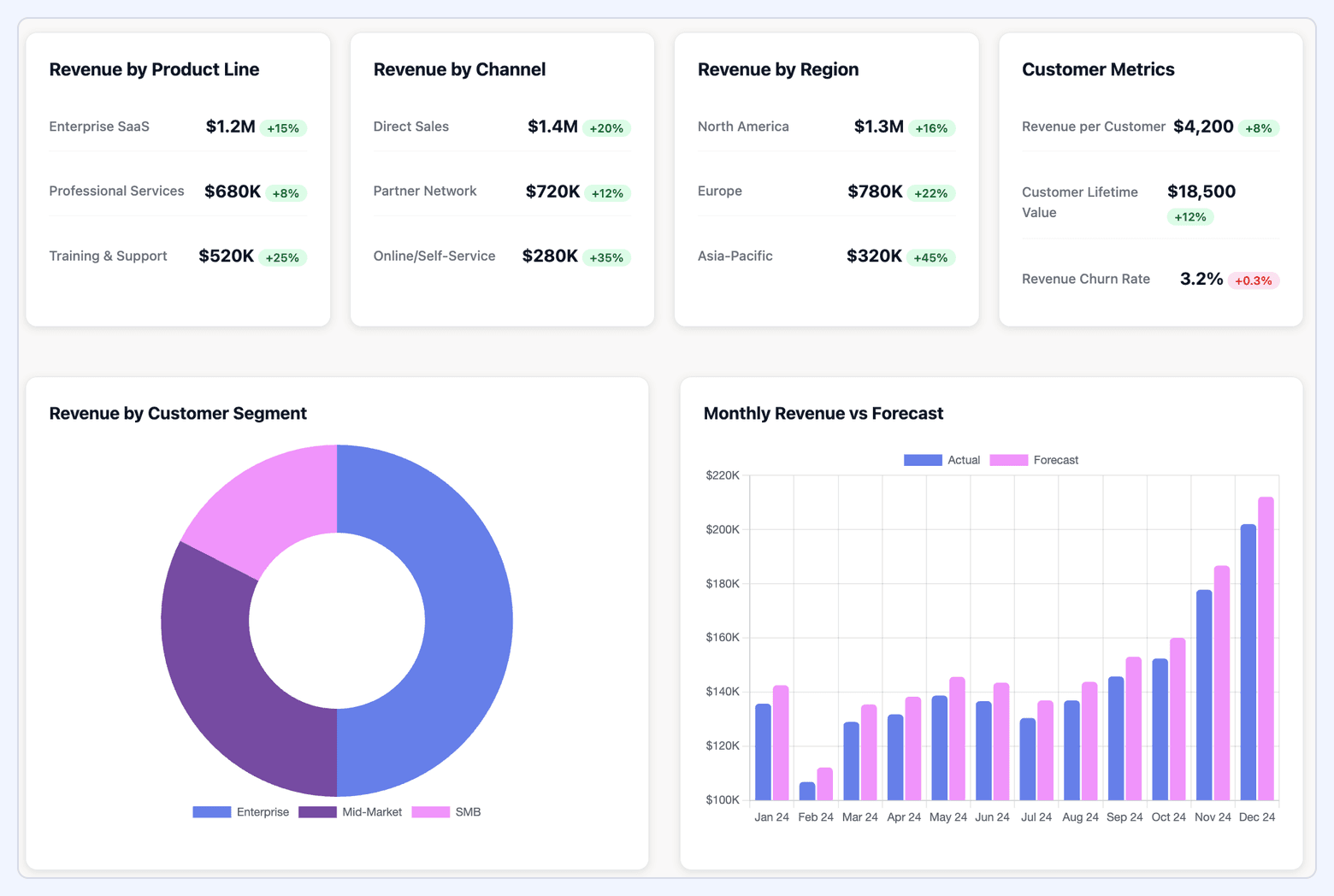
These charts can display different perspectives depending on business needs: total revenue over time, revenue by product line, region, or customer segment.
In large organizations where revenue streams are diverse and spread across multiple platforms, a well-structured revenue chart becomes an essential tool for aligning stakeholders and ensuring decisions are based on accurate, real-time data.
Understanding the Purpose of Visualizing Revenue
The primary purpose of a revenue chart is to translate raw financial data into actionable insights. Spreadsheets and datasets can hold the data, but visualizations reveal patterns and relationships that are easy to interpret and act upon.
By visualizing revenue, teams can quickly identify:
- Performance Trends: Is revenue accelerating, plateauing, or declining, and at what pace?
- Key Drivers: Which products, services, regions, or marketing channels are responsible for growth or underperformance?
- Opportunities and Risks: Where can resources be reallocated to capture untapped potential or mitigate revenue loss?
- Progress Toward Targets: How closely performance aligns with revenue forecasts, OKRs, or growth benchmarks.
For organizations operating at scale, effective revenue visualization plays a critical role in:
- Financial planning: Setting realistic budgets and growth forecasts based on historical performance and seasonality.
- Strategic decision-making: Guiding investment in high-performing business units or channels while addressing weak areas.
- Stakeholder communication: Presenting a clear and compelling view of financial health to executives, boards, and investors.
A strong revenue chart creates a shared understanding of business performance, enabling faster, more confident decisions across the organization.
Key Metrics Displayed on a Revenue Chart
A revenue chart should go beyond simply showing top-line numbers. When structured correctly, it becomes a comprehensive view of business performance, revealing the factors driving growth, the sustainability of revenue streams, and areas that need attention.
Below are the most important metrics to consider, along with their strategic value:
- Total Revenue: The aggregate income generated from all sales activities over a defined period. This is the foundational metric for understanding overall performance and serves as the anchor for all other breakdowns.
- Revenue by Product or Service: Breaks revenue down by specific offerings, providing visibility into which products or services are driving growth and which may be underperforming. This is especially important for businesses with diverse portfolios or multi-brand structures.
- Revenue by Channel: Categorizes income by marketing or sales channel, such as organic, paid media, direct sales, retail, or partner programs. This helps determine the ROI of different go-to-market strategies and informs budget allocation.
- Year-over-Year (YoY) Revenue Growth: Tracks how revenue compares to the same period in the previous year, showing growth trends while factoring out seasonality. This metric is critical for assessing long-term performance and identifying sustainable growth patterns.
- Monthly Recurring Revenue (MRR) / Annual Recurring Revenue (ARR): For subscription-based or SaaS business models, MRR and ARR measure predictable, repeatable income streams. These metrics are key for forecasting, retention analysis, and valuation discussions.
- Average Revenue per User (ARPU): Calculates the average income generated per customer or account, highlighting customer value over time. A rising ARPU often signals successful upselling, cross-selling, or improved product-market fit.
- Gross Revenue vs. Net Revenue: Distinguishes between total sales before deductions (gross) and final revenue after returns, discounts, and allowances(net). Tracking both provides insight into product profitability and operational efficiency.
- Revenue Growth Rate (Month-over-Month or Quarter-over-Quarter): Measures how quickly revenue is expanding within shorter timeframes. This is valuable for monitoring the impact of recent campaigns, market changes, or new product launches.
- Churn Impact (for recurring revenue models): Shows how lost customers or contracts affect recurring revenue streams. Pairing churn with MRR/ARR offers a more complete picture of retention and stability.
Operating vs. Non-Operating Revenue: What to Track
When building revenue charts, it's essential to distinguish between operating revenue and non-operating revenue.
This distinction ensures that the visualization accurately reflects the company’s core business performance rather than being skewed by irregular or non-recurring income streams.
Below is a comparison of the two types of revenue and how they should be treated in revenue analysis.
| Type of Revenue | Definition and Characteristics | Examples | Role in Growth Analysis |
|---|---|---|---|
| Operating Revenue | Income earned directly from core business activities. Recurring, predictable, and tied to the value delivered to customers; generally the most stable and reliable revenue stream. |
|
Primary focus for revenue growth charts. Reflects sales/marketing effectiveness and operational health; supports forecasting, budgeting, and goal tracking. |
| Non-Operating Revenue | Income from activities outside core operations. Often irregular or one-off; influenced by external markets and not a sustainable driver of operating growth. |
|
Useful for complete financial statements and cash planning, but can distort operational trendlines if mixed with operating revenue. Segment or annotate separately in growth visuals. |
Why the Distinction Matters
Operating revenue is directly tied to business performance and the strategies driving growth, making it the foundation of most revenue visualizations.
Non-operating revenue provides important context for financial reporting but should be segmented or annotated to avoid overstating operational success.
Mixing the two without clear differentiation can lead to misinterpretation of performance, especially when analyzing marketing ROI, sales effectiveness, or forecasting future growth.
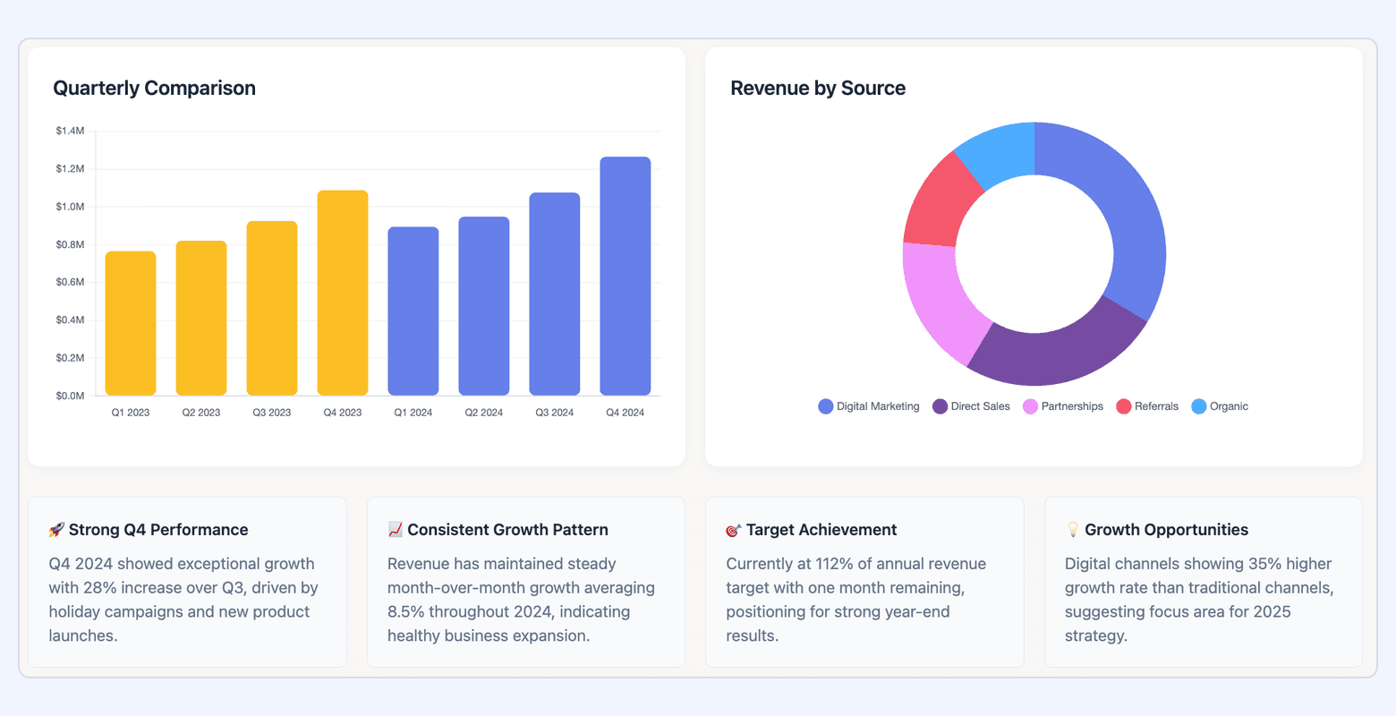
What Is the Best Chart to Show Revenue? 7 Common Types
The ideal chart type depends on both the structure of your revenue data and the story you want to tell.
Certain chart types excel at highlighting trends over time, while others are better suited for comparisons, composition, or correlation analysis. Selecting the wrong type can obscure insights or even mislead stakeholders, so aligning your visualization method with the intended message is critical.
Below is a comparison of seven commonly used chart types for visualizing revenue data, along with their ideal use cases, strengths, and limitations.
| Chart Type | Ideal Use Case | Pros | Cons |
|---|---|---|---|
| Line Chart | Tracking revenue over time (monthly, quarterly, yearly) to reveal growth patterns or seasonality | Clearly shows trends and direction over time; supports multiple revenue streams or segments | Too many lines create clutter; hard to compare many categories simultaneously |
| Bar Chart | Comparing revenue across categories (products, regions, channels) at specific points in time | Intuitive and easy to read; ideal for categorical or snapshot comparisons | Limited ability to show trends over time; space inefficient with many categories |
| Stacked Bar Chart | Showing revenue composition across segments and categories (e.g., new vs. existing customers) | Reveals total revenue while showing part-to-whole relationships; useful for analyzing structural shifts in revenue mix | Difficult to compare individual segments across bars; becomes visually complex with many segments |
| Area Chart | Highlighting cumulative revenue growth or illustrating how components add up over time | Emphasizes magnitude and cumulative effect; visually impactful for presentations | Overlapping areas can obscure detail; less precise for reading individual segment values |
| Waterfall Chart | Explaining drivers of change (e.g., forecast vs. actual or factors influencing growth/decline) | Clearly shows positive and negative contributions step-by-step; excellent for explaining gaps between expectations and results | Complex to build and maintain; hard to interpret if there are too many components |
| Pie Chart | Showing revenue distribution at a single point in time (e.g., product share, region share) | Quick visual grasp of parts-to-whole relationships; familiar format for non-technical audiences | Not suitable for trend or time-series analysis; readability declines with many slices |
| Scatter Plot | Correlating revenue with another variable (e.g., marketing spend, customer lifetime value) | Excellent for identifying relationships and outliers; flexible for exploratory analysis | Requires careful interpretation and statistical context; overlapping points can create clutter in dense datasets |
Additional Chart Types to Consider
For more specialized revenue analysis, other visualization methods may be appropriate:
- Heatmaps: Compare performance across multiple dimensions like region and product simultaneously.
- Bullet Charts: Track revenue against targets and benchmarks.
- Funnel Charts: Visualize conversion rates and revenue contribution across sales stages.
- Pareto Charts: Identify the top drivers contributing to the majority of revenue.
By choosing the right chart type for the right scenario, you ensure your revenue visualizations are clear, actionable, and aligned with strategic decision-making needs.
How to Create a Revenue Growth Chart: 5 Best Practices
Creating impactful revenue growth charts goes beyond simply plugging numbers into a visualization tool. It requires a strategic approach to ensure your charts are clear, accurate, and actionable.
1. Start with a Clear Objective
Before you even think about chart types, define the specific questions you want your revenue chart to answer. Are you tracking overall company growth, product-specific performance, or the effectiveness of a recent marketing campaign?
Each report should provide information based on initial requirements and avoid excessive and ineffective data.
For example, high-level corporate reports should display information regarding company goals, such as revenue growth, scaling, and customer retention rate.
A clear objective will guide your choice of metrics, chart type, and overall presentation, ensuring the chart provides meaningful insights.
2. Choose the Right Visualization Method
As discussed earlier, different chart types serve different purposes. Selecting the proper data visualization method for each metric is crucial.
If you're dealing with time analysis, line charts are generally superior. For comparing categories, bar charts work best.
Avoid using complex charts when a simpler one will suffice, and always prioritize clarity and ease of interpretation. The goal is to make the data immediately understandable to your audience.
3. Standardize and Automate Your Data Flow
A continuous, clean data flow is essential for dashboards providing a 360-degree context about your revenue activities. Manually exporting data from different platforms is time-consuming and prone to errors. To maintain data integrity and get real-time insights, automating your data flow is critical.
Enterprise platforms like Improvado are built for this challenge, automatically extracting data from over 500 marketing and sales platforms, including online, offline, custom and legacy sources, and consolidating it into a single, analysis-ready destination. This eliminates manual work and ensures your revenue charts are always accurate and up-to-date.
4. Use Color and Labels for Clarity
Strategic use of color can highlight key trends or differentiate revenue streams. However, avoid using too many colors, which can make a chart look busy and confusing. Ensure a consistent color palette and use it to draw attention to the most critical data points.
Clear, concise labels for axes, data points, and legends are equally important. They provide necessary context and prevent misinterpretation, making your financial charts professional and easy to understand.
5. Provide Context for Your Audience
This is one of the most important steps.
Numbers on their own can be misleading or incomplete, especially when revenue is influenced by multiple external and internal factors. By layering context into your visualization, you transform it from a static report into a decision-making tool that drives action.
Here’s how to ensure your revenue growth chart delivers clarity and meaning:
- Annotations for Key Events: Highlight significant factors that impact revenue performance, such as major product launches, pricing changes, market shifts, or marketing campaigns. These annotations explain sudden spikes or dips and prevent misinterpretation.
- Comparative Benchmarks: Place your revenue data in context by comparing it against targets, historical performance, or industry benchmarks. Showing revenue vs. forecast or year-over-year growth helps audiences assess whether results are tracking above or below expectations.
- Narrative Insights and Takeaways: Include a concise summary of what the chart reveals and why it matters. For instance, if a specific channel drove a significant percentage of growth, call it out directly. This helps stakeholders quickly understand the story behind the numbers without needing to interpret it themselves.
- Segmentation for Depth: When relevant, break down revenue by product line, region, or customer segment to expose underlying drivers. This prevents high-level figures from masking underperformance in specific areas.
By embedding these elements, you ensure the chart goes beyond visualizing "what happened" and instead communicates why it happened and what to do next.
How Do You Calculate Revenue for a Chart?
Before building a revenue chart, you need to ensure that the underlying calculations are consistent, precise, and aligned with your reporting goals.
While modern ERP and accounting systems can handle complex calculations across products, geographies, and currencies, the foundational revenue formulas remain straightforward. The challenge lies in applying them correctly and understanding whether you are reporting gross or net revenue.
Basic Revenue Calculation Formula
At its core, revenue represents the total income generated from goods sold or services rendered.
- For product-based businesses: Revenue = Sales Price per Unit × Number of Units Sold
- For service-based businesses: Revenue = Service Rate per Hour × Number of Hours Billed
- For subscription or SaaS models: Revenue = Number of Subscriptions × Subscription Price
Gross vs. Net Revenue
These two metrics represent very different financial realities. Gross revenue captures total sales activity, while net revenue reflects the actual revenue retained after deductions like returns, discounts, and allowances.
For high-stakes reporting mixing the two can lead to misinterpretation of business performance. Gross revenue is essential for tracking demand and top-line growth, whereas net revenue provides deeper insight into operational efficiency and profitability.
To ensure clarity, revenue charts should clearly label which metric is being used—or ideally, present both side-by-side. Below is a detailed comparison to help you determine when to use each figure.
| Aspect | Gross Revenue | Net Revenue |
|---|---|---|
| Definition | Total income generated from all sales before any deductions; the top-line figure on financial statements. | Actual revenue retained after subtracting returns, discounts, and allowances; reflects real operating performance. |
| Formula | Gross Revenue = Total Units Sold × Sales Price per Unit |
Net Revenue = Gross Revenue − (Returns + Discounts + Allowances) |
| Purpose and Use Cases |
|
|
| Components Included | All sales revenue with no deductions applied. | Deducts returns, discounts, and allowances to show retained revenue. |
| Advantages |
|
|
| Limitations |
|
|
Understanding Revenue vs. EBIT Charts
While revenue charts focus on the top-line income a business generates, EBIT (Earnings Before Interest and Taxes) charts delve deeper into profitability.
Formula: EBIT = Revenue − Cost of Goods Sold (COGS) − Operating Expenses
- COGS: Direct costs associated with producing goods or delivering services.
- Operating Expenses: Overheads such as salaries, rent, marketing, and administrative costs.
Questions EBIT answers:
- Is the company generating enough profit from its core activities?
- Are operational costs scaling appropriately with revenue growth?
- Which segments, product lines, or regions are most profitable?
A Library of Essential Revenue Charts for Your Dashboard
To build a truly all-in-one revenue dashboard, you'll want a variety of charts that cover different aspects of your business’s financial health.
Below are categorized examples (not exhaustive) to help you decide what to include based on your business type.
| Category | Chart Ideas / Metrics |
|---|---|
| High-Level Executive Revenue Charts | Total Revenue; Year-over-Year Growth; Compound Annual Growth Rate (CAGR); Revenue by Product/Service; Annual Recurring Revenue (ARR) & Monthly Recurring Revenue (MRR); Churn Rate; Average Revenue per User (ARPU); Net vs. Gross Revenue; Revenue by Region; Market Share; Quarterly Growth; Year-to-Date Revenue |
| Key SaaS Revenue Charts | Customer Acquisition Cost (CAC); Customer Lifetime Value (CLV); Net Promoter Score (NPS); LTV:CAC Ratio; New vs. Expansion MRR; MRR Churn; Retention Rate |
| Sales Performance Revenue Charts | Conversion Rate; Sales Cycle Length; Deal Slippage; Average Deal Size; Revenue by Sales Rep; Pipeline Value; Win Rate |
| Marketing Performance Revenue Charts | Return on Advertising Spend (ROAS); Revenue by Marketing Channel; Organic vs. Paid Revenue; Lead Distribution; Marketing-Generated Revenue; Cost per Lead vs. Revenue; Traffic to Revenue Conversion |
The Best Software to Build Your Revenue Charts
Once you know which revenue charts and metrics you want to track, the next step is selecting the right tools to build them. The choice of software depends on several factors, including the size of your organization, the complexity of your data environment, and the level of customization you need for analysis and reporting.
For smaller businesses, lightweight tools like Google Looker Studio or Excel might be sufficient for building basic dashboards.
However, as data sources multiply, spanning marketing, sales, finance, offline channels, and even custom internal systems—manual processes quickly become inefficient and error-prone.
Improvado is designed specifically to handle the scale and complexity of enterprise data environments, providing a single platform to collect, normalize, and visualize revenue data across every source.
Here’s why leading global brands and agencies choose Improvado for revenue charting and analysis:
- 1,000+ Native and Custom Connectors: Automatically extract data from every marketing, sales, and finance platform, including offline and legacy systems, and unify it in one central location for analysis.
- Enterprise-Grade Data Governance: Maintain data quality and compliance with frameworks like SOC 2, HIPAA, and GDPR. Features like naming convention enforcement, role-based access controls, and real-time anomaly detection ensure accuracy and trust in your revenue data.
- Automation at Scale: Eliminate manual reporting by fully automating the ETL process, from aggregation to transformation to visualization. This reduces operational overhead while keeping your dashboards real-time and analysis-ready.
- AI-Powered Insights: Improvado’s AI Agent enables both technical and non-technical teams to query data, uncover trends, and build dashboards simply by asking questions in plain language.
- Seamless Integration With BI Tools: Push clean, governed data directly into visualization platforms like Tableau, Looker, and Power BI, and use pre-built dashboards for quicker rollout.
For large, data-driven organizations, Improvado transforms revenue reporting from a fragmented, manual process into a streamlined, scalable system. Book a demo call with Improvado to make faster, smarter decisions.