%2520(1).png)
Most standard reports only summarize outcomes. They tell you what happened, but not why it happened. When revenue shifts, channel performance fluctuates, or a campaign stalls, surface-level metrics aren’t enough. Decision-makers need the ability to investigate underlying drivers to pinpoint the root cause.
Drill-down reporting provides that depth. It turns static dashboards into dynamic exploration tools that reveal patterns, anomalies, and opportunities hidden beneath top-line metrics. At its core, drill down reporting is an interactive data exploration technique: users click on a summary data point to expose the granular detail underneath, moving through a predefined data hierarchy without leaving the report view.
This guide explains the core principles of drill-down reporting, best practices for structuring insights, and the data foundation required to implement it effectively across your organization.
Key Takeaways:
- Go beyond the 'what': Drill down reports allow users to move from high-level summary data to granular details within a single view, answering the 'why' behind the numbers.
- Interactive, not static: The core feature is interactivity. Users click on data points (like a chart segment or table row) to reveal the underlying information.
- Hierarchy is key: Effective drill down reports rely on a logical data hierarchy, such as Time (Year > Quarter > Month > Day) or Geography (Country > State > City).
- Drives actionable insights: By uncovering root causes and specific trends, these reports empower faster, more accurate decision-making across all business departments.
What Is a Drill Down Report?
A drill down report is an interactive report that allows users to explore data at different levels of detail. Think of it as a set of nested layers. You start at the highest, most summarized level.
For example, you might see total annual revenue. With a single click, you can "drill down" to see that revenue broken down by quarter. Another click could show you monthly figures. Another could reveal weekly sales. This process continues until you reach the most granular level of data available.
The magic of drill down capabilities is that they exist within a single report or dashboard. You don't need to open multiple files or run separate queries. The context is maintained as you navigate through the data hierarchy. This makes data exploration intuitive and efficient.
The Power of a Data Hierarchy
The foundation of any drill down report is a well-defined data hierarchy. A hierarchy is a logical structure that organizes data from general to specific. Common examples include:
- Time hierarchy: Year → Quarter → Month → Week → Day
- Geographic hierarchy: Country → State/Province → City → Postal Code
- Product hierarchy: Category → Sub-Category → Product Line → SKU
- Marketing hierarchy: Channel → Campaign → Ad Set → Ad Creative
When you build a drill down report, you are essentially making these hierarchies navigable. The reporting tool understands the relationships between the levels. This allows users to move seamlessly up and down the chain, gaining a complete understanding of performance at every level of the business.
The Value of Drill Down Reporting in Business Intelligence
Drill down reports are a cornerstone of modern business intelligence (BI). They represent a shift from static, historical reporting to dynamic, exploratory analytics. Their value extends beyond simply presenting numbers; they change how organizations interact with and leverage their data.
Beyond Static KPI Dashboards
Many companies rely on standard KPI dashboards to monitor performance. While useful, these dashboards often present a fixed view of the data. If a key metric like Customer Acquisition Cost suddenly spikes, a static dashboard tells you it happened, but not why.
A drill down report lets you click on that KPI. You can then see the cost broken down by marketing channel, then by campaign, and finally by a specific ad. This immediate investigative power is transformative.
Empowering Self-Service Analytics
Traditionally, when a business user had a follow-up question about a report, they had to go back to the data analytics team. This created a bottleneck. The analyst would run a new query, create a new report, and send it back. The whole process could take hours or days.
Drill down reports democratize data analysis. They give business users the power to answer their own questions in real-time. This self-service capability frees up analysts to focus on more complex strategic projects.
With 63% of data teams spending more than 15-20% of their time on maintenance tasks, self-service drill-down capabilities become essential for organizational efficiency. When business users can explore data independently, technical teams can focus on strategic initiatives rather than ad-hoc reporting requests.
Fostering a Data-Driven Culture
When data is accessible and easy to explore, it becomes part of the daily conversation. Team members from marketing, sales, and finance can all dig into the same data set to understand performance from their perspective. A sales manager can drill down into regional performance. A marketing lead can analyze campaign effectiveness. This shared access and exploratory capability fosters a culture where decisions are consistently backed by data, not just intuition.
Drill Down vs. Drill Through vs. Drill Up: Key Differences Explained
Several terms sound similar but have distinct meanings. Understanding the distinction between drill down, drill through, and drill up is critical for designing effective analytical workflows. Each serves a different analytical purpose and requires different technical implementations.
Drill down moves vertically down a predefined hierarchy within the same data context.
Drill through moves horizontally to a different report, often with related but distinct data.
Drill up is the reverse of a drill down, moving from a detailed view back to a summary level.
| Aspect | Drill Down | Drill Through | Drill Up |
|---|---|---|---|
| Navigation Path | Vertical (General to Specific) | Lateral (To a new, related report) | Vertical (Specific to General) |
| Data Context | Stays within the same report and dataset | Moves to a new report, often a new dataset | Stays within the same report and dataset |
| User Action | Click on a chart element to see its components | Click on a data point to see a detailed report about it | Click a "back" or "up" button to see the summary |
| Core Question | "What makes up this total?" | "Show me more details about this specific item." | "How does this detail fit into the bigger picture?" |
| Example | Clicking '2024 Sales' to see Q1, Q2, Q3, Q4 sales. | Clicking a customer name to open their full profile. | Viewing monthly sales, then clicking "up" to see quarterly. |
| Data Structure | Requires a predefined hierarchy. | Requires linking two separate reports together. | Requires a predefined hierarchy. |
Key Benefits of Using Drill Down Reports
Adopting drill down reporting offers numerous advantages that directly impact business efficiency and intelligence. These benefits stem from the ability to interact with data in a more intuitive and meaningful way.
Enhanced Data Granularity
The most immediate benefit is the ability to access fine-grained detail on demand. High-level aggregates can be misleading.
For instance, overall website traffic might be stable. But a drill down could reveal that traffic from organic search is declining sharply, while paid traffic is increasing. This kind of granular insight is invisible in a summary view but crucial for taking corrective action.
Faster Root Cause Analysis
When a problem arises, speed is critical. Drill down reports are powerful diagnostic tools. Instead of exporting data to a spreadsheet for manual analysis, a manager can interactively investigate an issue directly within their dashboard. A sudden drop in sales in one region can be traced to a specific product category or even a single store in minutes, not hours.
Research shows that unified analytics drive 3x faster decision-making compared to traditional reporting methods. This acceleration becomes crucial when addressing performance issues or capitalizing on emerging opportunities in competitive markets.
Improved Decision-Making Accuracy
Decisions based on summary data are often educated guesses. Drill down capabilities replace guesswork with evidence. By understanding the specific drivers behind a trend, leaders can make more precise and confident decisions. This leads to better resource allocation, more effective strategies, and a stronger competitive advantage.
Increased User Engagement with Data
Static reports are often glanced at and filed away. Interactive drill down reports invite exploration. When users know they can find answers to their questions, they are more likely to engage with the data regularly. This continuous engagement leads to a deeper understanding of the business and the discovery of unexpected opportunities.
How to Create a Drill Down Report: A Step-by-Step Guide
Building an effective drill down report involves more than just choosing a chart type. It requires careful planning, data preparation, and a focus on the end user's needs. Following a structured process ensures the final report is not only functional but also insightful and easy to use.
Step 1: Define Your Business Questions
Before touching any data, start with the questions you need to answer. What decisions will this report support?
For a marketing team, questions might be: "Which channels are driving the most qualified leads?" or "How is our new campaign performing across different regions?" These questions will define the necessary metrics and hierarchies for your report.
Step 2: Establish Your Data Hierarchy
Based on your business questions, map out the logical drill paths. Identify the dimensions you want to explore, and arrange them from the highest level to the most granular. For a sales report, this might be Salesperson Team > Individual Salesperson > Customer > Product Sold. A clear hierarchy is the blueprint for your report's interactivity.
Step 3: Prepare and Structure Your Data
Your data must be clean, accurate, and structured to support your defined hierarchies. This is often the most critical step. Ensure your data sources are reliable and that the fields needed for your hierarchy are present and correctly formatted.
Given that data scientists spend nearly 60% of their time cleaning and organizing data, this preparation phase often becomes the biggest bottleneck in drill-down report creation. Improvado removes the bottleneck.
Instead of manually reconciling exports across platforms, Improvado automates the full data preparation workflow. It ingests data from 500+ marketing, analytics, and revenue sources, standardizes fields, aligns naming conventions, and structures the dataset so drill-down reporting becomes seamless.
Improvado supports drill-down reporting by:
- Automating ingestion from all major ad, CRM, analytics, and revenue platforms
- Normalizing metrics and dimensions so hierarchies work consistently across channels and regions
- Enforcing naming conventions to maintain clean rollups across campaigns and ad groups
- Mapping entities (campaigns, audiences, creatives, geos) into unified taxonomies
- Preparing warehouse-ready schemas optimized for BI tools such as Looker, Tableau, Power BI, and Mode
- Providing QA and governance checks to eliminate broken fields, missing values, and inconsistent granularity
With this automated data foundation, teams can focus on building insightful drill-down reports rather than wrestling with inconsistent data. Improvado ensures every layer of the hierarchy works correctly, enabling deeper analysis and faster decision-making.
Step 4: Choose the Right BI and Reporting Tool
Select a business intelligence or reporting tool that has robust drill down capabilities. Popular choices include Power BI, Tableau, and Looker Studio. When evaluating options, consider ease of use, performance with large datasets, and visualization options.
Step 5: Build the Initial Summary View
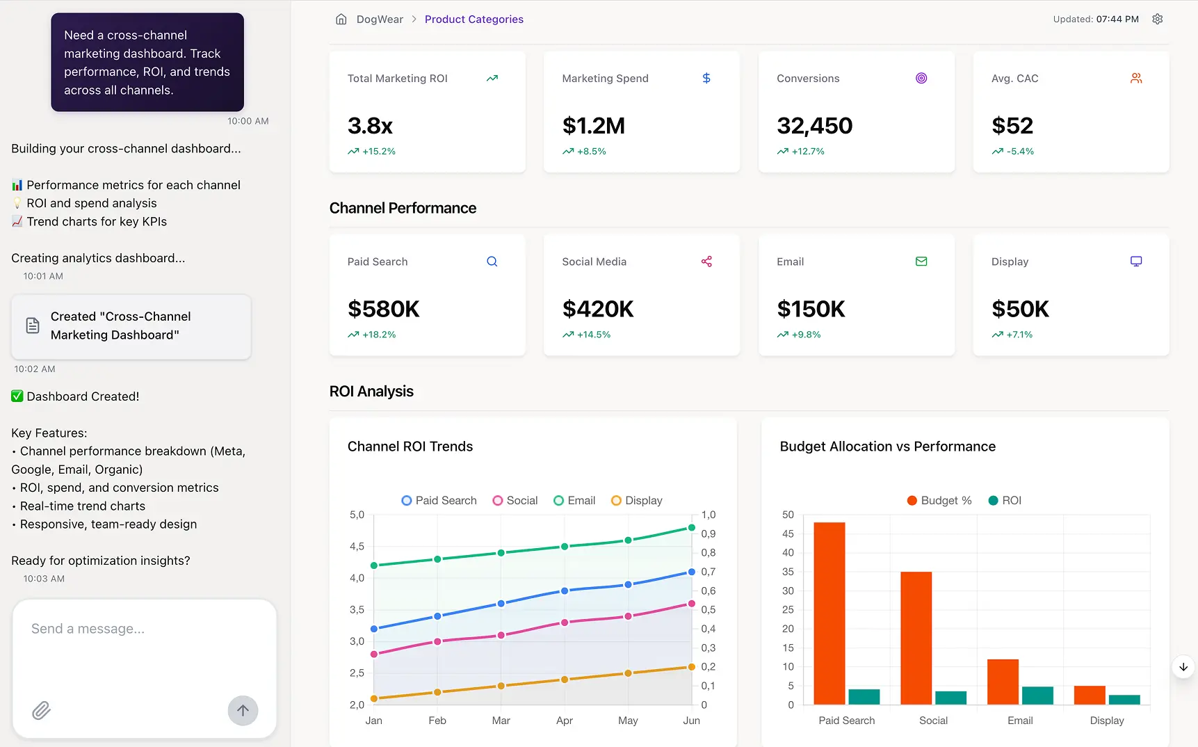
Start by creating the top-level dashboard. This should display the key performance indicators (KPIs) and summary charts that answer the main business questions at a glance. Use clear and simple visualizations like bar charts, pie charts, or scorecards. This initial view is the entry point for the user's analytical journey.
Step 6: Configure the Drill Down Paths
In your chosen tool, configure the interactive drill down actions. This involves linking the summary-level charts to the next level of detail in your hierarchy.
For example, you could configure a "Sales by Region" chart so that clicking on a specific region automatically filters the view or navigates to a new chart showing "Sales by City" for that region. Ensure the navigation is intuitive.
Step 7: Add Complementary Visualizations
As users drill down, the type of visualization may need to change to best represent the data. A high-level map might be great for showing countries, but a detailed table or bar chart is better for showing sales by individual stores. Design each level of the report to be as clear and insightful as possible.
Step 8: Test, Validate, and Iterate
Thoroughly test every drill path to ensure it works correctly and the data is accurate. Share a prototype with your end users and gather feedback. Are the drill paths intuitive? Is anything confusing? Use this feedback to refine the report. Great reports are rarely perfect on the first try; they evolve through an iterative process of use and improvement.
Or you can skip the entire manual workflow and get the insight instantly with Improvado’s AI Agent.
Instead of defining hierarchies, building drill paths, and configuring every layer of the report, you simply ask a question in natural language. AI Agent analyzes your unified dataset, identifies the relevant dimensions, and generates a drill-down narrative automatically.
It can break performance down by channel, campaign, audience, region, creative, or time period, whatever matters most to your analysis. It highlights root causes, surfaces anomalies, builds visualizations, and explains what changed and why.
All of this happens in seconds, without navigating dashboards or writing SQL.
For teams that want drill-down power without the operational overhead, the AI Agent provides an entirely new way to get answers: conversational, on-demand, and backed by high-quality, centralized data.
I use Improvado AI Agent to get basic analytics and quick solves. I just enter the question, and it gives me the answer I need.

Real-World Examples of Drill Down Reports in Action (With Use Cases)
The true power of drill down reports is best understood through practical examples. Across different industries and departments, these reports provide the clarity needed to make strategic decisions. Here are a few common use cases that illustrate their versatility.
E-commerce Sales Performance Analysis
An e-commerce manager needs to understand daily sales trends. Their drill down report starts with a view of total revenue and orders for the past 30 days.
- Level 1: Total revenue. The manager sees that yesterday's revenue was 15% below target.
- Level 2: Drill down by product category. They click on the revenue number and see a breakdown by category. They discover the "Electronics" category is the source of the underperformance.
- Level 3: Drill down by product. Clicking on "Electronics," they see a list of products. A popular smartphone model had zero sales yesterday.
- Level 4: Drill down by traffic source. They investigate that product further and find its product page had no traffic from its main paid ad campaign.
Insight: In just four clicks, the manager identified that a key ad campaign was accidentally paused, leading to a significant revenue loss. They can now immediately restart the campaign.
Marketing Campaign Analysis
A marketing director is reviewing the performance of their quarterly lead generation efforts. They use various marketing analytics platforms, but need a consolidated view.
- Level 1: Total leads generated. The dashboard shows they are slightly ahead of their lead goal.
- Level 2: Drill down by marketing channel. They click on the total and see the breakdown: Organic Search, Paid Social, Email, and PPC. They notice Paid Social is performing exceptionally well.
- Level 3: Drill down by social platform. Clicking on "Paid Social" reveals the performance on LinkedIn, Facebook, and Twitter. LinkedIn is driving 80% of the leads.
- Level 4: Drill down by campaign. Inside LinkedIn, they see that one specific campaign, "eBook for CFOs," is responsible for the vast majority of conversions.
Insight: The director learns that a specific content offer on a specific platform is their most effective lead generation tool. They can now reallocate budget from underperforming campaigns to double down on this successful strategy.
Financial Expense Tracking
A Chief Financial Officer (CFO) is analyzing company-wide operational expenses, which seem higher than projected. The role of drill-down analytics in financial reporting is to provide clarity and accountability.
- Level 1: Total operating expenses. The top-level report shows a 10% overage compared to the budget.
- Level 2: Drill down by department. The CFO drills down and finds the Marketing department is responsible for the largest variance.
- Level 3: Drill down by expense category. Within Marketing, they see that "Software Subscriptions" are much higher than planned.
- Level 4: Drill down by vendor. A final drill down reveals multiple redundant subscriptions for similar marketing automation tools across different teams.
Insight: The CFO can now work with the marketing team to consolidate software tools, eliminating redundant costs and bringing the budget back in line.
Advanced Drill Down Techniques for Deeper Insights
Once you've mastered the basics, you can employ advanced techniques to extract even more value from your drill down reports. These methods add layers of sophistication and allow for more nuanced and powerful data exploration. They move beyond simple hierarchical navigation.
Combining Drill Down with Filters and Slicers
A powerful technique is to use drill downs in conjunction with dynamic filters (often called slicers).
For example, a user could first filter a global sales report to show only "North America" and "Q4". Then, they could drill down into the filtered results to see performance by country, state, and city.
This combination allows for highly specific, multi-dimensional analysis, answering complex questions like "How did our new product line perform in California during the holiday season?"
Implementing Asymmetrical Hierarchies
Not all data fits into a neat, symmetrical hierarchy. An asymmetrical hierarchy is one where the branches of the tree have different depths.
For example, in an organizational chart, some managers might have direct reports who are also managers, while others only have individual contributors.
Building drill down reports that can handle these uneven structures is crucial for accurately representing complex business realities, such as intricate supply chains or multi-layered sales territories.
Using Drill Down to Enhance ROI Attribution Modeling
Drill down reports can significantly refine ROI attribution modeling. A high-level attribution model might assign credit to marketing channels. A drill down report allows an analyst to click on a channel like "Paid Search" and see the ROI broken down by individual campaigns, ad groups, and keywords.
This uncovers which specific elements are driving the best return, allowing for highly granular optimization of marketing spend.
Common Pitfalls and Best Practices in Drill Down Reporting
While powerful, drill down reports can become confusing or ineffective if not designed thoughtfully. Awareness of common pitfalls and adherence to best practices are key to creating reports that truly empower users rather than overwhelm them.
Pitfall 1: Overly Complex or Illogical Hierarchies
A common mistake is creating too many drill-down levels or using a hierarchy that doesn't make intuitive sense to the business user. If a user has to drill down through seven or eight levels to get to an answer, they are likely to get lost.
Similarly, if the path is not logical (e.g., drilling from City to Country), the report will be unusable.
Best practice: Keep hierarchies to 3-5 levels where possible. Design them based on the most common analytical paths users will take. Always test your hierarchies with actual end-users to ensure they are intuitive.
Pitfall 2: Poor Data Quality and Inaccuracy
If the underlying data is inaccurate, incomplete, or inconsistent, drilling down will expose these flaws. This erodes user trust in the report and in the data team. Users might see a summary total that doesn't match the sum of its drilled-down components, which immediately discredits the entire dashboard.
Teams using manual pipelines are even more likely to experience data quality issues.
Best practice: Invest in data governance and data quality processes. Enterprise data teams using Improvado report significant reductions in maintenance overhead thanks to automated pipeline management and governance frameworks that validate data across complex hierarchies.
Improvado continuously checks for missing fields, inconsistent naming, and structural issues while standardizing metrics from every source. This end-to-end automation ensures that drill-down reports are always powered by clean, reliable data without manual intervention.
Before Booyah Advertising implemented Improvado, their analytics team struggled with fragmented data architecture and frequent accuracy issues. Entire days of data were missing, duplicates distorted performance metrics, and aggregation across over 100 clients required extensive manual reconciliation.
After the migration, Booyah realized 99.9% data accuracy and cut daily budget-pacing updates from hours to 10-30 minutes. Improvado’s unified pipelines, normalization logic, and real-time refresh capability gave the agency full visibility and control over multi-source data (15–20 feeds per client).
“We never have issues with data timing out or not populating in GBQ. We only go into the platform now to handle a backend refresh if naming conventions change or something. That's it.
With Improvado, we now trust the data. If anything is wrong, it’s how someone on the team is viewing it, not the data itself. It’s 99.9% accurate.”

Pitfall 3: Slow Report Performance and Lag
Interactivity is the core of the drill down experience. If a user clicks to drill down and has to wait ten seconds for the report to update, they will become frustrated and abandon the tool. Poor performance is often caused by overly complex calculations, inefficient data models, or trying to process too much data in the browser.
Best practice: Optimize your data model for performance. Pre-aggregate data where possible. Use a BI tool that is known for its performance with large datasets. Test the report's load and interaction times under realistic conditions.
The Technical Architecture Behind Drill Down Reporting
Understanding the technology that powers drill down reports helps in building more robust and scalable solutions. The seamless interactive experience users see on the front end is supported by a well-designed back-end architecture. Several key components work together to make drill downs possible.
The Role of the Centralized Data Warehouse
For drill down reporting to function effectively across a business, data must be centralized. Improvado streamlines this centralization by automatically extracting and normalizing data from 500+ marketing sources, eliminating the manual export/import processes that typically create data silos and inconsistencies in drill-down reporting.
A modern cloud data warehouse serves as this central repository. It consolidates data from various source systems (like your CRM, ERP, and marketing platforms) into a single, structured location. This unification is a prerequisite for creating reports that allow a user to drill down from a high-level business metric all the way to a granular detail that originated in a different system.
The Importance of the Data Model
Once data is in the warehouse, it must be organized into a data model. This model defines the tables, the data fields, and, most importantly, the relationships between them.
For drill down, this is where hierarchies are formally defined. A well-designed star schema, for example, with a central fact table (containing metrics like sales amount) and multiple dimension tables (containing attributes like date, product, and location) is the classic architecture for enabling this kind of analysis.
OLAP Cubes vs. In-Memory Engines
Historically, Online Analytical Processing (OLAP) cubes were the primary technology for drill downs. These are multi-dimensional databases where data is pre-aggregated at every level of a hierarchy, making drill down operations extremely fast.
While still used, many modern BI tools now use powerful in-memory engines. These engines load large amounts of detailed data directly into RAM, allowing them to perform aggregations and calculations on the fly with incredible speed, offering more flexibility than rigid OLAP cubes.
Frequently Asked Questions
What is drill down in a report?
Drill down in a report refers to the ability to click on a summarized data point — such as a total revenue figure or a chart segment — and reveal the more granular data that makes up that number. The user moves through a predefined data hierarchy (for example, Year → Quarter → Month → Day) without leaving the report interface. This interactivity is what distinguishes a drill down report from a static export or a simple filtered table.
What is an example of a drill down report?
A common example is a sales performance report that displays total revenue by region. A user clicks on the "North America" bar, and the report expands to show revenue by country; clicking "United States" then reveals revenue by state, and so on down to individual transactions. Another example is a marketing dashboard where clicking a campaign-level cost figure drills into ad-set performance, then individual ad creative results.
What does it mean to drill down?
To drill down means to navigate from a high-level, aggregated view of data into progressively more detailed layers. In a business intelligence context, it means moving from a summary metric — like total monthly sales — into the specific segments, time periods, products, or customer groups that compose it. The goal is to identify the root cause of a trend or anomaly rather than simply observing it at the surface level.
What is a drill down analysis?
Drill down analysis is the investigative process of using drill down reports to move through data hierarchies in order to diagnose performance drivers. For example, if overall conversion rate drops, a drill down analysis might reveal that the decline is isolated to one traffic source, one geographic market, or one product category. It transforms a high-level observation into an actionable, evidence-based finding.
What is the difference between drill down and drill through?
Drill down navigates within the same report, revealing deeper levels of the existing data hierarchy (e.g., Year → Month → Day). Drill through, by contrast, opens a separate, linked report that provides related detail — for instance, clicking a revenue total might open a transaction-level report in a new view. Drill down keeps the user in context; drill through connects to a different dataset or report entirely.
Conclusion
Drill-down reports give teams the granularity needed to understand not just what happened, but why it happened. They reveal patterns, outliers, and root causes that surface-level dashboards can’t show. But this level of detail is only useful if the underlying data is accurate and consistent Otherwise, you’re drilling down into errors, not insights.
Improvado provides a data foundation foundation. It centralizes data from hundreds of marketing, analytics, and revenue sources and prepares it for analysis through automated cleanup, normalization, and governance. By delivering a unified, trustworthy dataset, Improvado ensures your drill-down reports always reflect the real story behind your performance. With clean, connected data flowing into your BI tools, teams can explore every layer of the funnel with confidence.
If you want to build drill-down reporting on a strong, automated data foundation, request a demo of Improvado.