A Salesforce dashboard is a customizable visual interface that displays real-time data from Salesforce CRM through components like charts, tables, and metrics cards. Dashboards pull data from underlying Salesforce reports and can be configured as standard dashboards (same view for all users) or dynamic dashboards (personalized data per viewer based on role/permissions). They support Lightning Experience with modern components and mobile rendering, or Classic interface with legacy chart types—each with distinct governor limits and refresh capabilities.
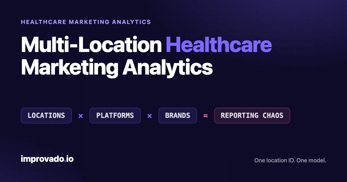
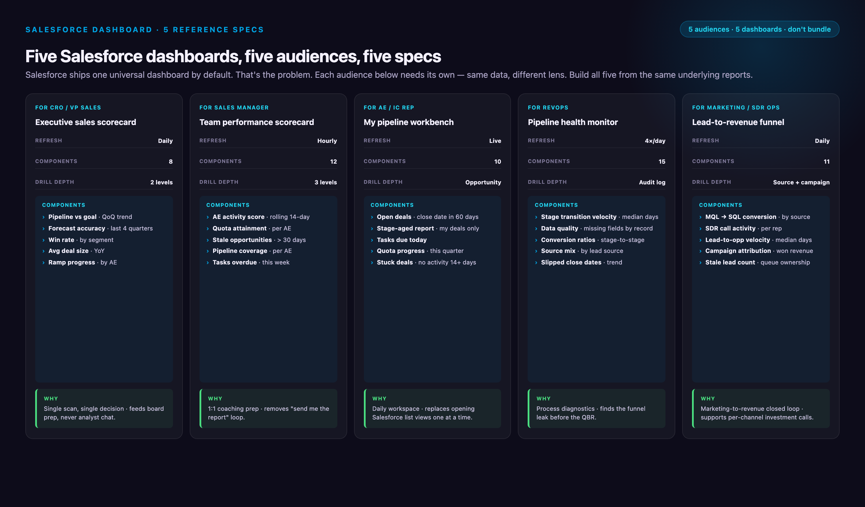
Marketing analysts searching for Salesforce dashboard examples often encounter lists of dashboard types without actionable specifications. This guide provides five complete dashboard implementations with component breakdowns, source report structures, and annotated screenshots. You'll get downloadable specifications for Sales Overview (executive KPIs), Account Executive (individual rep tracking), Pipeline Quality (deal health monitoring), Revenue Forecast (quota management), and Pipeline Generation (marketing attribution) dashboards—plus a 15-pattern component library showing high-value chart configurations. Each specification includes the exact reports feeding each component, filter logic, and typical workflow use cases. As of Summer 2026, Salesforce dashboards support brand color palettes (apply org-wide themes to charts) and Einstein Semantic Layer integration (zero-copy queries to Snowflake/BigQuery via Data Cloud), expanding customization and external data access.
Key Takeaways:
✓ Summer '26 introduces brand color palettes (org-wide theme application to charts) and Einstein Semantic Layer (zero-copy queries to Snowflake/BigQuery via Data Cloud).
✓ This guide provides specifications for 5 core dashboards: Sales Overview, Account Executive, Pipeline Quality, Revenue Forecast, Pipeline Generation—with component lists, report structures, and downloadable package.
✓ Salesforce offers two dashboard environments (Lightning and Classic) with different component types, mobile support, and refresh capabilities—migration requires manual reconfiguration of advanced filters and custom components.
✓ Dynamic dashboards show personalized data per user but are limited to 3 running users per refresh; standard dashboards show identical data to all viewers with no user limit.
✓ Built-in Salesforce dashboards refresh hourly at minimum—not true real-time. Sub-15-minute data freshness requires Einstein Analytics upgrade or external data pipeline.
✓ Dashboard projects fail when metrics contradict (pipeline coverage vs close rate), data integrity issues go unaddressed (duplicate records, stale async updates), or teams skip report optimization (filters, row limits, summary formulas) before building components.
What is a Salesforce dashboard?
Understanding the technical architecture matters because it determines what you can build and how fresh your data will be. Salesforce offers two primary dashboard environments—Lightning Experience and Classic—each with different capabilities:
Lightning vs Classic Dashboard Comparison
| Capability | Lightning Experience | Classic | Migration Impact |
|---|---|---|---|
| Component types | Bar, line, donut, funnel, scatter, metric, table, gauge (9 types) | Bar, line, pie, funnel, scatter, table, gauge, metric (8 types) | Pie charts convert to donut; some table filters require rebuild |
| Mobile rendering | Fully responsive with offline caching for Salesforce mobile app—critical for 2026 distributed sales teams | Limited mobile support, desktop-only layouts | Mobile users see degraded experience until migration |
| Governor limits (components/dashboard) | 20 components per dashboard | 20 components per dashboard | No change |
| Refresh frequency | Hourly minimum for scheduled; manual on-demand with API limits | Hourly minimum for scheduled; manual on-demand | No change; near-real-time requires Einstein Analytics upgrade |
| Filter behavior | Cross-component filters, date range filters, grouped filters | Basic filters only | Advanced filters must be manually reconfigured |
| Sharing model | Folder-based permissions, dynamic dashboard running user selection | Folder-based permissions | Review all sharing rules; Communities users may lose access |
| Brand color palettes | Org-wide theme application (Summer '26) | Not supported | Lightning gains design consistency |
| Custom components | Lightning Web Components (LWCs) supported as of Spring '26; Einstein Semantic Layer integration for Data Cloud reports (Summer '26) | Not supported | Custom visuals require LWC redevelopment |
| Typical load time (10 components) | 2-4 seconds | 3-6 seconds | Performance usually improves post-migration |
Dynamic vs Standard Dashboards
This distinction determines whether every viewer sees the same data or personalized data based on their role:
• Standard dashboards display identical data to all users who have access. Best for executive leadership dashboards, team performance boards, and company-wide KPI tracking. One dashboard serves all viewers. Simpler to maintain but requires broader data access permissions.
• Dynamic dashboards show each user their own data based on the "View Dashboard As" running user setting. Critical for individual contributor dashboards (account executives seeing only their opportunities, SDRs seeing only their leads). Requires Performance or higher edition in Lightning, or Enterprise edition with additional license in Classic. Governor limit: 3 running users in Lightning per dashboard refresh.
When building account executive or SDR dashboards, always use dynamic dashboards. When building VP-level or company-wide dashboards, standard dashboards are simpler and avoid the 3-user refresh limitation.
Dashboard Component Selection Guide
This matrix maps data characteristics to component types—use it to select components for the five dashboard specifications below:
| Data Pattern | Best Component Type | When to Avoid | Example Use Case |
|---|---|---|---|
| Trending over time | Line chart | When you have >8 series (lines become spaghetti) | Pipeline value by month, lead velocity week-over-week |
| Part-to-whole breakdown | Donut chart (Lightning) or Pie (Classic) | When you have >6 segments (legend becomes unreadable) | Pipeline by stage, opportunities by lead source |
| Ranking/comparison | Horizontal bar chart | When values are close together (bars look identical) | Rep performance leaderboard, account value ranking |
| Conversion funnel | Funnel chart | When stages have non-sequential logic (not true funnel) | Lead → MQL → SQL → Opportunity → Closed Won |
| Correlation/distribution | Scatter chart | When you have <15 data points (pattern unclear) | Deal size vs sales cycle length, activity level vs win rate |
| Single KPI | Metric component | When context matters more than the number itself | Total pipeline, forecast amount, win rate percentage |
| Progress to goal | Gauge component | When goal is arbitrary or changes frequently | Quota attainment, forecast vs target, campaign goal progress |
| Detailed record list | Table component | When you have >50 rows (users can't scan effectively) | Top 10 deals at risk, recent closed-lost opportunities |
Component limit strategy: With a hard cap of 20 components per dashboard, prioritize components that answer questions, not just display data. A metric card showing "Pipeline: $2.3M" without context is wasted space. A line chart showing pipeline trend over 12 weeks with forecast overlay answers "Are we trending up or down?" and consumes the same component slot.
For visual examples of each component type in context, see the Component Pattern Library section below (15 annotated configurations showing high-value chart patterns).
When NOT to Build a Salesforce Dashboard
Before diving into dashboard specifications, understand when Salesforce dashboards are the wrong tool. Building a dashboard when you need a different solution wastes time and creates adoption friction.
| Scenario | Why Dashboards Fail | Better Alternative |
|---|---|---|
| Data changes <50 times per year | Dashboard refresh overhead (hourly minimum) unnecessary for quarterly reviews | Ad-hoc reports run manually at review time |
| Only 1-2 people need the view | Maintenance burden outweighs value; no shared context benefit | Bookmarked report with filters saved as personal view |
| Underlying object has <100 records total | Charts with tiny datasets show noise, not patterns; manual review faster | List view with inline editing for quick scanning |
| Metric definition is disputed | Dashboard becomes political artifact; teams argue about calculations instead of insights | Align on metric definition first; use scratch reports to test formulas |
| Users need record-level editing from the view | Dashboards are read-only; users must click through to records, breaking workflow | List views with inline edit and mass actions |
| Need to blend Salesforce + external platform data | Native dashboards only query Salesforce reports; importing external data is impractical at scale | Data warehouse (Snowflake/BigQuery) + BI tool (Tableau/Looker) or Einstein Semantic Layer |
| Require sub-15-minute data freshness | Standard dashboards refresh hourly minimum; manual refresh hits API limits | Einstein Analytics/CRM Analytics (15-min increments) or live reports (query-time) |
Salesforce Dashboard Examples: 5 Complete Specifications
The following specifications provide component-level detail for five production dashboards. Each includes: dashboard type (standard vs dynamic), component list with chart types, source reports with groupings and filters, typical use case, and refresh recommendations. Use these as templates—copy the report structure, then customize filters and metrics for your org.
Which Dashboard to Build First
Dashboard needs scale with org complexity. Start with the minimum viable set, then expand as adoption proves value:
| Org Profile | Start With These Dashboards | Add These Second |
|---|---|---|
| 5-20 reps, <90 day sales cycle | Sales Overview + Account Executive | Pipeline Generation (if marketing-driven) |
| 20-100 reps, 90-180 day cycle | Revenue Forecast + Pipeline Quality | Sales Overview + Account Executive |
| 100+ reps, complex structure | All 5, but segment by region/product line | Role-specific variants (SDR, Manager views) |
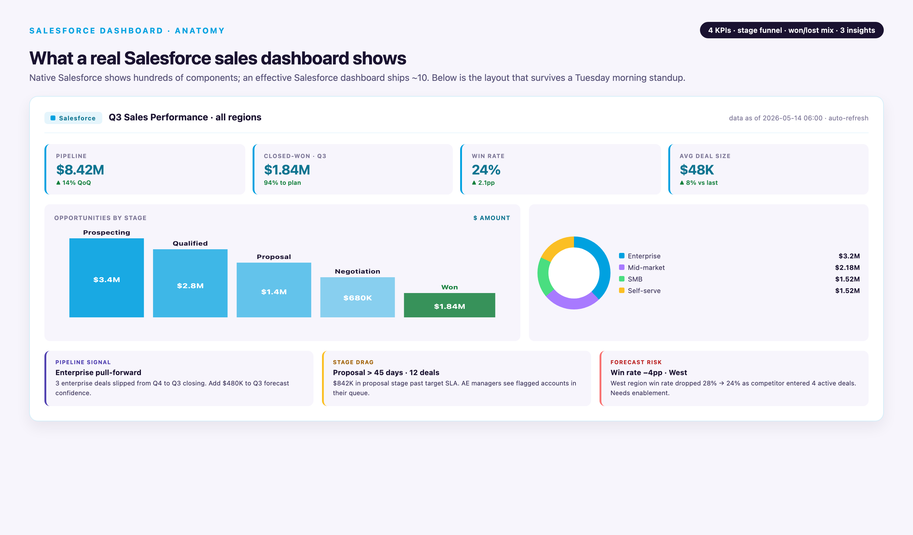
1. Sales Overview Dashboard (Standard, Executive-Facing)
Purpose: High-level organizational performance view for weekly leadership reviews and board meetings. Answers: "Are we on track to hit the quarter?" and "Where are blockers?"
Dashboard Type: Standard (all viewers see same data)
Refresh Schedule: Daily at 6 AM (scheduled) or manual refresh during live meetings
Component Specifications:
| Component | Chart Type | Source Report | Report Structure |
|---|---|---|---|
| Pipeline Trend by Stage | Line chart | Opportunities: Pipeline by Stage by Week | Summary report grouped by Stage Name (rows) + Close Date (columns, weekly buckets). Filter: Stage ≠ Closed Won/Lost, Close Date = Current Quarter. Display sum of Amount. |
| Total Pipeline Value | Metric card | Opportunities: Open Pipeline Sum | Summary report with no grouping. Filter: Stage ≠ Closed Won/Lost. Display sum of Amount with trend indicator (compare to 30 days ago). |
| Average Deal Size | Metric card | Opportunities: Avg Amount Current Quarter | Summary report with no grouping. Filter: Close Date = Current Quarter, Stage ≠ Closed Lost. Display average of Amount. |
| Pipeline by Owner (Top 10) | Horizontal bar chart | Opportunities: Pipeline by Owner | Summary report grouped by Owner Name. Filter: Stage ≠ Closed Won/Lost. Sort by Amount descending, row limit 10. Display sum of Amount. |
| Stage Conversion Rates | Funnel chart | Opportunities: Stage Progression Funnel | Summary report grouped by Stage Name. Filter: Created Date = Last 90 Days. Display record count per stage. Manually order stages in funnel component config. |
| Forecast vs Quota | Gauge chart | Opportunities: Forecast Amount vs Quota | Summary report with custom summary formula: SUM(Amount * Probability%) / SUM(Quota__c). Filter: Close Date = Current Quarter, Stage ≠ Closed Lost. Gauge max = 100%, breakpoints at 70% (red), 90% (yellow), 100% (green). |
Layout Notes: Place metric cards (Pipeline Value, Avg Deal Size) at top for quick scanning. Line chart spans full width below. Bar chart and funnel side-by-side in middle row. Gauge bottom center for visual anchor. Total: 6 components, well under 20-component limit.
Typical Use Case: VP Sales pulls this up at Monday morning leadership call. Team reviews pipeline trend—if Stage 2 is declining week-over-week, they dig into lead generation. Owner bar chart reveals if pipeline is concentrated with 2-3 reps (concentration risk). Forecast gauge shows if team needs to pull forward deals to hit the quarter.
2. Account Executive Dashboard (Dynamic, Individual Rep View)
Purpose: Personal activity and opportunity tracking for individual sales reps. Answers: "What should I work on today?" and "Am I on track to quota?"
Dashboard Type: Dynamic (each rep sees only their data based on Running User = $User)
Refresh Schedule: Hourly scheduled refresh during business hours (8 AM - 6 PM)
Component Specifications:
| Component | Chart Type | Source Report | Report Structure |
|---|---|---|---|
| My Pipeline Value | Metric card | Opportunities: My Open Pipeline | Summary report with no grouping. Filter: Owner = Running User, Stage ≠ Closed Won/Lost. Display sum of Amount with trend vs 7 days ago. |
| My Top 10 Opportunities | Table component | Opportunities: My Opps by Amount | Tabular report with columns: Opportunity Name, Amount, Stage, Close Date, Days Since Last Activity (formula field). Filter: Owner = Running User, Stage ≠ Closed Won/Lost. Sort by Amount descending, row limit 10. |
| My Quota Attainment | Gauge chart | Opportunities: My Closed Won vs Quota | Summary report with custom formula: SUM(Amount WHERE Stage = Closed Won) / Quota__c. Filter: Owner = Running User, Close Date = Current Quarter. Gauge max = 100%, breakpoints at 25/50/75/100%. |
| My Activity Trend | Line chart (3 series) | Activities: My Calls/Emails/Meetings by Week | Summary report on Task/Event objects grouped by Activity Date (weekly buckets). Filter: Owner = Running User, Activity Date = Last 12 Weeks. Display 3 series: count of Tasks WHERE Type=Call, count of Tasks WHERE Type=Email, count of Events WHERE Type=Meeting. |
| My Pipeline by Stage | Donut chart | Opportunities: My Pipeline by Stage | Summary report grouped by Stage Name. Filter: Owner = Running User, Stage ≠ Closed Won/Lost. Display sum of Amount. Limit to 5 stages max (combine early stages if needed). |
| My Win Rate | Metric card | Opportunities: My Win Rate Current Quarter | Summary report with custom formula: COUNT(Opp WHERE Stage=Closed Won) / COUNT(Opp WHERE Stage IN (Closed Won, Closed Lost)). Filter: Owner = Running User, Close Date = Current Quarter. Display as percentage. |
Layout Notes: Metric cards (My Pipeline, Quota Attainment, Win Rate) across top row for at-a-glance status. Table component spans full width below metrics—this is the action list. Activity trend line chart and pipeline donut side-by-side in bottom row. Total: 6 components.
Typical Use Case: Rep opens dashboard first thing every morning. Checks quota gauge to see if on track. Scans Top 10 table, focusing on deals with >14 days since last activity (stalled deals need attention). Reviews activity trend—if calls are declining week-over-week, rep knows they're slipping on outbound discipline. Pipeline donut reveals if too much pipeline is stuck in early stages (qualification problem).
Dynamic Dashboard Configuration: In dashboard settings, set "View Dashboard As" to "Running User" and select "Let dashboard viewers choose whom they view the dashboard as" = unchecked (forces reps to see only their data). Requires Performance Edition or higher.
3. Pipeline Quality Dashboard (Standard, Operations/VP Sales)
Purpose: Deal health monitoring and risk identification. Answers: "Which deals are stalled?" and "Where are our conversion bottlenecks?"
Dashboard Type: Standard (ops team and leadership see all pipeline)
Refresh Schedule: Twice daily (8 AM, 2 PM) to catch stalled deals mid-day
Component Specifications:
| Component | Chart Type | Source Report | Report Structure |
|---|---|---|---|
| Deal Size vs Days in Pipeline | Scatter chart | Opportunities: Size vs Age Scatter | Summary report with X-axis: Days_Since_Created__c (formula: TODAY() - CreatedDate), Y-axis: Amount, bubble size: Probability. Filter: Stage ≠ Closed Won/Lost. Outliers in top-right quadrant (large deals, long age) are stall risks. |
| Stalled Deals (No Activity >14 Days) | Table component | Opportunities: Stalled Deal Report | Tabular report with columns: Opportunity Name, Owner, Amount, Stage, Close Date, Days_Since_Last_Activity__c (formula field). Filter: Stage ≠ Closed Won/Lost, Days_Since_Last_Activity__c > 14. Sort by Amount descending, row limit 20. |
| Average Days in Stage 3 (Negotiation) | Metric card | Opportunities: Avg Days in Negotiation | Summary report with custom formula: AVG(Days_in_Stage_3__c). Filter: Stage = Negotiation OR (Stage = Closed Won/Lost AND Previous_Stage__c = Negotiation), Close Date = Current Quarter. Trend indicator vs last quarter. |
| Pipeline by Lead Source (Ranked by Close Rate) | Horizontal bar chart | Opportunities: Lead Source Effectiveness | Summary report grouped by Lead Source. Filter: Created Date = Last 90 Days. Display custom formula: COUNT(Opp WHERE Stage=Closed Won) / COUNT(All Opps) AS Close_Rate. Sort by Close_Rate descending. Reveals which sources produce quality pipeline, not just volume. |
| Pipeline Concentration Risk | Donut chart | Opportunities: Top 3 Deals vs Rest | Summary report with custom grouping: "Top 3 Deals" (manual selection of 3 largest opps) vs "All Other Deals". Filter: Stage ≠ Closed Won/Lost. Display sum of Amount. Red flag if Top 3 > 40% of total pipeline. |
| Stage 2→3 Conversion Rate Trend | Line chart | Opportunities: Stage 2 to 3 Conversion by Week | Summary report grouped by Stage_Entry_Date__c (weekly buckets). Filter: Current_Stage__c = Stage 3 OR (Stage = Closed Won/Lost AND Previous_Stage = Stage 3). Display custom formula: COUNT(Opps entering Stage 3) / COUNT(Opps that were in Stage 2 prior week). Requires historical stage tracking. |
Layout Notes: Scatter chart spans top half—most visually impactful for identifying outliers. Stalled deals table below scatter (action list). Metric card, bar chart, donut, line chart in 2x2 grid at bottom. Total: 6 components.
Typical Use Case: Revenue operations analyst reviews this daily. Scatter chart reveals a $500K deal that's been in pipeline 120 days with only 30% probability—likely needs executive intervention. Stalled deals table feeds into automated Slack alerts to rep managers. Lead source bar chart shows "Partner Referral" has 45% close rate vs "Cold Outbound" at 8%—informs budget reallocation. Concentration donut shows top 3 deals = 55% of pipeline—unacceptable risk concentration, team needs to build broader pipeline.
- →1,000+ pre-built connectors covering Salesforce, Google Ads, Meta, LinkedIn, HubSpot, and every major marketing/sales platform—no custom API builds
- →Automated schema normalization and data transformation—marketing metrics standardized across sources without SQL
- →2-year historical data preservation on connector schema changes—never lose trend data due to platform API updates
- →Dedicated CSM and professional services included—not an add-on tier
4. Revenue Forecast Dashboard (Standard, Sales Leadership)
Purpose: Forecast accuracy tracking and quota management. Answers: "Will we hit the quarter?" and "Where do we need pipeline acceleration?"
Dashboard Type: Standard (leadership and finance see unified forecast)
Refresh Schedule: Daily at 7 AM (before forecast call)
Component Specifications:
| Component | Chart Type | Source Report | Report Structure |
|---|---|---|---|
| Forecast Amount vs Quota | Gauge chart | Opportunities: Weighted Forecast vs Quota | Summary report with custom formula: SUM(Amount * Probability%) AS Weighted_Forecast, compared to SUM(Quota__c). Filter: Close Date = Current Quarter, Stage ≠ Closed Lost. Gauge max = 120% (overachievement zone), breakpoints at 80/90/100/110%. |
| Forecast by Stage (Commit, Best Case, Pipeline) | Horizontal bar chart (stacked) | Opportunities: Forecast Categories | Summary report grouped by Forecast_Category__c (Commit = 90-100% probability, Best Case = 50-89%, Pipeline = <50%). Filter: Close Date = Current Quarter, Stage ≠ Closed Lost. Display sum of Amount per category. Stack bars to show total potential. |
| Forecast vs Actual Closed (Weekly Accuracy) | Line chart (2 series) | Opportunities: Forecast Accuracy Trend | Summary report grouped by Week_of_Quarter__c. Series 1: Historical Forecast_Snapshot__c (custom object tracking weekly forecast commits). Series 2: Actual_Closed_Won_Amount__c for each week. Filter: Current Quarter. Gap between lines shows forecast accuracy—converging lines = accurate, diverging = sandbag/overpromise. |
| Top 10 Commit Deals with Risk Score | Table component | Opportunities: Commit Deals Report | Tabular report with columns: Opportunity Name, Owner, Amount, Close Date, Probability, Risk_Score__c (formula: IF(Days_Since_Last_Activity > 7, "High", IF(No_Decision_Maker_Engaged, "Medium", "Low")). Filter: Forecast_Category = Commit, Close Date = Current Quarter. Sort by Amount descending, row limit 10. |
| Forecast Coverage Ratio | Metric card | Opportunities: Pipeline Coverage | Summary report with custom formula: (SUM(Pipeline Amount WHERE Close Date = Current Quarter) / (Quota - Closed_Won_To_Date)). Filter: Stage ≠ Closed Won/Lost. Target: 3-4x coverage for healthy pipeline. Display with trend indicator. |
| Forecast by Product Line | Donut chart | Opportunities: Forecast by Product | Summary report grouped by Product_Line__c. Filter: Forecast_Category IN (Commit, Best Case), Close Date = Current Quarter. Display sum of Amount. Limit to 5 product lines max. |
Layout Notes: Forecast gauge dominant at top center—the single most important metric. Bar chart (forecast categories) and coverage ratio metric side-by-side below gauge. Line chart (accuracy trend) spans full width in middle. Table (commit deals) and donut (product breakdown) at bottom. Total: 6 components.
Typical Use Case: CRO opens this every morning before forecast call. Gauge shows 87% to quota—need $1.3M more. Bar chart reveals Commit category is only $800K, so team needs to move Best Case deals forward. Accuracy line chart shows historical pattern of 15% overpromise in Week 1, converging by Week 8—tells CRO to discount early-quarter commits. Table highlights $400K deal with "High" risk score due to no activity in 9 days—CRO calls rep manager immediately. Coverage ratio is 2.1x—below healthy threshold, signals pipeline generation problem for next quarter.
5. Pipeline Generation Dashboard (Standard, Marketing Operations)
Purpose: Marketing attribution and lead quality tracking. Answers: "Which campaigns drive pipeline?" and "Where are lead-to-opportunity conversion gaps?"
Dashboard Type: Standard (marketing ops and sales leadership see unified view)
Refresh Schedule: Daily at 9 AM (after overnight batch jobs complete)
Component Specifications:
| Component | Chart Type | Source Report | Report Structure |
|---|---|---|---|
| Full Funnel: Lead → MQL → SQL → Opp → Closed Won | Funnel chart | Leads & Opportunities: Full Funnel | Cross-object summary report spanning Leads and Opportunities. Stages: COUNT(Leads), COUNT(Leads WHERE Status=MQL), COUNT(Leads WHERE Status=SQL), COUNT(Opportunities), COUNT(Opportunities WHERE Stage=Closed Won). Filter: Lead Created Date OR Opp Created Date = Current Quarter. Conversion rates displayed on funnel segments. |
| New Leads by Week with MQL Conversion Trend | Line chart (2 series) | Leads: Volume and MQL Rate by Week | Summary report grouped by Created Date (weekly buckets). Series 1: COUNT(All Leads). Series 2: COUNT(Leads WHERE Status=MQL) / COUNT(All Leads) AS MQL_Rate. Filter: Created Date = Last 12 Weeks. Diverging lines indicate quality vs volume trade-off. |
| Lead Source by Conversion Rate (Not Volume) | Horizontal bar chart | Leads: Lead Source Quality Ranking | Summary report grouped by Lead Source. Filter: Created Date = Last 90 Days. Display custom formula: COUNT(Leads WHERE Converted=True) / COUNT(All Leads) AS Conversion_Rate. Sort by Conversion_Rate descending. Minimum 20 leads per source to avoid noise. |
| MQL → SQL Conversion % | Metric card | Leads: MQL to SQL Conversion | Summary report with custom formula: COUNT(Leads WHERE Status=SQL) / COUNT(Leads WHERE Status=MQL). Filter: MQL Date = Current Quarter. Display as percentage with trend vs last quarter. Target: >40% for healthy funnel. |
| Campaign ROI (Sorted by Pipeline Generated) | Table component | Campaigns: Pipeline Generated Report | Summary report on Campaign object with cross-object formula to Opportunities. Columns: Campaign Name, Campaign Cost, Leads Generated, Opportunities Created, Total_Opp_Amount__c, ROI (Total_Opp_Amount / Campaign Cost). Filter: Campaign Start Date = Last 6 Months. Sort by Total_Opp_Amount descending, row limit 15. |
| Average Lead Response Time | Metric card | Leads: Avg Response Time | Summary report with custom formula: AVG(First_Activity_Date__c - Created Date) in hours. Filter: Created Date = Last 30 Days, Status ≠ Unqualified. Display in hours with trend. Target: <4 hours for inbound leads. |
Layout Notes: Funnel chart spans top half—visual centerpiece showing end-to-end conversion. Line chart (lead volume + MQL rate) below funnel. Bar chart (lead source quality) and metric cards (MQL→SQL %, response time) in middle row. Table (campaign ROI) spans full width at bottom—action list for budget decisions. Total: 6 components.
Typical Use Case: Marketing operations analyst reviews this Monday morning. Funnel shows MQL→SQL conversion dropped from 45% to 38% last week—signals lead quality issue or sales follow-up gap. Line chart reveals lead volume spiked (webinar campaign) but MQL rate declined, confirming quality trade-off. Bar chart shows "Partner Co-Marketing" has 62% conversion vs "Paid Search" at 12%—reallocate budget. Campaign ROI table reveals "Q2 Webinar Series" generated $2.1M pipeline on $15K spend (140x ROI)—expand this program. Response time metric is 6.2 hours, above 4-hour target—alerts sales management to follow-up delays.
Cross-Object Reporting Note: This dashboard requires custom report types linking Lead → Campaign and Lead → Opportunity objects. If your org doesn't track Opportunity → Campaign linkage, use "Primary Campaign Source" field on Opportunity to attribute pipeline back to campaigns.
Component Pattern Library: 15 High-Value Chart Configurations
The following patterns show specific component configurations that surface insights missed by standard report views. Each pattern includes: problem it solves, data structure requirements, and interpretation guidance.
1. Stalled Deal Detector (Scatter Chart)
Problem: Large deals sitting in pipeline with no activity become invisible in standard pipeline reports until they slip past close date.
Configuration: Scatter chart with X-axis = Days_Since_Last_Activity__c, Y-axis = Amount, bubble size = Probability. Filter: Stage ≠ Closed Won/Lost. Outliers in top-right quadrant (high value, no recent activity) need immediate intervention.
Data Requirements: Requires formula field Days_Since_Last_Activity__c: TODAY() - MAX(Task.ActivityDate, Event.ActivityDate). Must have Task/Event tracking enabled.
Interpretation: Any bubble in top-right (>$100K, >14 days no activity) gets flagged in manager review. Pattern of bubbles clustering at 20-30 days indicates systematic follow-up gap in sales process.
2. Pipeline Coverage Zones (Gauge with Custom Breakpoints)
Problem: Simple pipeline-to-quota ratio doesn't account for stage quality—3x coverage of Stage 1 opps is not equivalent to 3x coverage of Stage 3.
Configuration: Gauge chart showing (Weighted Pipeline / Remaining Quota) with custom color zones: 0-2x red, 2-3x yellow, 3-4x green, 4-5x light green, >5x blue (over-forecasted). Weighted formula: SUM(Amount * Stage_Weight__c) where Stage 1 = 0.1, Stage 2 = 0.25, Stage 3 = 0.5, Stage 4 = 0.75.
Data Requirements: Custom field Stage_Weight__c on Opportunity, populated via workflow or Process Builder based on Stage Name.
Interpretation: 2-3x (yellow) signals "need more pipeline"; 3-4x (green) is healthy; >5x (blue) suggests sandbag behavior (reps hoarding low-probability opps to inflate pipeline).
3. Win Rate Trend with Moving Average (Line Chart)
Problem: Weekly win rate bounces due to small sample size, making true trends invisible.
Configuration: Line chart with 2 series: Series 1 = weekly win rate (COUNT(Closed Won) / COUNT(Closed Won + Closed Lost)), Series 2 = 4-week moving average. Filter: Close Date = Last 12 Weeks. Moving average smooths noise, revealing directional trend.
Data Requirements: Requires historical snapshot table to calculate moving average in report, or use Einstein Analytics for native moving average function.
Interpretation: If moving average is declining over 8+ weeks, indicates systematic problem (lead quality drop, pricing pressure, competitive displacement). Week-to-week spikes in Series 1 are noise, ignore unless 3+ consecutive weeks.
4. Top Deals at Risk Table (Table with Conditional Formatting)
Problem: Standard opportunity reports don't surface risk indicators—need composite view of amount + stall signals + close date proximity.
Configuration: Table with columns: Opportunity Name, Owner, Amount, Close Date, Days_to_Close__c, Days_Since_Last_Activity__c, Decision_Maker_Engaged__c (checkbox). Sort by Amount descending. Conditional formatting: Red highlight if (Days_to_Close < 14 AND Days_Since_Last_Activity > 7) OR Decision_Maker_Engaged = False.
Data Requirements: Formula fields Days_to_Close__c (Close Date - TODAY()), Days_Since_Last_Activity__c. Custom checkbox Decision_Maker_Engaged__c manually updated by reps or auto-populated via Contact Role logic.
Interpretation: Red rows = immediate escalation to manager. Use in weekly forecast calls—any red row >$50K gets 2-minute discussion on mitigation plan.
5. Activity Heatmap (Stacked Bar Chart)
Problem: Total activity count per rep hides activity distribution—some reps front-load the week, others procrastinate, affecting close rates.
Configuration: Stacked horizontal bar chart grouped by Owner Name. Each bar shows activity breakdown: Calls (blue), Emails (green), Meetings (orange) for Current Week. Sort by Total Activities descending. Add benchmark line at team average (e.g., 40 activities/week).
Data Requirements: Summary report on Task/Event objects with custom grouping by Type. Filter: Activity Date = Current Week.
Interpretation: Reps consistently below benchmark line need coaching or workload rebalancing. High call count but low meeting count suggests qualification issues (lots of cold calls, no progression). High email count but low calls suggests hiding behind inbox (avoidance behavior).
6. Lead Velocity Week-Over-Week (Line Chart with Annotations)
Problem: Absolute lead volume is vanity metric—velocity (rate of change) predicts future pipeline better.
Configuration: Line chart showing week-over-week % change in new leads: (This Week Leads - Last Week Leads) / Last Week Leads * 100. Annotations on chart mark campaign launches, trade shows, content releases. Filter: Last 12 Weeks.
Data Requirements: Requires calculated field or Einstein Analytics to compute % change. Manual annotations via dashboard component properties.
Interpretation: Sustained negative velocity (declining week-over-week for 4+ weeks) is early warning of pipeline drought in 60-90 days. Spike following campaign launch shows program effectiveness. Flat velocity despite increased spend indicates saturation or poor targeting.
7. Stage Duration Benchmark (Horizontal Bar Chart with Target Line)
Problem: Sales cycles elongate invisibly until it's too late—need real-time comparison to historical benchmarks per stage.
Configuration: Horizontal bar chart grouped by Stage Name. Each bar shows AVG(Days_in_Stage__c) for Current Quarter opportunities. Add vertical benchmark line showing historical average (calculated from prior 4 quarters). Bars exceeding benchmark highlighted red.
Data Requirements: Custom field Days_in_Stage__c for each stage (e.g., Days_in_Negotiation__c = TODAY() - Date_Entered_Negotiation__c). Historical benchmark calculated in separate report, hardcoded into dashboard component as reference line.
Interpretation: If "Negotiation" stage currently averages 23 days vs 14-day historical benchmark, indicates pricing pressure or legal bottleneck. Use to focus process improvement efforts on slowest stage.
8. Forecast vs Actual Waterfall (Stacked Bar Chart)
Problem: Forecast accuracy is opaque—teams can't see whether misses were due to slips, close rate drops, or new business gaps.
Configuration: Stacked bar chart with 5 bars: Bar 1 = Beginning-of-Quarter Forecast, Bar 2 = New Opps Added Mid-Quarter, Bar 3 = Opps Slipped Out, Bar 4 = Opps Closed Lost, Bar 5 = Actual Closed Won. Bars stack to show cumulative effect. Filter: Current Quarter.
Data Requirements: Requires historical snapshot of forecast at quarter start (custom object Forecast_Snapshot__c) and opportunity stage history tracking. Calculate deltas via custom report formulas.
Interpretation: Large "Slipped Out" bar indicates poor qualification or unrealistic close dates. Large "Closed Lost" bar signals competitive displacement or pricing issues. "New Opps Added" larger than slips/losses indicates strong pipeline generation masking other problems.
9. Lead Source ROI Quadrant (Scatter Chart with Quadrants)
Problem: Marketing teams optimize for lead volume or cost-per-lead, missing the conversion rate dimension that determines true ROI.
Configuration: Scatter chart with X-axis = Cost Per Lead, Y-axis = Lead-to-Opportunity Conversion Rate, bubble size = Total Leads. Quadrant lines at median Cost Per Lead and median Conversion Rate. Top-left quadrant (low cost, high conversion) = ideal. Bottom-right (high cost, low conversion) = kill.
Data Requirements: Summary report on Campaign object with formulas: Cost_Per_Lead__c = Total Cost / Leads Generated, Conversion_Rate__c = Opportunities Created / Leads Generated. Minimum 50 leads per campaign to avoid noise.
Interpretation: Campaigns in top-left quadrant get budget increases. Bottom-right quadrant gets shut down. Top-right (high cost, high conversion) are judgment calls—acceptable for enterprise if deal size justifies CAC. Bottom-left (low cost, low conversion) are volume plays—scale if sales can handle lead volume.
10. Customer Lifetime Value Dashboard: Churn Risk by Account Tier
Problem: Aggregate churn rate masks tier-specific problems—losing 3 enterprise accounts has different revenue impact than losing 30 SMB accounts.
Configuration: Grouped bar chart with X-axis = Account Tier (Enterprise, Mid-Market, SMB), Y-axis grouped by: Active Accounts, At-Risk Accounts (no renewal activity 60 days before renewal), Churned Accounts. Filter: Current Quarter. Calculate churn rate per tier.
Data Requirements: Custom field Account_Tier__c (picklist), At_Risk__c (formula: IF(Renewal_Date__c - TODAY() < 60 AND Last_Activity_Date__c < TODAY() - 30, TRUE, FALSE)), Churned__c (checkbox).
Interpretation: Enterprise churn >5% is crisis—each account represents significant ARR. SMB churn <20% is acceptable in many models. At-Risk count 2x higher in Mid-Market suggests CSM capacity issue at that tier. Use to prioritize renewal resources by tier-specific risk.
Related Metrics: Pair with CLV calculation (average account value * average retention months) and Customer Acquisition Cost by tier to identify which tiers are profitable long-term. If SMB CAC = $5K and CLV = $8K, margin is thin—consider moving upmarket. If Enterprise CAC = $50K and CLV = $300K, invest heavily in Enterprise renewal motions.
11. Product Performance Dashboard: Revenue by Product with Win Rate Overlay
Problem: Product revenue reports don't show efficiency—Product A might have 2x revenue of Product B but half the win rate, indicating pricing or market fit issues.
Configuration: Combination chart: vertical bars showing SUM(Amount WHERE Stage = Closed Won) grouped by Product_Line__c, line overlay showing Win_Rate per product (COUNT(Closed Won) / COUNT(Closed Won + Closed Lost)). Filter: Close Date = Current Quarter. Dual Y-axes ($ on left, % on right).
Data Requirements: Product_Line__c populated on Opportunity (from Product2 object via Opportunity Line Items, or manual picklist). Requires opportunities to be marked Closed Won or Closed Lost consistently.
Interpretation: High revenue + low win rate = market leader but competitive pressure (need pricing review or differentiation). Low revenue + high win rate = undermarketed gem (expand sales focus). Low revenue + low win rate = consider sunsetting or repositioning. Use to inform product roadmap and sales training priorities.
When NOT to Build: Single-product companies or orgs where Product2 object isn't properly utilized (e.g., services businesses selling only "Professional Services" line item). Also skip if <10 closed deals per product per quarter—insufficient sample size for meaningful win rate patterns.
12. Average Deal Size by Lead Source (Horizontal Bar Chart)
Problem: Lead source reports focus on volume and conversion rate, missing the deal size dimension—some sources produce fewer but larger deals.
Configuration: Horizontal bar chart grouped by Lead Source, showing AVG(Amount WHERE Stage = Closed Won). Filter: Close Date = Last 6 Months, minimum 5 closed deals per source. Sort by Avg Deal Size descending. Add benchmark line at overall company average.
Data Requirements: Lead Source field properly populated (via lead import, web-to-lead, or manual entry). Opportunity must inherit Lead Source from converted lead or be manually populated.
Interpretation: "Partner Referral" averages $150K vs "Paid Search" at $18K—signals different buyer segments and sales motions. Combine with conversion rate data to calculate true source efficiency: (Avg Deal Size * Conversion Rate) / Cost Per Lead. High deal size sources may justify lower conversion rates if ROI is positive.
13. Sales Cycle Length by Industry (Box Plot)
Problem: Average sales cycle hides distribution—some industries close fast, others slow, affecting forecast accuracy and resource allocation.
Configuration: Box plot (if available in Einstein Analytics) or grouped horizontal bar chart showing AVG(Days_to_Close__c) grouped by Industry. Include min/max/median markers. Filter: Stage = Closed Won, Close Date = Last 12 Months, minimum 10 deals per industry.
Data Requirements: Industry field populated on Account, inherited by Opportunity. Formula field Days_to_Close__c = Close Date - Created Date.
Interpretation: "Financial Services" averages 180 days vs "Technology" at 45 days—adjust sales capacity planning and quota ramp periods by industry segment. Long-tail industries (high variance) need different pipeline coverage ratios than predictable industries.
14. Rep Activity vs Attainment (Scatter Chart)
Problem: Can't distinguish between low performers who need more activity vs those who need better qualification—both show low attainment.
Configuration: Scatter chart with X-axis = Total Activities (calls + emails + meetings) per week, Y-axis = Quota Attainment %, bubble size = Pipeline Value. Filter: Current Quarter. Quadrant lines at median activity level and 100% attainment.
Data Requirements: Summary report joining Opportunity (Owner) with Task/Event (Owner) to aggregate activities per rep. Quota from custom field or custom object.
Interpretation: Top-left quadrant (low activity, high attainment) = natural closers or enterprise reps with large deals. Bottom-left (low activity, low attainment) = need activity coaching or PIP. Bottom-right (high activity, low attainment) = need qualification training or better leads. Top-right (high activity, high attainment) = A-players to clone.
15. Pipeline Generation by Campaign Type (Stacked Area Chart)
Problem: Point-in-time campaign ROI misses cumulative effect—nurture campaigns take 6 months to show impact, but get killed after 2 months.
Configuration: Stacked area chart with X-axis = Week, Y-axis = Pipeline Generated (sum of opp Amount where Primary Campaign Source = campaign), stacked by Campaign_Type__c (Webinar, Content, Paid Ads, Events). Filter: Last 12 Months, show cumulative sum.
Data Requirements: Campaign object with Type field properly categorized. Opportunity linked to Campaign via Campaign Influence or Primary Campaign Source field.
Interpretation: Area chart shows which campaign types have consistent generation (steady slope) vs spiky (events). Use to balance campaign mix—if 80% of pipeline comes from Events but events only happen quarterly, over-reliance risk. Steady content/nurture programs derisk pipeline generation.
Data Quality Audit Checklist Before Dashboard Build
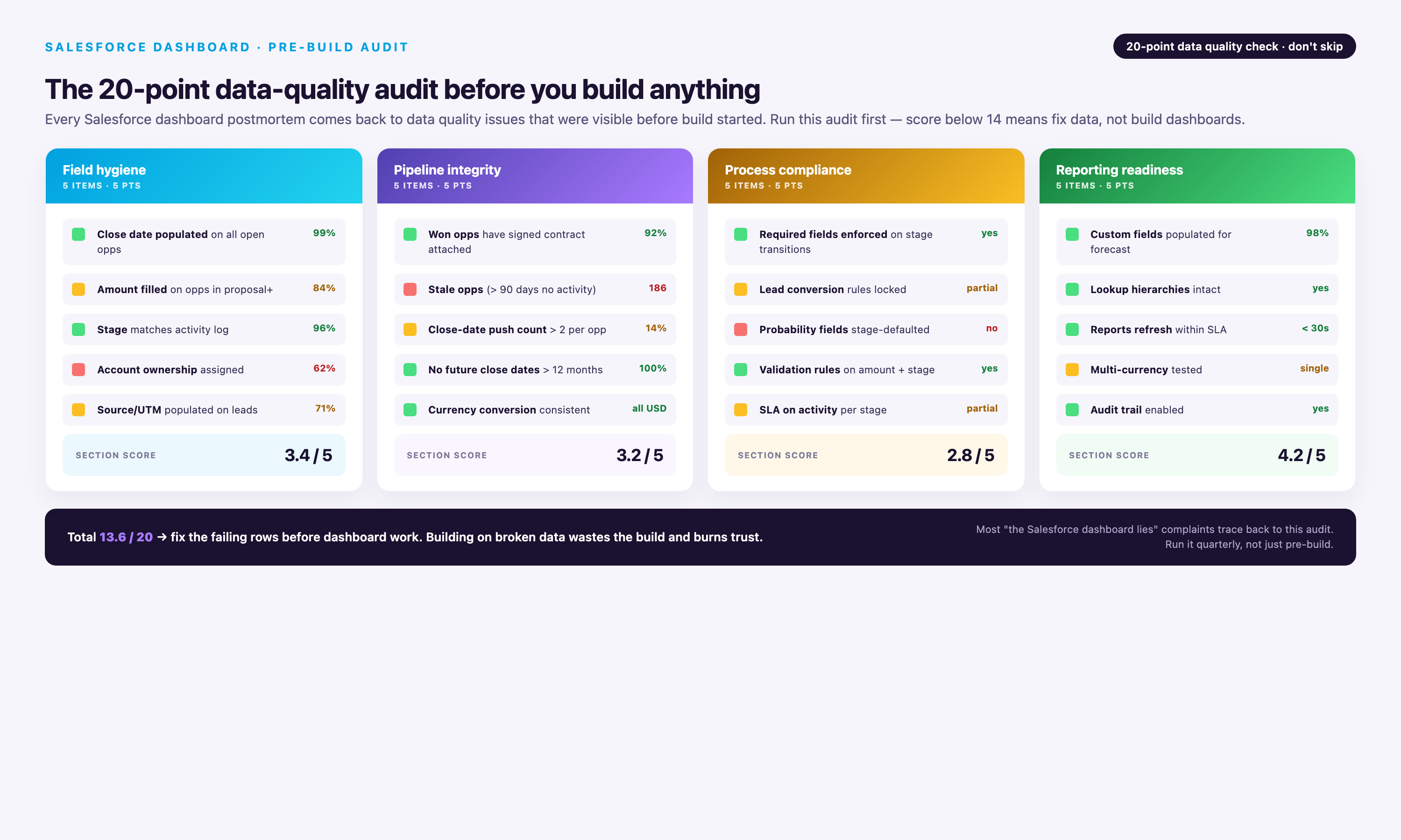
Run these validation queries before dashboard launch to catch data quality issues that will undermine adoption:
| Data Quality Check | Validation Query/Report | Acceptable Threshold |
|---|---|---|
| Duplicate opportunity records | Report: Opportunities grouped by Account Name + Close Date + Amount. Filter: COUNT(Opps) > 1. | <5% of records. Merge duplicates before dashboard launch. |
| Null required fields | Report: Opportunities where Stage = null OR Close Date = null OR Amount = null. | 0 records. Fix via validation rules or data cleanup. |
| Orphaned child records | Report: Opportunities where Account = null OR Owner = inactive user. | 0 records. Reassign or delete orphans. |
| Stage/status consistency | Report: Opportunities where (Stage = Closed Won AND Amount = 0) OR (Stage = Prospecting AND Probability = 90%). | 0 records. Indicates stage/probability misalignment. |
| Historical data completeness | Report: COUNT(Opportunities) by Created Date (monthly buckets) for last 12 months. | No months with 0 records unless known (e.g., company founding date). |
Dashboard vs Report vs List View: Decision Matrix
Not every data view belongs in a dashboard. Use this decision matrix to choose the right Salesforce interface for your use case:
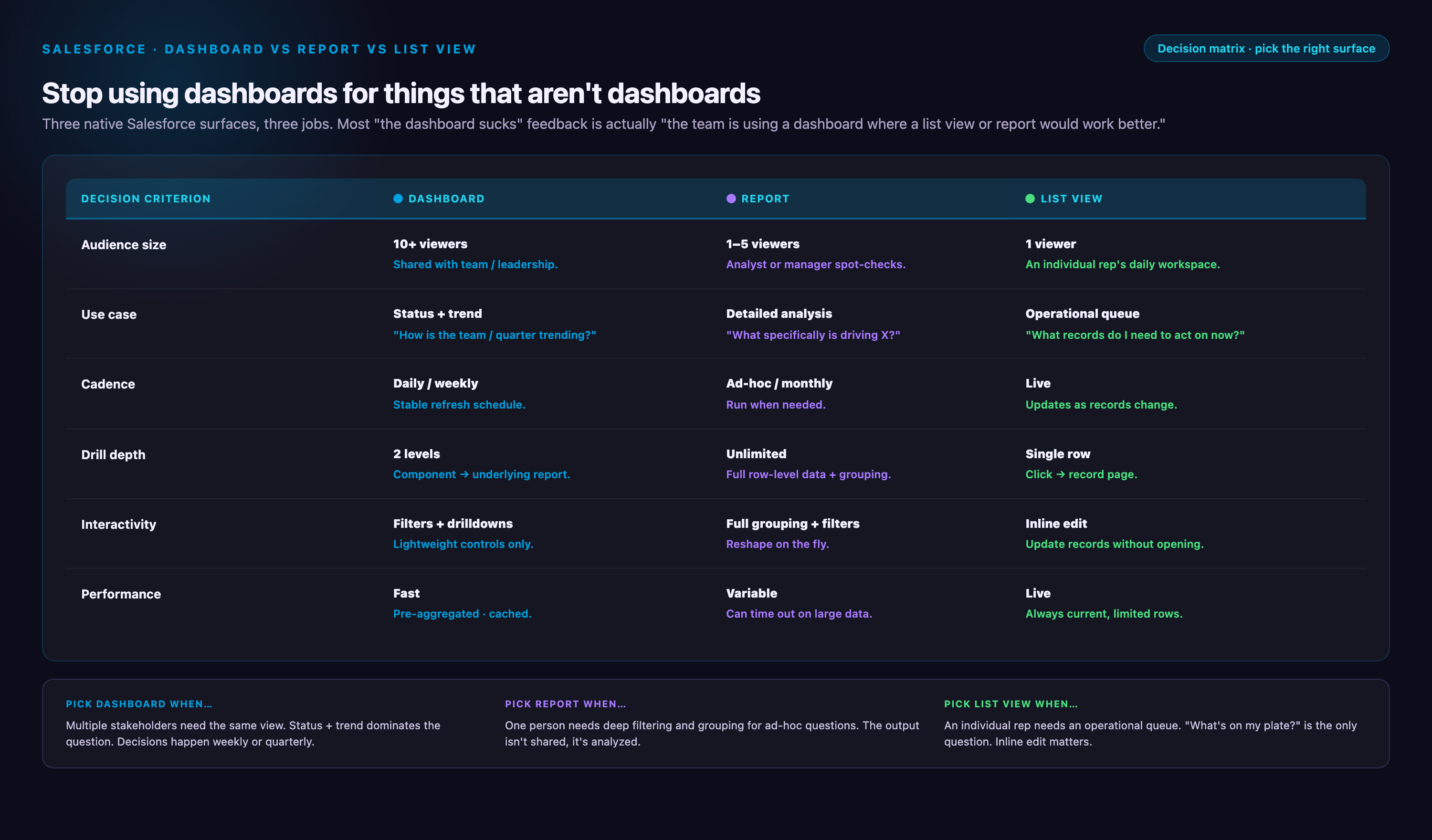
| Use Case | Best Interface | Why |
|---|---|---|
| 10+ people need to see the same aggregate metrics daily | Dashboard (standard) | Shared visual view with scheduled refresh; no per-user configuration needed |
| Each user needs personalized view of their data only | Dashboard (dynamic) | Running User filter shows each viewer their own data without building separate dashboards |
| Ad-hoc analysis with changing filters/groupings | Report | Reports allow on-the-fly column/filter changes; dashboards are static config |
| Need to export data to Excel for further manipulation | Report | Reports have native export; dashboards require clicking through to underlying report first |
| Daily workflow: scan records and update in bulk | List View | List views support inline editing and mass actions; dashboards/reports are read-only |
| Need to drill from summary to record detail frequently | List View | One-click to record detail; dashboard/report require 2-3 clicks |
| Comparing trends across multiple dimensions visually | Dashboard | Charts reveal patterns invisible in tabular data; reports show tables only |
| Monitoring single KPI (e.g., pipeline value) constantly | Dashboard (metric card) | Large visual display with trend indicator; easier to glance than report |
| Need to schedule and email automated snapshots | Report (with subscription) | Report subscriptions email PDF/Excel; dashboards require manual screenshots |
Why Dashboard Projects Fail: 4 Failure Cases with Post-Mortems
Most dashboard projects fail within 90 days of launch. These failure patterns are predictable and avoidable if you recognize the warning signs early.
Failure Case 1: Contradictory Metrics Create Perverse Incentives
Scenario: Sales leadership builds dashboard tracking both Pipeline Coverage Ratio (target: 3-4x) and Close Rate (target: >30%). Reps quickly realize these metrics contradict—high coverage requires adding low-probability deals (which tanks close rate), while high close rate requires ruthless qualification (which shrinks coverage).
What Went Wrong: Dashboard became political artifact. Reps gamed the system by marking borderline deals as "Closed Lost" early to preserve close rate, then re-opening them later as "new" opportunities (inflating coverage). Leadership lost trust in both metrics within 6 weeks.
Prevention: Identify metric conflicts before launch. Run this test: if optimizing for Metric A inherently hurts Metric B, you have a conflict. Resolution options: (1) Remove one metric, (2) Segment metrics by rep role (AEs track close rate, SDRs track coverage), (3) Use blended metric (e.g., Weighted Pipeline Quality = Coverage * Close Rate, optimizes for both).
| Metric Pair | Conflict | Resolution |
|---|---|---|
| Pipeline Coverage vs Close Rate | High coverage requires adding borderline deals (lowers close rate) | Segment: SDRs own coverage, AEs own close rate |
| Activity Volume vs Deal Quality | High activity incentivizes low-quality touches (spray and pray) | Replace volume with conversion metrics (calls → meetings rate) |
| Lead Volume vs Conversion Rate | Marketing chases volume at expense of qualification | Blended metric: Qualified Lead Volume = Leads * Conversion Rate |
| Forecast Commit vs Actual Attainment | Reps sandbag commit to always beat (destroys forecast accuracy) | Reward forecast accuracy, not just attainment (e.g., bonus for ±10% accuracy) |
Failure Case 2: Data Integrity Issues Go Unaddressed
Scenario: Marketing ops launches Pipeline Generation Dashboard showing 35% MQL-to-SQL conversion rate. Sales leadership celebrates improvement from prior quarter's 22%. Three weeks later, sales ops discovers 40% of "SQL" records in current quarter are duplicates created by lead import error—actual conversion is 18%, not 35%.
What Went Wrong: Dashboard was built on dirty data. Team made budget decisions (increased paid ads spend) based on false conversion signal. Once corrected, leadership questioned all dashboard metrics, killing adoption.
Prevention: Run data quality audit BEFORE dashboard build (see checklist above). Implement ongoing monitoring: add "Data Quality Score" metric card to every dashboard showing % of records with complete required fields. If score drops below 95%, display red warning banner on dashboard. Make data quality a standing agenda item in weekly dashboard review meetings.
Post-Mortem Insight: Most data quality issues are discovered only after dashboards go live and someone asks "Why is this number so different from last week?" Proactive validation catches 80% of issues pre-launch.
Failure Case 3: The Adoption Death Spiral
Scenario: Revenue operations builds comprehensive Sales Overview Dashboard with 18 components. Launch training gets 90% attendance, enthusiastic feedback. Week 2: only 40% of team opens dashboard. Week 6: <10% usage. Week 12: dashboard archived.
What Went Wrong: Dashboard load time was 8-11 seconds due to unoptimized reports (cross-object joins, no row limits, complex formulas calculated at query time). Users tried it twice, got frustrated, returned to manual Excel exports. No one reported the load time issue because training didn't establish feedback channel.
Prevention: Test dashboard load time in production environment with realistic data volume BEFORE launch. Target: <4 seconds for 10-component dashboard. If over 6 seconds, optimize reports (apply filters at report level, add row limits, simplify cross-object joins, move complex calculations to formula fields updated via workflow). Post-launch: monitor dashboard usage weekly via Analytics Studio. If usage drops >30% week-over-week, conduct user interviews within 48 hours to diagnose blockers.
Load Time Optimization Checklist:
• Apply filters at report level, not dashboard level (reduces data volume before rendering)
• Set explicit row limits on all reports (2000 max for charts, 50 max for tables)
• Use summary reports with groupings (not tabular reports that group at query time)
• Limit cross-object joins to 4 objects max per report
• Calculate ratios/formulas in custom formula fields (updated via workflow) instead of report formulas
• Use relative date filters ("Current Quarter") instead of absolute dates (avoids parameter passing delays)
• Schedule dashboard refresh during off-peak hours (reduces server load during business hours)
Failure Case 4: The Permission Labyrinth
Scenario: Sales operations builds Account Executive Dashboard (dynamic) and rolls out to 50 reps. 15 reps report "no data" on first day. 10 reps see partial data (some components blank). 5 reps see other reps' data (security violation). Operations spends 40 hours over 2 weeks troubleshooting permissions, user adoption craters.
What Went Wrong: Salesforce dashboard permissions span 5 layers: dashboard folder sharing, report folder sharing, object-level permissions (via profile/permission set), field-level security, and record-level access (via role hierarchy/sharing rules). Missing any one layer breaks dashboard for that user. Operations tested only as System Admin (who has all permissions), missing permission gaps for end users.
Prevention: Create permission testing checklist spanning all 5 layers. Before launch, test dashboard access as 3-5 actual end users (not admin), covering different roles/profiles. Use "Login As" feature to verify each user sees expected data. Document permission requirements in launch playbook: "To access AE Dashboard, users need: (1) Folder access: Sales Dashboards folder, (2) Object access: Read on Opportunity/Task/Event, (3) Field access: Read on Amount/Stage/Close Date/Probability, (4) Record access: Opportunities where Owner = Running User."
Permission Troubleshooting Flowchart:
• Can user see dashboard in folder list? NO → Check dashboard folder sharing settings. YES → Go to step 2.
• Does user see "Insufficient Privileges" error? YES → Check object-level permissions (Opportunity Read access). NO → Go to step 3.
• Does dashboard load but show 0 records? YES → Check record-level access (role hierarchy, sharing rules, Running User setting for dynamic dashboards). NO → Go to step 4.
• Do some components show data, others blank? YES → Check field-level security on fields used in blank components. Check report folder sharing for underlying reports. NO → Go to step 5.
• Does user see other users' data (security violation)? YES → Check Running User setting on dynamic dashboard (should be "Running User", not specific user). Check report filters don't have hardcoded Owner values.
Blending Salesforce with External Data: When You Need More Than Dashboards
Native Salesforce dashboards can only display data from Salesforce reports. When you need to blend Salesforce opportunity data with marketing spend from Google Ads, customer support tickets from Zendesk, or product usage from Segment, you have three options:
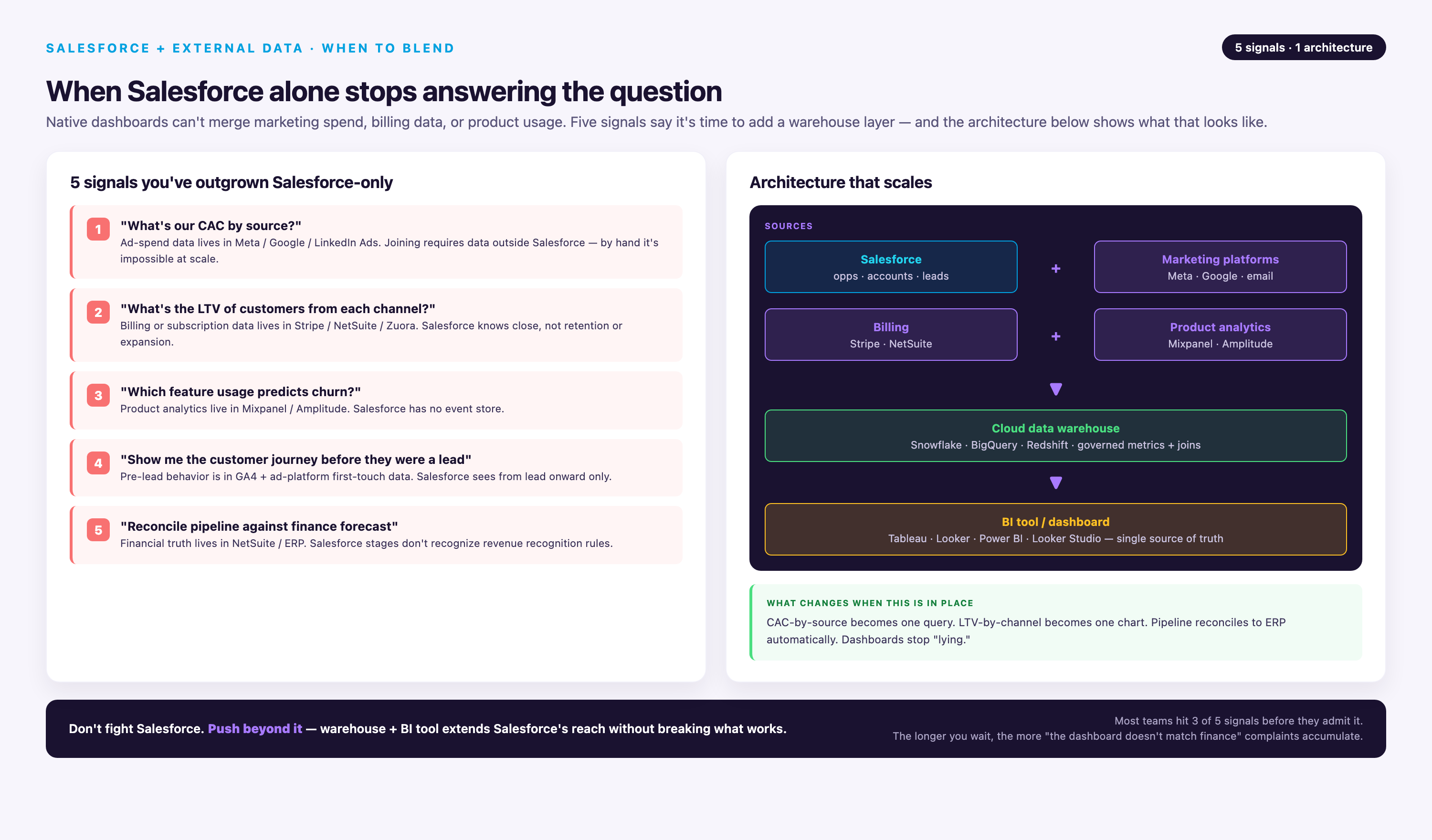
Option 1: Einstein Semantic Layer (Summer 2026 Release)
Capabilities: Zero-copy data federation—query external data warehouses (Snowflake, BigQuery, Databricks) directly from Salesforce without importing. Data stays in warehouse, queries execute via Data Cloud. Supports joins between Salesforce objects and warehouse tables in Lightning reports.
Best For: Orgs already using Snowflake/BigQuery with clean data models. Requires Data Cloud license ($60K-$150K annual depending on data volume).
Limitations: Read-only (can't write back to warehouse), limited to batch refresh (not true real-time), requires semantic model configuration (not plug-and-play).
Option 2: Manual CSV Import to Custom Objects
Capabilities: Export data from external platforms (e.g., Google Ads spend by campaign), import into Salesforce custom object via Data Loader, link to Campaign object via external ID. Build reports joining Campaign + Campaign_Spend__c custom object.
Best For: Low-volume use cases (<5K rows), infrequent updates (weekly/monthly), small teams without engineering resources.
Limitations: Breaks at scale (manual imports consume hours weekly), prone to human error (wrong CSV format, missed updates), no historical preservation (overwrites previous data unless versioned custom objects are built).
Option 3: Data Warehouse + BI Tool
Capabilities: Extract Salesforce data to warehouse (Snowflake/BigQuery/Redshift) via ETL tool, join with other platform data in warehouse, build dashboards in BI tool (Tableau/Looker/Power BI). Supports complex transformations, historical snapshots, and cross-platform attribution modeling.
Best For: 80% of multi-platform dashboard use cases. Required when blending 3+ data sources, calculating custom metrics not supported by Salesforce formulas (e.g., marketing mix modeling), or building customer-facing embedded analytics.
Limitations: Requires data engineering resources (setup ETL pipelines, maintain transformations), higher cost (warehouse + BI licenses), learning curve for end users (Tableau/Looker UX differs from Salesforce).
Conclusion: Dashboard Implementation Roadmap
Building effective Salesforce dashboards requires balancing technical architecture, data quality, and user adoption. Start with these steps:
Week 1-2: Discovery and Data Audit
• Interview 5-10 end users to identify top 3 questions dashboards must answer
• Run data quality audit (duplicate detection, null field check, orphaned records)
• Select 1-2 dashboards from this guide that match your org profile (see "Which Dashboard to Build First" table)
• Test load time of underlying reports in production environment with realistic data volume
Week 3-4: Build and Test
• Build selected dashboards following component specifications in this guide
• Test as 3-5 actual end users (not admin) using "Login As" to verify permissions across all 5 layers
• Validate metrics against known ground truth (e.g., compare dashboard "Total Pipeline" to manual SOQL query)
• Optimize report performance if load time >4 seconds
Week 5: Launch and Monitor
• Conduct 30-minute live training showing 3 specific insights users can act on (not generic dashboard tour)
• Create feedback Slack channel or Chatter group for users to report issues
• Monitor usage via Analytics Studio weekly—if drops >30%, conduct user interviews within 48 hours
• Schedule weekly 15-minute dashboard review meeting for first 6 weeks to build habit
Month 2-3: Iterate and Expand
• Remove components with <10% click-through rate (users ignore them)
• Add components addressing top 3 questions from user feedback
• Build second dashboard from this guide once first achieves >70% weekly active usage
• Document permission requirements and troubleshooting steps in internal wiki
Salesforce dashboards succeed when they answer specific questions faster than manual analysis. Use the five specifications in this guide as templates, customize metrics for your business model, and validate with real users early. The downloadable dashboard package provides a starting point—import, test with your data, and iterate based on actual usage patterns.
Most importantly: don't build dashboards just because you can. If a list view or ad-hoc report solves the problem faster, use those instead. Dashboards are the right tool when 10+ people need the same visual insights daily—everything else is scope creep.