
Shopify stores generate large volumes of transactional, behavioral, and marketing data. As traffic and order volume scale, native Shopify reports become insufficient for performance management. Teams face fragmented views across storefront analytics, paid media, CRM, and inventory systems. Without a unified dashboard, decisions rely on partial data, manual exports, and inconsistent KPIs. This limits visibility into revenue drivers, conversion bottlenecks, and profitability trends.
In this guide, you’ll get:
- 25+ essential Shopify KPIs across revenue, acquisition, retention, and operations
- 4 ready-to-use dashboard frameworks for executives, marketing, ecommerce, and lifecycle teams
- Real examples of unified dashboards used by scaling ecommerce brands
- A step-by-step approach to connecting Shopify with GA4, Google Ads, Meta, TikTok, CRM, and email platforms
- A blueprint for building a 360° commerce view with governed, automated reporting
By the end, you’ll know how to move from native Shopify reports to a production-grade analytics system that supports real growth decisions.
Key Takeaways:
- The Shopify dashboard is your central hub for store management, but its native analytics have limitations, especially for cross-channel marketing.
- Mastering key metrics across sales, marketing, and customer behavior is crucial for making informed decisions and identifying growth opportunities.
- Customizing your dashboard by adjusting date ranges, applying filters, and organizing sections helps tailor the view to your specific business goals.
- A unified dashboard that integrates Shopify data with marketing platforms (like Google Ads, Facebook Ads) provides a complete view of performance and true marketing ROI.
- Leveraging a platform like Improvado automates data collection and reporting, creating a single source of truth that saves time and powers strategic growth.
Quick answer
The Shopify dashboard is the operational control layer of your ecommerce store, providing access to orders, products, customers, payments, and basic performance reporting. It is designed to support daily store management, not advanced analytics. The Admin Dashboard is the default interface for store operations, while the Partner Dashboard serves agencies managing multiple stores.
What Is the Shopify Dashboard?
The Shopify dashboard is the operational control layer of your ecommerce store. It provides access to orders, products, customers, payments, and basic performance reporting. It is designed to support daily store management, not advanced analytics.
As stores scale, data volume, channel complexity, and product catalogs grow. At that point, operational reporting is no longer sufficient. Teams need structured analytics to manage revenue, acquisition efficiency, inventory risk, and customer value. This is where the limits of native dashboards emerge.
Understanding the different Shopify dashboard environments and their analytical scope is necessary before designing a scalable data strategy.
The Standard Shopify Admin Dashboard
The Shopify Admin Dashboard is the default interface for store operations. It supports:
- Order and fulfillment management
- Product and inventory updates
- Customer records
- Payment and discount configuration
- Basic analytics and reports
The Home view provides summary cards for sales, sessions, and orders over a selected time range. Built-in reports offer visibility into revenue, traffic sources, and conversion rates.
However, these reports are designed for quick operational checks. They lack customizable data models, cross-channel attribution, margin calculations, and historical cohort analysis.
The Shopify Partner Dashboard
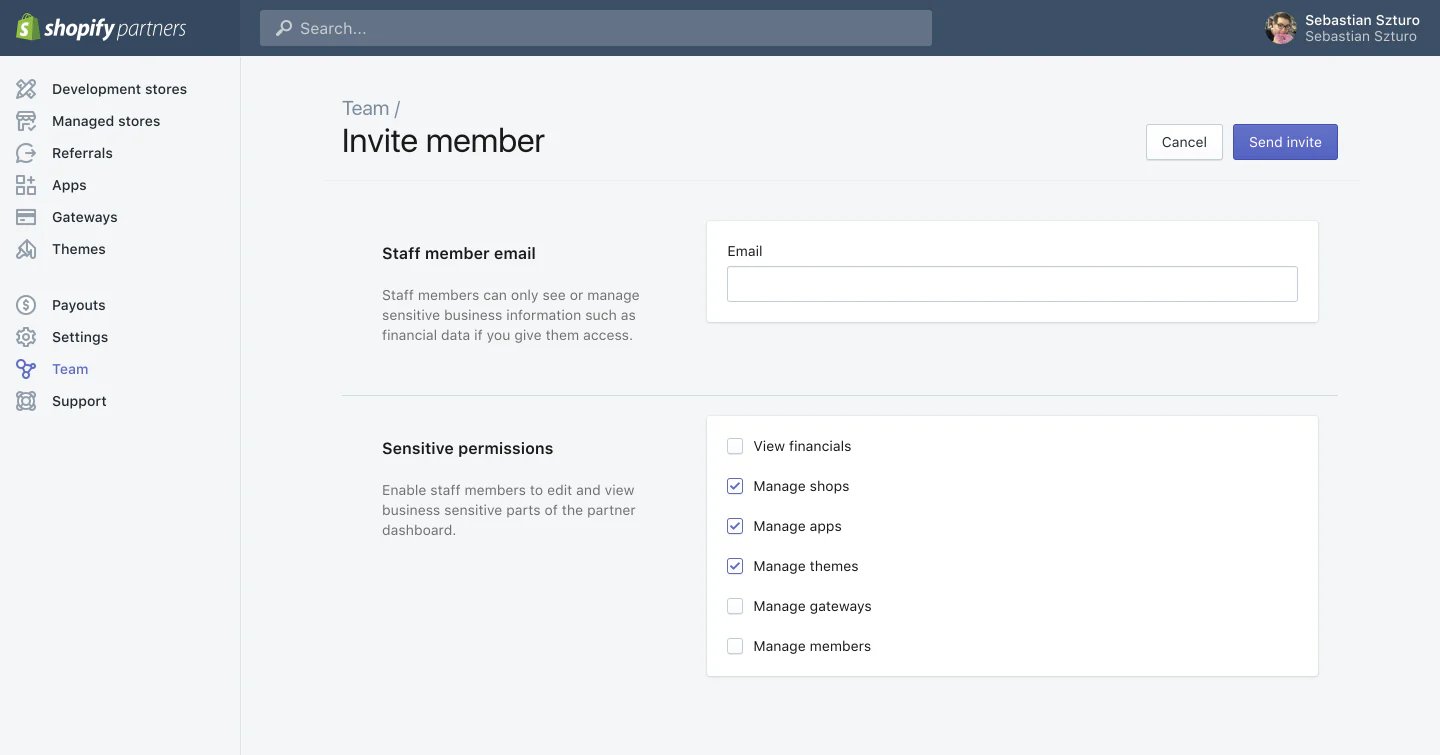
The Shopify Partner Dashboard is designed for agencies, developers, and technology partners managing multiple stores. It provides:
- Store creation and management tools
- App development and deployment
- Referral and revenue tracking
- Access control across client accounts
Analytics within individual client stores remain identical to the standard Admin Dashboard. The Partner environment improves portfolio management, but it does not extend analytical depth at the store level.
Limitations of Native Shopify Analytics
Native Shopify analytics is designed for operational reporting, not advanced business intelligence. As store complexity grows, several structural limitations appear.
Key limitations include:
- Limited analytical depth: No native support for custom funnels, cohort analysis, RFM segmentation, lifetime value modeling, or predictive analytics. Filtering logic is basic, making complex retention or acquisition queries impossible to run natively. Recent platform updates have also reduced access to historical comparison reports.
- Attribution constraints: Shopify relies primarily on last-click attribution. Assisted conversions, post-view impact, and cross-device journeys are not modeled. Discount codes often overwrite acquisition source data. Conversion reporting commonly misaligns with GA4 and ad platforms by 20–30%.
- Data integration limits: Shopify analytics remains isolated from paid media, CRM, ERP, and marketplace systems. Multi-store rollups, unified customer views, and cross-channel performance reporting require external tools.
- Historical data restrictions: Most native reports retain roughly 13 months of history. Long-term trend analysis depends on manual exports. Large catalogs encounter throttling in bulk operations and data extraction.
- Enterprise scalability gaps: Backend data access is restricted. Advanced reporting depends on third-party apps. Metric governance controls are limited. Native inventory reporting lacks forecasting and multi-channel stock synchronization.
As a result, native Shopify analytics supports day-to-day operations but does not provide the analytical foundation required for scaled ecommerce growth.
Navigating the Shopify Admin Dashboard: A Step-by-Step Tour
Before designing advanced analytics, teams need a clear understanding of Shopify’s native operating environment.
The Admin Dashboard is where store operations, customer activity, and basic performance reporting converge. Mastering its structure helps identify which questions can be answered natively and where external analytics layers become necessary.
Accessing the Admin Environment
The Shopify Admin is accessed through your store’s secure admin URL.
Enterprise teams typically enforce two-factor authentication and role-based permissions to control data access across marketing, ecommerce, and operations teams.
Once logged in, users land on the Home view. This environment is optimized for operational awareness, not deep analysis. It prioritizes immediacy over historical context.
The Home Feed as an Operational Monitor
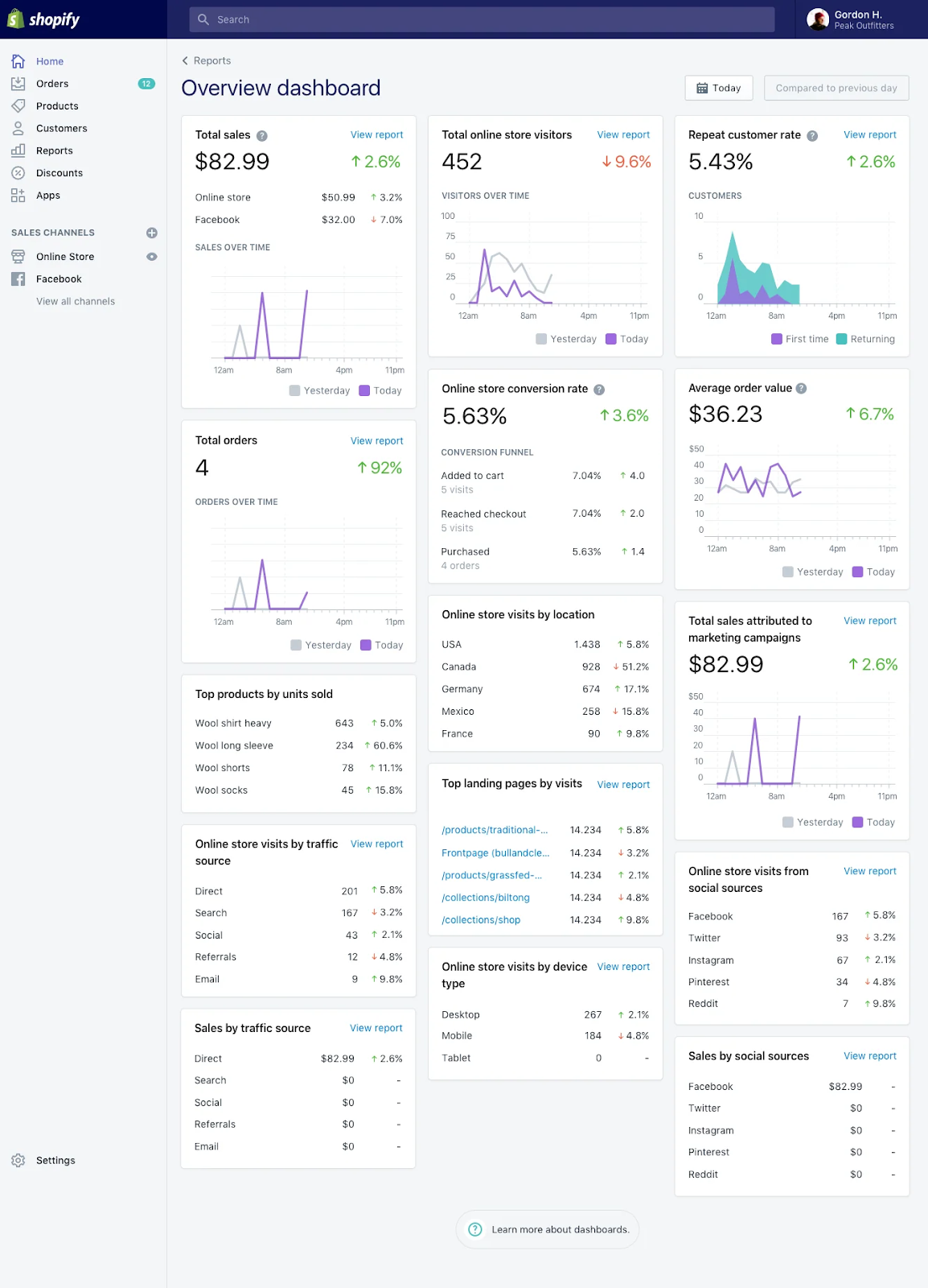
The Home feed provides a rolling snapshot of store activity. It displays summary cards for revenue, sessions, order volume, and fulfillment status. It also surfaces real-time order events and visitor activity.
This view is effective for daily health checks. It answers “Is the store running normally?” It does not answer “Why performance changed?” or “Which channels drive profitable growth?”
As store scale increases, teams outgrow the Home feed quickly.
The Analytics and Reports Workspace
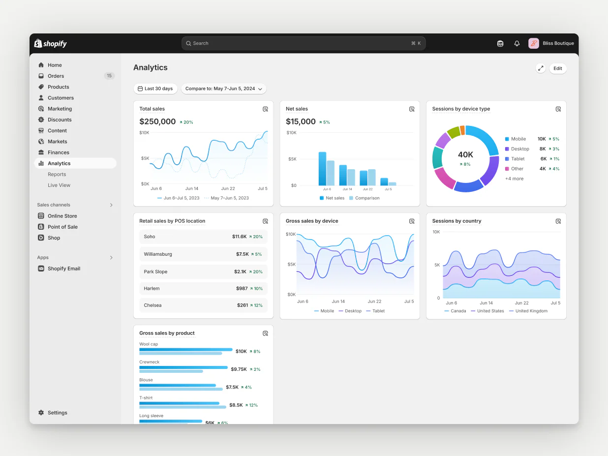
The Analytics section contains Shopify’s native reporting layer. It includes pre-built dashboards, tabular reports for sales by product, traffic source, marketing channel, and customer behavior.
These reports provide structured access to Shopify’s internal datasets. However, they remain fixed in schema, limited in filtering logic, and disconnected from external marketing and customer systems. They are reference points, not decision systems.
Live View for Real-Time Activity Tracking
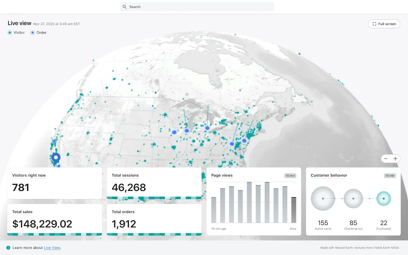
Live View displays real-time visitor behavior. Teams can see geographic distribution, page navigation, cart additions, and completed checkouts as they occur.
This is useful during high-traffic moments such as product drops, influencer campaigns, or seasonal promotions. It confirms that traffic is reaching the site and transactions are flowing.
However, Live View does not support segmentation, attribution, or performance diagnostics. It is a situational awareness tool, not an analytics engine.
Customizing Your Shopify Analytics Dashboard for Deeper Insights
Shopify’s native analytics provides standardized views designed for broad usability. Customization allows teams to adapt these views to specific operational questions.
The goal is to reduce noise, surface relevant signals, and align reporting with how decisions are made inside the organization.
Native customization improves visibility. It does not change the underlying analytical depth. Understanding this distinction is important when designing reporting workflows.
- Date range and comparison views: Teams adjust date ranges to monitor trends, assess seasonality, and evaluate campaign impact. Comparison modes allow period-over-period checks, such as month-over-month or year-over-year performance. This supports directional insight but not cohort or lifecycle analysis.
- Basic filtering and segmentation: Reports can be filtered by product type, vendor, traffic source, location, or device. This enables tactical segmentation, such as identifying underperforming product categories or low-converting channels. Filters cannot be stacked, which prevents multi-variable queries.
- Dashboard card configuration: The main Analytics dashboard allows adding, removing, and rearranging KPI cards. Teams tailor views for marketing, ecommerce, or operations roles. Card configurations are user-specific, which limits shared reporting standards across teams.
- Custom report creation: Shopify supports building custom reports by selecting dimensions and metrics from predefined datasets. This allows basic tailoring of tables, such as revenue by product category or orders by region. Query logic and metric definitions remain fixed.
- Saved views and scheduled exports: Custom reports can be saved for reuse. Exports can be manually downloaded or scheduled via apps. This supports recurring reporting but still relies on manual or third-party automation.
What Should a Shopify Dashboard Include? 25+ Must-Track Shopify KPIs
A dashboard is only valuable if it tracks metrics that influence decisions. Vanity metrics create activity without insight. Operational KPIs reveal where revenue is created, where margin is lost, and where growth can be scaled sustainably.
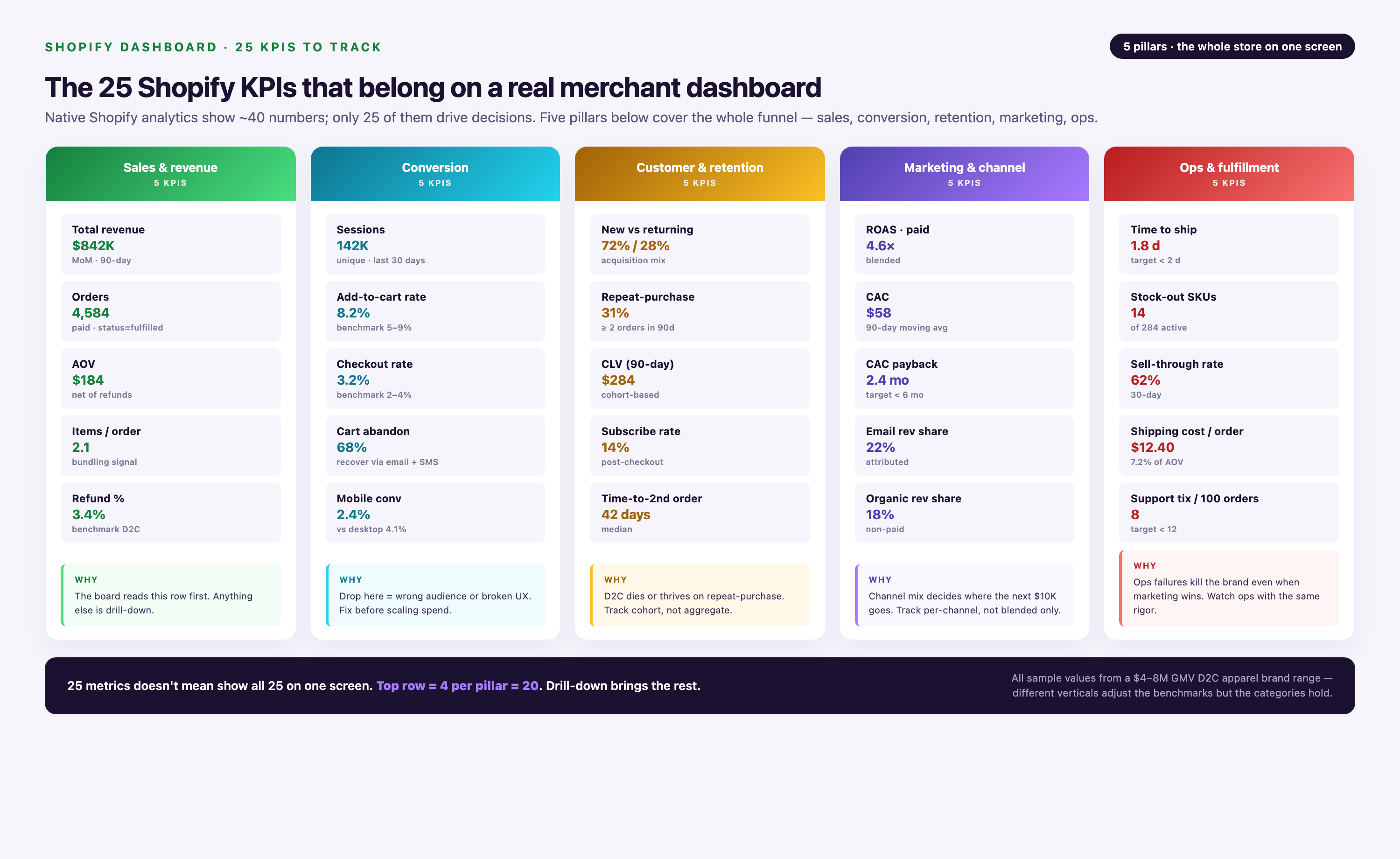
Below is a structured KPI framework used by high-performing Shopify organizations.
Sales & Revenue Metrics
- Total Sales (Gross Revenue): The top-line revenue generated from all sales before any deductions.
- Net Sales: Revenue after discounts and returns are subtracted. A more accurate reflection of actual income.
- Average Order Value (AOV): Total revenue divided by the number of orders. A key lever for increasing revenue without needing more traffic.
- Conversion Rate: The percentage of store visitors who complete a purchase. A critical indicator of your store's effectiveness.
- Gross Margin: The percentage of revenue left after subtracting the Cost of Goods Sold (COGS). Measures profitability.
Marketing & Acquisition Metrics
- Online Store Sessions: The total number of visits to your store. A top-of-funnel indicator of brand reach.
- Traffic by Source/Channel: Breaks down where your visitors are coming from (e.g., Organic Search, Social, Paid Ads, Direct). Essential for understanding which marketing channels are working.
- New vs. Returning Customers: The ratio of first-time buyers to repeat purchasers. A vital metric for balancing acquisition and retention efforts.
- Cost Per Acquisition (CPA): The average cost to acquire one new customer. Must be lower than your Customer Lifetime Value for profitability.
- Return on Ad Spend (ROAS): The revenue generated for every dollar spent on advertising. The primary success metric for paid campaigns.
Customer Behavior Metrics
- Bounce Rate: The percentage of visitors who leave your site after viewing only one page. A high bounce rate can indicate poor landing page relevance or user experience.
- Pages per Session: The average number of pages a visitor views during a session. Higher numbers suggest greater engagement.
- Average Session Duration: The average length of time a visitor spends on your site.
- Add to Cart Rate: The percentage of sessions where a visitor adds at least one item to their cart. Measures product page effectiveness.
- Cart Abandonment Rate: The percentage of shoppers who add items to their cart but do not complete the purchase. A major area for optimization.
Customer Value Metrics
- Customer Lifetime Value (CLV): The total net profit a business can expect to make from a single customer over their entire relationship with the brand.
- Repeat Customer Rate: The percentage of your customer base that has made more than one purchase. A strong indicator of customer loyalty and product satisfaction.
- Purchase Frequency: The average number of times a customer buys from you in a given period.
- Time Between Purchases: The average time that passes between a customer's orders. Helps in timing re-engagement campaigns.
Inventory & Operations Metrics
- Top Products by Units Sold/Revenue: Identifies your best-selling items.
- Inventory Levels & Sell-Through Rate: Tracks how quickly you are selling through your inventory. Critical for avoiding stockouts or overstock situations.
- Shipping Costs: Monitors your fulfillment expenses, a major factor in overall profitability.
- Order Fulfillment Time: The time it takes from when an order is placed to when it's shipped. A key component of customer satisfaction.
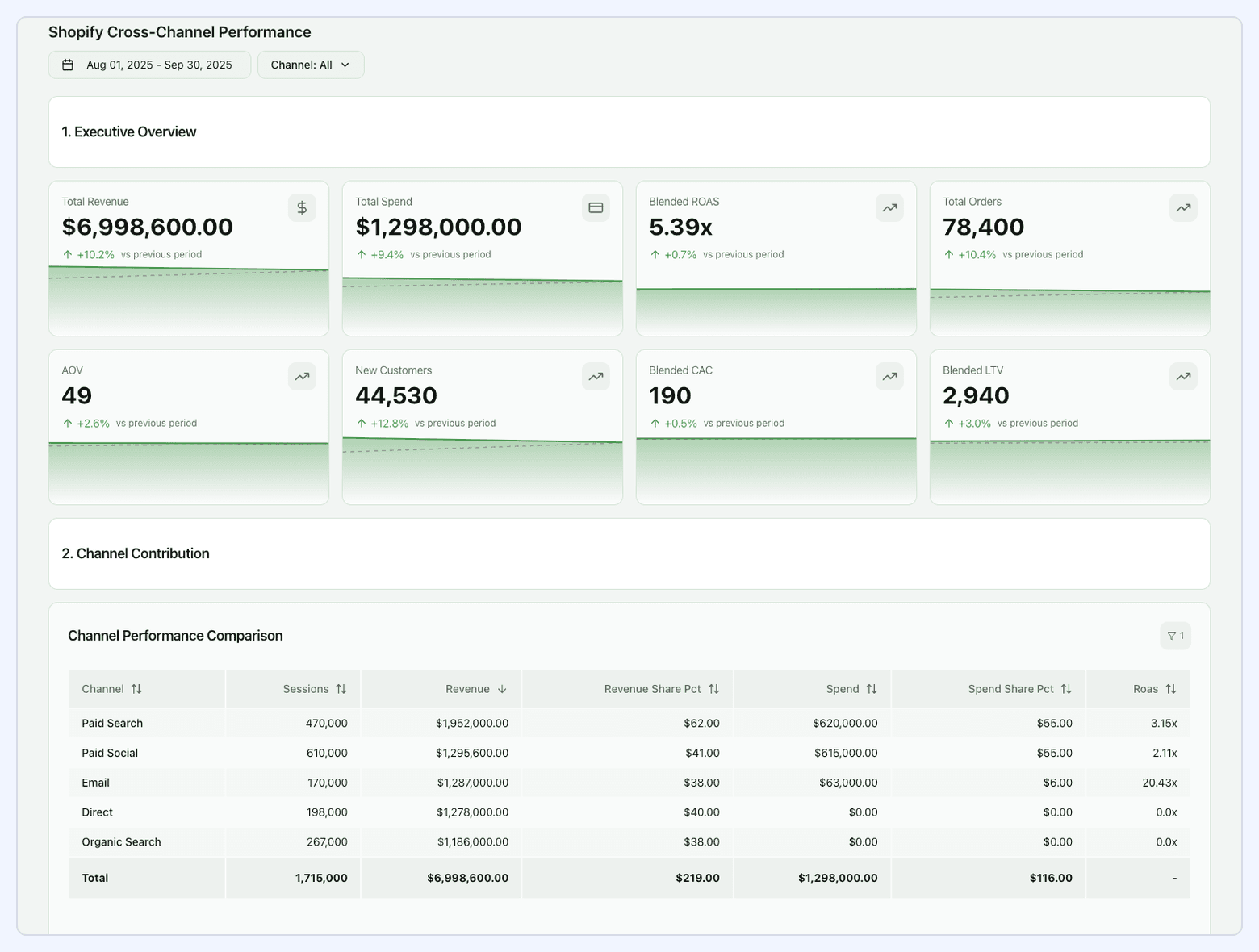
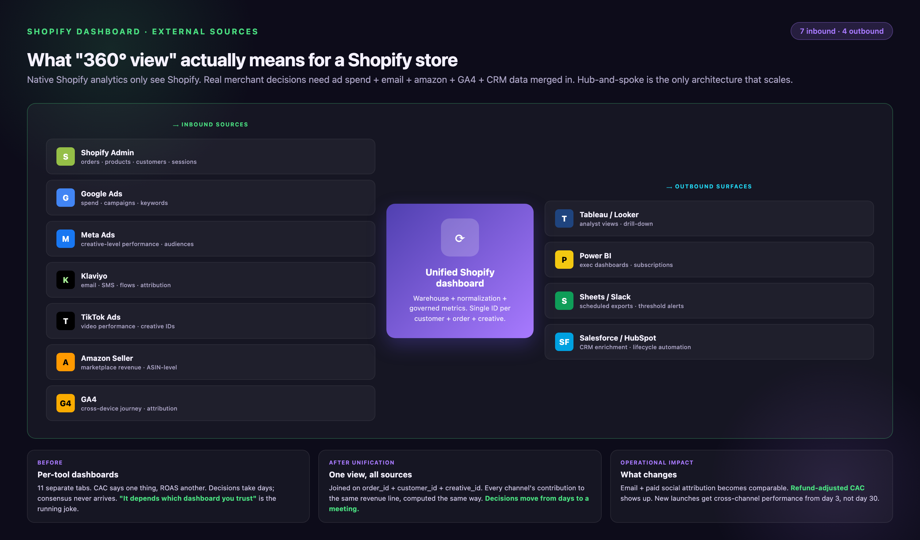
Why a Unified Shopify Dashboard is a Game-Changer
Tracking KPIs inside native Shopify analytics provides visibility into store activity but it does not explain how demand is created, how customers move across channels, or how marketing spend translates into long-term value.
As channel mix and data volume grow, isolated storefront reporting becomes a strategic constraint. A unified dashboard is a requirement for scalable ecommerce decision-making.
Breaking Data Silos Beyond Shopify
Shopify data records transactions and onsite behavior. Marketing platforms record intent creation. CRM systems record customer history. Fulfillment systems record delivery performance. When these datasets remain separate, teams optimize each function locally rather than optimizing the business globally.
A unified dashboard connects these layers. It ingests data from paid media, email, CRM, marketplaces, and operations systems. It normalizes schemas, aligns identifiers, and standardizes metrics. This turns fragmented activity logs into an integrated commercial dataset.
ASUS needed a centralized platform to consolidate global marketing data and deliver comprehensive dashboards and reports for stakeholders.
Improvado, an enterprise-grade marketing analytics platform, seamlessly integrated all of ASUS’s marketing data into a managed BigQuery instance. With a reliable data pipeline in place, ASUS achieved seamless data flow between deployed and in-house solutions, streamlining operational efficiency and the development of marketing strategies.
"Improvado helped us gain full control over our marketing data globally. Previously, we couldn't get reports from different locations on time and in the same format, so it took days to standardize them. Today, we can finally build any report we want in minutes due to the vast number of data connectors and rich granularity provided by Improvado.
Improvado saves us about 90 hours per week and allows us to focus on data analysis rather than routine data aggregation, normalization, and formatting."

Establishing a Single Source of Truth
Disconnected tools produce conflicting numbers. Marketing reports show one revenue figure. Finance reports show another. Teams lose time reconciling dashboards instead of improving performance.
A unified dashboard resolves this by enforcing shared metric definitions, governed transformations, and consistent attribution logic. With Improvado, Shopify, marketing, and revenue data are centralized, standardized, and delivered as analysis-ready datasets. Every team works from the same trusted foundation.
Enabling Cross-Channel Performance Intelligence
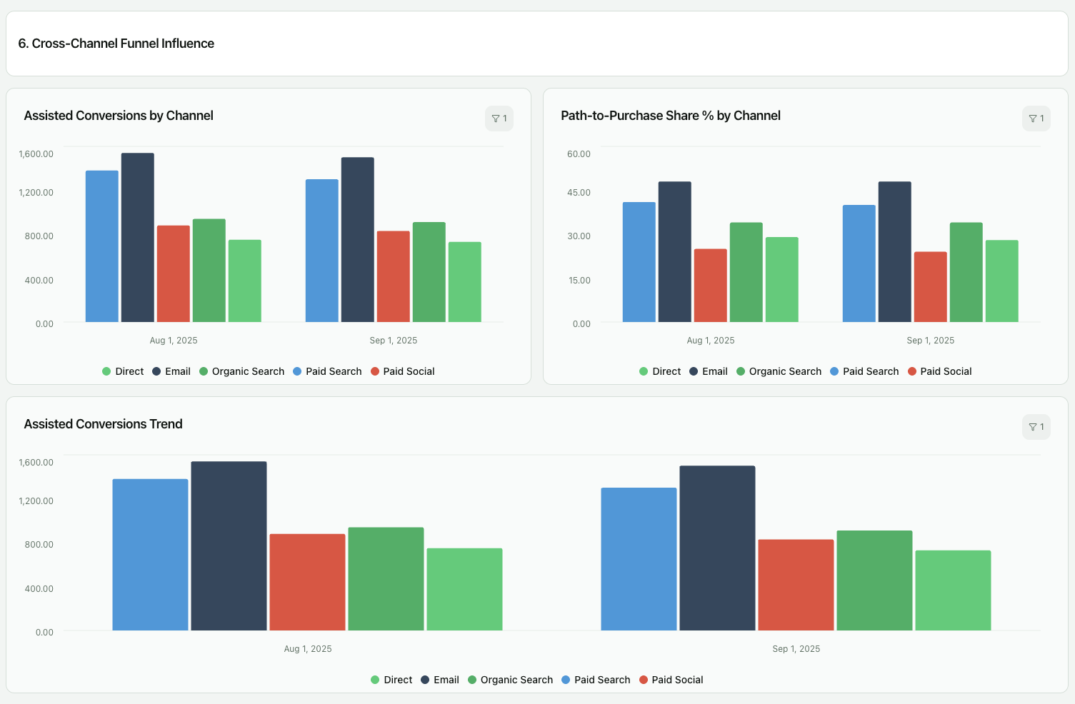
Growth decisions require understanding how channels interact, not how they perform in isolation. A unified dashboard shows how paid social drives first-time visits, how search captures intent, how email converts returning customers, and how these paths translate into revenue and lifetime value.
This visibility supports budget allocation based on total customer impact, not last-click results. It enables comparison of channel efficiency, acquisition quality, and retention contribution in one analytical environment.
Accelerating Decision Cycles
Manual exports and spreadsheet reporting introduce delay, error, and version conflicts. Automated dashboards replace these workflows with continuous data refresh, governed metrics, and real-time access.
Teams detect performance shifts earlier, validate hypotheses faster, and act with confidence. The outcome is not just better reporting. It is faster, evidence-based execution across marketing, ecommerce, and finance.
Building Your Ultimate Shopify Sales Dashboard
A specialized Shopify sales dashboard is one of the most valuable assets for any ecommerce business. It goes beyond the basic revenue numbers to provide a deep, real-time understanding of sales performance, product trends, and the effectiveness of your sales funnel.
1. Connecting Sales Data with Marketing Spend
The first step in building a powerful sales dashboard is to place sales data in the context of marketing investment. This means visualizing your total sales alongside your total ad spend, broken down by channel.
This immediately highlights your overall profitability and shows which channels are contributing the most revenue.
A proper Shopify sales dashboard should clearly display your ROAS and CPA for each campaign, allowing for quick and effective optimization.
2. Visualizing Sales Funnels and Conversion Paths
A great sales dashboard visualizes the entire customer journey, from initial website visit to final purchase.
This includes tracking key funnel metrics like session-to-add-to-cart rate, add-to-cart-to-checkout-initiated rate, and checkout-initiated-to-purchase rate.
By visualizing this funnel, you can instantly pinpoint where in the process you are losing the most potential customers and focus your optimization efforts on the weakest link.
3. Tracking Product Performance in Real Time
Your sales dashboard should provide an at-a-glance view of your top-performing products. This includes not just units sold and revenue generated, but also metrics like profit margin per product and return rates.
This allows you to make strategic decisions about inventory, promotions, and product bundling.
For example, you might discover that your highest-revenue product actually has a very low margin, prompting a pricing review or a shift in marketing focus to a more profitable item.
| Feature | Native Shopify Dashboard | Improvado Unified Dashboard |
|---|---|---|
| Data Sources | Shopify store data only | Shopify + 1,000+ marketing sources (Google Ads, Facebook, TikTok, etc.) |
| Cross-Channel View | No, data is isolated | Yes, complete view of all marketing and sales data in one place |
| Marketing Attribution | Limited, basic last-click attribution | Advanced, customizable attribution models (e.g., multi-touch, time decay) |
| Customization | Basic reordering of pre-built widgets | Fully customizable with any BI tool (Tableau, Looker Studio, Power BI) |
| Data Automation | N/A (data is native) | Fully automated data extraction, transformation, and loading (ETL) |
| Real-Time Data | Yes, for some metrics (Live View) | Yes, with scheduled data refreshes as frequently as needed |
| Historical Data | Limited by Shopify retention policies | Unlimited, stored in your own data warehouse for long-term analysis |
| Primary Goal | Day-to-day store operations and basic reporting | Strategic, cross-functional business intelligence and growth |
Integrating External Data Sources for a 360-Degree View
A 360-degree view of your customer and business performance is the holy grail of ecommerce analytics. Achieving it requires integrating data from all the platforms you use to market, sell, and communicate.
This is where the true power of a modern data stack comes into play.
Connecting Google Analytics for Deeper Web Insights
While Shopify Analytics is great for transaction-focused data, Google Analytics (GA4) provides much deeper insights into user behavior on your site.
By integrating GA4 data, you can analyze complex user paths, create custom event tracking, and understand content engagement in ways Shopify can't.
A unified dashboard can display your Shopify conversion rate alongside your GA4 engagement rate, providing a richer context for your site's performance.
Integrating Paid Media Platforms (Google Ads, Facebook Ads, TikTok)
This is the most critical integration for most Shopify stores. You need to see your spend, impressions, clicks, and CPC from platforms like Google Ads, Facebook Ads, and TikTok directly alongside your Shopify sales, AOV, and LTV.
This direct comparison is the only way to calculate true ROAS and CPA. It allows you to answer questions like, "Which Facebook ad creative is driving the most valuable customers, not just the most clicks?"
The process of building a robust marketing data pipeline is essential for this level of analysis.
Pulling in Social Media Data for Engagement Analysis
Integrating organic social media data from platforms like Instagram, Facebook, and Pinterest can help you understand the impact of your content strategy on sales.
By tracking metrics like engagement rate, follower growth, and post reach alongside your website traffic and sales, you can start to draw correlations between social media activity and business outcomes.
This is where dedicated social media analytics tools integrated with your sales data become invaluable.
Combining CRM and Email Marketing Data
For brands with a strong focus on retention, integrating data from your CRM (like Salesforce or HubSpot) and your email marketing platform (like Klaviyo or Mailchimp) is key.
This allows you to segment your customer base in sophisticated ways. You can build dashboard widgets that show the LTV of customers acquired through email campaigns versus paid ads, or track the conversion rate of different customer segments, providing deep insights for your retention marketing strategy.
Best Practices for Shopify Dashboard Management
Creating a powerful dashboard is only half the battle. To make it a central part of your company's operating rhythm, you need to manage it effectively. Follow these best practices to ensure your dashboard drives action, not analysis paralysis.
Define Your Goals and Key Questions First
Don't start by dragging and dropping metrics onto a canvas. Start by asking, "What business question are we trying to answer?" or "What is the primary goal of this dashboard?" For example, a goal might be "Increase AOV by 15%."
The dashboard should then be built specifically to track the metrics that influence AOV, such as top product bundles, promotion effectiveness, and upsell adoption rates.
Choose the Right Visualizations for Your Data
The way you visualize data matters. Use line charts for trends over time, bar charts for comparisons between categories, and pie charts (sparingly) for showing parts of a whole. A single "scorecard" number is great for displaying a key KPI like total revenue. A table is useful for granular detail.
Choosing the right visualization makes the data easier to understand at a glance.
Schedule Regular Dashboard Reviews with Your Team
A dashboard that no one looks at is useless. Integrate dashboard reviews into your team's regular meetings. A weekly marketing meeting could start with a 10-minute review of the marketing performance dashboard.
This creates a culture of data-driven decision-making and ensures that insights are translated into action.
Keep It Clean and Focused on Actionable Metrics
It can be tempting to cram as much data as possible onto a single dashboard. Resist this urge. A cluttered dashboard is an overwhelming one.
Focus on the "so what?" metrics. For every chart or number, ask yourself, "What decision would I make based on this information?" If there's no clear answer, it might not belong on your primary dashboard.
Real-World Shopify Dashboard Examples & Templates
Visualizing what's possible can help inspire your own dashboard creation. While tools like Improvado offer pre-built templates, understanding the purpose behind each one is key. Here are some examples of powerful, specialized KPI dashboards you can build.
The Executive Summary Dashboard (High-Level KPIs)
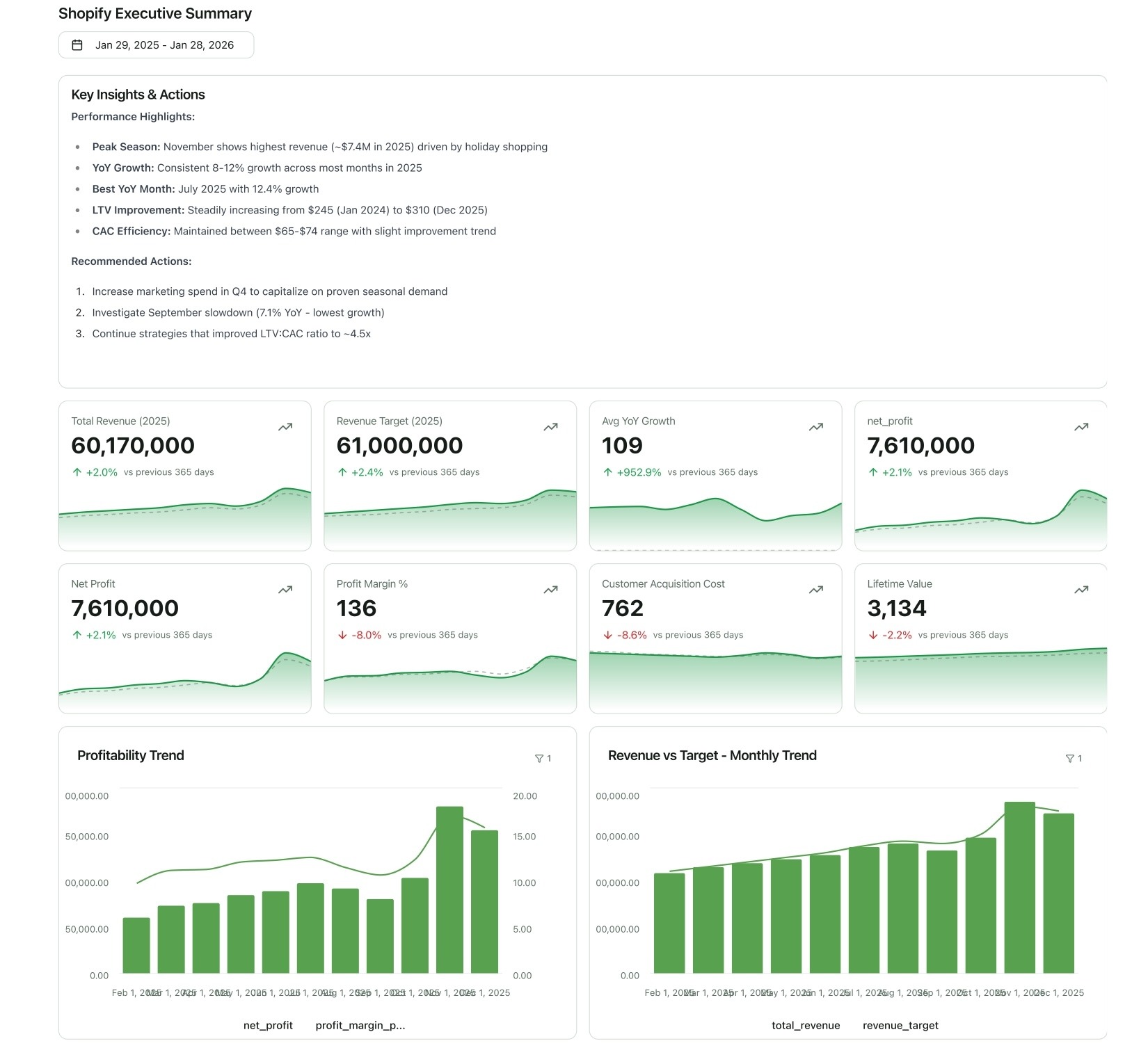
This dashboard is for C-level executives and key stakeholders. It focuses on the big picture and business health.
- Key Metrics: Total Revenue (vs. Target), Net Profit, Customer Acquisition Cost (CAC), Customer Lifetime Value (LTV), Year-over-Year Growth.
- Visualizations: Big scorecard numbers for top-line KPIs, simple line charts for trends, and a gauge chart for progress towards quarterly goals.
The Marketing Performance Dashboard (Channel-Specific Breakdown)
This is the marketing team's daily driver. It connects ad spend to sales outcomes across all channels.
- Key Metrics: Spend by Channel, ROAS by Channel, CPA by Channel, Conversions by Campaign, Traffic by Source.
- Visualizations: A detailed table comparing channel performance, bar charts for campaign-level results, and a funnel visualization for conversion paths.
The Ecommerce Operations Dashboard (Inventory & Fulfillment)
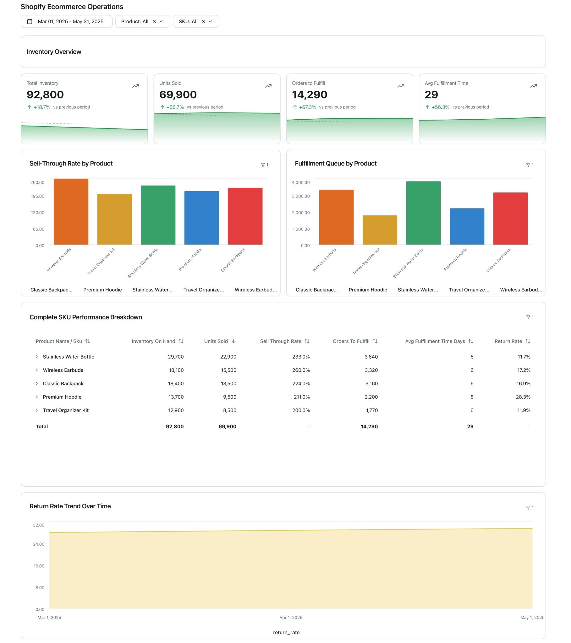
This dashboard is for your operations team to ensure the business runs smoothly behind the scenes.
- Key Metrics: Inventory Levels by SKU, Sell-Through Rate, Orders to Fulfill, Average Fulfillment Time, Return Rate by Product.
- Visualizations: Inventory alerts, tables of top-selling products, and trend lines for fulfillment efficiency.
The Customer Lifecycle Dashboard (Retention & LTV)
This dashboard is focused on customer loyalty and long-term value. It's crucial for subscription or high-repeat-purchase businesses.
- Key Metrics: New vs. Returning Customer Revenue, Repeat Purchase Rate, LTV by Cohort, Churn Rate, Time Between Purchases.
- Visualizations: Cohort analysis charts, line graphs showing LTV growth over time, and segment breakdowns of your most valuable customers.
How Improvado Helps Shopify Teams
Shopify’s native reports are built for operational visibility. They show what happens inside the store. They do not connect acquisition, conversion, retention, and profitability across channels. As ecommerce complexity grows, teams need more than dashboards. They need a unified, governed analytics foundation.
Improvado centralizes Shopify, paid media, CRM, email, and revenue data into a single analytics layer. It extracts, transforms, and standardizes data across 1,000+ sources, aligning schemas and enforcing shared metric definitions. With automated pipelines and governed transformations, reporting becomes continuous and reliable.
Dashboards refresh automatically. Attribution logic stays consistent. Historical data is preserved in your warehouse.
Teams spend less time preparing reports and more time optimizing performance.
On top of this foundation, Improvado’s AI Agent turns unified data into instant insight. Teams can generate dashboards from natural-language prompts, analyze cross-channel performance, surface growth drivers, and answer complex questions without manual SQL or spreadsheet work. Instead of waiting for reports, teams can explore and act in real time.
Improvado helps Shopify teams move from isolated reports to a scalable analytics system built for growth. If you’re ready to replace fragmented reporting with decision-grade intelligence, book a demo with Improvado.