Marketing analysts face a critical challenge. They must turn fragmented SEO data into dashboards that drive decisions. Data comes from Google Search Console, GA4, and third-party tools. Most SEO dashboards fail for a key reason. They visualize proxy metrics like traffic and impressions. However, they don't connect these metrics to business impact. Rankings don't link to revenue. CTR reports don't trigger action. Position tracking ignores conversion quality.
Key Takeaways
• Dashboards with fewer than 12 primary metrics drive 3x more optimization actions than those displaying 30+ metrics.
• Native GSC connector limits reach 1,000 rows; sites tracking 100+ keywords need Supermetrics, BigQuery, or Google Sheets exports.
• Three dashboard archetypes required: executives need 5-7 KPIs monthly, SEO teams need 20+ metrics weekly, clients need 10-12 metrics quarterly.
• GSC-GA4 discrepancies (10k clicks vs 9.2k sessions) stem from bot filtering, sampling differences, and timezone mismatches—require annotations.
• Free Sheets-based dashboards cost $1,500-2,400/month in analyst labor at scale; $200/month Supermetrics is cheaper for 200+ landing pages.
This guide shows you how to build decision-led SEO dashboards in Looker Studio (formerly Google Data Studio). These dashboards go beyond visualization. You'll learn when to use native connectors versus third-party integrations. You'll discover how to configure calculated fields. These fields surface CTR opportunities and ranking velocity. You'll learn how to blend Google Search Console with GA4. This tracks organic click-to-conversion funnels. You'll set up automated alerts for anomalies. These include sudden position drops or traffic spikes. We'll cover dashboard architecture for three audiences. Executives need monthly ROI summaries. SEO teams require daily operational metrics. Clients expect branded quarterly reports. We'll also provide troubleshooting guides for common data inconsistencies between GSC and Analytics.
Key Takeaways
• Looker Studio dashboards must connect proxy metrics to business outcomes. Proxy metrics include traffic, impressions, and rankings. Use calculated fields like click potential score and weighted average position. Do not just display raw GSC numbers.
• Three dashboard archetypes serve different needs: - Executive: 5-7 KPIs, monthly refresh, ROI focus - Operational: 20+ metrics, weekly refresh, for SEO teams - Client Reporting: 10-12 metrics with YoY comparison and narrative context
• Native Looker Studio connectors work for sites tracking under 100 keywords. Above that threshold, connector row limits apply. The GSC API limits data to 1,000 rows. Data blending complexity increases significantly. Supermetrics, BigQuery exports, or scheduled Google Sheets aggregation become necessary.
• Data inconsistencies between Google Search Console and GA4 stem from three sources. Google Search Console shows 10k clicks. GA4 shows 9.2k sessions. Bot filtering causes some discrepancies. Sampling differences also contribute. Timezone mismatches create additional variance. These are not platform errors. Dashboard annotations are required. Stakeholder education is necessary.
• Automated alerts track 28-day changes in clicks, CTR, and average position. These metrics are benchmarked against SEO/GEO industry norms. The alerts transform dashboards from reporting tools into management levers. They trigger tactical optimization.
Planning Your SEO Dashboard Strategy
Before opening Looker Studio, define who will use this dashboard. Also define what decisions it must enable. Executives need 5-7 high-level KPIs refreshed monthly. These assess ROI and budget allocation. Key metrics include organic revenue contribution, year-over-year traffic growth, and cost-per-acquisition from organic channels. SEO teams require 20+ operational metrics updated weekly or daily. These include keyword ranking velocity, page-level CTR opportunities, technical crawl errors, backlink acquisition rate, and content gap analysis. Client-facing dashboards demand 10-12 metrics with clear narrative context. They also need branded design and quarterly comparison views. These demonstrate campaign value without overwhelming stakeholders with SEO jargon.
Organize your dashboard into logical sections that mirror the SEO funnel. Include an section with scorecard KPIs (total clicks, average position, impressions). Add a section analyzing top pages by traffic and conversion rate. Include a section tracking ranking distribution and opportunity keywords (high impressions, low CTR). Add a section for Core Web Vitals and indexation status if integrated via custom data sources. Include a section if you're blending third-party rank tracking tools. Avoid "data puke"—the temptation to visualize every available metric. A 2026 found that dashboards with fewer than 12 primary metrics drove 3x more optimization actions than dashboards displaying 30+ metrics. Decision-makers could identify patterns without cognitive overload. Overview Content Performance Keyword Analysis Technical Health Competitive Context Incremys analysis
Determine refresh frequency based on data latency and stakeholder cadence. Google Search Console data lags 2-3 days, so daily dashboards create false urgency around stale numbers. Weekly refreshes suit operational SEO work—enough frequency to catch ranking drops from algorithm updates or technical issues, but not so frequent that natural fluctuations trigger panic. Monthly or quarterly refreshes work for executive summaries and client reports where trend direction matters more than day-to-day volatility. Set dashboard date ranges to match: 90-day rolling windows for operational views, 12-month comparisons for strategic planning, and 28-day vs. prior-period for anomaly detection.
Dashboard Build Triage: Choosing Your Data Architecture
Looker Studio's native Google Search Console connector works smoothly for small to mid-sized sites, but architectural decisions depend on your data scale and reporting complexity. Use this decision matrix to determine your setup path:
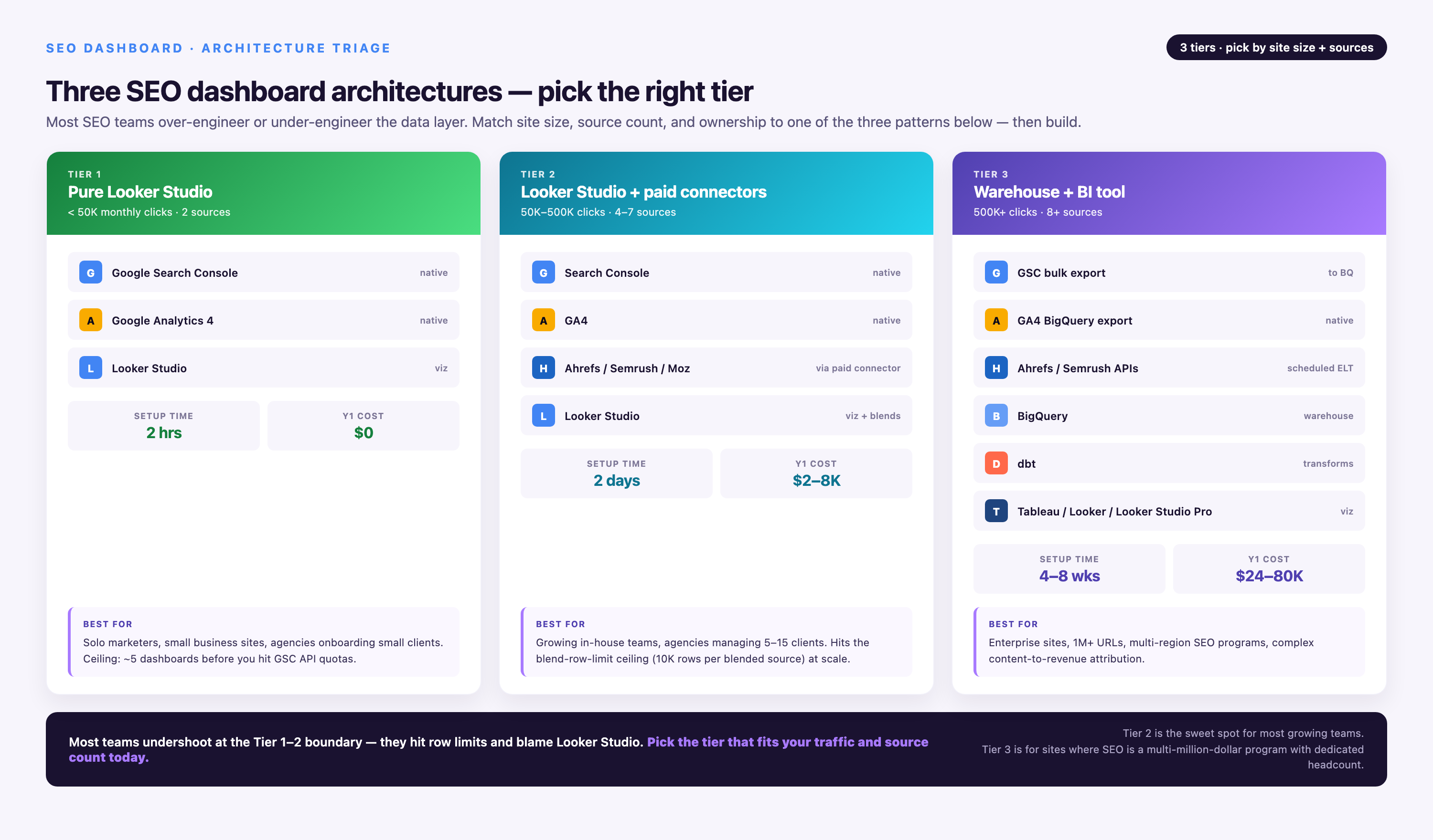
| Your Scenario | Recommended Architecture | Cost | Limitations |
|---|---|---|---|
| Tracking <10 priority keywords, single domain, executive summary only | Native GSC connector → Looker Studio | Free | 1,000 row query limit, 16-month data retention, 2-3 day lag |
| 10-100 keywords, need historical trends beyond 16 months | GSC → scheduled Google Sheets export → Looker Studio | Free (requires weekly manual export or Apps Script automation) | Manual labor ~2 hrs/week; Sheets performance degrades above 50k rows |
| 100-500 keywords, blending GSC + GA4 + third-party rank tracker | Supermetrics or Porter Metrics connector → Looker Studio | $99-$699/month depending on data sources | Connector refresh limits (Supermetrics: 1x/day on lower tiers); additional cost per source |
| 500+ keywords, enterprise site with multiple subdomains, custom attribution | GSC API → BigQuery → Looker Studio | BigQuery: ~$50-200/month for typical SEO dataset; requires data engineering setup | Technical complexity (SQL knowledge required); 1-2 week setup time |
| Agency managing 10+ client dashboards, white-label reporting, custom KPIs | Marketing data platform (Improvado, Funnel, etc.) → Looker Studio or Tableau | Custom pricing (typically $2k+/month enterprise tier) | Higher cost barrier; overkill for single-site use cases |
The "free" GSC connector hits hard limits at scale. Google's Search Console API restricts queries to 1,000 rows per request, meaning dashboards tracking 100+ keywords must use filtered data sources (one per keyword category) or accept incomplete datasets. If your site ranks for 5,000+ keywords, the native connector shows only your top 1,000 by impressions unless you apply dimension filters—which fragments your data into multiple sources and complicates cross-filtering. GSC retains only 16 months of data; building year-over-year comparison charts for 2026 vs. 2023 requires exporting historical data to Google Sheets or BigQuery before it expires from the API.
Hidden costs emerge when "free" architectures scale. A mid-sized e-commerce site tracks 200 landing pages. It spans 5 device types and 10 countries. This generates 10,000 unique dimension combinations. Blending this with GA4 session and conversion data requires calculated fields. It also needs cross-source filters and manual data quality checks. These tasks consume 5-8 hours per week of analyst time. At a $75/hour analyst rate, that's $1,500-2,400/month in labor costs. A $200/month Supermetrics subscription is significantly cheaper. A $100/month BigQuery setup is also cheaper. Both beat "free" manual workflows. Technical debt compounds these costs. Sheets-based architectures break when formulas reference moved cells. Scripts hit Google's 6-minute execution limit on large exports. Dashboard load times exceed 30 seconds when querying unoptimized data sources. This degrades stakeholder trust in the reporting system.
Getting Started with Looker Studio
Looker Studio (rebranded from Google Data Studio in 2026) is Google's free data visualization platform with over 1,300 connectors to advertising, analytics, and business data sources. In 2026, it includes responsive dashboard features, cross-source filtering, and Gemini AI integration for Pro users. To begin, visit lookerstudio.google.com and sign in with your Google account—no separate registration required. The platform is completely free with unlimited dashboards and viewers, relying on Google's ecosystem to monetize through data source integrations (Google Ads, Analytics 4, BigQuery) rather than seat-based pricing.
Once logged in, click → to start a blank dashboard. You'll be immediately prompted to select a data source. For SEO dashboards, the most critical connector is . This provides organic search performance data directly from Google's index. Other essential connectors include for session behavior and conversions from organic traffic. provides Core Web Vitals if using community connectors. Third-party SEO tool connectors are also valuable. offers 8 specialized dashboards for rankings, audits, and backlinks. is a keyword tracker with revenue linking. provides traffic evolution and health checks with 13-month trend analysis. Create Report Google Search Console Google Analytics 4 Google PageSpeed Insights SE Ranking Porter Metrics Data Bloo
Connector Latency and Data Freshness
Understanding data refresh rates prevents stakeholder confusion and sets realistic reporting expectations. Each connector has different latency characteristics that impact dashboard design:
| Data Source | Typical Latency | Refresh Frequency | Dashboard Impact |
|---|---|---|---|
| Google Search Console | 2-3 days | Daily (once data is available) | Never show "yesterday" in date selectors; use 3-day lag minimum |
| Google Analytics 4 | 24-48 hours | Daily | Blending with GSC creates 1-2 day mismatch; align date ranges carefully |
| Ahrefs API | Real-time (for owned sites); 1-7 days for competitor data | Hourly for rankings; weekly for backlinks | Can show "current" rankings but creates expectation mismatch with GSC historical data |
| SEMrush API | 12-24 hours | Daily | Good middle ground for blending with GA4; still lags behind GSC by 1 day |
| Google Sheets (manual export) | Dependent on export schedule | Manual or scripted (daily/weekly) | Historical data solution; use for YoY comparisons beyond API retention limits |
Do not blend real-time data sources with delayed sources in the same time-series chart. Real-time sources include Ahrefs hourly rankings. Delayed sources include GSC with a 3-day lag. Blending them creates visual inconsistencies. Recent days show gaps or misleading trends. Instead, use separate dashboard sections. Use "Current Rankings" for real-time APIs. Use "Historical Performance" for GSC data. Alternatively, apply a consistent 3-day lag across all blended sources. Filter date ranges to exclude the most recent 72 hours. Critical warning:
Starting a Project
After creating a blank report, select the Search Console connector from the connector gallery. You'll be prompted to authorize Looker Studio to access your GSC data—click Authorize and select the Google account that has Search Console property access (Owner or Full user permissions required; Restricted users cannot connect). Next, configure your data source parameters:
• Property: Select your verified Search Console property (e.g., https://www.example.com/ for domain properties or sc-domain:example.com for domain-level properties). Domain properties aggregate data across all subdomains and protocols; URL-prefix properties show only the exact prefix specified.
• Table Type: Choose between Site Impressions (aggregates all URLs on your site—use for overall performance tracking) or URL Impressions (shows individual landing page performance—use for page-level analysis). Most dashboards need both, connected as separate data sources.
• Select for standard organic search. Choose for Google Images traffic. Use for video carousel results. Select for Google News. SEO dashboards typically focus on Web search. Add Image or Video as separate data sources only if they drive significant traffic. Check GSC directly first. Search Type: Web Image Video News
Click Add to Report to proceed to the blank canvas. To add additional data sources later (like Google Analytics 4 or a second GSC property for international sites), navigate to Resource → Manage Added Data Sources → Add a Data Source. This is also where you edit existing source parameters if you need to switch from Site Impressions to URL Impressions or change the selected property.
Dimensions vs. Metrics
Looker Studio distinguishes between dimensions and metrics. Dimensions are categories within your dataset, displayed in green. Metrics are numerical measurements of those categories, displayed in blue. Understanding this difference is critical for building meaningful charts. Dimensions segment your data. In GSC, dimensions include Query (the keyword searched), Landing Page (the URL that appeared in results), Country (searcher location), Device (desktop, mobile, tablet), and Date. Metrics measure performance within those segments. These include Clicks (users who clicked your result), Impressions (times your result appeared in search), Average Position (mean ranking across all impressions), and CTR (click-through rate, calculated as Clicks ÷ Impressions). Dimensions Metrics
Every visualization requires at least one dimension and one metric. A table showing "top keywords by clicks" uses Query (dimension) and Clicks (metric). A time-series chart tracking "impressions over time" uses Date (dimension) and Impressions (metric). A geo map displaying "traffic by country" uses Country (dimension) and Clicks (metric). You can add multiple metrics to a single visualization—for example, a line chart with Date (dimension) showing both Clicks and Impressions (two metrics) as separate lines—but mixing multiple dimensions requires careful consideration of data granularity and can cause row limit issues when GSC returns too many unique combinations.
Essential Calculated Fields for SEO Analysis
Calculated fields transform raw GSC metrics into actionable insights by deriving new metrics from existing data. These formulas run at query time in Looker Studio, letting you create custom KPIs without modifying source data. Access calculated fields by clicking any chart, then navigating to the Data panel → Add a Field. Here are seven essential calculated fields for SEO dashboards:
| Calculated Field | Formula | Use Case |
|---|---|---|
| YoY Click Change % | ((Clicks - Clicks (Last Year)) / Clicks (Last Year)) * 100 |
Compare current period performance to same period last year, accounting for seasonality. Display in scorecard with conditional formatting (green if positive, red if negative). |
| Weighted Average Position | SUM(Average Position * Impressions) / SUM(Impressions) |
More accurate than simple average position because it weights rankings by search volume. A keyword ranking #1 with 10k impressions matters more than a #3 ranking with 100 impressions. |
| Click Potential Score | Impressions * (Expected CTR for Position - Actual CTR)Expected CTR table: Pos 1=28%, Pos 2=15%, Pos 3=11%, Pos 4-5=8%, Pos 6-10=5% |
Identifies high-opportunity pages: lots of impressions but CTR below expected rate for their ranking. Optimize title tags and meta descriptions for these URLs first. |
| Ranking Tier | CASE |
Segment keywords by ranking band for distribution analysis. Track how many keywords moved from Page 2 to Top 10 month-over-month. |
| Keyword Visibility Score | (Impressions / 1000) * (1 / Average Position) |
Combines search volume and ranking into a single visibility metric. Higher scores indicate keywords with both volume and strong positions—your most valuable organic assets. |
| Position Change (WoW) | Average Position - Average Position (Last Week) |
Track week-over-week ranking movement. Negative values mean improved rankings (moved from position 8 to 5 = -3 change). Use in table with conditional formatting to spot volatility. |
| Organic Conversion Value (requires GA4 blend) | SUM(Conversions) * Average Order ValueBlend GSC Landing Page with GA4 Page Path + Source/Medium="google / organic" |
Connects organic traffic to revenue. Shows which landing pages drive not just clicks but actual business value. Requires GA4 ecommerce tracking or goal values configured. |
To implement Click Potential Score accurately, create a separate Google Sheet. Add a lookup table of expected CTR by position. Base this on updated for 2026 SERP features. Blend this Sheet with your GSC data on the Position dimension. Then calculate the delta between expected and actual CTR. This highlights title tag optimization opportunities. Pages ranking well but underperforming on clicks need attention. Weak meta descriptions or SERP snippet issues are likely causes. industry benchmarks like Sistrix's 2020 study
KPI Selection Decision Tree
Not every SEO dashboard needs the same metrics. Use this decision tree to determine which KPIs to include based on your reporting context:
| Decision Point | If YES → Add These KPIs | Dashboard Implementation |
|---|---|---|
| Are you tracking branded vs. non-branded performance separately? | Branded Clicks, Non-Branded Clicks, Branded CTR, Non-Branded CTR | Create calculated field with regex filter: REGEXP_MATCH(Query, ".*(brand|company name).*") for branded, inverse for non-branded. Separate scorecards for each. |
| Do you have international subdirectories or domains? | Clicks by Country, Position by Country, Hreflang Validation Status | Use Country dimension with geo map visualization. If using hreflang, blend with crawl data from Screaming Frog exports to flag missing/incorrect tags. |
| Is mobile traffic >50% of your organic sessions? | Mobile CTR, Desktop CTR, Mobile vs. Desktop Position Gap | Add Device dimension to all primary charts. Create calculated field: AVG(Position) [Device=mobile] - AVG(Position) [Device=desktop] to identify mobile ranking penalties. |
| Are you tracking content marketing ROI? | Clicks by Content Type (Blog/Landing Page), Conversion Rate by Landing Page, Traffic per Published Post | Blend GSC Landing Page with GA4 Page Path and add custom dimension for content type (requires manual tagging in CMS or regex-based classification). |
| Do you optimize for featured snippets or SERP features? | Impressions with SERP Features, Position 1 CTR (to detect snippet cannibalization) | GSC API doesn't explicitly flag snippets, but Position 1 with CTR <20% often indicates featured snippet above organic result. Track with conditional alert. |
| Are you reporting to executives or budget holders? | Organic Traffic as % of Total Traffic, Estimated Organic Traffic Value (clicks × CPC), YoY Growth Rate | Blend GSC with GA4 for total traffic percentage. Import Google Ads CPC data to calculate traffic value: SUM(Clicks * Avg CPC for Query). Requires Ads API or manual keyword export. |
| Do you run A/B tests on title tags or meta descriptions? | CTR by URL (before/after change), Position Change During Test Period | Annotate dashboard with test start date. Compare 30-day CTR before vs. 30-day CTR after change (excluding first 7 days for index lag). Requires manual annotation or Sheets-based test log. |
Conditional selection prevents dashboard bloat. An executive reviewing monthly performance doesn't need device-level breakdowns or hourly ranking fluctuations—they need total clicks, YoY growth, and revenue attribution. Conversely, an SEO manager debugging a traffic drop needs granular data: which specific landing pages lost rankings, on which devices, in which countries, for which keyword clusters. Build multiple dashboards for different audiences rather than cramming every dimension into one overcomplicated view.
- →1,000+ pre-built data connectors with automatic schema updates—no manual fixes when Google changes its API
- →Marketing Cloud Data Model harmonizes naming conventions across platforms (Google Ads 'Campaign' = Meta 'Campaign Name' = single standardized field)
- →250+ pre-built data governance rules validate budgets, flag anomalies, and enforce naming standards before data reaches dashboards
- →AI Agent for conversational analytics—ask 'Which landing pages have declining organic traffic but rising paid spend?' and get visualizations in seconds
- →2-year historical data preservation across connector changes (when Google deprecated Universal Analytics, Improvado auto-mapped to GA4 equivalents)
- →SOC 2 Type II, HIPAA, GDPR, CCPA certified with row-level access controls and audit logs for enterprise compliance
- →Dedicated Customer Success Manager and professional services included—not an add-on
Blending Google Search Console with Google Analytics 4
Blending data sources connects SEO visibility metrics with user behavior metrics. SEO visibility metrics include impressions and rankings. User behavior metrics include sessions and conversions. This answers critical questions like "Which keywords drive clicks that actually convert?" It also answers "Do pages ranking in positions 4-10 have higher bounce rates than top-3 results?" Here's how to blend GSC and GA4 in Looker Studio:
Add the Google Search Console connector to your report. Configure it for the URL Impressions table type. Also add the Google Analytics 4 connector to your report. In GA4, ensure you've created a custom dimension for Landing Page. If it doesn't exist, navigate to GA4 Admin → Data Display → Custom Definitions → Create Custom Dimension. Set Dimension name = "Landing Page" and Event parameter = "page_location". Step 1: Prepare your data sources.
Step 2: Create a blended data source. In Looker Studio, go to Resource → Manage Blended Data → Add a Blend. Select GSC URL Impressions as your primary data source and GA4 as your secondary source. Set the Join Key to Landing Page (from GSC) and Landing Page or Page Path (from GA4). Choose Left Outer Join to include all GSC landing pages even if they have no GA4 sessions (possible if users clicked but immediately bounced before GA4 tag fired, or if tag implementation has issues).
Step 3: Handle URL parameter mismatches. GSC often includes URL parameters (e.g., example.com/page?utm_source=google) while GA4 may strip them depending on your property settings. Create calculated fields in both data sources that normalize URLs before blending:
• GSC field: REGEXP_REPLACE(Landing Page, "\\?.*", "") (removes everything after ?)
• GA4 field: REGEXP_REPLACE(Page Path, "\\?.*", "")
Use these calculated fields as your join keys instead of raw Landing Page dimensions.
Step 4: Select blended metrics. From the GSC source, add Clicks, Impressions, Average Position, and CTR. From the GA4 source, add Sessions, Engaged Sessions, Conversions, and Bounce Rate. Now you can create tables showing Landing Page (dimension) with columns for Clicks (GSC), Sessions (GA4), and Conversion Rate (GA4), revealing which pages drive visibility but fail to convert.
If your blended table shows zero GA4 sessions for URLs you know have traffic, check for protocol mismatches. GSC uses https:// while GA4 records just /path. Also check trailing slash inconsistencies (GSC: /page/, GA4: /page). Check case sensitivity differences too (GSC: /Page, GA4: /page). Use and calculated fields to standardize before blending. If numbers still don't match, verify your GA4 property includes organic traffic. Check that Default Channel Group or Session Source/Medium shows "Organic Search" or "google / organic" for a sample landing page in the GA4 interface. Expect it in Looker Studio only after confirming this. Common blending errors: LOWER() REGEXP_REPLACE()
The Three Dashboards You Actually Need
Instead of building one dashboard that serves no one well, create three purpose-built views for distinct audiences. Each has different metric priorities, refresh cadences, and visualization styles:
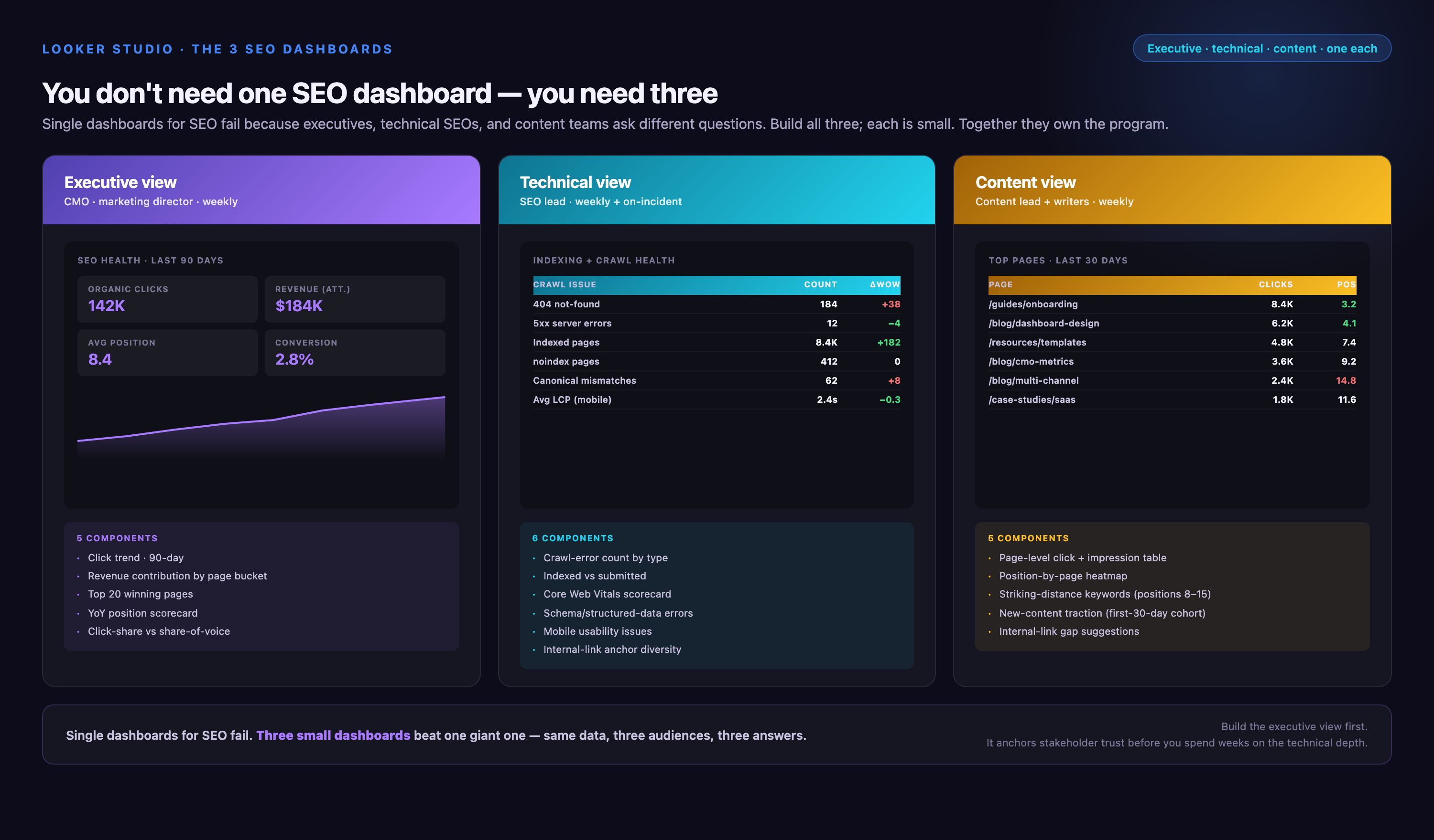
Executive Summary Dashboard
Audience: CMOs, VPs, budget holders
Refresh: Monthly or quarterly
Metrics: 5-7 high-level KPIs only
This dashboard answers the question "Is our SEO investment working?" in under 30 seconds. Open with a scorecard row showing:
• Total Organic Clicks (with YoY % change)
• Estimated Organic Traffic Value (clicks × avg CPC from Google Ads—demonstrates SEO's paid search offset)
• Organic Conversion Rate (requires GA4 blend)
• Keywords Ranking in Top 10 (count of queries with Average Position ≤10)
• Average Position (weighted by impressions)
Follow with two visualizations: (1) a line chart showing 12-month organic clicks trend with prior-year comparison line. This demonstrates growth trajectory. (2) A bar chart showing top 5 landing pages by conversion value. This proves business impact, not just traffic. Avoid granular tables, device breakdowns, or technical jargon. Use large fonts and traffic-light color coding. Green indicates above-target performance. Red indicates below-target performance. Include narrative text boxes explaining major changes. For example: "November traffic spike driven by holiday buying guide ranking #1 for 'best gifts for marketers'."
Operational SEO Dashboard
Audience: SEO managers, content teams, analysts
Refresh: Weekly or daily
Metrics: 20-30 actionable metrics
This dashboard identifies what to optimize next. Structure in sections:
Overview Section:
• 7-day and 28-day click trends (time series)
• Position distribution (pie chart: Top 3 / 4-10 / 11-20 / 21+)
• Device performance (table: Device | Clicks | CTR | Avg Position)
Opportunity Identification Section:
• Top 20 pages by Click Potential Score (calculated field from earlier—high impressions, low CTR relative to position)
• Keywords ranked 4-10 with >1,000 monthly impressions (table sorted by impressions descending—these are your "push to top 3" targets)
• Pages with position drops >5 ranks week-over-week (uses Position Change calculated field with filter)
Content Performance Section:
• Top 20 landing pages by clicks (table with clicks, CTR, position)
• Bottom 20 pages by CTR (filters to pages with >500 impressions but CTR <2%—title tag optimization targets)
• Newly ranking pages (filter to landing pages with first impression date in last 30 days)
Add filter controls for Date Range, Country, Device, and Query (with regex support) so analysts can drill into specific issues. For example, filtering Query to .*how to.* shows only informational keyword performance, while .*buy.*|.*price.* isolates transactional queries.
Client Reporting Dashboard
Audience: External clients, agency stakeholders
Refresh: Monthly or quarterly
Metrics: 10-12 metrics with heavy narrative context
This dashboard proves campaign value and educates clients on SEO progress. It balances data with storytelling:
Campaign Summary (narrative text box):
"In Q1 2026, we focused on optimizing 15 high-opportunity pages identified in January. These pages ranked positions 4-8 for target keywords with strong search volume but below-average CTR. Through title tag rewrites, schema markup implementation, and internal linking improvements, we moved 11 of 15 pages into top-3 positions, driving a 34% increase in organic clicks quarter-over-quarter."
KPI Scorecard:
• Total Clicks (with prior quarter comparison)
• Total Impressions
• Average Position
• CTR (overall site average)
• Top 10 Keywords (count)
Progress Highlights:
• Table: "Top 5 Ranking Improvements" (Keyword | Old Position | New Position | Monthly Impressions)
• Table: "Top 5 Traffic Drivers" (Landing Page | Clicks | Change vs. Last Month)
• Bar chart: Month-over-month click growth for last 12 months
Competitive Context:
If you have rank tracking data from SEMrush or Ahrefs, add a table showing "Our Position vs. Top Competitor" for 10 priority keywords. This demonstrates not just your performance, but your standing in the competitive landscape.
Brand this dashboard with client logo, use their color scheme, and include a footer with agency contact info. Set view-only sharing permissions and disable data download if protecting proprietary tactics. Consider adding a "Methodology" text box explaining GSC data lag, why impressions don't equal search volume, and why position fluctuations are normal—preempting common client questions.
How to Create an SEO Dashboard: Step-by-Step Chart Building
With your data sources connected and calculated fields created, you're ready to build visualizations. Looker Studio offers multiple chart types; selecting the right one depends on the analytical question you're answering.
Chart Type Selection Matrix
| Analytical Question | Optimal Chart Type | Reasoning |
|---|---|---|
| Which pages lost the most traffic this month? | Table (sorted by Click Change descending) | Tables let you display multiple metrics (Landing Page, Clicks, Click Change, Position Change) and sort by the metric that matters. Add conditional formatting: red for negative click change. |
| Is seasonality affecting our rankings? | Time series (line chart with 2-year date range) | Line charts show trends over time. Comparing 2025 and 2026 on the same chart reveals seasonal patterns (e.g., holiday traffic spikes, summer lulls). |
| Which device type has the worst conversion rate? | Bar chart (Device dimension, Conversion Rate metric) | Bar charts excel at comparing discrete categories. Horizontal bars make device labels easy to read; vertical bars work for few categories. |
| What's our ranking distribution across all keywords? | Pie chart or donut chart (Ranking Tier calculated field) | Pie charts show part-to-whole relationships. Use Ranking Tier field (Top 3 / 4-10 / 11-20 / 21+) to visualize portfolio health. Avoid for >5 categories—becomes unreadable. |
| Which countries drive the most organic traffic? | Geo map (Google Maps chart, Country dimension) | Geo maps provide instant geographic context. Color intensity represents metric value (darker = more clicks). Works only with Country dimension—not useful for city-level data. |
| Is there a correlation between position and CTR? | Scatter plot (X-axis: Avg Position, Y-axis: CTR) | Scatter plots reveal relationships between two metrics. Expect downward trend (better position = higher CTR); outliers indicate title tag issues or SERP feature interference. |
| What's our current organic click total? | Scorecard (single metric display) | Scorecards emphasize key numbers. Add comparison period (vs. last month) and conditional formatting. Use large font; place at top of dashboard for immediate visibility. |
Avoid common chart selection mistakes. Don't use pie charts for more than 5 categories. Use a bar chart instead. Don't use line charts for non-time dimensions. Categorical data like Device should be bars, not lines. Don't use tables when a chart would surface patterns faster. Time-series data in a table hides trends. A line chart makes those trends visible.
Adding Interactive Controls and Filters
Static dashboards quickly become obsolete. Interactive controls let users explore data without creating separate reports for every scenario. Add controls by clicking Add a Control in the toolbar, then selecting the control type:
• Date Range Control: Essential for all dashboards. Place at the top. Set default to "Last 28 days" for operational dashboards or "Last 90 days" for executive views. Enable comparison mode to show prior-period metrics automatically. Common mistake: forgetting to apply the date range control to all charts—select each chart, go to Data panel → Date Range Dimension, and choose "Auto" to inherit from control.
• Drop-down List (for dimensions like Device, Country): Lets users filter entire dashboard to mobile-only or US-only traffic. Set to "Multi-select" if users need to compare multiple values (e.g., US + UK + Canada). Common mistake: applying filter to only some charts—use the control's "Apply to" setting to ensure all relevant charts respond.
• <Advanced Filter (for Query dimension with regex): Power-user feature for SEO teams. Allows filtering to branded queries (.*company name.*), question queries (.*how to.*|.*what is.*), or excluding brand (^(?!.*brand).*). Common mistake: not escaping special characters—use \. to match literal periods in brand names with domains.
• Slider (for metrics like Impressions or Clicks): Useful for filtering tables to high-volume keywords only (e.g., "Show only queries with >1,000 impressions"). Reduces noise in operational dashboards.
Configure control interactions carefully. If you add a Country filter, decide whether it should affect all charts or just specific sections. For client dashboards, limit controls to Date Range only—too many filters overwhelm non-technical stakeholders. For operational dashboards, provide full filtering flexibility but set sensible defaults (e.g., Date Range defaulting to last 28 days, Device defaulting to "All").
Adding Context with Annotations and Narrative
Data without context is just numbers. Annotations transform dashboards from reporting tools into storytelling platforms:
• Text boxes for anomaly explanations: Add a text box above charts with volatile data: "Traffic spike on March 15 driven by media mention in [Industry Publication]. Ranking for '[high-volume keyword]' jumped from position 12 to position 3 following backlink from article." This preempts stakeholder questions and demonstrates your monitoring.
• Annotations on time-series charts: Right-click any date point on a line chart → Add Annotation. Mark algorithm updates (Google core updates, spam updates), site changes (redesigns, technical SEO fixes), or external events (PR campaigns, seasonal promotions). Use consistent annotation labels: "Core Update - Mar 2026", "Title Tag Optimization - Week of 2/10".
• Conditional formatting for targets: If your goal is 10% CTR improvement, apply conditional formatting to CTR metrics: green if ≥10% above baseline, yellow if 5-9% above, red if below baseline. This creates a visual performance indicator without requiring text.
• Narrative summary at top: Start executive dashboards with a 2-3 sentence text box summarizing the period: "Q1 2026: Organic clicks increased 22% YoY driven by 8 new pages reaching top-3 rankings for target keywords. Average position improved from 12.4 to 9.1. Conversion rate from organic traffic held steady at 3.2%, indicating quality growth rather than just volume increase."
For client dashboards, include a methodology note explaining data limitations. Google Search Console data includes a 2-3 day delay. It is also sampled for high-traffic sites. Position represents average across all impressions. Individual searches may show different rankings based on location, device, and personalization. This sets accurate expectations. It prevents "but when I search, I see position 8, not position 5" objections.
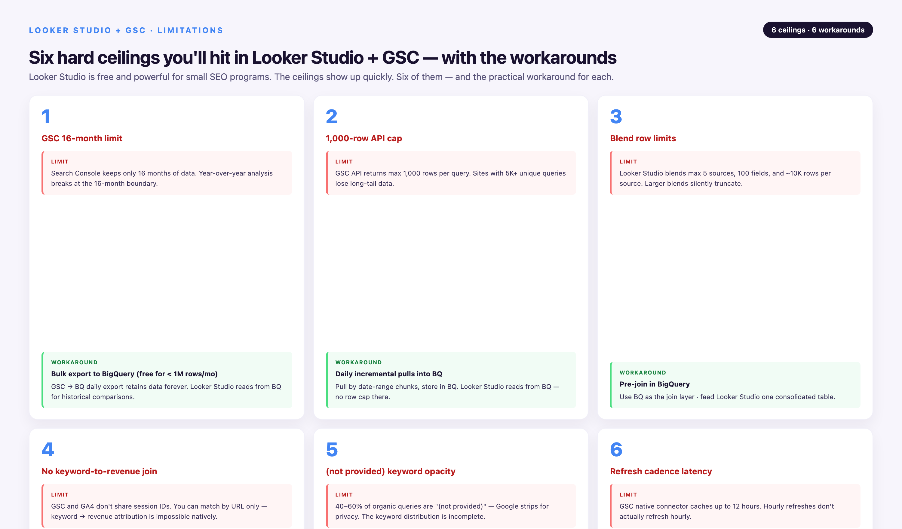
Data Studio + GSC: Limitations and Practical Workarounds
Google Search Console's API imposes constraints that impact dashboard design. Understanding these limitations—and implementing workarounds—prevents stakeholder disappointment and reporting gaps.
| Limitation | Impact | Workaround | Implementation Difficulty |
|---|---|---|---|
| 16-month data retention | Cannot build YoY dashboards comparing 2025 to 2024 after April 2026 (data from before January 2025 is deleted) | Daily scheduled export of GSC data to Google Sheets via Apps Script or third-party tools (Search Analytics for Sheets add-on). Archive historical data in BigQuery for long-term retention. | Medium (requires one-time script setup; runs automatically thereafter) |
| 1,000 row query limit | Dashboards tracking 100+ keywords only show top 1,000 by impressions. Bottom 50% of keyword portfolio invisible. | Create multiple filtered data sources: one for branded queries, one for non-branded, one for product category A, etc. Each source stays under 1,000 rows. Use dropdown control to switch between sources, or create separate dashboard pages per category. | Low (manual data source configuration in Looker Studio) |
| "Not provided" keywords | GSC shows aggregated queries only; individual long-tail keywords grouped into buckets | No direct workaround via API. For full query list, manually export from GSC UI (Performance → Export → Download as CSV) and upload to Google Sheets. Blend Sheets data with Looker Studio. Update export monthly. | Medium (manual export required; cannot be fully automated) |
| 2-3 day data delay | Cannot report on "yesterday's" performance; most recent data is always 48-72 hours old | Set stakeholder expectations upfront. Add prominent text box to dashboard: "Data current through [Date -3 days]". Use date range controls that default to "Last 28 days, ending 3 days ago" to avoid showing incomplete recent days. | Low (communication and UI design, no technical work) |
| No backlink data | GSC shows which sites link to you but not anchor text, link context, or quality scores | Integrate third-party backlink tools (Ahrefs, Majestic, SEMrush) via their Looker Studio connectors or manual CSV exports. Blend with GSC landing page data to correlate backlink growth with ranking improvements. | Medium to High (requires paid third-party tool subscription + connector setup) |
| No keyword search volume | GSC shows impressions (how often YOU appeared) but not total search volume for the keyword | Export keyword list from GSC, run through Google Keyword Planner or third-party tool (Ahrefs, SEMrush) to get search volume, upload results to Google Sheets, blend with GSC data on Query dimension. | Medium (requires third-party tool access and monthly refresh) |
The 1,000-row limit is the most common breaking point. Sites ranking for 5,000+ keywords cannot display all queries in a single table or chart. The practical solution: segment your keyword universe into strategic categories (branded vs. non-branded, product lines, content types, funnel stages) and create separate Looker Studio data sources with Query filters applied. For example, create a "Branded Keywords" data source with filter Query CONTAINS 'YourBrandName' and a "Non-Branded Keywords" source with inverse filter. Each stays under 1,000 rows, and you can build separate dashboard pages or use a dropdown control to switch between views.
For historical data beyond 16 months, the Search Analytics for Sheets add-on automates daily GSC exports to Google Sheets. Configure it once to run nightly, appending new rows to a master sheet. After 6-12 months, you'll have a historical dataset that predates GSC's API retention window, enabling true long-term trend analysis. Export this Sheets data to BigQuery for unlimited retention and faster query performance once it exceeds 100k rows.
Common Dashboard Failures and Debugging Guide
Even properly configured dashboards exhibit issues that confuse stakeholders and erode trust in SEO reporting. Here are the most frequent problems and their diagnostic solutions:
GSC Shows 10k Clicks, GA4 Shows 9.2k Sessions—Why?
This 8% discrepancy is normal and expected. Google Search Console counts every click on your search result, regardless of what happens afterward. Google Analytics 4 only counts a session if:
• The user's browser successfully loads your page and executes the GA4 tag (blocked by ad blockers ~5-15% of the time)
• The click isn't filtered as bot traffic by GA4's internal algorithms (GSC includes some bot clicks that GA4 removes)
• The user doesn't immediately hit "back" before the page fully loads (GSC counts click, GA4 never fires)
Typical discrepancy ranges: 5-15% lower sessions than clicks. If your gap exceeds 20%, investigate:
• Check GA4 tag implementation—use Google Tag Assistant Chrome extension to verify tag fires on landing pages
• Review GA4 filters—admin may have excluded traffic from certain geographies, IPs, or referrers
• Examine page load speed—if Core Web Vitals are poor (LCP >4 seconds), users may bounce before GA4 tag executes
Add a text box near blended GSC-GA4 charts. Explain the expected discrepancy: "GSC Clicks typically 5-10% higher than GA4 Sessions due to bot filtering and tag load timing. Discrepancies within this range are normal and expected." Include current discrepancy percentage as a calculated metric. Use this metric to flag unusual spikes. Dashboard solution:
Date Range Selector Breaks When Mixing GSC and GA4
Google Search Console uses UTC timezone for all data. Google Analytics 4 uses your property's configured timezone (often PST, EST, etc.). When you set a dashboard date range to "March 1-31, 2026" and blend GSC with GA4:
• GSC returns data for March 1 00:00 UTC through March 31 23:59 UTC
• GA4 returns data for March 1 00:00 PST through March 31 23:59 PST
• If you're in PST (UTC-8), there's an 8-hour offset—GSC's "March 1" starts 8 hours before GA4's "March 1"
This creates misaligned day-level metrics. A traffic spike that GSC attributes to March 15 might appear in GA4 as March 14 (if it happened at 9 PM PST = 5 AM UTC March 16).
Dashboard solution: Avoid day-level blended charts. Use week-level or month-level aggregation for blended GSC+GA4 visualizations—timezone offsets average out over 7+ day periods. For day-level analysis, keep GSC and GA4 in separate charts. Add a note: "GSC and GA4 use different timezones; daily metrics may show 1-day offset. Weekly and monthly views are timezone-normalized."
Calculated CTR Field Breaks with Impression Sampling
If you create a calculated field CTR = (Clicks / Impressions) * 100 instead of using GSC's native CTR metric, it may produce incorrect values. Why? Google samples impression data for high-traffic sites (>1M daily impressions), but always provides exact click counts. Your calculated CTR divides exact clicks by sampled impressions, inflating the percentage.
Dashboard solution: Always use GSC's native CTR metric from the data source field list, not a calculated field. Native CTR is computed before sampling and remains accurate. If you must calculate CTR for blended sources (e.g., CTR from blended GSC clicks and third-party impression data), add a disclaimer that values are estimates based on sampled impressions.
Dashboard Loads Slowly or Times Out
Looker Studio dashboards can take 30+ seconds to load. This happens when querying large datasets (>500k rows). It also happens with complex calculated fields. These fields span multiple blended sources. This slow performance frustrates users.
Performance optimization checklist:
• Filter at source level, not chart level: If you only need US traffic, apply Country=US filter in the data source configuration, not individually on each chart. This reduces the dataset Looker Studio queries.
• Limit date ranges for large sites: Default to 90-day windows instead of 12-month for sites with >1M monthly clicks. Provide a control to expand if needed, but don't force every page load to query a year of data.
• If your dashboard includes a "2025 vs 2024" comparison, create a Google Sheet extract of 2026 data. This data is static. Blend it with live 2026 GSC data. Querying 2 years of live data is slower. Querying 1 year live plus 1 year cached is faster. Use data extracts for historical comparisons:
• Avoid multiple breakdown dimensions in single charts: A table with dimensions Query + Landing Page + Country + Device generates millions of unique rows. Limit to 1-2 dimensions per chart. If you need deeper analysis, create drill-down pages accessed via dashboard links.
• For charts that don't need query-level granularity, create a Sheets data source with pre-calculated monthly totals. Use this instead of querying raw GSC API. Avoid aggregating in Looker Studio. Example: "Total clicks by month". Pre-aggregate metrics in Google Sheets:
After optimizations, dashboards should load in <10 seconds on standard connections. If still slow, consider migrating high-traffic sites to BigQuery-based architecture where you control query optimization via SQL.
Why Is My Data Not Appearing?
Blank charts or "No data" messages despite knowing your site has traffic:
• Check data source refresh: Looker Studio caches data; click Refresh Data in the data source settings to force a new API pull.
• Verify GSC property ownership: Your Google account must be an Owner or Full user in Search Console for the selected property. Restricted users cannot connect via API.
• Confirm date range: If your date range is set to "Last 7 days" but GSC has a 3-day lag, you're querying days with no data yet. Shift range to "Last 7 days, ending 3 days ago".
• Inspect filter conflicts: If you have a Country filter set to "US" and a Device filter set to "tablet", but your site has no US tablet traffic, the chart will be empty. Temporarily remove all filters to verify data exists, then reapply selectively.
• Check dimension/metric compatibility: Some dimension-metric combinations don't work in GSC API. For example, you cannot query "Clicks by Search Appearance" (search appearance isn't a dimension, it's a filter). Review Google's Search Analytics API documentation for valid combinations.
Free SEO Dashboard Templates for Looker Studio
Starting from scratch is time-consuming. These templates provide pre-built dashboards you can copy and connect to your own data sources:
Porter Metrics SEO Dashboard
Best for: Quick setup, revenue-linked SEO insights
Data sources: Google Search Console, Google Analytics 4
Cost: Free
Porter Metrics offers a 4-page SEO template tracking keyword rankings, position changes, top pages by clicks and impressions, CTR opportunities, organic traffic trends vs. prior periods, branded/non-branded query splits, and page-level conversions. The template includes pre-built calculated fields for Click Potential Score and Weighted Average Position. Setup takes approximately 3 minutes: copy the template, authenticate your GSC and GA4 accounts, and select your properties. White-label version available for agencies.
Key feature: Revenue attribution—connects GA4 conversion data to GSC landing pages, showing which organic keywords drive actual business value, not just traffic.
SE Ranking Looker Studio Templates
Best for: Agencies needing complete, client-ready reports
Data sources: Search Console, GA4, SE Ranking, Google Ads, Chrome UX Report, Google Sheets
Cost: Free (requires SE Ranking connector, which may need SE Ranking subscription starting ~$50/month)
SE Ranking provides 8 specialized dashboard templates:
• Keyword Rankings Dashboard: Daily position tracking, ranking distribution, position velocity, search volume integration
• Site Audit Dashboard: Technical SEO health checks, crawl errors, broken links, indexation status
• Competitor Analysis Dashboard: Side-by-side ranking comparisons, keyword gap analysis, visibility scores
• Backlink Analysis Dashboard: New/lost backlinks, referring domains growth, anchor text distribution, link quality metrics
• Traffic Analysis Dashboard: Organic traffic trends, landing page performance, traffic sources breakdown
• E-commerce SEO Dashboard: Product page rankings, category performance, conversion rates by organic keyword
• Core Metrics Dashboard: Executive summary with 8 KPI scorecards, monthly goal tracking
• Agency Management Dashboard: Multi-client view, client-by-client performance, white-label branding
All templates include algorithm update annotations (Google core updates marked automatically), customizable branding (logo, colors, fonts), and real-time data refresh. Best suited for teams already using SE Ranking for rank tracking; connector pulls proprietary SE Ranking data not available in GSC alone.
Data Bloo Advanced SEO Dashboard
Best for: Long-term trend analysis and data segmentation
Data sources: Search Console, Google Analytics
Cost: Free tier available; paid plans start ~$29/month for advanced features
Data Bloo's focuses on 13-month trend views for total and organic traffic. It provides site health scoring and keyword distribution across top pages. The tool includes clustering segmentation capabilities. Automated anomaly detection alerts trigger when traffic drops exceed 20% week-over-week. These alerts send email notifications. Integration with Google Sheets enables custom dimension mapping. Users can tag pages by content type, funnel stage, or business unit. Advanced SEO template
Key feature: Clustering—automatically groups keywords by topic similarity, showing which content clusters drive the most traffic vs. which are underperforming and need internal linking or content expansion.
Improvado SEO + Paid Media Unified Dashboard
Best for: Enterprises needing cross-channel attribution and marketing data governance
Data sources: 1,000+ connectors including GSC, GA4, Google Ads, LinkedIn, Meta, Salesforce, HubSpot, and custom APIs
Cost: Custom pricing (contact sales)
Improvado offers pre-built SEO dashboard templates within its marketing analytics platform. It differentiates by solving data normalization and blending challenges at scale. Instead of manually configuring Looker Studio blends, teams avoid inconsistent naming conventions across platforms. Improvado's applies 250+ pre-built transformation rules. These rules harmonize data before it reaches your dashboard. For example, Google Ads calls it "Campaign". Meta calls it "Campaign Name". LinkedIn calls it "Campaign". Improvado standardizes all to a single "Campaign" field. This field exists in its Marketing Cloud Data Model (MCDM). Manual field mapping is eliminated. Marketing Data Governance
For SEO specifically, Improvado dashboards connect organic performance data. This includes GSC and GA4. They also connect paid search performance data. This includes Google Ads and Microsoft Ads. Additionally, they connect CRM data from Salesforce and HubSpot. Together, these connections answer attribution questions like:
• "Which organic keywords drive leads that close fastest in Salesforce?"
• "What's the incrementality of paid search vs. organic for branded queries?" (shows overlap and cannibalization)
• "How does organic content assist paid conversions in multi-touch attribution?"
Implementation typically takes days, not months, with a dedicated Customer Success Manager and professional services included (not an add-on). Improvado preserves 2 years of historical data even when connector schemas change (e.g., when Google deprecates a metric), preventing reporting breaks. SOC 2 Type II, HIPAA, GDPR, and CCPA certified for enterprises with strict compliance requirements.
Improvado's AI Agent enables conversational analytics over all connected data sources. Ask "Which landing pages have declining organic traffic but increasing paid ad spend?" in natural language. Receive visualizations in seconds without building manual dashboard queries. Key differentiator:
Limitation: Overkill for single-site, SEO-only use cases. Best suited for marketing teams managing 10+ data sources who need unified reporting and governance, not just SEO dashboards.
Sharing, Permissions, and Automated Distribution
Once your dashboard is built, configure sharing settings to control access and enable automated distribution. Looker Studio offers granular permission controls similar to Google Drive:
Setting Viewer and Editor Permissions
Click Share in the top-right corner of your dashboard. You'll see three permission levels:
• Viewer: Can view the dashboard, interact with filters and date range controls, and export data (if you enable exports). Cannot edit charts, add new visualizations, or modify data sources. Use this for clients, executives, and stakeholders who consume reports but don't build them.
• Editor: Can modify charts, add new data sources, change dashboard layout, and adjust sharing settings. Grant this only to trusted team members who actively maintain the dashboard.
• Owner: Full control including deleting the dashboard and transferring ownership. Only the original creator starts as Owner; you can transfer ownership via the Share menu if transitioning dashboard maintenance to another team member.
For client dashboards, set to Viewer and . Use the gear icon in Share menu. Uncheck "Viewers can download data" to protect proprietary keyword strategies. This prevents clients from exporting your entire GSC dataset. disable data download
Generating Shareable Links
Instead of adding individual email addresses, create a shareable link:
• Private (default): Only specific people you've shared with can access. Requires Google account authentication.
• Anyone with the link (Viewer): Anyone with the URL can view, no Google login required. Useful for embedding dashboards in intranets or sharing with external stakeholders without Google accounts. Warning: Link is not password-protected—anyone who obtains it can view your data. Don't use for sensitive competitive intelligence.
• Public on the web (rare for SEO dashboards): Dashboard appears in Google search results. Only use for public transparency reports or open-source project metrics.
For agency-client relationships, use "Anyone with the link (Viewer)" and share via secure channel (client portal, encrypted email). Regenerate link if client relationship ends to revoke access.
Scheduling Automated Email Reports
Looker Studio can email dashboard snapshots on a recurring schedule, eliminating manual report distribution:
• Open your dashboard
• Click the three-dot menu (top-right) → Schedule email delivery
• Configure schedule: Daily (not recommended for SEO—GSC lag makes daily meaningless). Weekly (good for operational teams). Monthly (standard for executive and client reports). Quarterly.
• Set delivery time (e.g., "Every Monday at 9 AM PST" or "First day of month at 8 AM")
• Add recipient emails (can include multiple stakeholders)
• Choose format: PDF (static snapshot, good for archiving), Link (always shows live data, good for teams who interact with dashboard)
PDF emails attach the entire dashboard as of the scheduled time. If your dashboard has multiple pages, the PDF includes all pages. For large dashboards (>10 charts), PDFs can exceed 5 MB—Gmail's attachment limit—causing delivery failures. Solution: Schedule as "Link" instead, which embeds a thumbnail and "View Report" button directing to the live dashboard.
Best practice: Set monthly client reports to deliver on the 5th of the month (allowing GSC's 3-day lag to populate through end of prior month) at 8 AM local client time. Include a brief email template: "Your March 2026 SEO performance report is ready. Key highlights: +12% organic clicks YoY, 8 new top-10 rankings, average position improved from 14.2 to 11.7. Review the full dashboard here: [link]"
Embedding Dashboards in Websites or Portals
For agencies with client portals or internal team wikis, embed Looker Studio dashboards directly:
• Click File → Embed report
• Copy the provided iframe code
• Paste into your HTML page, CMS, or portal (Notion, Confluence, WordPress, custom web apps all support iframes)
• Adjust width and height attributes in iframe tag to fit your layout (e.g., <iframe width="100%" height="1200px" ...>)
Embedded dashboards respect Looker Studio's sharing permissions—if the dashboard is set to "Private", viewers must authenticate with Google. If set to "Anyone with the link", embedded view works without login. Test embedding in an incognito browser to verify access works as expected for external users.
When to Upgrade Beyond Looker Studio
Looker Studio excels for small to mid-sized SEO reporting, but certain use cases outgrow its capabilities. Consider upgrading to a marketing data platform like Improvado, Funnel, or Supermetrics + BigQuery when:
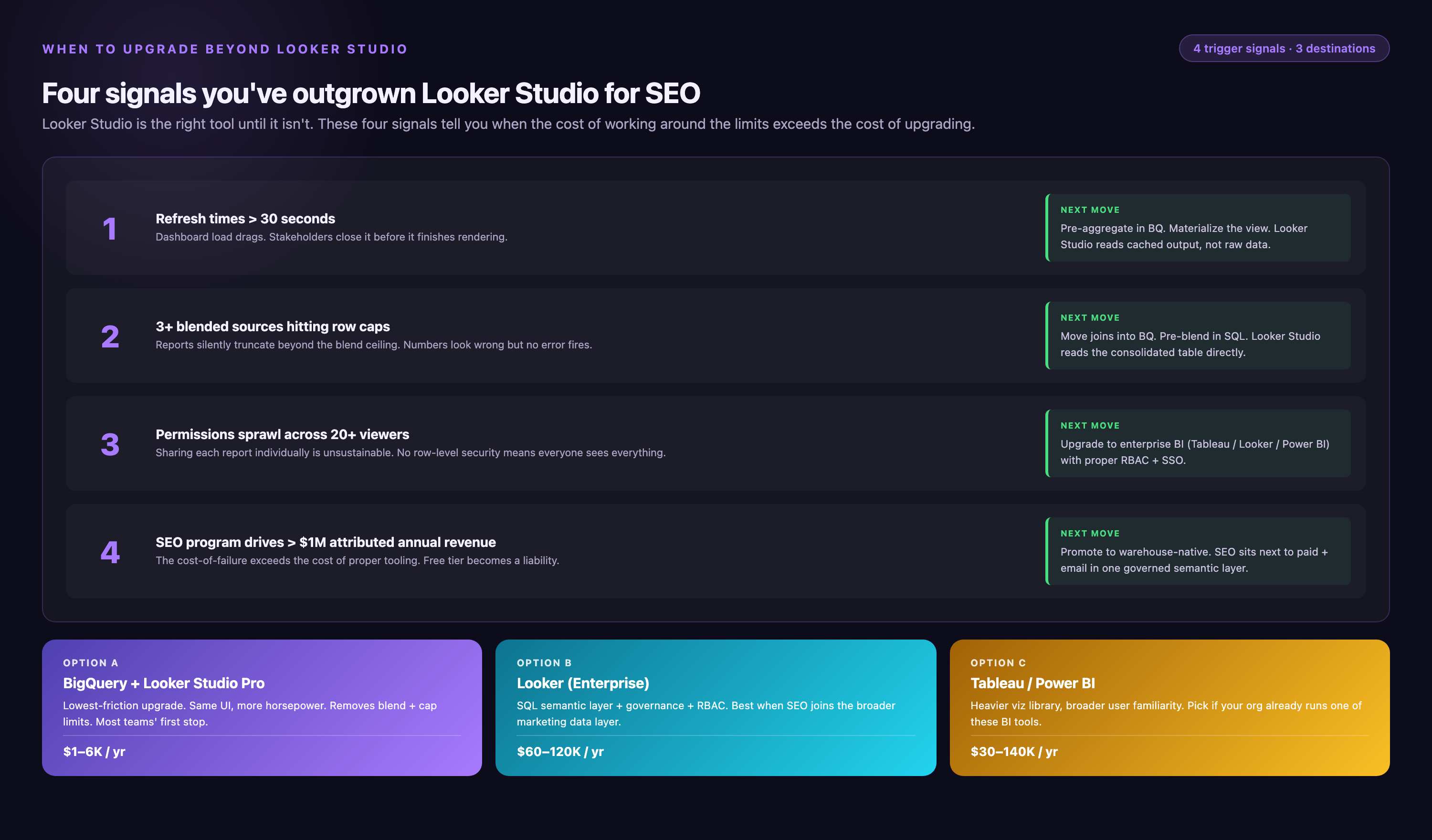
• You manage 10+ client dashboards and spend >10 hours/week manually updating data sources, fixing broken connectors, or recreating dashboards. Marketing data platforms centralize connector management and use template-based dashboard deployment—build once, replicate for 50 clients in minutes.
• You need to blend >5 data sources (GSC, GA4, Google Ads, Meta, LinkedIn, Salesforce, HubSpot) and Looker Studio's manual blending becomes unmaintainable. Platforms like Improvado normalize and blend data automatically via their Marketing Cloud Data Model, eliminating field mapping labor.
• Data governance is a compliance requirement—SOC 2, HIPAA, or GDPR audits flag Looker Studio's lack of row-level access controls and data lineage tracking. Enterprise platforms provide audit logs showing who accessed which data when, required for regulatory compliance.
• You're hitting GSC API rate limits (50,000 requests/day) from running multiple high-refresh dashboards. Platforms with direct BigQuery integration cache GSC data locally, reducing API calls by 90%.
• Custom attribution models are critical—multi-touch attribution, data-driven attribution, or custom weighting between organic and paid channels. Looker Studio only supports last-click attribution; dedicated platforms offer configurable attribution logic.
• You need historical data beyond 16 months and don't want to manage BigQuery infrastructure yourself. Platforms handle automatic historical data archiving and migrations when API schemas change (e.g., when Google sunsets Universal Analytics, Improvado automatically maps old UA metrics to equivalent GA4 metrics, preventing report breakage).
Looker Studio remains the best starting point for 90% of SEO dashboards. Upgrade only when specific pain points (scale, governance, attribution complexity) justify the cost increase from free to $2k-10k/month for enterprise platforms.
Conclusion
Effective SEO dashboards in Looker Studio do more than display rankings and traffic. They connect proxy metrics to business decisions. They use calculated fields, automated alerts, and contextual annotations. By architecting dashboards around three distinct audiences, you improve outcomes. These audiences are executives, SEO teams, and clients. Select appropriate data blending strategies based on keyword scale. Implement performance optimizations throughout your dashboard. You transform Google Search Console's raw data into a management lever. This lever triggers optimization actions and demonstrates organic search ROI. Start with a single-page operational dashboard tracking 10-15 metrics. Iterate based on stakeholder questions. Expand to specialized views as your SEO program matures. Specialized views include branded performance, content ROI, and competitive tracking. The dashboards that drive results are the ones teams actually use weekly. They are simple, fast-loading, and focused on answering one core question: "What should we optimize next?"