
Most GA4 users rely on default reports that prioritize nothing—tracking 30+ metrics when only 5-7 actually drive decisions. This guide shows you how to build custom Google Analytics 4 dashboards that surface the metrics you check daily, when to use Reports versus Explorations versus external tools, and how to avoid the configuration mistakes that break dashboards at scale.
You'll get 10 role-specific dashboard templates showing exact metric selections and card arrangements (Section 6), a troubleshooting flowchart that diagnoses data mismatches in 5-30 minutes (Section 8), and governance best practices for teams sharing dashboard access. GA4's 2026 features—Generated Insights (February 2026) and cross-channel budget optimization (January 2026 beta)—are covered where relevant, but this guide prioritizes foundations that work regardless of feature rollouts.
Quick answer
A Google Analytics 4 dashboard is a customized collection of reports and metrics organized to answer specific business questions. GA4 replaced UA's drag-and-drop widgets with three mechanisms: Reports (pre-aggregated, no sampling, 24-48h lag), Explorations (ad-hoc analysis, samples after 10M events), and Library (navigation organizer for role-based Collections).
Key Takeaways
• GA4 dashboards use three mechanisms—Reports (pre-aggregated, no sampling), Explorations (ad-hoc, samples after 10M events), and Library (navigation organizer)—not the old UA drag-and-drop widget system.
• Overview Reports cap at 16 cards and 4 metrics per card due to GA4 processing limits; build multiple focused dashboards instead of one mega-dashboard.
• Segments define user/session cohorts (e.g., all mobile users) and apply to entire reports; filters refine data within specific cards (e.g., US traffic only)—use segments for audience analysis, filters for data cleanup.
• 10 role-specific dashboard templates show exact metric selections and card arrangements for CMO, PPC Manager, Content Marketer, and 7 other roles (see Section 6).
• Troubleshooting flowchart diagnoses dashboard data mismatches in 5-30 minutes (see Section 8).
• Metric Reliability Matrix scores 15 common metrics on 0-100 scale with audit tests—Sessions (60/100, bot traffic), Engagement Rate (55/100, auto-play videos), New Users (50/100, cookie deletion).
What Is a Google Analytics 4 Dashboard?
A Google Analytics 4 dashboard is a customized collection of reports and metrics organized to answer specific business questions. GA4 replaced UA's drag-and-drop widget dashboards with three mechanisms: Reports (pre-built and customizable views in the Reports section), Explorations (free-form analysis workspace for ad-hoc investigation), and Library (where you organize which reports appear in your navigation).
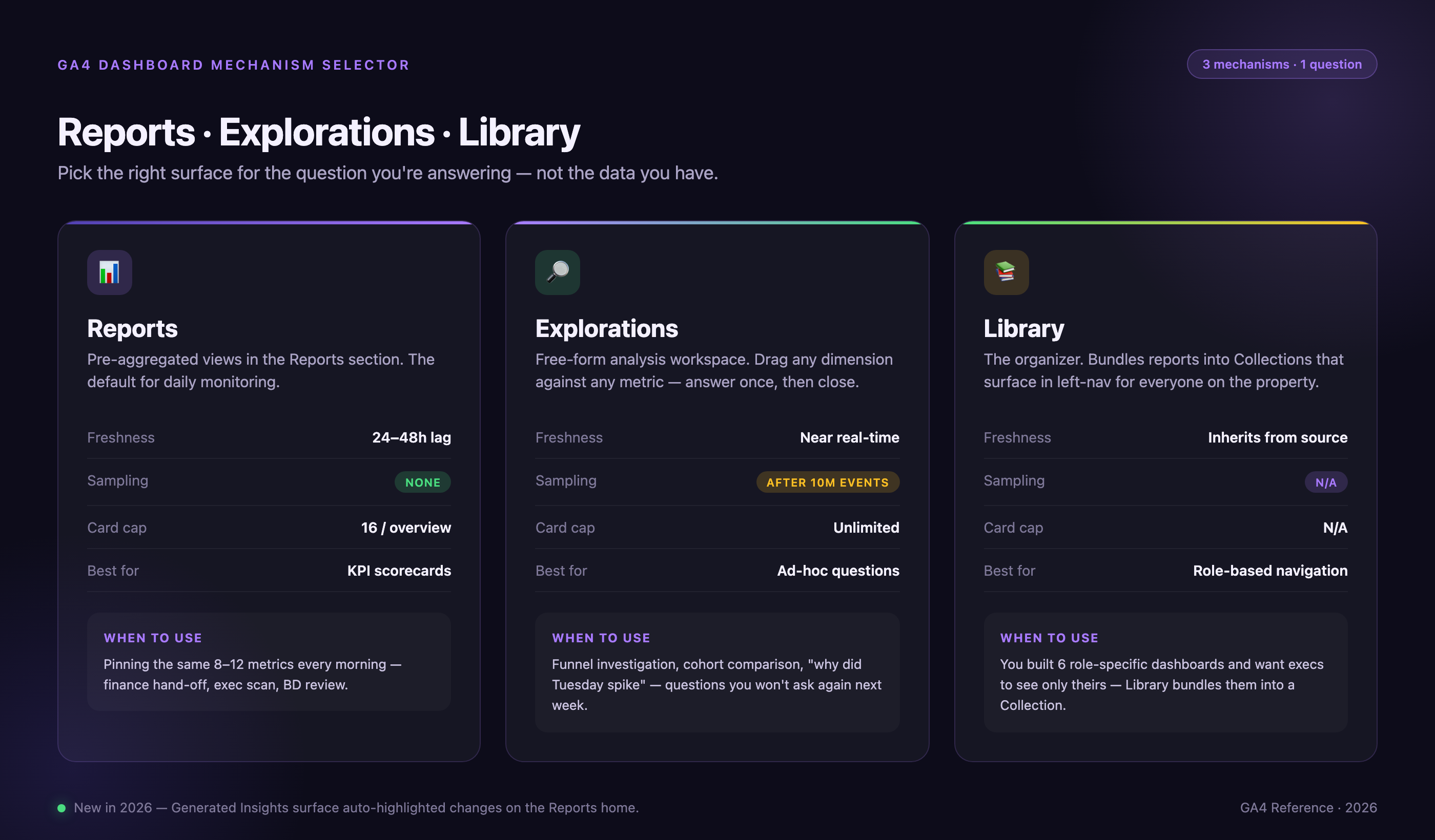
Choose based on your needs: Reports for daily monitoring (data lags 24-48 hours, no sampling), Explorations for ad-hoc analysis (real-time but samples after 10M events), Library for organizing role-specific dashboard collections. New in 2026: Generated Insights appear automatically on the Reports home page, highlighting top data changes since your last visit.
When to Use Default Reports Versus Custom Dashboards
If your KPIs match GA4's pre-built reports (Traffic Acquisition, Engagement, Monetization), use defaults—they auto-update when Google adds new dimensions or deprecates old ones. Build custom dashboards only when you need:
(1) Cross-report synthesis: combining acquisition + engagement + conversion in one view instead of switching between three reports.
(2) Non-standard KPIs: tracking SaaS trial starts instead of e-commerce purchases, or content engagement depth instead of page views.
(3) Role-specific views: hiding irrelevant metrics so executives see revenue trends without bot traffic diagnostics cluttering the interface.
(4) Audit trails: custom reports show who created/modified them; default reports don't log changes.
Custom dashboards require quarterly audits to verify event taxonomy hasn't changed—default reports handle this automatically. If 80% of your questions are answered by defaults, don't build custom.
Dashboard Refresh Strategy Matrix
The right dashboard type depends on your data volume and freshness requirements. This matrix shows which GA4 mechanism (or external tool) to use based on your traffic and latency tolerance:
| Data Freshness Need | 1-10M events/month | 10M+ events/month | 100M+ events/month | |
|---|---|---|---|---|
| Real-time (seconds) | Explorations (unsampled) | Explorations (likely sampled) | Data API + custom dashboard | BigQuery streaming + BI tool |
| Hourly | Explorations | Data API | BigQuery scheduled queries | BigQuery + incremental refresh |
| Daily | Reports (free) | Reports (free) | Reports or BigQuery | BigQuery batch export |
| Weekly/Monthly | Reports | Reports | Reports | Reports or BigQuery |
Cost implications: Reports and Explorations are free regardless of volume. For 100M+ events/month requiring unsampled historical analysis beyond 14 months, BigQuery export + BI tools cost $200-500/month in query fees but require engineering time.
Dashboard Review Cadence by Role
Different roles need different refresh frequencies. This table maps dashboard consumer role to optimal review patterns:
| Role | Dashboard Type | Review Frequency | Alert Setup | Collaboration Pattern |
|---|---|---|---|---|
| Executive | Strategic (5-7 KPIs) | Monthly | ±20% variance from goal | View-only + email summary |
| Manager | Tactical (10-12 metrics) | Weekly | ±15% week-over-week | View + comment access |
| Analyst | Operational (15-20 metrics) | Daily | Anomaly detection on key events | Edit access + version control |
| Ops/DevOps | Incident (3-5 technical metrics) | Real-time during incidents | Immediate Slack notification | API access for automation |
Daily dashboard reviews require 15-20 minutes per day—evaluate if decision frequency justifies attention cost. If you're checking a dashboard daily but only acting monthly, move to weekly reviews and set alerts for anomalies.
Which GA4 Dashboard Type Should You Build?
Before creating any dashboard, answer three questions to avoid the most common mistake—building the wrong type for your use case:
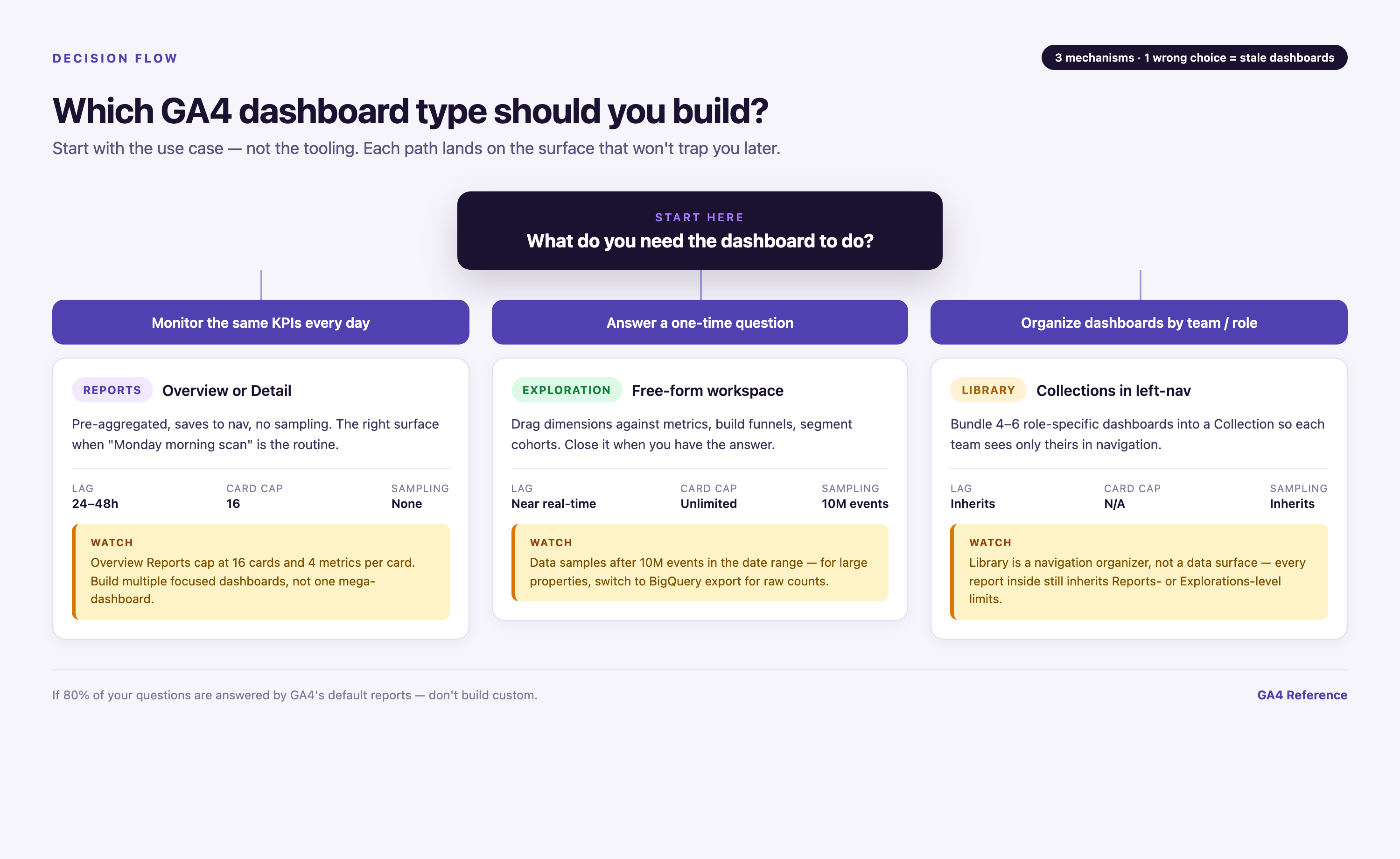
| If you need to... | Build this | Why | Technical Constraints |
|---|---|---|---|
| Monitor the same metrics every day | Reports (Overview or Detail) | Pre-aggregated data, no sampling, saves to navigation | 24-48h data lag; max 16 cards per Overview; handles high-cardinality dimensions better than Explorations |
| Answer a one-time question | Exploration | Flexible dimensions/segments, but data samples after 10M events | Near real-time but sampled >10M events in date range; doesn't save to Library; cardinality limits on custom dimensions |
| Blend GA4 with non-Google data | Looker Studio or Improvado | GA4 Reports and Explorations can't join external sources | Looker Studio: configurable refresh (15 min - 12 hrs); Improvado: sub-hour refresh with 1,000+ connectors |
| Track 1-4 summary metrics | Overview Report | Card-based layout, max 16 cards per report | 16-card cap prevents UI slowdown on high-traffic properties; 4 metrics per card max |
| Drill into granular dimensions | Detail Report | Table-based, sortable columns, filters | Same 24-48h lag and cardinality handling as Overview; better for row-level analysis |
| Need historical data >14 months | BigQuery export | GA4 free tier deletes data after 14 months | Unsampled forever; query costs ~$5/TB; requires SQL or BI tool; daily batch export only |
Common mistake: Building Explorations for daily monitoring. Explorations are designed for ad-hoc investigation, not recurring views—they sample data, don't save to your main navigation, and reset filters between sessions. Use Reports for metrics you check regularly.
When NOT to Build a GA4 Dashboard
GA4 dashboards fail in specific scenarios. This table shows when to use different tools instead:
| Scenario | Why GA4 Fails | Better Tool | Migration Complexity |
|---|---|---|---|
| Real-time revenue tracking | GA4 lags 24 hours | Stripe/Shopify dashboard | Low—native tools exist |
| User-level GDPR requests | GA4 aggregates data | BigQuery raw export | Medium—requires SQL |
| CRM activity tracking | GA4 web-only | Salesforce/HubSpot | Low—CRM has built-in reporting |
| Server errors/uptime | GA4 client-side only | Sentry/Datadog | Low—APM tools designed for this |
| 5-year trend analysis | 14-month retention limit | BigQuery export | High—must start before data expires |
| Offline conversions | GA4 lacks offline import | CRM with attribution | Medium—requires integration |
| C-suite 1-metric view | Dashboard login friction | Email automation | Low—scheduled reports work better |
Cross-Property Dashboard Consolidation Scenarios
Multi-property setups require different dashboard strategies. This table shows how to consolidate data from multiple GA4 properties:
| Business Model | GA4 Setup | Dashboard Tool | Refresh Cadence | Cost at 10M events/month |
|---|---|---|---|---|
| Single brand, multi-region | Roll-up property | GA4 Reports | 24-48 hours | Free |
| Multi-brand portfolio | Separate properties | Looker Studio blending | 12 hours | Free |
| Agency (50+ clients) | Property per client | Improvado + data warehouse | Custom pricing | |
| Franchise model | Property per location + roll-up | BigQuery + Looker | Daily batch | $200-400/month |
Key Metrics for Your GA4 Dashboard
The metrics you track depend on your business model and role. Here are the most common categories with common misconfiguration warnings:
| Metric + Definition | Best Dashboard For | Common Misconfiguration |
|---|---|---|
| Sessions, Users, New Users — Traffic volume by source/medium | Traffic Acquisition | Not filtering internal IP ranges inflates sessions by 15-40%; bot traffic counted in Sessions but not Engaged Sessions |
| Engagement Rate, Avg Engagement Time, Events per Session, Scroll Depth — User interaction depth | Engagement Overview | Auto-play videos trigger 10s engagement threshold artificially; scroll-triggered events fire on page load, inflating metrics |
| Key Events (Conversions), Conversion Rate, Event Count — Goal completions | Conversion Report | Marking 30 events as key events dilutes analysis—limit to 5-7 true business outcomes (form submits, purchases, signups) |
| Revenue, Transactions, Avg Order Value, Cart Abandonment — E-commerce outcomes | E-commerce Purchases | Multi-currency sites: GA4 converts to property currency at time of transaction; historical data not recalculated if exchange rates change |
| Page Views, Landing Page Performance, Exit Rate, Bounce Rate — Content performance | Landing Page Report | Page path includes query parameters by default (e.g., /product?id=123 counts as separate page); use Page Path + Query String dimension for full URL or strip parameters in data stream settings |
| Channel Grouping, First User Source, Campaign Performance — Attribution by marketing channel | Acquisition Overview | Default channel grouping misclassifies traffic without UTM tags as Direct; 30-50% of organic search shows as Direct if users bookmark pages or type URLs |
Custom dimensions and metrics integration: GA4 allows 50 custom dimensions per property (25 user-scoped, 25 event-scoped) and 50 custom metrics. Use custom dimensions for business-specific attributes not captured by default (e.g., customer tier, content category, product SKU). Reserve custom metrics for calculated values (e.g., profit margin, lead score). Avoid custom metrics if you can achieve the same result with calculated fields in Explorations—custom metrics consume your 50-metric limit permanently, while calculated fields are exploration-specific and don't count against quotas. Once you hit the 50-dimension limit, you must archive old dimensions (losing historical data) to add new ones.
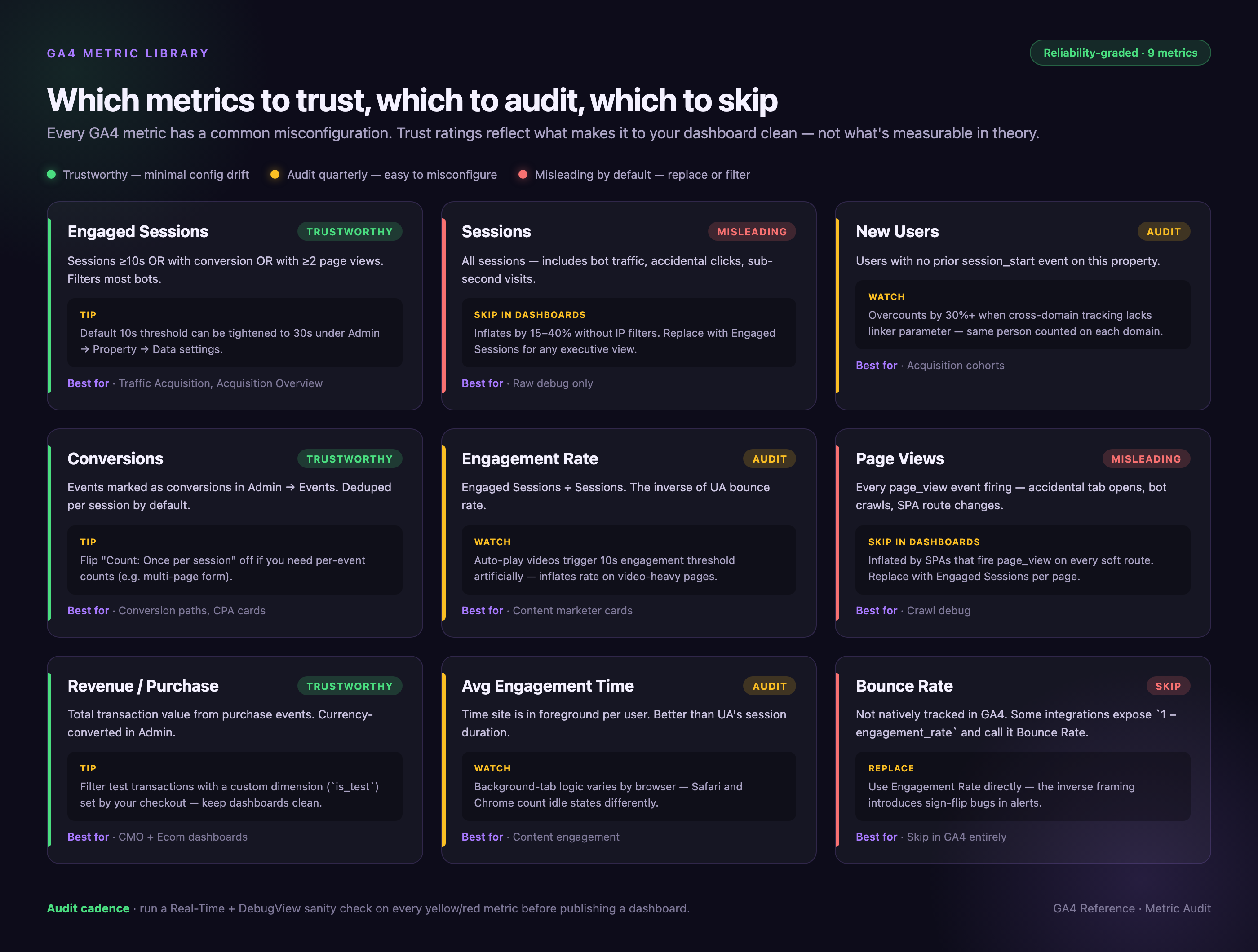
Metric Reliability Matrix
Not all GA4 metrics are reliable. This matrix scores common metrics on accuracy and provides audit tests:
| Metric | Reliability Score (0-100) | Primary Failure Mode | Audit Test | Replacement Metric |
|---|---|---|---|---|
| Sessions | 60 | Bot traffic included | Compare Sessions vs Engaged Sessions—if gap >30%, bots present | Engaged Sessions |
| Engagement Rate | 55 | Auto-play videos trigger threshold | Audit event taxonomy for video_start firing on page load | Manual engagement audits |
| New Users | 50 | Cookie deletion overcounts | Cross-verify with CRM new lead count—gap often exceeds 30% | CRM unique contacts |
| Page Views | 65 | SPAs break tracking | Compare GA4 page_view vs server logs for same period | Server-side page impressions |
| Scroll Depth | 50 | Fires on lazy load | Check event parameters—scroll % should not be 0 or 100 immediately | Time-qualified scroll (e.g., 75% after 30s) |
| Time on Page | 40 | Last page always = 0 seconds | Compare Avg Time on Page vs Avg Engagement Time per session | Avg Engagement Time |
| Direct Traffic | 45 | Misattributed organic/referral | Check UTM coverage report—if | Source/Medium with proper UTM tagging |
10 Role-Specific Dashboard Templates
Each template shows exact metric selections, card arrangements, and one metric to exclude. Build these as Overview Reports with 8-12 cards maximum.
Template 1: CMO Executive Dashboard
Metrics (6 cards):
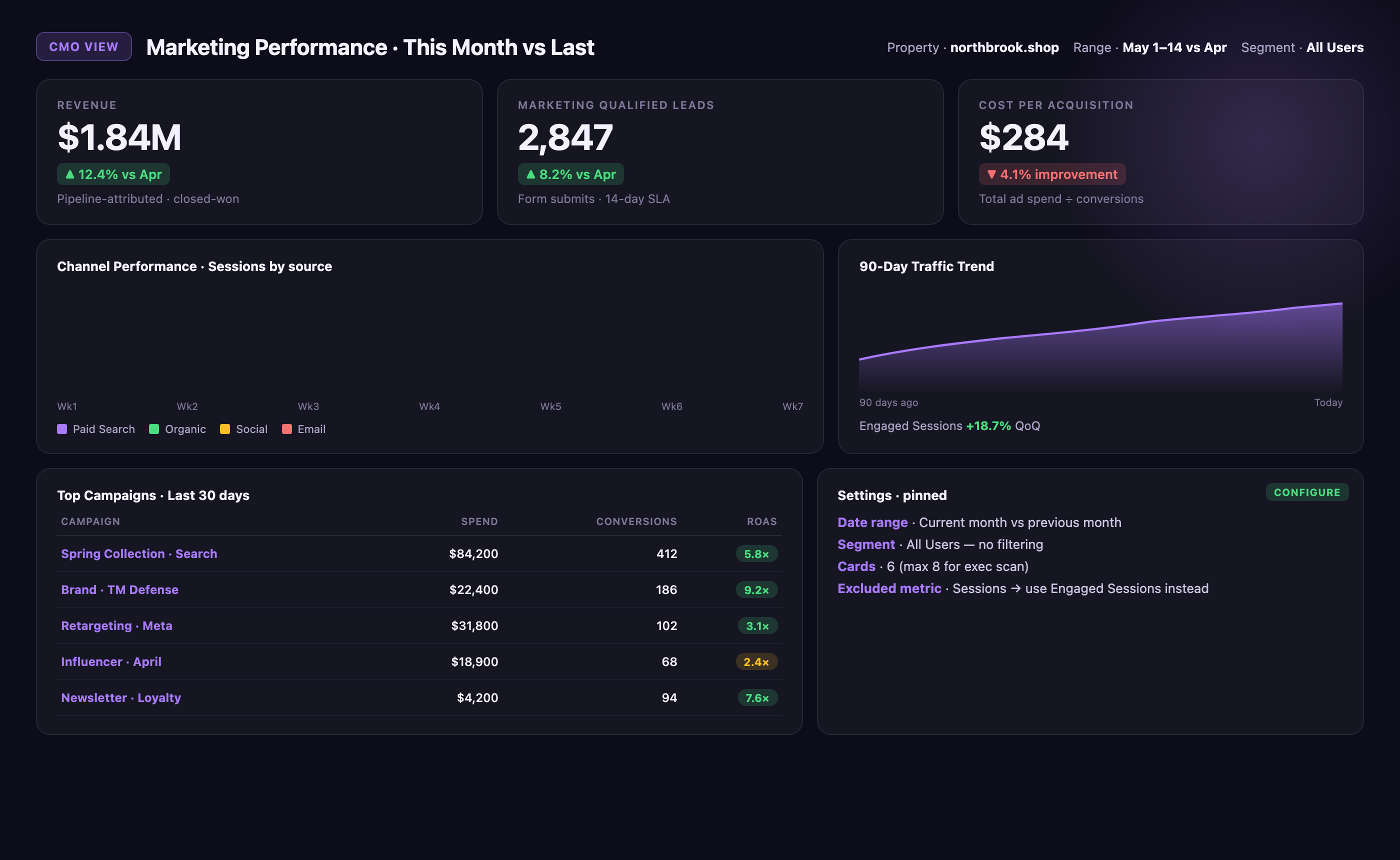
• Revenue (current month vs prior month, ±% change)
• Marketing Qualified Leads (MQLs from form submissions)
• Cost per Acquisition (total ad spend ÷ conversions)
• Channel Performance (stacked bar: Paid Search, Organic, Social, Email)
• Top Campaigns (table: campaign name, spend, ROAS)
• Website Traffic Trend (line chart: last 90 days)
Card arrangement: Revenue and MQLs in top-left (primary scan position), CPA top-right, channel performance center-left (largest card), campaigns and traffic bottom half.
Segments: All Users (no filtering—executives want total picture).
Date range: Current month vs previous month.
Red flag metric to exclude: Sessions—use Engaged Sessions instead to filter bot traffic that executives don't need to see.
Template 2: PPC Manager Dashboard
Metrics (10 cards):
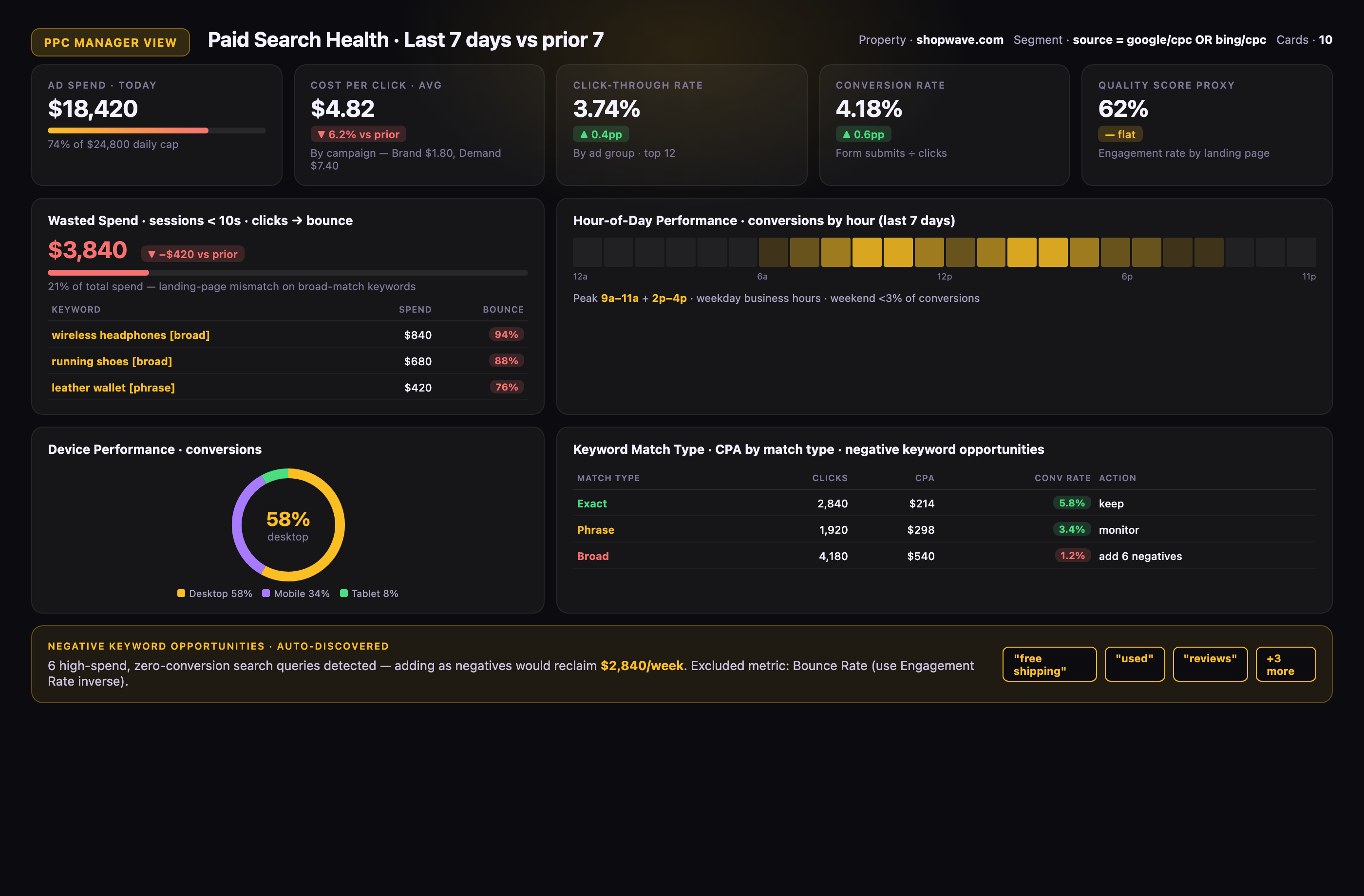
• Ad Spend (daily budget burn rate)
• Cost per Click (CPC by campaign)
• Click-through Rate (CTR by ad group)
• Conversion Rate (form submits ÷ clicks)
• Quality Score Proxy (engagement rate by landing page)
• Wasted Spend (clicks with <10s session duration)
• Device Performance (conversions by mobile/desktop/tablet)
• Hour-of-Day Performance (conversions by hour)
• Keyword Match Type Analysis (exact/phrase/broad performance)
• Negative Keyword Opportunities (high-spend, zero-conversion queries)
Card arrangement: Spend and CPC top row (budget monitoring), CTR and conversion rate second row (funnel health), wasted spend and device performance third row (optimization targets).
Segments: Paid Traffic (source = google / cpc OR source = bing / cpc).
Date range: Last 7 days vs previous 7 days.
Red flag metric to exclude: Bounce Rate—GA4 doesn't track this; use Engagement Rate inverse instead.
Template 3: Content Marketer Dashboard
Metrics (9 cards):

• Top Pages (by Engaged Sessions)
• Avg Engagement Time per Page
• Scroll Depth (% reaching 75%)
• Content Downloads (PDF, ebook key events)
• Social Referrals (traffic from social platforms)
• Internal Search Queries (site search terms)
• Content-to-Conversion Path (pages viewed before form submit)
• New vs Returning Readers (user type split)
• Newsletter Signups (key event count)
Card arrangement: Top pages and engagement time top row (content performance), scroll depth and downloads second row (engagement depth), social and search third row (discovery channels).
Segments: Organic Traffic + Social Traffic (exclude paid).
Date range: Last 30 days.
Red flag metric to exclude: Page Views—use Engaged Sessions per page to filter accidental clicks and bot crawls.
Template 4: E-commerce Manager Dashboard
Metrics (12 cards):
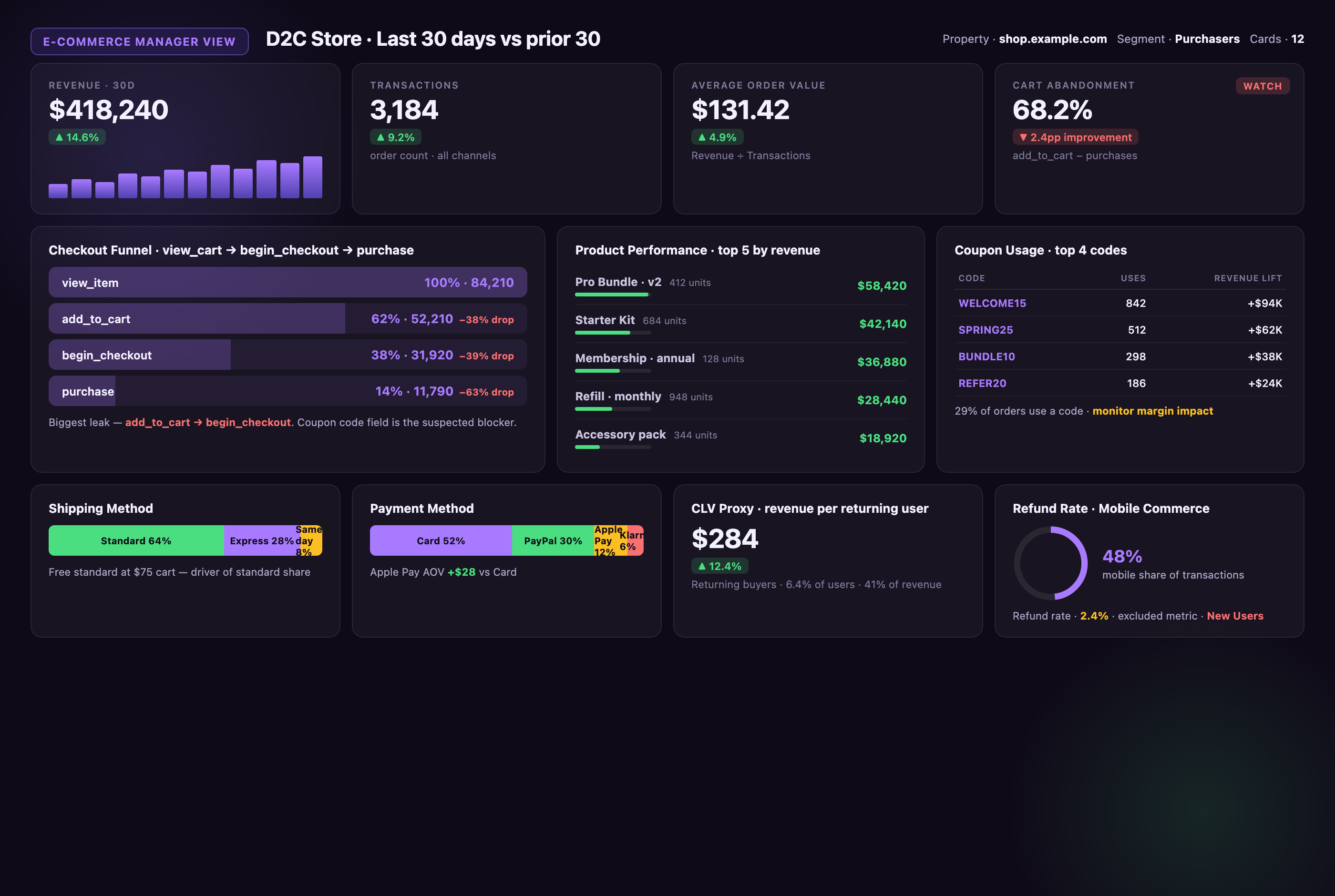
• Revenue (daily trend)
• Transactions (order count)
• Avg Order Value (revenue ÷ transactions)
• Cart Abandonment Rate (add_to_cart events - purchases)
• Product Performance (top 10 by revenue)
• Checkout Funnel (view_cart → begin_checkout → purchase)
• Coupon Usage (promo code redemptions)
• Shipping Method Selection (standard/express split)
• Payment Method (credit/PayPal/other)
• Customer Lifetime Value Proxy (revenue per returning user)
• Refund Rate (refund events ÷ purchases)
• Mobile Commerce Share (transactions by device)
Card arrangement: Revenue, transactions, AOV top row (primary KPIs), cart abandonment and product performance second row (optimization levers), funnel and checkout details bottom cards.
Segments: Purchasers (users who triggered purchase event).
Date range: Last 30 days vs previous 30 days.
Red flag metric to exclude: New Users—e-commerce cares about purchase behavior, not user novelty; track Returning Purchasers instead.
Template 5: SaaS Growth Lead Dashboard
Metrics (11 cards):
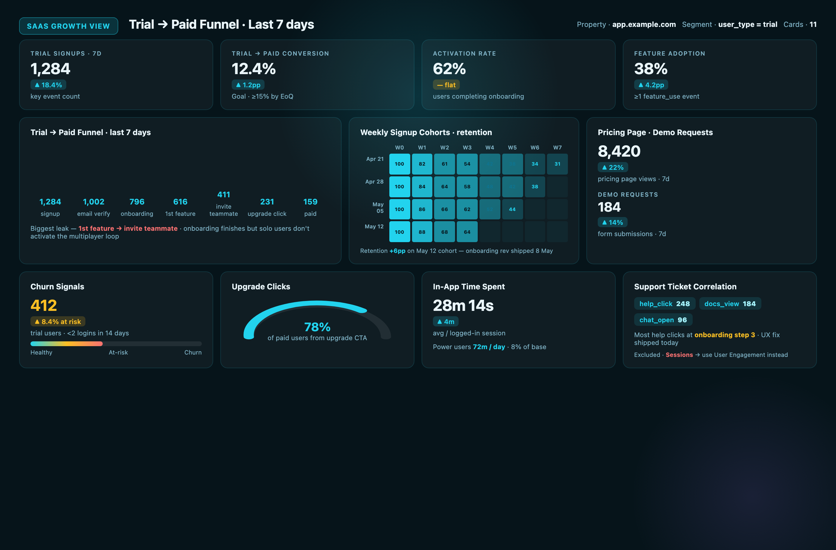
• Trial Signups (key event count)
• Trial-to-Paid Conversion Rate
• Activation Rate (users completing onboarding)
• Feature Adoption (% users triggering feature_use events)
• Churn Signals (users with <2 logins in 14 days)
• Pricing Page Views (traffic to /pricing)
• Demo Requests (form submissions)
• Upgrade Clicks (CTA clicks from free to paid)
• User Cohorts (weekly signup cohorts, retention view)
• In-App Time Spent (engagement time for logged-in users)
• Support Ticket Correlation (session_start events with help_click)
Card arrangement: Trial signups and conversion rate top row (top-of-funnel), activation and feature adoption second row (product engagement), churn signals and pricing views third row (revenue risk).
Segments: Trial Users (custom dimension: user_type = trial).
Date range: Last 7 days (SaaS moves fast).
Red flag metric to exclude: Sessions—SaaS tracks user-level behavior; use User Engagement instead of session aggregates.
Template 6: Agency Client Report Dashboard
Metrics (8 cards):
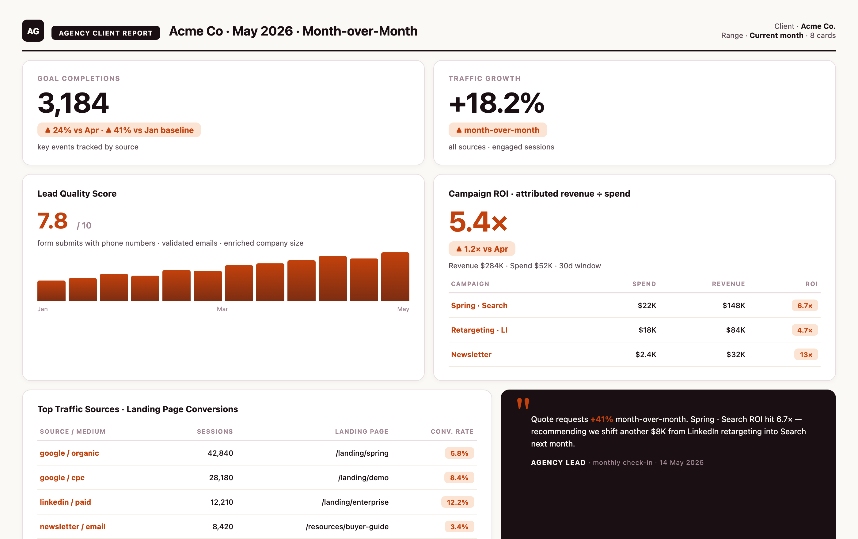
• Goal Completions (key events by source)
• Traffic Growth (month-over-month % change)
• Lead Quality Score (form submissions with phone numbers)
• Campaign ROI (revenue attributed to campaigns ÷ spend)
• Top Traffic Sources (source/medium table)
• Landing Page Conversions (conversion rate by landing page)
• Mobile vs Desktop Performance
• Client-Specific KPI (custom metric, e.g., quote requests)
Card arrangement: Goal completions and traffic growth top row (progress narrative), lead quality and ROI second row (value proof), sources and landing pages bottom row (tactical detail).
Segments: All Traffic (clients want full picture).
Date range: Current month.
Red flag metric to exclude: Time on Page—clients don't care about dwell time; focus on conversions.
Template 7: SEO Analyst Dashboard
Metrics (10 cards):
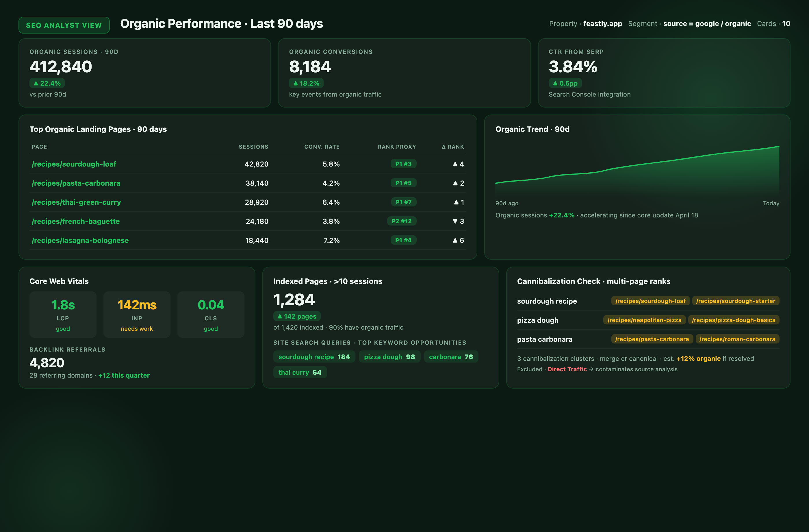
• Organic Sessions
• Organic Conversions (key events from organic traffic)
• Top Organic Landing Pages (sessions by page)
• Keyword Rankings Proxy (landing page performance trend)
• Core Web Vitals (from GA4 + Search Console integration)
• Click-Through Rate from SERP (Search Console data)
• Backlink Referrals (traffic from referring domains)
• Indexed Page Performance (pages with >10 sessions)
• Site Search Queries (internal search terms = keyword opportunities)
• Cannibalization Check (multiple pages ranking for same query)
Card arrangement: Organic sessions and conversions top row (outcomes), top pages and CTR second row (visibility), Core Web Vitals and backlinks third row (technical health).
Segments: Organic Traffic Only (source = google / organic).
Date range: Last 90 days (SEO changes show slowly).
Red flag metric to exclude: Direct Traffic—SEO analysts need clean organic attribution; Direct contaminates source analysis.
Template 8: Product Manager Dashboard
Metrics (9 cards):
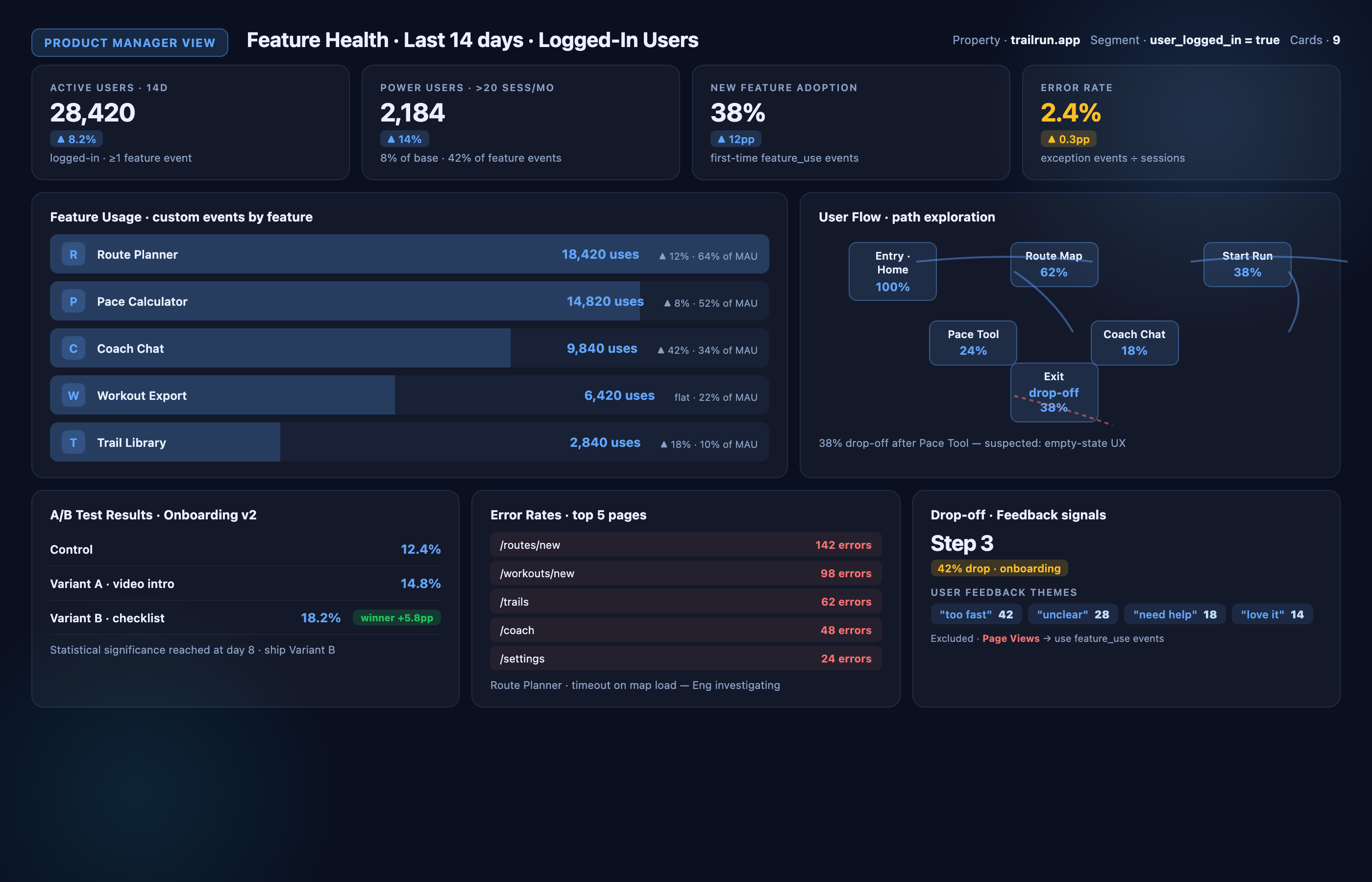
• Feature Usage (custom events by feature name)
• User Flows (path exploration: entry page → feature interaction → exit)
• Error Rates (exception events by page)
• A/B Test Results (conversion rate by experiment variant)
• User Feedback (survey_response events)
• Session Recordings Heatmap Proxy (scroll depth + click events)
• Power User Identification (users with >20 sessions/month)
• Drop-off Points (funnel abandonment by step)
• New Feature Adoption Rate (first-time feature_use events)
Card arrangement: Feature usage and user flows top row (engagement), error rates and A/B test results second row (quality), feedback and power users third row (insights).
Segments: Logged-In Users (custom dimension: user_logged_in = true).
Date range: Last 14 days.
Red flag metric to exclude: Page Views—product managers care about feature interactions, not page loads.
Template 9: CRO Specialist Dashboard
Metrics (11 cards):
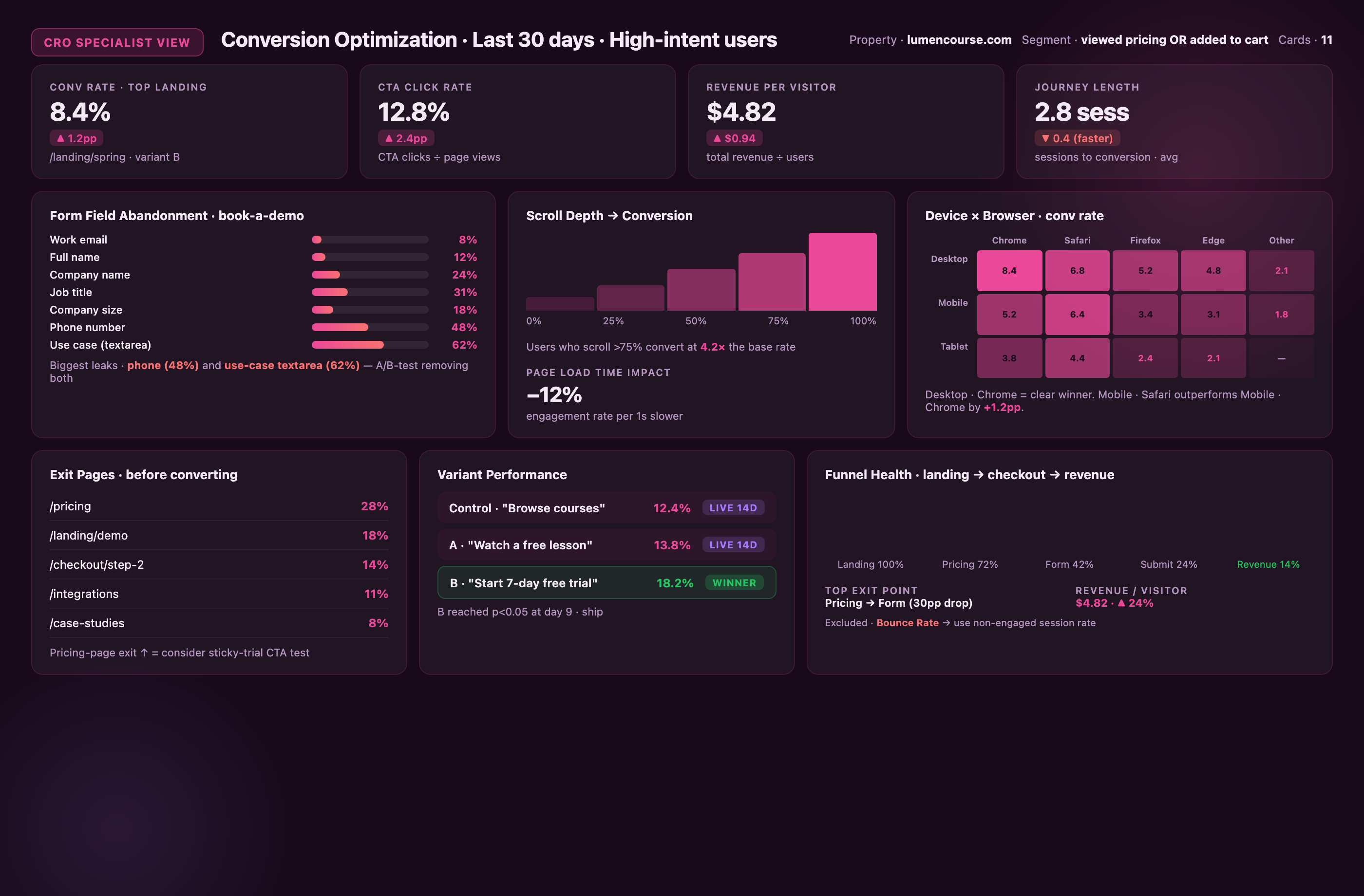
• Conversion Rate by Landing Page
• Form Field Abandonment (form_start - form_submit)
• CTA Click Rate (CTA clicks ÷ page views)
• Scroll Depth to Conversion Correlation
• Exit Pages (where users leave before converting)
• Device Conversion Rates (mobile vs desktop)
• Browser/OS Performance (conversion rate by browser)
• Page Load Time Impact (engagement rate by page speed bucket)
• Variant Performance (if running experiments)
• User Journey Length (sessions to conversion)
• Revenue per Visitor (total revenue ÷ users)
Card arrangement: Conversion rate and form abandonment top row (funnel health), CTA clicks and scroll depth second row (engagement levers), exit pages and device performance third row (friction points).
Segments: High-Intent Users (viewed pricing OR added to cart).
Date range: Last 30 days.
Red flag metric to exclude: Bounce Rate—doesn't exist in GA4; use non-engaged session rate instead.
Template 10: Executive Summary Dashboard
Metrics (5 cards only):
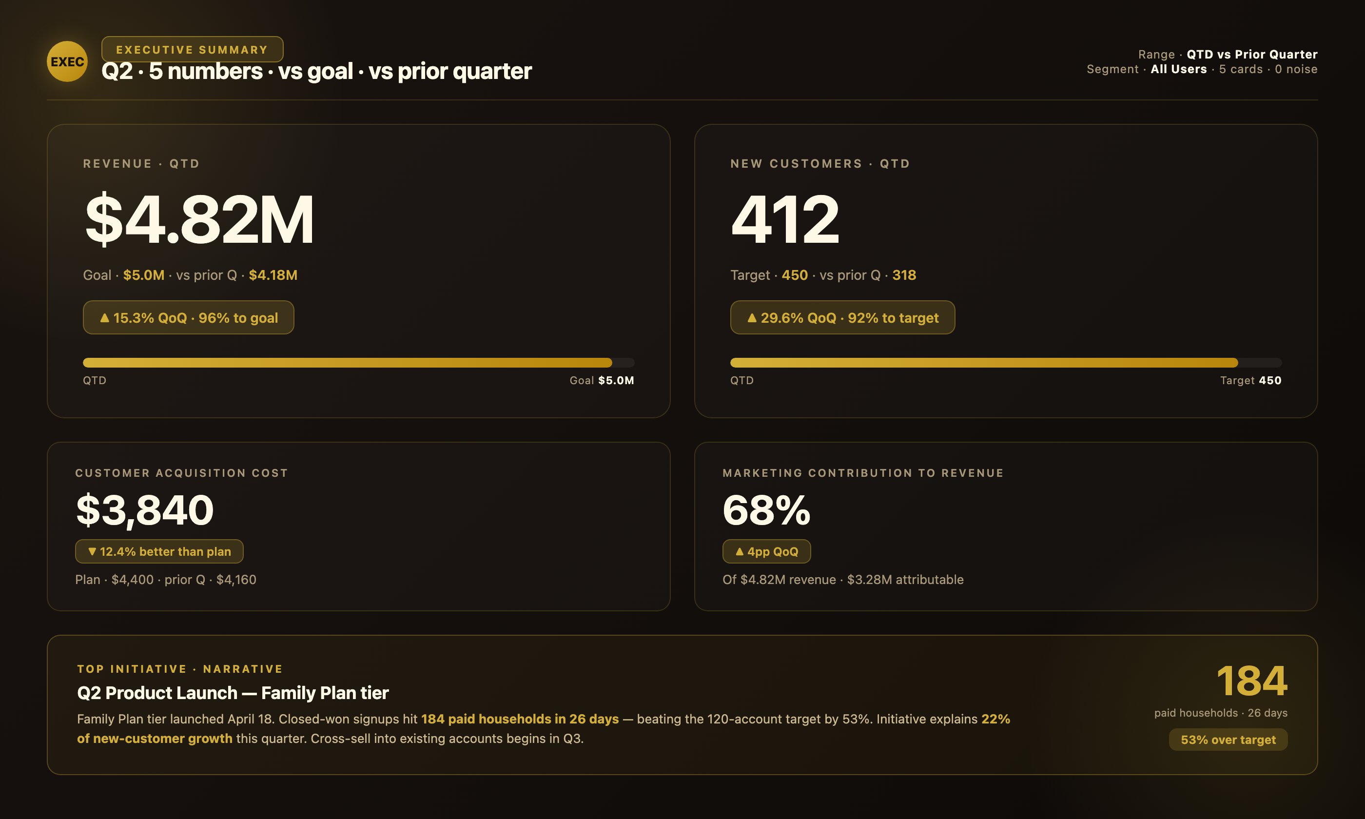
• Revenue (vs goal)
• New Customers (vs target)
• Customer Acquisition Cost
• Marketing Contribution to Revenue (%)
• Top Initiative Performance (1 custom metric, e.g., product launch signups)
Card arrangement: Revenue and new customers top row (large cards), CAC and marketing contribution second row, custom initiative bottom (storytelling card).
Segments: All Users.
Date range: Quarter-to-date vs previous quarter.
Red flag metric to exclude: Everything else—executives need 5 numbers, not 50.
Dashboard Audit Checklist
Use these 8 diagnostic questions to verify your dashboard is tracking reliable data:
☐ Do your event names include verbs? Event names like "click_cta" or "submit_form" are descriptive; "homepage" or "product_page" are page views masquerading as events and inflate engagement metrics.
☐ Have you verified engaged_session threshold fires correctly? Open an Incognito window, load your site, and wait exactly 9 seconds without scrolling or clicking. Check Real-Time report—if it shows an engaged session, your threshold is misconfigured (should require 10+ seconds).
☐ Does your New Users metric match CRM within 20%? Export 30 days of New Users from GA4 and compare to new lead/contact records in your CRM for the same period. If GA4 exceeds CRM by >30%, you have cookie deletion or cross-device overcounting.
☐ Have you excluded internal IP ranges? Admin → Data Streams → Configure tag settings → Show more → Define internal traffic → add your office/VPN IPs. Then Admin → Data Settings → Data Filters → activate Internal Traffic filter.
☐ Are you tracking <5 key events as conversions? More than 5-7 key events dilutes analysis. Audit: Admin → Events → mark key events. If you have 15+ marked, prioritize only top-funnel macro conversions (purchase, signup, qualified lead).
☐ Do your UTM parameters follow a naming convention? Inconsistent UTMs (e.g., "utm_source=fb" vs "utm_source=Facebook" vs "utm_source=facebook") create duplicate rows in acquisition reports. Document and enforce a taxonomy.
☐ Have you validated cross-domain tracking? If your site spans multiple domains (e.g., example.com and shop.example.com), users should maintain the same Client ID across domains. Check: GA4 DebugView → cross-domain click → verify session continues on new domain.
☐ Is your Engaged Sessions rate 40-70%? Below 40% suggests content-experience mismatch or bot traffic. Above 80% indicates events firing on page load (auto-play videos, scroll listeners at 0%) artificially inflating engagement.
Dashboard Data Mismatch Troubleshooting Flowchart
When your dashboard shows unexpected numbers, use this decision tree:
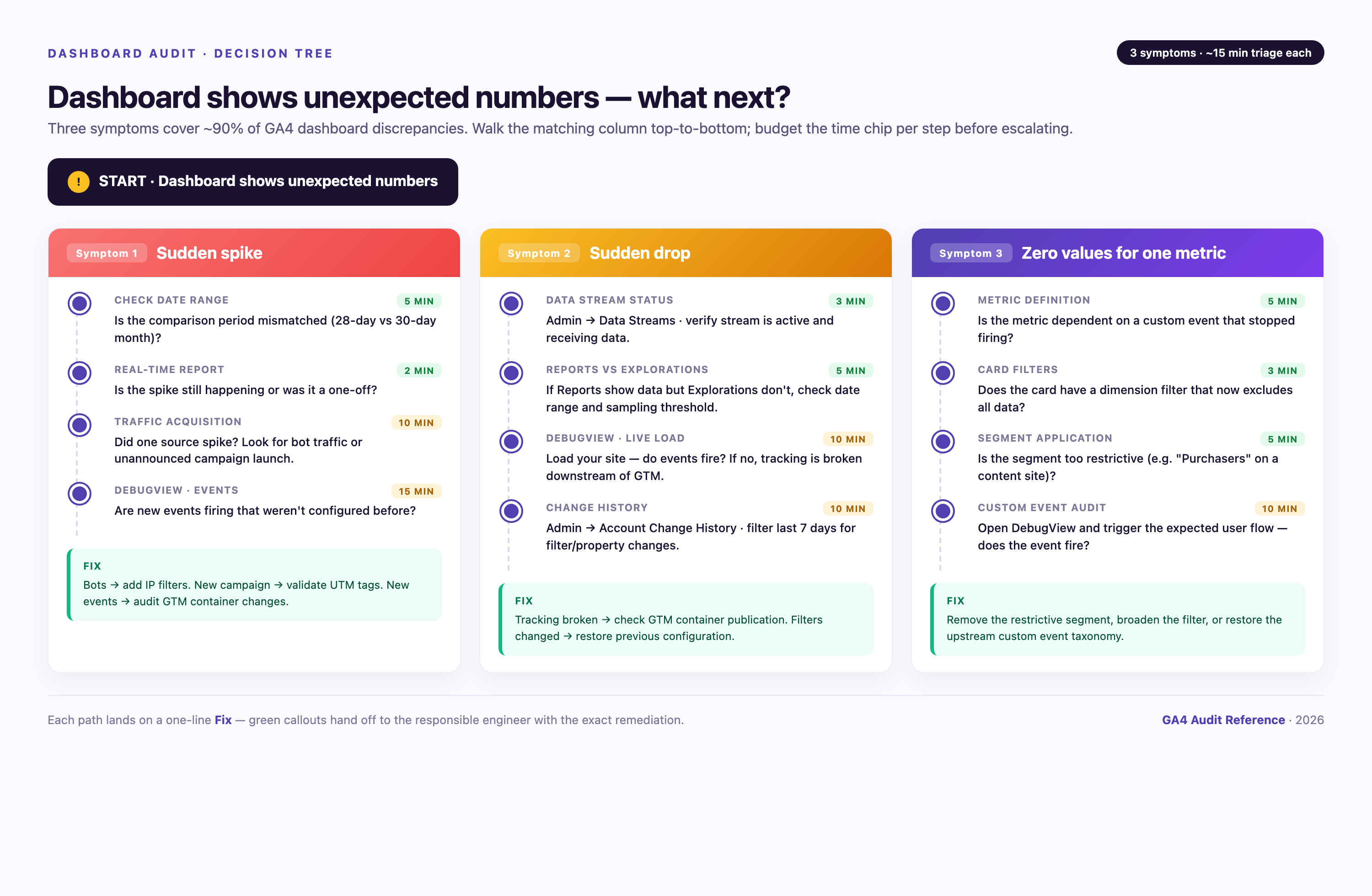
START: Dashboard shows unexpected numbers
Symptom 1: Sudden spike
→ Check date range: Is comparison period mismatched? (5 min)
→ Check Real-Time report: Is spike still happening or was it one-time? (2 min)
→ Inspect Traffic Acquisition: Did one source spike? Check for bot traffic or marketing campaign launch. (10 min)
→ Review Events in DebugView: Are new events firing that weren't configured before? (15 min)
FIX: If bot traffic, add IP filters. If campaign, validate UTM tags. If new events, audit GTM container changes.
Symptom 2: Sudden drop
→ Check data stream status: Admin → Data Streams → verify stream is active and receiving data. (3 min)
→ Compare Reports vs Explorations: If Reports show data but Explorations don't, check date range. (5 min)
→ Inspect DebugView: Load your site—do events fire? If no, tracking is broken. (10 min)
→ Review Recent Changes: Admin → Account Change History → filter last 7 days for filter/property changes. (10 min)
FIX: If tracking broken, check GTM container publication. If filters changed, restore previous configuration.
Symptom 3: Zero values for specific metric
→ Check metric definition: Is metric dependent on custom event that stopped firing? (5 min)
→ Check card filters: Does card have dimension filter that excludes all data? (3 min)
→ Check segment application: Is segment too restrictive (e.g., 'Purchasers' on content site with no e-commerce)? (5 min)
FIX: Remove restrictive filters or segments. Verify custom events in DebugView.
Symptom 4: Numbers don't match CRM/ad platform
→ Check attribution window: GA4 uses 90-day default; ad platforms use 1-7 days. (5 min)
→ Check conversion counting: GA4 counts all instances; Facebook counts unique users. (10 min)
→ Check timezone: Property timezone vs ad account timezone mismatch shifts date boundaries. (3 min)
→ Check sampling: Yellow triangle in Exploration? Sampled data won't match unsampled sources. (2 min)
FIX: Document attribution methodology. Accept 10-20% variance as normal. For exact matching, export raw data to warehouse.
Symptom 5: Historical data changed
→ Check data retention settings: Admin → Data Settings → Data Retention → verify still set to 14 months. (3 min)
→ Check if property was deleted and recreated: Historical data is lost if property was removed. (5 min)
FIX: If retention changed, data is permanently deleted. Start BigQuery export immediately to prevent future loss.
Why Your Dashboard Shows Different Numbers Than Other Tools
Cross-platform discrepancies are the #1 stakeholder complaint. Here's how to reconcile:
GA4 vs Google Ads
Issue: Conversion counts don't match.
Reason: Google Ads uses last-click attribution within 30 days; GA4 uses data-driven attribution across 90 days.
Reconciliation formula: Filter GA4 conversions to source = google / cpc AND attribution model = last click AND date range = 30 days. Numbers should align within 5%.
GA4 vs Facebook Ads
Issue: Facebook shows more conversions.
Reason: Facebook counts 1-day click + 1-day view attribution by default; GA4 counts 90-day click, no view-through.
Reconciliation formula: Accept 20-40% variance. Facebook includes view-through conversions (user saw ad, didn't click, later converted). GA4 doesn't count these unless you enable User-ID tracking.
GA4 vs Salesforce
Issue: Lead counts differ.
Reason: GA4 counts form submissions at the moment event fires; Salesforce counts leads at CRM record creation (may happen hours later after validation).
Reconciliation formula: GA4 form_submit events ≥ Salesforce new leads. Subtract test submissions and spam to reconcile.
GA4 vs Shopify
Issue: Transaction times don't match.
Reason: Shopify records order timestamp when customer clicks "Place Order"; GA4 fires purchase event when confirmation page loads (may be 2-10 seconds later).
Reconciliation formula: Group by date (not hour) to reconcile. Daily totals should match within 2%.
GA4 vs Google Search Console
Issue: Clicks in Search Console exceed Sessions in GA4.
Reason: Search Console counts all clicks including those from users with JavaScript disabled, bots, or users who bounced before GA4 loaded.
Reconciliation formula: Search Console clicks ≥ GA4 organic sessions. Expect 10-15% higher click count in Search Console.
How to Build a Custom Dashboard in GA4 (Step-by-Step)
GA4 offers three methods for building custom dashboards. Choose based on your reporting needs:
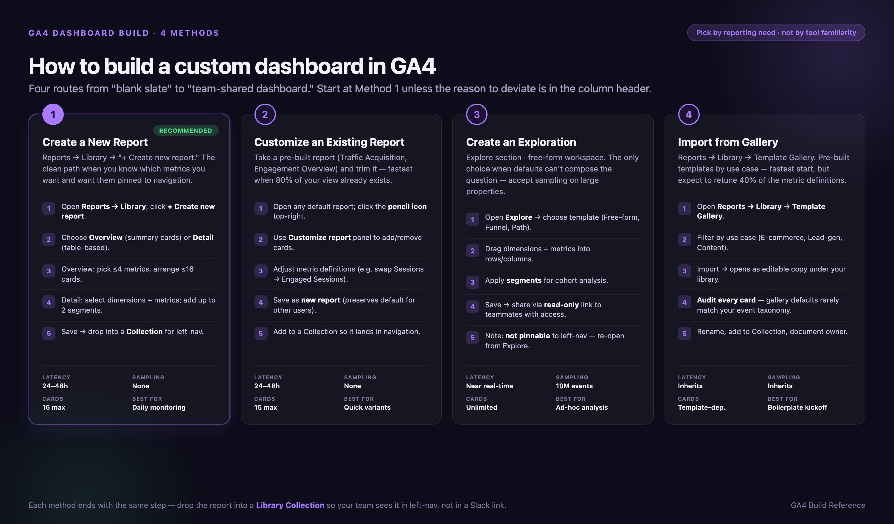
Method 1: Create a New Report
• Navigate to Reports → Library in the left sidebar.
• Click "+ Create new report" and select either "Create overview report" (summary cards) or "Create detail report" (table-based).
• For overview reports: choose up to 4 metrics and arrange up to 16 summary cards.
• For detail reports: select dimensions (e.g., source/medium, page path) and metrics (e.g., sessions, conversions).
• Add segments (optional): Click + Compare at top of report → Add segment → Choose predefined (e.g., Mobile traffic, Purchasers) or create custom (e.g., Users who viewed pricing page). Segments apply to entire report; filters apply to specific cards.
• Save and name your report.
• To add it to your navigation: go to Library → Collections → Edit, create a new topic header, and drag your report under it. It will now appear in all users' left navigation automatically.
Method 2: Customize an Existing Report
• Go to Reports and open any default report (e.g., Traffic acquisition, Engagement).
• Click the pencil icon (Edit) in the top-right corner.
• Add or remove cards, change metrics, adjust dimensions.
• Click Save → Save changes to current report (overwrites default) OR Save as new report (creates copy).
• If you save as new, go to Library to add it to a collection so it appears in navigation.
Pro tip: Never overwrite default reports. Always "Save as new" so you can restore defaults if customization breaks.
Method 3: Create an Exploration
• Click Explore in left sidebar.
• Choose a template: Free-form, Funnel exploration, Path exploration, Segment overlap, Cohort exploration, User lifetime.
• Drag dimensions (e.g., Source / Medium) to Rows and metrics (e.g., Sessions) to Values.
• Add segments or filters in the right panel.
• Explorations don't save to Library—they live in the Explore section only. Share via Share this exploration button (generates link).
Common mistake: Using Explorations for daily monitoring. Build a Report instead—Explorations reset filters between sessions and sample data over 10M events.
Method 4: Import from Gallery
• Go to Reports → Library.
• Scroll to bottom and click "Import from Gallery".
• Browse templates: Google provides pre-built reports for e-commerce, lead generation, and publishers.
• Select a template and click Import.
• Customize the imported report by clicking the pencil icon.
Best use: Starting point for complex dashboards. Import, then modify metrics to match your business model.
How to Share and Import GA4 Dashboards
GA4 dashboards are shared via Library Collections. When you add a custom report to a collection, it appears automatically in all users' navigation—no per-user customization needed.
Sharing Reports with Your Team
• Go to Reports → Library.
• Under Your Library, find the report you want to share.
• Click Collections → Edit.
• Create a new collection (e.g., "Marketing Team Dashboards") or add to existing.
• Drag your custom report into the collection.
• All users with access to the property will now see this report in their left navigation under the collection name.
Access control: To control who can edit reports, go to Admin → Property Access Management and assign roles:
• Viewer: Can view reports but not edit.
• Analyst: Can create Explorations and custom reports.
• Editor: Can modify reports and change property settings.
• Administrator: Full access including user management.
Exporting Dashboards
GA4 doesn't support exporting dashboard configurations as JSON or XML. To replicate a dashboard across properties:
• Document the configuration: screenshot each card, note dimensions/metrics/filters.
• Manually rebuild in target property.
• Use GA4 Management API to script report creation (requires developer resources).
Alternative Dashboard Platforms
Native GA4 dashboards have limitations (no multi-source blending, 14-month retention, sampling). Third-party tools address these gaps:
| Platform | Best For | Key Features | Pricing |
|---|---|---|---|
| Improvado | Enterprise teams blending 10+ sources | 1,000+ connectors, Marketing Data Governance with 250+ pre-built rules, 2-year historical preservation on schema changes, sub-hour refresh, AI Agent for conversational analytics | Custom pricing |
| Looker Studio | Google ecosystem teams, budget-conscious | Free, 850+ partner connectors, native Google integrations, drag-and-drop customization | Free |
| Databox | Small teams, mobile dashboard access | Pre-built templates, mobile app, goal tracking, automated alerts | Free tier, paid from $47/month |
| DashThis | Agencies managing multiple clients | White-label reports, automated client delivery, 34 integrations | From $39/month |
| Supermetrics | Teams using Google Sheets or Excel | Data connector for Sheets/Excel, scheduled refreshes, 100+ sources | From $19/month |
When to use external tools: If you need to combine GA4 with CRM data (Salesforce, HubSpot), ad platforms (Facebook, LinkedIn), or e-commerce (Shopify, WooCommerce) in one dashboard, native GA4 can't blend these sources. Looker Studio works for small datasets; Improvado handles enterprise scale with governance (limitation: requires initial setup time for connector configuration).
Dashboard Governance for Teams
When multiple users create dashboards, configuration drift and abandoned reports create clutter. Implement these governance rules:
Assign Report Owners
Every custom report should have a documented owner responsible for:
• Quarterly audits (verify metrics still align with business goals)
• Event taxonomy updates (when tracking changes, update dashboard)
• Access control (who can view/edit)
• Deprecation decisions (when to sunset unused reports)
Document ownership in a shared spreadsheet: Report Name | Owner | Last Audit Date | Status (Active/Deprecated).
Enforce Naming Conventions
Use this format: [Team] - [Purpose] - [Date Created]
Examples:
• Marketing - Weekly Campaign Performance - 2026-03
• Sales - Lead Quality Dashboard - 2026-01
• Executive - Monthly KPI Summary - 2025-12
Naming conventions prevent "Dashboard Copy 3" and "New Report (1)" clutter in Library.
Version Control for Dashboards
GA4 doesn't track configuration changes. Use this manual versioning workflow:
Step 1: Export configuration as JSON
Use GA4 Management API to export report configuration:
curl -H "Authorization: Bearer YOUR_ACCESS_TOKEN" \
https://analyticsadmin.googleapis.com/v1beta/properties/YOUR_PROPERTY_ID/customDimensions
Step 2: Commit to Git
Save JSON output to Git repository with commit message:
git commit -m "Updated CMO dashboard: added Revenue by Channel card, removed Sessions metric"
Step 3: Automate weekly exports
Python script for automated backups:
import requests
import json
import os
from datetime import datetime

PROPERTY_ID = "YOUR_PROPERTY_ID"
ACCESS_TOKEN = os.getenv("GA4_ACCESS_TOKEN")

url = f"https://analyticsadmin.googleapis.com/v1beta/properties/{PROPERTY_ID}/customDimensions"
headers = {"Authorization": f"Bearer {ACCESS_TOKEN}"}

response = requests.get(url, headers=headers)
config = response.json()

timestamp = datetime.now().strftime("%Y-%m-%d")
filename = f"ga4_config_backup_{timestamp}.json"

with open(filename, "w") as f:
    json.dump(config, f, indent=2)

print(f"Backup saved: {filename}")
When configuration drift occurs (dashboard shows unexpected data), diff JSON files to identify which metrics or filters changed.
Quarterly Dashboard Audit Process
Every 90 days, audit all custom dashboards:
Week 1: Usage audit
• Export GA4 Admin audit log (Admin → Account → Account Change History).
• Identify reports not accessed in 90+ days.
• Email report owners: "Dashboard X hasn't been accessed since [date]. Archive or keep?"
Week 2: Metric validation
• Review each dashboard's key events—do they still fire?
• Check DebugView for each tracked event.
• Verify custom dimensions haven't hit 50-limit quota (forcing archival of old dimensions that dashboard relies on).
Week 3: Stakeholder interviews
• Ask dashboard consumers: "Does this dashboard answer your top 3 questions?"
• If no: redesign. If yes: document and preserve.
Week 4: Documentation update
• Update governance spreadsheet with audit results.
• Archive unused dashboards (don't delete—move to "Archived Dashboards" collection).
5 Dashboard Configurations That Break at Scale
These configurations work on low-traffic sites but fail at enterprise scale:
1. Mega-Dashboard with 30+ Cards
Symptom: Dashboard takes 20+ seconds to load, times out on mobile.
Why it breaks: GA4 Overview Reports cap at 16 cards for performance reasons. Creating multiple single-card reports then combining them in Library bypasses the limit but causes UI slowdown—each card queries GA4 API separately.
Fix: Build 3-4 focused dashboards (Acquisition, Engagement, Conversion) instead of one omnibus view. Executives get 5-card summary, analysts get detailed views.
2. Real-Time Exploration as Daily Dashboard
Symptom: Data changes between sessions, filters reset, team complains numbers don't match.
Why it breaks: Explorations sample data after 10M events in selected date range. Real-time queries on high-traffic sites trigger sampling, making comparisons unreliable.
Fix: Use Reports for daily monitoring (24-48h lag but unsampled). Reserve Explorations for ad-hoc investigation.
3. 50 Custom Dimensions in One Report
Symptom: Report loads but shows (other) for 80% of rows.
Why it breaks: GA4 enforces cardinality limits—high-cardinality dimensions (e.g., User ID, Product SKU with 10K+ variants) trigger data aggregation into (other) bucket.
Fix: Limit to 5-7 dimensions per report. For detailed SKU analysis, export to BigQuery.
4. Unfiltered Internal Traffic
Symptom: Engagement metrics 2x higher than industry benchmarks, New Users count includes team logins.
Why it breaks: Without IP filtering, employee traffic (QA, content reviews, dev testing) contaminates production data. On small sites, internal traffic can be 30-50% of total.
Fix: Admin → Data Streams → Configure tag settings → Define internal traffic → add IP ranges → Admin → Data Settings → Data Filters → activate Internal Traffic filter.
5. Cross-Domain Tracking Without Linker Parameter
Symptom: Users appear as new sessions when moving from example.com to shop.example.com, attribution breaks.
Why it breaks: GA4 Client ID is domain-specific by default. Without linker parameter, cross-domain clicks start new sessions with new Client IDs, fragmenting user journeys.
Fix: Enable cross-domain tracking in GTM: GA4 Configuration tag → More Settings → Configure your domains → add all domains → enable "Pass link parameters in URL" → test with DebugView.
Conclusion
Building effective GA4 dashboards requires understanding when to use Reports (daily monitoring, no sampling), Explorations (ad-hoc analysis), or external tools (multi-source blending). The 10 role-specific templates in this guide show exact metric selections proven to work for CMOs, PPC managers, content marketers, and seven other roles—copy these configurations to avoid trial-and-error.
The Metric Reliability Matrix reveals which metrics mislead (Sessions includes bots, New Users overcounts by 30%+, Engagement Rate is gamed by auto-play videos) and provides audit tests you can run today to verify data quality. When dashboards show unexpected numbers, use the troubleshooting flowchart to diagnose mismatches in 5-30 minutes—checking for sampling (yellow triangle), date range misalignment (Reports lag 24-48h), or attribution model differences (GA4 vs ad platforms).
Three critical mistakes break dashboards at scale: building mega-dashboards with 30+ cards (causes UI slowdown—split into focused views), using Explorations for daily monitoring (data samples and filters reset—use Reports instead), and not filtering internal traffic (inflates engagement by 30-50%—add IP filters immediately). Implement quarterly dashboard audits to identify unused reports, validate event taxonomy, and prevent configuration drift.
For teams managing 10+ data sources beyond GA4, Improvado provides 1,000+ connectors with Marketing Data Governance (250+ pre-built rules) and 2-year historical preservation when connector schemas change—eliminating the manual fixes required when Google deprecates API fields (limitation: requires initial setup time for connector configuration). Start with native GA4 Reports for single-source dashboards, add Looker Studio when you need basic multi-source blending, and upgrade to Improvado when governance and historical continuity become non-negotiable.