
Aggregate metrics like monthly active users or total sign-ups hide more than they reveal. They describe volume, not behavior.
A growth spike can look healthy on the surface while masking poor retention, weak activation, or low lifetime value. Without understanding how users behave after acquisition, teams risk optimizing for short-term gains instead of durable growth.
Cohort analysis solves this problem by shifting the focus from totals to trajectories. It groups users by shared attributes and tracks how each group performs over time. This makes it possible to see where users drop off, which cohorts retain or monetize best, and how product or marketing changes affect long-term outcomes.
In this guide, we explain how to use cohort analysis to diagnose churn, evaluate channel quality, and make decisions based on lifecycle performance rather than surface-level metrics.
Key Takeaways
- Understand user behavior: Cohort analysis groups users by shared traits (like sign-up date) to track their behavior over time, providing deeper insights than aggregate metrics.
- Reduce churn and improve retention: By identifying when users disengage, you can implement targeted strategies to improve the customer experience and boost retention rates.
- Optimize marketing spend: Analyze which acquisition channels or campaigns bring in the most loyal, high-value users, allowing you to double down on what works.
- Make data-driven decisions: Use cohort data to validate hypotheses, measure the impact of new features, and understand the long-term health of your product or service.
- Tools matter: While tools like Google Analytics offer basic cohort reports, advanced analysis often requires platforms that can unify data from multiple sources, like Improvado, to get a complete picture.
Quick answer
Cohort analysis is a subset of behavioral analytics that groups users by shared characteristics (like sign-up date or acquisition channel) and tracks their behavior over time. Instead of viewing all users as one undifferentiated group, it isolates specific segments to reveal retention patterns, churn drivers, and the long-term impact of product or marketing changes on user lifecycle performance.
What Is Cohort Analysis?
Cohort analysis is a subset of behavioral analytics that breaks down data by taking a specific group of users – a cohort – and tracking them over time.
Instead of looking at all users as one massive, undifferentiated group, it lets you observe how different segments of people who share a common characteristic behave throughout their customer lifecycle. In business analytics, this characteristic is often a time-based event.
For example, all users who signed up for your SaaS product in the first week of January form one cohort. Another cohort might be all customers who made their first purchase during a Black Friday sale. The key is that they all experienced the same event at the same time.
Why does it matter for understanding user behavior?
By isolating and comparing different cohorts, you can see how changes in your business impact user behavior.
Did the cohort acquired after your new onboarding flow was launched have a higher retention rate than the one before it?
Do users acquired through Google Ads retain better than those from Facebook campaigns?
This method helps you move from correlation to causation. Instead of just seeing that your overall churn rate went down, you can pinpoint the specific marketing campaign or product update that led to a more engaged and loyal user base.
The Core Benefits of Cohort Analysis
Integrating cohort analysis into your analytics workflow provides powerful advantages that directly impact your bottom line and strategic planning.
Understand and Improve User Retention
This is the primary benefit.
A cohort chart visually displays user retention over time, showing the percentage of users from each cohort who remain active week after week or month after month.
This helps you identify critical drop-off points in the user journey and develop strategies to improve the customer experience at those specific stages.
Pinpoint Drivers of Customer Churn
By comparing cohorts, you can identify what drives users away.
For instance, if you notice a cohort from a specific month churns much faster than others, you can investigate what happened during that time. Was there a critical bug, a confusing feature release, or a change in pricing?
Cohort analysis gives you the clues to diagnose and fix the root causes of churn.
Measure and Optimize Marketing Campaign Effectiveness
Not all user acquisition channels are created equal. A campaign might drive thousands of sign-ups, but if those users churn within a month, the return on investment is poor.
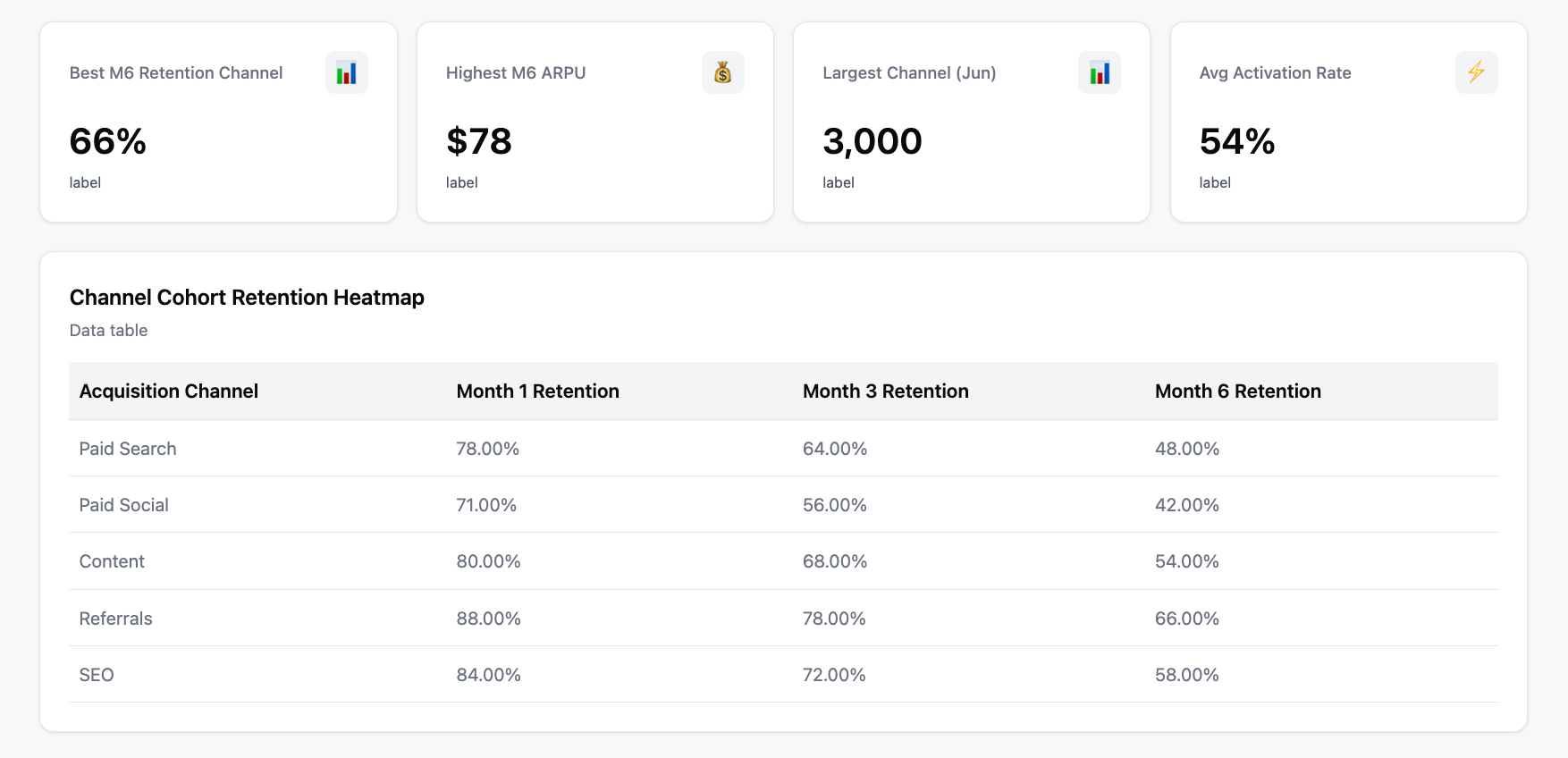
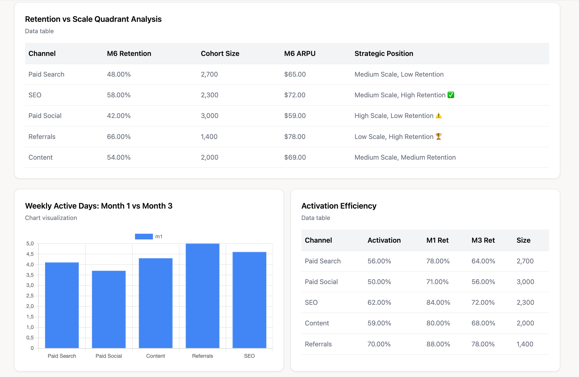
By creating cohorts based on acquisition source, you can analyze which campaigns deliver users with the highest long-term retention and customer lifetime value (CLV), allowing you to optimize your marketing spend for quality, not just quantity.
Improve Customer Lifetime Value (CLV)
Higher retention directly translates to a higher CLV. Cohort analysis allows you to see how different user groups monetize over time.
By understanding which cohorts are most valuable, you can tailor your marketing and product efforts to attract and retain more of these high-value customers.
Make Data-Driven Product Decisions
Product teams can use cohort analysis to measure the impact of their work.
For example, you can compare the retention of a cohort that experienced a new onboarding process against a cohort that didn't. This provides clear, quantitative evidence of whether a new feature or user experience improvement was successful, guiding the future product roadmap with real data.
Key Types of Cohorts Explained with Examples
Cohorts can be defined by various characteristics. The two most common types are acquisition and behavioral cohorts, but several others can provide valuable insights.
Acquisition Cohorts (Based on sign-up date)
This is the most common type of cohort. Users are grouped by when they first signed up, made a purchase, or downloaded your app.
This is excellent for tracking how user retention changes over time and correlating it with your marketing and product initiatives.
Example: You create monthly acquisition cohorts for your SaaS product. By comparing the January 2026 cohort to the February 2026 cohort, you can see if users who joined in February are sticking around longer, perhaps due to a new marketing campaign or product update launched that month.
Behavioral Cohorts (Based on actions taken)
These cohorts group users based on specific actions they have (or have not) taken within your product or website during a given time period. This is incredibly powerful for understanding which user actions correlate with long-term retention.
Example: In a mobile gaming app, you could create two behavioral cohorts: users who made an in-app purchase in their first week versus users who did not. Analyzing the long-term retention of these two groups will likely show that the purchasing cohort is significantly more engaged.
Time-Based Cohorts
While often used interchangeably with acquisition cohorts, time-based cohorts focus on grouping users based on the timing of a specific interaction or event.
This allows businesses to understand how user behavior evolves over different time frames, such as weekly, monthly, or quarterly. It's particularly useful for tracking engagement patterns and identifying seasonality.
Other Cohort Types
- Geographic Cohorts: Grouping users by city or country can reveal regional differences in user behavior or the effectiveness of localized marketing campaigns.
- Churn Cohorts: Analyzing users who churned in a specific time period can help identify common behaviors or attributes that precede cancellation.
- Product Usage Cohorts: For SaaS products with multiple pricing tiers or feature sets, you can cohort users by the plan they are on to understand retention and CLV by customer segment.
How to Perform a Cohort Analysis: A Step-by-Step Framework
While specific tools vary, the fundamental process for conducting a meaningful cohort analysis remains consistent.
Step 1: Define Your Business Question
Start with a clear question you want to answer. A vague goal like "improve retention" is too broad. Instead, ask something specific, such as:
- Which of our Q3 marketing campaigns acquired users with the highest 90-day retention rate?
- Did our new user onboarding flow, launched in May, reduce churn in the first 30 days?
- Do users who use Feature X within their first week have a higher CLV?
Step 2: Identify the Necessary Metrics
Based on your question, determine the key metrics you need to track. These are the indicators that will tell you if a cohort is performing well or not. Common metrics include:
- Retention rate: The percentage of users who are still active after a certain period.
- Churn rate: The percentage of users who stop using your product or service.
- Customer lifetime value (CLV): The total revenue a business can expect from a single customer account.
Step 3: Define Your Cohorts
Identify the specific characteristics that will define your user groups. This includes two parts:
- The acquisition event: The initial action that groups users (e.g., sign-up, first purchase, app install).
- The time period: The timeframe for the acquisition event (e.g., daily, weekly, monthly).
Step 4: Gather and Visualize the Data
Collect the raw user data required for your analysis. This involves pulling user IDs, event timestamps, and transaction data from multiple systems. You then organize this data into a cohort chart, where rows represent cohorts and columns represent time since acquisition. This structure makes retention, churn, and value trends visible over time.
Gathering this level of user- and event-level data is often the hardest part. Enterprise teams typically rely on dozens of platforms across paid media, analytics, CRM, and revenue systems. Data is fragmented, inconsistently structured, and difficult to join at scale. Manual extraction and stitching quickly become a bottleneck.
A unified marketing intelligence platform like Improvado automates this entire process. Improvado centralizes user and event data from hundreds of sources, prepares it for analysis, and delivers it in a consistent, cohort-ready format.
Key Improvado capabilities that support cohort analysis include:
- Automated ingestion of user-level data from marketing, analytics, and CRM platforms
- Identity and entity mapping to connect users across channels and touchpoints
- Standardization of timestamps, events, and conversion logic
- Data transformation and enrichment inside the warehouse
- Governance and validation to ensure cohort accuracy over time
- Delivery of clean datasets to BI tools for cohort visualization
- Native dashboards and AI-powered analysis for faster insights
With this foundation in place, cohort charts become reliable analytical tools rather than one-off reports. Teams can focus on interpreting behavior and improving retention instead of spending time assembling data.
Step 5: Analyze, Interpret, and Take Action
With your data visualized, look for trends, patterns, and differences between cohorts.
Is retention improving over time?
Does one cohort stand out as particularly strong or weak?
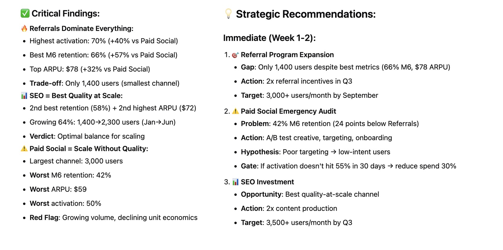
Formulate a hypothesis based on your findings (e.g., "The cohort from our content marketing campaign is more valuable because they were better educated on our product").
Finally, turn these insights into concrete actions, like reallocating budget or refining your onboarding, and measure the results.
Cohort Analysis: How to Use Google Analytics
Google Analytics 4 (GA4) offers a built-in cohort exploration report that makes it easy to perform a basic cohort analysis without needing to export raw data.
Setting up a cohort analysis report in GA4
- Navigate to the Explore section in the left-hand menu of your GA4 property.
- Click on Cohort exploration to open a new report template.
- The report will automatically populate with some default settings, which you can now customize.
Understanding the report elements: Cohort size, Metric, and Date Range
In the "Tab Settings" panel, you will define the core components of your analysis:
- Cohort inclusion: This is the event that defines your cohorts. The default is first_touch (equivalent to acquisition date), but you can change it to any event, such as session_start or purchase.
- Return criteria: This is the action a user must take to be considered "retained" in a subsequent period (e.g., session_start, app_update).
- Cohort granularity: Choose the time frame for your cohorts (daily, weekly, or monthly).
- Metric: Select the value you want to analyze for each cohort cell. This is typically Active users, but you can also choose metrics like Transactions or LTV.
- Date Range: Specify the overall time period for your analysis.
Interpreting the GA4 cohort visualization
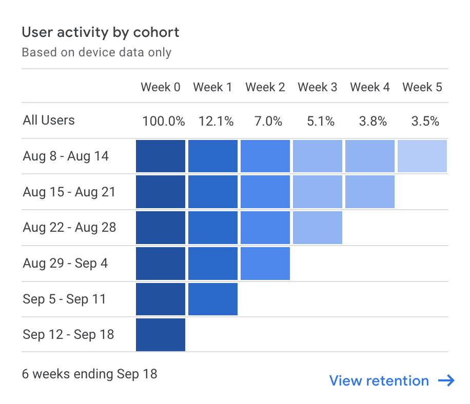
The output is a triangular chart or heat map.
- Rows: Each row represents a different cohort (e.g., the week of Oct 1, the week of Oct 8).
- Columns: Each column represents the time elapsed since the cohort was formed (e.g., Week 0, Week 1, Week 2).
- Cells: The cells show the value of the metric you selected for that cohort at that point in time. The color intensity helps you quickly spot trends—darker cells typically indicate higher retention or activity.
By reading across a row, you can track the retention of a single cohort over time. By reading down a column, you can compare the retention of different cohorts at the same point in their lifecycle (e.g., comparing the Week 4 retention of all cohorts).
Real-World Cohort Analysis Examples
Theory is helpful, but seeing cohort analysis in action makes its value clear.
Example for an E-commerce Business
Business question: Do customers acquired during our Black Friday sale have a higher or lower long-term value than customers acquired at other times?
Cohorts:
- Cohort A: Customers who made their first purchase during the Black Friday week.
- Cohort B: Customers who made their first purchase in the month before Black Friday.
Analysis: Track the repeat purchase rate and average order value for both cohorts over the next six months.
Potential insight: You might find that Black Friday customers have a lower repeat purchase rate, indicating they were one-time deal-seekers. This insight could lead you to create targeted post-purchase email campaigns specifically for this cohort to encourage a second purchase.
Example for a SaaS Company
Business question: Does completing our in-app onboarding tutorial affect user retention?
Cohorts:
- Cohort A: New users who completed the full onboarding tutorial in their first session.
- Cohort B: New users who skipped or did not complete the tutorial in their first session.
Analysis: Compare the 30, 60, and 90-day retention rates for both behavioral cohorts.
Potential insight: If Cohort A shows significantly higher retention, it provides strong evidence that the onboarding is effective. The product team could then experiment with making the tutorial mandatory or more engaging to push more users into the "successful" cohort.
Example for a Mobile App
Business question: How did our major UI redesign in Q2 affect user engagement?
Cohorts:
- Cohort A: Users who installed the app in Q1 (before the redesign).
- Cohort B: Users who installed the app in Q2 (after the redesign).
Analysis: Compare the week-over-week retention and average number of sessions per user for both cohorts.
Potential insight: If Cohort B demonstrates higher retention and more frequent sessions after the first few weeks, it indicates the redesign was successful at creating a more engaging user experience for new users.
Cohort Analysis Tools Beyond Google Analytics
GA4 is a useful starting point for cohort analysis, but it is not designed for advanced or enterprise-scale use cases. As teams begin asking deeper questions about retention, lifetime value, and channel quality, more specialized tools become necessary.
Spreadsheet Software (Excel, Google Sheets)
Spreadsheets can support basic cohort analysis when datasets are small. Teams typically export raw transaction or event data, group users into cohorts using pivot tables, and calculate retention or repeat behavior manually.
This approach offers flexibility, but it has clear limitations. Manual updates are required every time new data arrives. Formulas are easy to break. Joining marketing, product, and revenue data is difficult. As data volume grows, spreadsheets become slow, unreliable, and hard to audit.
Product Analytics Platforms (Mixpanel, Amplitude, Heap)
Product analytics platforms are built for detailed user behavior analysis. They allow teams to define acquisition and behavioral cohorts, track events over time, and visualize retention and conversion patterns with precision.
These tools are especially strong for product-led growth teams focused on in-app behavior. However, they often lack full visibility into marketing spend, acquisition costs, and revenue attribution. This makes it difficult to evaluate cohorts in the context of ROI or channel efficiency.
Marketing Analytics and Intelligence Platforms
Marketing analytics and intelligence platforms address these gaps at an enterprise level. They are designed to unify user-level data across marketing, analytics, CRM, and revenue systems.
Platforms like Improvado automate data extraction from hundreds of sources and handle identity mapping across channels. They provide no-code data transformation and modeling directly in the warehouse, making it possible to build sophisticated cohort analyses without heavy engineering work.
This enables teams to analyze cohorts based on acquisition channel, campaign, or spend, and connect those cohorts to long-term retention and lifetime value.
Conclusion
Cohort analysis is a powerful framework for understanding your customers on a deeper level. By moving beyond surface-level metrics and analyzing how specific groups of users behave over time, you can uncover the true drivers of retention, churn, and long-term value.
Whether you're optimizing marketing campaigns, making critical product decisions, or improving the customer experience, cohort analysis provides the actionable, data-driven insights needed to foster sustainable growth. Start with a simple question, leverage the tools at your disposal, and begin transforming your data from a record of the past into a roadmap for the future.