
Email marketing consistently delivers one of the highest returns among digital channels. But strong ROI does not happen by default. Performance depends on list quality, segmentation, timing, content relevance, and deliverability. Without clear visibility into these factors, marketers struggle to understand why engagement drops, conversions stall, or revenue plateaus.
An email marketing dashboard brings structure to this complexity by turning raw campaign data into actionable signals.
In this guide, we break down how to build an effective email marketing dashboard. We cover the key metrics that matter at each stage of the funnel, how to structure data for accurate analysis, and how to connect email performance to downstream outcomes like pipeline and revenue.
Key Takeaways:
- An email marketing dashboard centralizes all your email campaign data into one visual interface, providing a single source of truth for performance analysis.
- Tracking the right KPIs is crucial. Focus on metrics tied to revenue and engagement, not just vanity metrics like open rates.
- Effective dashboards integrate data from multiple sources–like your ESP, CRM, and eCommerce platform–for a complete view of the customer journey.
- Use a unified analytics platform to automate data collection and reporting. This saves time and ensures your insights are always up-to-date and accurate.
Quick answer
An email marketing dashboard is a centralized view of all key email performance metrics that brings campaign, audience, and engagement data into one place. It tracks delivery rates, open and click-through rates by segment, conversion rate, revenue per send, unsubscribe rates, and list growth over time, enabling marketers to evaluate results quickly and consistently instead of relying on individual campaign reports.
What Is an Email Marketing Dashboard?
An email marketing dashboard is a centralized view of all key email performance metrics. It brings campaign, audience, and engagement data into one place so marketers can evaluate results quickly and consistently. Instead of relying on individual campaign reports, the dashboard shows trends over time and highlights performance patterns across segments and sends.
A well-designed email dashboard goes beyond open rates. It tracks metrics that reflect both engagement and business impact, such as:
- Delivery and inbox placement rates
- Open and click-through rates by segment
- Conversion rate and revenue per send
- Unsubscribe and spam complaint rates
- List growth and churn over time
The dashboard also supports deeper analysis. Marketers can compare campaigns, test subject lines or content, monitor deliverability issues, and understand how email contributes to the broader marketing funnel. By consolidating these signals into a single, structured view, an email marketing dashboard enables faster decisions and more effective optimization.
The Core Benefits: Moving from Guesswork to Data-Driven Strategy
Implementing a centralized email marketing dashboard unlocks new levels of efficiency and effectiveness. It also provides the foundation for broader marketing analytics that connect email performance to overall business success.
Gain a Complete View of Campaign Performance
Data silos are a major challenge for marketers. Your email platform has engagement data. Your website analytics has behavior data. Your CRM has customer data.
A dashboard breaks down these silos. It brings all relevant information together. You get a holistic view of how your email campaigns influence customer behavior from the first click to the final sale.
Make Faster, Data-Driven Decisions
With real-time data at your fingertips, you can make smarter decisions faster.
Did a new subject line significantly increase open rates? You can apply that learning to your next campaign immediately.
Is a specific segment not engaging? You can quickly launch a re-engagement campaign.
Dashboards remove the guesswork and empower you to act on insights, not intuition.
Improve Resource and Budget Allocation
An email dashboard clearly shows what's working and what isn't. You can see which campaigns, segments, and content types are driving the most revenue.
This insight allows you to allocate your time and budget more effectively. You can double down on high-performing strategies and stop wasting resources on tactics that don't deliver results.
Enhance Team Collaboration and Alignment
A shared dashboard ensures everyone is on the same page. Your entire team, from copywriters to strategists to leadership, can see the same data. This fosters alignment around common goals. It simplifies communication and makes it easier to report on progress to stakeholders. Everyone understands what success looks like and how their work contributes to it.
Essential KPIs for Your Email Marketing Dashboard
Your dashboard is only as good as the data it contains. Choosing the right KPIs is the most important step in building an effective email metrics dashboard. Group your metrics into categories to tell a complete story: engagement, conversion, and list health.
Engagement Metrics: Is Your Audience Listening?
These metrics tell you how subscribers are interacting with your emails.
- Open Rate: The percentage of recipients who opened your email. While it can be affected by privacy changes, it still provides a basic health check on your subject lines and brand recognition.
- Click-Through Rate (CTR): The percentage of recipients who clicked on one or more links in your email. This is a stronger indicator of engagement than open rate.
- Click-to-Open Rate (CTOR): The percentage of people who opened your email and then clicked a link. This metric measures the effectiveness of your email's content and call-to-action.
- Unsubscribe Rate: The percentage of recipients who unsubscribed from your list after receiving an email. A high rate could signal issues with content relevance or email frequency.
Conversion & Revenue Metrics: Are You Driving Action?
These are the bottom-line metrics that connect email efforts to business results. Tracking these is vital for calculating your email marketing ROI.
- Conversion Rate: The percentage of email recipients who completed a desired action. This could be making a purchase, filling out a form, or downloading a resource. This is a critical metric for any email marketing campaign dashboard.
- Revenue Per Email (RPE): The total revenue generated by a campaign divided by the number of emails delivered. This KPI directly measures the financial performance of each send.
- Average Order Value (AOV): The average dollar amount spent each time a customer places an order through an email campaign. Tracking AOV helps you understand the quality of the conversions you are driving.
- Number of Orders: A straightforward metric showing the total orders attributed to your email marketing efforts. It provides a clear link between your campaigns and sales.
List Health Metrics: Is Your Foundation Strong?
A healthy, growing list is the foundation of a successful email program.
- List Growth Rate: The rate at which your email list is growing. It is calculated by taking the number of new subscribers minus unsubscribes, then dividing by the total number of subscribers.
- Bounce Rate: The percentage of emails that were not delivered. This includes hard bounces (permanent failures, like an invalid address) and soft bounces (temporary issues, like a full inbox). A high hard bounce rate can damage your sender reputation.
- Subscriber Acquisition Cost (SAC): The total cost to acquire a new email subscriber. This helps you understand the efficiency of your list-building efforts.
Building Your Dashboard: Key Components and Data Sources
An effective email reporting dashboard is not just about plugging in data. It's about creating a system for insight. This involves connecting the right data sources and structuring them for clarity.
A well-designed system can serve as one of your most valuable KPI dashboards for the entire marketing organization.
Core Data Sources to Integrate
To get a complete picture, you must pull data from several systems. Relying only on your Email Service Provider (ESP) is a common mistake.
- Email Service Provider (ESP): This is your primary source for engagement metrics. Platforms like Mailchimp, Klaviyo, and Campaign Monitor provide data on opens, clicks, bounces, and unsubscribes.
- Website Analytics Platform: Tools like Google Analytics 4 (GA4) are essential. They track what users do after they click a link in your email, including pages visited, time on site, and goal completions.
- Customer Relationship Management (CRM): Your CRM (e.g., Salesforce, HubSpot) contains valuable customer data. Integrating it allows you to segment your email performance by lead status, customer lifetime value, or other custom fields.
- Ecommerce Platform: For online retailers, platforms like Shopify or Magento are critical. They provide the conversion and revenue data needed to calculate ROI, such as orders, AOV, and revenue per campaign.
The flow of information from these sources into your reports constitutes your marketing data pipeline. For scalability, many businesses centralize this information in a data warehouse before visualizing it, ensuring data integrity and speed.
Marketing analytics platforms like Improvado simplify this entire process by centralizing data from all these sources into a single, analytics-ready layer. Improvado automatically aggregates data from ESPs, web analytics tools, CRMs, and ecommerce platforms, then cleans, normalizes, and aligns it before it reaches your dashboard.
This removes manual data stitching, ensures consistent metric definitions, and keeps dashboards continuously refreshed.

Key Components of an Effective Dashboard
A great dashboard is more than just a collection of charts. It tells a story and guides the user toward insights.
Consider including these components:
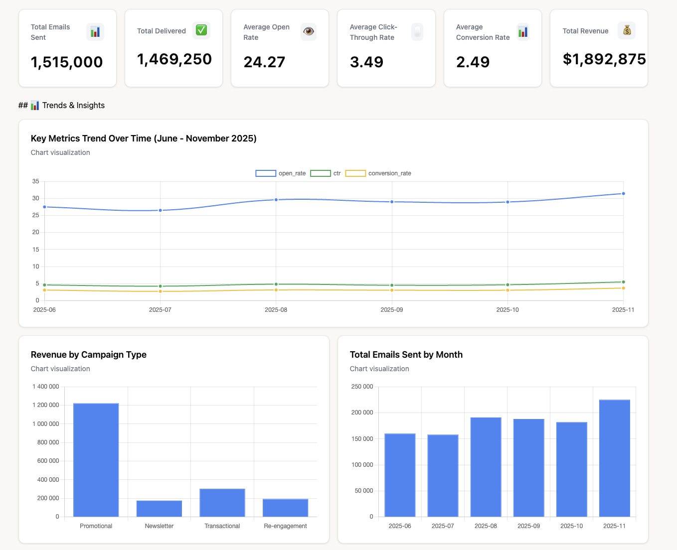
- High-Level Summary: An executive-level overview at the top. This should show the most important KPIs at a glance, like total revenue from email, conversion rate, and list growth.
- Trend Analysis: Line charts showing performance over time. This helps you spot seasonality, track the impact of strategic changes, and identify long-term trends.
- Campaign-Level Breakdown: A detailed table or section that allows you to compare the performance of individual email campaigns. This is crucial for identifying your most successful content and tactics.
- Audience Segmentation: Visualizations that break down performance by different audience segments. For example, comparing the engagement of new subscribers vs. loyal customers.
- Interactive Filters: The ability to filter the entire dashboard by date range, campaign type, or audience segment. This allows users to drill down and explore the data for themselves.
Data Visualization Platforms
Here are a couple of popular data visualizations platforms you can use to build an email marketing dashboard.
| BI Tool | Best For | Key Strengths | How Improvado Helps |
|---|---|---|---|
| Looker Studio (formerly Google Data Studio) | Teams heavily invested in the Google ecosystem. | Free to use, easy to learn, great for collaboration and sharing. | Pipes in non-Google data (e.g., Facebook Ads, HubSpot) for a complete view. |
| Tableau | Data analysts and teams needing powerful, interactive visualizations. | Best-in-class data visualization, advanced analytics features, highly interactive. | Automates the complex data blending and preparation required to use Tableau effectively. |
| Microsoft Power BI | Enterprises using the Microsoft stack (Azure, Office 365). | Deep integration with Excel and other Microsoft products, strong data modeling capabilities. | Provides hundreds of marketing connectors, saving dev time on building custom APIs. |
Email Marketing Dashboard Examples & Templates
There is no one-size-fits-all email marketing dashboard template. The best dashboard is tailored to your specific goals.
However, we can look at common examples organized by purpose. These serve as a great starting point for building your own.
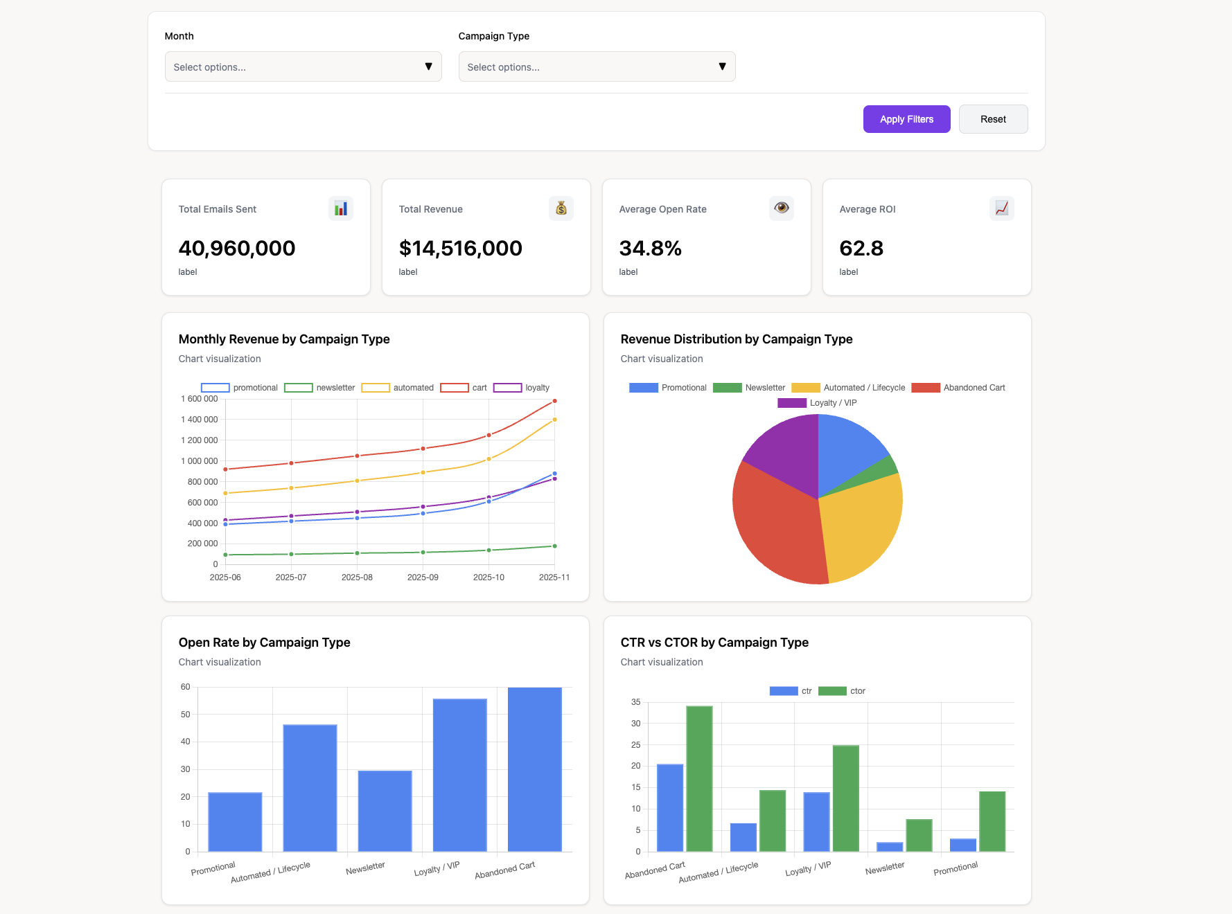
1. The Campaign Performance Dashboard
This is the most common type of dashboard. It focuses on the performance of individual email sends and automated sequences.
- Primary Goal: To evaluate the effectiveness of specific campaigns and identify top-performing content.
- Key Widgets: A filterable table showing all recent campaigns with columns for Sent, Delivered, Open Rate, CTR, Conversion Rate, and Revenue. A bar chart comparing the CTOR of your top 5 campaigns this month. A time-series chart showing revenue attributed to email over the last 90 days.
2. The Audience Health & Growth Dashboard
This dashboard shifts focus from individual campaigns to the health of your subscriber list.
- Primary Goal: To monitor list growth, engagement trends, and subscriber churn.
- Key Widgets: A line chart showing list growth rate over time. A pie chart breaking down your audience by engagement level (e.g., highly engaged, somewhat engaged, inactive). A scorecard widget displaying your overall unsubscribe rate and bounce rate. A bar chart showing new subscribers by acquisition source.
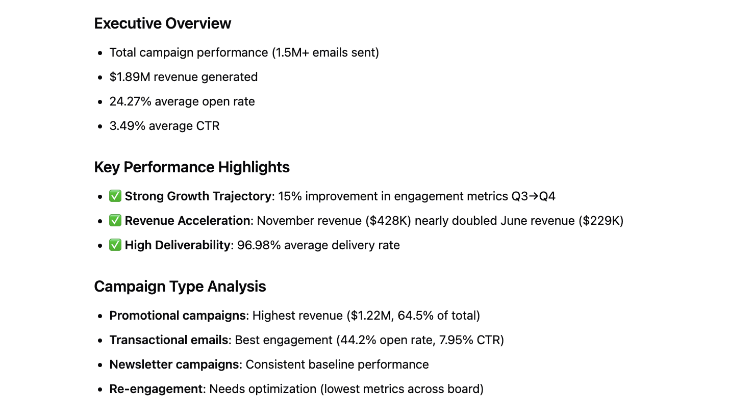
3. The Executive Summary Dashboard
This high-level dashboard is designed for leadership and stakeholders. It focuses on bottom-line business impact, not granular campaign metrics.
- Primary Goal: To communicate the overall ROI and strategic value of the email marketing channel.
- Key Widgets: Large scorecard widgets for Total Revenue from Email (quarter-to-date), Email-Attributed Conversions, and ROI. A gauge chart showing progress toward quarterly revenue goals. A simple line chart comparing email performance to other channels like social media or paid search.
Choosing Your Platform: Native Analytics vs. Unified Dashboards
You have two main options for building your dashboard. You can use the built-in analytics within your ESP, or you can use a dedicated platform that unifies data from all your marketing tools. The choice has significant implications for the quality of your insights.
| Aspect | Native ESP Reporting (e.g., Mailchimp) | Unified Analytics Dashboard (Improvado) |
|---|---|---|
| Data Sources | Limited to data within the ESP (opens, clicks, unsubscribes). | Integrates hundreds of sources (ESP, CRM, Ads, Analytics, eCommerce). |
| Cross-Channel Analysis | Not possible. Email is viewed in a silo. | Core feature. Compare email performance against all other marketing channels. |
| Customization | Very limited. You get standard, pre-built reports. | Fully customizable. Build dashboards tailored to your specific KPIs and goals. |
| Attribution Modeling | Basic last-click attribution, if any. | Supports advanced multi-touch attribution models to see the full customer journey. |
| Real-Time Reporting | Often delayed or requires manual refresh. | Automated, near real-time data updates for timely decision-making. |
| Scalability | Becomes limiting as your marketing stack grows more complex. | Designed to scale with your business and data complexity. |
| Single Source of Truth | No. It's just one piece of the puzzle. | Yes. Creates a centralized, trusted source for all marketing data. |
Step-by-Step: How to Set Up Your Email Marketing Dashboard
Creating a powerful dashboard is a systematic process. Follow these steps to ensure you build a tool that is both useful and sustainable.
Step 1: Define Your Goals and Audience
Start with the "why." What questions do you need this dashboard to answer? Who will be using it? A dashboard for an email specialist will look very different from an executive summary. Clearly define the business objectives you want to track, such as increasing lead generation by 15% or improving customer retention.
Step 2: Select Your Key Performance Indicators (KPIs)
Based on your goals, choose 5-10 primary KPIs. Avoid the temptation to track everything. A cluttered dashboard is an ineffective dashboard. Focus on the metrics that directly reflect progress toward your objectives. Refer to the KPI section above for ideas.
Step 3: Choose Your Dashboarding Tool
Decide where you will build your dashboard. You can use a dedicated dashboarding software or a broader BI tool. Your decision will depend on your budget, technical resources, and the complexity of your needs. For ultimate flexibility, many choose BI tools and use middleware to handle the data connections.
Step 4: Integrate Your Data Sources
This is often the most challenging step. You need to connect your ESP, CRM, analytics tools, and any other relevant platforms. Using powerful data integration tools like Improvado can automate this process. It eliminates the need for manual CSV uploads and complex API management.
Step 5: Design and Build Your Visualizations
Now, you can start building. Choose the right chart type for each KPI. Use line charts for trends, bar charts for comparisons, and scorecards for single, important numbers. Group related metrics together. Use clear labels and a logical layout to make the dashboard easy to read and interpret.
Step 6: Automate, Share, and Iterate
Set up your dashboard to refresh automatically. A static dashboard quickly becomes irrelevant. Share the dashboard with the relevant stakeholders and provide training on how to use it. Finally, treat your dashboard as a living document. Solicit feedback and make improvements over time as your goals and strategies evolve.
Email Marketing Dashboard Best Practices for Actionable Insights
A high-quality email marketing dashboard is built for analysis and optimization, not passive reporting. It should surface patterns, explain performance shifts, and guide clear next steps. The following best practices help ensure your dashboard delivers real value at scale.
1. Define a clear analytical purpose for every metric
Each KPI should answer a specific question. If a metric does not support a decision, remove it. Avoid vanity metrics unless they provide early signals for downstream performance.
2. Structure metrics by funnel stage
Organize KPIs so performance issues are easy to locate.
- Deliverability: send volume, hard and soft bounce rate, spam complaints, inbox placement
- Engagement: open rate, click-through rate, click-to-open rate, dwell time
- Conversion: conversion rate, revenue per email, assisted conversions
- List health: growth rate, churn, unsubscribe rate, inactivity rate
This structure helps diagnose whether issues stem from reach, relevance, or conversion.
3. Normalize metrics across campaigns and time
Compare performance using consistent definitions and time windows. Normalize metrics such as revenue per recipient or clicks per 1,000 sends to make comparisons fair across different list sizes and campaign types.
4. Segment beyond basic lists
Go deeper than static audience groups. Segment by:
- Lifecycle stage (prospect, MQL, customer)
- Engagement history (active vs. dormant)
- Frequency exposure
- Content category or intent signal
Advanced segmentation reveals why performance changes, not just that it changed.
5. Track trends and volatility, not just averages
Use rolling averages, week-over-week deltas, and standard deviation bands. This helps identify early signs of fatigue, deliverability degradation, or over-mailing before performance collapses.
6. Connect email to downstream outcomes
Email rarely converts in isolation. Integrate CRM and revenue data to track:
- Lead progression and velocity
- Pipeline contribution
- Revenue influence
- Customer lifetime value
This elevates email analysis from engagement reporting to revenue accountability.
7. Benchmark performance against history and targets
Context matters. Compare results against historical baselines, internal benchmarks, and campaign goals. This prevents overreacting to normal variance and highlights true anomalies.
8. Design for exception-based analysis
Dashboards should highlight what needs attention. Surface threshold breaches, unusual drops, or unexpected spikes. Reduce cognitive load so teams can act quickly.
9. Ensure data freshness and reliability
Outdated or inconsistent data leads to poor decisions. Dashboards should refresh automatically and rely on governed, standardized data to maintain trust.
10. Keep the dashboard focused and modular
Avoid building one dashboard for every question. Use modular views for deliverability, engagement, and revenue analysis. This keeps dashboards fast, readable, and useful for different stakeholders.
Conclusion
An email marketing dashboard is essential for understanding how campaigns actually perform. It brings structure to complex engagement, conversion, and revenue signals that are otherwise scattered across tools. With the right dashboard, teams can identify deliverability issues early, optimize content and timing, and connect email activity to real business outcomes. Without a reliable view, decisions are based on assumptions instead of data.
Improvado provides the data foundation that makes email marketing dashboards accurate and scalable. It aggregates data from ESPs, web analytics, CRMs, and ecommerce platforms, then cleans, standardizes, and governs it before it reaches dashboards. This ensures consistent metrics, automated refreshes, and a single source of truth for analysis across teams.
If you want an email marketing dashboard built on clean, unified data, request a demo of Improvado.