
If there’s one thing all marketers have in common, it’s a shared dread of reporting time. Whether you’re a marketing agency managing dozens of clients or a VP of Marketing, stitching together reports from multiple regional branches, building a dashboard and reporting on it can be stressful.
Marketing dashboard software streamlines reporting by automating data collection and visualization, transforming complex, fragmented marketing data into clear, actionable insights. This article compares top marketing dashboard tools, outlining their capabilities, advantages, and limitations to help you select the right platform for your team’s reporting and decision-making needs.
Quick answer
The best dashboard software solutions for 2026 include Improvado, which automates marketing data pipelines with 1,000+ connectors and AI-powered report creation; Tableau, a powerful BI tool for interactive visualizations; Microsoft Power BI, offering deep Microsoft ecosystem integration; and Klipfolio, a cloud-based platform with pre-built connectors for quick setup and real-time monitoring.
What Is Marketing Dashboard Software?
Marketing dashboard software is a specialized platform that consolidates marketing data from multiple sources into a unified, real-time reporting environment. It automates data ingestion, normalization, and visualization, providing a single source of truth for performance metrics across channels such as advertising, CRM, web analytics, and revenue systems.
For enterprise operations teams, these tools reduce the reliance on manual reporting processes and eliminate fragmented data silos. They allow decision-makers to monitor KPIs, track budget allocation, and quickly identify trends or anomalies at scale.
Why Do You Need Dashboard Software? Key Benefits
Implementing dashboard software offers numerous benefits, transforming how businesses perceive and interact with their data. These tools are essential for any organization committed to data-driven strategies:
- Automated Reporting: Eliminate manual data collection and report generation. Dashboard platforms automate the aggregation and visualization of metrics, saving valuable time and resources.
- Real-time Insights: Gain immediate access to live data, allowing for prompt identification of trends, opportunities, or issues. This real-time capability supports agile responses and proactive decision-making.
- Centralized Data View: Consolidate data from multiple sources into a single source of truth. This unified view provides a comprehensive understanding of performance across different departments or campaigns.
- Enhanced Data Visualization: Transform raw data into visually appealing and easy-to-understand charts and graphs. This visualization facilitates quicker comprehension and better insight extraction.
- Improved Collaboration: Share interactive dashboards easily across teams, fostering a common understanding of KPIs and promoting collaborative problem-solving.
- Strategic Decision-Making: Empower business users with clear, concise insight needed to make informed strategic and operational choices, optimizing business performance.
What are the Key Features of Dashboard Software?
When evaluating dashboard tools, understanding their key features is paramount to finding the right fit for your business.
Here are the essential capabilities to look for:
- Interactive Components and Data Filters: Top dashboard software solutions offer interactive features that allow users to drill down into specific data points, apply filters, and manipulate the data view without requiring technical expertise. This enables deeper exploration and a personalized analytical experience, turning static reports into dynamic insights.
- Multi-Source Data Integration: A robust dashboard platform must connect to a wide array of data sources, including CRM systems, marketing platforms, financial software, databases, and more. Seamless data integration capabilities ensure that all your key metrics can be pulled into one centralized dashboard, providing a holistic view of your operations.
- Customizable Interface and Widgets: The ability to customize dashboards with a drag-and-drop interface and various widgets is critical. This feature allows users to build dashboards tailored to their specific reporting needs, arranging visualizations and KPIs in a way that is most intuitive and useful for their role. White-label options are also valuable for branded reporting.
- Real-time Data Updates: For truly data-driven decision-making, real-time data updates are essential. The best dashboard software refreshes data automatically, ensuring that users always have the most current information at their fingertips to track performance instantly.
- AI-Powered Insights and Automation: Many modern dashboard tools now integrate AI-powered capabilities for advanced analytics, predictive modeling, and automated insight generation. These features can identify hidden trends, anomalies, and opportunities that might otherwise go unnoticed, further enhancing the value of the platform.
- Export and Sharing Capabilities: The ability to easily export dashboards into various formats and share them securely with stakeholders is a must-have. Features like scheduled email reports, embedding options for websites or internal portals, and mobile app access enhance collaboration and accessibility for business users.
The Best Dashboard Software Solutions for 2026
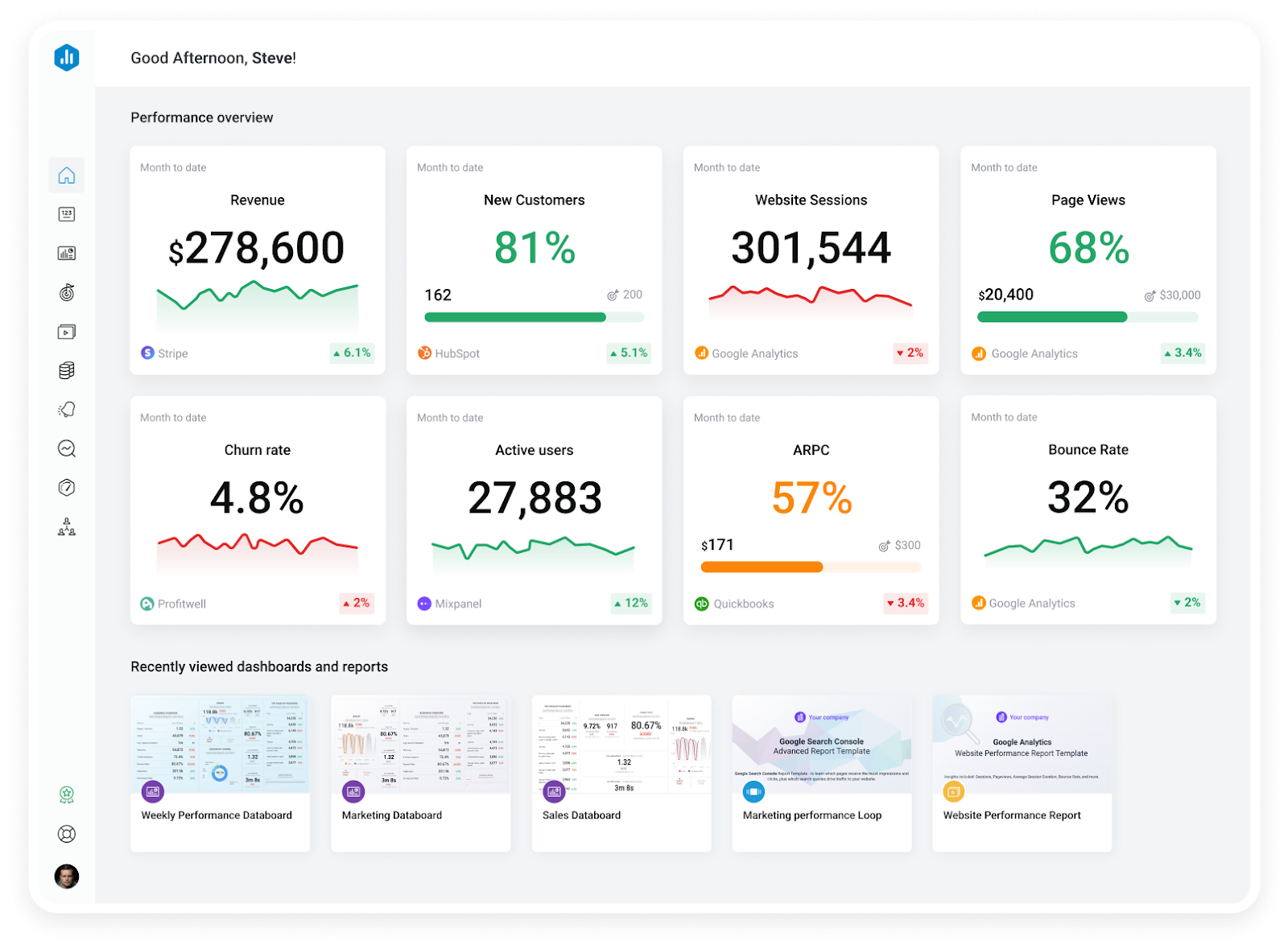
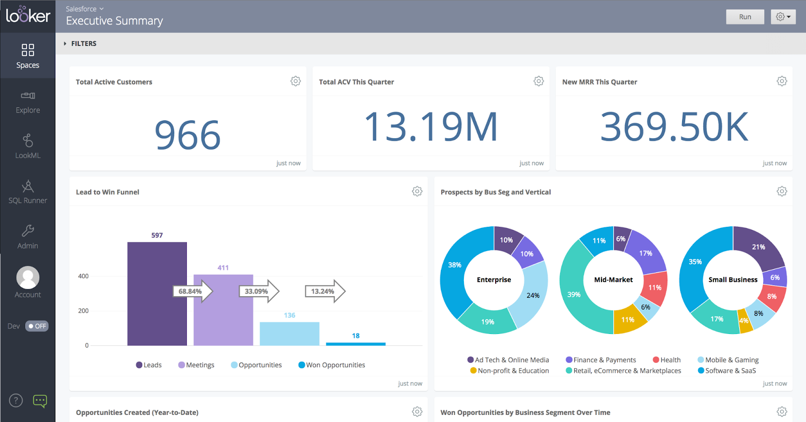
1. Improvado
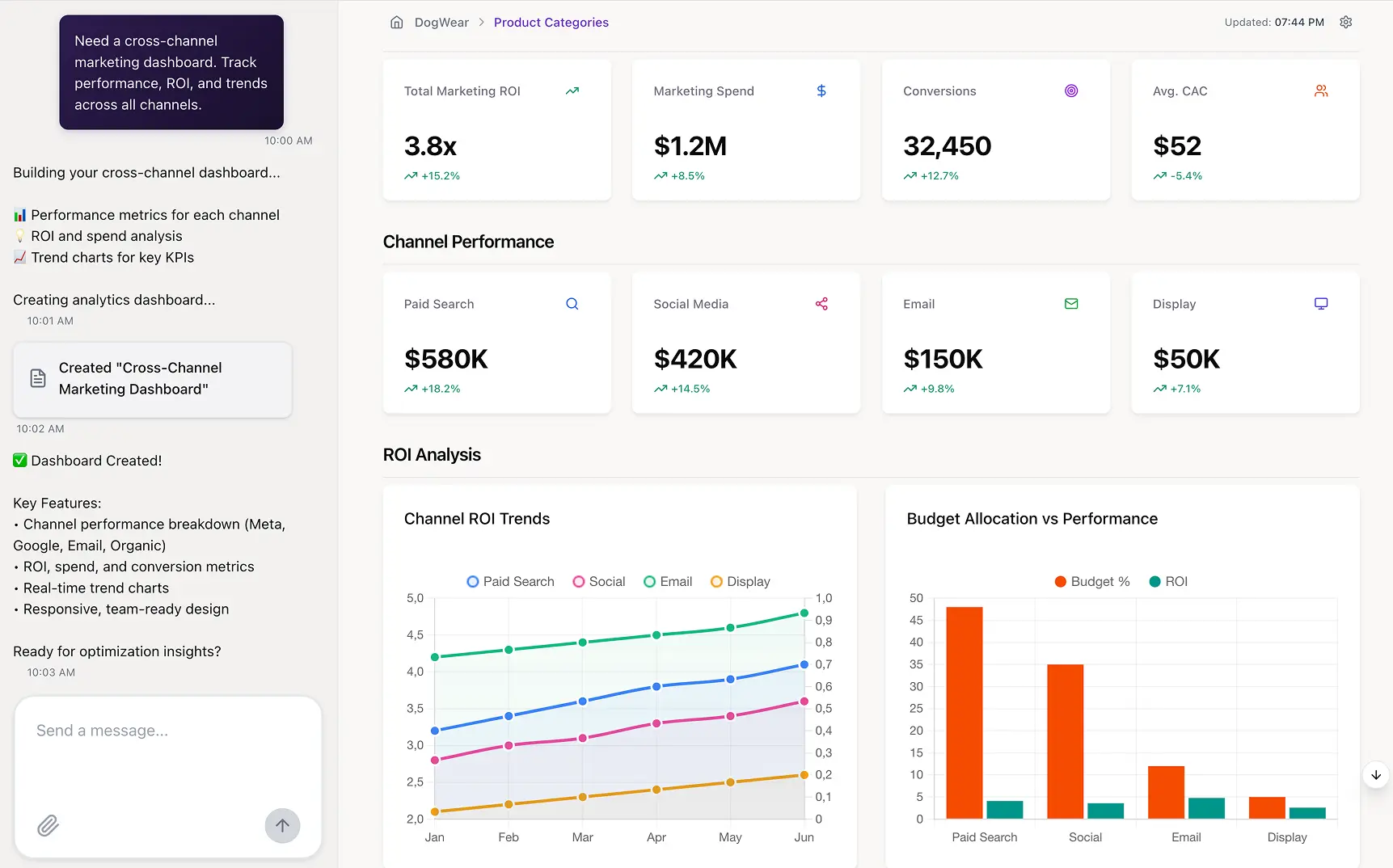
Improvado, a marketing analytics and intelligence platform, simplifies reporting and dashboard creation for large-scale organizations.
Unlike general-purpose BI tools, it automates the entire data pipeline, connecting to hundreds of marketing and sales data sources, transforming and harmonizing the data, and delivering it as clean, analysis-ready data streams directly into the BI tool or data warehouse of your choice.
Its built-in AI Agent enables teams to create dashboards and reports instantly using plain language, with no SQL or technical expertise required.
In addition to custom builds, Improvado provides pre-built, automated dashboard templates for performance tracking, ROI analysis, and budget pacing. This empowers teams to move beyond manual spreadsheets to a unified, scalable reporting system while keeping their preferred BI platforms like Tableau, Looker, or Power BI fully powered with trusted, centralized data.
Key Features:
- 1,000+ Pre-Built Marketing Data Source Connectors: Connect seamlessly to platforms like Google Ads, Facebook Ads, Amazon Ads, Walmart Connect, DV360, CM360, LinkedIn Ads, Salesforce, HubSpot, and more.
- Automated ETL (Extract, Transform, Load): Fully automate data ingestion, standardization, and normalization to eliminate repetitive tasks and accelerate time to insight.
- AI Agent for Dashboard & Report Creation: Build dashboards and reports instantly by asking questions in plain language, no SQL or technical expertise needed.
- Pre-Built Marketing Dashboard Templates: Deploy dashboard templates for performance tracking, ROI reporting, budget pacing, and revenue alignment to speed up reporting workflows.
- Naming Convention Management: Standardize inconsistent naming across platforms with automated rules and mappings, ensuring unified, reliable data for reporting and analytics.
- Native BI & Data Warehouse Integrations: Stream clean, analysis-ready data into Snowflake, BigQuery, Redshift, Tableau, Looker, Power BI, and other tools for deeper analytics.
- Enterprise-Grade Data Governance & Compliance: Role-based access controls, audit trails, and compliance with SOC 2 Type II, HIPAA, and GDPR to protect sensitive marketing and customer data.
Pros:
- Deep marketing and revenue data expertise
- No-code integrations for faster deployment
- AI Agent for ad-hoc report generation and insights
- Enterprise-grade scalability and security
- Highly customizable transformations for complex data models
- Excellent fit for multi-brand or multi-region organizations
Cons:
- Primarily focused on marketing and sales data, less suited for general business analytics
- Pricing structure designed for enterprises, which may be cost-prohibitive for smaller businesses
Improvado Pricing
Improvado offers custom pricing based on data volume, number of data sources, and required features. Pricing is structured to fit enterprise teams with complex needs, and every engagement begins with a personalized demo to define scope and implementation strategy.

2. Tableau
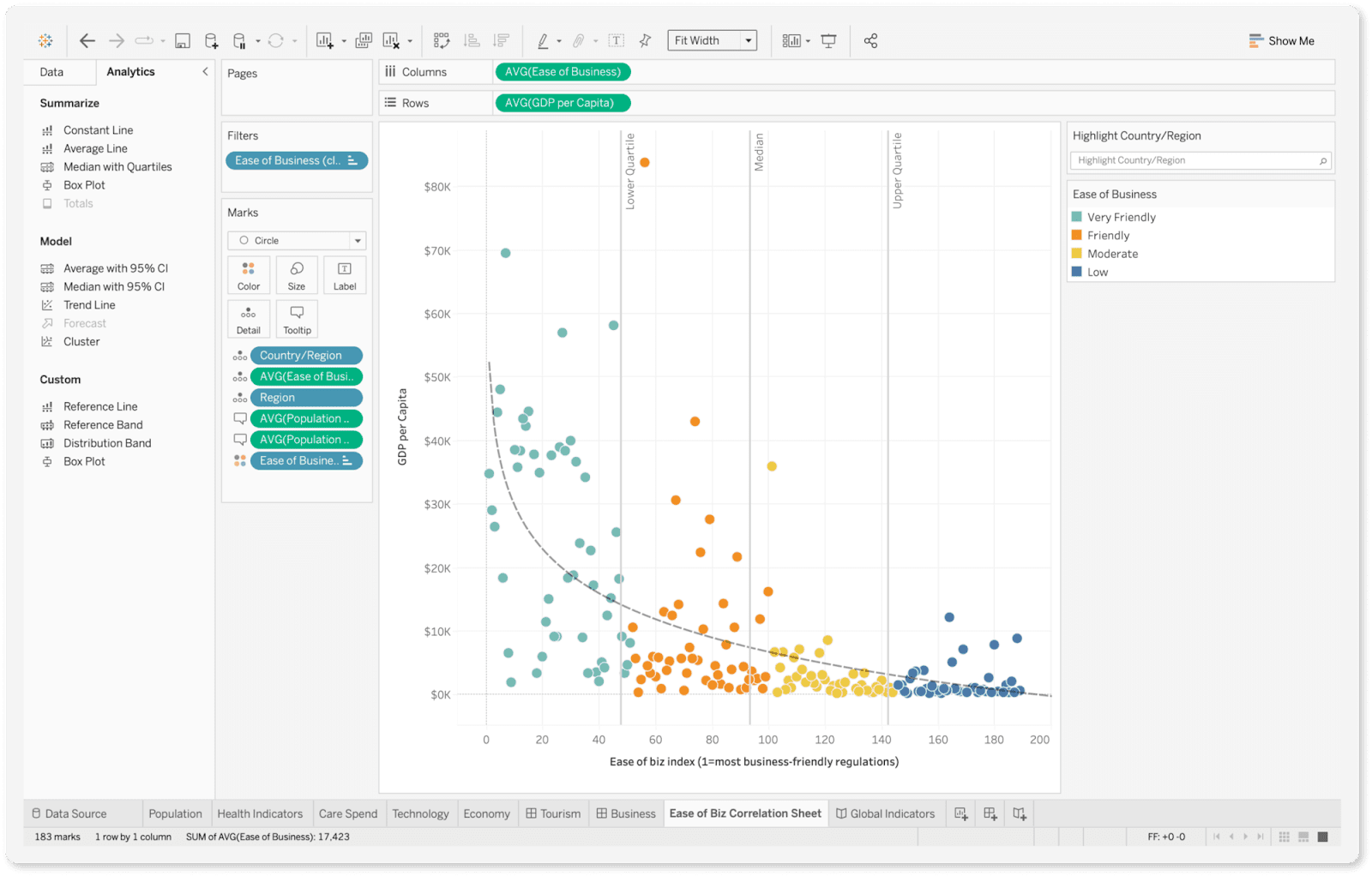
Tableau is a business intelligence and data visualization tool designed to help teams explore and analyze large datasets. It’s widely used for building interactive dashboards and reports that make complex data easier to understand and share.
Tableau integrates with various data sources, enabling teams to create custom visualizations and track performance metrics across marketing, sales, and other business functions.
Key Features:
- Drag-and-drop dashboard builder
- Wide range of visualization options
- Integration with multiple data sources and warehouses
- Advanced analytics and calculations
- Interactive and shareable reports
- Collaboration and dashboard sharing tools
- Mobile-optimized dashboards
- Extensions and custom integrations through Tableau Exchange
Pros:
- Powerful, flexible data visualization capabilities
- Wide variety of visualization types and customization options
- Strong collaboration and sharing features
- Scales well for large datasets and complex analysis
Cons:
- Requires clean, well-structured data from external sources
- Steeper learning curve for advanced features
- Limited marketing-specific templates out of the box
- It can be expensive for smaller teams or organizations
Marketers often face a challenge with Tableau due to its lack of built-in, marketing-specific models. Before looking for insights, users must spend hours creating custom metrics and models.
Improvado consolidates disparate revenue data into a unified dataset, preparing it for analysis before pushing it to Tableau.
To further simplify and speed up the process, the platform provides a no-code data transformation framework and a number of pre-built data models for common use-cases.
“Once the data's flowing and our recipes are good to go—it's just set it and forget it. We never have issues with data timing out or not populating in GBQ. We only go into the platform now to handle a backend refresh if naming conventions change or something. That's it.”

Tableau Pricing
Tableau pricing is role-based, rather than a single flat fee.
Costs depend on the type of user license—Creator, Explorer, or Viewer—with each tier granting different levels of functionality, from full data preparation and dashboard building down to read-only access.
Pricing also varies by deployment model: Tableau Cloud (hosted by Salesforce) or Tableau Server (self-hosted on-premise or private cloud).
3. Microsoft Power BI
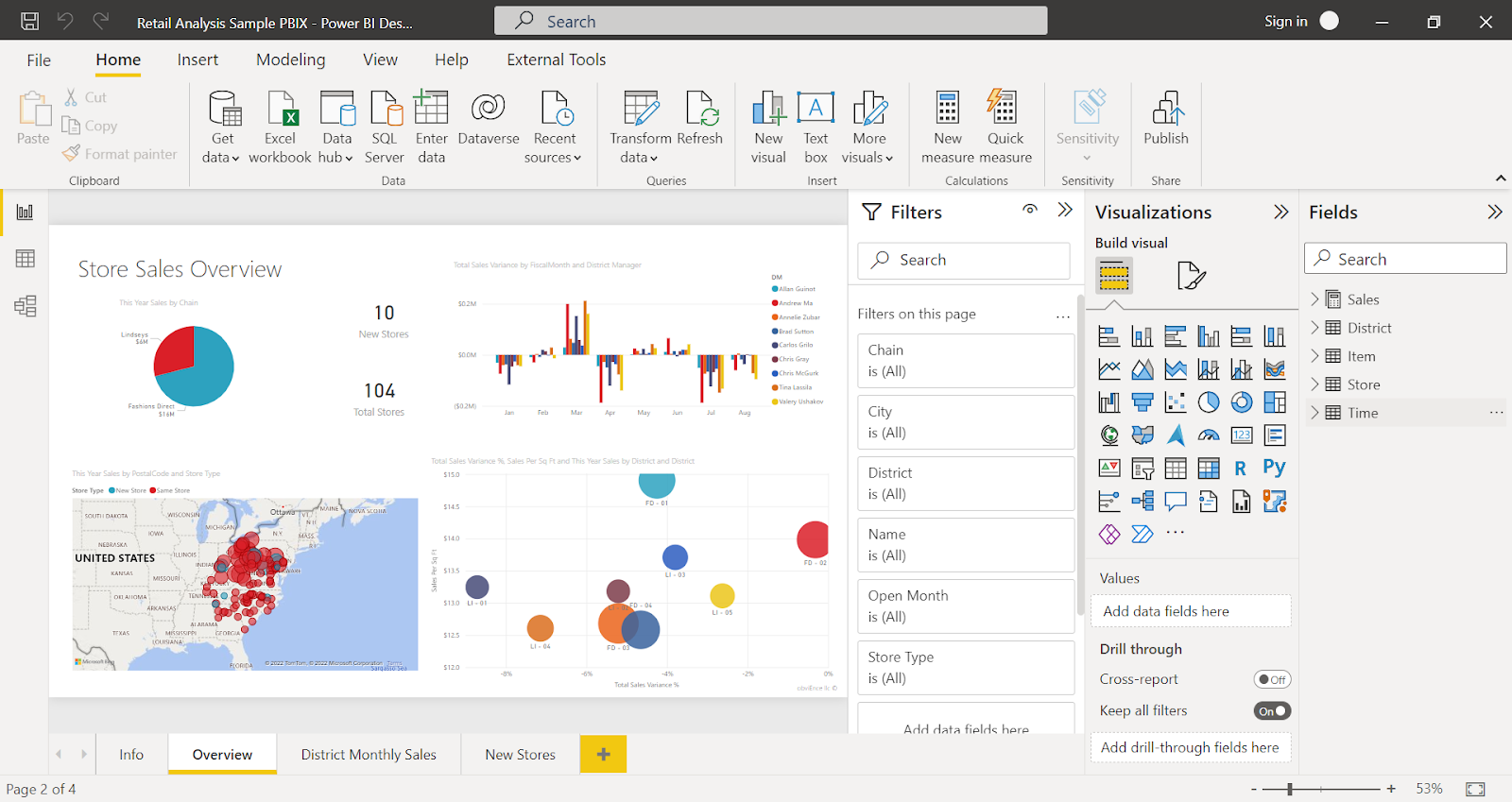
Power BI is a business analytics and dashboard platform developed by Microsoft.
It enables teams to connect to diverse data sources, create interactive dashboards, and generate reports that support data-driven decision-making.
With native integration across the Microsoft ecosystem, Power BI is ideal for organizations already using tools like Excel, Azure, and Microsoft 365, offering flexibility and scalability for both simple reporting and advanced analytics.
Key Features:
- Drag-and-drop dashboard builder
- Wide range of visualizations and chart types
- Native integration with Microsoft tools and services
- Data modeling and advanced calculations with DAX
- AI-powered data insights and visualizations
- Real-time data streaming and monitoring
- Collaboration through Power BI Service and Microsoft Teams
- Mobile-optimized dashboards and reports
- Extensive connectors to cloud and on-premise data sources
Pros:
- Deep integration with Microsoft products and services
- Cost-effective entry point compared to other BI tools
- Scales well from basic reporting to enterprise analytics
- AI-driven features for advanced data insights
- Strong sharing and collaboration capabilities
Cons:
- Data preparation must be done outside the tool for best results
- Steeper learning curve for DAX and advanced modeling
- Interface can feel complex for non-technical users
- Limited out-of-the-box marketing-specific templates
Power BI Pricing
Power BI pricing is tiered based on functionality and deployment needs. The entry-level option provides individual users with basic dashboarding and reporting capabilities.
Organizations that require collaboration, sharing, and enterprise-scale usage often transition to per-user licenses with more advanced features.
4. Klipfolio
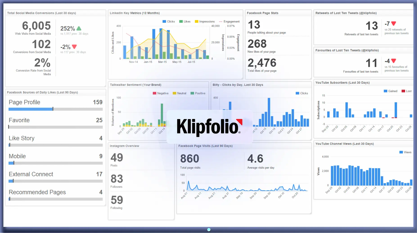
Klipfolio is a cloud-based reporting and dashboard tool. It provides a wide range of pre-built data connectors and visualization options, making it easier to track marketing, sales, and operational performance.
Key Features:
- Pre-built connectors for popular marketing and sales platforms
- Real-time data monitoring and live dashboards
- Customizable dashboard and visualization builder
- Pre-built metric templates and reports
- Data blending from multiple sources
- Mobile-friendly dashboards
- Embedded analytics for client reporting
- Role-based access control and sharing options
Pros:
- Quick to set up and deploy with minimal technical expertise
- Real-time visibility into performance metrics
- Extensive library of pre-built connectors and templates
- Cost-effective solution for teams with basic reporting needs
Cons:
- Limited advanced analytics and transformation capabilities
- Less scalable for complex enterprise data environments
- Requires external tools for deeper data preparation
- Visualizations less customizable compared to advanced BI tools
Klipfolio Pricing
Pricing starts at $140 a month for a basic plan, including 3 dashboards, access to the template library, and 130 data sources.
The most expensive plan is the Premier plan for marketing agencies, priced at $1,025 per month.
5. Databox
Databox is an analytics and dashboard tool that offers a library of pre-built connectors and templates to track marketing, sales, and business performance metrics.
The platform connects directly to over 100 popular marketing, sales, and analytics tools, pulling data into customizable dashboards that update automatically.
Key Features:
- Pre-built connectors for marketing, sales, and business tools
- Library of ready-to-use dashboard templates
- Drag-and-drop dashboard builder
- Real-time data syncing and monitoring
- Goal tracking and performance alerts
- Mobile app for reporting on the go
- Scheduled reporting and automated snapshots
- Easy sharing and collaboration options
Pros:
- Quick setup with a wide range of pre-built templates
- User-friendly interface for non-technical users
- Mobile-friendly dashboards and reporting
- Simplifies basic performance tracking and sharing
Cons:
- Limited data transformation and modeling capabilities
- Less flexible for complex, multi-source reporting
- Relies heavily on pre-built templates with limited customization
- May not scale well for advanced enterprise analytics needs
Databox Pricing
Databox pricing is primarily determined by the number of data sources, starting at $159 per month for the Professional plan, which includes 3 data sources and unlimited users.
Additional data sources cost about $5.60 each per month. Users are unlimited across plans, and higher tiers offer advanced features like AI-powered insights and faster data syncs.
6. Geckoboard
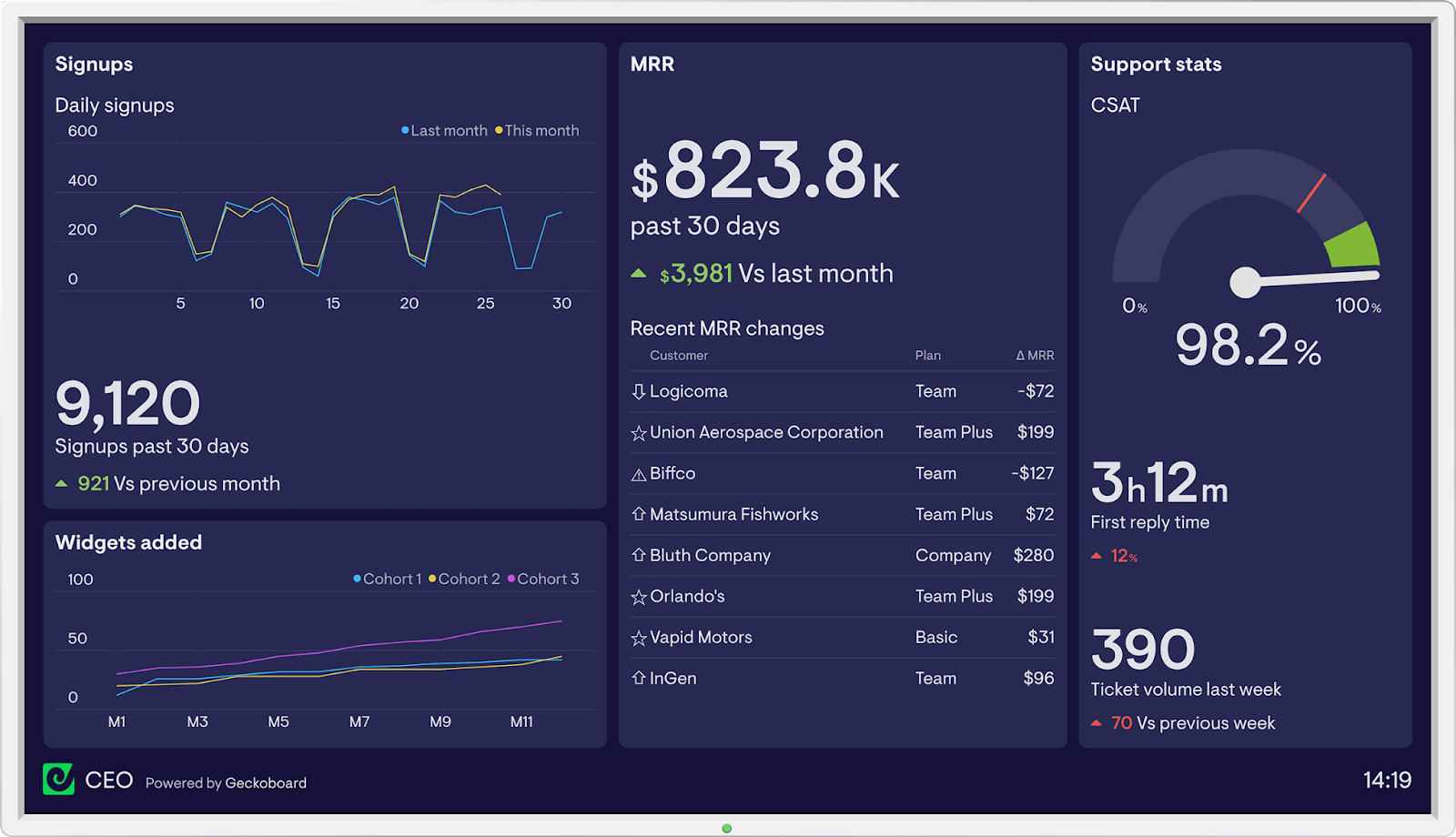
Geckoboard is a dashboard tool designed to display key metrics from multiple data sources in a single, visual interface. It focuses on real-time performance monitoring and makes it easy to share updates across teams through TVs, monitors, or web-based dashboards.
With pre-built integrations and a straightforward setup process, Geckoboard is primarily used for tracking marketing, sales, and customer support KPIs in a simple, visual format.
Key features:
- Pre-built connectors for popular marketing, sales, and support tools
- Real-time data syncing for live metric tracking
- Drag-and-drop dashboard builder
- Library of pre-built widgets and visualizations
- Easy sharing to monitors, TVs, and team displays
- Mobile-friendly dashboard access
- Scheduled dashboard snapshots and reports
- Simple permissions and sharing controls
Pros:
- Easy to set up and use with minimal technical effort
- Real-time performance monitoring and live dashboards
- Clear, visual presentation for team-wide visibility
- Works well for tracking a focused set of KPIs
Cons:
- Limited customization for complex data needs
- No advanced data modeling or transformation layer
- Primarily focused on display, not deep analysis
- Less suited for enterprise-level reporting and governance
Geckoboard Pricing
Geckoboard pricing in 2026 starts at $44 per month for the Essential plan, which includes 1 dashboard and 1 user with access to over 80 data sources. The Pro plan begins at $87 per month and supports 5 dashboards and 10 users, adding features like custom logos and priority support.
7. Whatagraph
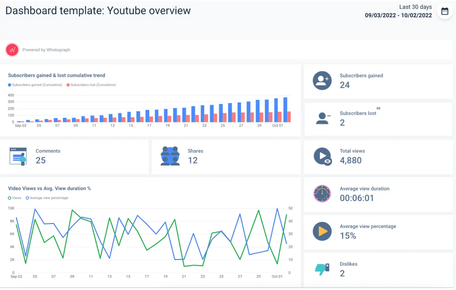
Whatagraph is a reporting and dashboard tool that offers a range of pre-built integrations and templates, making it simple to track campaign performance and share updates with stakeholders. The platform focuses on streamlining reporting workflows, especially for teams managing multiple clients or marketing channels.
Key features:
- Pre-built connectors for marketing and sales platforms
- Library of customizable reporting templates
- Drag-and-drop report and dashboard builder
- Automated scheduled reporting and email delivery
- Real-time data syncing and live dashboards
- White-label reporting for agencies and client work
- Cross-channel performance tracking
- Collaboration and sharing features
Pros:
- Simplifies reporting across multiple marketing platforms
- Wide selection of pre-built templates and integrations
- Useful for agencies and teams managing multiple clients
- White-label capabilities for branded client reports
Cons:
- Limited data transformation and advanced analytics features
- Less customizable for complex reporting requirements
- Primarily focused on reporting, not deep data exploration
- May not scale well for large, enterprise-level data environments
Whatagraph Pricing
Whatagraph doesn't provide pricing information on the website.
8. Cyfe
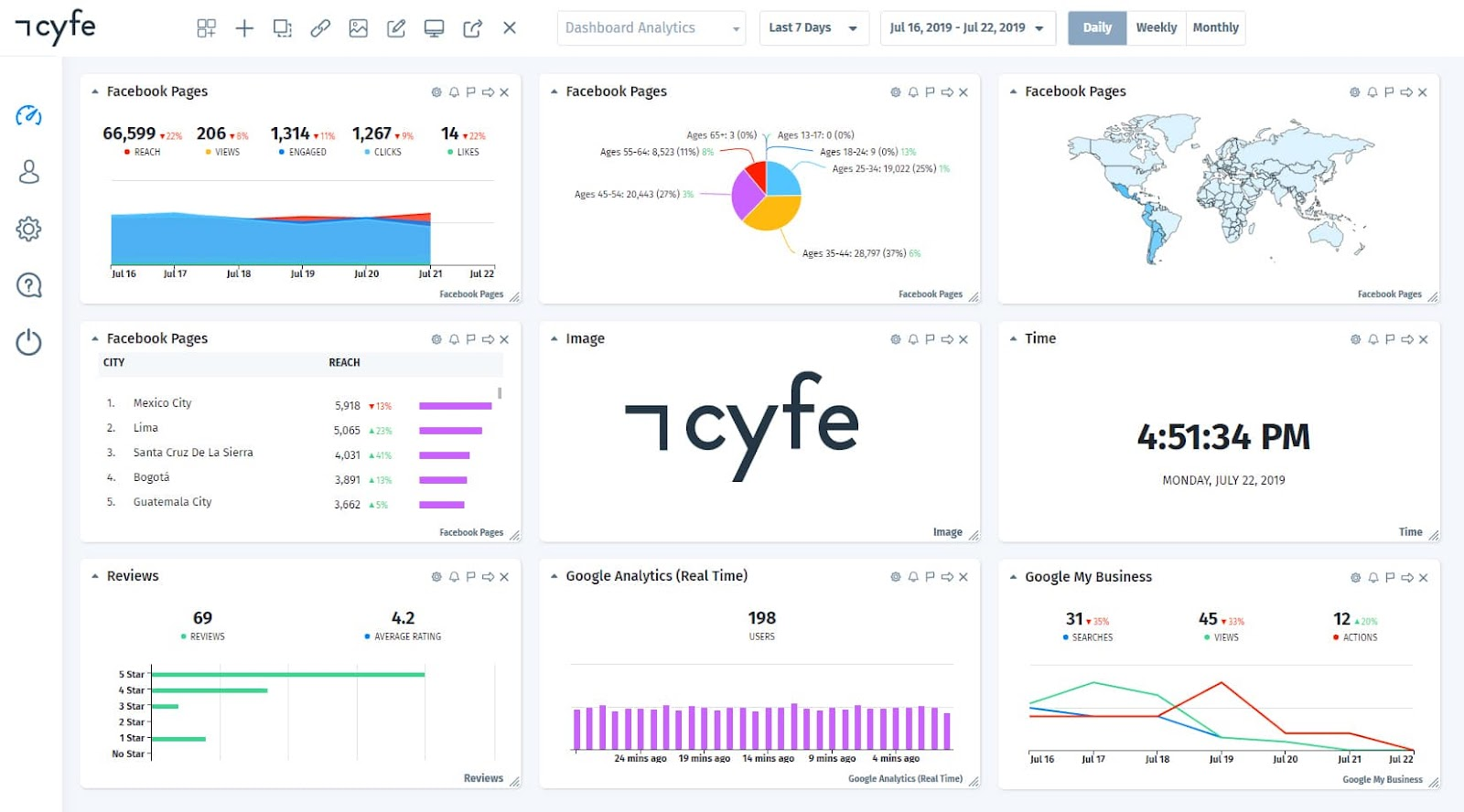
Cyfe is an all-in-one dashboard tool designed to monitor data from multiple business functions, including marketing, sales, finance, and operations.
It offers a range of pre-built widgets and integrations that allow teams to track KPIs in one place. With real-time updates and customizable dashboards, Cyfe is often used for high-level performance monitoring across different departments.
Key features:
- Pre-built widgets for marketing, sales, finance, and operations
- Integration with popular data sources and services
- Customizable, multi-dashboard setup
- Real-time data syncing and live updates
- Historical data tracking and archiving
- Role-based access and sharing permissions
- Automated reporting and scheduled email snapshots
- White-label dashboard options for client reporting
Pros:
- Centralized view of KPIs across multiple business functions
- Wide selection of pre-built widgets and integrations
- Real-time monitoring for up-to-date performance tracking
- White-label capabilities for client or stakeholder reports
Cons:
- Limited advanced analytics and data modeling features
- Less flexible for complex, enterprise-level reporting
- Customization options can be basic compared to BI tools
- Requires external tools for deeper data preparation and governance
Cyfe Pricing
Cyfe pricing is based on the number of dashboards and users needed, with the minimum plan starting at $29 per month for 5 dashboards and 1 user.
Pricing scales with additional dashboards and users, and higher tiers offer more dashboards, unlimited users, white-labeling, and client management features.
Cyfe is positioned as a budget-friendly dashboard tool, suitable for smaller teams or solo marketers focusing on basic marketing KPIs.
9. Domo

Domo is a cloud-based business intelligence platform that centralizes data from multiple sources into one environment for visualization and analysis.
Domo offers extensive data connectors, tools for data preparation and transformation, customizable dashboards, and real-time syncing. The platform includes governance controls, role-based permissions, and options for building custom applications, making it suitable for managing large datasets and complex reporting structures.
Key features:
- Pre-built connectors for marketing, sales, finance, and operations data
- Drag-and-drop dashboard and report builder
- Real-time data syncing and live updates
- Data transformation and preparation tools
- AI-powered data insights and predictive analytics
- Collaboration and sharing features within the platform
- Mobile-optimized dashboards and reporting
- Role-based access control and data governance
- Custom app development for tailored business needs
Pros:
- Comprehensive platform combining dashboards, data prep, and analytics
- Wide range of integrations and pre-built connectors
- Scales well for large, complex organizations
- Strong collaboration and sharing features
- AI-driven insights for advanced decision-making
Cons:
- Steeper learning curve for advanced features
- Higher cost compared to simpler dashboarding tools
- Setup and customization may require technical expertise
- Overly complex for teams with basic reporting needs
Domo Pricing
Domo pricing is based on a credit consumption model combined with per-user licensing, making it somewhat complex and variable. The total price depends on factors like data volume, frequency of data refreshes, and the number of users.
Businesses purchase credits that are consumed by actions such as data storage, ingestion, and report generation, so more extensive data needs increase costs. Implementation and customization can add significant extra expenses.
10. Looker
Looker is a cloud-based business intelligence and analytics platform used to centralize and explore data from multiple sources. It provides tools for data modeling, real-time querying, and building customizable dashboards and reports.
Looker integrates with modern data warehouses and offers governance features to manage access and maintain consistency across datasets. Its framework allows teams to define metrics and calculations in a structured, reusable way for reporting and analytics.
Key features:
- Native integration with modern cloud data warehouses
- Data modeling and metric definitions through LookML
- Customizable dashboards and visualizations
- Real-time data querying and exploration
- Role-based access controls and permissions
- Collaboration and sharing features
- Embedded analytics for external applications
- API access for custom integrations
Pros:
- Strong data modeling capabilities for consistent reporting
- Works natively with leading cloud data warehouses
- Flexible dashboards and visualizations
- Supports embedded analytics for external use cases
Cons:
- Requires technical expertise to set up and manage LookML
- Limited out-of-the-box templates for marketing-specific use cases
- Can be complex for non-technical users
- Pricing may be high for smaller teams or organizations
Looker Pricing
Looker does not offer public, fixed pricing and typically requires engaging with sales for a custom quote based on business needs.
Looker pricing is primarily customized and based on several factors, including the number and types of users, the scale of deployment, and the volume of data processed. Pricing usually starts at around $35,000 to $60,000 per year for smaller teams, with additional costs for advanced features, API usage, and embedded analytics.
11. Zoho Analytics
Zoho Analytics, formerly Zoho Reports, is part of the Zoho business software ecosystem. It is a cloud-based business intelligence and analytics platform that consolidates data from various sources for reporting and visualization.
Zoho Analytics provides tools for data preparation, custom dashboard building, and advanced analytics. With a range of native integrations and an AI-powered assistant, Zoho Analytics supports both simple dashboarding needs and more complex analysis, while offering governance features for managing data access and permissions.
Key features:
- Pre-built connectors for marketing, sales, finance, and operations data
- Drag-and-drop dashboard and report builder
- Data preparation and transformation tools
- AI-powered assistant for natural language queries
- Real-time data syncing and scheduled refreshes
- Advanced analytics with predictive and statistical functions
- Collaboration and sharing options
- Role-based permissions and governance controls
- Mobile app for dashboards and reporting on the go
Pros:
- Broad set of features for reporting and analytics
- AI assistant for simplified data exploration
- Wide range of native integrations
- Cost-effective compared to many enterprise BI tools
Cons:
- Limited customization for highly complex data models
- May require external tools for advanced data engineering
- Interface can feel less polished compared to other BI platforms
- Performance can be slower with very large datasets
Zoho Analytics Pricing
Zoho Analytics offers five pricing plans for cloud deployment, starting at $24 per month, billed annually. On-premise deployment for personal use is free. The price for professional cases depends on the destination: AWS, Docker, or Azure.
12. Sisense
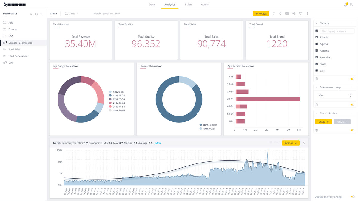
Sisense is a business intelligence and analytics platform designed to combine data preparation, analysis, and visualization in one environment.
It supports data from multiple sources, offering tools for transformation, modeling, and dashboard creation. Sisense includes features for embedding analytics into external applications and managing governance and permissions, making it suitable for organizations that need customizable, scalable reporting and analytics infrastructure.
Key Features:
- Integration with cloud and on-premise data sources
- Data preparation and transformation tools
- Customizable dashboards and visualizations
- Embedded analytics for external apps and products
- Real-time data querying and updates
- Role-based access controls and governance
- Collaboration and sharing features
- API support for custom integrations
- AI and machine learning capabilities for advanced analytics
Pros:
- Combines data preparation, visualization, and analytics in one platform
- Strong embedded analytics capabilities
- Scales well for complex enterprise environments
- Flexible APIs for customization and integration
Cons:
- Setup and management can require technical expertise
- Higher cost compared to lightweight dashboard tools
- Interface may feel complex for non-technical users
- Requires clean, structured data for best performance
Sisense Pricing
Similar to some other dashboard software solutions, Sisense doesn’t publicly disclose its pricing information.
13. Qlik Sense
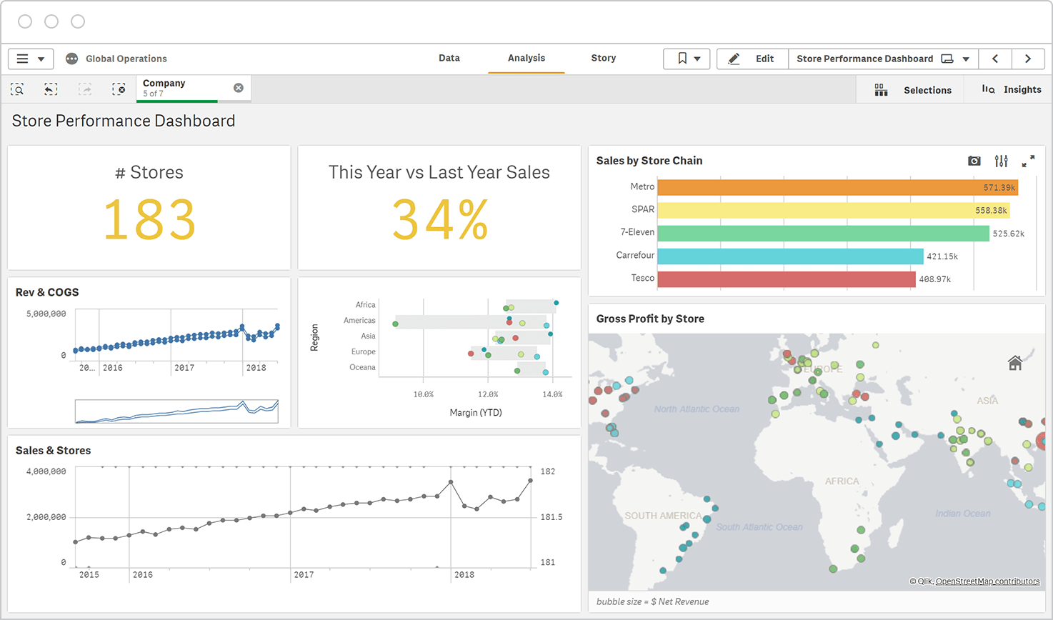
Qlik Sense is a business intelligence and data analytics platform that combines data integration, visualization, and exploration capabilities.
Qlik Sense uses an associative data model for real-time querying and discovery, supporting both guided analytics and self-service reporting. The platform also includes governance features for managing data access and ensuring consistency across teams.
Key Features:
- Integration with cloud and on-premise data sources
- Associative data model for real-time analysis
- Customizable dashboards and visualizations
- Data preparation and transformation tools
- AI-powered insights and predictive analytics
- Self-service analytics and guided exploration
- Role-based permissions and governance controls
- Collaboration and sharing features
- Mobile-optimized dashboards and reporting
- API support for custom integrations
Pros:
- Associative data model for flexible, in-depth analysis
- Strong support for both self-service and guided analytics
- Scalable architecture for enterprise environments
- Wide range of data integration options
Cons:
- Steeper learning curve for advanced features
- Setup and maintenance may require technical expertise
- Interface can feel complex for non-technical users
- Higher cost compared to basic dashboarding tools
Qlik Sense Pricing
Qlik offers four capacity-based pricing plans, starting at $200 a month billed annually.
14. Grafana
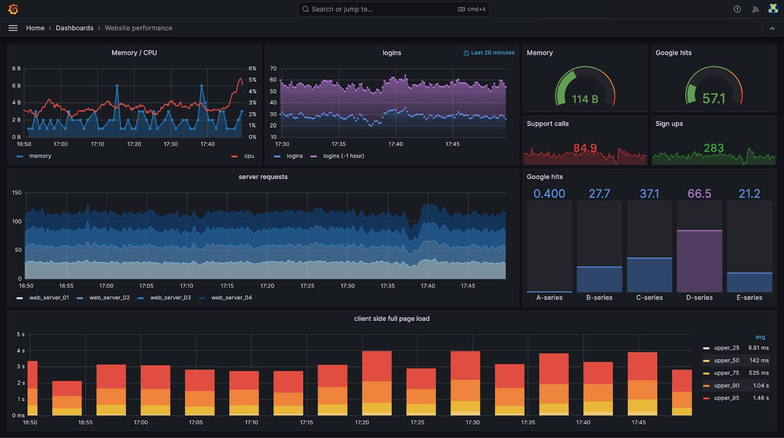
Grafana is an open-source analytics and visualization platform used to monitor and display data from multiple sources in real time.
Grafana supports a wide variety of data connections, including databases, cloud services, and time-series data platforms.
It is widely used for building interactive, customizable dashboards that track metrics across infrastructure, application performance, and business operations.
Key Features:
- Integration with numerous data sources, including SQL databases, cloud services, and time-series databases
- Customizable dashboards with a wide range of visualizations
- Real-time data monitoring and live updates
- Alerting system with configurable notifications
- Role-based access controls and permissions
- Collaboration and dashboard sharing tools
- Plugin ecosystem for extended functionality
- API support for custom integrations
- Open-source core with commercial enterprise options
Pros:
- Flexible and highly customizable dashboarding environment
- Wide range of supported data sources and plugins
- Strong real-time monitoring and alerting capabilities
- Open-source with a large user community and enterprise-grade upgrades
Cons:
- Requires technical expertise for setup and configuration
- No built-in data transformation or modeling layer
- Less focused on marketing and business reporting out of the box
- Customization can be time-consuming for complex use cases
Grafana Pricing
Grafana pricing includes a free plan with basic features and limits, such as 10,000 series metrics and up to 3 team members.
Paid plans start with Grafana Pro at $49 per month plus usage fees, offering more users and longer data retention.
The Advanced and Enterprise plans include additional users and enhanced enterprise features, with pricing available upon request.
15. GoodData
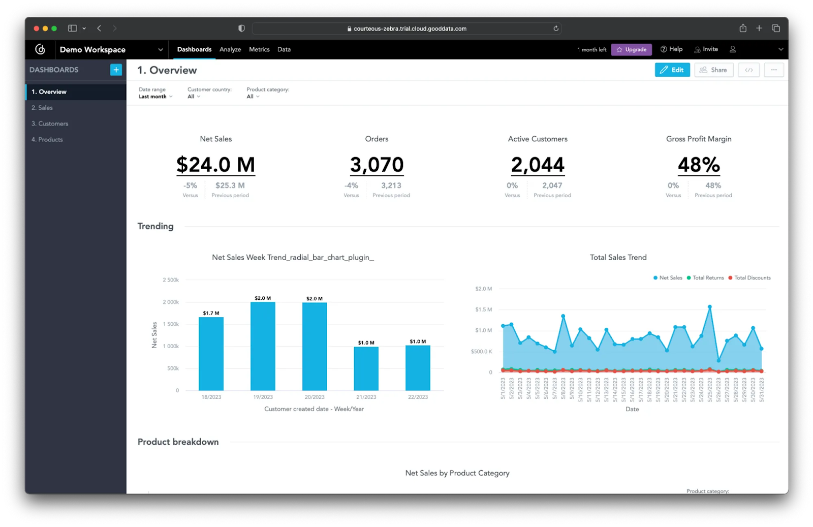
GoodData is a cloud-based business intelligence and analytics platform designed to centralize data from multiple sources and deliver insights through customizable dashboards and reports.
It offers tools for data preparation, modeling, and governance, along with options for embedding analytics into external applications. GoodData focuses on scalability and flexibility, supporting both internal analytics needs and external client-facing reporting.
Key Features:
- Integration with cloud and on-premise data sources
- Data modeling and preparation tools
- Customizable dashboards and visualizations
- Embedded analytics for external applications and products
- Role-based permissions and governance controls
- Real-time data querying and updates
- Collaboration and sharing features
- API support for custom integrations
- White-label capabilities for client reporting
Pros:
- Strong embedded analytics and white-label features
- Scales well for both internal and external reporting use cases
- Robust governance and access control options
- Flexible APIs for integration and customization
Cons:
- Requires technical expertise for advanced setup and data modeling
- Limited out-of-the-box templates for marketing-specific reporting
- Learning curve for non-technical users
- May be more complex than necessary for basic reporting needs
GoodData Pricing
GoodData pricing is structured around two main plans: Professional and Enterprise.
- The Professional plan uses a per-workspace pricing model where customers pay a platform fee plus charges based on the number of workspaces, allowing unlimited users and data per workspace. This plan includes analytics features, embedding functionality, multi-tenancy, AI-powered natural language queries, and standard support.
- The Enterprise plan offers custom pricing tailored to specific use cases and adds enterprise-grade security, compliance, 24/7 prioritized SLAs, dedicated customer success managers, and full access to AI and analytics lake capabilities.
Free Dashboard Tools
While dedicated dashboard software often comes with a price tag, several free options can serve as starting points for individuals or small businesses with limited budgets.
16. Excel
Excel can be used to create basic dashboards, especially for less complex data sets or for users who are highly proficient in spreadsheets.
You can use Excel's charting tools, pivot tables, and conditional formatting to visualize key metrics and create an interactive dashboard.
However, Excel lacks the real-time data integration, automation, and advanced interactive visualization features of dedicated dashboard software, making it less scalable for growing data volumes or diverse data sources.
17. Looker Studio (formerly Google Data Studio)
Looker Studio is a powerful and free dashboard tool that allows users to connect to various data sources, including Google Analytics, Google Ads, BigQuery, and other platforms.
It offers drag-and-drop functionality for creating interactive reports and dashboards. Looker Studio is an excellent choice for marketing professionals and small businesses looking for a cost-effective way to visualize their marketing data and track KPIs.
18. Tableau Public
Tableau Public is the free version of Tableau's renowned data visualization platform. It allows users to create interactive dashboards and visualizations and publish them to the Tableau Public server for public sharing.
While it's free, it's important to note that any data or dashboards created are publicly accessible. It's a great tool for learning data visualization, showcasing portfolios, or analyzing publicly available datasets.
Use Improvado to Build Reliable Marketing Dashboards
To create dashboards that truly reflect marketing performance, start with a platform that integrates seamlessly with your entire MarTech stack and connects to all marketing and revenue data sources. The right solution should automate data aggregation, normalization, and transformation, ensuring the data powering your dashboards is accurate and analysis-ready.
Improvado provides the data foundation and automation needed to deliver reliable, real-time dashboards. Its platform eliminates manual reporting, enforces consistent metric definitions, and integrates directly with BI tool of your choice or builds dashboards natively through its AI Agent.
Book a demo with Improvado’s experts to see how it can streamline your marketing reporting workflows and improve decision-making.