Marketers today are drowning in data. It flows from countless platforms – social media, ad networks, CRMs, and analytics tools. This data chaos makes it nearly impossible to see the big picture.
This is the problem a marketing dashboard is built to solve. A great dashboard transforms fragmented data into a clear, unified view of performance. It tells you what’s working, what’s not, and where to focus your efforts in real-time.
This guide will show you exactly how to build and use dashboards that drive growth, with over 25 templates to get you started today – preview templates here!
Key Takeaways:
- A marketing dashboard is a visual interface that centralizes real-time data from multiple sources like Google Ads, Meta, and Salesforce for quick analysis.
- Key benefits include saving hundreds of hours on manual reporting, enabling faster, data-driven decisions, and clearly demonstrating marketing ROI to leadership.
- Effective dashboards are automated, tailored to specific roles (e.g., CMO vs. channel manager), and focus on actionable KPIs over vanity metrics.
- You can build dashboards using spreadsheets, BI tools, or specialized platforms. However, automated data platforms like Improvado offer the most scalable and reliable solution.
12 Dashboard Templates You Can Copy-Paste Into Your Stack Today
Pre-built wireframes with exact KPI placements, formula references, and stakeholder matching. From executive overview to budget pacing — every dashboard your marketing team needs in one PDF.
Get All 12 TemplatesWhat Is a Marketing Dashboard? And What It's Not
A marketing dashboard is a centralized, interactive interface that visualizes key performance indicators (KPIs) from various marketing channels and platforms. It provides a real-time, at-a-glance view of performance. This allows teams to monitor campaigns, track progress toward goals, and make informed decisions quickly.
Think of it as the cockpit of your marketing operations. Instead of logging into a dozen different tools to check performance, you have one central hub. It aggregates data from sources like Google Analytics, Meta Ads, HubSpot, and Salesforce into a standardized, easy-to-understand format.
Dashboard vs. Report: Understanding the Difference
People often use dashboard and report interchangeably, but they serve different purposes.
- A dashboard is dynamic and interactive. It's designed for monitoring real-time performance and identifying immediate issues or opportunities. It answers the question, "What's happening now?"
- A report is static and comprehensive. It's typically created for a specific period (e.g., weekly, monthly) and provides a deep dive into historical data. It answers the question, "What happened over this period?"
A dashboard gives you the live pulse of your marketing. A report provides the detailed analysis needed for strategic planning.
Why Every Marketing Team Needs a Dashboard: The Core Benefits
Implementing a marketing dashboard delivers tangible business benefits. It transforms your team from reactive to proactive, empowering them with the insights needed to optimize performance continuously.
1. Drastically Reduce Manual Reporting Time
The most immediate benefit is time savings. Teams often spend 10-20 hours per week manually exporting data, cleaning it in spreadsheets, and building reports.
An automated dashboard can reduce this effort by over 80%. This frees up your team to focus on what truly matters: strategy and optimization.
2. Enable Faster, Smarter Decisions
With real-time data at your fingertips, you can spot trends and anomalies as they happen.
Did your cost per lead on Facebook suddenly spike?
Did a blog post go viral?
A dashboard alerts you instantly, allowing you to react quickly, shifting budget, pausing a failing ad, or doubling down on a winner.
3. Prove and Maximize Marketing ROI
Connecting marketing activities to revenue is the ultimate goal. A well-built dashboard integrates data from your ad platforms, marketing automation system, and CRM. This allows you to track the entire customer journey and demonstrate your direct impact on the bottom line. It makes it easy to calculate and improve your marketing ROI.
4. Align Sales, Marketing, and Leadership
When everyone is looking at the same data, alignment happens naturally. A shared dashboard becomes the single source of truth for all teams. Sales can see the quality of leads marketing is generating.
Leadership gets a clear, high-level view of performance. This transparency fosters collaboration and builds trust.
The Anatomy of an Effective Marketing Dashboard: Key Components
A powerful dashboard is a carefully designed system with several essential components working together. Understanding this anatomy is key to building a tool that provides real value.
Data Sources and Integration
The foundation of any dashboard is its data. An effective dashboard pulls information from all relevant sources, including advertising platforms (Google Ads, LinkedIn Ads), analytics tools (Google Analytics), CRM systems (Salesforce), and even offline sources.
This unified view is critical for true marketing analytics.
To streamline this step, organizations rely on platforms like Improvado to centralize and standardize all marketing and customer data before it reaches the dashboard.
Improvado consolidates data from hundreds of sources, aligns metrics and taxonomies, and delivers clean, analysis-ready datasets, removing the need for manual aggregation, connector maintenance, or custom data preparation.
This ensures dashboards are built on reliable, consistent, and always up-to-date information.
Key Performance Indicators (KPIs)
KPIs define how performance is measured and should directly reflect the strategic purpose of the dashboard.
The right KPIs will vary depending on the dashboard type: an executive dashboard prioritizes revenue efficiency and high-level trends, a performance dashboard focuses on channel effectiveness and optimization levers, and a campaign dashboard emphasizes granular, in-flight metrics.
Effective dashboards highlight actionable KPIs such as Cost Per Acquisition, Revenue per Marketing Dollar, Conversion Rate, or Pipeline Contribution, while deprioritizing vanity indicators like impressions or follower counts.
KPIs must be selected with the audience, decision-making workflow, and intended outcomes in mind to ensure the dashboard drives insight rather than noise.
Visualizations
Data visualizations (charts, graphs, maps) turn raw numbers into understandable insights. The key is to choose the right visualization for the data.
For example, use a line chart for trends over time, a bar chart for comparisons, and a pie chart for composition.
Read our guide to data visualization techniques to handle complex, multi-dimensional datasets with greater precision and clarity.
Filters and Segmentation
A great dashboard is interactive. Users should be able to filter and segment data to dig deeper. Common filters include date range, marketing channel, campaign, or geographic region. This allows users to answer their own questions without needing a data analyst.
Automation
The entire process, from data extraction to visualization, should be automated.
Data should refresh on a regular schedule (daily or even hourly) without any manual intervention. This ensures the information is always timely and reliable, making it a cornerstone of any robust cross-channel reporting strategy.
How to Create a Marketing Dashboard: 4 Proven Methods
There are several ways to build a marketing dashboard, each with its own pros and cons. The right choice depends on your budget, technical resources, and data complexity. Here’s a breakdown of the most common approaches.
| Method | Cost | Setup Time | Data Connectivity | Automation | Scalability | Best For |
|---|---|---|---|---|---|---|
| 1. Spreadsheets (Excel/Google Sheets) | Low | High | Manual / Limited | Minimal | Low | Small teams with simple needs and few data sources. |
| 2. BI Tools (Tableau, Looker Studio) | Medium | Medium-High | Native Connectors | Partial | Medium | Teams with data analysts who can manage data connections and modeling. |
| 3. Dashboard Software (Databox, DashThis) | Medium | Low | Pre-built Connectors | High | Medium | Marketers who need quick, template-based dashboards without technical help. |
| 4. Marketing Data Platforms (Improvado) | High | Low | Extensive (500+) | Full | High | Growing teams and enterprises needing a reliable, scalable single source of truth. |
1. DIY with Spreadsheets (Google Sheets/Excel)
This is the most basic method. You manually export data from your platforms and paste it into a spreadsheet.
While cheap, it's incredibly time-consuming, error-prone, and doesn't scale. It's a starting point but quickly becomes a bottleneck.
2. Using Business Intelligence (BI) Tools
Tools like Looker Studio (formerly Google Data Studio), Power BI, or Tableau offer powerful visualization capabilities. They have native connectors to some marketing platforms.
However, you are still responsible for cleaning, blending, and normalizing the data yourself, which requires significant technical expertise.
3. Using Pre-built Dashboard Software
These platforms specialize in making dashboards easy for marketers. They offer pre-built connectors and templates.
This is a great step up from spreadsheets, but you can be limited by their connectors and data transformation capabilities. You might hit a wall as your needs become more complex.
4. Automating with a Marketing Data Platform
The most reliable and scalable approach to dashboard creation uses a combination of best-in-class tools rather than relying on a single platform.
In this model, a marketing data pipeline solution like Improvado automates data extraction and normalization, a cloud data warehouse serves as the centralized storage layer, and a BI tool (Tableau, Looker, Power BI) provides flexible reporting and visualization.
This integrated architecture ensures high performance at scale, eliminates manual data preparation, and allows each component to do what it does best:
- Pipelines automate movement and standardization of cross-channel data.
- The warehouse keeps data structured, governed, and analytics-ready.
- The BI layer delivers fully customizable dashboards for any stakeholder.
To support this architecture, Improvado provides:
- Automated data extraction from 500+ marketing and sales sources
- Normalization and metric harmonization for consistent cross-platform logic
- Marketing-specific data models built for campaign, audience, and revenue analysis
- Flexible loading into warehouses and BI tools (BigQuery, Snowflake, Redshift, Tableau, Looker, Power BI)
- Data quality checks and governance automation that minimize drift and inconsistencies
- AI-powered transformation and analysis capabilities to accelerate dashboard development and insight generation
This combined approach gives teams scalability, extensibility, and long-term reliability, something single-tool dashboards can't match.
25+ Marketing Dashboard Examples & Templates for Every Goal
The best marketing dashboard is one tailored to a specific purpose.
A CMO needs a different view than a PPC specialist. Here are over 25 examples and templates, grouped by function, to inspire your own dashboard creation.
Strategic and Performance Dashboards
#1. Marketing Performance Dashboard
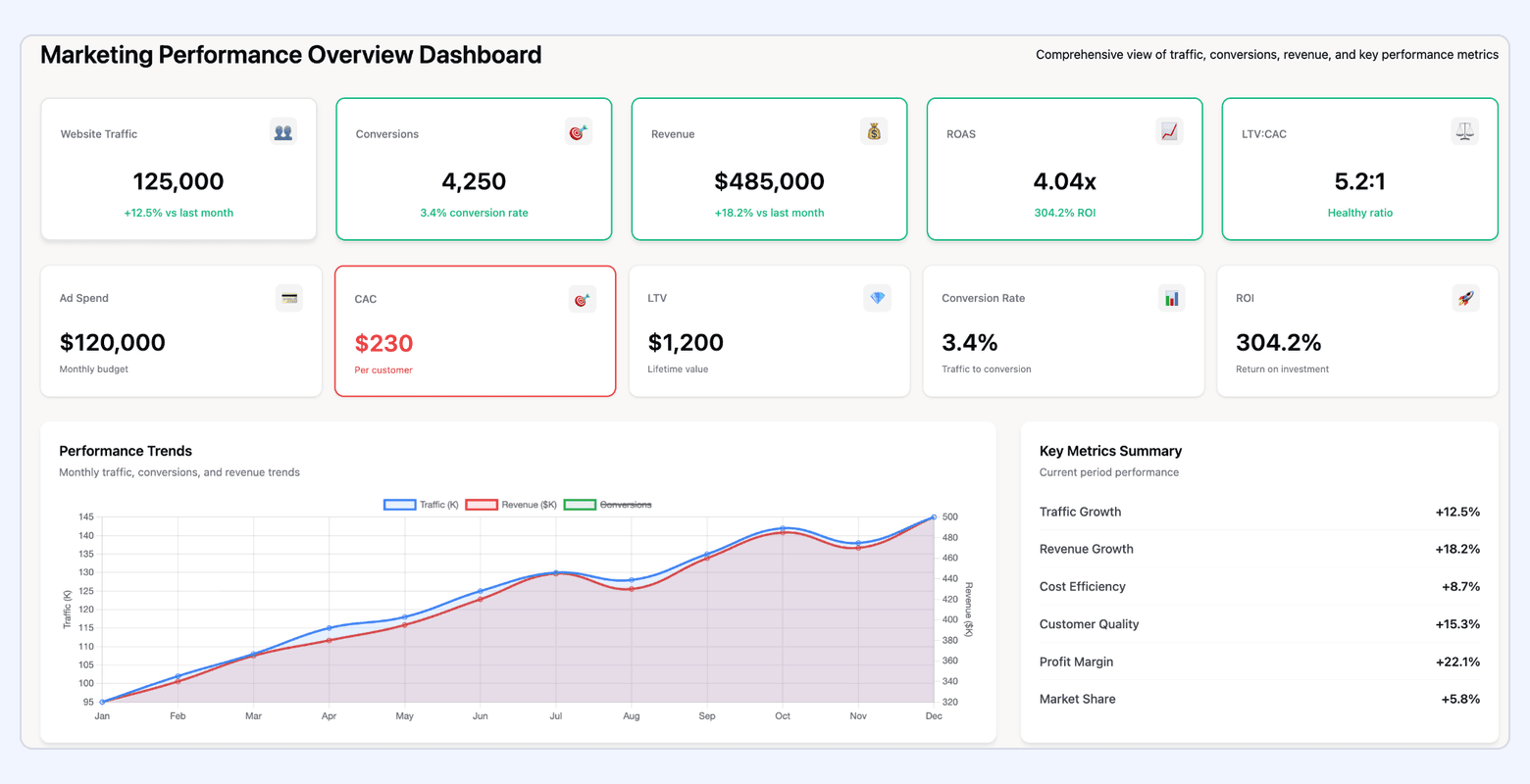
This is your master dashboard. It provides a holistic view of campaign performance across all channels. It consolidates metrics like spend, impressions, clicks, conversions, and ROI from every platform into one place for easy comparison.
Best for: Growth teams and agencies managing multi-channel campaigns who need a single source of truth for marketing ROI and performance trends.
Key Metrics Included:
- Channel-level spend, impressions, clicks, CTR, CPC, CPM
- Conversion metrics: CVR, CPA, ROAS
- Funnel metrics: lead volume, MQLs, SQLs, opportunities
- Cross-channel comparisons to understand efficiency and scale
- Performance breakdowns by campaign, ad group, audience, device, geography
Key considerations:
- Ensure unified taxonomy across platforms to compare like-for-like metrics
- Include pacing vs. plan to manage budgets proactively
- Highlight both absolute performance and efficiency ratios
#2. CMO Dashboard
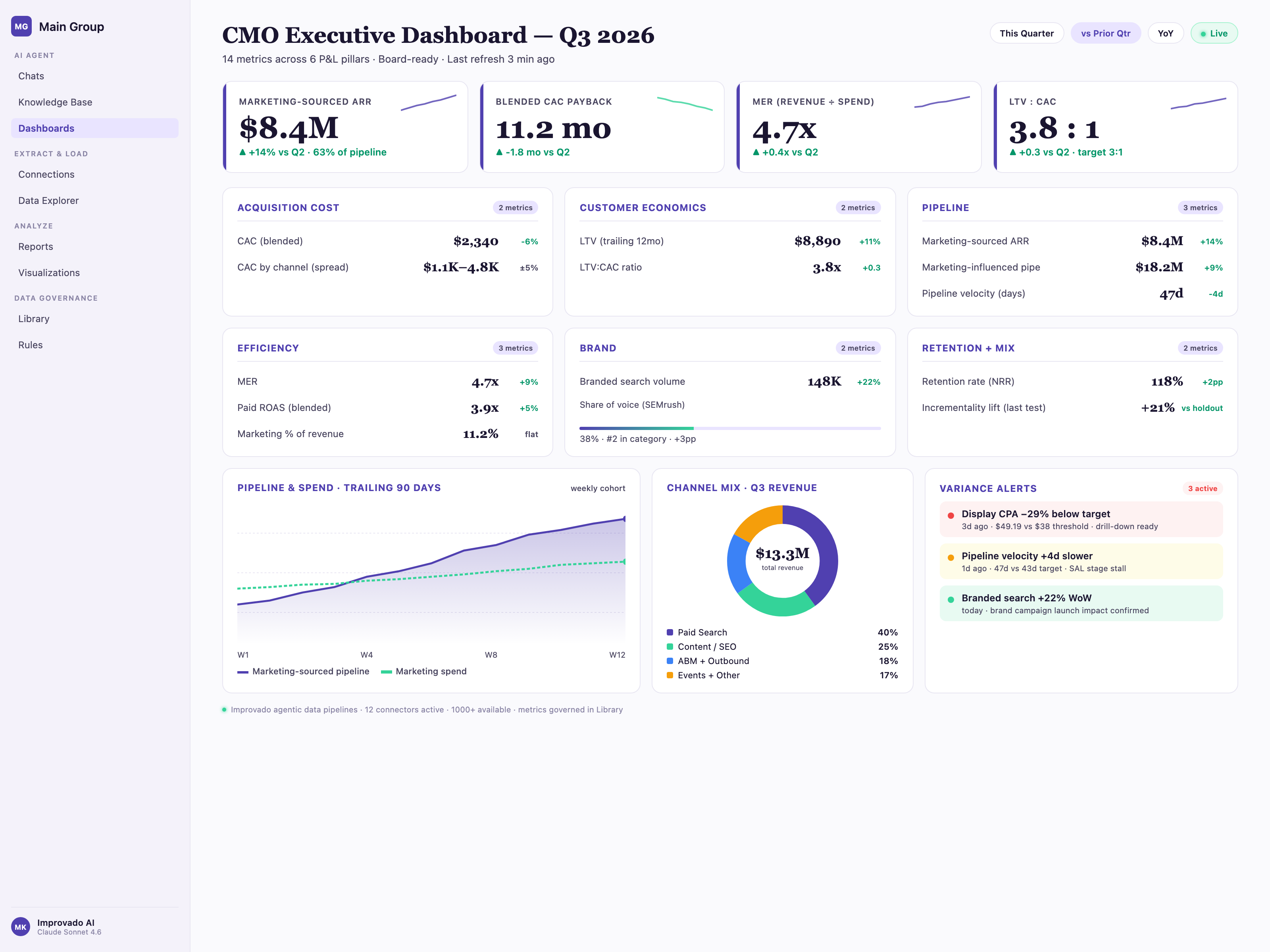
This dashboard provides an executive-level view focused on business impact, not channel execution. It connects marketing activity to revenue, margin, pipeline, and customer value.
The CMO dashboard is designed for strategic decision-making, quarterly planning, and board-level visibility.
Best for: CMOs and executive teams overseeing multiple channels, regions, or brands who need a high-level, outcome-focused view of marketing performance.
Key Metrics Included:
- Customer Acquisition Cost (CAC)
- Customer Lifetime Value (CLV)
- Revenue attribution (marketing-sourced and marketing-influenced)
- Marketing ROI and payback period
- Pipeline contribution and velocity
- Retention, NRR, and churn-related marketing metrics
Key considerations:
- Minimize platform detail; emphasize strategic outcomes
- Include trends over time to show trajectory, not snapshots
- Focus on metrics tied directly to business health and growth
#3. Marketing ROI Dashboard
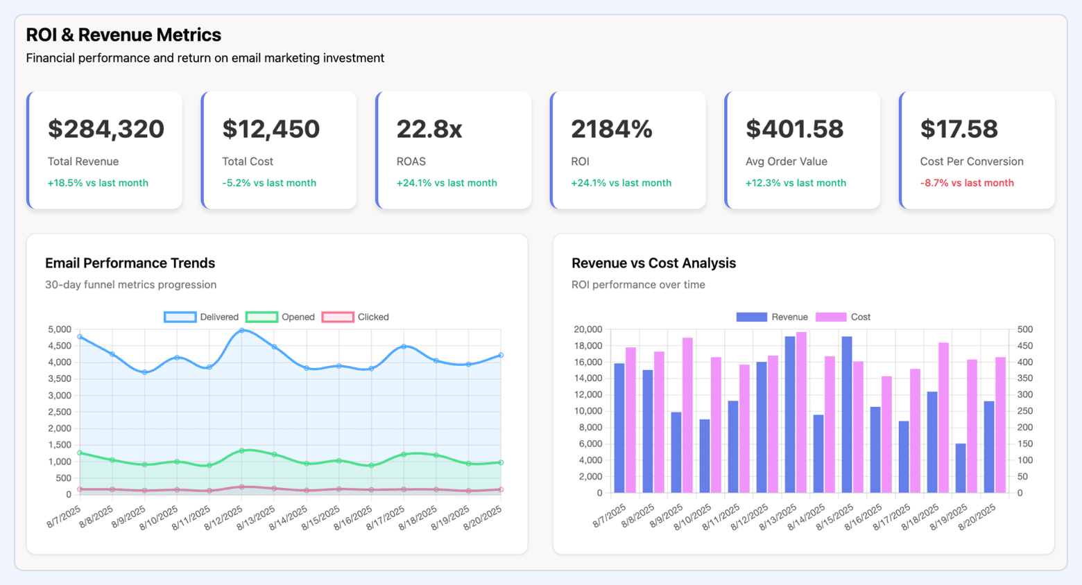
This dashboard focuses exclusively on financial performance, measuring how effectively marketing spend translates into revenue and profit. It breaks down ROI by channel, campaign, and tactic to spotlight the most profitable investments.
What it includes:
- Spend vs. revenue by channel
- ROAS, blended ROI, and marginal ROI
- CAC by channel and segment
- Profit contribution by campaign
- Payback period and unit economics (for example, CAC:CLV ratio)
- Forecasted vs. actual ROI
Key considerations:
- Normalize revenue attribution across platforms to avoid double-counting
- Include incremental lift where possible
- Use cohort analysis for channels with longer conversion cycles
#4. Marketing KPI Dashboard
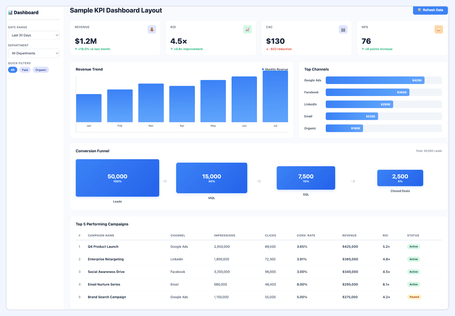
A flexible KPI dashboard designed to track progress against core marketing objectives. It typically blends leading indicators (early signals of performance) with lagging indicators (outcomes that confirm success).
What it includes:
- Website performance: sessions, new users, engaged sessions, bounce rate
- Lead generation: leads, MQLs, SQLs, pipeline influence
- Engagement: email CTR, content interactions, social engagement rate
- Revenue-related KPIs: pipeline creation, bookings, retention impact
- Channel-specific KPIs tailored to the team’s operating model
Key considerations:
- Ensure KPIs are aligned to quarterly/annual targets
- Include benchmarks or targets for context
- Use segmentation (industry, audience, product line) for deeper insight
Channel-Specific Dashboards
#5. SEO Dashboard
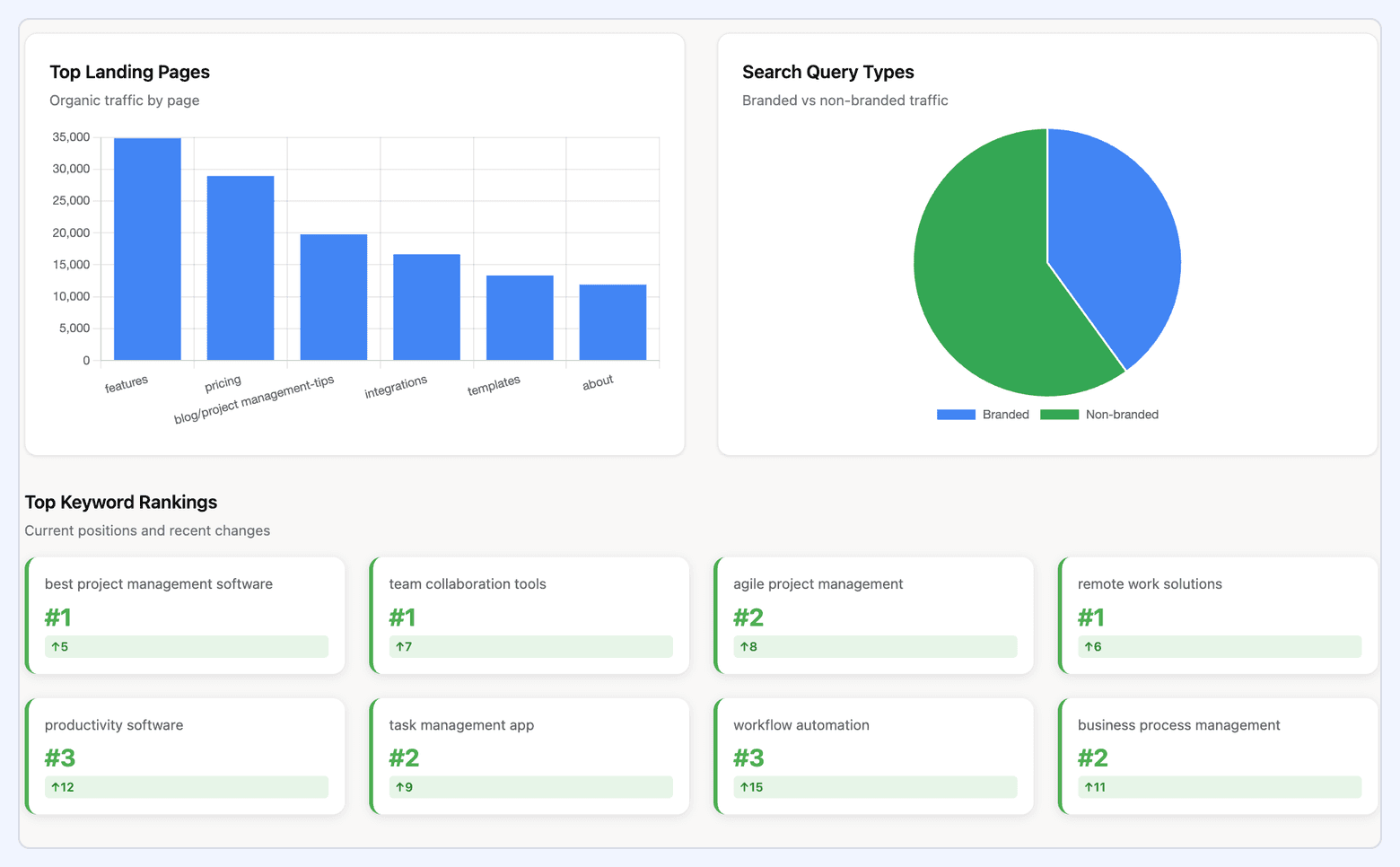
An SEO dashboard tracks the health and scalability of your organic search performance. It integrates data from Google Search Console, Google Analytics, and SEO platforms like Ahrefs or Semrush, giving visibility into how effectively your website attracts and converts organic traffic.
What it includes:
- Organic traffic and landing page performance
- Keyword rankings: position, volatility, and ranking distribution
- CTR by query and page
- Backlink profile metrics: referring domains, authority metrics, lost vs. gained links
- Technical indicators: crawl errors, index coverage, Core Web Vitals
- Organic conversions, goal completions, and revenue attribution
Key considerations:
- Prioritize visibility into ranking shifts for high-value keywords
- Use segmentation (brand vs. non-brand queries) to clarify true performance
- Incorporate technical SEO alerts for proactive maintenance
#6. Social Media Dashboard
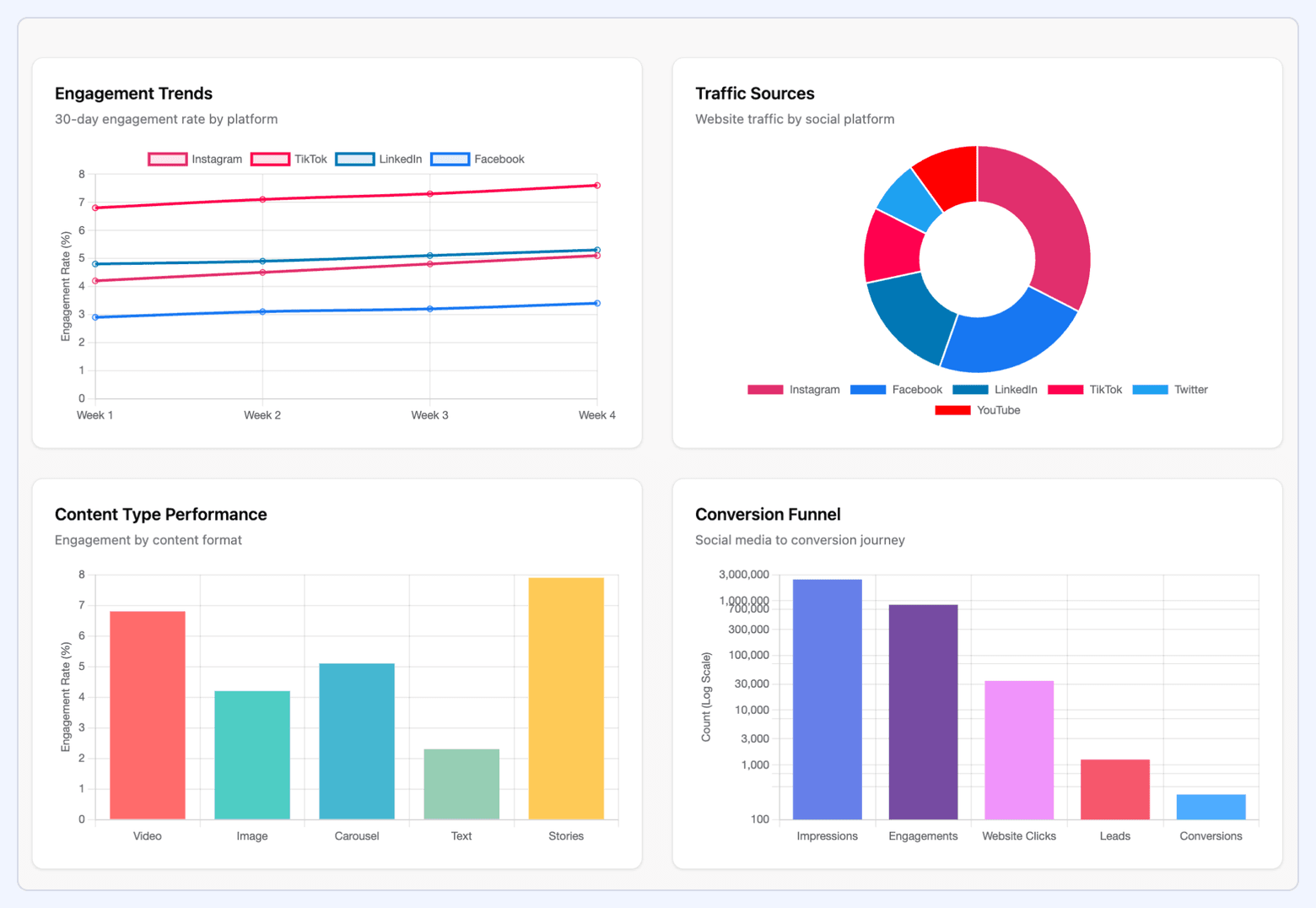
A social media dashboard monitors the performance of both paid and organic social channels in one place. It provides a cross-platform view across Meta, LinkedIn, X, TikTok, and YouTube, enabling teams to evaluate engagement, audience growth, and contribution to business goals.
What it includes:
- Engagement metrics: likes, comments, shares, saves, interactions per impression
- Reach and impressions across channels
- Follower growth and audience demographics
- Click-through rates and landing page performance
- Paid performance: CPM, CPC, CTR, ROAS, cost per result
- Content-level breakdown: top-performing posts, formats, and creators
Key considerations:
- Normalize metrics across platforms for meaningful comparisons
- Track organic and paid together to understand amplification effects
- Highlight insights on creative performance, not just channel totals
#7. Email Marketing Dashboard
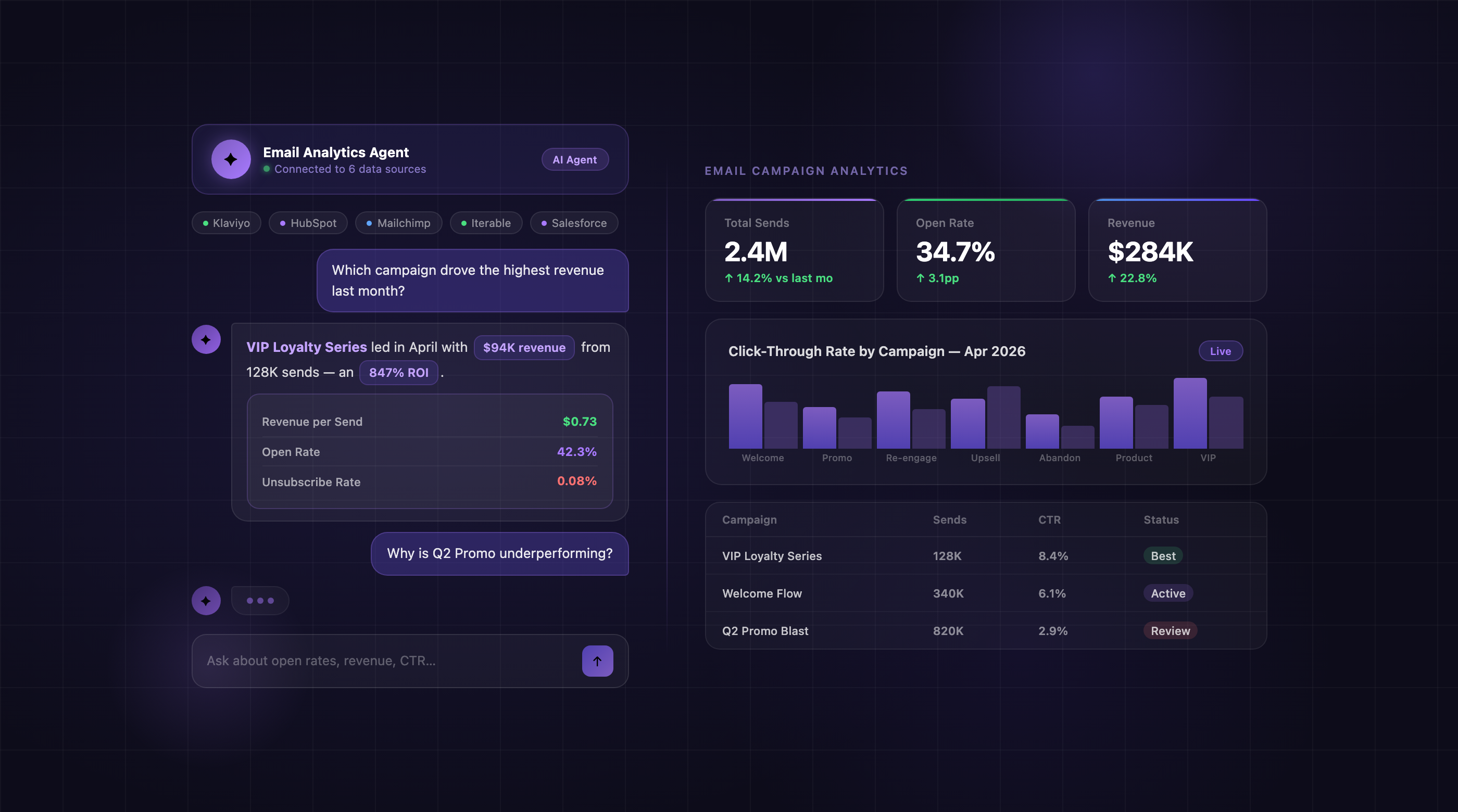
An email dashboard measures how effectively your campaigns engage your audience and support acquisition, nurturing, or retention. Pulling data from Mailchimp, HubSpot, Marketo, or Salesforce Marketing Cloud, it provides transparent insight into deliverability and behavior.
What it includes:
- Open rate, click-through rate, and click-to-open rate
- Conversion rate and revenue per email
- Unsubscribe rate, bounce rate, and spam complaint rate
- Performance by segment, list, and automation workflow
- A/B test outcomes for subject lines, send times, and content variants
- Lifecycle metrics: welcome flows, nurture sequences, re-engagement series
Key considerations:
- Distinguish performance between one-off campaigns and automated flows
- Track deliverability trends to prevent long-term list degradation
- Segment performance by audience type, device, and geography
#8. Content Marketing Dashboard
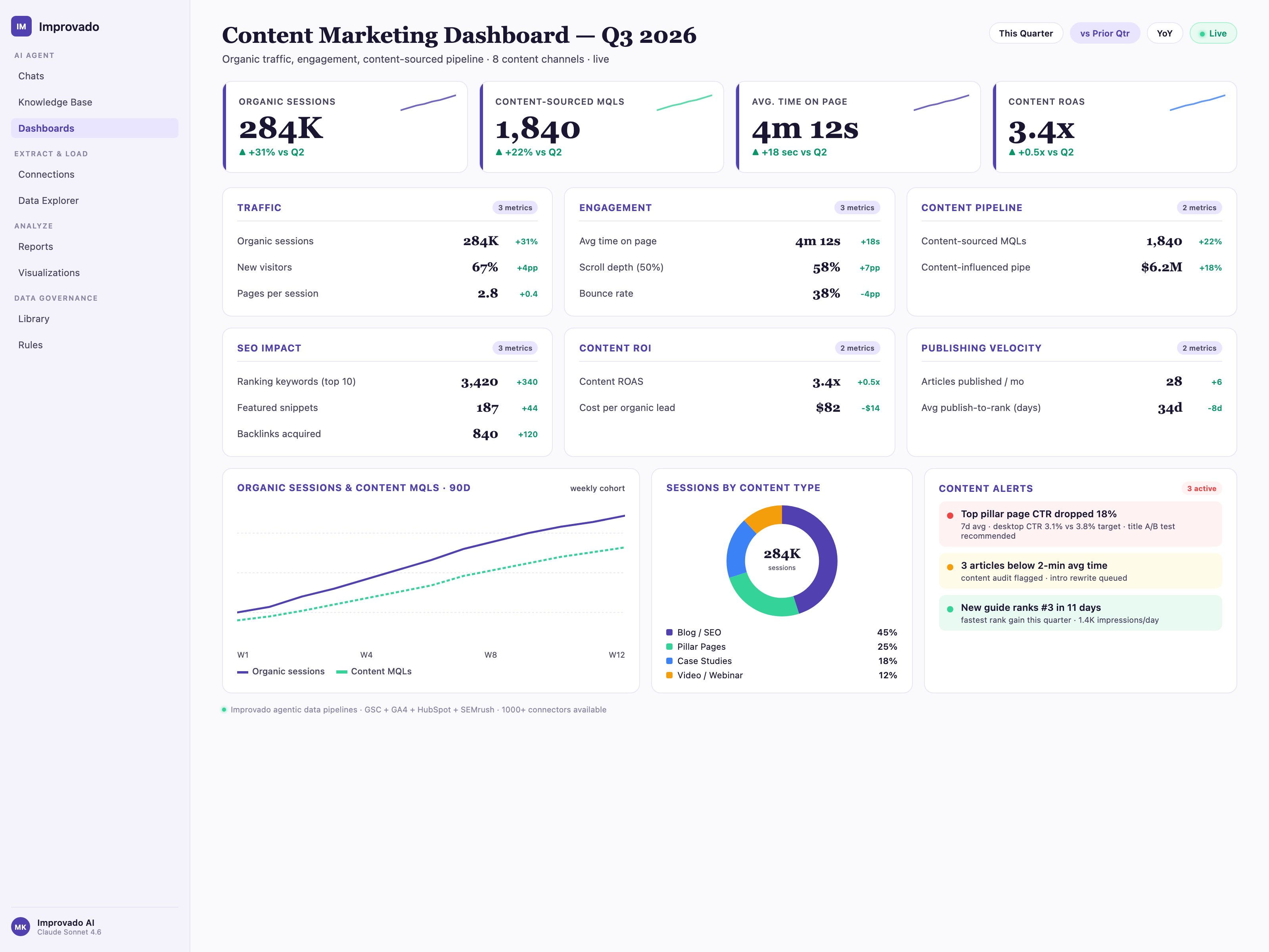
A content dashboard evaluates how well your content ecosystem, including blogs, videos, guides, landing pages, webinars, drives traffic, engagement, and conversions. It blends analytics data (Google Analytics, Adobe Analytics) with social distribution insights.
What it includes:
- Page views, unique visitors, and scroll depth
- Time on page and engagement rate
- Content-assisted conversions and pipeline contribution
- Top-performing assets by traffic source (search, social, referral, email)
- Video analytics: watch time, retention curves, engagement
- Social metrics for distribution effectiveness: shares, saves, referral traffic
Key considerations:
- Map content to the funnel (TOFU, MOFU, BOFU) to assess strategic coverage
- Highlight content decay and identify assets needing updates
- Track performance by topic cluster to support SEO and authority-building
Paid Media Dashboards
#9. Google Ads Dashboard
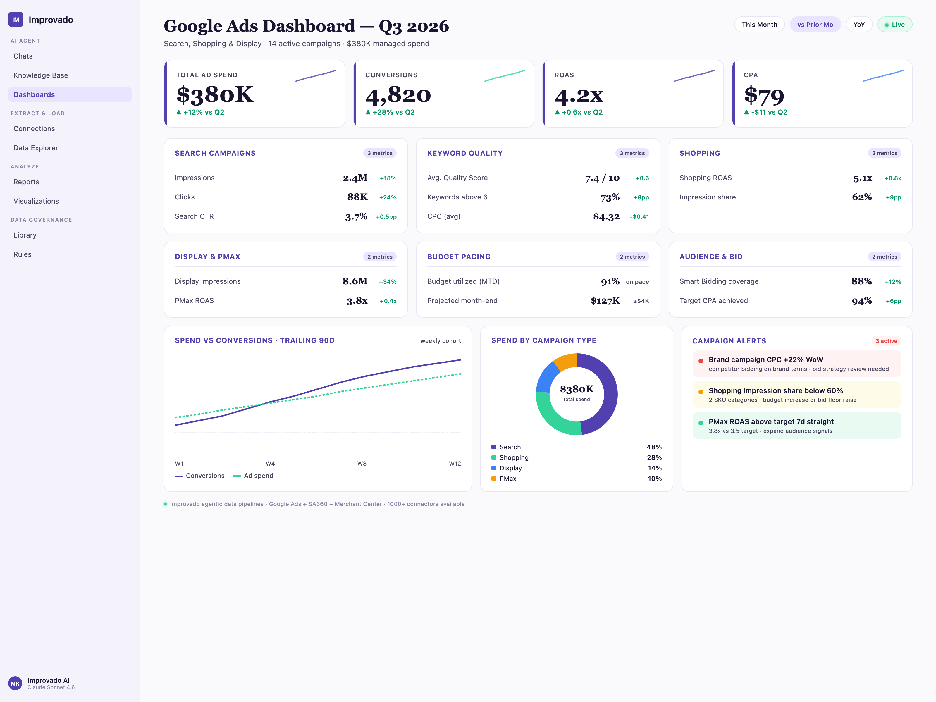
A Google Ads dashboard provides a granular, performance-oriented view of your paid search campaigns. It allows teams to diagnose efficiency and intent quality at every layer of the account structure, from keywords to device types.
What it includes:
- CPC, CPM, CTR, search impression share
- Quality Score components (ad relevance, landing page experience, expected CTR)
- Conversion Rate, CPA, ROAS, cost per conversion
- Keyword-level metrics: match type, query performance, negative keyword impact
- Device segmentation: mobile vs. desktop efficiency
- Budget pacing and forecasted performance
Key considerations:
- Use search term insights to refine match types and improve relevance
- Track impression share loss (rank/budget) to guide scaling decisions
- Include Quality Score trends to prioritize optimization focus
#10. PPC Dashboard
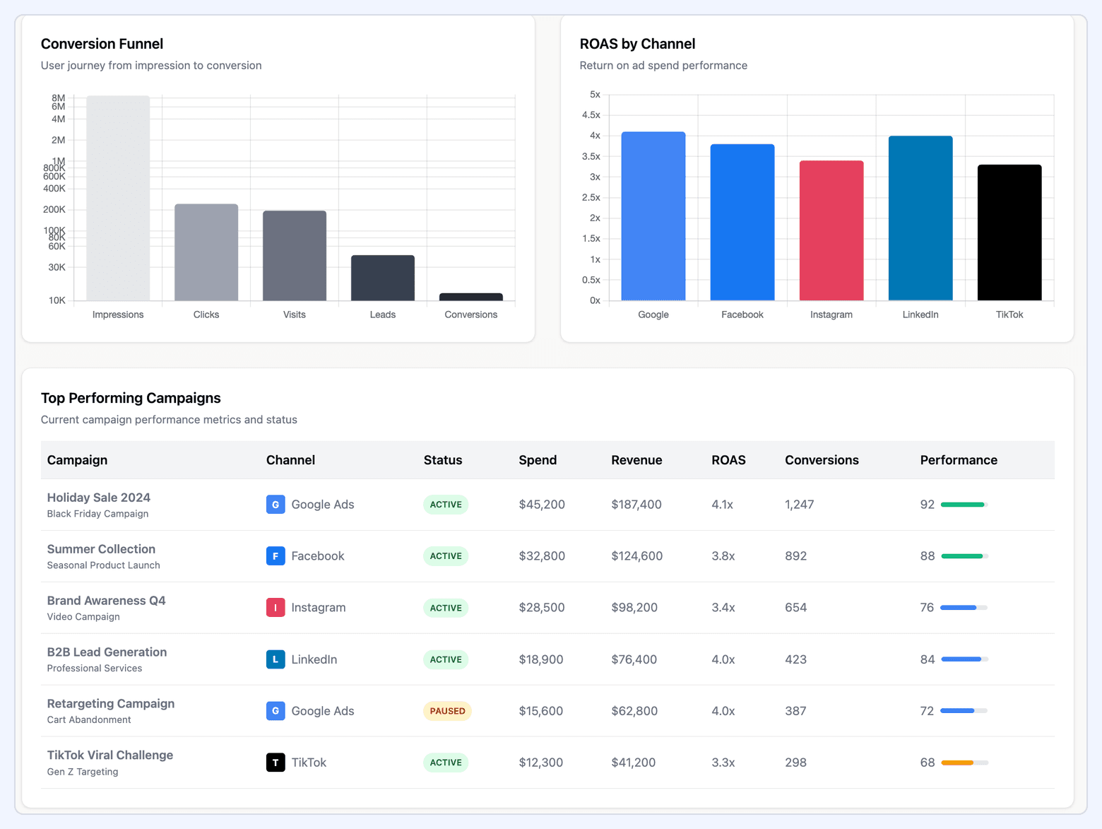
A PPC dashboard consolidates performance across Google Ads, Microsoft Ads, and other paid search platforms. It enables cross-engine comparison and identifies where cost efficiency or volume potential is strongest.
What it includes:
- Cross-platform spend, clicks, conversions, CPA, and ROAS
- Brand vs. non-brand performance segmentation
- Channel-level Quality Score and ad relevance indicators
- Cost efficiency breakdowns across engines (Google vs. Microsoft)
- Query-level performance for high-intent vs. low-intent traffic
- Platform-specific audience insights and remarketing impact
Key considerations:
- Normalize metrics across platforms for accurate comparisons
- Highlight incremental value from Microsoft Ads, which often has lower CPCs
- Track performance by geography and device for scaling opportunities
#11. Meta Ads (Facebook & Instagram) Dashboard
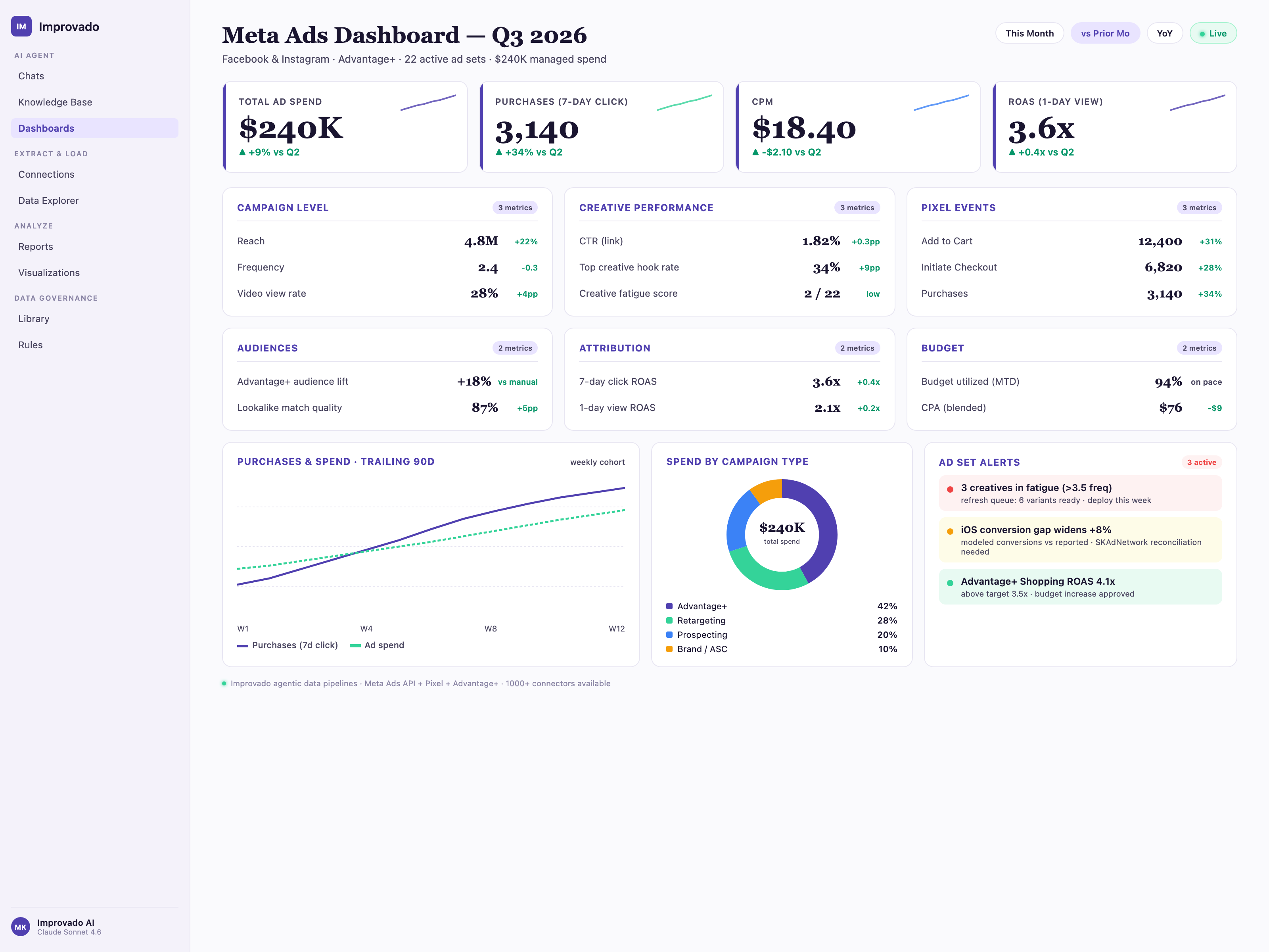
A Meta Ads dashboard focuses on paid social performance across Facebook and Instagram. Because Meta campaigns rely heavily on creative and audience signals, this dashboard surfaces insights that drive incremental improvements.
What it includes:
- Cost Per Result (CPR), CPM, CTR, and Conversion Rate
- ROAS and CAC across prospecting vs. retargeting
- Frequency, reach, and audience saturation
- Creative-level performance: thumbnails, formats, hooks
- Relevance/Quality ranking indicators (engagement rate ranking, conversion rate ranking)
- Breakdown by placement (Feed, Reels, Stories, Audience Network)
Key considerations:
- Track frequency to avoid audience fatigue
- Segment creative by format (Reels vs. Stories vs. Feed) to evaluate efficiency
- Use retargeting performance to assess audience funnel health
#12. TikTok Ads Dashboard
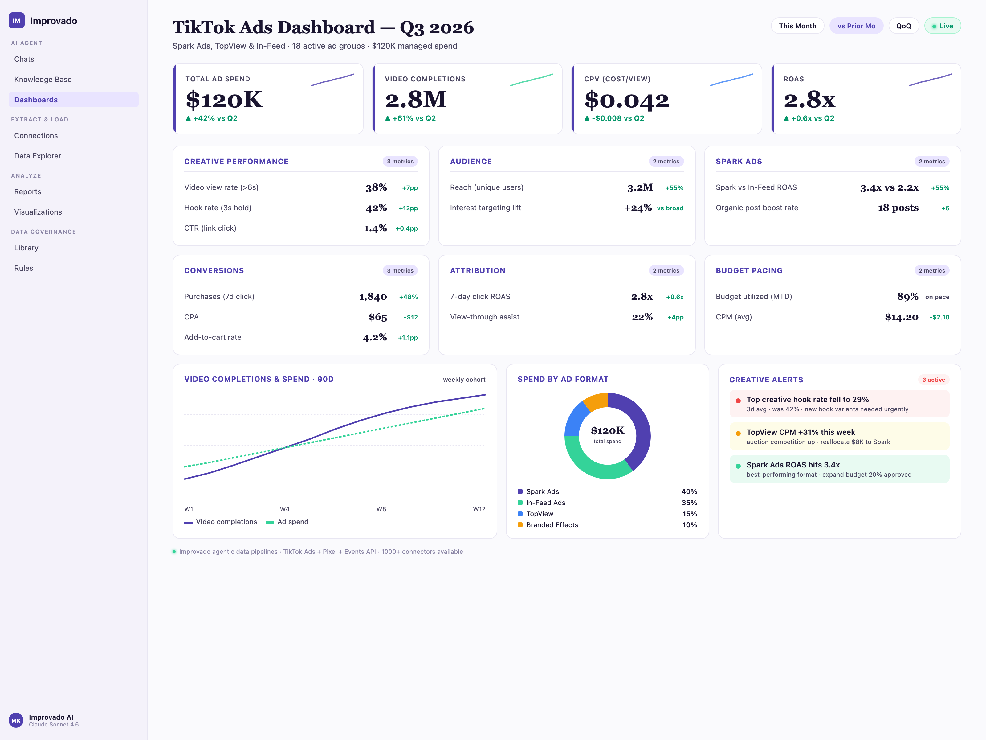
A TikTok Ads dashboard measures performance on a fast-moving, creative-driven platform where engagement and algorithmic signals matter as much as conversion metrics. It reveals how content resonates and where spend should scale.
What it includes:
- Views, view-through rate (VTR), 2s/6s watch metrics
- Engagement rate (likes, comments, shares)
- CTR, CPC, CPA, ROAS
- Creative-level metrics: thumb-stop rate, hook effectiveness
- Performance by audience, placement, and objective
- Trend alignment indicators (sounds, formats, creators)
Key considerations:
- Emphasize creative iteration cadence—TikTok fatigues quickly
- Use watch-through metrics as leading indicators for conversions
- Compare Spark Ads vs. non-Spark ads for authenticity impact
#13. Programmatic Advertising Dashboard
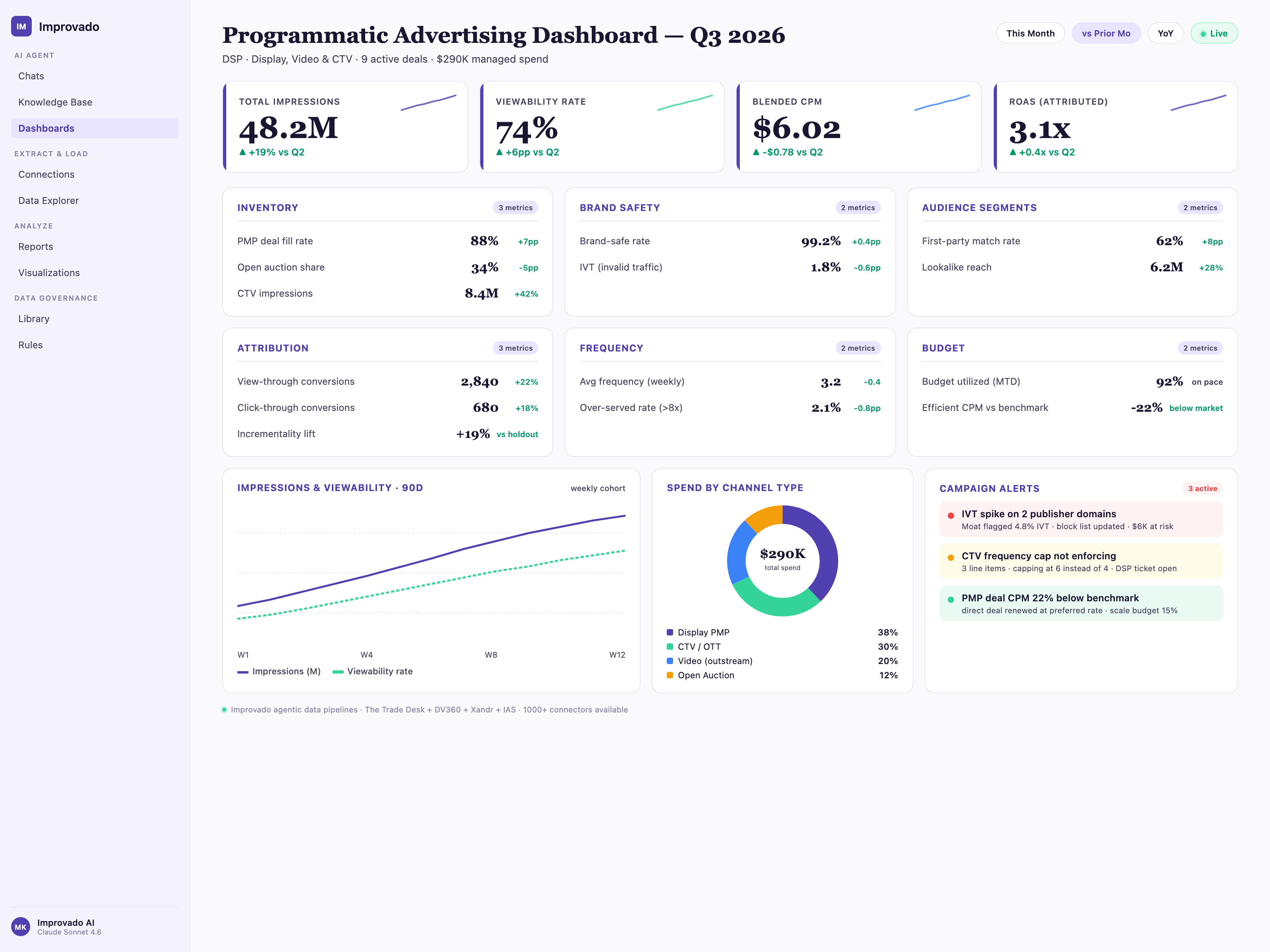
A programmatic dashboard provides visibility into campaigns running across DSPs such as The Trade Desk, DV360, or Amazon DSP. It uncovers performance across publishers, inventory sources, and audience segments.
What it includes:
- Impressions, reach, viewability rate, completion rate
- eCPM, eCPC, eCPA, and eROAS
- Brand-safety and fraud metrics (IVT, GIVT, SIVT)
- Supply-path optimization insights (SSPs, exchanges, publishers)
- Frequency caps and pacing
- Audience-level performance (demographics, intent segments, contextual categories)
Key considerations:
- Use viewability and IVT metrics to optimize supply path efficiency
- Isolate high-performing publishers and audiences for incremental scaling
- Track pacing across flight dates to prevent under-delivery
Tactic & Funnel Dashboards
#14. Lead Generation Dashboard
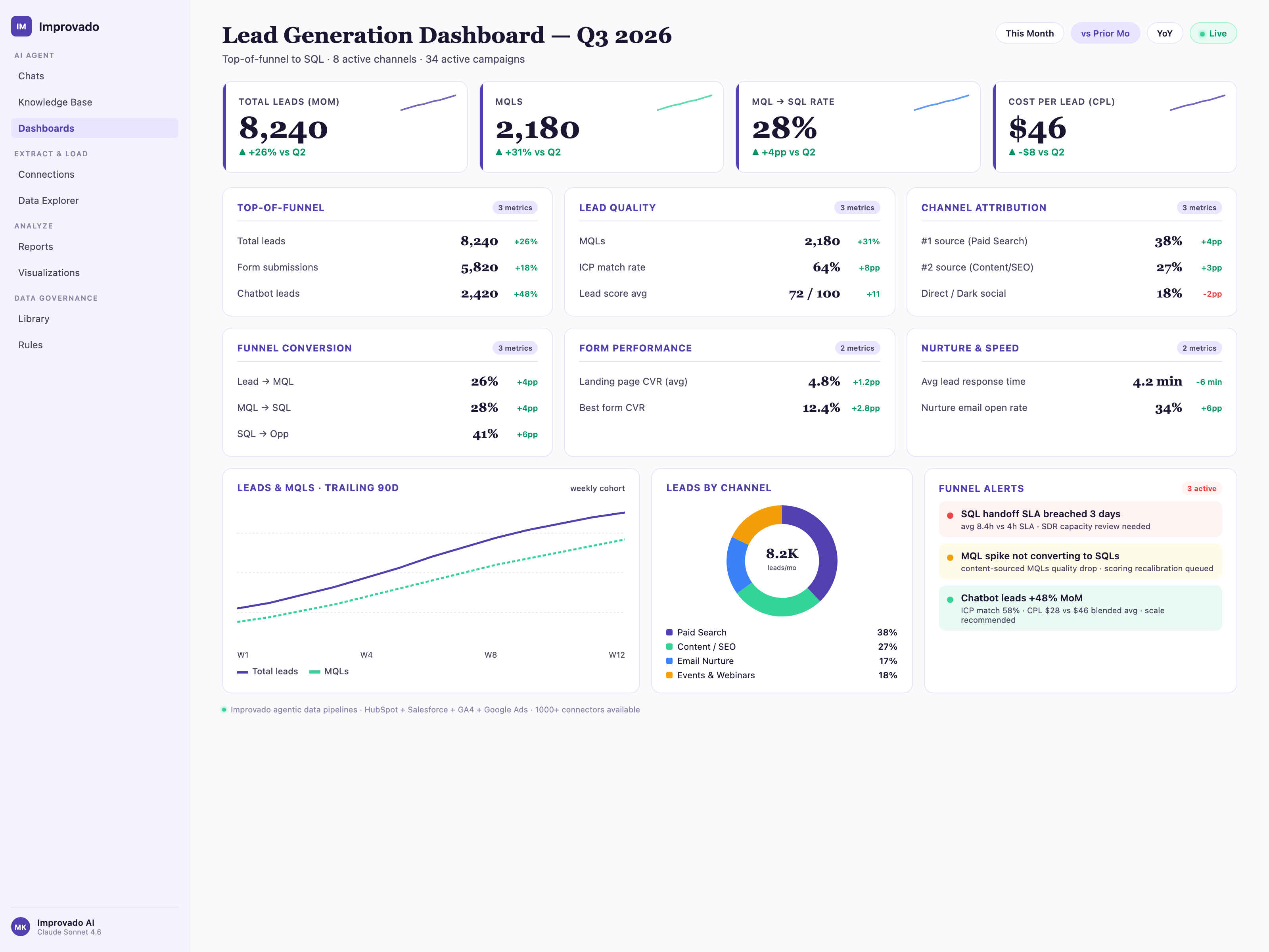
A lead generation dashboard focuses on the top of the funnel, providing visibility into how effectively channels drive new leads and how those leads progress toward qualification. It helps teams evaluate both volume and quality of acquisition efforts.
What it includes:
- Lead volume by channel, campaign, and landing page
- MQLs, SQLs, and Lead→MQL→SQL progression rates
- CPL, cost per MQL, and cost per SQL
- Form fill rate, landing page conversion rate
- Lead quality indicators (fit score, intent score, enrichment data)
- Lead source contribution to pipeline and revenue
Key considerations:
- Distinguish between paid, organic, referral, and partner-driven leads
- Track lead quality by channel, not just volume
- Connect CRM and marketing data to close the loop on outcomes
#15. Account-Based Marketing (ABM) Dashboard
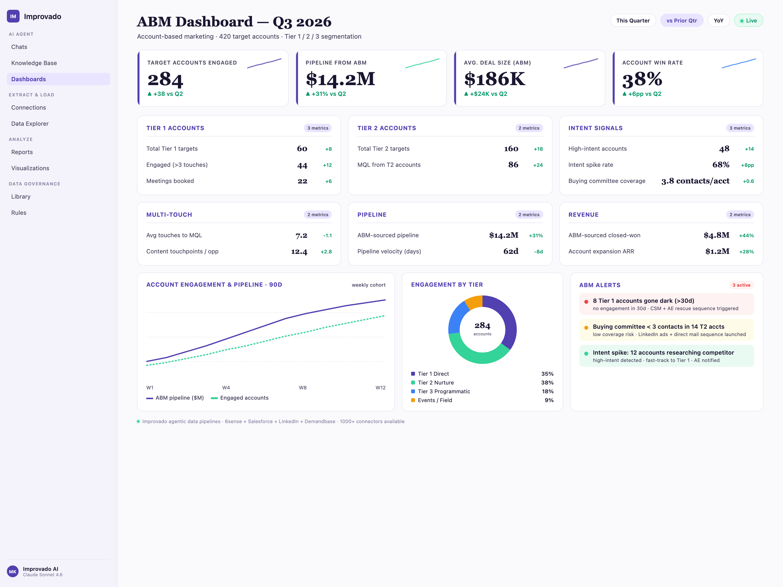
An ABM dashboard is essential for B2B organizations targeting specific accounts. It measures engagement, penetration, and progression across named-account lists rather than broad audiences.
What it includes:
- Account coverage and penetration: contacts added, personas engaged
- Account engagement score (across email, ads, website, events)
- Pipeline contribution from target accounts
- Deal velocity, stage progression, and average deal size
- Account intent signals and surges
- Advertising performance by account or cluster
Key considerations:
- Use heatmaps to visualize account readiness and engagement tiers
- Segment by ICP tiers (Tier 1, Tier 2, Tier 3 accounts)
- Integrate intent platforms (Bombora, G2, 6sense) for accurate insights
#16. Marketing Attribution Dashboard
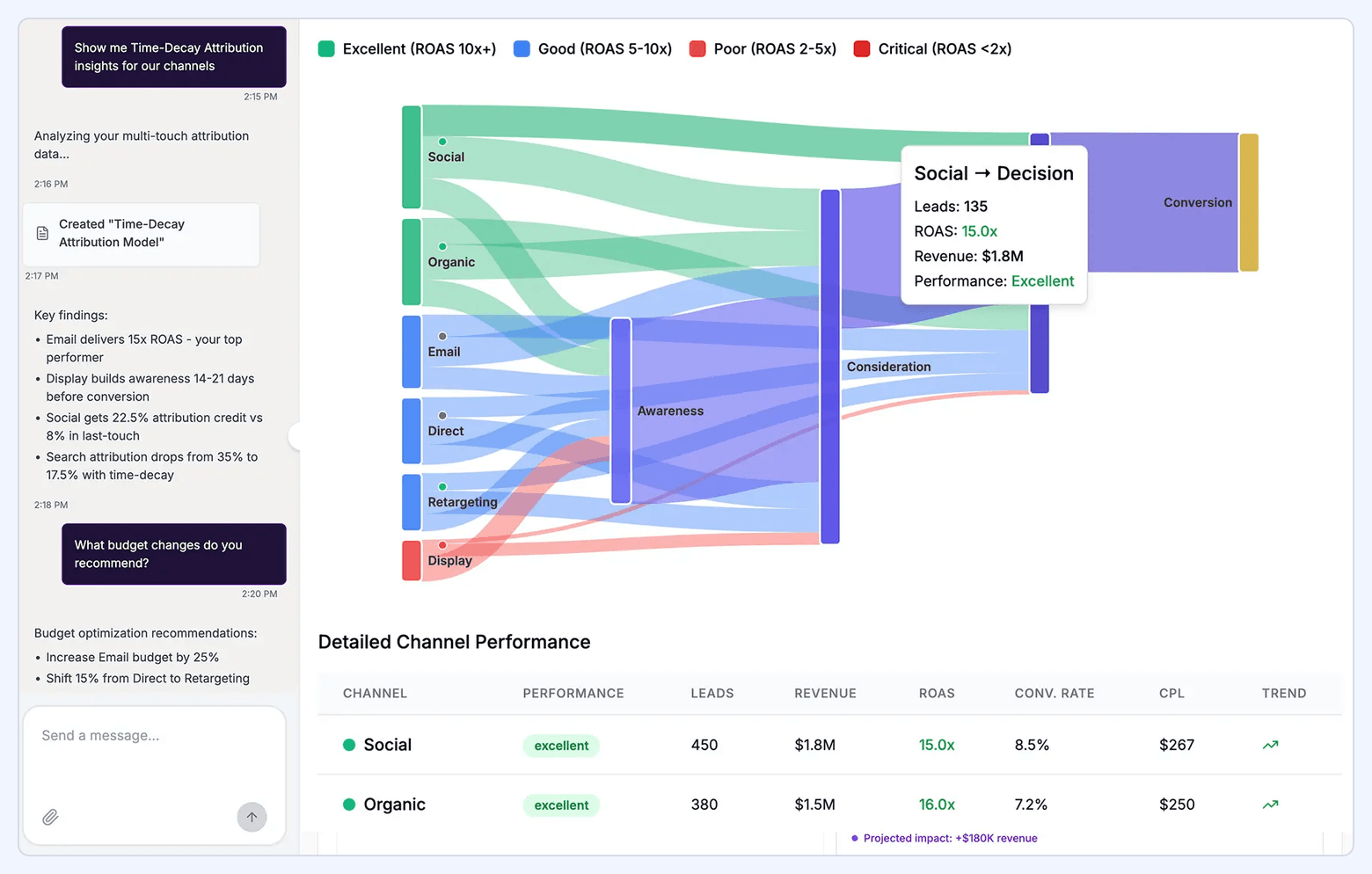
A marketing attribution dashboard clarifies which channels and touchpoints contribute to conversions. It helps teams understand where value is created across the customer journey, not just where conversions occur.
What it includes:
- Attribution models: first-touch, last-touch, linear, U-shaped, time-decay
- Channel contribution to revenue and pipeline
- Path-to-conversion visualization
- Assisted conversions and multi-touch influence
- ROI and CAC by attribution model
- Segment-based analysis: new vs. returning users, high-LTV cohorts
Key considerations:
- Use multiple models to reduce bias in interpretation
- Ensure cross-channel data is normalized to prevent double-counting
- Pair attribution with lift tests where possible for accuracy
#17. Web Analytics Dashboard
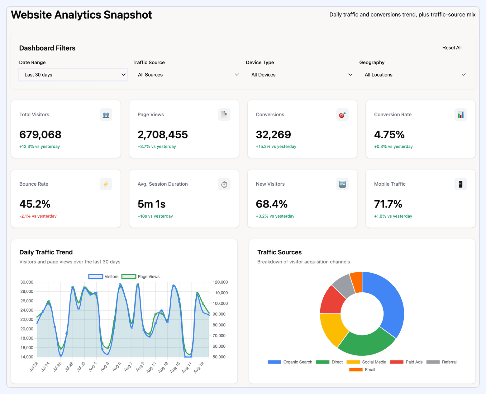
A web analytics dashboard monitors website performance and user behavior. Built using Google Analytics 4 data, it provides insight into traffic quality, engagement depth, and conversion performance.
What it includes:
- Users, sessions, traffic sources, engaged sessions
- Engagement rate, scroll depth, session duration
- Bounce rate and landing page performance
- Conversion Rate (macro & micro conversions)
- Funnel performance (view → engage → convert)
- Device, geography, and content-path segmentation
Key considerations:
- GA4’s event-based model requires clearly defined events and parameters
- Track content clusters rather than individual pages for strategic insight
- Include both acquisition and behavior metrics to understand full context
#18. A/B Test Dashboard
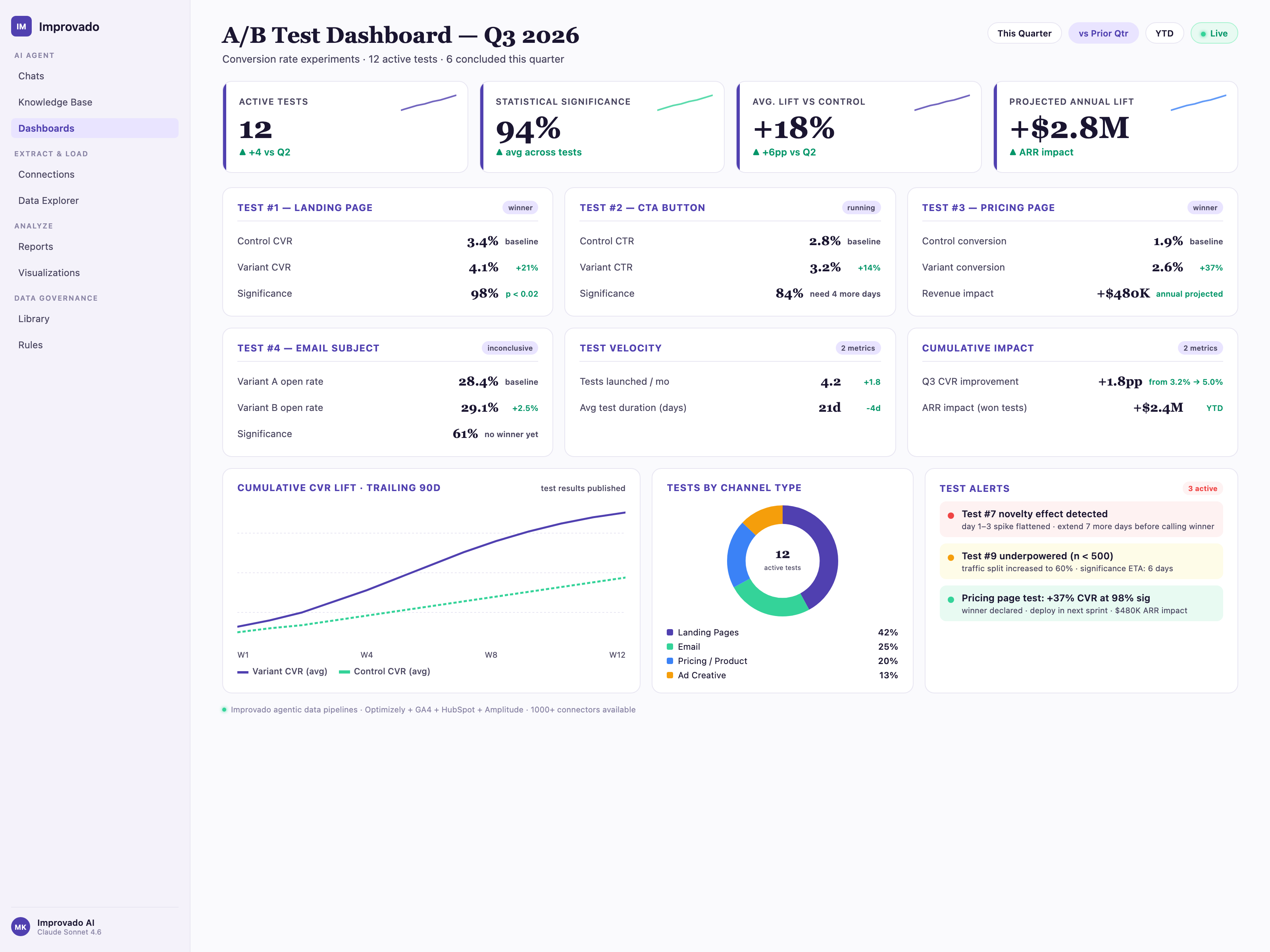
An A/B test dashboard measures experiment performance and helps teams determine which variant should be implemented. It supports continuous optimization across landing pages, ads, emails, and product experiences.
What it includes:
- Variant performance: impressions, clicks, conversions
- Conversion Rate and lift percentage
- Statistical significance and confidence intervals
- Audience segmentation (device, traffic source, geography)
- Experiment duration and exposure share
- Post-test analysis: predicted long-term impact
Key considerations:
- Ensure sample sizes and experiment duration meet significance thresholds
- Compare variants on both primary and secondary metrics
- Track past experiments to build institutional learning over time
Business Type Dashboards
#19. Ecommerce Dashboard
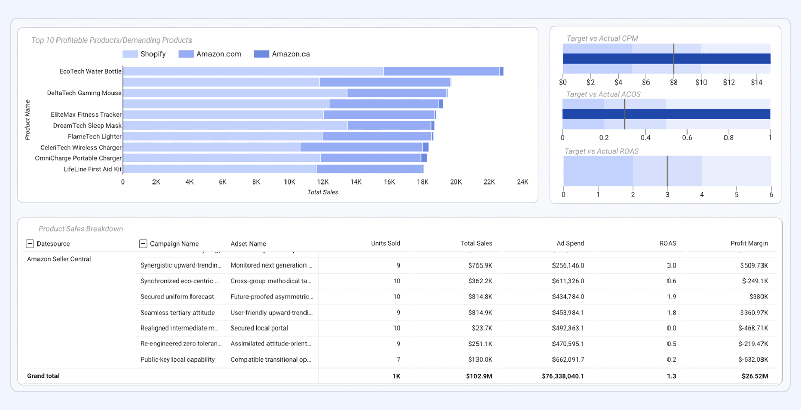
An ecommerce dashboard gives online retailers a unified view of revenue performance, customer behavior, and funnel efficiency. It consolidates data from platforms like Google Analytics, Shopify, and paid media sources to reveal how traffic converts into revenue.
What it includes:
- Revenue, AOV, units per transaction
- Cart abandonment and checkout abandonment rates
- CLV, CAC, and repeat purchase rate
- Revenue by traffic source, campaign, and device
- Product performance: top sellers, margin analysis, inventory insights
- Funnel metrics (product view → add to cart → checkout → purchase)
Key considerations:
- Segment new vs. returning buyers to understand retention
- Track discount impact on margin and profitability
- Combine paid and organic traffic insights for full attribution clarity
#20. Shopify Dashboard
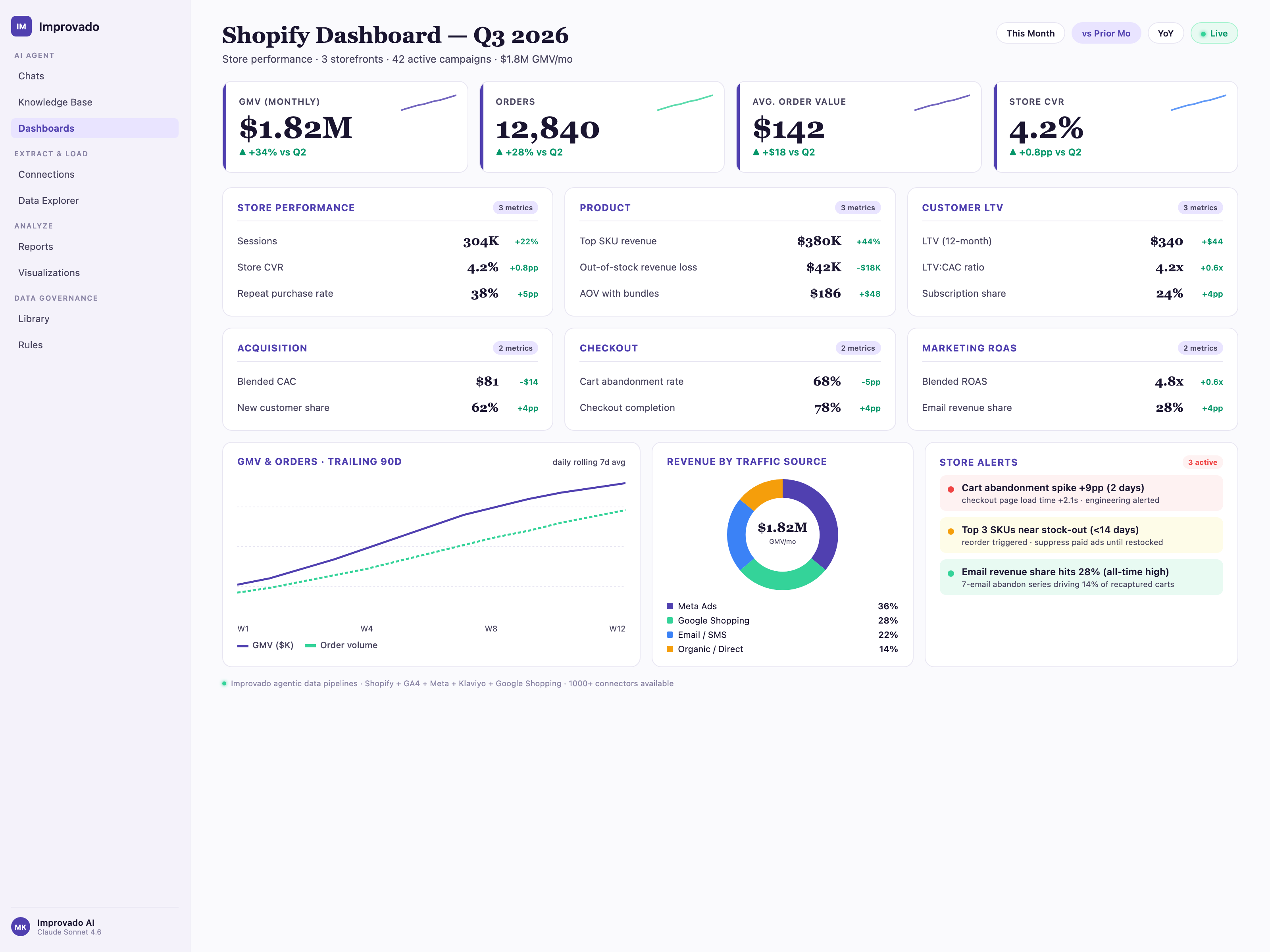
A Shopify dashboard provides store owners with granular insights directly from the Shopify API, offering a deep understanding of sales trends, customer behavior, and operational performance.
What it includes:
- Total sales, net sales, gross margin
- Customer cohorts: first-time vs. returning customers
- Product-level metrics: SKU performance, inventory levels, refunds
- Checkout conversion rate and abandoned checkout trends
- Discount usage, upsell/cross-sell performance
- Order value distribution and subscription metrics (if applicable)
Key considerations:
- Monitor product lifecycle and identify emerging best-sellers
- Track fulfillment metrics to align marketing with operations
- Use customer cohort analysis to refine retention strategies
#21. Amazon Ads Dashboard
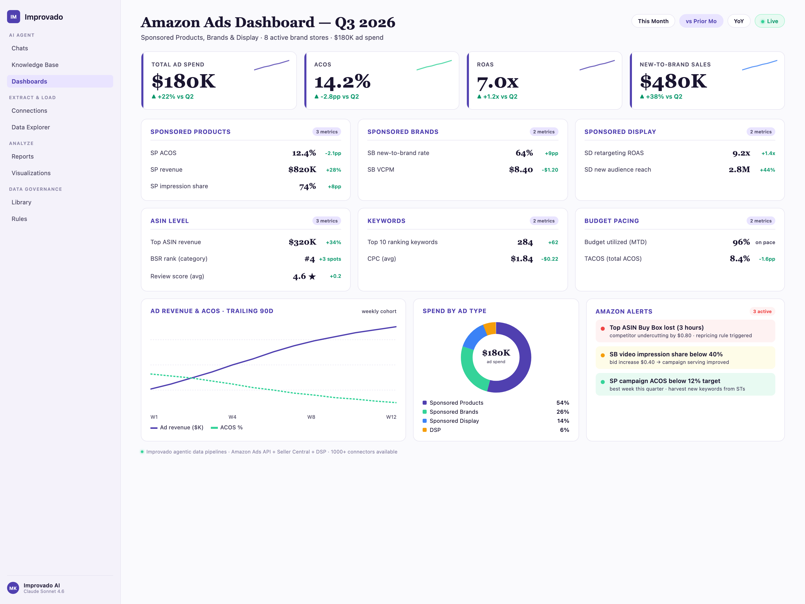
An Amazon Ads dashboard helps brands understand how paid campaigns influence visibility, sales, and unit economics within the Amazon ecosystem.
What it includes:
- ACoS, TACoS, ROAS
- Ad-attributed sales and organic lift
- Keyword performance: match types, search term insights
- Campaign performance across Sponsored Products, Brands, Display
- Share of Voice and impression share
- Unit economics: contribution margin, blended profitability
Key considerations:
- Compare TACoS vs. ACoS to evaluate long-term brand efficiency
- Track organic rank movement alongside paid campaigns
- Use negative keyword insights to eliminate wasted spend
#22. SaaS Dashboard
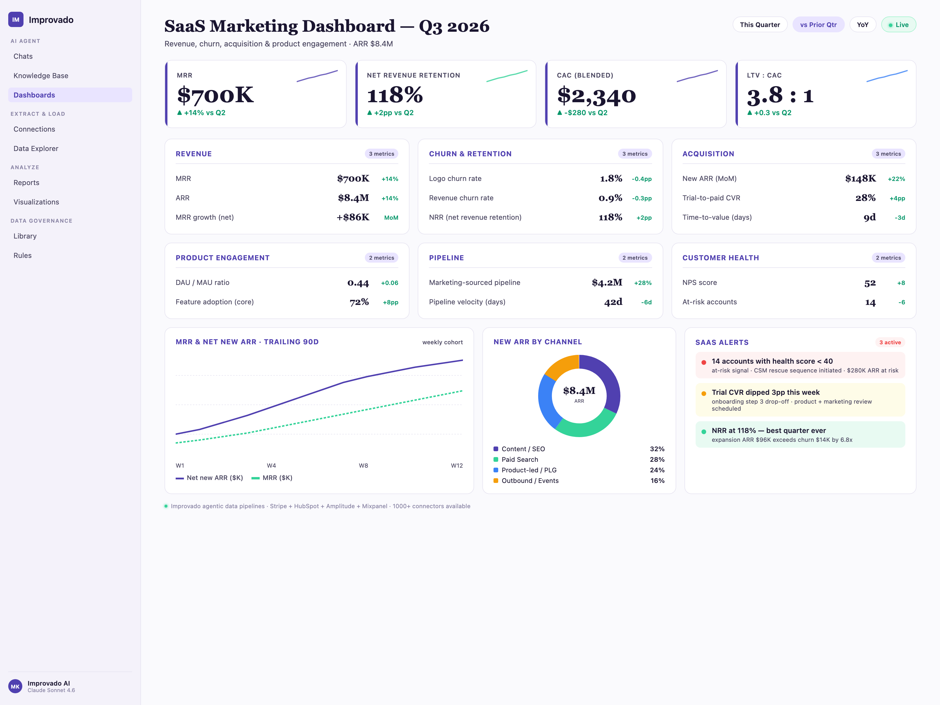
A SaaS dashboard focuses on recurring revenue, customer retention, and efficiency of the subscription business model. It centralizes product, marketing, and financial data.
What it includes:
- Monthly Recurring Revenue (MRR) and Annual Recurring Revenue (ARR)
- Churn rate, expansion revenue, contraction revenue
- CLV, CAC, CAC payback period
- Activation rate, onboarding funnel, product usage retention
- Pipeline contribution from marketing and sales
- Net Revenue Retention (NRR) and Gross Revenue Retention (GRR)
Key considerations:
- Leverage cohort analysis for retention and long-term value
- Track product engagement as a leading indicator of churn
- Link lead sources to lifetime value for better budget allocation
#23. Marketing Agency Dashboard
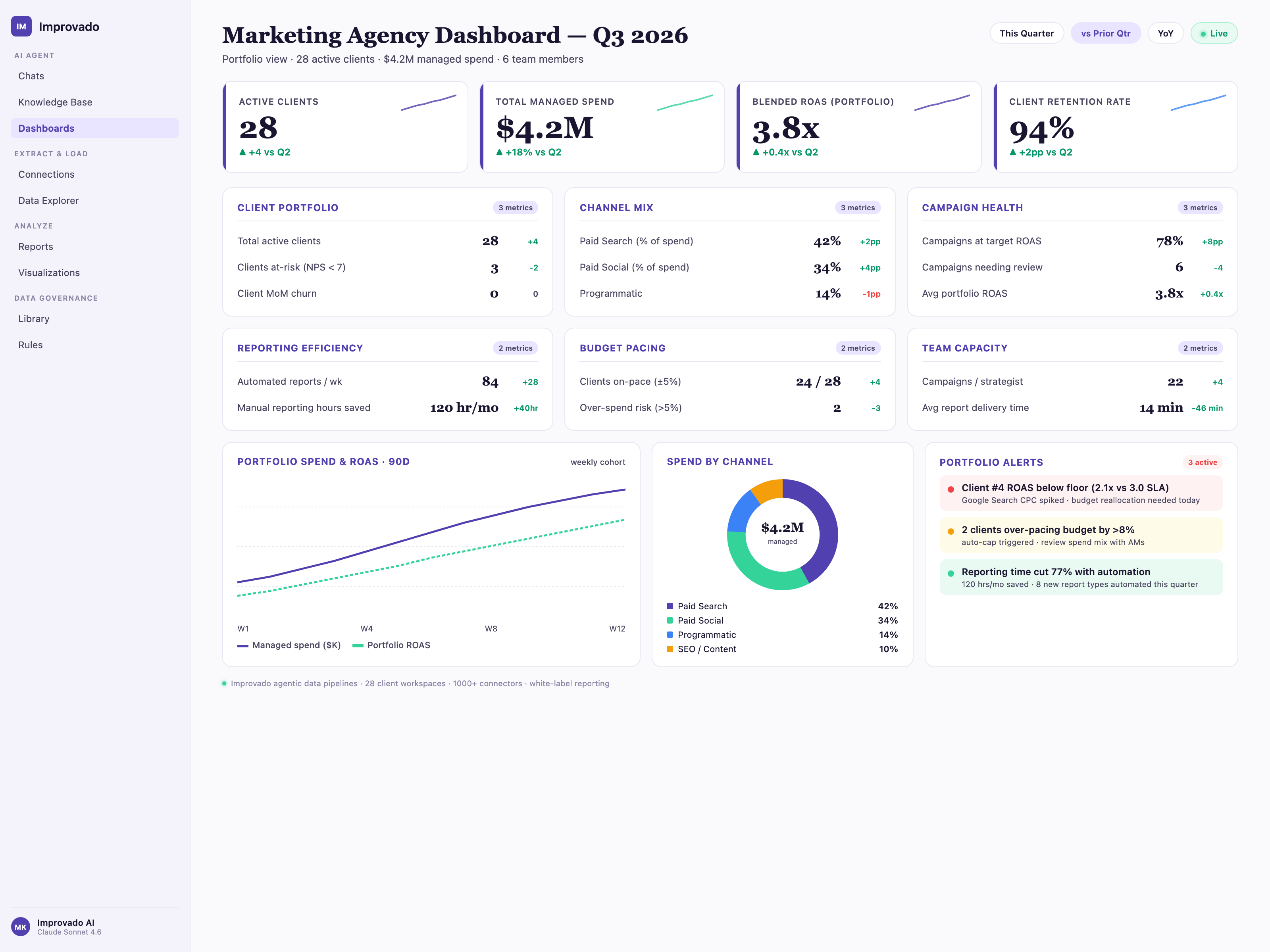
A marketing agency dashboard enables agencies to monitor and report performance across multiple clients, standardizing KPIs while maintaining client-specific customization.
What it includes:
- Multi-client portfolio performance
- Channel-level performance: paid, organic, email, social, etc.
- Budget pacing and utilization across accounts
- Lead, pipeline, and revenue contribution for performance-driven clients
- Creative performance and testing insights
- Client-level benchmarks and comparisons
Key considerations:
- Use templates to streamline onboarding and reporting
- Provide custom KPI groups for each client’s goals
- Include white-label reporting for professional client presentations
#24. B2B Marketing Dashboard
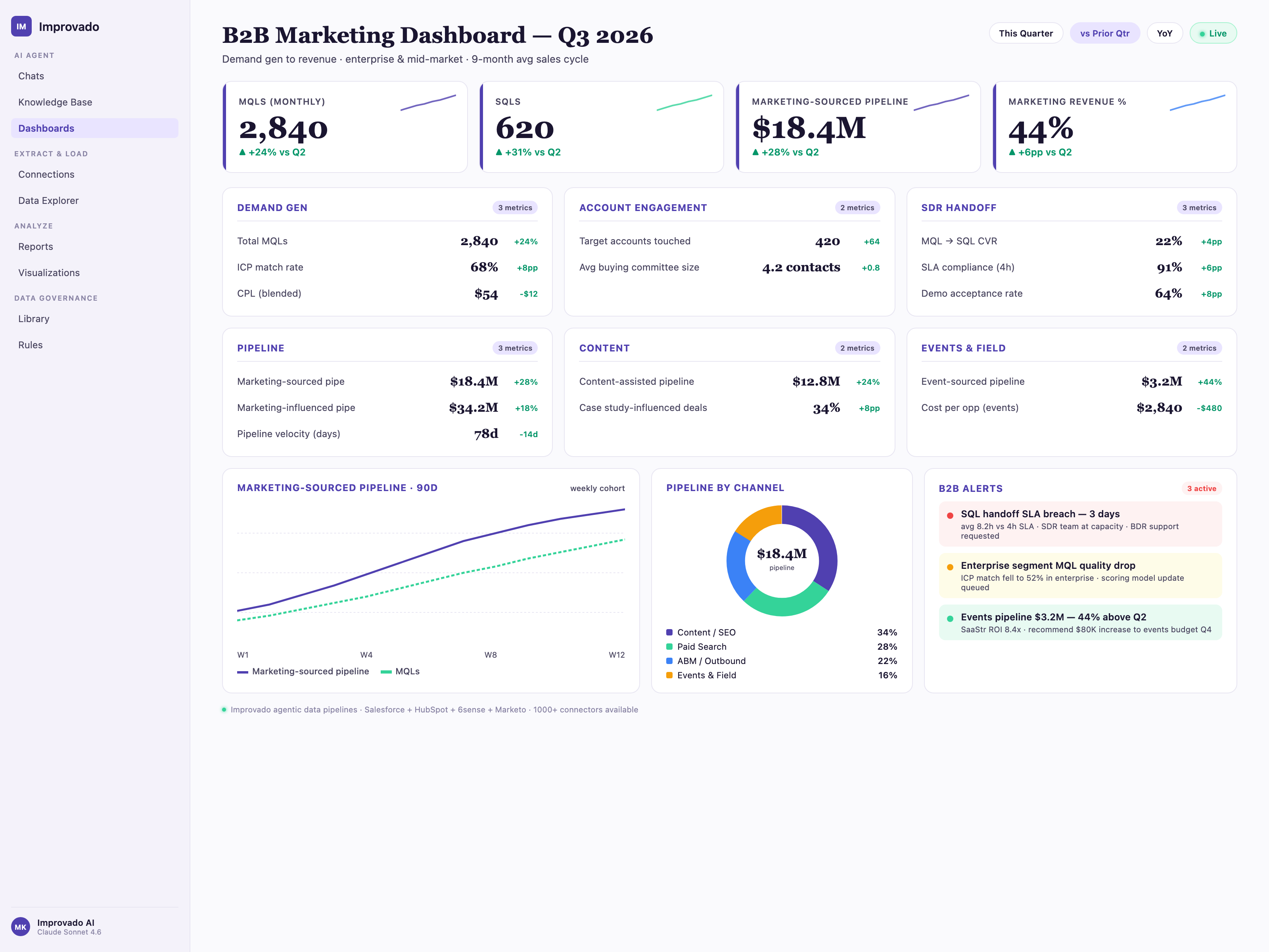
A B2B marketing dashboard connects marketing activity to the sales pipeline, offering visibility from lead generation to closed-won revenue.
What it includes:
- MQLs, SQLs, Opportunities, and Pipeline Created
- Lead-to-SQL and SQL-to-opportunity conversion rates
- Account engagement levels and ABM contribution
- Sales cycle length by channel and segment
- Pipeline velocity and win rate
- Marketing-sourced vs. marketing-influenced revenue
Key considerations:
- Align definitions of MQL/SQL across marketing and sales
- Integrate CRM data for real-time pipeline visibility
- Segment by ICP tiers, industries, or company sizes
#25. Marketing Data Quality Dashboard
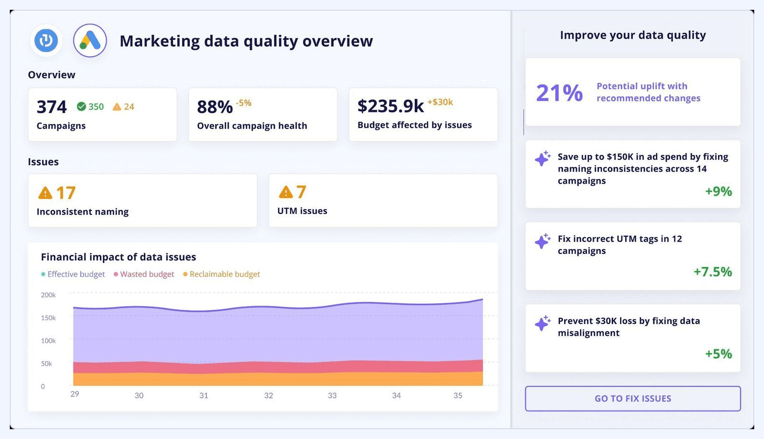
A data quality dashboard ensures all dashboards across the organization are built on accurate, complete, and consistent data. It monitors the operational health of the marketing data ecosystem.
What it includes:
- Data freshness and update frequency
- Missing fields, null values, or broken connectors
- Anomalies in naming conventions or taxonomy
- Schema drift detection
- Duplicate records and mapping inconsistencies
- Error logs for extraction, transformation, or loading
Key considerations:
- Automate alerts to flag issues before they impact reporting
- Track upstream changes from platforms that may break pipelines
- Use standardized naming taxonomies for clean dashboarding
Choosing the Right KPIs for Your Marketing Dashboard
A dashboard is only as good as the metrics it displays. Choosing the right KPIs is crucial. The key is to focus on metrics that align with your business objectives and provide actionable insights. A helpful framework is to organize your KPIs by the marketing funnel.
Awareness Stage KPIs
These metrics measure your ability to reach your target audience.
- Impressions: The number of times your content was displayed.
- Reach: The number of unique people who saw your content.
- Share of Voice (SOV): Your brand's visibility compared to competitors.
Consideration Stage KPIs
These metrics track how effectively you engage your audience.
- Website Traffic: The number of sessions on your website.
- Click-Through Rate (CTR): The percentage of people who clicked your ad or link.
- Time on Page / Engagement Rate: How long users stay and interact with your content.
- Leads / Form Fills: The number of potential customers who showed interest.
Conversion Stage KPIs
These are the bottom-line metrics that measure your success in driving action.
- Conversions: The number of desired actions taken (e.g., purchases, sign-ups).
- Conversion Rate: The percentage of users who convert.
- Cost Per Acquisition (CPA / CAC): The average cost to acquire a new customer.
- Return on Ad Spend (ROAS): The revenue generated for every dollar spent on advertising.
Loyalty & Retention Stage KPIs
These metrics show your ability to retain customers and grow their value.
- Customer Lifetime Value (CLV): The total revenue a customer is expected to generate.
- Churn Rate: The percentage of customers who cancel their subscription or stop buying.
- Repeat Purchase Rate: The percentage of customers who make more than one purchase.
Best Practices for Marketing Dashboard Design & Usability
A poorly designed dashboard, even with perfect data, will go unused. To create a dashboard that people love to use, follow these design principles.
- Know your audience: Tailor the dashboard to its users. An executive needs a high-level summary. A channel manager needs granular detail. Create different dashboards or views for different roles.
- Start with questions, not data: Before you build anything, define the key questions the dashboard needs to answer. For example, "Which channels are driving the most qualified leads?" This ensures your dashboard is purpose-driven.
- Use visual hierarchy: Place the most important information in the top-left corner, as people naturally read in a Z-pattern. Use size and color to draw attention to key metrics.
- Choose the right visualizations: Don't default to pie charts for everything. Use line charts for time-series data, bar charts for comparisons, and scorecards for single, important KPIs. Keep it simple and clear.
- Provide context: A number by itself is meaningless. Always include comparisons to provide context. Compare performance to the previous period, a set goal, or an industry benchmark.
- Keep it simple: Avoid cluttering your dashboard with too many metrics or charts. A crowded dashboard is overwhelming and confusing. Focus on the few metrics that truly matter. If needed, create separate "deep dive" dashboards.
Common Pitfalls to Avoid When Building Dashboards
Many marketing dashboards fail to deliver on their promise. They end up as glorified data dumps that nobody uses. Here are common mistakes to avoid.
- The "data puke": This happens when you try to cram every possible metric onto a single screen. It creates visual noise and makes it impossible to find actionable insights. Stick to a focused set of KPIs.
- Focusing on vanity metrics: Tracking metrics like impressions and likes can feel good, but they don't correlate with business success. Prioritize metrics that are tied to revenue and growth.
- Using siloed data: A dashboard that only shows data from one platform (e.g., only Google Ads) is of limited use. The real power comes from integrating and comparing data across all your channels.
- Lack of automation: If someone has to manually update the dashboard each week, it's not a dashboard; it's a report. True dashboards are built on automated data pipelines that ensure the data is always fresh and reliable.
- Ignoring data governance: Inconsistent campaign naming conventions and tracking parameters lead to messy, untrustworthy data. A solid data governance strategy is a prerequisite for accurate dashboarding.
Automating Your Marketing Dashboards with Improvado
The biggest challenge in building a great marketing dashboard isn't visualization. It's the data infrastructure behind it.
A marketing data pipeline and intelligence platform Improvado solves the most difficult parts of the process, so you can get insights faster.
Improvado fully automates the data pipeline:
- Data extraction: It connects to over 500 marketing, sales, and analytics sources with pre-built, maintained connectors. You never have to worry about API changes breaking your connections.
- Data transformation: It automatically cleans, maps, and harmonizes your data from all these sources into a standardized model. This creates a single source of truth.
- Data loading: It loads this analysis-ready data into any BI tool (like Tableau, Looker Studio, Power BI) or data warehouse you use.
By handling the entire backend process, Improvado allows your team to build any dashboard they need on top of clean, reliable data. This approach is more scalable, flexible, and trustworthy than trying to manage dozens of individual data connections yourself.
Book a demo with Improvado to get from data to dashboards fast.
.png)


.png)
