Looker, Tableau, and Power BI are three leading business intelligence (BI) platforms, each with distinctive features tailored to different organizational needs.
This comparison delves into the strengths and limitations of each tool, with actionable insights provided through the lens of ease of use, visualization capabilities, data connectivity, collaboration, and pricing.
By the end of this article, you will be able to tell which BI solution is best suited for your data and organization needs.
Key Takeaways:
- Power BI is the clear winner for organizations within the Microsoft ecosystem. It offers strong functionality at a very competitive price point and is easy for Excel users to adopt.
- Tableau leads in data visualization. Its intuitive drag-and-drop interface allows for creating stunning, complex, and highly interactive dashboards with unparalleled flexibility.
- Looker excels in data governance and embedding. Its LookML modeling layer creates a reliable, single source of truth, making it ideal for data teams who need to deliver consistent analytics at scale.
- No matter which tool you choose, its value depends entirely on the quality and accessibility of your data. A robust data pipeline is a necessity for success.
An Introduction to the BI Titans
Before diving into a feature-by-feature battle, let's establish a baseline understanding of each platform and its core philosophy.
What Is Tableau?

Tableau, owned by Salesforce, is a market leader focused on visual analytics. Its primary strength is its ability to create beautiful and interactive data visualizations quickly.
Users can connect to various data sources and explore data with a simple drag-and-drop interface. It empowers business users to ask and answer their own questions without heavy reliance on IT.
What Is Power BI?
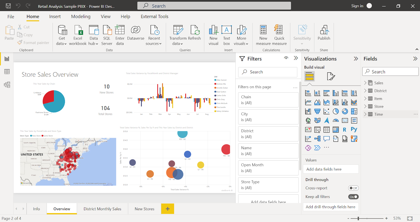
Power BI is Microsoft's answer to business intelligence. It is a suite of business analytics tools designed to be accessible and affordable.
Deeply integrated with the Microsoft ecosystem (like Excel, Azure, and Office 365), Power BI is a natural choice for companies already invested in Microsoft products. It balances user-friendliness with powerful data modeling capabilities.
What Is Looker?
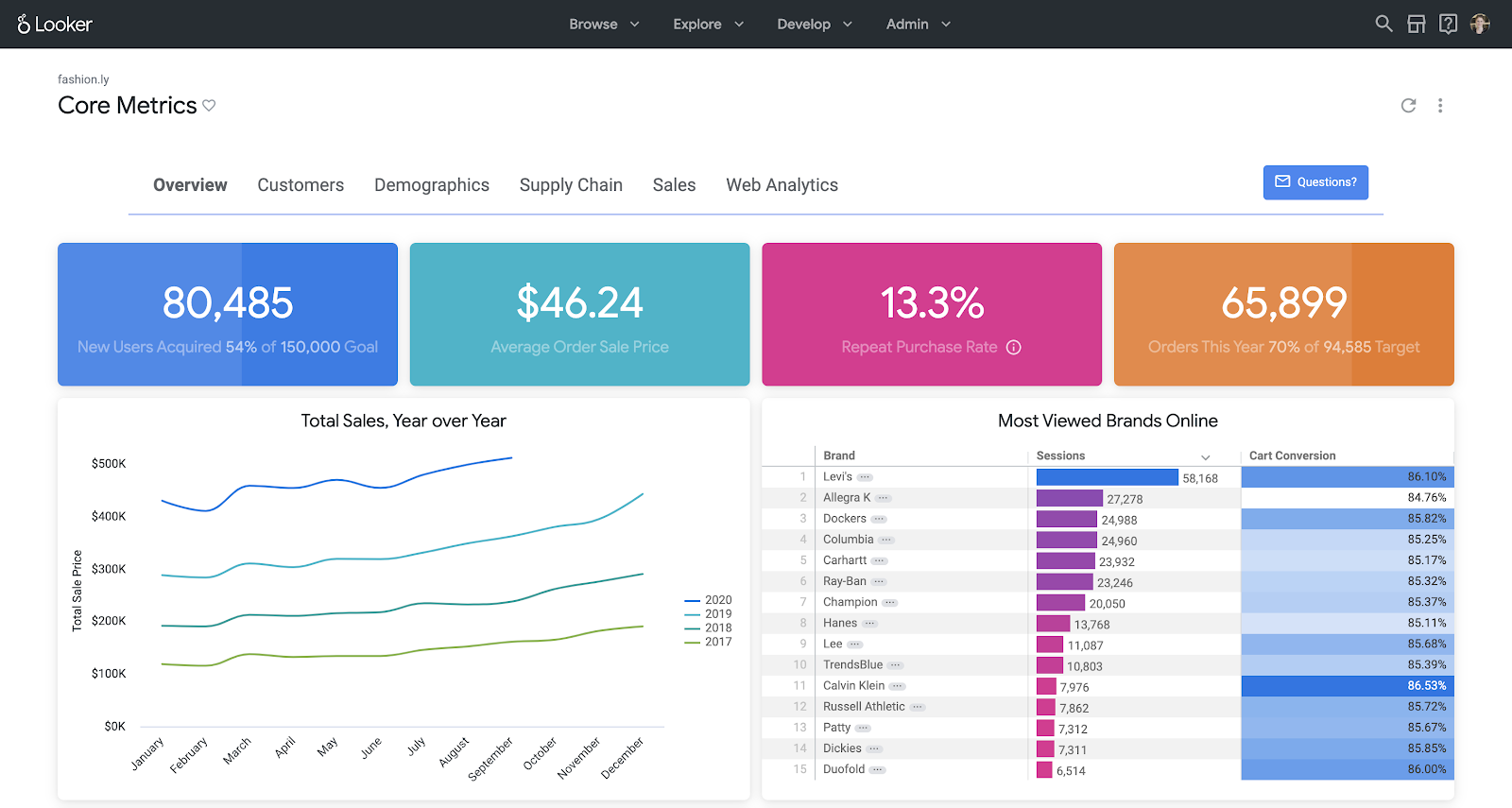
Looker, now integrated into Google Cloud suite, takes a different approach. It is a browser-based platform centered on a powerful data modeling layer called LookML.
This layer acts as a single source of truth. Data teams define business logic in LookML, and business users can then explore this governed data with confidence. This makes Looker a strong choice for data governance, consistency, and embedding analytics into other applications.
At-a-Glance Comparison: Tableau vs. Power BI vs. Looker
This table provides a high-level overview of how the three tools stack up against each other across key dimensions.
| Aspect | Tableau | Power BI | Looker |
|---|---|---|---|
| Best For | Data analysts and business users needing best-in-class, interactive visualizations. | Organizations in the Microsoft ecosystem seeking a powerful, cost-effective, all-in-one solution. | Data-mature companies needing strong governance, embedded analytics, and a single source of truth. |
| Key Strength | Unmatched visualization flexibility and interactivity. | Seamless Microsoft integration and aggressive pricing. | Centralized data modeling (LookML) and governance. |
| Learning Curve | Low for basic visuals, moderate to high for advanced features. | Low for Excel users, moderate for advanced DAX modeling. | High, requires SQL and LookML knowledge for setup. |
| Data Modeling | Good, with Tableau Prep for ETL. Less centralized than Looker. | Excellent and powerful with Power Query and DAX. | Excellent, centralized, and reusable via LookML. |
| Pricing Model | Per-user subscription (Creator, Explorer, Viewer). Can get expensive. | Freemium model with affordable Pro and Premium per-user/capacity tiers. | Custom pricing based on usage and scale. Generally the most expensive. |
| Deployment | Cloud (Tableau Cloud) and on-premise (Tableau Server). | Primarily cloud, with an on-premise report server available. | Cloud-native (Google Cloud). Can be deployed on other clouds. |
| AI/ML Features | Ask Data (NLQ), Explain Data, Einstein Discovery integration. | AI Visuals, QA (NLQ), Azure Machine Learning integration. | Integration with Google Cloud AI/ML services like BigQuery ML. |
Ease of Use & Learning Curve
A tool's value is limited by how many people can actually use it. The learning curve for each platform varies significantly based on the user's technical background.
Tableau: Intuitive for Explorers
Tableau is famous for its user-friendly interface. Business users can connect to a data source and start creating charts in minutes. Its drag-and-drop functionality feels natural and encourages exploration.
However, mastering Tableau is another story. Creating complex calculated fields, level-of-detail (LOD) expressions, and sophisticated dashboard actions requires significant training and practice.
Power BI: Familiar for Excel Vets
Power BI offers the shallowest learning curve for anyone proficient in Microsoft Excel. The interface and concepts like Power Query for data transformation are very similar. This familiarity makes initial adoption smooth for a vast number of business professionals.
The challenge comes with DAX (Data Analysis Expressions), Power BI's formula language. While incredibly powerful, DAX has a steep learning curve and is essential for any non-trivial analysis.
Looker: Built for Developers First
Looker has the steepest learning curve of the three. It is not designed for casual business users to simply connect to a spreadsheet and build a chart.
The initial setup requires data engineers or developers to write LookML code. This code defines the data model, dimensions, and measures. Once this governed model is built, the self-service experience for business users becomes incredibly simple and safe. They can explore data without fear of making mistakes in joins or calculations.
Data Connectivity & Integration
A BI tool must connect to where your data lives. The breadth and depth of these connections are crucial evaluation criteria.
Tableau's Broad Connector Library
Tableau boasts one of the most extensive libraries of native connectors. It can connect to everything from simple Excel files and Google Sheets to complex data warehouses like Snowflake, Redshift, and BigQuery.
It also supports generic ODBC/JDBC connections for less common sources. Tableau offers flexibility with "Live" and "Extract" connection types. Live connections query the database directly, while extracts pull data into Tableau's high-performance in-memory engine (Hyper).
Power BI's Microsoft-Centric Universe
As expected, Power BI's integration with the Microsoft stack is flawless. It connects seamlessly to Azure SQL Database, Azure Synapse Analytics, and Analysis Services.
Beyond Microsoft, it has a large and growing list of connectors to services like Salesforce, Google Analytics, and various databases.
One of its key strengths is Power Query (also found in Excel), a powerful tool for data extraction, transformation, and loading (ETL) from hundreds of sources, including many for social media analytics. However, some users find that managing a multitude of sources can lead to significant data integration challenges.
Looker's Database-Centric Approach
Looker works differently. It doesn't extract and store data. Instead, it queries the source database directly in real-time. This means it requires a powerful, modern SQL database or data warehouse to perform well.
It supports over 50 SQL dialects, including BigQuery, Snowflake, Redshift, and Databricks. This in-database architecture ensures data is always fresh and leverages the power of your existing data warehouse. The trade-off is a lack of connectivity to simple file-based sources like local CSVs or Excel files.
Data Modeling & Transformation
Raw data is rarely ready for analysis. How each tool handles data preparation and modeling is a fundamental differentiator.
Tableau Prep Builder
Tableau offers Tableau Prep Builder, a separate application for data preparation. It provides a visual interface for cleaning, shaping, and combining data from different sources.
Users can build data flows to automate these tasks. While powerful, it's a separate process from dashboard development. Data modeling within Tableau Desktop itself is less structured than in Power BI or Looker. It relies on defining relationships between data sources and creating calculated fields on a case-by-case basis.
Power BI's Power Query & DAX
Power BI has a deeply integrated and powerful data modeling engine. Power Query is used for the initial ETL steps, offering a user-friendly interface with hundreds of transformation options. After data is loaded, a relational model is built in the "Model" view.
The real power comes from DAX. This language allows for the creation of sophisticated calculated columns and measures, enabling complex business logic and time-intelligence functions that go far beyond simple aggregations.
Looker's Centralized LookML
Looker's approach to data modeling is its crown jewel. LookML is a proprietary language used to describe dimensions, aggregates, calculations, and data relationships.
This code is version-controlled (via Git) and acts as a single, governed semantic layer for the entire organization. All queries pass through this model, ensuring that metrics like "revenue" or "active user" are calculated identically in every report.
This resolves ambiguity and builds trust in data. It is a very different approach from traditional ETL processes where logic is often buried in individual reports.
Visualization & Dashboarding Capabilities
This is where data becomes insight. The ability to create clear, compelling, and interactive visuals is a core function of any BI tool.
Tableau: The Visualization Virtuoso
Tableau is the undisputed leader in data visualization. Its "Show Me" feature intelligently suggests chart types, but the real power lies in its free-form canvas. Users can create an almost limitless variety of charts, including complex options like Sankey diagrams, sunburst charts, and geospatial maps with advanced layering.
Tableau's dashboards are highly interactive, with features like tooltips, filtering, highlighting, and dashboard actions that allow charts to communicate with each other.
For organizations that need to build sophisticated KPI dashboards, Tableau provides unmatched flexibility.
Power BI: Capable and Ever-Improving
Power BI offers a comprehensive library of standard visuals. These are easy to configure and cover most common business needs. The platform's real strength is its custom visuals marketplace (AppSource), which contains hundreds of third-party visuals for specific use cases. While Power BI's interactivity is good, it can feel more constrained than Tableau's.
However, its bookmarking and drill-through features are powerful for creating guided analytical paths for users. The overall aesthetic is clean and modern, fitting well with other Microsoft products.
Looker: Functional and Governed
Looker provides a solid set of standard visualization types. You can build clean, informative dashboards that are easy to understand. However, visualization is not its primary focus.
The customization options are more limited compared to Tableau. You won't find the same level of pixel-perfect control over formatting and layout. The emphasis is on delivering consistent, governed data through clear charts, rather than creating bespoke, visually stunning data art. It's more about substance and reliability than style.
AI & Machine Learning Capabilities
Modern BI platforms are increasingly incorporating AI to automate insights and make advanced analytics more accessible.
Tableau's AI Features
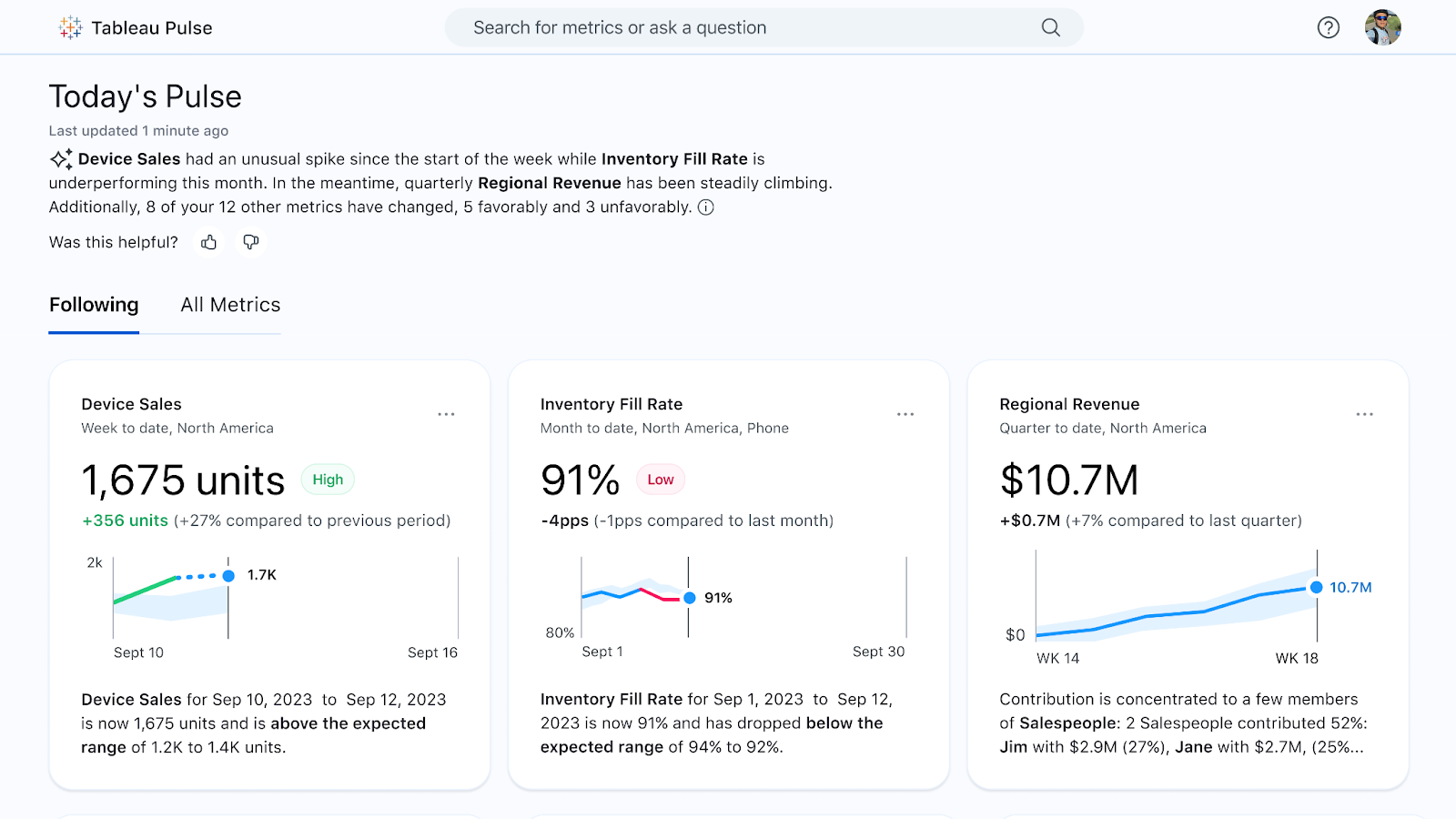
Tableau has invested heavily in AI.
- Ask Data allows users to type questions in natural language and get answers as visualizations.
- Explain Data uses statistical models to automatically explain the drivers behind a specific data point.
- With the Salesforce acquisition, Tableau now integrates with Einstein Discovery, providing no-code predictive modeling and prescriptive recommendations directly within dashboards.
Power BI's Azure Integration
Power BI leverages Microsoft's broader AI ecosystem. The "Q&A" visual is its Natural Language Query (NLQ) feature. It also includes specific "AI visuals" like the Key Influencers chart and the Decomposition Tree, which automatically analyze data to find key drivers.
For more advanced needs, Power BI seamlessly integrates with Azure Machine Learning, allowing data scientists to incorporate custom ML models into their reports and dashboards.
Looker's Google Cloud Synergy
Looker's AI capabilities are tied to its position within Google Cloud. It integrates directly with BigQuery ML, allowing users to build and execute machine learning models using simple SQL commands.
This empowers analysts to create forecasts and classifications without needing to be expert data scientists. Looker can then visualize the output of these models, bringing predictive insights into the hands of business users.
Performance & Scalability
As data volumes grow, the ability of a BI tool to handle large datasets and a high number of users without slowing down is critical.
Tableau's Hyper Engine
Tableau's performance with large datasets largely depends on its Hyper in-memory data engine. When data is extracted into a .hyper file, query performance is exceptionally fast.
For live connections, performance is dependent on the speed of the underlying database. Tableau Server and Tableau Cloud can be scaled out to handle increasing user loads, but this requires careful architectural planning and can become costly.
Power BI's VertiPaq Engine and Premium Capacity
Power BI also uses a powerful in-memory columnar database engine called VertiPaq (the same engine as in SSAS). It provides excellent compression and query performance.
For very large datasets that exceed memory limits per user, Power BI offers "Premium" capacity. This provides dedicated hardware resources in the Azure cloud, ensuring consistent performance for the entire organization.
Features like DirectQuery and composite models allow for handling petabyte-scale data in supported sources like Azure Synapse.
Looker's In-Database Architecture
Looker's scalability is entirely dependent on the scalability of your underlying data warehouse. Since Looker pushes all query processing down to the database, it can handle virtually unlimited data volumes as long as your database (like BigQuery, Snowflake, or Redshift) is provisioned to handle the load.
This architecture avoids data duplication and leverages your investment in a modern, scalable cloud data warehouse. This makes it an excellent choice for massive datasets.
Pricing & Total Cost of Ownership
Pricing is a complex and crucial factor. It's not just about the license cost but the total cost of ownership, including training, development, and infrastructure.
Tableau: Tiered and Pricey
Tableau uses a tiered, per-user pricing model:
- Creator ($75/user/month): For analysts and power users who need to connect to data and create content. Includes Tableau Desktop and Prep Builder.
- Explorer ($42/user/month): For business users who need to explore existing dashboards and create some of their own from published data sources.
- Viewer ($15/user/month): For users who only need to view and interact with shared dashboards.
This can become very expensive for large organizations.
Power BI: The Cost Leader
Power BI's pricing is highly competitive:
- Free: For individual use with Power BI Desktop.
- Pro ($10/user/month): The standard license for users who need to publish and share reports.
- Premium Per User ($20/user/month): Includes all Pro features plus access to larger model sizes and advanced AI features.
- Premium Per Capacity (Starts at ~$5,000/month): For large-scale enterprise deployments, allowing free report distribution to viewers.
For most companies, Power BI offers the lowest TCO.
Looker: Enterprise Custom Pricing
Looker does not have public, transparent pricing. It is a custom-quoted platform based on factors like the number of users, database connections, and deployment scale. It is generally considered the most expensive of the three, with pricing tailored to mid-market and enterprise companies. The value proposition is in its governance and developer-centric features, which can save significant costs in data engineering and maintenance over time.
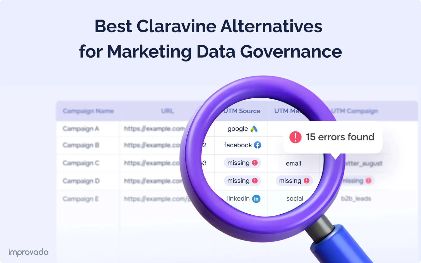
The Critical Role of a Data Pipeline
This entire comparison highlights a universal truth: the output of any BI tool is a direct reflection of its input – underlying data. Inaccurate, incomplete, or siloed data will lead to flawed dashboards, no matter how beautiful or interactive they are.
This is where a platform like Improvado becomes essential. Tools like Tableau, Power BI, and Looker are for the "last mile" of analytics – visualization and exploration. They are not designed to handle the messy, complex work of data collection and harmonization from dozens of disparate sources.
Improvado fills that gap by acting as the data pipeline and transformation layer that modern BI workflows depend on. It centralizes data from hundreds of marketing, sales, and revenue platforms, cleans it, normalizes it, and prepares it for analysis long before pushing it to BI.
Improvado provides the infrastructure that BI tools rely on through:
- Automated data ingestion from 1,000+ marketing, advertising, analytics, and revenue sources
- Normalization and harmonization of metrics, dimensions, naming conventions, and taxonomies
- Data transformation pipelines that clean, structure, and enrich data for downstream use
- Centralized storage in any major data warehouse (BigQuery, Snowflake, Redshift, Databricks)
- Entity mapping and de-duplication to resolve fragmented campaign, audience, and channel data
- Built-in data governance that enforces consistency, validates inputs, and prevents quality issues
- Real-time and scheduled syncs to ensure BI dashboards always reflect current performance
- AI-powered analysis through Improvado’s AI Agent for instant, natural-language insights
With Improvado as the backbone of your analytics stack, BI tools stop fighting inconsistent data and start delivering reliable, strategic insights.
Which BI Tool Is Right for You?
There is no single "best" BI tool. The right choice depends entirely on your company's specific context, including your budget, existing tech stack, user skill sets, and data strategy goals. This comparison should serve as a guide to help you make an informed decision.
Here’s a final summary to guide your choice:
- Choose Power BI if: You are heavily invested in the Microsoft ecosystem, your user base is familiar with Excel, and cost is a primary decision factor. It offers an unbeatable combination of power and price.
- Choose Tableau if: Your top priority is empowering users to create stunning, highly interactive, and flexible data visualizations. It is the best tool for visual data exploration and storytelling.
- Choose Looker if: Your main goal is to establish a governed, single source of truth for your data. It is the best choice for data teams that need to deliver reliable, embedded, and scalable analytics to the entire organization.
Ultimately, the most successful BI implementations recognize that the visualization tool is only one piece of the puzzle. Investing in a robust data foundation is the most important step.