%2520(1).png)
Each department in the organization collects immense volumes. With increasingly larger amounts of data used to guide decisions, everyone in the company needs to be able to analyze data and present findings clearly and meaningfully. That’s what data storytelling is all about. It blends visualizations with narrative to deliver actionable insights.
This article unveils the essence of data storytelling, its significance, and how you can master the art of telling stories with data.
Quick answer
Data storytelling is the process of building narratives around datasets, using visualizations to present their meaning clearly and compellingly. It blends visualizations with narrative to deliver actionable insights, transforming complex data sets into clear, compelling narratives that drive understanding and action.
What is Data Storytelling?
As Thomas Davenport, the co-founder of the International Institute for Analytics once said: “Data is worthless if you don’t communicate it.”
That’s the main problem that data storytelling is trying to solve.
Humans are made to share data in the form of stories, so communicating any type of data in the form of a compelling story will more likely capture the attention of your audience. The thing is, our attention spans are quite short. It becomes even shorter when trying to process a year’s worth of data in a single report.
That’s why data storytelling is an essential skill, whether you’re trying to present achievements to stakeholders, share insights with your colleagues, or make an actionable real-time dashboard.
The Components of a Data Story
At its core, data storytelling involves three main components:
- Data: The raw, quantitative information gathered from various sources. This serves as the foundation of your story, providing the evidence to support your narrative.
- Narrative: The storyline or sequence of events that connects your data points. This is where you interpret the data, highlighting significant trends, patterns, or anomalies that need attention. The narrative gives your data meaning and makes it relatable to your audience.
- Visualization: The use of graphical representations like charts, graphs, and maps to illustrate the data in a visually appealing and digestible format. Good visualization enhances understanding, making complex data accessible at a glance.
How to Tell a Story with Data
Telling a story with data is an art and science that requires precision, insight, and creativity. The goal is to transform complex data sets into clear, compelling narratives that drive understanding and action. Here’s how you can achieve that:
Step 1. Define Characters of Your Story
The first thing you should think about when creating a data story: whom does this story affect? Just like in books, stories usually revolve around characters that the audience can relate to.
This step requires you to deeply understand your audience, their pains, expectations, and background. For example, if you’re speaking to marketers, your data story should concentrate on someone launching new campaigns and proving their ROI. Explain how the insights from your story will help them achieve their goal and impact their workflow.
Step 2. Add More Context to Your Story
Your next step would be to add more details to the story, such as time, place, and other external factors. You need to explain why it’s important for the protagonist to achieve goals right now and what would happen if they fail.
Your data story should explain the importance of the described insights at this particular moment of time, what happens if the protagonist leverages them correctly, and what happens if not.
This is the part where you can start using visualizations to predict the outcomes for both scenarios.
Step 3. Show the Challenges Ahead
In this phase, it's crucial to introduce a key moment of tension. This will act as the core challenge within your narrative.
The problem should seem significant to the audience to get them emotionally invested in finding a solution to the problem. Also, the problem should be familiar to your listeners or it won’t resonate with them.
The solution to this problem should lie in the insights presented. Show how the data you’re presenting can solve the problem and what’s the reward waiting for your protagonist at the end of the story.
Step 4. Propose a Solution
Finish your story with a solution featuring insights you’re trying to convey through the story. Your solution should feel unique and inevitable, while the reward should be measurable and meaningful.
Show how the protagonist solves the problem, by breaking it down into smaller points and what happens after each of these points gets handled. Make sure that the solution not only resonates with your main audience but aligns with the company’s objectives as well. If the audience zooms out, do they see the added value for the organization?
Here are some best practices to adhere to when crafting your data story:
- Select the Right Data: Choose data that supports your narrative and objective. It’s crucial to use accurate, up-to-date data from reliable sources to build credibility and trust.
- Use Visuals Wisely: Select visualizations that enhance your narrative and make complex data understandable. Charts, graphs, and infographics are effective tools for highlighting trends, comparisons, and patterns.
- Simplify and Focus: Avoid overwhelming your audience with too much information. Focus on the key points that are essential to your narrative. Simplify complex data by breaking it down into digestible chunks.
- Craft a Clear Message: Make sure your data story has a clear, concise message. Use straightforward language and avoid jargon that could confuse your audience.
- Engage and Persuade: The best data stories not only inform but also engage and persuade the audience. Use your data to make a compelling case for your conclusions and recommended actions.
Using Data to Tell a Story: Examples
Here are concise examples that demonstrate how data storytelling can be effectively employed:
Sales Performance Over Time
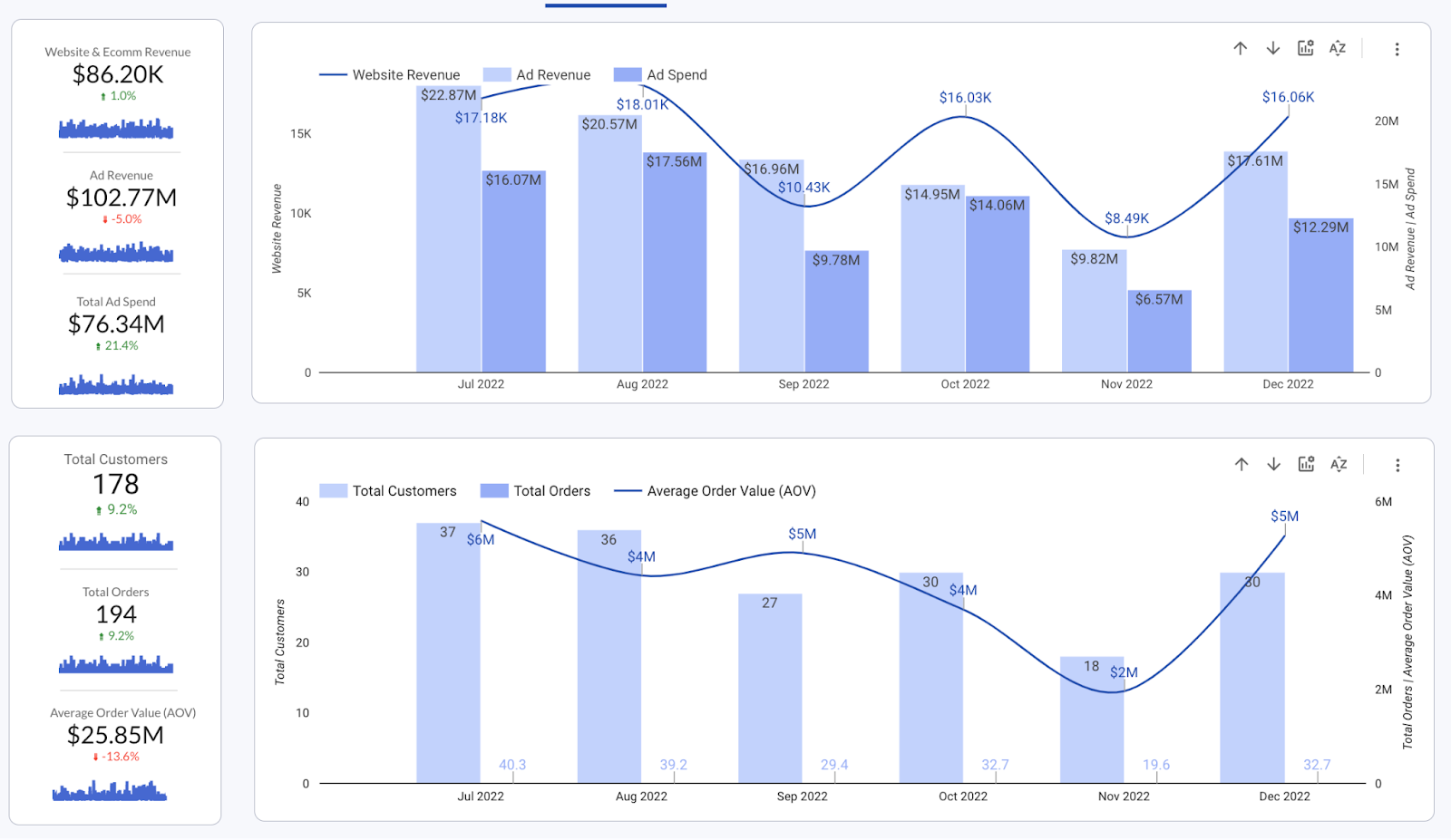
A company might track sales data across different regions and products over several quarters. By visualizing this data in a line chart or bar graph, they can narrate a story of growth, identify seasonal trends, and pinpoint areas needing improvement. For instance, a noticeable dip in sales in a particular region during Q3 could lead to a deeper investigation, revealing underlying causes such as supply chain issues or increased competition. This narrative can guide strategic decisions to address these challenges.
Customer Satisfaction Analysis
Surveys and feedback forms are gold mines for data storytelling. Analyzing customer satisfaction scores alongside product or service changes can reveal the direct impact of business decisions on customer experience. A data story might highlight how a new product feature led to a spike in positive feedback or how changes in customer service protocols improved overall satisfaction ratings. This story not only validates past decisions but also informs future improvements.
Website Traffic Sources
For businesses with an online presence, understanding where website traffic comes from is crucial. By analyzing data on traffic sources (e.g., organic search, social media, direct visits), businesses can craft stories that highlight the most effective channels. For example, a surge in traffic from social media following a targeted campaign can demonstrate the campaign's success and justify further investment in social media marketing strategies.
Campaign Performance Comparison
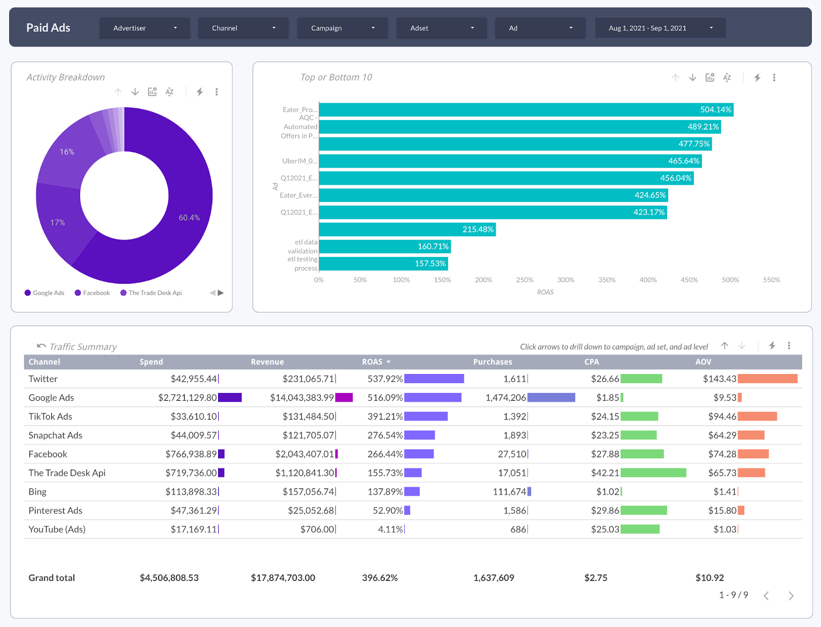
Comparing the performance of different marketing campaigns can uncover what resonates best with the target audience. Data visualization can show which campaigns yielded the highest engagement, conversion rates, or ROI. This story helps marketing teams understand the elements of successful campaigns, informing future marketing strategies and budget allocations.
Craft Engaging Marketing Data Stories with Improvado
Data storytelling is not just about presenting data; it's about transforming it into a narrative that informs, engages, and prompts action. However, it involves having all aspects of data in place first (data collection, organization, cleaning, analytics, visualization, etc.). It’s possible to create a story without these components, but it won’t be nearly as effective.

Improvado is an AI-powered, unified marketing intelligence and analytics platform that is designed for marketers and businesses to unlock the power of data to drive impactful business decisions. Improvado connects over 1,000+ data sources, integrates data into a centralized warehouse, transforming it into strategic insights, and facilitating analysis and presentation through rich, actionable reports.
With Improvado, you can instantly get answers to any marketing questions and back data stories with actionable insights. Book a call with Improvado’s experts to see the platform in action and figure out how it can help your business achieve revenue goals.