Do you feel like you're always playing catch-up when it comes to your business? You're not alone. It can be tough to track all of your progress and figure out where you need to make changes. Lucky for you, there's a solution: digital dashboards.
A digital dashboard is a tool that helps you visualize your key business data, metrics, and KPIs. By tracking your progress over time, you can see which areas need improvement and which ones are doing well.
But if you try to build a dashboard without an overarching framework, you'll likely end up with a mess of disconnected data sets and no clear way to improve your business.
In this article, we'll explain what digital dashboards are, why they're important, and how they can help improve your business. We'll also give you a proven framework that, if followed correctly, virtually guarantees results.
Key Takeaways
- A digital dashboard is an electronic interface providing real-time data visualization and KPI tracking
- The three types of dashboards: operational (real-time monitoring), strategic (high-level trends), analytical (deep exploration)
- Effective dashboards integrate multiple data sources, update in real-time, and use clear visualizations
- Follow the 5 second rule: users should grasp key insights within 5 seconds
- Google Looker Studio offers free basic dashboard capabilities; enterprise tools like Improvado, Tableau, and Power BI provide advanced features
- ChatGPT assists with dashboard planning and code generation but doesn't create functional dashboards directly
- Full digital dashboards integrate data across all business functions for comprehensive visibility
What Is a Digital Dashboard?
Key characteristics of digital dashboards:
- Real-time data updates: Automatic refreshing ensures users always view current information
- Data integration: Connects to data sources across the organization eliminating manual data aggregation
- Interactive visualizations: Users can drill down, filter, and explore data beyond surface-level metrics
- Customization: Configurable to show relevant KPIs and metrics for specific roles or departments
- Accessibility: Available via web, desktop, or mobile apps for monitoring anywhere
The Three Types of Dashboards
Organizational needs vary by role, decision timeframe, and objective, requiring three distinct dashboard categories.
1. Operational Dashboards
Operational dashboards monitor real-time business operations and immediate performance, alerting teams to issues requiring prompt action. These dashboards focus on current status, tracking hourly or daily metrics for frontline managers and operational staff.
Characteristics:
- Real-time updates: Data refreshes every few seconds to minutes
- Current snapshot focus (today, this hour, this shift)
- Action-oriented alerts for threshold breaches
- Granular detail for immediate troubleshooting
Examples: Sales dashboards tracking today's revenue, support ticket queues, website traffic monitoring, inventory levels by warehouse, server performance monitoring.
2. Strategic Dashboards
Strategic dashboards provide high-level views of organizational performance against long-term goals, designed for executives and senior leadership. These dashboards emphasize trends, comparisons, and progress toward strategic objectives over months, quarters, or years.
Characteristics:
- Monthly, quarterly, or annual timeframes
- Focus on KPIs aligned with strategic goals
- Historical comparisons and trend analysis
- Minimal drill-down (designed for consumption, not exploration)
Examples: Executive dashboards showing annual revenue growth, market share trends, customer acquisition cost evolution, strategic initiative progress.
3. Analytical Dashboards
Analytical dashboards enable deep data exploration and hypothesis testing, supporting analysts and data professionals conducting research or investigating patterns. These dashboards emphasize interactivity and flexibility for uncovering insights.
Characteristics:
- Extensive interactive elements (filters, drill-downs, comparisons)
- Multiple visualization types for analysis
- Historical data access for trend identification
- Support for ad-hoc questions and exploration
Examples: Marketing campaign performance analysis, customer behavior segmentation, product adoption analysis, supply chain optimization dashboards.
Benefits of Digital Dashboards
Digital dashboards transform how organizations monitor performance, make decisions, and communicate insights.
| Benefit | Impact |
|---|---|
| Faster Decision-Making | Real-time insights enable immediate responses to opportunities or problems rather than waiting for periodic reports |
| Improved Visibility | Centralized data eliminates information silos – everyone views the same metrics ensuring alignment |
| Time Savings | Automated data aggregation and visualization replaces hours of manual report creation |
| Better Accountability | Transparent performance tracking clarifies who owns which metrics and KPIs |
| Proactive Management | Alerts and notifications enable teams to address issues before they escalate |
Key Features of Effective Digital Dashboards
Great digital dashboards share common design and functional characteristics:
Real-Time Data Updates
Real-time data capabilities ensure dashboards reflect current business state, not outdated snapshots. Automatic refreshing eliminates manual report regeneration – users always see the latest metrics the moment they access the dashboard.
Implementation approaches:
- Live connections: Direct database queries updating as underlying data changes
- Scheduled refreshes: Periodic updates (every minute, 5 minutes, hourly) balancing freshness with system performance
- Event-driven updates: Triggers refreshing data when specific actions occur (new sale, completed transaction)
This is critical for high-velocity marketing environments where budget pacing, ROAS swings, channel mix shifts, and lead-flow fluctuations require immediate visibility.
In practice, maintaining real-time performance across fragmented marketing systems requires automated data infrastructure. Improvado supports this by:
- Syncing data across 500+ ad, CRM, and analytics platforms on high-frequency schedules
- Maintaining live connections to cloud warehouses (Snowflake, BigQuery, Redshift, Databricks) for instant dashboard refresh
- Applying pre-filter extraction to update only relevant campaign and conversion data in real time
- Delivering event-driven update pipelines for media, lead, and revenue events
- Automating schema transforms so dashboards don’t break when platforms change fields
This ensures dashboards always display current metrics with governed logic, enabling faster budget decisions, operational responsiveness, and confident optimization.

Interactive Elements and Customization
Dashboards are most valuable when users can interrogate the data.
Key capabilities of an effective dashboard include:
- Dynamic filtering and segmentation: Slice performance by channel, campaign, geo, audience, product line, or funnel stage.
- Drill-downs and hierarchical navigation: Move from executive KPIs to channel- and campaign-level detail without switching tools.
- Flexible date windows and cohort views: Compare performance across time ranges, lifecycle stages, or customer cohorts.
- Scenario toggles and benchmarks: Enable side-by-side comparisons (e.g., predicted vs. actual ROAS, branded vs. non-branded search, paid vs. organic lift).
This level of control reduces ad-hoc report requests, speeds decision cycles, and empowers teams to explore why and what next.
Clear Data Visualization
Effective dashboards use appropriate chart types matching data relationships and insights. Well-chosen visualizations communicate patterns instantly, poor choices confuse users and obscure trends.
Best practices include:
- Matching chart types to analytical needs: Use time-series for pacing and trend analysis, bar charts for categorical comparisons, scatter plots for ROI and efficiency patterns, and funnel charts for conversion progression.
- Prioritizing signal and hierarchy: Place core KPIs at the top, supporting diagnostics below, and context panels where necessary.
- Applying consistent metric and color logic: Standardize conventions (e.g., green = performance improvement, red = decline) to avoid cognitive load.
- Minimizing noise: Remove redundant labels, unnecessary decoration, and unclear scales that obscure insight rather than clarify it.
Mobile Responsiveness
Modern digital dashboards must function across desktop, tablet, and mobile devices. Users increasingly need to monitor metrics remotely, responsive design ensures accessibility regardless of device or screen size.
15 Digital Dashboard Examples by Department
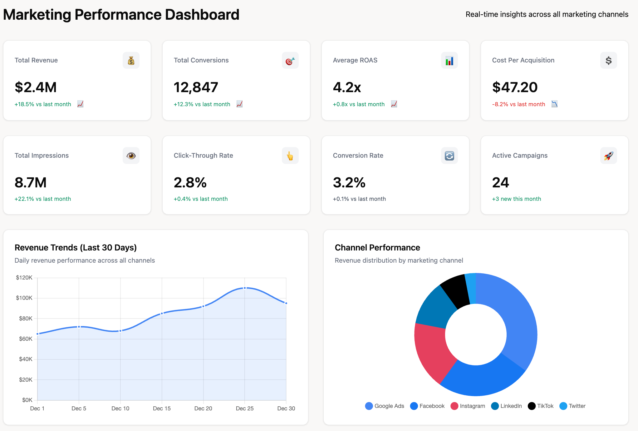
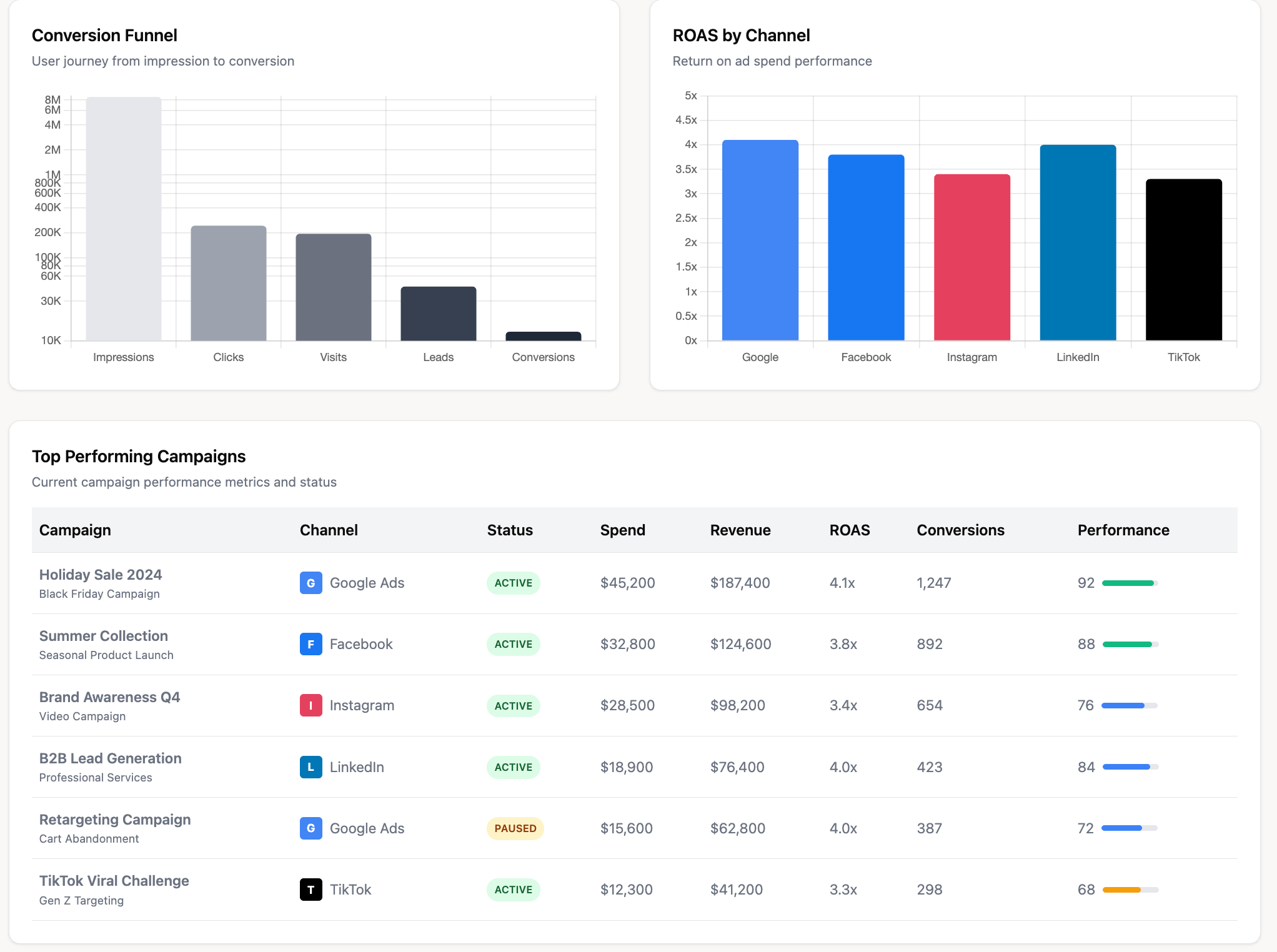
1. Marketing Performance Digital Dashboard
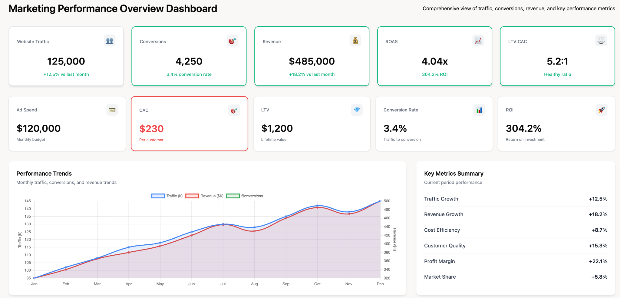
Purpose: Track campaign effectiveness, lead generation, and ROI across all marketing channels
Key metrics: Website traffic, conversion rates, cost per lead, marketing-qualified leads (MQLs), return on ad spend (ROAS), campaign performance by channel
Data sources: Google Analytics, advertising platforms, CRM, email marketing tools
2. Sales Dashboard
Purpose: Monitor daily sales performance, pipeline health, and revenue forecasting
Key metrics: Today's revenue, deals closed, pipeline value, win rate, average deal size, sales cycle length, quota attainment
Data sources: CRM (Salesforce, HubSpot), billing systems
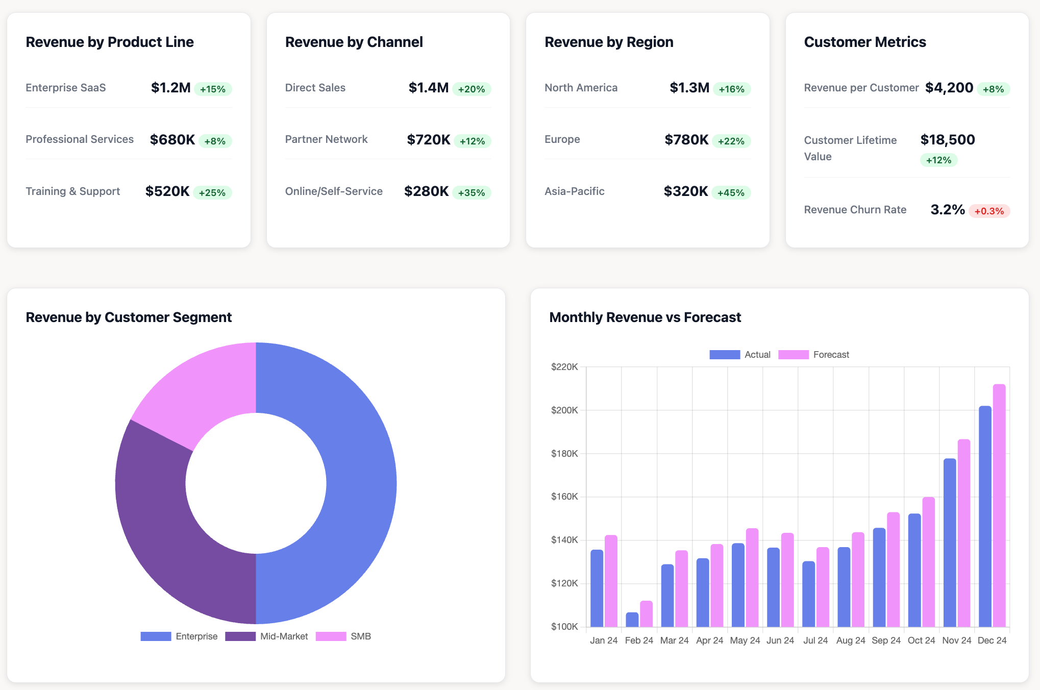
3. Executive Digital Dashboard
Purpose: Provide C-suite with high-level business health snapshot
Key metrics: Revenue vs. forecast, gross margin, customer acquisition cost (CAC), customer lifetime value (LTV), cash flow, Net Promoter Score (NPS)
Data sources: Financial systems, CRM, customer success platforms
4. Customer Support Dashboard
Purpose: Track support team performance and customer satisfaction
Key metrics: Open ticket count, average response time, resolution time, customer satisfaction score (CSAT), first-contact resolution rate
Data sources: Help desk software (Zendesk, Intercom, Freshdesk)
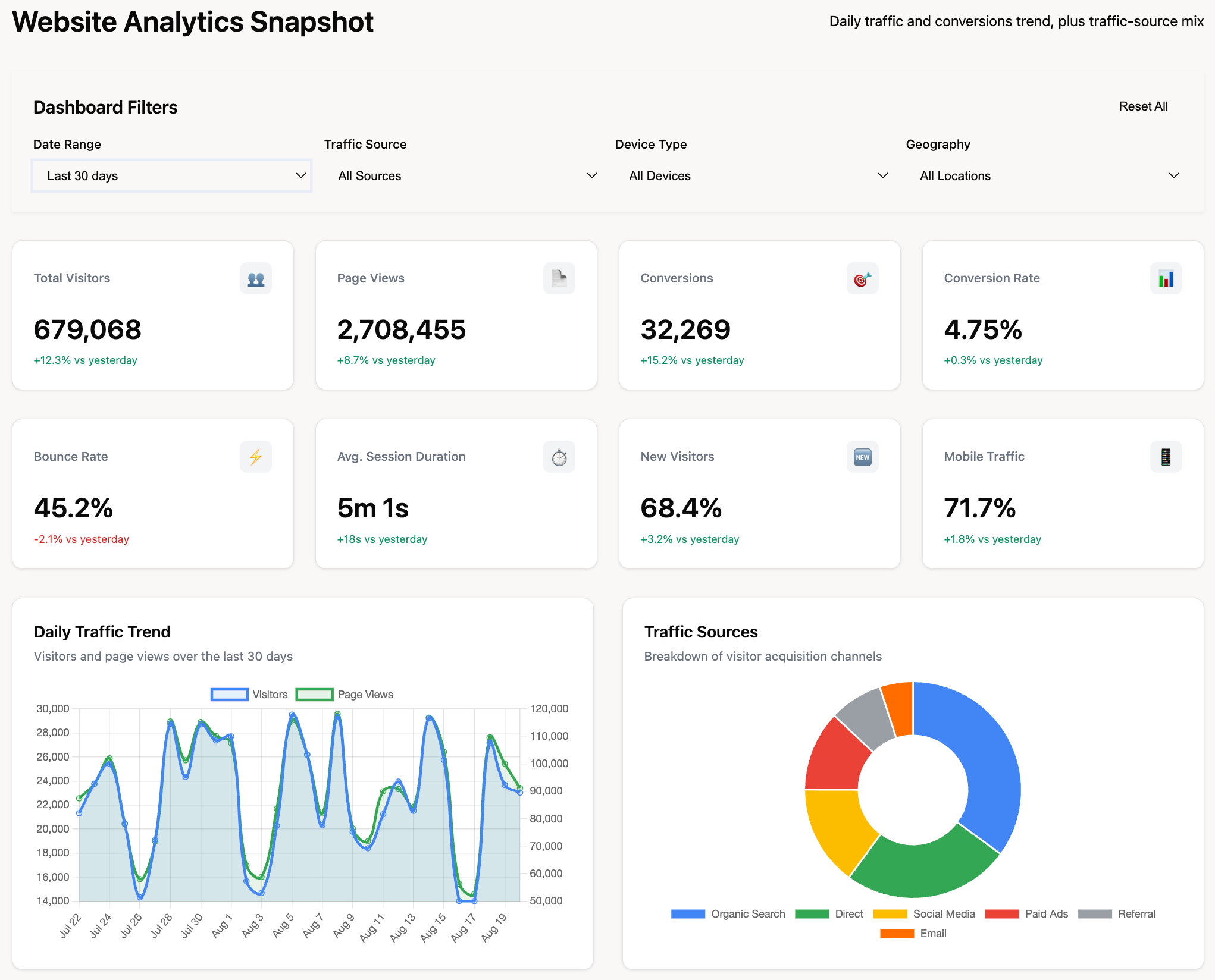
5. Website Analytics Digital Dashboard
Purpose: Monitor website traffic, user behavior, and conversion funnels
Key metrics: Visitors, page views, bounce rate, session duration, top pages, conversion rates, traffic sources
Data sources: Google Analytics, Google Search Console, heatmap tools
6. Social Media Dashboard
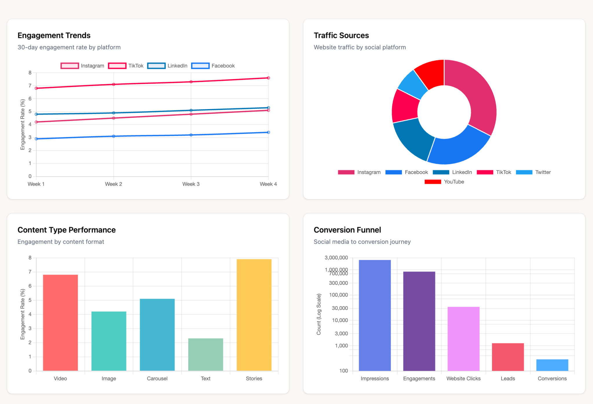
Purpose: Track social media engagement and campaign performance
Key metrics: Followers growth, engagement rate, impressions, clicks, shares, sentiment analysis
Data sources: Social media platforms (Facebook, LinkedIn, Twitter, Instagram)
7. Finance Digital Dashboard
Purpose: Monitor financial health, budget tracking, and expense management
Key metrics: Revenue, expenses, profit margins, budget vs. actual, accounts receivable aging, burn rate
Data sources: Accounting software (QuickBooks, Xero), ERP systems
8. Product Analytics Dashboard
Purpose: Track product usage, feature adoption, and user engagement
Key metrics: Active users, feature usage rates, user retention, churn rate, session frequency
Data sources: Product analytics tools (Mixpanel, Amplitude), application databases
9. Supply Chain Dashboard
Purpose: Monitor inventory levels, shipment status, and supply chain efficiency
Key metrics: Inventory levels by SKU, order fulfillment time, supplier performance, backorder rate, warehouse capacity
Data sources: Inventory management systems, ERP, logistics platforms
10. HR Digital Dashboard
Purpose: Track employee metrics, recruitment, and workforce analytics
Key metrics: Headcount, employee turnover rate, time-to-hire, training completion rates, absence rates
Data sources: HRIS systems, applicant tracking systems
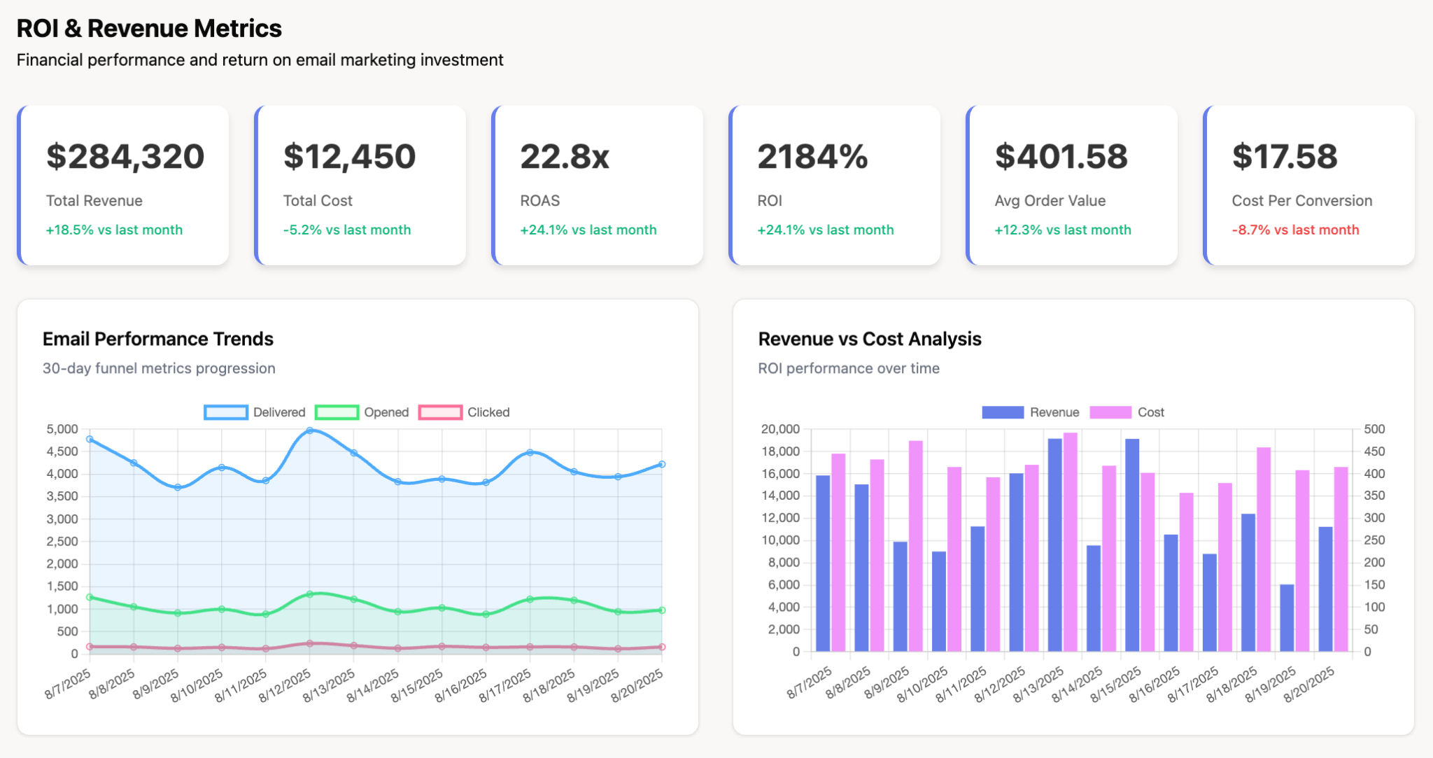
11. Email Marketing Dashboard
Purpose: Monitor email campaign performance and subscriber engagement
Key metrics: Open rate, click-through rate, conversion rate, unsubscribe rate, list growth, revenue per email
Data sources: Email marketing platforms (Mailchimp, Marketo, ActiveCampaign)
12. Project Management Dashboard
Purpose: Track project progress, resource allocation, and deadline adherence
Key metrics: Tasks completed, project status, milestone completion, budget utilization, resource capacity
Data sources: Project management tools (Asana, Jira, Monday.com)
13. E-commerce Dashboard
Purpose: Monitor online store performance and customer purchasing behavior
Key metrics: Total sales, conversion rate, average order value, cart abandonment rate, top products, customer acquisition cost
Data sources: E-commerce platforms (Shopify, WooCommerce, Magento), Google Analytics
14. IT Operations Dashboard
Purpose: Monitor system health, performance, and security incidents
Key metrics: Server uptime, response time, error rates, security alerts, bandwidth usage, incident count
Data sources: Monitoring tools (DataDog, New Relic, Splunk), server logs
15. Customer Success Digital Dashboard
Purpose: Track customer health, adoption, and renewal risk
Key metrics: Customer health scores, product usage rates, renewal dates, expansion opportunities, churn risk indicators
Data sources: CRM, product usage analytics, customer success platforms
How to Create a Digital Dashboard: Step-by-Step Guide
Creating an effective digital dashboard follows a structured process ensuring it delivers value:
Step 1: Define Objectives and Audience
Start by clarifying what the dashboard should accomplish and who will use it. Different roles need different information: executives want high-level summaries while analysts need granular detail.
Questions to answer:
- What decisions will this dashboard support?
- Who are the primary users?
- How frequently will they access it?
- What actions should they take based on insights?
Step 2: Identify Key Metrics and Data Sources
Determine which KPIs and metrics matter most for your objectives. Prioritize ruthlessly – effective dashboards focus on 5-9 critical metrics rather than overwhelming users with dozens of data points.
Document all required data sources and verify data accessibility and quality before designing visualizations.
Step 3: Select Dashboard Software
Which software is best for dashboards? The optimal choice depends on your technical capabilities, data complexity, and budget:
- Improvado: Provides pre-built templates, 500+ data connectors, no-code setup which is ideal for marketing teams.
- Tableau: Powerful business intelligence tool for advanced analytics and complex visualizations.
- Power BI: Microsoft's BI platform integrating well with Excel and Office ecosystem.
- Looker Studio: Free tool from Google offering basic dashboard capabilities.
- Geckoboard: Designed specifically for TV display dashboards in offices.
- Domo: Enterprise BI platform with extensive data connector library.
Step 4: Design Layout and Visualizations
Build dashboard layout prioritizing most important metrics. Follow the 5 second rule for dashboards: users should grasp main insights within 5 seconds of viewing.
Select appropriate chart types for each metric (line charts for trends, bar charts for comparisons, gauges for single KPI status).
Step 5: Connect Data Sources and Test
Integrate data sources, configure refresh schedules, and validate data accuracy. Test with actual users to ensure clarity and usability before full deployment.
Digital Dashboard Tools and Software Options
Does Google Have a Dashboard Tool?
Yes, Google offers Looker Studio (formerly Google Data Studio), a free dashboard tool integrating with Google services like Analytics, Ads, Search Console, and Sheets. While excellent for basic needs and Google ecosystem integration, Looker Studio has limitations with non-Google data sources and advanced customization compared to enterprise BI platforms.
Can ChatGPT Create Dashboards?
Can ChatGPT create dashboards? ChatGPT cannot directly build functional digital dashboards with real-time data connections. However, it assists in several ways:
- Planning: ChatGPT helps define dashboard requirements, suggest relevant KPIs, and outline structure
- Code generation: For custom dashboards, ChatGPT generates code snippets in Python, JavaScript, or R for specific visualizations
- Formula assistance: Creates calculated fields and formulas for metrics
- Design feedback: Provides critiques on dashboard layouts and visualization choices
While ChatGPT won't replace dedicated dashboard software, it accelerates the planning and development process.
Conclusion: Get Started with Digital Dashboards
Digital dashboards have become essential tools for modern organizations, transforming how teams monitor performance, identify opportunities, and make data-driven decisions. Whether you need operational dashboards for day-to-day monitoring, strategic dashboards for executive oversight, or analytical dashboards for deep exploration, the right digital dashboard solution delivers real-time insights and actionable intelligence.