%2520(1).png)
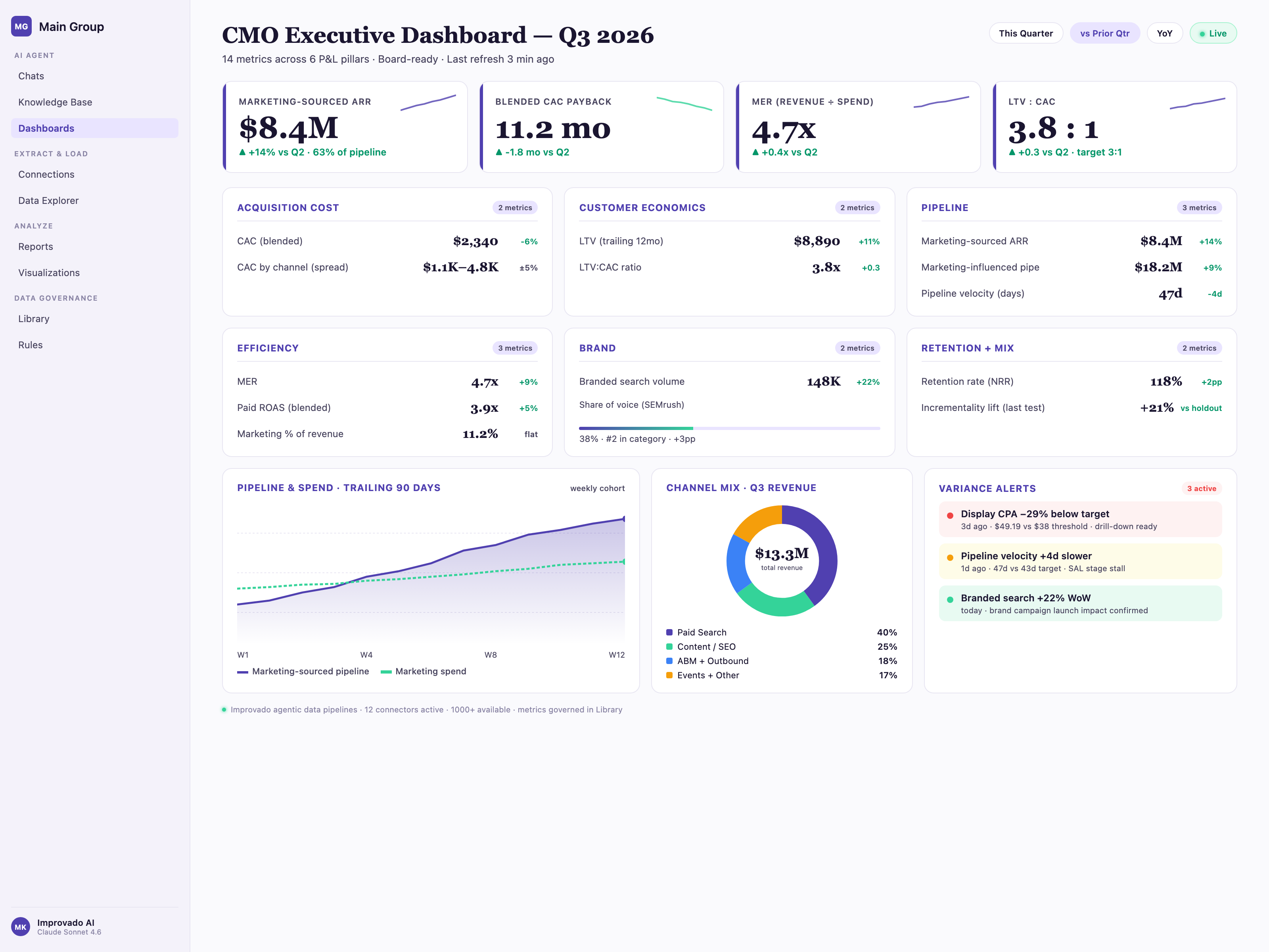
Executive dashboards differ from operational and analytical dashboards in three critical ways: audience (C-suite vs. managers vs. analysts), metric count (5-8 KPIs vs. 20+ metrics vs. 50+ data points), and refresh requirements (daily/weekly vs. hourly vs. real-time). Most organizations waste 6-12 months evaluating tools because they skip this foundational distinction and either over-engineer for simplicity or under-deliver for complexity.
Quick answer
Executive dashboard software serves C-suite audiences with 5-8 high-level KPIs refreshed daily or weekly. Leading options include Omni Analytics for governed metrics and self-service exploration, Tableau for visual polish, Power BI for Microsoft ecosystems, FineBI for balanced governance, and Improvado for marketing data aggregation from 1,000+ platforms. Total cost of ownership can triple upfront licensing costs over three years when including implementation, data engineering, and training.
Key Takeaways
• Executive dashboards serve C-suite with 5-8 KPIs refreshed daily/weekly, not the 20+ metrics operational dashboards monitor hourly.
• Organizations waste 6-12 months evaluating tools by skipping the distinction between executive, operational, and analytical dashboards.
• Total cost of ownership can triple upfront licensing costs over three years when including implementation, data engineering, and training.
• Real-time vendor claims typically mean 5-15 minute refresh cycles; request P95 latency SLAs and network logs to verify actual performance.
• Complexity scoring: 5-7 points uses native connectors; 8-11 points requires ETL layer; 12-15 points needs data warehouse plus 8-12 week implementation.
This guide maps five executive dashboard solutions to six real scenarios. The solutions are Omni Analytics, Tableau, Power BI, FineBI, and Improvado. The scenarios include a CFO tracking burn rate, a CMO monitoring CAC, and a COO watching ops efficiency. You'll find quantitative benchmarks for data latency. You'll also find total cost of ownership calculations. These include hidden implementation costs. Diagnostic criteria help determine your needs. Do you need enterprise BI? Do you need self-service analytics? Or do you need a templatized slide deck instead of software?
Executive Dashboard vs. Operational Dashboard vs. Analytical Dashboard: Which One Do You Need?
Before evaluating vendors, understand which dashboard category matches your requirements. Most teams buy the wrong tier—either over-engineering simple monitoring needs or under-delivering on complex analysis workflows.
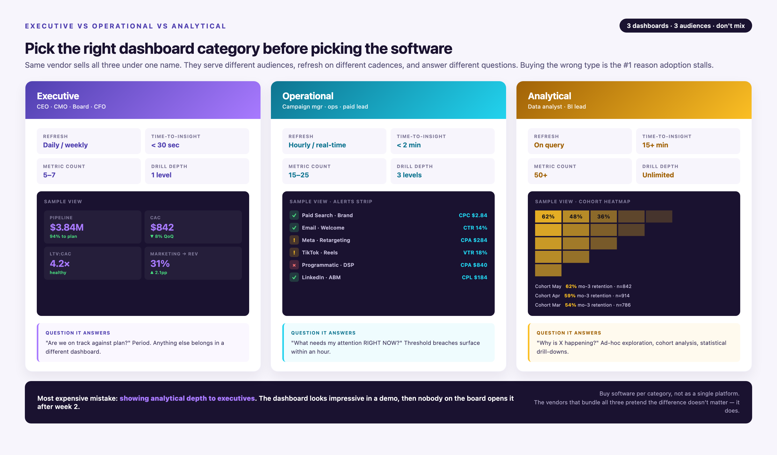
| Dimension | Executive Dashboard | Operational Dashboard | Analytical Dashboard |
|---|---|---|---|
| Primary Audience | C-suite (CEO, CFO, CMO, COO) | Managers, team leads | Analysts, data scientists |
| Typical Metric Count | 5-8 KPIs (revenue, burn rate, CAC, churn) | 20+ metrics (campaign performance, pipeline stages) | 50+ data points (cohort analysis, attribution models) |
| Refresh Frequency | Daily or weekly | Hourly or every 15 minutes | Real-time or on-demand query |
| Interactivity Level | Low (view-only, occasional drill-down) | Medium (filter by date range, channel, region) | High (custom queries, cohort segmentation, what-if scenarios) |
| Data Granularity | Aggregated summaries (monthly revenue, YoY growth) | Daily or weekly breakdowns (campaign spend by day) | Row-level detail (individual transaction records) |
| Customization Need | Minimal (standard KPI templates) | Moderate (team-specific views) | High (custom calculated fields, SQL queries) |
| Example Use Case | Board meeting preparation, quarterly business reviews | Daily stand-ups, weekly pipeline reviews | Attribution modeling, cohort retention analysis, A/B test evaluation |
| When NOT to Use | Executives prefer narrative reports; fewer than 5 users; single data source | Real-time alerting required; data changes hourly | Fixed KPI monitoring only; non-technical audience |
This distinction prevents two common failure modes. First, deploying an analytical dashboard for executives who want three numbers at a glance. Second, giving analysts an executive summary when they need to test hypotheses with row-level data. If your executives ask "why" more than "what," you need operational or analytical dashboards instead.
Do You Actually Need Executive Dashboard Software? A Diagnostic Flowchart
Many organizations over-buy dashboard software when simpler solutions would serve their needs better. Use this decision framework to narrow your search before evaluating vendors.
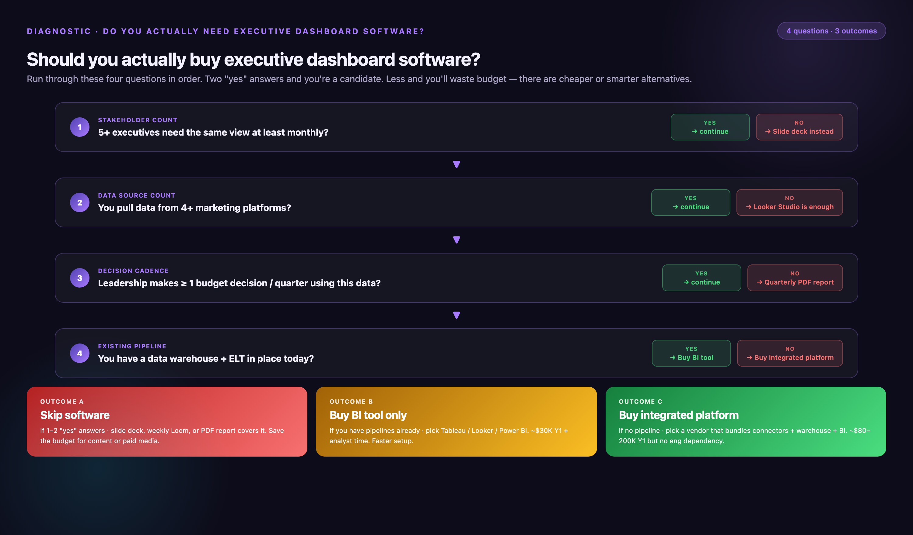
| Diagnostic Question | If Yes | If No |
|---|---|---|
| Do you have more than 3 data sources? | Proceed to next question | Use native tool reporting (e.g., Salesforce dashboards if CRM is your only source) |
| Do more than 5 executives need access? | Proceed to next question | Build templatized Google Slides or Excel workbooks with manual weekly updates |
| Are dashboards viewed more than once per week? | Proceed to next question | Set up automated email reports with static charts—no dashboard needed |
| Do you have a technical team (data engineer, BI analyst, or developer)? | Consider self-hosted or open-source options (Metabase, Superset) alongside SaaS | Limit search to no-code SaaS platforms only (Power BI, FineBI, Improvado) |
| Do your data sources change monthly or more frequently? | Avoid dashboard software—connector maintenance will exceed reporting value. Hire fractional analytics help instead. | Dashboard software is viable—proceed to vendor evaluation |
| Do you have documented data governance policies (metric definitions, ownership, access controls)? | Proceed with confidence—tools like Omni Analytics and Looker require this foundation | Pause vendor evaluation. Establish metric definitions and ownership first, or risk conflicting numbers across dashboards. |
If you answered "no" to the first three questions, dashboard software is over-engineering. Early-stage startups with fewer than 10 employees should prioritize spreadsheet discipline over BI tooling. Organizations in regulated industries (healthcare, finance) must verify that vendors meet HIPAA, SOC 2, or GDPR requirements before evaluating features—many executive dashboard platforms lack compliance certifications despite marketing claims.
Data Complexity Assessment: Mapping Your Integration Needs to Solution Tiers
Executive dashboard software selection depends primarily on data complexity, not feature counts. Use this scoring framework to identify your integration tier before comparing vendors.
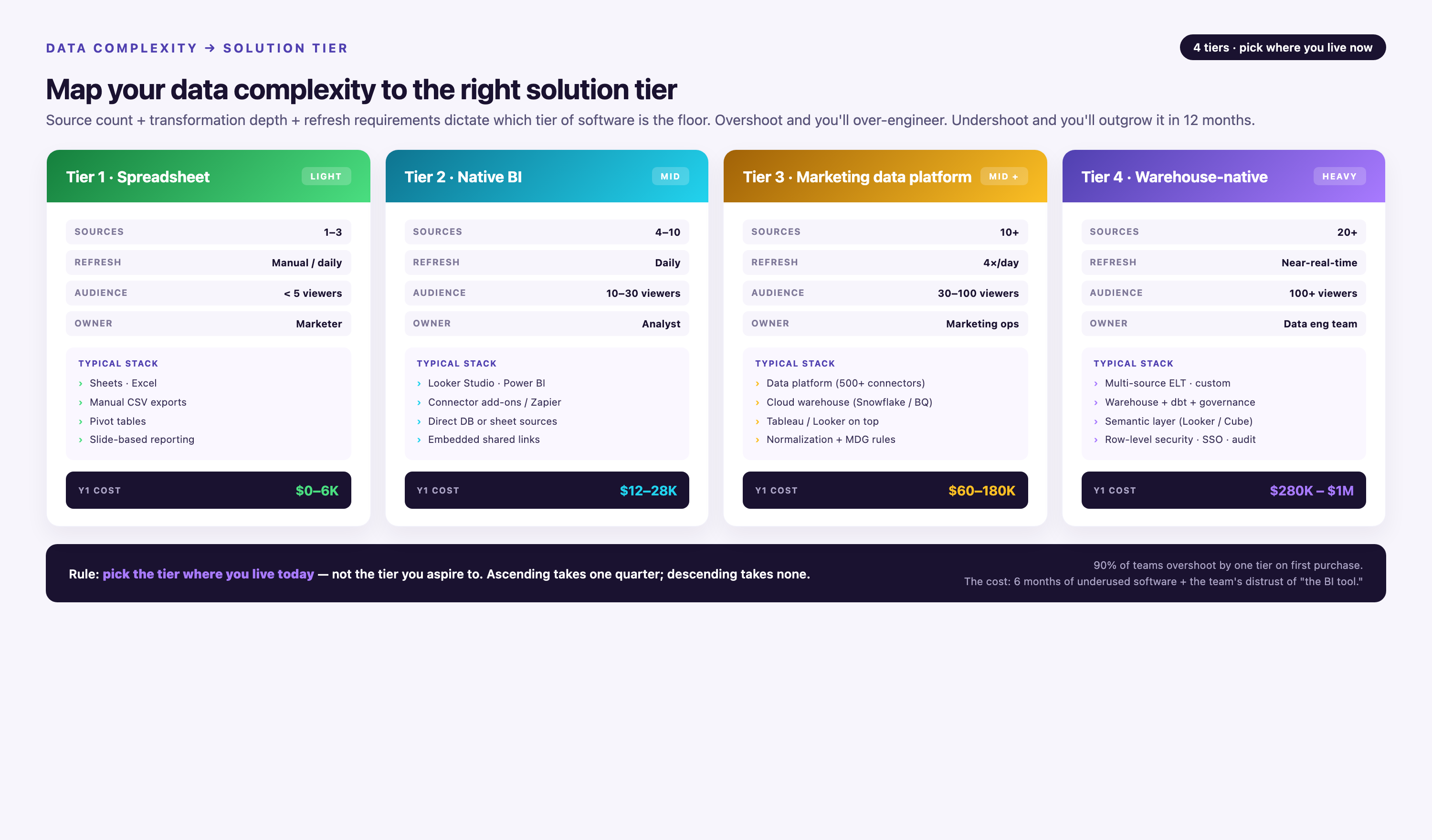
| Complexity Factor | Simple (1 point) | Moderate (2 points) | Complex (3 points) |
|---|---|---|---|
| Number of Data Sources | 1-3 sources | 4-10 sources | 11+ sources |
| Daily Data Volume | 100K-1M rows/day | >1M rows/day | |
| Transformation Needs | None (direct API pulls) | Light (renaming fields, filtering) | Heavy (joins, calculated metrics, deduplication) |
| Real-Time Requirements | Batch (daily updates acceptable) | Near-real-time (15-60 min latency) | Streaming (sub-minute/continuous ingestion) |
| Historical Data Depth | 90 days or less | 6-24 months | 2+ years (data warehouse required) |
Scoring interpretation:
• 5-7 points (Simple): Native connectors in Power BI, FineBI, or Tableau sufficient. No dedicated data pipeline needed.
• 8-11 points (Moderate): Add an ETL layer (Fivetran, Stitch) or marketing-specific integration platform (Improvado) between sources and dashboard.
• 12-15 points (Complex): Requires data warehouse (Snowflake, BigQuery, Redshift) + transformation layer (dbt) + semantic modeling (Looker LookML, Omni Analytics). Plan 8-12 weeks for implementation.
Example scenarios with complexity scores:
• 3 data sources (Google Ads, Salesforce, Stripe). Less than 50K rows per day. Daily batch updates. 90-day history. No transformations required. Use Power BI or FineBI with native connectors. Scenario A (Score: 6):
• 7 sources (Google Ads, Meta, LinkedIn, HubSpot, Shopify, Zendesk, Stripe). 200K rows/day with hourly refresh. 12-month history available. Light transformations include UTM parsing and currency conversion. Use Improvado or Fivetran to aggregate data. Then connect Tableau or Omni Analytics. Scenario B (Score: 9):
• 15+ sources including custom APIs. 2M+ rows/day with <5 min latency required. 3-year history needed. Heavy transformations required: multi-touch attribution and customer lifetime value calculations. Build Snowflake + dbt stack. Model in Looker LookML or Omni Analytics. Visualize in Tableau. Scenario C (Score: 14):
Marketing teams typically score 8-11 points due to multiple ad platforms, CRM systems, and web analytics tools requiring UTM normalization and campaign mapping. Finance teams with ERP + CRM integrations often score 10-13 points when combining transactional data with forecasting models.
Real-Time Data Performance: What Vendors Mean vs. What You Get
Vendors claiming "real-time dashboards" rarely deliver sub-minute latency. Here are actual data refresh benchmarks for common integration patterns, based on technical documentation and G2 user reviews:
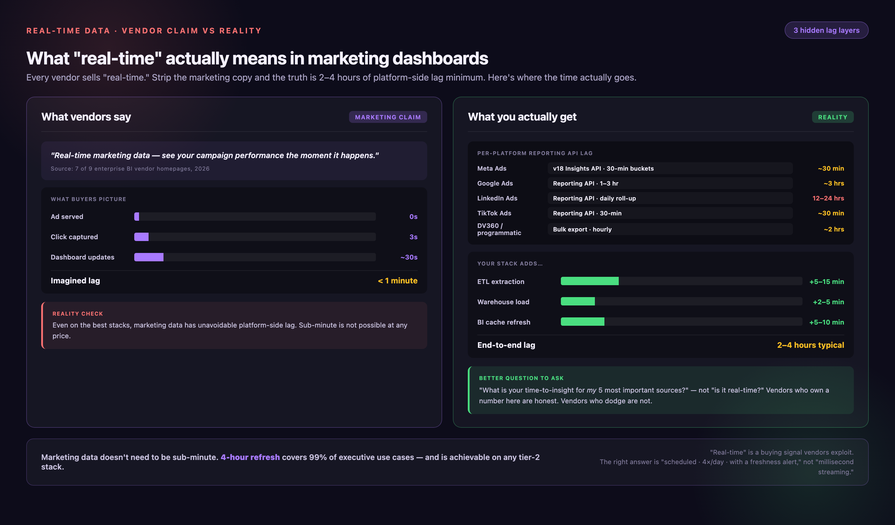
| Integration Pattern | Typical Latency (P50) | Worst-Case Latency (P95) | Example Tools |
|---|---|---|---|
| Direct API Refresh | 1-5 minutes | 10-15 minutes | Power BI (scheduled refresh), Tableau (live connection) |
| Database Query (direct connection) | 5-15 minutes | 20-30 minutes | Looker, Omni Analytics (live queries to warehouse) |
| Data Warehouse Sync | 15-60 minutes | 90-120 minutes | Fivetran → Snowflake → Tableau |
| Batch ETL (scheduled) | Hourly or daily | Next scheduled run + processing time | Traditional ETL tools, CSV imports |
| Streaming (event-based) | 2-5 minutes | Kafka → Snowflake → live query dashboard |
Key questions to ask vendors during demos:
• "What is your P95 latency for [specific data source]?" — Forces vendors to provide worst-case performance, not best-case marketing claims. If they can't answer, request access to status page or monitoring dashboards.
• "Can you show network logs during a dashboard refresh?" — Reveals whether "live" dashboards actually query sources or pull from a cache updated hourly.
• "What happens when a data source API rate-limits your requests?" — Google Ads, Meta, and Salesforce enforce strict rate limits. Tools without retry logic or request queuing will show stale data without alerting users.
• "Do you maintain a separate cache layer, and how often does it refresh?" — Many "real-time" dashboards query a Redis or Memcached layer updated every 5-15 minutes, not the source system.
For marketing analysts, 15-minute latency is acceptable for daily campaign monitoring but insufficient for real-time bid adjustments or flash sales. If your use case requires sub-5-minute latency, verify that the dashboard tool supports streaming ingestion—most do not.
Customization Depth: Testing Vendor Flexibility in Demos
The ability to customize dashboards separates executive-grade tools from rigid templates. Test these four scenarios during vendor demos to assess customization depth:
Scenario 1: Calculated Metrics Without SQL
Ask the vendor to create a calculated metric like CAC payback period (Customer Acquisition Cost ÷ Monthly Recurring Revenue per customer) without writing SQL. Tools like Power BI and FineBI offer formula builders with drag-and-drop fields; Tableau requires calculated field syntax; Looker demands LookML modeling. If your team lacks SQL expertise, eliminate tools requiring code for basic business logic.
Scenario 2: Executive-Specific Views That Hide Operational Details
Request a dashboard version showing only revenue, burn rate, and cash runway—omitting the 20+ operational metrics visible to managers. Effective tools support role-based layouts, not just row-level security. If the vendor can only filter data access but not simplify visual complexity, executives will receive cluttered dashboards requiring manual explanation.
Scenario 3: Third-Party Widget Embedding
Ask whether you can embed external content like Salesforce Einstein predictions, Gong conversation insights, or custom React components. Power BI supports custom visuals via AppSource; Tableau allows extensions; Looker and Omni Analytics require iframe embedding workarounds. This capability matters for teams consolidating multiple intelligence sources into one executive view.
Scenario 4: White-Label for Board Presentations
Request removal of vendor branding (logos, "Powered by" footers) and custom color schemes matching corporate identity. Many tools charge premium tiers for white-labeling or prohibit it entirely. If dashboards will be screenshotted for board decks or client reports, verify branding removal in your contract—sales reps often promise this verbally without documentation.
Map vendor capabilities to these scenarios in your evaluation scorecard. A tool passing three of four scenarios meets most executive dashboard customization needs; passing all four suggests enterprise-grade flexibility.
- →1,000+ pre-built connectors to advertising, CRM, and analytics platforms—no custom API work required
- →Marketing Cloud Data Model with pre-mapped CAC, LTV, ROAS calculations across all channels
- →250+ data governance rules prevent dirty campaign data from reaching executive dashboards
- →2-year historical data preservation when ad platforms change schemas—no data loss during migrations
Total Cost of Ownership: The Hidden Expenses Vendors Don't Advertise
Published per-user pricing obscures the true cost of executive dashboard deployments. Use this TCO calculator to estimate three-year costs including implementation, maintenance, and scaling:
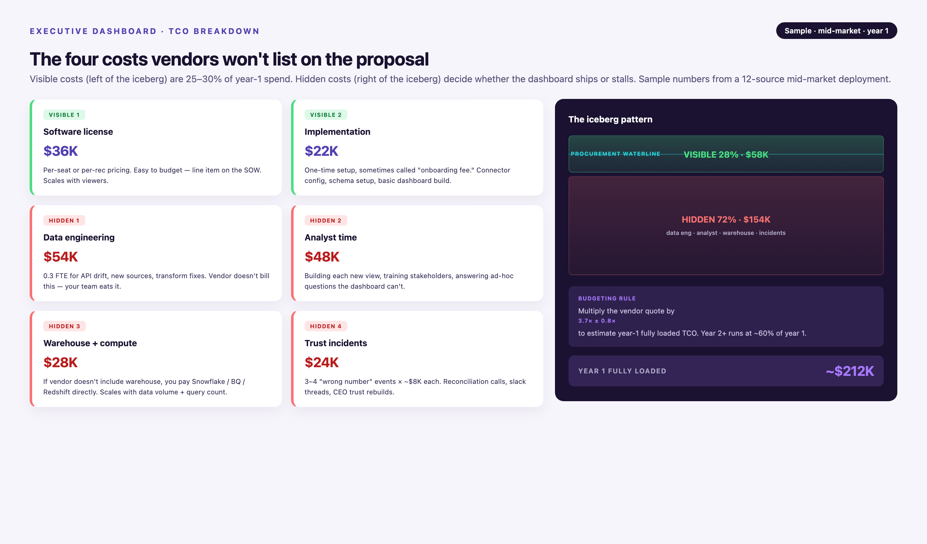
| Cost Category | Low-End Estimate | High-End Estimate | Notes |
|---|---|---|---|
| Software Licensing (per user/month) | $20-$40 | $70-$150 | Power BI Pro ($10-$20), Tableau Creator ($70), enterprise tiers higher. Multiply by user count × 36 months. |
| Implementation Services | $5,000-$15,000 | $50,000-$150,000 | DIY setup (low) vs. consulting firm engagement (high). Tableau and Looker often require partners. |
| Data Engineering (integration setup) | 40-80 hours | 200-400 hours | Connecting data sources, building transformations, testing data quality. At $150/hr contractor rate: $6K-$60K. |
| Training (initial rollout) | 8-16 hours | 40-80 hours | User onboarding, admin training, documentation creation. Often underestimated—factor 2-4 hours per user. |
| Connector Maintenance (annual) | 20-40 hours/year | 100-200 hours/year | Fixing broken API connections when vendors change schemas. Google Ads and Meta update frequently. |
| Dashboard Redesign Cycles | 2-4 times over 3 years | 6-12 times over 3 years | New campaigns, rebrands, or KPI shifts require rebuilding dashboards. Budget 10-20 hours per redesign. |
| Data Warehouse Costs (if required) | $100-$500/month | $2,000-$10,000/month | Snowflake, BigQuery, or Redshift for large data volumes. Scales with query frequency and storage. |
TCO Formula: Total Cost = (Licensing × Users × 36 months) + Implementation + (Data Engineering Hours × Hourly Rate) + Training + (Maintenance Hours/Year × 3 × Hourly Rate) + (Redesign Frequency × Hours per Redesign × Hourly Rate) + (Data Warehouse × 36 months)
Example calculation for a 15-person team with moderate complexity (score 9 from earlier framework):
• Licensing: $50/user/month × 15 users × 36 months = $27,000
• Implementation: $20,000 (consulting firm)
• Data Engineering: 120 hours × $150/hr = $18,000
• Training: 30 hours × $150/hr = $4,500
• Maintenance: 60 hours/year × 3 years × $150/hr = $27,000
• Redesigns: 4 cycles × 15 hours × $150/hr = $9,000
• Data Warehouse: $500/month × 36 months = $18,000
• Total 3-Year TCO: $123,500 (vs. $27,000 in advertised licensing costs—4.6× multiplier)
Organizations underestimating TCO often abandon dashboard projects after the first year when maintenance costs exceed budget. Request customer references from vendors and ask specifically about post-launch surprises in implementation timelines or ongoing engineering needs.
When Executive Dashboards Fail: Five Anti-Patterns and Mitigation Tactics
Even well-implemented dashboard software fails if organizational factors undermine adoption. Watch for these failure modes during rollout:
Failure Mode 1: Metric Vanity Theater
• Symptom: Executives glance at dashboards during meetings but make decisions based on anecdotal reports or spreadsheets circulated separately.
• Root Cause: Dashboards display vanity metrics (total impressions, page views) instead of business outcomes (pipeline influenced, revenue attributed). Marketing teams default to easily measurable KPIs rather than challenging ones.
• Mitigation: Conduct a pre-launch KPI audit. For each dashboard metric, ask: "If this number moves 20% in either direction, what specific action would we take?" Metrics failing this test are decorative, not diagnostic. Replace with actionable alternatives: swap "website traffic" for "demo requests from target accounts"; swap "email open rate" for "MQL-to-SQL conversion rate." [From Data to Decisions Using Actionable, 2024]
Failure Mode 2: Stale Data Causes Bad Decisions
Leadership makes strategic calls based on dashboard data. They later discover that integration pipelines were broken. This happened for days or weeks. No alerts were triggered during this time. Symptom:
• Root Cause: No data quality monitoring. API connections silently fail when vendors change authentication schemas or rate limits, leaving dashboards displaying last-known values without timestamps indicating freshness.
• Mitigation: Implement data freshness alerts. Tools like Improvado include built-in anomaly detection; for other platforms, set up external monitors (e.g., dbt tests, Great Expectations) that Slack-alert when source data hasn't updated in expected timeframes. Display "last updated" timestamps prominently on every dashboard tile.
Failure Mode 3: No Ownership = No Updates
• Symptom: Dashboards become "shelfware" three months post-launch. KPIs remain static even as business priorities shift; broken charts go unfixed; user questions go unanswered.
• Root Cause: Dashboards treated as IT projects rather than business products. No individual stakeholder responsible for accuracy, relevance, or evolution.
• Mitigation: Assign a dashboard owner (typically a senior marketing analyst or BI lead) with explicit responsibilities: quarterly KPI review with executives, monthly data quality audits, triage for user-reported issues. Embed dashboard reviews into existing rituals (QBRs, monthly all-hands) so they don't become orphaned.
Failure Mode 4: Wrong Granularity for Audience
• Symptom: Executives constantly ask dashboard builders to "show me the underlying data" because aggregated views don't answer their questions. Alternatively, executives ignore dashboards entirely because they're overwhelmed by operational detail.
• Root Cause: Mismatch between dashboard design and executive decision-making style. Some C-suite leaders want three numbers; others want drill-down capability to transaction logs.
• Mitigation: Build tiered dashboards. Start with an executive summary (5-8 KPIs, zero drill-down). Add a secondary operational view accessible via "View Details" link. During pilot phase, track which executives use drill-down features—if fewer than 30% click through in the first month, remove the complexity to avoid cognitive overload.
Failure Mode 5: Mobile-Unusable Dashboards
• Symptom: Executives screenshot dashboards and text images to each other rather than sharing live links. Mobile users report dashboards are "too small to read" or "don't load on my phone."
• Root Cause: Dashboards designed on desktop monitors (1920×1080) without mobile-first testing. Charts optimized for 27-inch screens become illegible on 6-inch phones.
• Mitigation: Mandatory mobile testing before launch. Load dashboards on actual iOS and Android devices (not just browser emulators) and verify: font sizes ≥14pt, tap targets ≥44×44 pixels, charts use high-contrast colors, critical KPIs visible without horizontal scrolling. Power BI and Tableau offer mobile-specific layout editors—use them. If mobile experience remains poor after optimization, provide alternate delivery (daily email summary with top 3 KPIs).
Top 5 Executive Dashboard Software Solutions for Marketing Analysts in 2026
This section compares five platforms based on governed metrics, self-service capabilities, integration complexity, and total cost of ownership. The solution-to-scenario matrix below maps each tool to specific executive use cases.
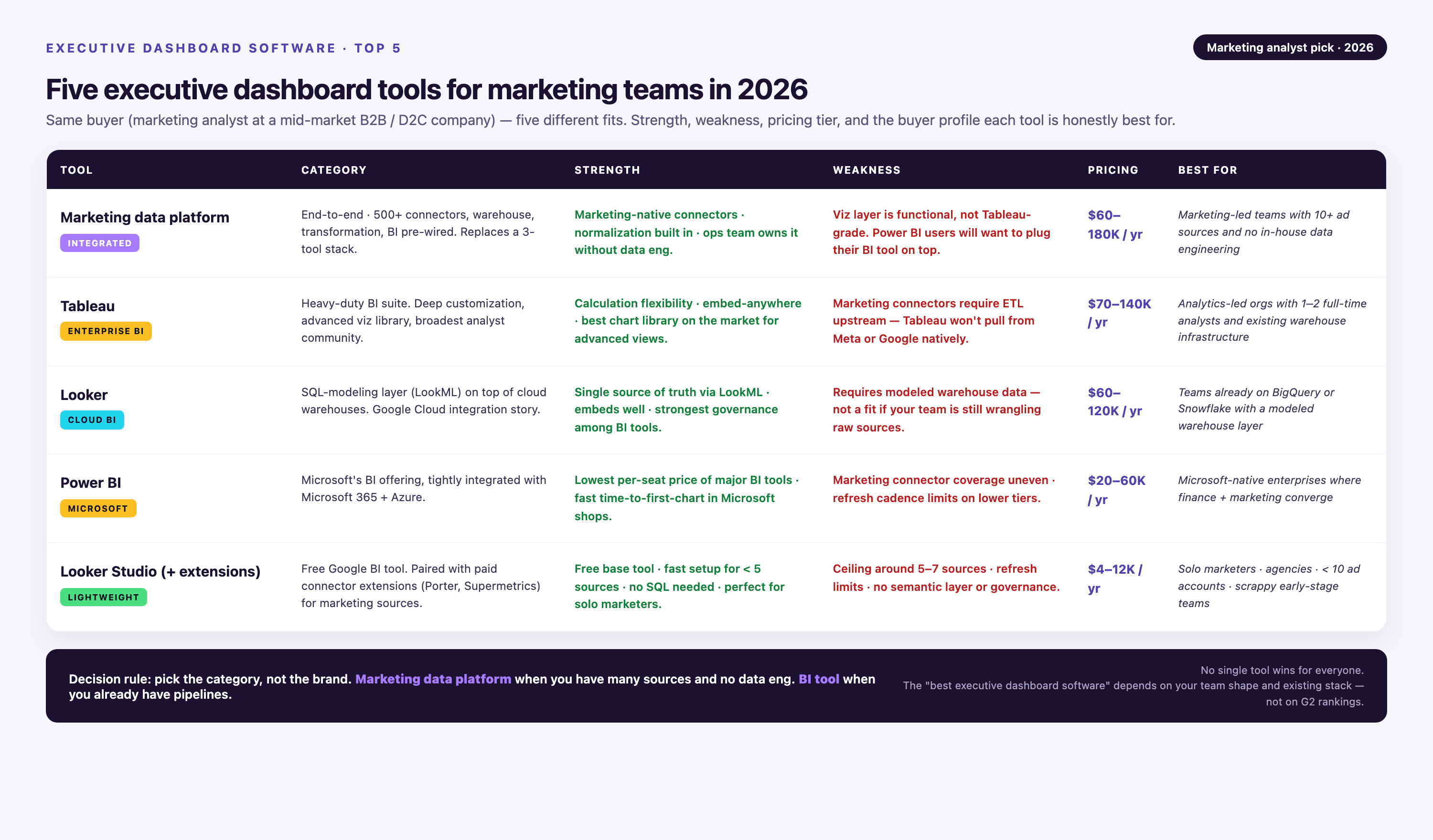
Solution-to-Scenario Matrix: Which Tool Fits Your Executive's Needs?
| Executive Scenario | Omni Analytics | Tableau | Power BI | FineBI | Improvado |
|---|---|---|---|---|---|
| CFO tracking burn rate, runway, and budget variance | ★★★★★ Semantic layer ensures consistent finance definitions across departments; live warehouse queries for up-to-date actuals. |
★★★★☆ Exceptional visual polish for board presentations; requires separate ETL for multi-source finance data. |
★★★★☆ Strong Excel integration for budget imports; native connectors to Dynamics, NetSuite. Governance via Premium workspace. |
★★★☆☆ Good for departmental finance views; lacks advanced forecasting models CFOs need for scenario planning. |
★★★☆☆ Excels at marketing spend tracking but limited for P&L consolidation across finance systems. |
| CMO monitoring CAC, pipeline velocity, and attribution | ★★★★☆ Self-service exploration lets marketing teams build custom attribution views; needs data engineering for complex models. |
★★★★☆ Best for visualizing funnel stages and cohort analysis; steep learning curve for non-technical CMOs. |
★★★★☆ 800+ connectors cover most marketing stacks; natural language Q&A helps CMOs query data without analysts. |
★★★☆☆ Drag-and-drop suitable for campaign reporting; lacks sophisticated attribution modeling capabilities. |
★★★★★ Purpose-built for marketing: 1,000+ pre-built connectors, automated UTM normalization, Marketing Cloud Data Model with pre-mapped CAC/LTV metrics. |
| COO managing operational efficiency (fulfillment, support, logistics) | ★★★☆☆ Suitable for metrics from data warehouses; less ideal for direct operational system connections (ERPs, ticketing). |
★★★★☆ Strong for process flow visualizations; connects to Salesforce Service Cloud, Zendesk, Jira. |
★★★★★ Microsoft ecosystem integration (Dynamics 365, Azure IoT) ideal for operations; real-time streaming for supply chain. |
★★★★☆ Real-time dashboards and mobile access suit field operations; embedded analytics for internal tools. |
★★☆☆☆ Focused on marketing data; lacks operational system connectors COOs need. |
| CRO forecasting revenue, tracking quota attainment, pipeline health | ★★★★☆ Governed sales metrics prevent "two versions of truth" between sales ops and finance; AI-assisted forecasting. |
★★★★★ Salesforce native connector + CRM Analytics integration; industry-leading pipeline waterfall visualizations. |
★★★★☆ Dynamics + LinkedIn Sales Navigator integration; AI insights for deal scoring; row-level security by sales region. |
★★★☆☆ Adequate for regional sales dashboards; lacks predictive analytics CROs use for pipeline forecasting. |
★★★☆☆ Strong for marketing-influenced pipeline (campaign source tracking) but not full sales cycle visibility. |
| Multi-executive board meetings (CEO + C-suite reviewing company health) | ★★★★★ Semantic layer guarantees all execs see identical metric definitions; embeddable in board portals. |
★★★★★ Presentation-quality visualizations; custom branding for investor decks; offline snapshots for confidential meetings. |
★★★★☆ Teams integration allows live dashboard walkthroughs in virtual board meetings; export to PowerPoint preserves interactivity. |
★★★☆☆ Suitable for internal all-hands; white-label options limited for external board presentations. |
★★★☆☆ Excellent for marketing reviews; less complete for cross-functional board KPIs. |
| Product-led growth teams embedding dashboards for customers | ★★★★★ Built for embedded analytics with per-customer data isolation, white-label UI, usage-based billing support. |
★★★☆☆ Embedding possible but expensive (requires Embedded Analytics license); branding removal limited. |
★★★★☆ Power BI Embedded offers good customization; row-level security manages multi-tenant data. Licensing complexity. |
★★★★☆ Strong embedded options for SaaS products; on-premise deployment available for regulated industries. |
★★☆☆☆ Not designed for customer-facing analytics; primarily internal reporting tool. |
Star ratings combine three factors: fit-for-purpose, implementation complexity, and cost-effectiveness. Fit-for-purpose asks if the tool solves this scenario naturally. Implementation complexity measures how much custom work is required. Cost-effectiveness evaluates TCO relative to value delivered. A 5-star rating indicates the tool was purpose-built for this use case. 3 stars means workable with customization. 2 stars or below signals consider alternatives.
Detailed Tool Reviews
Omni Analytics
Omni Analytics leads the 2026 executive dashboard market for organizations prioritizing governed metrics and self-service exploration. Its semantic layer—a centralized repository of business logic and metric definitions—ensures CFOs, CMOs, and board members see identical calculations regardless of who builds the dashboard.
Key differentiators:
• Governed metrics library: Data teams define KPIs once (e.g., "Monthly Recurring Revenue = SUM(subscription_value) WHERE status = 'active'"), then all users—from executives to analysts—query the same definition. Eliminates "finance revenue" vs. "sales revenue" discrepancies.
• Live cloud warehouse queries: Connects directly to Snowflake, BigQuery, Redshift, Databricks without intermediate ETL pipelines. Dashboards reflect data warehouse state in near-real-time (5-15 minute latency typical).
• AI-assisted querying: Natural language interface ("Show me CAC by channel for Q1 2026") generates SQL queries in the background. Reduces executive dependency on analysts for ad-hoc questions.
• Embedded analytics: White-label dashboards for product teams building customer-facing analytics. Supports row-level security and per-tenant data isolation.
• Best for: Mid-market to enterprise B2B companies (500+ employees) with existing data warehouses and dedicated data engineering teams. Organizations where metric consistency across departments is a known pain point.
• Limitations: Requires data warehouse infrastructure (Snowflake, BigQuery, etc.)—not suitable for teams without centralized data storage. Semantic layer setup demands SQL expertise; initial configuration takes 4-6 weeks. Pricing is custom and scales with data volume, making it cost-prohibitive for smaller teams.
• Pricing: Custom enterprise pricing based on data volume and user count. Early-stage companies report $2,000-$5,000/month starting costs; enterprises with terabyte-scale data pay $10,000+/month.
• Implementation timeline: 4-8 weeks for semantic layer modeling and initial dashboard rollout. Faster if existing dbt models can be imported.
Tableau
Tableau remains the gold standard for visual depth and presentation quality in executive dashboards. Its extensive chart library, pixel-perfect layout control, and interactive drill-down capabilities make it the default choice for organizations where dashboard aesthetics matter—particularly for board presentations and investor meetings.
Key differentiators:
• Unmatched visualization variety: 24 native chart types plus custom extensions (Sankey diagrams, waterfall charts, heat maps). Executives can explore data through multiple lenses without leaving the dashboard.
• Presentation mode: Full-screen, branded dashboards with animation effects for storytelling. Export to PowerPoint preserves interactivity when embedded.
• Salesforce integration: Native CRM Analytics connector for sales and pipeline dashboards. Tableau was acquired by Salesforce in 2019, making it the natural choice for Salesforce-heavy organizations.
• Offline snapshots: Save dashboard states as PDFs or packaged workbooks for air-gapped environments or confidential board meetings.
• Best for: Large enterprises (1,000+ employees) with dedicated BI teams and emphasis on visual storytelling. CFOs and CROs presenting to boards or investors benefit most from Tableau's polish.
• Limitations: Steep learning curve—most users require 40+ hours of training to achieve proficiency with calculated fields and level-of-detail expressions. Metric governance depends on external tools (dbt, Atlan) since Tableau lacks a native semantic layer. Desktop application (Tableau Desktop) required for advanced dashboard building; web-only Tableau Server has limited authoring capabilities.
• Pricing: Tableau Creator (full authoring): $70/user/month; Tableau Explorer (edit existing dashboards): $35/user/month; Tableau Viewer (view only): $15/user/month. Enterprise agreements start at ~$50,000/year for 50-100 users.
• Implementation timeline: 6-12 weeks for initial rollout including data source connections, dashboard design, and user training. Enterprises with complex data landscapes often engage Tableau consulting partners, extending timelines to 3-6 months.
Microsoft Power BI
Power BI dominates executive dashboards in Microsoft-centric organizations. Its unbeatable entry-level pricing drives adoption. Native integration with Excel, Teams, Azure, and Dynamics 365 strengthens its appeal. For companies already paying for Microsoft 365 E5 licenses, Power BI Premium Per User (PPU) is included. There is no additional cost. This makes it the most cost-effective enterprise BI solution.
Key differentiators:
• Microsoft ecosystem lock-in: Embed dashboards in Teams channels, export to Excel with live data refresh, integrate Outlook calendar data for executive availability dashboards. SharePoint embedding for intranet portals.
• Q&A natural language querying (e.g., "Show me revenue by region"). Anomaly detection auto-highlights KPI deviations. Key influencers analysis explains questions like "why did churn spike last month?" AI-driven insights:
• Power BI's "datasets" feature lets non-technical users define metrics and relationships. It uses a visual interface. This reduces dependency on SQL-fluent data teams. Semantic modeling without code:
• Row-level security: Granular access controls by department, region, or custom attributes. CFOs can share a single dashboard with sales VPs where each sees only their region's data.
• Best for: Organizations with 50-5,000 employees heavily invested in Microsoft stack (Azure, Dynamics, Office 365). Excellent for finance and operations teams requiring Excel interoperability.
• Limitations: Premium capacity pricing becomes expensive at scale—organizations exceeding 100 users often face $5,000-$20,000/month infrastructure costs. Refresh rates capped at 8-48 times per day depending on license tier (Premium Per User vs. Premium Capacity), limiting real-time use cases. Desktop application (Power BI Desktop) required for report authoring; web service is view-only for most users.
• Pricing: Power BI Pro: $10/user/month (basic dashboards, limited refresh); Power BI Premium Per User: $20/user/month (faster refresh, larger datasets); Power BI Premium Capacity: $4,995/month (unlimited users, dedicated cloud resources). Microsoft 365 E5 includes PPU at no extra cost.
• Implementation timeline: 2-4 weeks for initial dashboard rollout if connecting to Microsoft data sources (Dynamics, SharePoint, Azure SQL). 6-10 weeks when integrating non-Microsoft platforms (Salesforce, Google Analytics, AWS) due to connector limitations.
FineBI
FineBI serves mid-market organizations seeking a balance between self-service flexibility and IT-controlled governance. Its drag-and-drop interface lowers the technical barrier for marketing analysts and department heads to build dashboards, while centralized data modeling prevents metric fragmentation.
Key differentiators:
• Self-service with guardrails: Business users build dashboards from pre-approved data tables curated by IT, reducing ad-hoc data requests without sacrificing data quality.
• Supports both live database queries and scheduled batch updates. Live queries power operational dashboards. Batch updates power executive summaries. This approach accommodates different latency requirements in one platform. Real-time and scheduled refresh:
• Native iOS and Android apps with offline dashboard caching. This enables executives to review KPIs during flights. It also works in areas with poor connectivity. Mobile-first design:
• Available as cloud SaaS, on-premise installation, or private cloud deployment. This makes it suitable for regulated industries. Healthcare and finance require data residency controls. Deployment flexibility:
• Best for: Mid-market companies (200-2,000 employees) in regulated industries or with hybrid cloud requirements. Retail, healthcare, and financial services organizations appreciate on-premise deployment options.
• Limitations: Smaller user community compared to Tableau or Power BI, resulting in fewer third-party tutorials, templates, and integrations. Advanced analytics (predictive modeling, machine learning integration) less mature than competitors. Chart customization options narrower than Tableau—preset templates work well for standard executive dashboards but limit creative data storytelling.
• Pricing: FineBI offers usage-based and subscription pricing. Cloud SaaS starts at ~$30/user/month for small teams; enterprise on-premise licenses quote custom pricing based on server deployment and user count. Typical mid-market deployment: $40,000-$80,000/year for 50-150 users.
• Implementation timeline: 3-6 weeks for cloud deployment; 6-12 weeks for on-premise installation including IT security review, server provisioning, and integration setup.
Improvado
Improvado specializes in marketing analytics infrastructure rather than general-purpose executive dashboards. It solves the specific pain point of CMOs and VPs of Marketing who need to consolidate data from 10-50 advertising, CRM, and web analytics platforms into unified performance dashboards—without maintaining custom API integrations.
Key differentiators:
• 1,000+ pre-built marketing connectors: Native integrations for Google Ads, Meta Ads, LinkedIn Ads, TikTok, Snapchat, Amazon Ads, Salesforce, HubSpot, Marketo, Google Analytics 4, Adobe Analytics, and 990+ other marketing platforms. New connectors added weekly based on customer requests.
• Automated data normalization: Harmonizes inconsistent field names across platforms (e.g., "campaign_name" in Google Ads vs. "adset_name" in Meta) into a unified schema, eliminating manual mapping.
• Marketing Cloud Data Model (MCDM): Pre-built data transformations for common marketing KPIs (CAC, LTV, ROAS, MQL-to-SQL conversion) across channels. Reduces "metric definition" debates between marketing and finance.
• Natural language queries over all connected data sources. Ask questions like "What was our Google Ads ROAS for enterprise accounts in Q4?" No SQL knowledge required. No dashboard building needed. AI Agent for conversational analytics:
• Marketing Data Governance: 250+ pre-built validation rules (e.g., "campaign names must include date_channel_audience format") prevent dirty data from reaching dashboards. Budget pacing alerts notify teams before overspending.
• Best for: Enterprise marketing teams (50+ person marketing orgs) at B2B SaaS, e-commerce, or agency clients managing $500K+/month in ad spend across 10+ platforms. CMOs who've previously struggled with Fivetran or Stitch for marketing data aggregation.
• Limitations: Purpose-built for marketing data—lacks connectors for finance (ERP, accounting), operations (supply chain, logistics), or HR systems that CFOs and COOs need. Not a standalone dashboard tool; outputs to Tableau, Looker, Power BI, or Google Sheets, requiring separate visualization licensing. Pricing is custom enterprise-only with no self-service tier, making it inaccessible to startups or SMBs. Implementation requires upfront professional services engagement (included in contract).
• Pricing: Custom enterprise pricing based on number of data sources, data volume, and user count. Typical mid-market contracts: $30,000-$100,000/year. Includes dedicated Customer Success Manager, professional services for custom connectors, and 2-year historical data preservation on schema changes.
• Implementation timeline: Typically operational within a week for standard connector setups (Google Ads, Meta, Salesforce, GA4). Custom connectors or complex transformation logic may extend to 2-4 weeks. Dedicated onboarding includes data audit, KPI mapping workshop, and dashboard template setup.
• Integration approach: Improvado sits between marketing platforms and your dashboard tool of choice. Data flows: Ad Platforms → Improvado (aggregation + transformation) → Data Warehouse or BI Tool (Tableau, Looker, Power BI) → Executive Dashboard. This "data infrastructure" positioning means Improvado complements rather than replaces the dashboard tools reviewed above.
Executive Dashboard Implementation Timeline: Realistic Phases and Red Flags
Vendor sales reps promise "go live in two weeks." Reality: most executive dashboard projects take 8-16 weeks from kickoff to executive adoption. Use this four-phase checklist to set realistic expectations and identify timeline risks early.
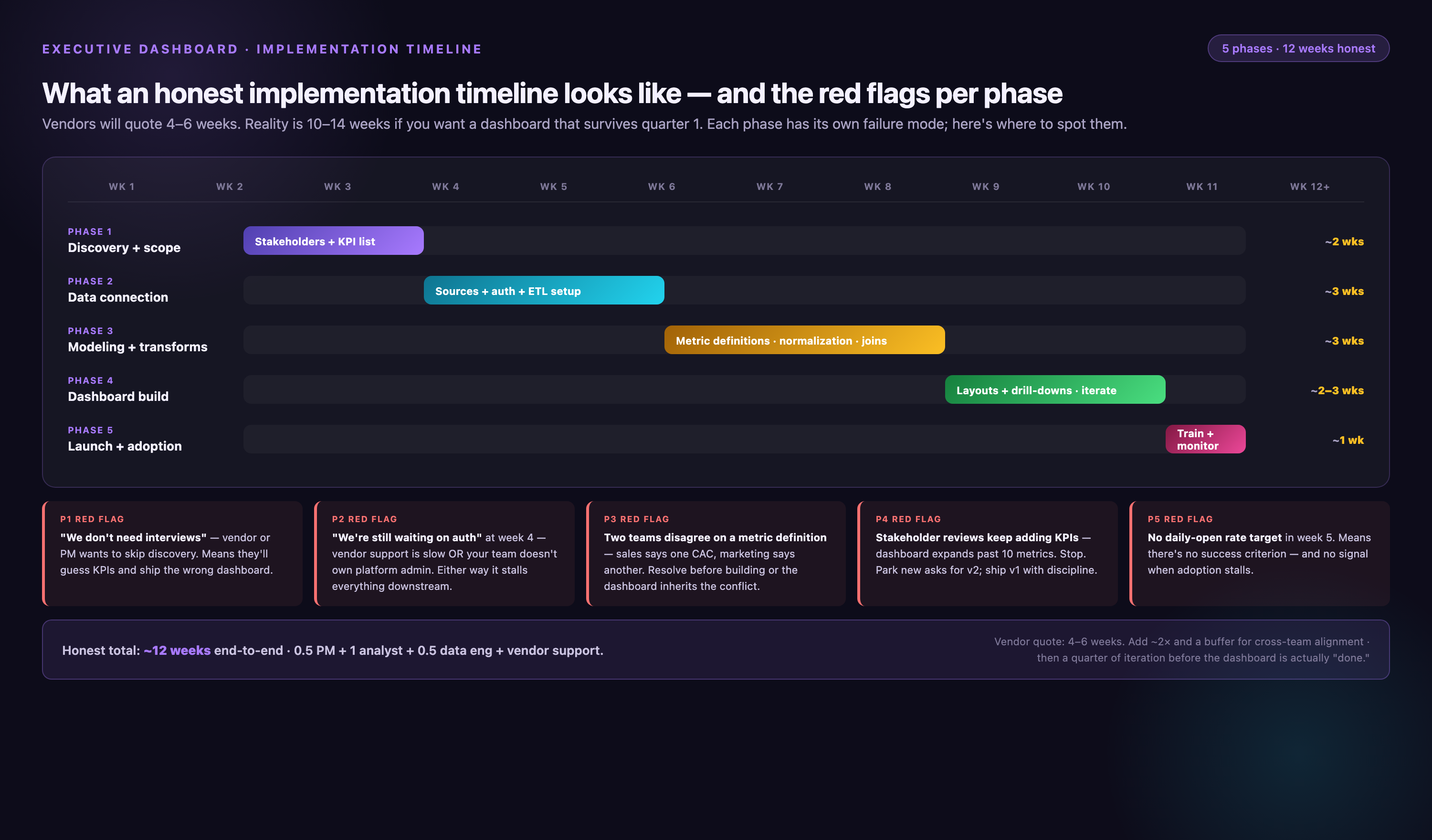
| Phase | Duration | Key Activities | Red Flags That Extend Timeline |
|---|---|---|---|
| 1. Data Audit & KPI Definition | 2-4 weeks | • Inventory all data sources • Document current metric definitions • Identify discrepancies (e.g., "revenue" calculated differently by finance vs. sales) • Prioritize 5-8 executive KPIs • Map data lineage (source → transformation → dashboard) |
• No documented metric definitions • Executives disagree on KPI priorities • Legacy systems require manual exports • Historical data quality issues (missing months, duplicate records) |
| 2. Integration Setup & Testing | 4-8 weeks | • Connect data sources via APIs or database links • Build ETL pipelines (extract, transform, load) • Test data accuracy (compare dashboard values to source system reports) • Set up data refresh schedules • Implement error alerting |
• APIs lack required metrics (need custom fields) • Rate limits require throttling logic • Data transformations more complex than expected (multi-currency, timezone conversions) • IT security review delays API access |
| 3. Dashboard Design & Stakeholder Review | 2-3 weeks | • Build initial dashboard mockups • Conduct executive feedback sessions • Iterate on layout and chart types • Add drill-down views for operational detail • Test mobile rendering • Create documentation and user guides |
• Executives request last-minute KPI changes • Dashboard too complex (cognitive overload) • Chart types unclear or misleading • Branding/color scheme debates • Accessibility requirements (screen readers, colorblind-safe palettes) |
| 4. Training & Adoption (ongoing) | Ongoing | • Conduct executive onboarding sessions • Assign dashboard owner for maintenance • Embed dashboards in existing workflows (QBRs, board meetings) • Monitor usage analytics (who's logging in, which charts viewed) • Quarterly KPI review and dashboard updates |
• Executives prefer email reports over live dashboards • No dedicated dashboard owner • Dashboard not integrated into meeting agendas • Usage drops after first month (shelfware) |
Timeline accelerators: (1) existing data warehouse eliminates integration phase bottlenecks; (2) off-the-shelf dashboard templates reduce design iteration; (3) pilot with 1-2 executives before company-wide rollout validates approach quickly.
Timeline decelerators: (1) compliance reviews add 2-4 weeks for security audits. These include HIPAA and SOC 2 requirements. (2) Custom connector development is needed when data sources lack APIs. (3) Stakeholder disagreement on metrics causes delays. Pause dashboard work and resolve definitions first.
Conclusion
Selecting the right executive dashboard software requires balancing immediate reporting needs against long-term total cost of ownership. Implementation timelines vary significantly—from rapid two-week deployments for straightforward cloud setups to multi-month enterprise initiatives involving custom data pipelines and attribution modeling. Marketing analysts must account for hidden costs beyond licensing: data engineering resources, professional services, team training, ongoing connector maintenance, and inevitable dashboard refinements. What appears as an attractive per-user monthly fee often multiplies three to five times when factoring these operational expenses across a three-year horizon.
As 2026 approaches, successful KPI tracking depends less on tool selection and more on organizational readiness. Teams should audit existing data infrastructure, clarify governance requirements for regulated environments, and establish clear success metrics before deployment begins. The most powerful dashboard becomes a liability without proper change management and user adoption strategies. Companies that invest upfront in understanding their technical debt and stakeholder requirements will extract genuine business value—transforming manual reporting burdens into actionable intelligence that drives marketing strategy and accountability.
When NOT to Use Executive Dashboard Software
Most executive dashboard content assumes you need software. This section addresses five scenarios where dashboard platforms over-engineer simpler needs.
Scenario 1: Early-Stage Startups (<10 Employees)
• Why skip dashboards: Founders and early employees have direct access to all systems (Stripe for revenue, Google Analytics for traffic, Salesforce for pipeline). Dashboard overhead (integration setup, maintenance, training) exceeds value when any team member can log into source systems in 30 seconds.
• Alternative: Build a weekly Google Sheets template combining manual exports. Assign one person (often a BizOps or Marketing Ops hire) to update it every Monday. Revisit dashboard software at 25-50 employees when data access becomes a bottleneck.
Scenario 2: Single Data Source with Native Dashboards
If 90%+ of your executive metrics live in one platform, that platform's built-in reporting often suffices. Examples include Salesforce for sales-led B2B companies or Shopify for single-channel e-commerce brands. Salesforce dashboards cover most executive KPI needs. HubSpot reporting covers most executive KPI needs. Shopify analytics cover most executive KPI needs. Third-party tools are often unnecessary. Why skip dashboards:
Alternative: Invest in training executives to use native dashboards. Schedule quarterly "dashboard design" sessions with platform specialists to customize layouts for executive consumption. Save BI budget for when you add 3+ disparate data sources.
Scenario 3: Ad-Hoc Analysis Needs Exceed Monitoring Needs
• Why skip dashboards: If executives primarily ask "why" questions ("Why did CAC spike last quarter?") rather than "what" questions ("What is our current CAC?"), they need analytical tools (SQL editors, Jupyter notebooks) not monitoring dashboards. Static KPI displays frustrate executives who want to test hypotheses.
• Alternative: Hire a senior analyst or fractional analytics consultant to run executive reporting cycles. Deliver narrative reports (Google Docs, PowerPoint) with custom analysis for each business question, supported by data tables and charts. Reserve dashboard tools for operational teams monitoring daily metrics.
Scenario 4: No Data Governance Foundation
• Why skip dashboards: Building dashboards before defining metrics creates "two versions of truth." Marketing calculates CAC one way, finance another; dashboards display conflicting numbers; executives lose trust in data. Dashboards amplify metric inconsistency rather than resolving it.
• Alternative: Pause dashboard projects. Conduct a metric definition workshop with cross-functional stakeholders (CFO, CMO, CRO, VP Ops). Document definitions in a shared wiki (Notion, Confluence). Implement those definitions in SQL views or dbt models. Only then build dashboards querying governed metrics.
Scenario 5: Executives Prefer Narrative Reports
• Why skip dashboards: Some C-suite leaders prefer reading prose explanations over interpreting charts. Cultural fit matters—dashboards fail in organizations where executives value context and storytelling over self-service data access. Forcing dashboard adoption in narrative-driven cultures wastes implementation effort.
• Alternative: Formalize a "business review" cadence where analysts prepare written reports with embedded charts, delivered via email or Slack. Use tools like Jupyter notebooks or Observable for reproducible analysis, exporting to PDF or Google Docs for distribution. Reserve interactive dashboards for middle management and analysts.
Special Requirements: Multi-Tenant, Embedded, Offline, and Regulated Industry Dashboards
Standard executive dashboard deployments assume single-tenant (one company), online-only, and minimal compliance requirements. These edge cases require specialized tooling or configuration:
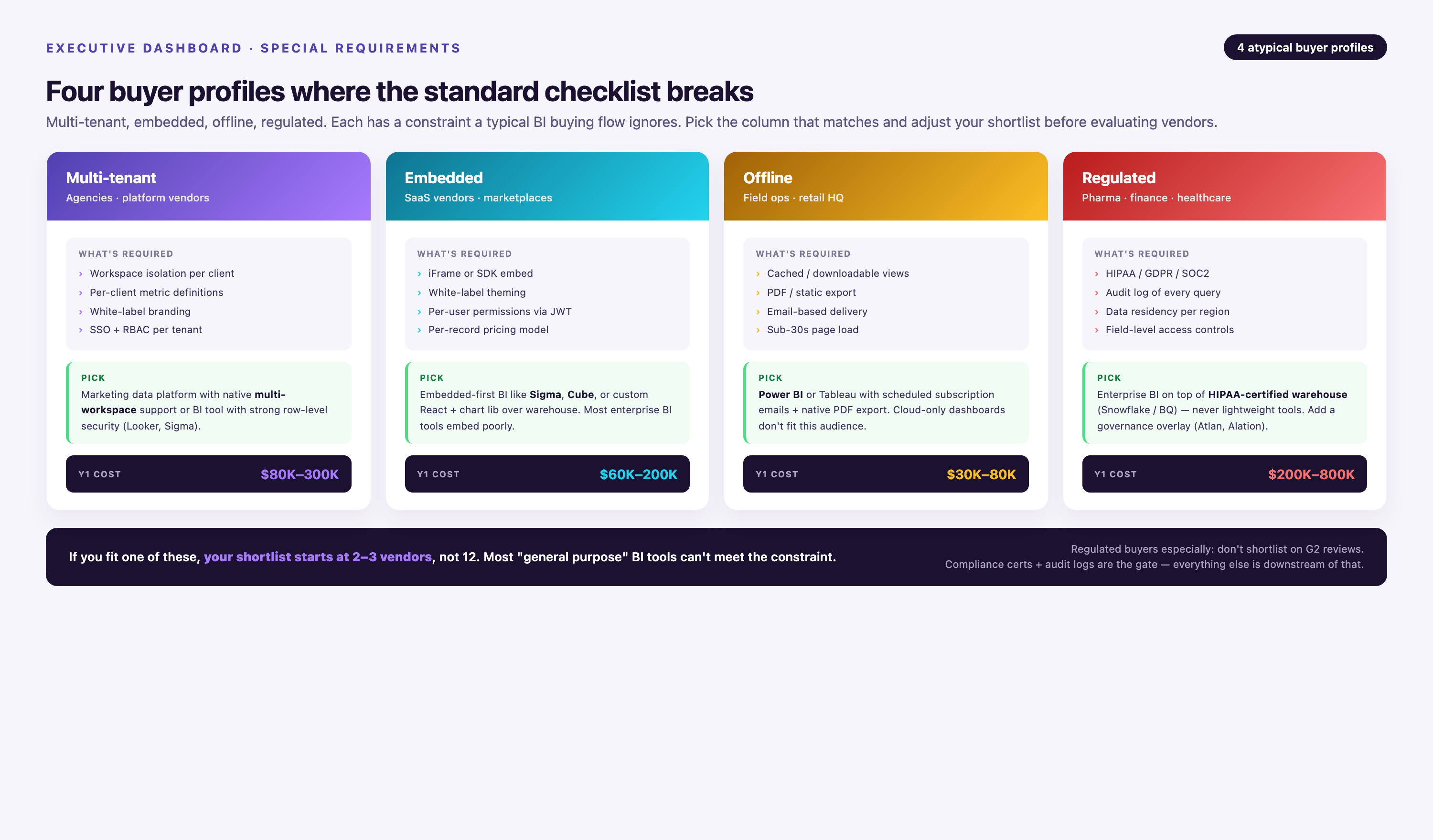
Multi-Tenant Dashboards for Agencies and MSPs
Agencies managing 20+ client accounts need per-client data isolation, white-label branding, and usage-based billing. Omni Analytics and Power BI Embedded support row-level security and tenant-specific schemas; FineBI offers multi-tenant cloud deployments. Avoid Tableau unless purchasing dedicated Embedded Analytics licenses (expensive at scale).
Configuration checklist: (1) database-level tenant isolation using separate schemas per client, (2) parameterized dashboards passing client_id at login, (3) white-label UI removing vendor logos, (4) usage tracking for client billing.
White-Label/Embedded Dashboards for Product Teams
SaaS products embedding analytics for end customers (e.g., marketing platform showing campaign performance to clients) require iframe-embeddable dashboards, SSO integration, and API-driven provisioning. Omni Analytics purpose-built for this; Power BI Embedded workable with engineering effort; Tableau and FineBI require premium tiers. Improvado not designed for customer-facing analytics.
Technical requirements: (1) embed via iframe with CORS headers. (2) SSO via SAML or OAuth. (3) API to programmatically create dashboards per customer. (4) usage metering for pricing tiers.
Offline Dashboard Access for Field Executives
Executives traveling internationally or operating in low-connectivity environments need cached dashboards viewable without internet. FineBI and Power BI offer mobile apps with offline snapshot mode; Tableau supports packaged workbooks; Omni Analytics and Improvado require constant connectivity.
Implementation: (1) enable mobile app offline caching in admin settings, (2) schedule nightly dashboard snapshots, (3) set cache expiration to 7 days to prevent stale data, (4) test airplane mode behavior before executive travel.
Regulated Industry Requirements (HIPAA, SOC 2, GDPR)
Healthcare, finance, and EU-operating companies face compliance mandates. Verify vendors meet: certification. Improvado, Tableau, Power BI, and Omni Analytics are all certified. FineBI varies by deployment. is required. Improvado, Azure-hosted Power BI, and AWS-hosted Tableau support this. Verify requirements in contract. is needed. EU data center hosting is available. Power BI, Tableau, and FineBI on-premise all support this. (1) SOC 2 Type II (2) HIPAA Business Associate Agreement (3) GDPR data residency
Compliance checklist: (1) request SOC 2 report from vendor, (2) negotiate BAA if handling PHI, (3) verify data residency in sales contract, (4) implement audit logging. Track who accessed what data when. (5) establish data retention policies. Delete customer data within 30 days of offboarding.
Conclusion: Choosing the Right Executive Dashboard Software for Your Team in 2026
Executive dashboard software selection begins with diagnostic questions—not vendor comparisons. Before evaluating tools, determine: (1) Do you have more than three data sources? (2) Do more than five executives need access? (3) Are dashboards viewed weekly or more? (4) Is there an existing data governance foundation? Answering "no" to any of these suggests simpler alternatives (spreadsheets, native platform dashboards, narrative reports) over BI software.
For marketing analysts and CMOs consolidating 10+ advertising and CRM platforms, eliminates integration complexity. This complexity often sinks executive dashboard projects. Its 1,000+ pre-built connectors deliver governed metrics. The Marketing Cloud Data Model does this without six months of data engineering.
Pair Improvado's data aggregation with for board-ready visualizations. Use for Microsoft ecosystem integration. Choose for self-service exploration. Deploy these on top of your existing data warehouse.
Organizations prioritizing metric consistency across departments should lead with semantic layer tools (, ) to prevent "two versions of truth." Finance and operations teams benefit most from 's Excel interoperability. These teams operate in Microsoft-heavy environments. They also benefit from Azure integration. Mid-market companies in regulated industries have specific needs. They require on-premise deployment. 's flexible hosting model fits these requirements. Omni Analytics Looker Power BI FineBI
Implementation timelines stretch from two weeks (simple Power BI deployment connecting to Dynamics and SharePoint) to four months (enterprise Tableau + Snowflake + dbt stack with custom attribution modeling). Budget not just licensing costs but hidden TCO: data engineering hours, implementation services, training, connector maintenance, and dashboard redesigns. A $50/user/month tool often costs 4-5× that figure over three years when factoring these expenses.
Watch for five failure modes post-launch:
(1) Metric vanity theater displays unactionable KPIs on dashboards.
(2) Stale data results from broken integrations without alerting.
(3) No dashboard ownership leads to abandonment.
(4) Wrong granularity fails to serve executive audiences.
(5) Mobile-unusable designs cause screenshot workarounds.
Assign a dashboard owner. Implement data freshness monitoring. Conduct quarterly KPI reviews. Test mobile rendering before executive rollout.
The best executive dashboard software in 2026 depends on organizational context. Key factors include data maturity, technical resources, compliance requirements, and executive consumption preferences. Feature counts matter less than these contextual factors.
Start with the diagnostic flowchart in this guide. Score your data complexity next. Map your executive scenarios to the solution matrix. Calculate realistic TCO for your organization. Pilot with 1-2 executives before company-wide deployment.
This sequenced approach prevents lengthy evaluation cycles. It avoids the 6-12 month reviews that waste budget. Over-engineered or under-delivering tools become less likely.