Table Widget
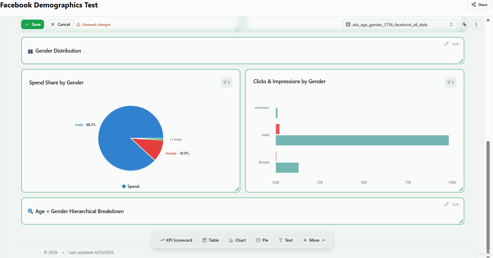
The Table widget displays multi-column data in a structured grid — combining dimensions (row groupings) and metrics (numeric columns) from your connected data source. The use cases below show common ways to configure it.
Build your table
1. Add a Table widget to your dashboard
Display detailed data in a structured grid with dimensions and metrics as columns.
- Open your dashboard in edit mode.
- Click Select a default data table in the header and choose your data source (e.g. cross_channel_automated_recipe).
- Click + Table in the bottom toolbar. The widget appears on the canvas and the Properties Panel opens automatically.
- In the Data section, click a metric (e.g. Clicks, Impressions) and a dimension (e.g. Advertiser Name) to populate the table.
- Close the Properties Panel to see the finished widget.
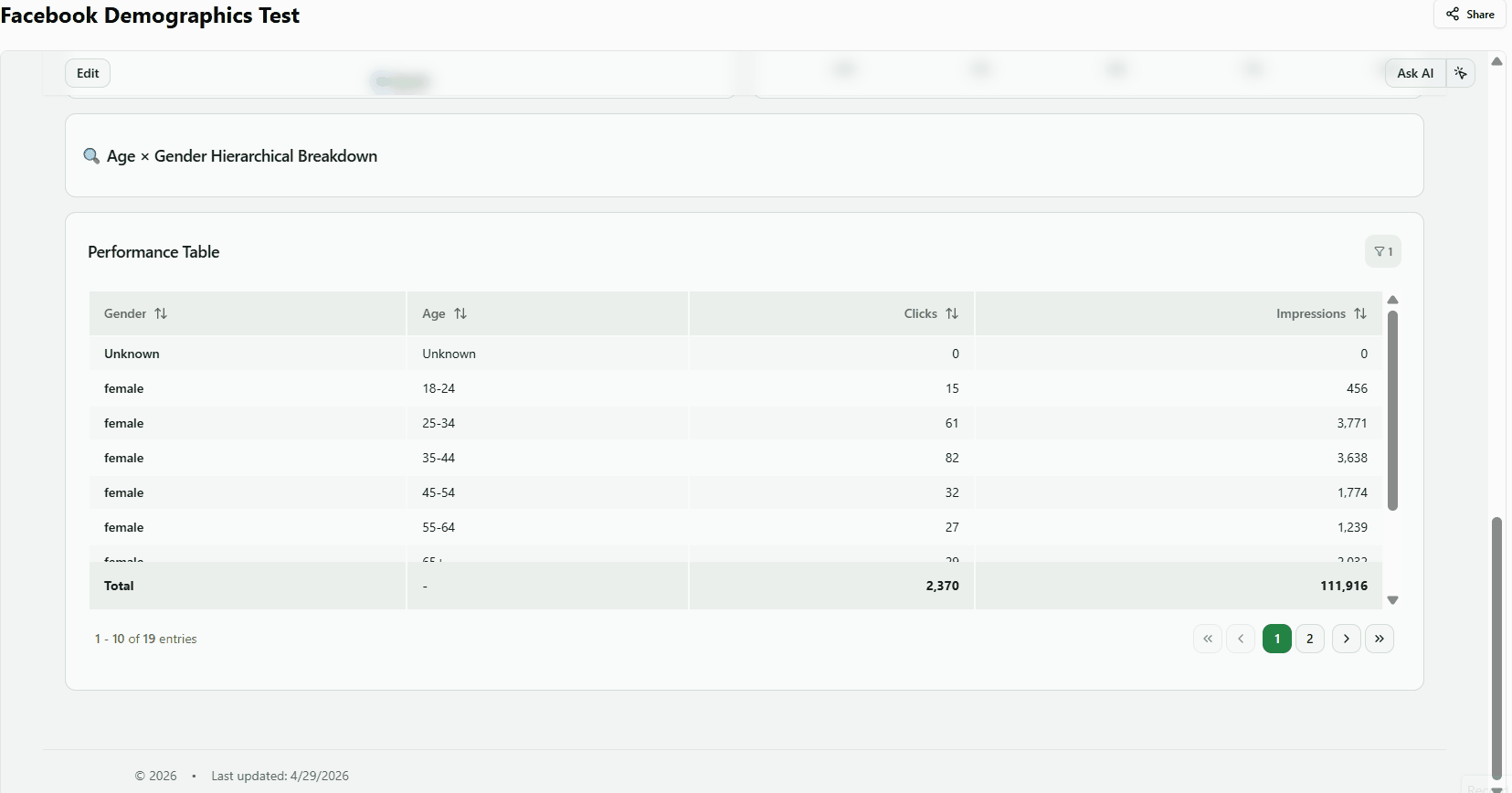
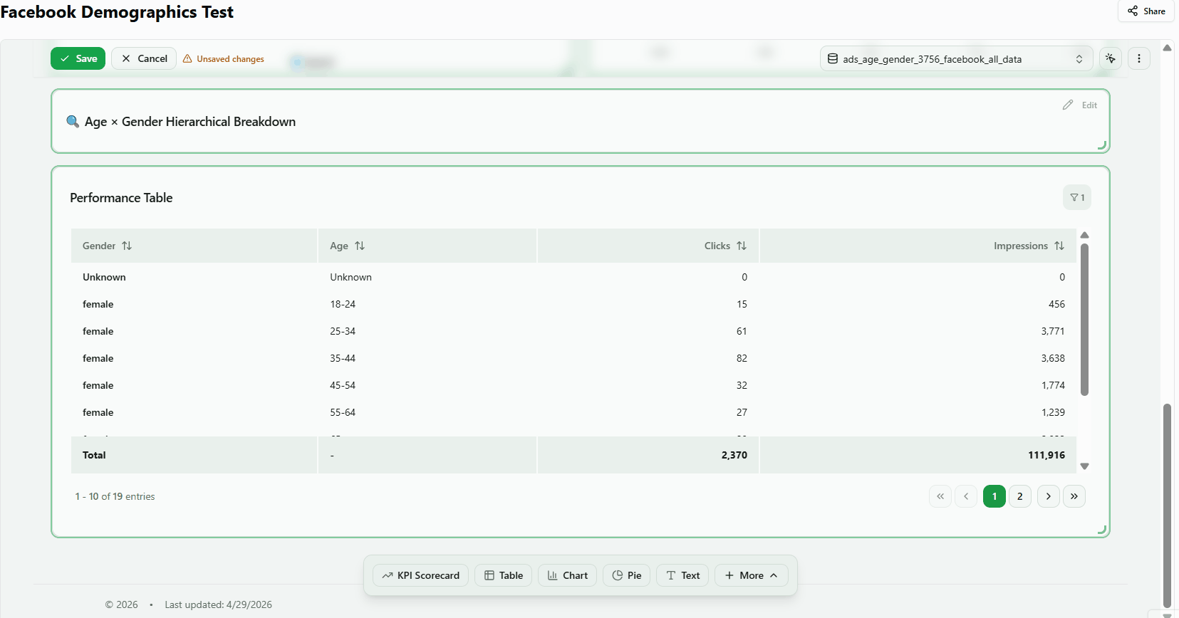
Result: The table renders with a row per dimension value and a column per selected metric. The default title is Performance Table.
2. Choose which metrics appear as columns
Add or remove numeric columns — spend, clicks, impressions, ROAS, and more — to show exactly the data your audience needs.
- Open the Properties Panel and click the Data section.
- In the metrics picker, click any metric to add it as a column (e.g. Spend, Clicks).
- Click a selected metric again to remove it.
- The table refreshes immediately as you make changes.
Column Features:
- Drag-to-Resize — Grab column borders to adjust width
- Column Reordering — Drag headers to rearrange
- Sorting — Click any column header
- Auto-detected Types — Numeric columns get totals; ID-like columns are treated as dimensions
Tip: Add a dimension first — without a dimension, numeric columns aggregate into a single summary row.
3. Group rows by a dimension
Break the table into one row per unique dimension value — by campaign, channel, advertiser, or any categorical field in your data source.
- Open the Data section in the Properties Panel.
- Find the Dimensions picker and click a field (e.g. Campaign Name, Data Source Type).
- The table reloads showing one row per unique value of that dimension.
Result: Each row represents a unique dimension value (e.g. one row per campaign), with metric totals aggregated for that group. The Configure Dimensions prompt disappears once a dimension is selected.
Work with results
4. Sort the table by any column
Click any column header to rank rows by that metric or dimension — useful for quickly identifying top or bottom performers.
- Ensure the table has at least one dimension and one metric loaded.
- Click a column header (e.g. Spend) in the rendered table.
- An arrow indicator appears showing the sort direction (ascending or descending).
- Click the same header again to reverse the sort order.
Result: Rows reorder immediately. Click a different header to sort by a different column.
5. Navigate large datasets with pagination
Page through results when the table contains more rows than the visible page size.
- Add a dimension with many unique values (e.g. Campaign Name) and a metric.
- Pagination controls appear at the bottom of the widget when data exceeds the page size.
- Click Next or a page number to navigate to the next set of rows.
Note: If no pagination controls appear, all rows fit on a single page. Increase the Rows Limit in the Filters section (see Control row count and grouping limits below) to load more data and trigger pagination.
6. Show a totals summary row
Display a bold Total row at the bottom of the table that sums all metric columns across all visible rows.
- Add a dimension and at least one metric to the table.
- Close the Properties Panel to view the rendered table.
- A Total row appears at the bottom, showing the sum of each metric column.
Result: The total row aggregates all data rows. For example, if individual campaign spend values are $5,000, $8,000, and $12,000, the Total row shows $25,000. The sum is mathematically exact across all loaded rows.
Per-metric aggregation methods:
- Sum
- Average/Weighted Average
- Min/Max
- Count
- % of Total (Each cell value displayed as percentage of the column total. Total row shows 100%. Useful for proportional distribution analysis.)
- Formula
- None
Format the display
7. Choose a visual style and enable sticky headers
Switch between table layouts to match your dashboard design, and pin the header row so column names stay visible when scrolling.
- Open the Properties Panel and go to the Layout section.
- Select a Table Style:
- Default — standard rows with no extra styling
- Striped — alternating row background colors for easier scanning
- Bordered — visible borders around every cell
- Compact — reduced row padding for higher data density
- To keep column headers visible while scrolling, enable the Sticky Header toggle.
Note: Sticky header is most useful when the table has many rows and the widget spans a large portion of the canvas.
8. Change how dates are displayed
Format the date column to match your regional preference or reporting convention.
- Open the Properties Panel and find the Date Format selector (in the Basics or Appearance section).
- Choose from the available formats:
- Oct 15, 2025 — abbreviated month name
- October 15, 2025 — full month name
- 10/15/2025 — numeric US format
- 2025-10-15 — ISO 8601 format
- The date column updates immediately.
Note: The date format selector applies to all date-type columns in the table. If the table has no date column, this setting has no visible effect.
Control your data
9. Row count, series limit, and Others grouping
Limit how many rows the table fetches and how many dimension values are shown — useful for keeping large datasets manageable.
- Open the Filters section in the Properties Panel (not the Data section).
- Set Rows Limit to control the total number of data rows fetched (e.g. 100, 500, 1000, 5000).
- Set Series Limit to show only the top N dimension values (e.g. top 5 campaigns by spend).
- Enable Show Others to add an Others row that aggregates all dimension values beyond the series limit.
Result: With Series Limit set to 5 and Show Others enabled, the table shows the top 5 rows plus one Others row summarising the rest. This keeps the table focused without hiding the aggregate impact of lower-ranked items.
10. Use a different data source for a single widget
Override the dashboard-level data table for one widget so it pulls from a different source than the rest of the dashboard.
- Add any widget and open the Data section in the Properties Panel.
- Look for a Data Source or Use Custom Table selector within the widget properties.
- Select a different table from the dropdown. The available metrics update to match the new table's columns.
Result: This widget uses its own data source independently of the dashboard default. Other widgets on the same dashboard are unaffected.
Data Export:
- CSV Download — Export table data as CSV file
- Copy to Clipboard — Copy for pasting into spreadsheets
Note: If no per-widget table selector is visible, the widget inherits the dashboard default table automatically.
Was this article helpful?
Thanks for the feedback!