Chart Widget
The Chart widget visualizes metrics over time as bars, lines, or area series — combining dimensions, calculated metrics, and optional custom SQL queries. The use cases below show common ways to build and configure it.
Build your chart
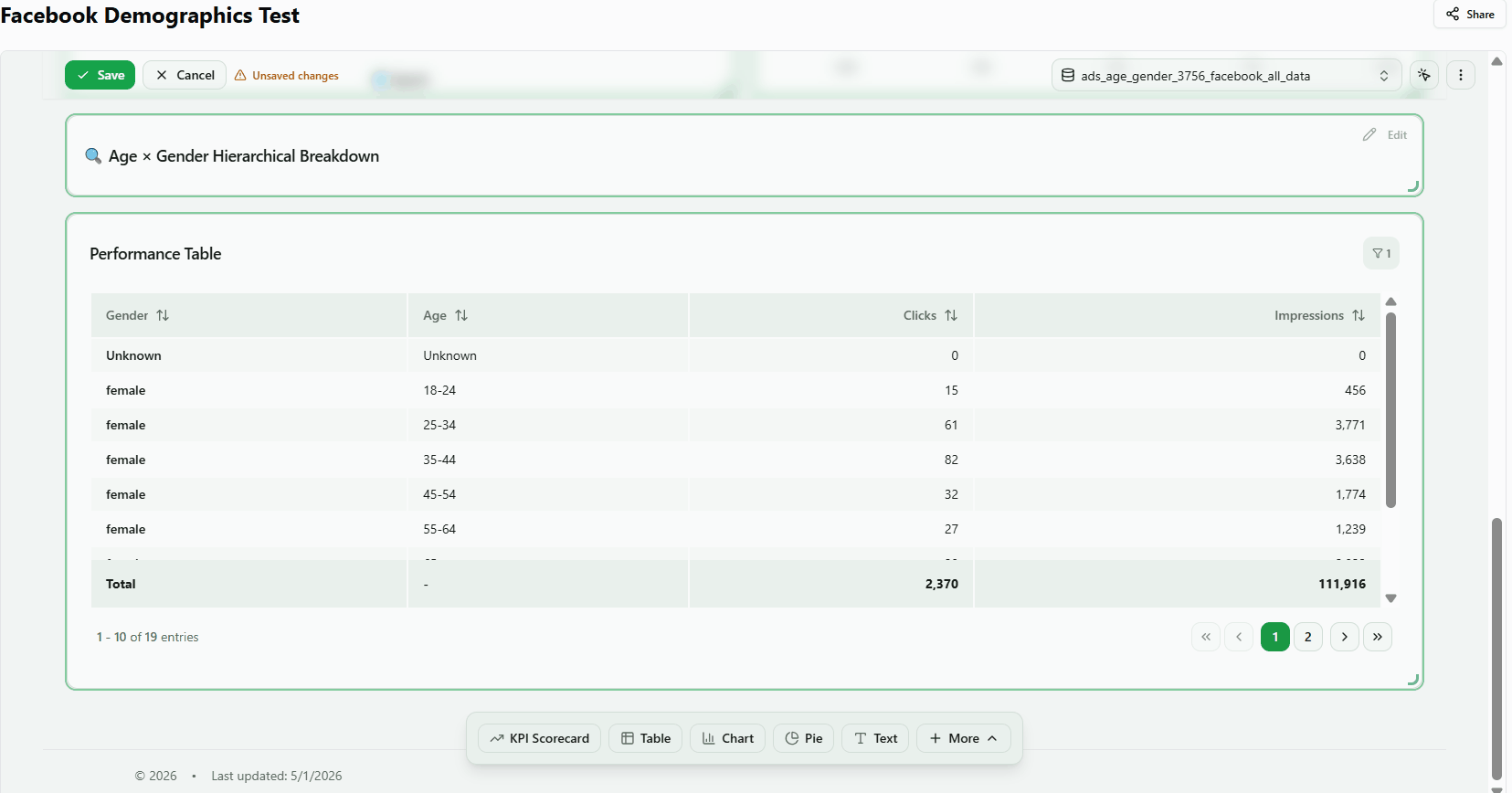
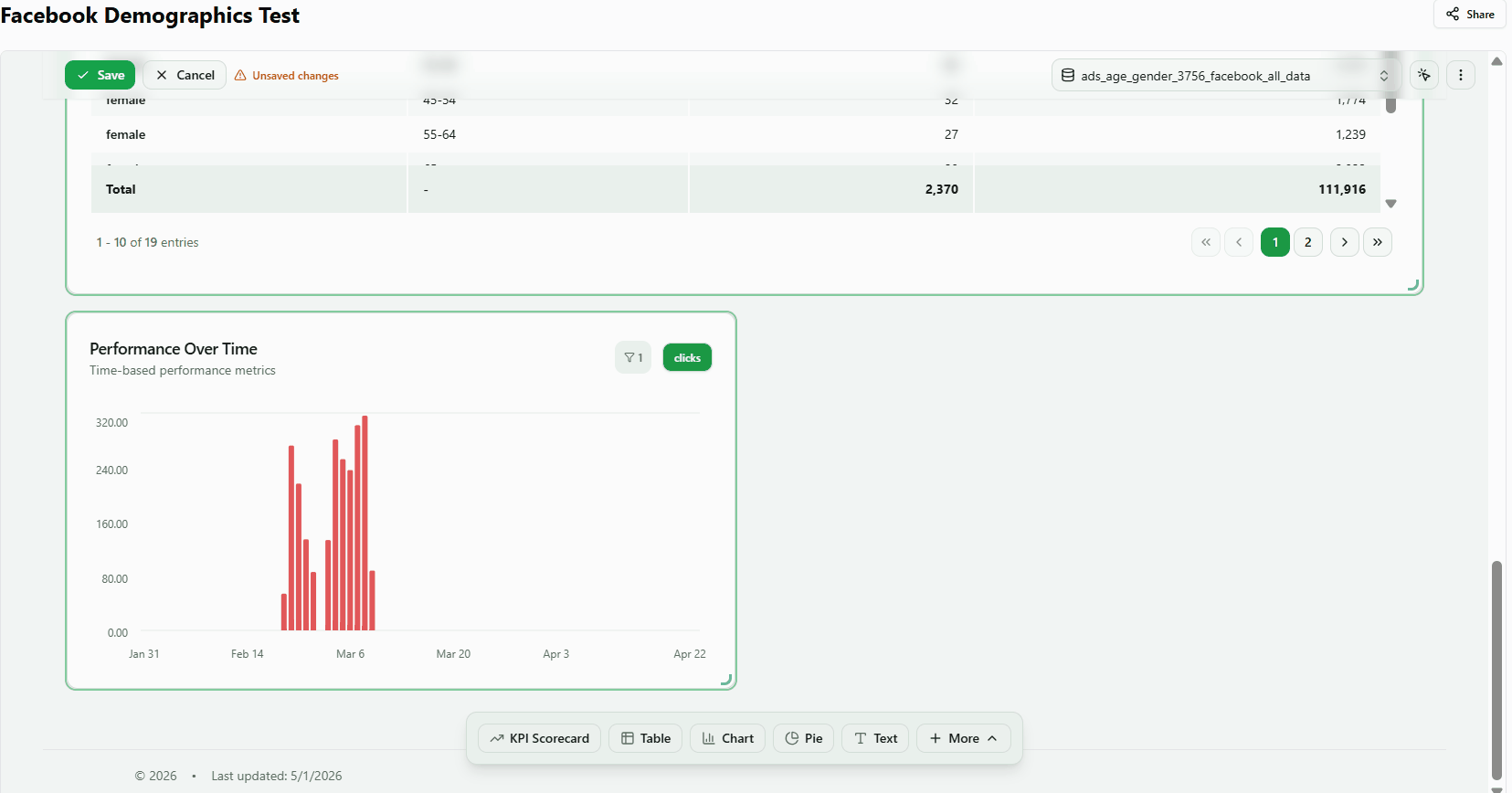
1. Add a Chart widget to your dashboard
Display time-series data for one or more metrics from your connected data source.
- Open your dashboard in edit mode.
- Click Select a default data table in the header and choose your data source (e.g. cross_channel_automated_recipe).
- Click + Chart in the bottom toolbar. The widget appears on the canvas and the Properties Panel opens automatically.
- In the Data section, click one or more metrics (e.g. Spend, Revenue) to populate the chart.
- Close the Properties Panel to see the finished widget.
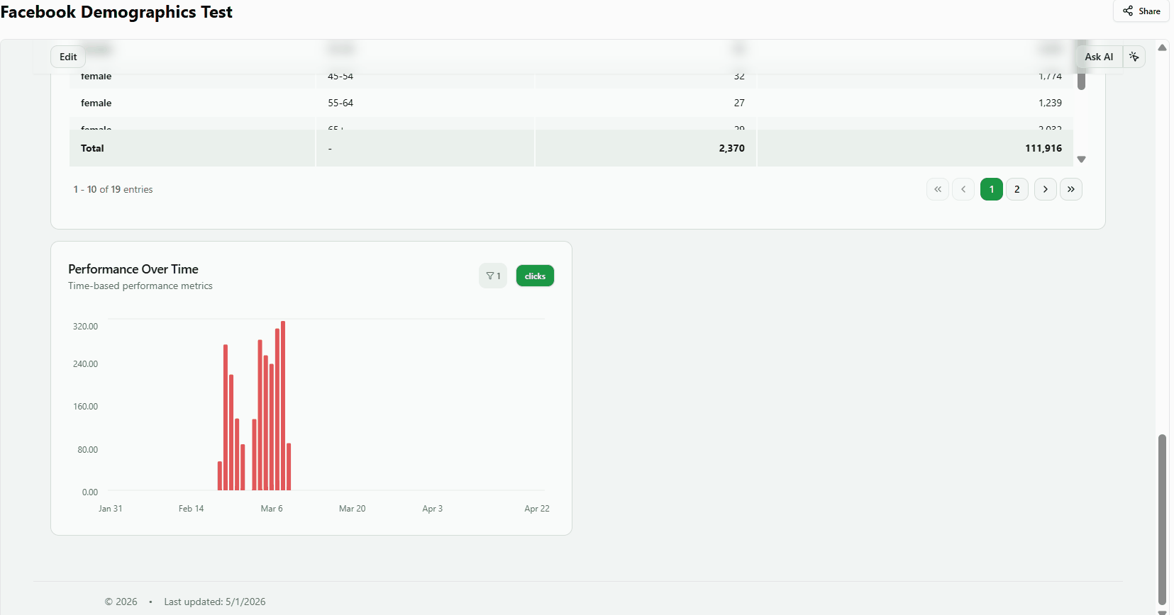
Result: The chart renders with a time-series bar or line for each selected metric. The default title is Performance Over Time.
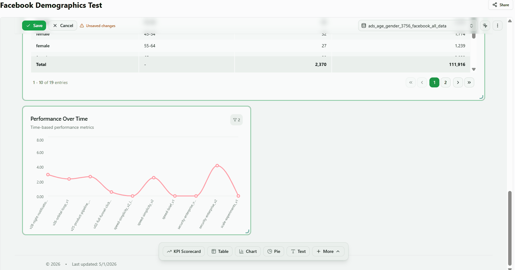
2. Select metrics
Add or remove the numeric series displayed on the chart.
- Open the Properties Panel and click the Data section.
- Use the search input to find a metric by name (e.g. Spend, Clicks).
- Click a metric to add it as a series on the chart.
- Click a selected metric again to remove it.
Result: The chart updates immediately. A badge next to the Data section label shows the current count (e.g. 2 metrics). The legend updates to reflect active series.
In composed mode, each metric can have its own visualization type — set one metric as bars, another as a line overlay.
Example: Show spend as bars with a ROAS line overlay.
3. Add a calculated metric
Plot ratio-based metrics such as ROAS or CTR alongside raw spend or impression data.
- Open the Data section.
- Select a base metric (e.g. Spend).
- Search for and select a calculated metric (e.g. ROAS, CTR, CPC).
Result: The chart displays two series. Because calculated metrics use a different scale than raw metrics, the chart may assign a secondary Y-axis automatically.
4. Add multiple calculated metrics
Compare several performance ratios on the same chart.
- Open the Data section.
- Search for and select two or more calculated metrics (e.g. ROAS and CTR).
Result: Each calculated metric renders as a separate series with ratio values, not raw sums.
Tip: If one series appears as a flat line near zero, both metrics share a Y-axis with very different scales. Switch to Tabbed view mode to inspect each series independently.
5. Break down by dimension
Split a single metric into one series per dimension value — useful for comparing performance across channels, campaigns, or advertisers.
- Open the Data section in the Properties Panel.
- Select a metric (e.g. Spend).
- In the Dimensions picker, click a categorical field (e.g. Data Source Type, Campaign Name).
Result: The chart reloads showing one colored series per unique dimension value. The legend lists each value by name.
Choose visualization type
6. Switch a metric between bar and line
Control how each metric is rendered — as vertical bars or as a continuous line.
- Open the Data section.
- Find the metric in the Selected Metrics list.
- Click Bar or Line next to the metric name to change the chart type for that series.
Result: Bar mode renders columns per time period. Line mode draws a continuous curve connecting data points. Both types can coexist on the same chart — for example, Spend as bars and ROAS as a line on a secondary axis.
7. Flip bar orientation
Switch between vertical columns and horizontal bars — useful when dimension labels are long.
- Open the Layout Panel and ensure the chart includes at least one Bar metric.
- Find the Bar Orientation selector in the Basics or Data section.
- Select Vertical for upward-growing bars, or Horizontal for left-to-right bars.
Result: Horizontal orientation moves category labels to the Y-axis, making long dimension names easier to read.
8. Stack or group bars
Layer bars on top of each other to show totals, or place them side by side to compare individual values. Per-metric stacking configuration with global defaults. Dimension breakdowns create separate series per dimension value.
- Open the Data section with at least two metrics selected.
- Click the expand arrow on a metric row to open its options.
- Under Bar Mode, click Stacked to layer bars, or Grouped to place them side by side.
Result: Stacked mode shows total contribution across metrics. Grouped mode makes individual values easier to compare directly.
Note: Bar Mode only appears when the metric visualization type is set to Bar.
9. Switch to combined or tabbed view
Display all metrics overlaid on a single chart area, or give each metric its own tab.
- Open the Properties Panel and go to the Basics section.
- Find the View Mode selector.
- Select Combined to overlay all metrics on one chart.
- Select Tabbed to show one metric at a time — tab buttons appear above the chart for switching between series.
Result: Combined mode is best for comparing trends side by side. Tabbed mode is helpful when metrics have very different scales that are difficult to visualize together.
Format the display
10. Show value labels on bars
Display exact numeric values directly on each bar so viewers can read data without hovering.
- Open the Data section and click the expand arrow next to a metric to open its options.
- Check Show value labels to enable per-bar numeric labels.
- Set the Visibility dropdown to All to show a label on every bar. The default (Auto) hides labels automatically when the chart is too dense to display them all.
- Uncheck Show value labels to remove the labels.
Control visibility options: Auto, All, Hover, Ends, Min/Max, Every 2nd/3rd/5th, Sparse.
Background styles: none, halo, pill. Sizes: small, medium, large.
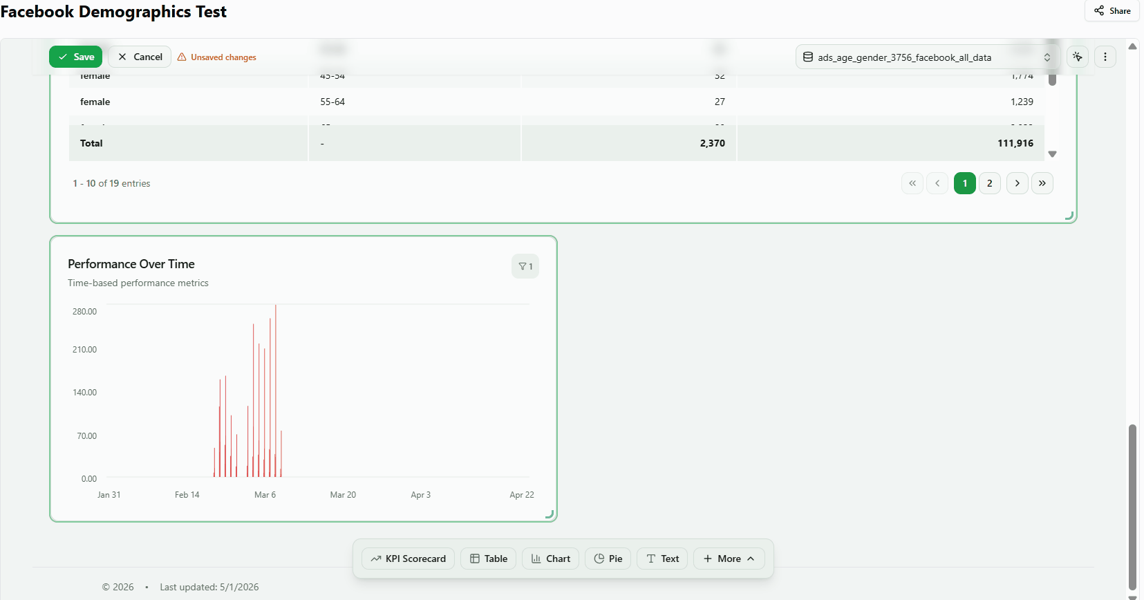
11. Format X-axis dates
Choose how date labels are displayed along the bottom axis of a time-series chart.
- Open the Axes Panel and find the X-Axis or Appearance section.
- Change the Date Format dropdown to one of the available options:
- Oct 15 — abbreviated month name
- October 15, 2025 — full month name
- 10/15/2025 — numeric US format
- 2025-10-15 — ISO 8601 format
Result: X-axis labels update immediately.
Note: Longer formats may cause labels to overlap on narrow charts or short date ranges.
12. Configure the Y-axis
Add a descriptive label to the Y-axis and control how tick values are formatted.
- Open the Y-Axis (or Axes) section in the Properties Panel.
- Type a label in the axis title input (e.g. Total Spend ($)).
- Change the Format setting to match your data: Currency, Percentage, Number, or Custom.
Result: The Y-axis title appears alongside the axis. Tick values update to the chosen format (e.g. $1,000 for currency). The axis renders 5–12 tick labels depending on the data range and widget height.
13. Inspect values with the hover tooltip
Move the cursor over any data point to see a tooltip showing the date and metric value for that period.
- Close the Properties Panel so the chart is fully visible.
- Move the cursor over the chart area (not the axis labels).
- Hover over a bar or line data point.
Result: A tooltip appears showing the date and metric value for that period (e.g. $2,084.47). Move the cursor across the chart to inspect different data points.
14. Toggle and position the legend
Show or hide the series legend, and choose where it appears relative to the chart area.
- Open the Properties Panel and go to the Layout section.
- Use the Show Legend toggle to show or hide the legend.
- When the legend is visible, open the Legend Position dropdown and select Top, Bottom, Left, or Right.
Result: The legend moves to the selected position. Bottom is the default. Top placement is useful when the chart has limited vertical space.
Filter and limit data
15. Change period grouping
Aggregate time-series data by day, week, month, quarter, or year to control chart granularity.
- Open the Filters section in the Properties Panel.
- Find the Period Comparison dropdown (default: Daily).
- Select a grouping: Daily, Weekly, Monthly, Quarterly, or Yearly.
Result: The chart re-fetches data and displays fewer, aggregated data points as the grouping gets coarser — for example, ~30 points for Daily vs ~4–5 for Weekly over a 30-day range.
Tip: Enable Show period toggle on chart (also in the Filters section) to let viewers switch the grouping directly on the published chart.
16. Set rows and series limits
Control how much data the chart fetches and how many dimension series are displayed at once.
- Open the Filters section in the Properties Panel.
- Set Rows Limit to control the total number of data rows fetched (e.g. 100, 365, 1000, 5000).
- Set Series Limit to show only the top N dimension values (e.g. top 5 campaigns by spend).
- Enable Show Others to add an Others series that aggregates all values beyond the series limit.
Result: With Series Limit set to 5 and Show Others enabled, the chart shows the top 5 series plus one Others series. This keeps the chart readable without hiding the aggregate impact of lower-ranked items.
Note: Series Limit and Show Others are only relevant when a dimension breakdown is active.
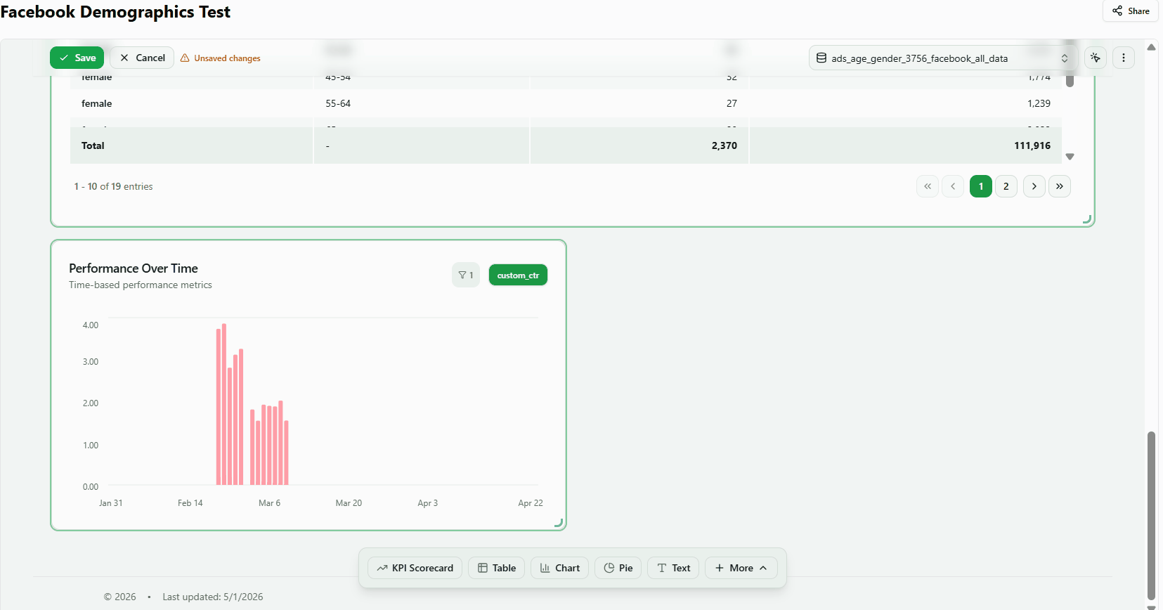
Custom SQL
17. Write and execute custom SQL
Replace the auto-generated query with your own SQL to calculate or filter data exactly as needed.
- Open the Properties Panel and scroll to the Query section (the last accordion in the panel).
- Click Write Custom SQL (or Customize Query if a query already exists).
- Clear the editor and type your SQL. Use {schema}.{table} as the table reference and {where_date} for the date filter placeholder.
- Wait a few seconds for the query to execute. The editor shows the number of rows returned.
Result: The widget displays data from your custom query. A Custom SQL indicator confirms that auto mode is off.
Note: The SQL editor has a 1-second debounce — the query runs shortly after you stop typing.
18. Custom SQL with dimension breakdown
Write SQL that returns a date column and a categorical dimension to create a multi-series chart colored by dimension value.
- Open the Query section and click Write Custom SQL.
- Write a query that returns a date, a dimension, and a metric. For example: SELECT toDate(date) as date, channel, SUM(spend) as spend FROM {table} WHERE 1=1{where_filters} GROUP BY date, channel ORDER BY date LIMIT 500
- Wait for the query to execute and confirm the row count is greater than zero.
- Open the Data section — the dimension column (e.g. channel) should appear automatically in the Dimensions area.
Result: The chart renders one colored series per unique dimension value, detected automatically from the SQL result columns.
19. Edit custom SQL and revert to auto
Modify an existing custom query, then discard the changes and return the widget to its auto-generated query.
- Open the Query section and click Customize Query to see the current auto-generated SQL.
- Edit the SQL (e.g. add LIMIT 1 at the end) and verify the widget updates.
- Click Revert to Auto to discard the custom SQL and restore auto-generated mode.
Result: The SQL editor closes and the widget returns to its original auto-generated query and data.
20. Reset custom SQL to snapshot
Restore the SQL to the version captured when you first entered custom mode, without fully reverting to auto mode.
- Open the Query section and click Customize Query. The auto-generated SQL is saved as a snapshot.
- Modify the SQL (e.g. replace SUM(spend) with COUNT(*)) and verify the widget reflects the change.
- Click Reset in the SQL editor to restore the snapshot.
Result: The SQL reverts to the snapshot version and the widget displays the original data again. Unlike Revert to Auto, Reset keeps the widget in custom SQL mode — it only undoes your edits.
21. Handle an invalid SQL query
The widget shows a clear error state when a query fails, without crashing the dashboard or other widgets.
- Open the Query section and click Write Custom SQL.
- Type invalid SQL (e.g. SELEKT * FORM nonexistent_table) and wait for the query to execute.
- Observe the error state in the widget and Query section.
- Replace the invalid SQL with a valid query and wait for it to execute.
Result: The widget shows an error indicator without crashing the dashboard. Replacing the SQL with a valid query clears the error and restores the widget data.
Was this article helpful?
Thanks for the feedback!