The Billing Dashboard offers an in-depth analysis of your data usage, providing crucial segmented insights into extracted rows over your usage period. It also includes interactive features, enhancing your ability to examine and understand the data in a more dynamic and effective manner.
Billing Dashboard vs Usage Dashboard
Improved Visualization: Clearer and more interactive graphs to track data usage over time.
Enhanced Data Breakdown: More detailed comparisons of data usage across different periods and categories.
User Experience: A more intuitive layout that simplifies navigation and makes it easier to find the most important information at a glance.
Filtering Functionality: Refined filtering options to better exclude irrelevant data and focus on what matters.
How to explore Billing Dashboard
To begin utilizing this feature select the Billing Dashboard item in the menu on the left side of the screen.
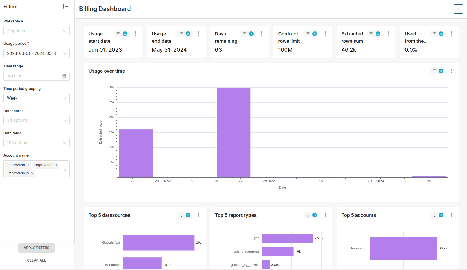
Once the Billing Dashboard page has loaded, you will see charts showing your usage and filters to configure them.
Let's look at each of them in more detail.
Interactive Features
Global, use the 'Settings' (three horizontal dots in the top right corner) to:
Refresh the entire dashboard
Download the data in formats like CSV, Excel, or as an image for further use.
Set auto-refresh interval (every 1, 6, 12, or 24 hours)
Individual charts, utilize the 'Settings' (three vertical dots) with the following features:
Force Refresh for up-to-date information.
Enter Fullscreen for an expanded view.
View as Table for a detailed tabular analysis.
Download the data in formats like CSV, Excel, or as an image for further use.
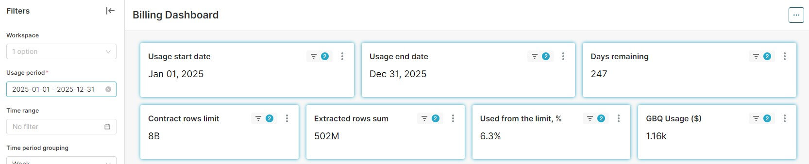
Charts overview
Scorecards:
Usage start date/end date: the start and end date of the usage period.
~Usage Period - tracks data flow from a defined start to end date, allowing for historical analysis. The total duration of the contract is divided by 1 year (e.g. 2.5 years will be represented as three separate usage periods 1 year/1 year/half a year), if the contract <= 1 year it will be a single, complete period.
Days remaining: Displays the countdown of days until the end of the current usage period.
Contracted rows limit: Displays the exact number of rows that can be extracted under your current contract terms.
Extracted rows sum: Indicates the total number of data rows that have been extracted to Improvado’s storage.
Used from the limit: Provides a quick view of how much of your usage cap has been consumed, in percentage (%).
GBQ Usage: Shows cumulated GBQ usage for the current usage period, in dollars ($).
Usage over time:
Tracks data insertion over time, highlighting activity peaks and troughs.
Detailed Breakdowns:
Offers granular views like 'Top 5 data sources', 'Top 5 report types', and 'Top 5 accounts', enabling pinpoint analysis of data interactions.
Represents each data table's activity, showcasing the volume of data engaged within each source for direct period-to-period comparison that can be specified using the time range filter.
Visualizes how and what the top 10 datasets have been accessed and used over a selected timeframe, highlighting key trends and patterns in data interaction.
Summary:
Presents a detailed breakdown of data extraction across different workspaces and their data tables.
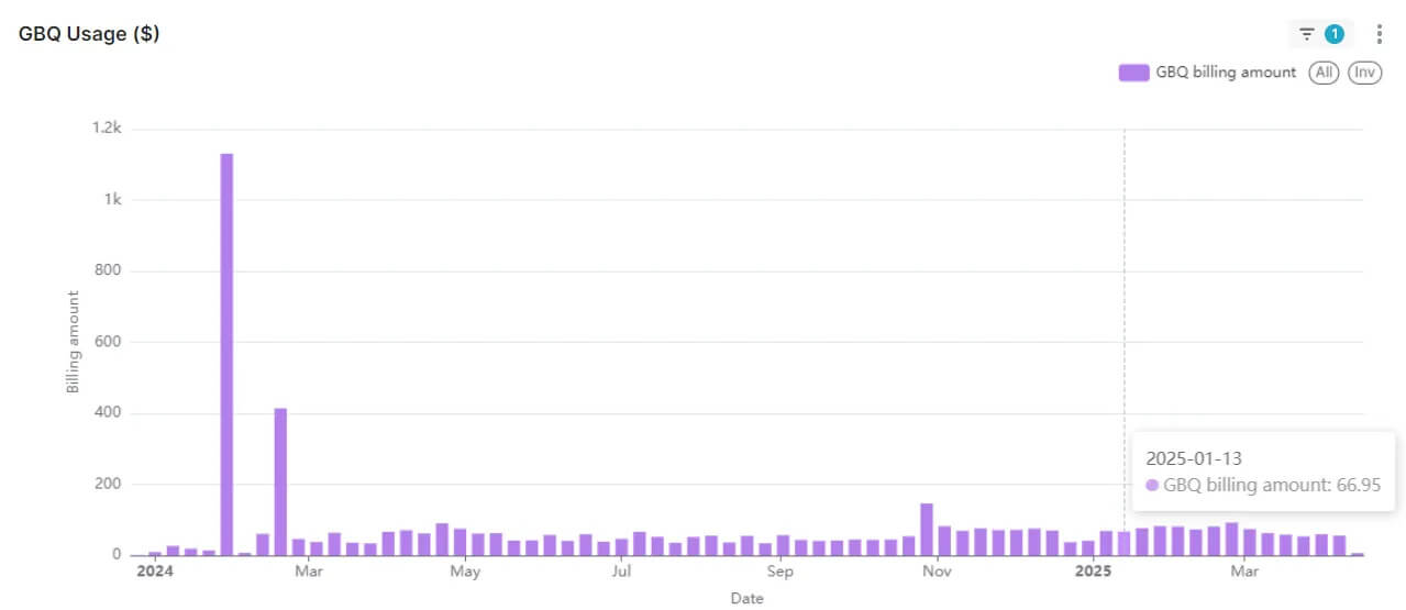
GBQ Usage:
Presents a daily breakdown of data usage for your Improvado‑managed Google BigQuery account.
{% docs-informer info %}
1. Usage data can lag by 3–7 days due to BigQuery processing.
2. To determine the total cost for GBQ usage during the current period, please refer to the corresponding scorecard above.
{% docs-informer-end %}
These features come together to not only streamline your workflow but also to empower strategic decision-making by giving you a macro and micro view of your data landscape. They're designed to be intuitive, ensuring you can leverage these insights immediately and effectively.
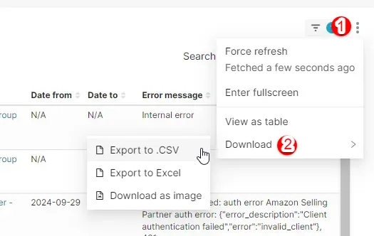
How to export dashboard charts
You can export any chart in Billing Dashboard as .CSV, Excel, or download it as image.
To export a chart - click on the icon with three dots (1) -> click Download (2) -> select a file format for your export:
Filters
To refine the data presented in the Billing Dashboard, the platform offers a variety of filters that allow you to tailor the information to your specific needs.
You can filter your data by:
Workspace (Select a specific workspace to view its data usage.)
Usage period (Specify the usage period to view its data usage.)
Time range (Choose a pre-set or custom date range to focus your data usage analysis, note that the smallest intervals, like a minute to an hour, are not supported.)
Time period grouping (Group your data by selected time intervals, note that the smallest intervals, like a minute to an hour, are not supported.)
Data Source (Filter the data by specific sources to see usage from particular platforms.)
Data Table (Narrow down the view to specific data tables for targeted analysis.)
Account name (Focus on data usage related to a particular account within your workspace.)
After choosing the necessary parameters in filters you can apply them by clicking on the “Apply filters” button, it will automatically refresh your overview page. If you want to undo all the applied filters, click on the “Clear all” button.
Note: Chart and table elements are interactive, you can click on them to filter certain data.
{%docs-informer info%}
If you have any issues, please contact your CSM.
{%docs-informer-end%}
.png)
.png)
.png)
.png)
.png)


.png)