%20(1).png)
.png)
.png)
KPI Dashboards: What They Are and How to Build One
Creating key performance indicators (KPIs) is one thing. Understanding how to read those KPIs and effectively track progress toward their completion is another.
Displaying all KPIs on a single dashboard helps you create a coherent data story to help teams reach and exceed their goals. Without the dashboard, it’s often hard to see the forest for the trees and confidently navigate through all objectives.
Ready to learn more about KPI dashboards and explore how to build one for yourself? Then, let’s dive in.
Key Takeaways
- KPI dashboards combine data from various sources and display key insights using visual elements such as charts and graphs.
- Effective KPI dashboards are focused and goal-centric, including only the data end-users need to answer KPI-specific business queries.
- Some key benefits of KPI dashboards include facilitating executive decision-making, identifying opportunities and underperformance, increasing team collaboration and transparency, and facilitating real-time data analysis at scale.
- To create a KPI dashboard, first choose the KPIs and metrics to track. Then select the relevant data sources. Once you’ve identified these, visualize the data using relevant charts and graphs. Lastly, share the dashboard.
- Follow best practices to build KPI dashboards that everyone trusts. Include only data relevant to the goals, use text and interactive elements effectively, be visually consistent, keep it simple, and use good-quality data.
- Analytics tools like Improvado can automatically sync all your data from different sources, ensure all your data has satisfactory quality, and provide you with a KPI dashboard that will serve as a single source of truth for your teams.
What Are KPI Dashboards?

KPIs or key performance indicators are measurements that track how well a company, department, team, or person is progressing toward a goal. In other words, they are success metrics calculated based on data from different sources.
KPI dashboards show progress on KPIs in a visual, easily digestible format to help inform business decisions. Real-time dashboards automate any manual data wrangling processes, allowing teams to focus on uncovering insights into their goal progress.
KPI dashboards are a necessary foundation for teams and companies that want to join the data-driven side. However, ensuring you use good-quality data to avoid false insights is vital.
What Do KPI Dashboards Include?
A KPI dashboard includes all the relevant data end users need to make data-driven decisions for ultimate goal achievement and to adjust their strategy on the go.
The included metrics depend on the dashboard’s audience. What’s their goal? What question do they want to have answered? Which KPIs are important for the audience to gauge performance? What data can best help them get actionable business insights?
Once you’ve determined these variables, choose all the relevant data you need to include in the dashboard. Use various visualization techniques, such as trend analysis over time and comparatives and benchmarks, to provide more context.
Also, add annotations to the visuals to help describe the data to the end user.
Key Business Benefits of KPI Dashboards
Data is only useful when you can make sense of it. However, making sense of it gets increasingly complicated with the growing amount of data you collect. That’s what KPI dashboards help you with. Let’s review how exactly this is achieved.
Facilitates effective executive decision-making
With a KPI dashboard, executives don’t have to wait for different departments to report on their activities and performance. All of this information is stored in a single source of truth for the company’s KPIs.
Executives have a real-time view of each team’s performance and contribution to the organization’s bottom line. This means they can see which units and processes to focus on to achieve business goals faster.
Improves operational efficiency and effectiveness
KPI dashboards streamline organizational workflow, making it easy for employees to work efficiently.
Let’s say the marketing team needs data on the lead-to-customer conversion rate from the sales team or the customer satisfaction index score from the customer support team. In these cases, they can get this info from the KPI dashboard without waiting for someone to hand them the data, stopping the time-consuming back and forth between different parties.
Increases collaboration and transparency between teams
With a shared KPI dashboard of real-time data, teams can easily make decisions without waiting for another person’s input.
This democratizes data, fostering collaboration and accelerating communication, ultimately leading to better team alignment and happier employees.
Facilitates real-time data analysis at scale
The real-time delivery of KPI dashboards gives executives insights into business operations as they happen.
Using a dashboard's interactive elements, they can drill down into each specific KPI without going through many spreadsheets or wading through different programs.
Provides valuable data for predicting business growth
KPIs tell you how you're progressing toward a goal. With a KPI dashboard, you have a tool that helps you assess the direction your business is heading.
You can better see patterns and forecast business growth—and with that, decide the next steps that will allow you to reach your business objectives efficiently, especially for small businesses looking to scale quickly.
Provides insights on what to prioritize
Data overwhelm is a huge problem for many decision-makers. Having dashboards on relevant KPIs—fueled by good-quality data— means you can better analyze business operations without being overwhelmed.
Since dashboards properly organize and visualize critical information, you can quickly identify what to focus on and prioritize.
Steps for Creating KPI Dashboards
Developing a KPI dashboard is an intricate and time-consuming activity. But, not for those who know the right steps and use the right tools to visualize KPIs.
Choose the KPIs and metrics to track
What questions do end-users want to have answered and what information do they need? Consider this when creating a KPI dashboard, so you don't end up featuring vanity metrics.
Focus only on the most crucial metrics for the monitored activity. For example, if you’re building a sales pipeline dashboard, you definitely don’t need to include CLTV or CPA, because salespeople have almost nothing to do with these metrics.
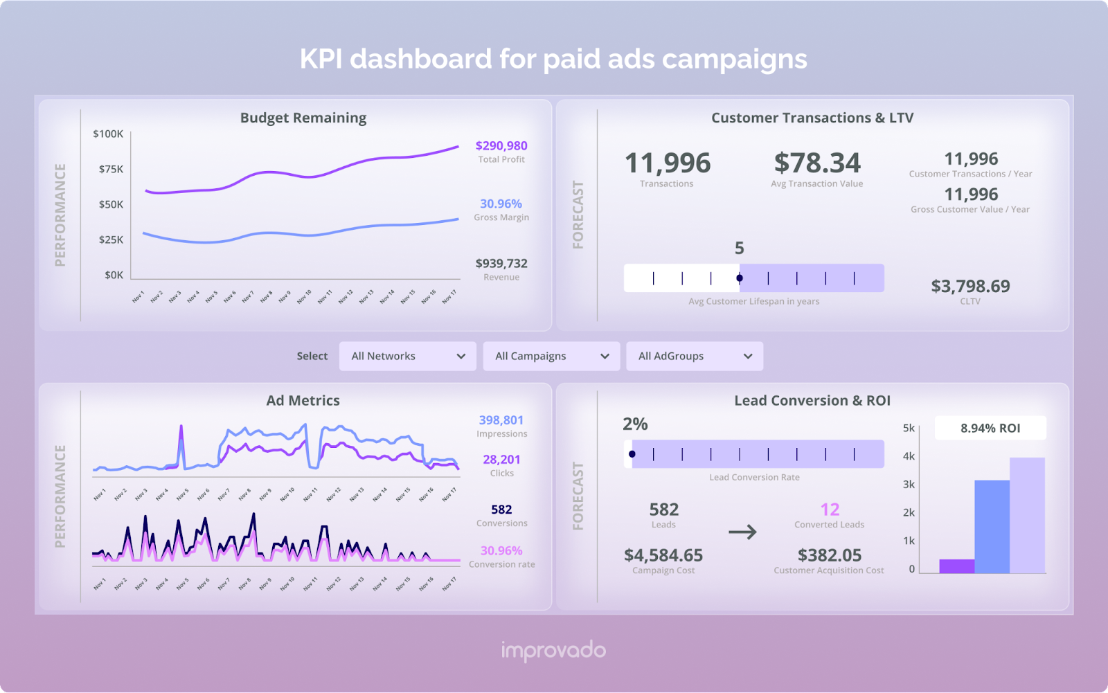
Most KPI dashboards use the MAD framework—a three-level approach to creating dashboards. It includes the monitor level for high-level KPIs like annual recurring revenue or relative market share, the analysis level for analyzing KPIs across various departments, and the drill level for detailed KPIs for deep-dive analysis.
Select relevant data sources
Evaluate all your available data sources and decide which ones are relevant. This isn't always straightforward, especially with the many tools businesses use nowadays.
Choose data sources wisely because each new one comes with engineering and maintenance hassles. You’ll have to connect each source to your dashboarding tool, fetch the right data, transform it into a digestible form, and come up with new charts to visualize it. Not to mention that data sources come with unique APIs which require frequent updates on the back-end.
A better option is to connect all required data sources with an automated analytics platform. For example, Improvado integrates with 500+ different marketing and sales data sources to quickly extract data and streamline it to a dashboard tailored to the user’s objectives. With Improvado’s plug-and-play approach, you can jumpstart your analytics and scale it as you go by adding data sources from the library.

Create suitable charts and graphs
Data visualization is no less important a task than data collection. Your main challenge is to come up with the right way to narrate your story with charts and graphs.
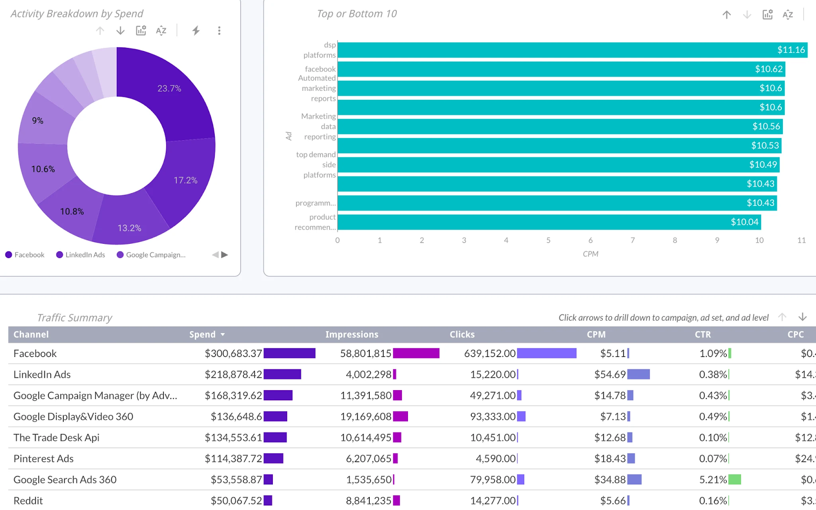
For example, if you want to compare values, use bar charts and scatter plot charts. For analyzing trends, line and column charts are ideal. You can use charts like Mekko/Marimekko to understand data distribution.
Yet again, building your visualization from scratch requires analytical know-how and experience with business intelligence tools.
But you can take the easy path. Improvado offers a variety of dashboard templates for your marketing and sales data. You don’t have to create any charts. Just connect the data sources, choose a template, and modify the charts however you want. That’s how you save time on dashboard development while having the same flexibility provided by business intelligence tools.
Share the dashboard
Give access—with the appropriate permissions—to everyone who needs to see the KPI dashboard. You can also export it into a PDF document for sharing through emails, meetings, or presentations.
Best Practices to Build a KPI Dashboard
Creating effective KPI dashboards becomes easier when you follow some best practices.
Include only KPIs relevant to the goals
Always be aware of the audience and why they need a KPI dashboard.
What do they want to know? What KPIs do they need to compare and contrast? Building the dashboard with your audience in mind will reveal what information should be included.
Use text effectively
Your data is telling a story. As much as the charts and graphs illustrate that, so does the language you use for labeling and descriptions.
Get clear on the insights you want to get across using well-thought-out annotation principles.
Clearly label interactive elements and make it obvious that they are clickable or drillable.
Aim for visual consistency
Having a nice-looking KPI dashboard is a key element of effective dashboards. Your ultimate goal is to display data that key people in the organization can quickly get insights into.
One way to do this is by sticking to consistent colors and styles and applying visual design principles.
Keep it simple
It's easy to get excited about the various charts and graphs you can make out of all your data, but clutter ruins KPI dashboards.
Make them as simple as possible. Overcrowding with irrelevant data—no matter how interesting—will only distract from the narrative you're trying to convey.
Ensure you’re using clean data
KPI dashboards make data easy to understand. But it's of no use if this data is from poor-quality sources. Before creating a dashboard, ensure that the integrity and accuracy of your data are sound.
How to Create a KPI Dashboard with Improvado
Creating a KPI dashboard is a time suck, although an extremely valuable time suck. If you do everything right, from data collection to styling your charts, you get a single source of truth for any of your business activities.
Marketing analytics platforms make the process 10X easier. You just plug in the required data sources, choose the metrics you want to track, then choose a dashboard template that suits you.
The main difference between using Improvado and building a dashboard yourself is that we’ve got everything done for you. You only have to choose what you want to see on the dashboard and how you would like to see it.

500+ data sources under one roof to drive business growth. 👇


%20(1).png)
.png)


