%20(1).png)
.png)
.png)
Beyond Numbers: How Data Visualization Empowers Decision-Making
Data visualization transforms complex data sets into clear, understandable visuals, aiding in better decision-making. This article discovers the essence of data visualization and showcases examples that exemplify its effectiveness in conveying information.
What Is Data Visualization?
Core Components of Data Visualization
Visual Elements
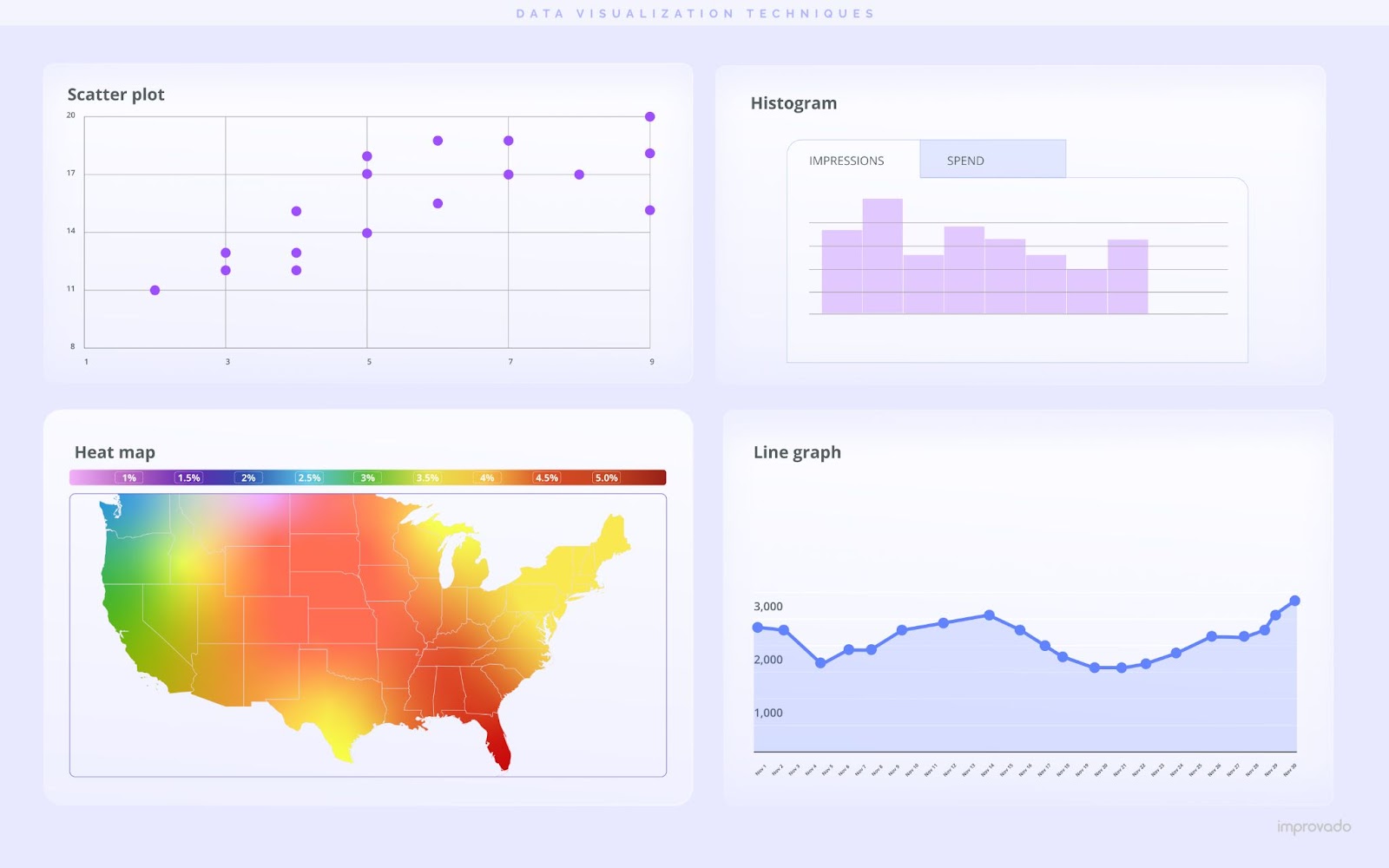
The core components of data visualization revolve around visual elements such as charts, graphs, and maps. These elements are crucial for translating complex data into a format that's easily understandable.
Understanding and selecting the right visual elements based on the data and the message intended to convey is key to effective data visualization.
- Bar Charts: Best for comparing quantities across different categories. Use them to highlight differences or similarities among discrete data points.
- Line Charts: Ideal for showing trends over time. They help in tracking changes across different intervals, making it easier to identify patterns or growth trends.
- Pie Charts: Effective for illustrating parts of a whole. They're most impactful when you want to show percentage or proportional data, with a clear visual indication of each category's contribution to the total.
- Scatter Plots: Utilized to observe relationships between variables. These plots can reveal correlations, trends, and outliers within datasets, making them essential for data analysis involving two or more variables.
- Maps: Provide geographical data visualization. They are crucial for displaying data that has a spatial element, offering insights into trends, distributions, or patterns across different regions.
Data Integrity
Data integrity in data visualization refers to the accuracy and consistency of data throughout its lifecycle. It is critical for ensuring that visualizations reliably represent the underlying information, free from corruption or unauthorized alteration. Maintaining data integrity involves rigorous validation, cleansing, and safeguarding practices to prevent errors and biases that could mislead decision-making.
The automates data aggregation from over 500 marketing and sales sources and seamlessly integrates with any enterprise business intelligence and data visualization solution.
With pre-built data models and dashboards tailored for specific marketing scenarios, such as analyzing ad spend or attributing sales revenue, Improvado minimizes manual effort and reduces the risk of errors or misleading visualizations.
Book a demo call to learn more about Improvado and how it can simplify business intelligence at an enterprise level.
User Interaction

User experience in data visualization is fundamental to ensuring the effectiveness and accessibility of the visual representation of data. It focuses on designing visualizations that are intuitive, engaging, and informative for the user.
To enhance the user experience in data visualization, focus on designing intuitive interfaces that cater to the user's needs and preferences. This includes employing clear and concise visual design principles that aid in the comprehension of complex data. Effective data visualization should offer interactive elements, such as hover details, clickable legends, and filters, allowing users to delve deeper into the data as needed. These interactive features enable a more engaging and personalized exploration of data, which is critical for making informed decisions.
This involves also selecting the appropriate type of visualization for the data, using colors and layouts that enhance understanding, and providing interactive elements that allow users to explore data in more depth.
Here are some of the basic rules. Following them, you will significantly enhance user experience:
- Make visualizations adaptable to different screen sizes for wider accessibility.
- Use clear and intuitive labeling to improve comprehension.
- Implement a logical structure and flow that guides the viewer's understanding.
- Select color schemes that enhance readability and convey information effectively. For instance, avoid red-green combinations to accommodate colorblind users.
- Employ interactive elements judiciously to encourage deeper exploration without overwhelming.
- Prioritize simplicity over complexity to ensure key insights stand out.
- Use annotations and tooltips to provide context and explain data points.
- Integrate filters and search functions to allow users to customize views based on their interests.
Narratives and Context

Narrative and context are pivotal in data visualization, turning raw data into a story that resonates. They frame the data, providing background and setting the stage for the visualization, ensuring that the intended message is clear and impactful.
A well-crafted narrative guides viewers through the visualization, highlighting key points and findings. Contextual elements, such as historical data comparisons or industry benchmarks, add depth, enhancing the viewer's understanding and engagement.
To tell a compelling story with your data, follow these rules:
- Start with a clear title that encapsulates the story you're telling with your data.
- Use annotations to highlight key points and explain anomalies within the visualization.
- Incorporate comparative elements, like benchmarks or historical data, to provide scale and relevance.
- Implement a logical sequence in the presentation of data to guide the viewer through the narrative.
- Employ storytelling techniques, such as setting a problem and presenting data as the solution, to engage the audience.
- Include a summary or conclusion that reinforces the main message or insight from the data.
- Make sure all sources of data are clearly cited to enhance credibility and allow for further exploration.
Design Consistency
Design consistency in data visualization ensures a cohesive and professional appearance, enhancing readability and comprehension. This involves aligning elements like color schemes, typography, and layout styles across all visuals. This uniformity ensures that data is presented in an orderly manner, reducing cognitive load and enhancing the audience's ability to quickly understand and analyze the information.
Benefits of Data Visualization
Data visualization plays a crucial role in transforming complex data into actionable insights. This process streamlines the decision-making process for marketing professionals, enhances the overall comprehension and communication of data. But let’s look at each of these points in detail.
Improved Decision-Making
Traditional data analysis, often mired in spreadsheets and lengthy reports, can obscure vital information and delay strategic actions. Conversely, data visualization cuts through the complexity, presenting trends, outliers, and patterns in an immediately graspable format. This clarity is indispensable for swift, informed decisions—critical in a landscape where timing can differentiate between market leadership and obsolescence.

A study by Bain & Company underscores the tangible benefits of advanced analytics capabilities of which data visualization is a key component. According to their findings, companies at the forefront of analytics leverage data in decision-making processes twice as frequently as their counterparts and make decisions much faster.
Enhanced Data Interaction
Interactive data visualization tools represent a leap forward in how data is analyzed and understood. Unlike static charts or graphs, these tools allow users to dive deeper into the data, offering a hands-on experience where they can adjust parameters, explore different scenarios, and immediately see the outcomes of their inquiries. This dynamic form of analysis not enhances user engagement and promotes a more nuanced understanding of the data.
Furthermore, interactive visualization tools support a more inclusive data analysis process. They democratize data access, empowering a broader range of stakeholders to engage with and derive value from information. This inclusivity broadens the scope of insight generation, leading to more robust and well-rounded business strategies.
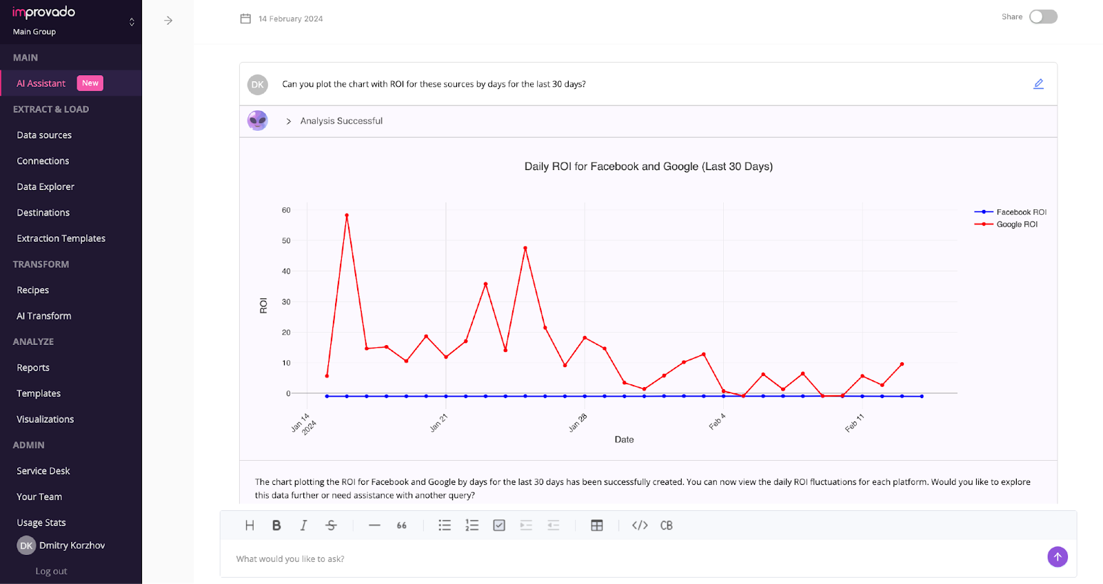
With AI-powered data visualization and exploration solutions, companies can take a step even further. Integrating natural language capabilities into data interaction tools significantly improves access to data across teams, democratizing data analysis. This approach allows team members, regardless of their technical proficiency, to engage with and understand complex datasets through simple queries and commands. By removing the barriers to data exploration, organizations can tap into a wider range of perspectives and expertise, enriching the analysis process.
Immediate Identification of Errors
Data visualization plays a crucial role in enhancing data quality by facilitating the immediate identification of errors and anomalies. Visual representations of data, such as charts and graphs, make it easier to spot discrepancies that could be overlooked in textual reports or spreadsheets. This rapid detection allows for swift corrections, minimizing the risk of decision-making based on flawed data.
Streamlined Reporting
In a situation where you need to quickly provide an answer to the question 'Which month in the past 3 years was the most profitable?', which data representation would you use?

Data visualization streamlines the reporting process by converting complex datasets into visually digestible formats. This capability is particularly useful when conveying intricate data insights to diverse stakeholders. Visual formats, such as graphs and charts, enable quick identification of trends, outliers, and correlations that text-based reports might obscure.
Additionally, data visualization supports the customization of reports to highlight specific data points or trends, making it easier for different departments to understand the relevance of the insights to their specific context. This approach not only enhances the efficiency of communication but also ensures that decisions are based on a clear and accurate understanding of the data.
Accessibility to Non-Experts
Data visualization serves as a bridge between complex data analysis and the broader audience, effectively making intricate datasets accessible to non-experts. This process involves converting raw data into visual formats, such as graphs, charts, and maps, that are intuitively understood. By doing so, it eliminates the need for specialized analytical skills to interpret data trends and insights.
As a result, organizations benefit from a more inclusive decision-making process, where diverse perspectives contribute to a holistic understanding of data insights.
Insightful Visualizations Start with Clear Data
Data visualization starts with making sure your data is well-organized and of high quality. That's where tools like Improvado step in.
Improvado automates data aggregation from over 500 marketing and sales sources, streamlines data preparation, and seamlessly integrates with any enterprise data visualization BI solution.
With pre-built recipes tailored for specific marketing scenarios, such as analyzing ad spend or attributing sales revenue, Improvado minimizes manual effort and reduces the risk of errors or misleading visualizations. This ensures a smoother transition to data analysis, enabling businesses to focus on deriving actionable insights.
Book a demo call to learn more about Improvado and how it can simplify business intelligence at an enterprise level.
Frequently Asked Questions
.jpeg)
500+ data sources under one roof to drive business growth. 👇
Improvado handles data prep, you focus on impactful marketing


%20(1).png)
.png)


