%20(1).png)
.png)
.png)
4 Landing Page Experiments You Should Try to Boost Conversions
If only life were an A/B split test.
Think about it. All those key decisions you make in life. Who to marry? What college to go to? What car to buy? Stay where you’re working right now or jump ship and take the new offer?
Of course, you can’t split test these major life decisions. So even when you look back in anger and regret, even when you wish you had chosen a different color on that $25,000 kitchen remodel, you really don’t know how the alternative would have gone.
But here’s the beautiful thing for marketers and entrepreneurs. We can split test many of our marketing decisions, especially on our landing pages.
We teach a philosophical approach to marketing experimentation in our new online training focused on optimizing web pages (the course is fully underwritten by MECLABS Institute, with no monetary cost to participants).
So Pavel and Anastasia reached out to me, and asked me to share some testing ideas with the data-driven audience that reads the Improvado blog. Here are four varied experiments to spur your next great test idea.
But before we jump into the experiments -- what is a landing page test? A landing page test is when you create two (or more) versions of your landing page (often known as a control and treatment) and serve these pages to an equal number of real customers considering real purchase decisions. By measuring the results of this real customer behavior, you can determine which landing page approach works best for your company.
That is the mechanics of a landing page test. However, the success of a landing page test is driven by the marketer. Use psychology and philosophy to drive conversion increases. Psychology to better understand the customer. And philosophy to better understand yourself. After all, you play a key role in the success of your company and your products. So getting in the right mindset is crucial to your company’s success. I hope these four experiments spur some ideas in you.
Experiment #1: Which anxiety correction has the biggest impact on your product pages?
When you look at your landing pages, remember this – not all cost is monetary. In other words, your potential customers are (sometimes unconsciously) factoring in other elements when deciding whether to buy your product.
One of those factors is anxiety. The patented MECLABS Conversion Sequence Heuristic defines anxiety as “a psychological concern stimulated by a given element.”
Customers may have anxiety that your product won’t do what it says it will. Or show up when you say it should. Or even what you will do with the information they give you.
If you want to increase conversion on your landing pages, experiment with ways to decrease anxiety on your product pages.
The MECLABS team ran an experiment to decrease anxiety on a product page to improve the sales of e-books from a well-known retailer (while I name other brands in the rest of the experiments in this blog post, this retailer must remain anonymous).
The team tested four different versions of the product page against the control. These treatments were created based on a hypothesis of what elements might cause customer anxiety.(The control was the same page, except it did not account for any of these potential forms of customer anxiety).
Version A adjusted for anxiety regarding site security. Version B focused on anxiety that the e-book would not be compatible with the customer's reading device.

Version C moved the product description up on the page. In this case, the product description was a synopsis of the e-book to overcome the anxiety that the e-book wouldn’t be helpful or interesting for a potential customer.
Version D adjusted for an anxiety that is especially relevant in the COVID-19 era – shipping time. In this case, since it is a virtual product, the shipping time referred to how quickly customers could access the e-book.

Here are the results from the experiment:
- Control – 1.92% conversion rate (CR)
- Version A: Site Security – 2.56% CR, a 33.4% relative increase in conversion
- Version B: Product Specifications – 2.29% CR, a 19.1% increase
- Version C: Description – 3.42% CR, a 78% increase
- Version D: 2.35% CR, a 22.5% increase
Version C – moving the product description up on the page – had the biggest impact with a 78% relative increase in conversion.
Now, I don’t want you to look at this experiment and think I am telling you that moving a product description higher on your product pages will almost double conversion. It might. Or it might not. Your customers and product are unique.
The bigger lesson is this – every attempt to decrease anxiety increased the conversion rate.
So, look at your product pages. Do your customers fully understand your product and fulfillment process? What unnecessary anxiety might your potential customers have? What can you communicate to help relieve that anxiety?
Creating a high-converting landing page begins with this process – asking key questions about how you can better serve the customer, building hypotheses based on these questions, and then testing those hypotheses to discover what really works.
Experiment #2: Which checkout page will yield the highest conversion rate from billing information to confirmation?
A purchase is a journey. And just like a journey in the real world, customers may change their mind along the way.
So creating a high-performing product page is not enough. Potential customers may clickthrough your product page and then drop out later in the funnel, for example, on the checkout page.
The MECLABS team ran an experiment with VacationRoost to determine what checkout page would be most effective for the vacation home rental company.
The control featured a two-step horizontal design that shaded and separated Step 2 (second half of the form) until a “Continue” button was clicked, allowing users to move forward in the checkout process.
Once users completed the second step, they would click a second “Submit Reservation” button.

The treatment changed the form design from a two-step horizontal flow to a vertical design with minimized form fields. The treatment also reduced the calls-to-action to a single “Book My Vacation” button.
You’ll notice that the new design allowed the team to add anxiety-reducers to the right of the form.
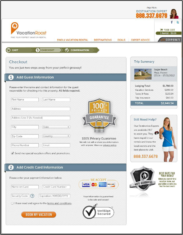
The treatment produced a 36.1% relative increase in the conversion rate.
Again, the bigger lesson here isn’t that this exact change will produce the same result for your checkout page (although, hopefully it gives you some pretty good test ideas).
The lesson is that to increase the ultimate conversion success of your landing pages you must look beyond the landing page. Consider the full buyer’s journey, and how you can best serve the customer from beginning to end.
Experiment #3: Which B2B landing page should you send traffic to with your ad spend?
The previous examples were for B2C products. But the same experimentation can be done with B2B landing pages as well.
And this next example hints at why landing page experimentation can be so effective – if you are spending money on driving traffic to a landing page, improving your landing page’s conversion rate also improves your ROAS (return on ad spend) and, ultimately, your ROI (return on investment).
Here’s a simple change that made a difference.
The team at AppVault had a webinar they planned to promote on LinkedIn to generate new leads.
The HR tech company took the landing page for this content and duplicated it for testing, making one change — one had the CTA on the left, and one had it on the right.
“I spent $300 on each landing page within LinkedIn — two separate campaigns to understand which one was converting better. As a result, the left side converted significantly higher,” said Geoffrey Bell, Marketing Manager, AppVault.
After that, the team spent more money on LinkedIn but promoted the page that had been more successful, thereby optimizing the investment — not only on that one platform, either.
The team also conducted third-party advertising on websites and sent a promotional email to its list – all driving potential webinar attendees to the higher-converting landing page.
Experiment #4: Which location-based landing page template will produce more leads for a services business?
We’ve discussed B2C and B2B landing pages, so let’s round out this blog post with an example of a services page.
BusinesSuites provides virtual office services and meeting rooms for companies of all sizes. The team split the site’s paid search traffic 50/50 – half going to a control landing page and half going to a treatment landing page.
Here’s a look at a control landing page. The control had blocks of text explaining BusinesSuites’ offered services as well as the address and a map.

For the treatment, the team scaled back the landing page itself.
“What we decided to do, specifically, was really limit the copy and direct everything to the form fill on the page,” said Dana Kraft, Director of Marketing, BusinesSuites.
The copy was broken down into a few bullet points, which explained BusinessSuites as a service. There were also third-party logos of awards the company had received and a list of groups associated with BusinesSuites.
Here is a look at the treatment.

As you can see, the treatment had a very clear headline – “Office Available in [Location Name]” (the company has 30 locations and this is a location-based business so each landing page focused on a specific location).
The treatment landing page had a single image of an office while the control page had multiple images, including of the building exterior.
And the treatment landing page had a shortened form with a clearer call-to-action – “Get a Quote” versus “Send Inquiry.”
The treatment page didn’t include a phone number, while the control did.
After the experiment ran, BusinesSuites discovered its drastic design changes were worth it. The new landing pages produced an 88% higher conversion rate than previous pages.
One reason I included this example is because it had multiple drastic changes, while the previous experiments I showed had far simpler changes.
If you just change one thing (and you run a valid experiment) you know that one thing is what produced the results. If you change multiple things, it can be hard to pinpoint what really had an impact. But you still can go back and be more granular with future testing to determine what changes produced the result…once you get the results for your business. Which is key.
This is an important consideration when formulating your experiments – what will it take to really move the needle with your unique customers? And what does your business need to succeed?
“For us, we don’t get millions of visitors a day, so we don’t get that many opportunities in reality to test stuff in any given year. Test something big so that if it works, it can make a huge difference, and it’s worth the time and investment you make in testing and then in rolling out the changes,” Kraft said.
What do you need to run a split test on a landing page?
You need two things – tools and understanding.
You can get the tools in many places, and some are even free. They are sometimes called A/B testing software or split testing software. Prominent makers of these tools include Adobe, Google, Optimizely, and Visual Website Optimizer. This is the easy part.
But understanding how people make choices, that’s the hard part. Because putting two landing pages in a splitter and running a test won’t get you the results you want. Making the right changes will.
The good news is, the more you test, the better you will understand how people make choices. Your understanding of the customer will grow over time. You will run better and better tests. And get better results.
So stick with it.
What’s a good conversion rate for a landing page?
Conversion rates are kind of like salaries. Everyone wants to know what everyone else is getting. But we’re all a little afraid to ask, and way too shy to share.
So what do we do? We check out the vaunted industry averages. Helpful as a general ballpark, yes, but they only help to a point.
For example, this blog post on average conversion rates has averages that range from 0.55% when the acquisition channel is email (I’m guessing a purchased email list) to 35% when the landing page has a contest form.
I’m writing an article right now that featured web conversion rates from 17 B2B and B2C marketers, and the rates range from one to two percent (for a tourism company in the UK during COVID lockdown) to 61% (for a B2B educational publisher on articles with a strong purchase intent when conversion is measured as clickthrough rate).
So first you have to understand – take all averages with a grain of salt. Many factors go into landing page conversion rate – from traffic source to conversion ask.
So it ultimately comes down to this – a good conversion rate for a landing page is a profitable conversion rate.
How much does your traffic to that landing page cost? What is the average order value? What are your margins? What is your goal for return on capital? Answering questions like these will help you get the answer you really need – discovering a good conversion rate for that specific landing page for your company.
Regardless of what types of landing pages or products you have, there is a commonality in all marketing experimentation. It begins with you – the marketer or entrepreneur. It begins with your sincere desire to learn about your unique customers, to discover how to better serve them to increase business results.
That is what data is, after all, right? Whether data from a marketing experiment or any other type of marketing and sales data. It provides hints and insights to other human beings, human beings we just happen to call customers. When you learn how to read that data, you learn about these people. You can serve these people. And in so doing, you achieve the results your business needs.

500+ data sources under one roof to drive business growth. 👇


%20(1).png)
.png)


